Split View
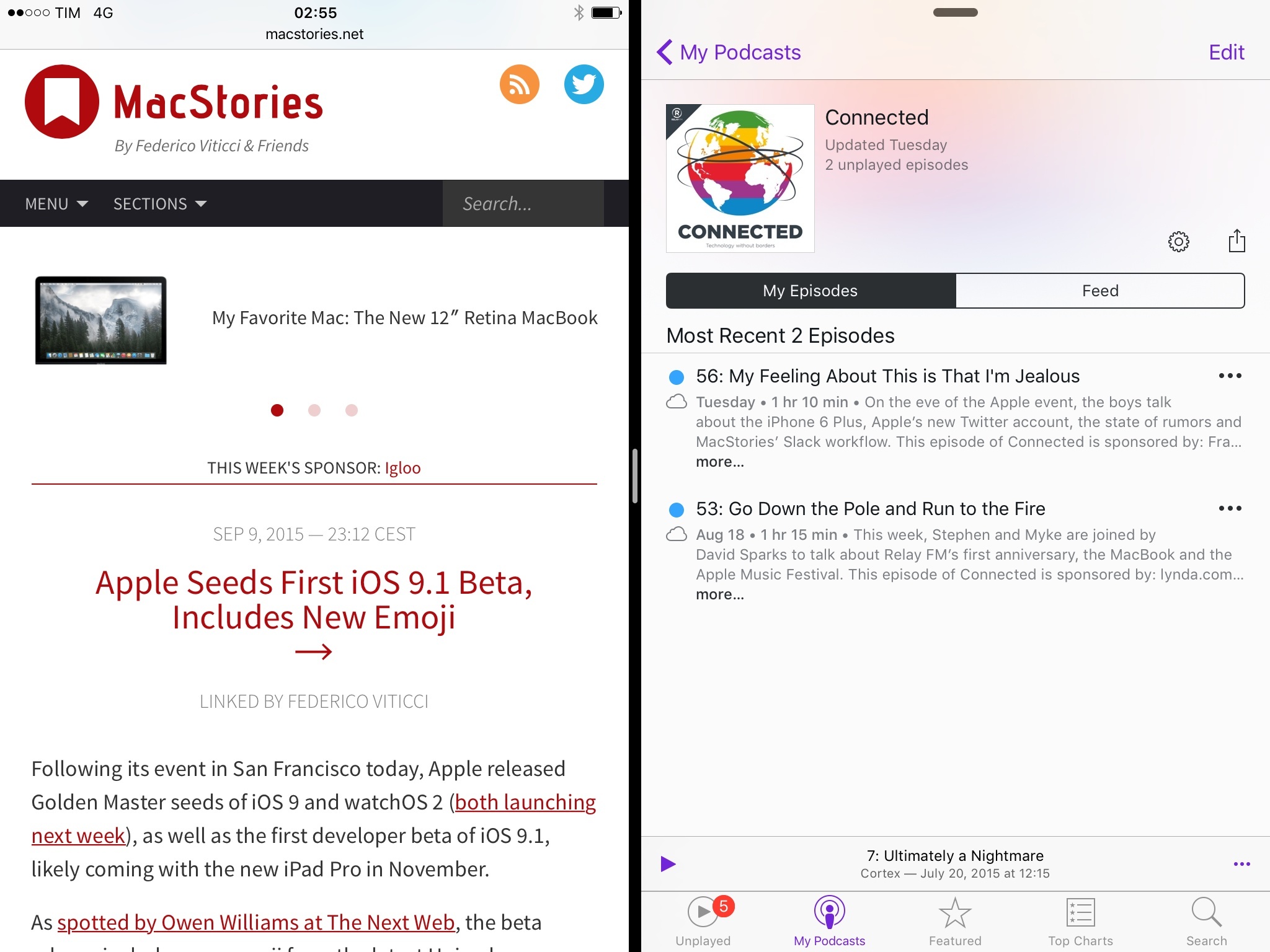
If there was still any doubt on the iPad graduating from utility to computer with iOS 9, Split View clears it all. Split View is a fundamental re-imagination of the iPad’s interaction model five years after its launch. More than any other productivity enhancement in iOS 9, Split View is the iPad’s coming-of-age feature.
As the name suggests, Split View is Apple’s take on split-screen multitasking that lets the iPad display two apps simultaneously, enabling users to interact with both apps at the same time. Because of its toll on hardware and system resources, Split View is exclusive to the latest generation iPads.
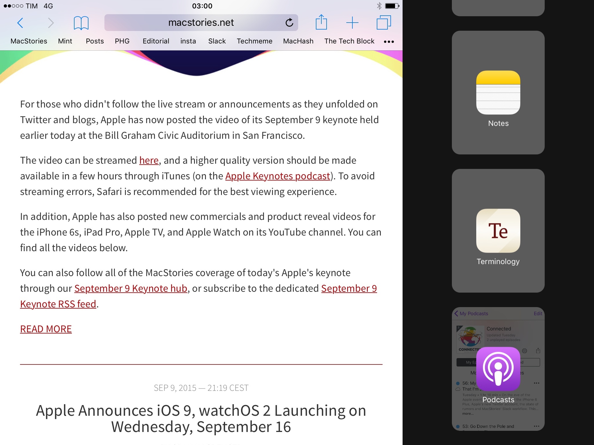
Split View can be considered Slide Over’s offspring: it can only be activated by entering Slide Over first and tapping a vertical divider that will put both apps (primary and secondary) side by side, active at the same time. In Split View, the app switcher for the secondary app is the same one used for Slide Over, too.
There is no other way to activate Split View in iOS 9: the feature is entirely based on Slide Over, both in terms of design and user manipulation. If you want, you can move between Slide Over and Split View by tapping the divider and iOS 9 will cycle through the two modes.
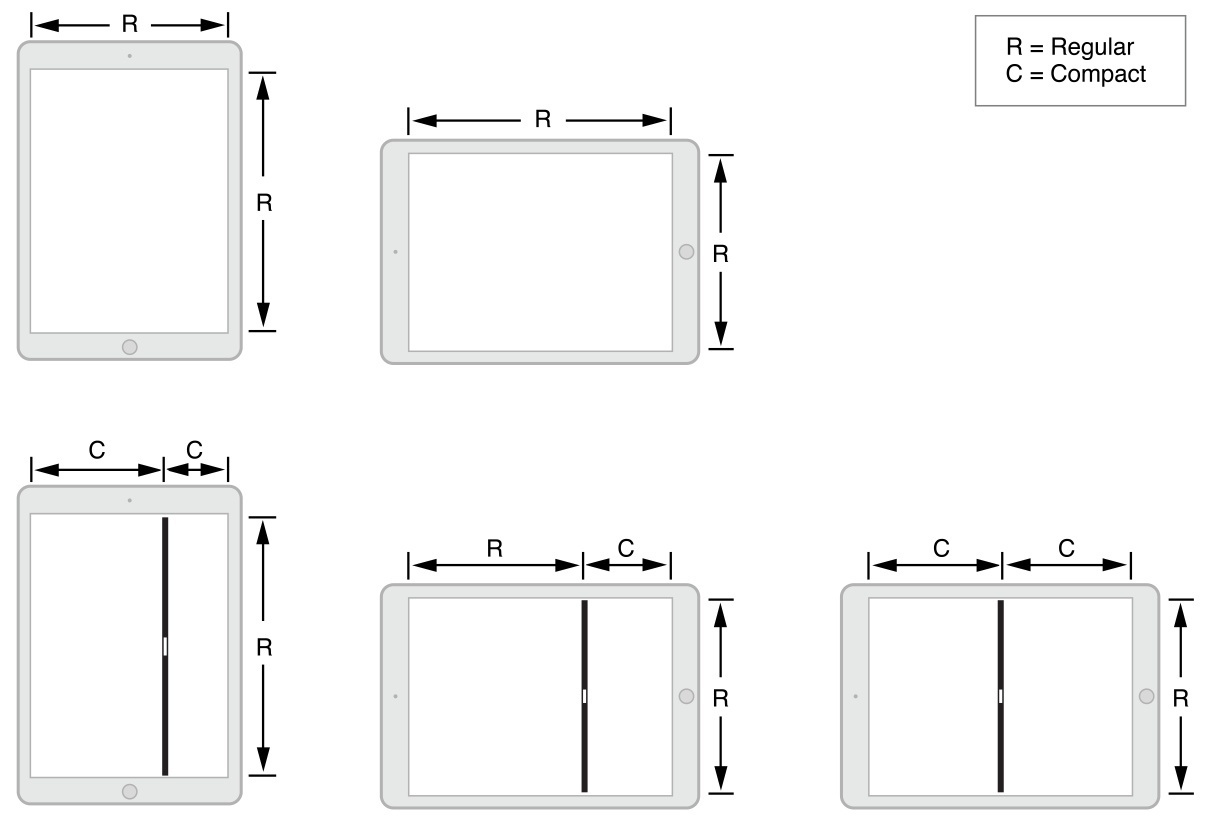
Split View uses regular and compact size classes for three possible layouts. Before iOS 9, iPad apps always used regular size classes for both vertical and horizontal orientations as they ran in full-screen mode all the time. With Split View, the vertical size class is always regular, but the horizontal size class can change to compact. The diagram below shows how Split View affects size classes for iPad apps.
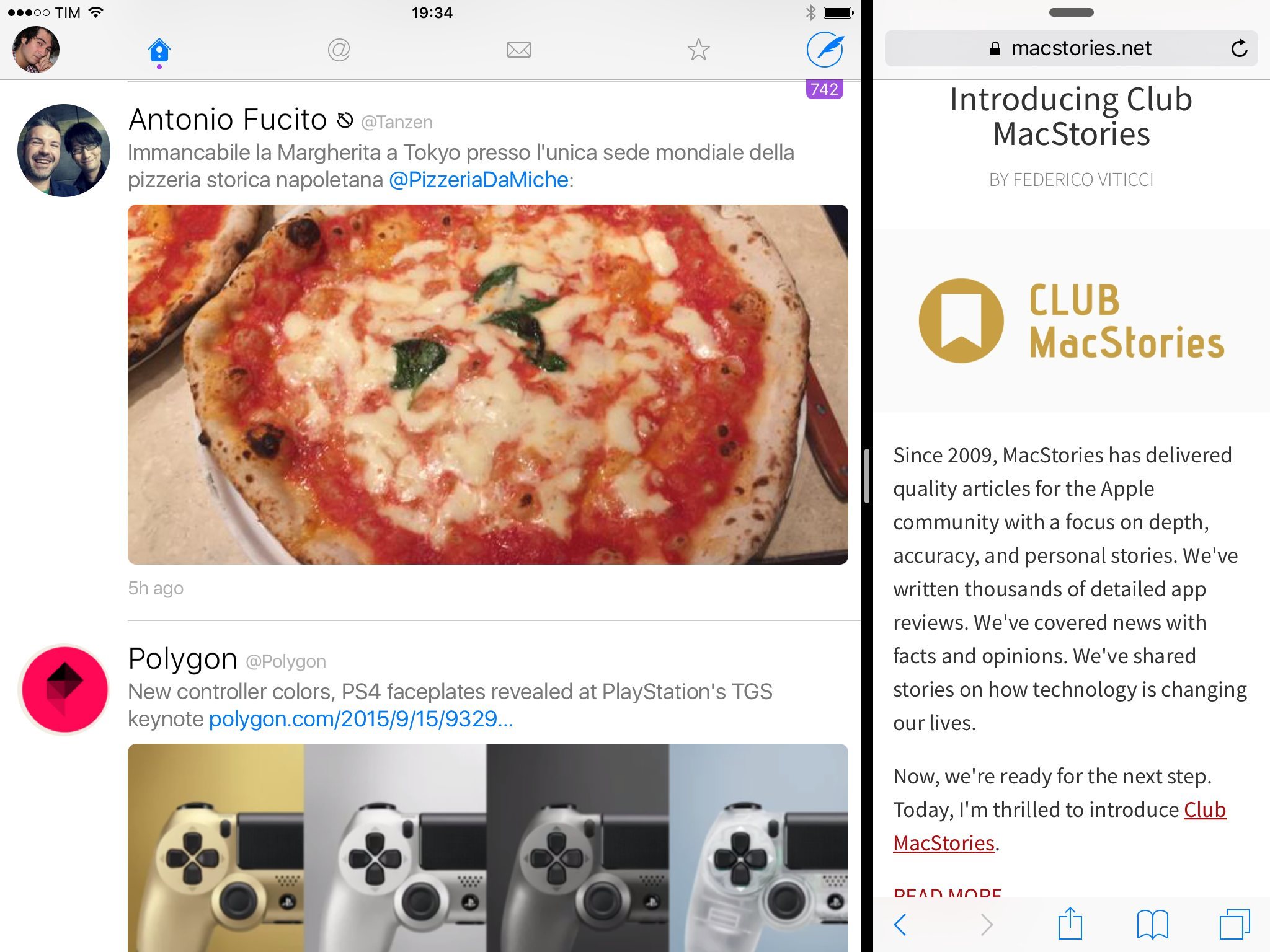
When in Split View, the user can control the size of the app window by dragging the divider to switch between layouts. This is best experienced with Split View in landscape, where the secondary app can be resized to use 25% or 50% of the screen.
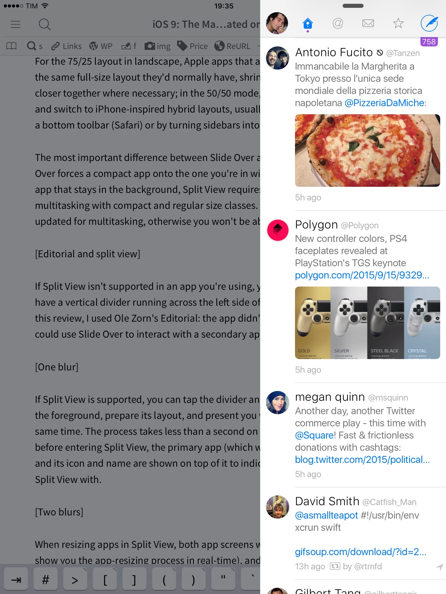
For the 75/25 layout in landscape, Apple apps that are primary tend to keep roughly the same full-size layout they’d normally have, shrinking and putting some buttons closer together where necessary; in the 50/50 mode, though, apps tend to resize more and switch to iPhone-inspired hybrid layouts, usually by moving some top buttons to a bottom toolbar (Safari) or by turning sidebars into cards (Reminders).
The most important difference between Slide Over and Split View is that while Slide Over forces a compact app onto the one you’re in with no consequence on the primary app that stays in the background, Split View requires both apps to support multitasking with compact and regular size classes. Split View needs two iOS 9 apps updated for multitasking, otherwise you won’t be able to split the screen in two.
If Split View isn’t supported in an app you’re using, you’ll notice that Slide Over won’t have a vertical divider running across the left side of the secondary app. When writing this review, I used Ole Zorn’s Editorial: the app didn’t support iOS 9 multitasking, so I could use Slide Over to interact with a secondary app, but I couldn’t enter Split View.
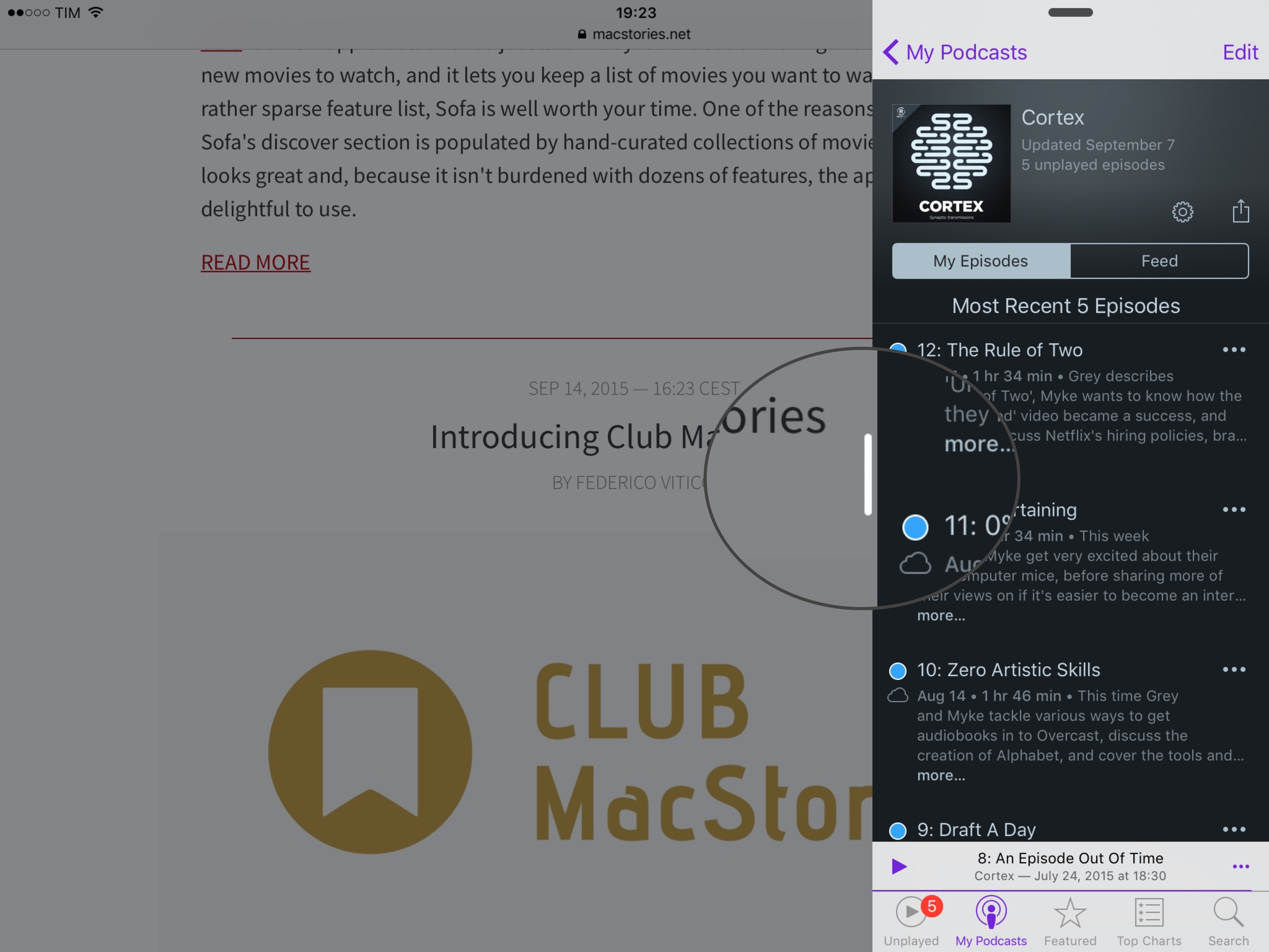
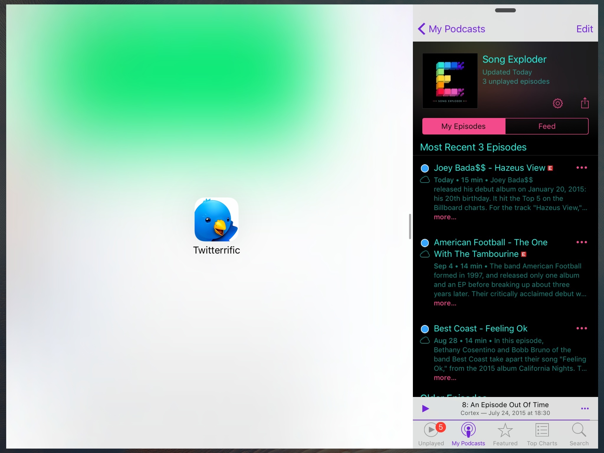
If Split View is supported, you can tap the divider and iOS will bring the primary app in the foreground, prepare its layout, and present you with two apps on screen at the same time. The process takes less than a second on the iPad Air 2; after tapping and before entering Split View, the primary app (which was in the background) is blurred and its icon and name are shown on top of it to indicate which app you’re about to use Split View with.
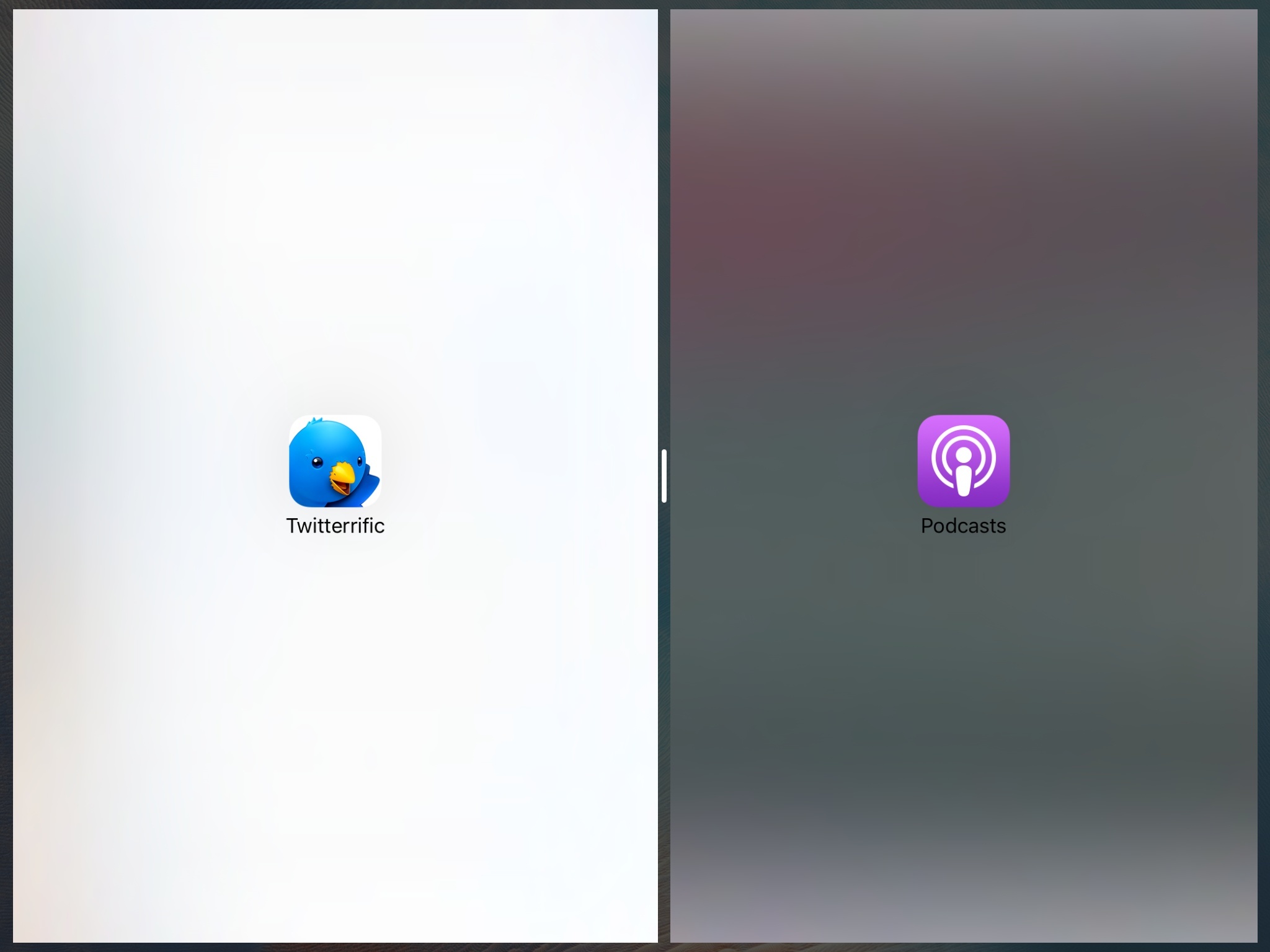
When resizing apps in Split View, both app screens will be blurred (iOS doesn’t want to show you the app-resizing process in real-time), and you’ll get the Split View counterparts upon releasing the divider – again, it takes less than a second.
There’s a nice detail worth mentioning about resizing apps. When you’re dragging the divider to resize apps in Split View, it will turn white and both apps will slightly recess in the background to communicate they’re being manipulated by the user.
Dragging the divider is also how apps are dismissed and how you can return to a full-screen app. To leave Split View manually, you have to grab the divider and swipe right to put the secondary back into the app switcher, or swipe left to dismiss the primary app and make the secondary app full-screen (primary). The process works the same way in both directions, with an app undocking from Split View as you reach the edge of the screen through an animation that pulls it away from the adjacent app and that dims it. It’s a delightful transition, smoothly animated on the iPad Air 2.
In my experience, Apple’s approach has been working well: when they have to adopt compact layouts in Split View, landscape apps are somewhat reminiscent of an iPad mini inside an iPad Air 2 – you can tell they’re using iPad layouts, only smaller.
Other times, Apple uses a few tricks to mix and match elements of iPhone interfaces with iPad UIs to save on space, but the end result is not annoying thanks to conventions of the iOS platform. And when they’re using narrow layouts for Slide Over and Split View, iPad apps almost transform into smaller iPhone versions with longer layouts, which is fine for quick interactions. The constraints that Apple has put in place ensure you never end up with odd or uncomfortable app layouts, and that is the best design decision behind Split View and the new multitasking initiative as a whole.
Split View is an option. You’re not relinquishing control of the traditional iOS experience when switching to Split View, and you don’t have to use it if you don’t want to. Apps don’t launch in Split View mode by default: while on a Mac apps launch in windowed mode and full-screen is optional, the opposite is still true on iOS 9. Apps are, first and foremost, a full-screen affair on iOS, and the way Apple designed Split View doesn’t suggest that is changing any time soon.
Split View isn’t like window management on a desktop: Apple wanted to eschew the complexities of traditional PC multitasking and windowing systems, and by rethinking the entire concept around size classes and direct touch manipulation, they’ve largely achieved this goal. They have created new complexities specific to iOS and touch, but it’s undeniable that Slide Over and Split View are far from the annoyances inherent to window management on OS X. The iPad is fighting to be a computer and Split View epitomizes this desire, but it doesn’t want to inherit the worst parts of multitasking from desktop computers.
“User control without unlimited freedom” would be a good way to describe Split View. While the user controls when Split View is activated and when it should be dismissed, Apple has (rightly) shied away from granting users the ability to resize app screens manually, have multiple overlapping windows on screen, or overcomplicate the divider with additional menus.
The competition (and some jailbreak tweaks) had set a precedent for this; instead, Apple has shown remarkable restraint in building a split-screen feature which requires minimal management.
As a result, apps in Split View don’t feel like windows at all: users never get to choose an app’s position beyond its primary or secondary state; they can’t drag an app in a corner and put three apps on screen with draggable resize controls. The screen splits to accommodate two apps – and that’s it. It’s easy to grasp, fast, and it feels natural on the Air 2.
For a long time, I thought that Apple wouldn’t bring this kind of multitasking to the iPad because of the complexity therein, but Split View changed my mind. Unlike windows on OS X, I don’t have to worry about overlapping windows and apps to manage windows, which is liberating. I may not be able to look at five apps at the same time, but how often do I need that many apps at the same time anyway?
The fact that Split View is going to be available on El Capitan as well speaks for itself. Windows are great, but managing them usually isn’t. Starting fresh with Split View feels like the best option for the iPad. This isn’t a case of Stockholm Syndrome: limitations and an intuitive design truly open up new possibilities that aren’t weighed down by confusion or complexity.
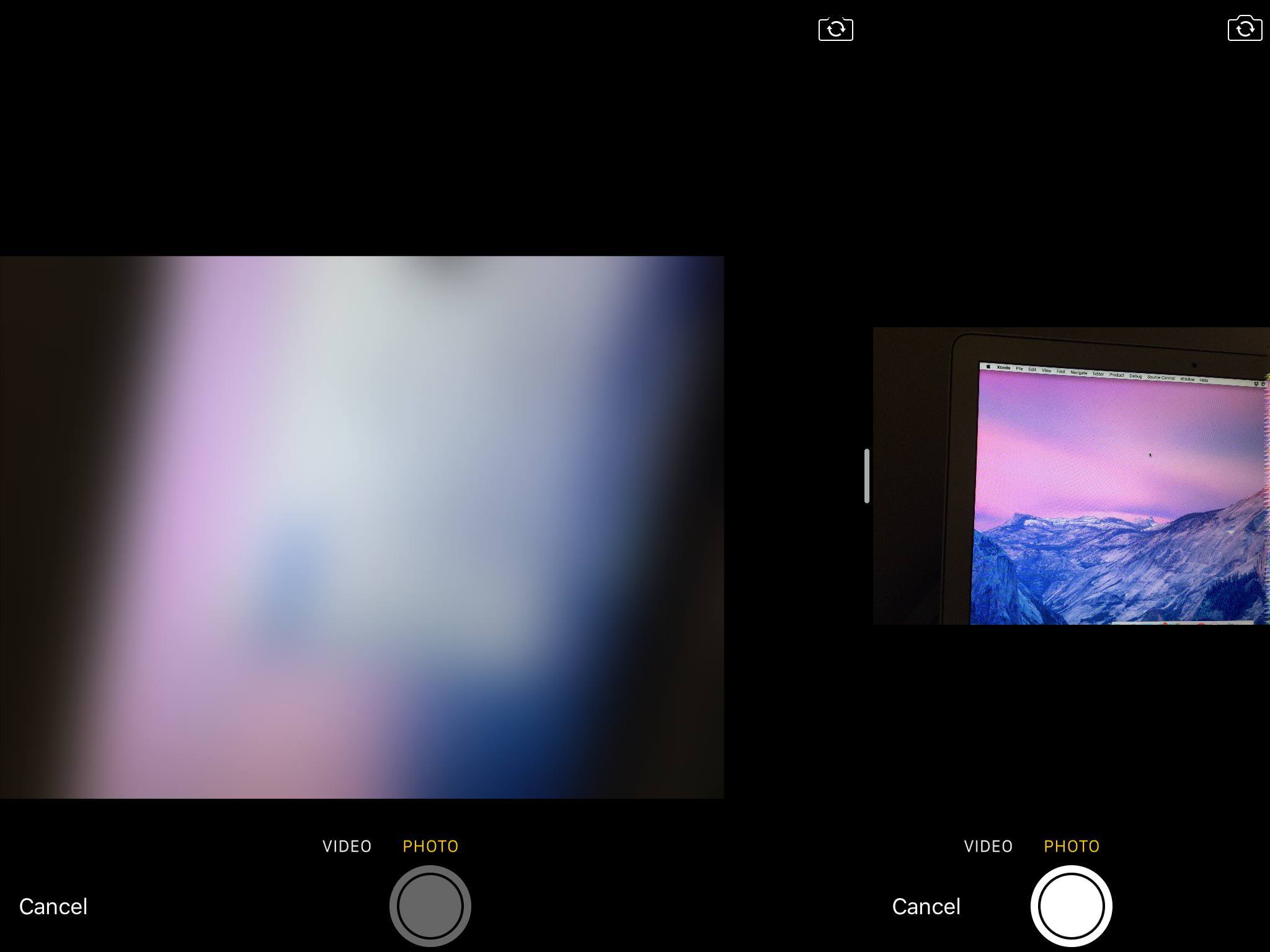
Take the iPad’s camera for example. In theory, by putting two apps that are capable of taking pictures and videos in Split View, you should be able to look at an iOS camera in two places. But that’s not how it works in iOS 9. If you try to snap a photo in two apps when Split View is on, iOS will pause any existing instance of the camera, so you won’t be able to look at the same scene from two different apps.
This feels right given the relationship between hardware and software on iOS: there is only one camera that takes advantage of an iPad’s processor and volume controls to take pictures. Rather than bringing additional complexity to the camera APIs24, Apple designed Split View with clear boundaries that serve the user experience.
At the same time, they’ve also given developers the ability to opt out of Split View if they don’t want their apps to support it. While I suspect that most iPad apps updated for iOS 9 will work with Split View, it’s likely that games meant to be played in full-screen with deeper access to the iPad’s hardware and resources won’t feature Split View integration. This is fair when you consider the increased memory pressure on a complex 3D game that needs to share the screen with another advanced app or game, but I’d still love to see a Split View-enabled Minecraft running alongside a guide to the game or a live chat.
Split View breeds a new set of limitations and complexities, but it doesn’t fall in the trap of imitating PC multitasking. Taken at face value, Split View really is just a way to use two apps at the same time. As we’ll explore later on, that “just” is part of a bigger picture that goes beyond the idea of multiple app screens, with exciting possibilities worth addressing.
- What happens if you press the volume button to take a picture in Split View with two camera apps? What about processor usage and battery life for two live camera views? ↩︎


