Dark Mode and Colors
For the past couple of years, iOS has provided users with a ‘Smart Invert Colors’ accessibility preference that would try to invert the color of the interface while leaving elements such as images untouched.
iOS 13’s dark mode is not a simple inversion of colors. Instead, Apple has re-engineered UIKit around the idea of semantic and dynamic colors that give apps a visual hierarchy; when apps take advantage of these new APIs and color definitions, the system automatically takes care of picking the best colors (for highlights, accent colors, and other UI elements) to maximize contrast with dark mode while respecting the multiple layers of interface that may be shown onscreen at once.
At a high level, Apple is advising developers to start describing the “purpose” of their colors rather than their hardcoded values. This is possible because iOS 13 comes with built-in definitions for the system “blue” or “red” colors, which don’t have a single value anymore but instead change subtly between light and dark appearances.
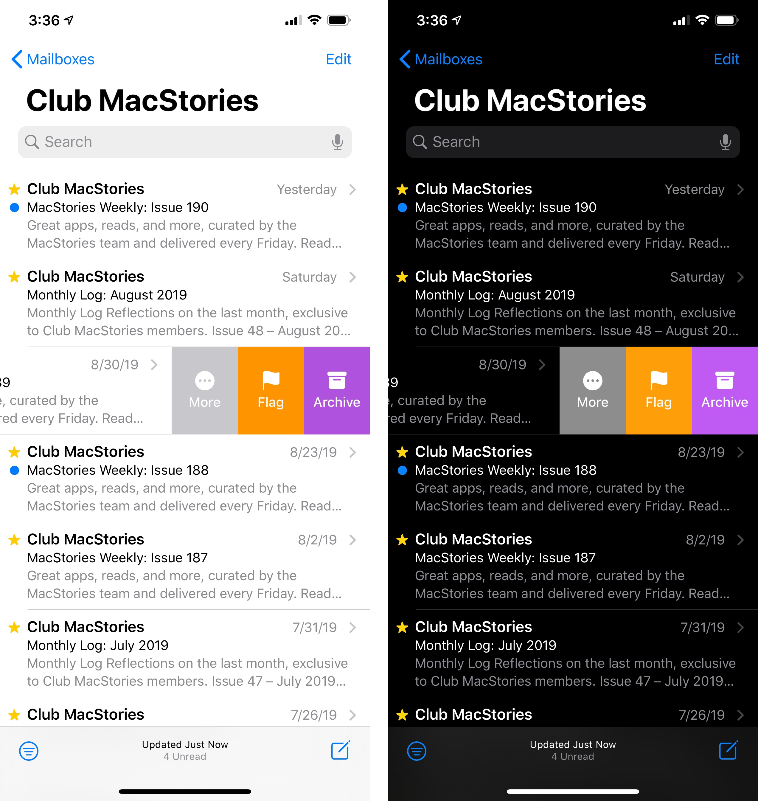
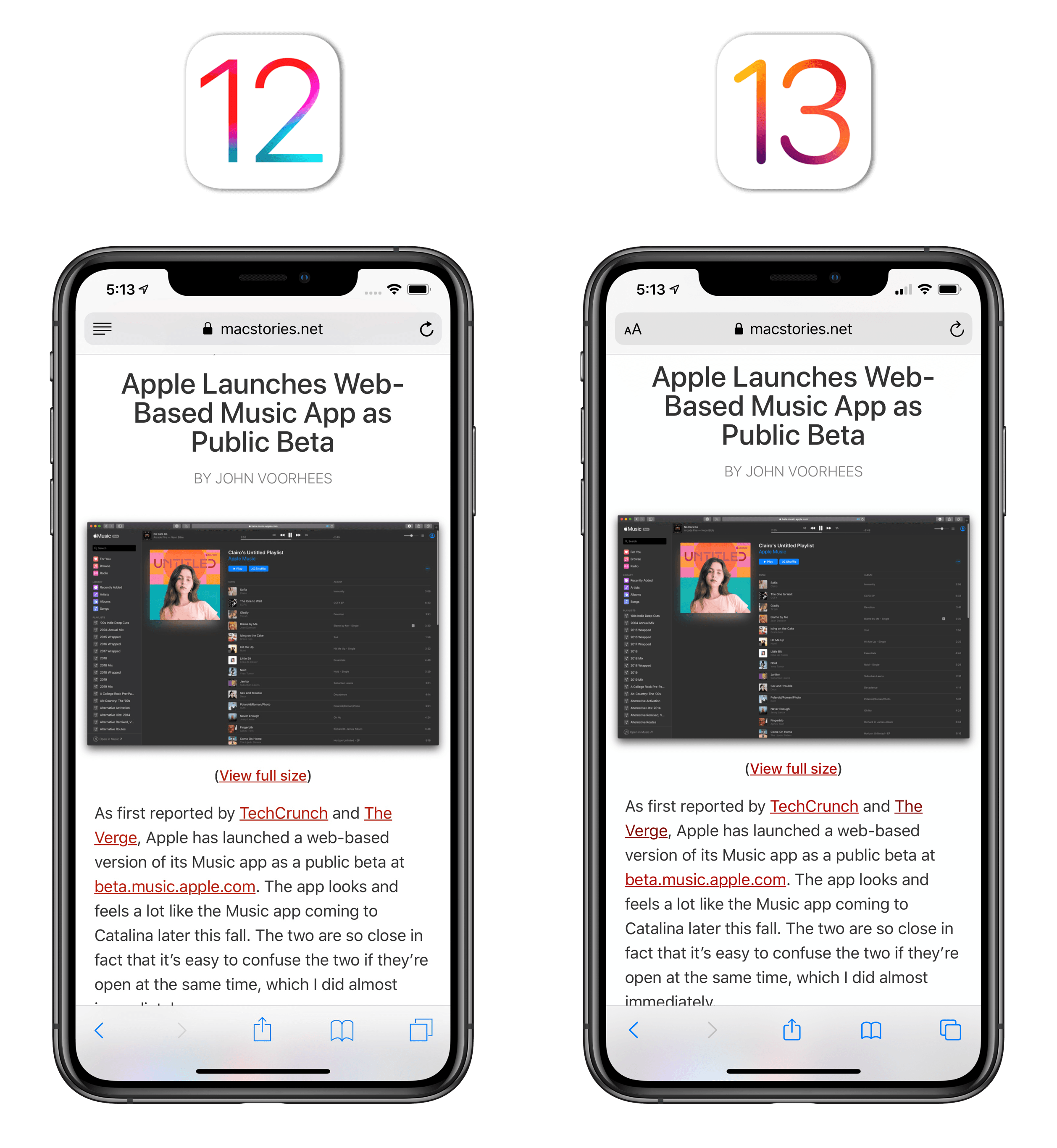
For instance, consider the following Mail screenshots:
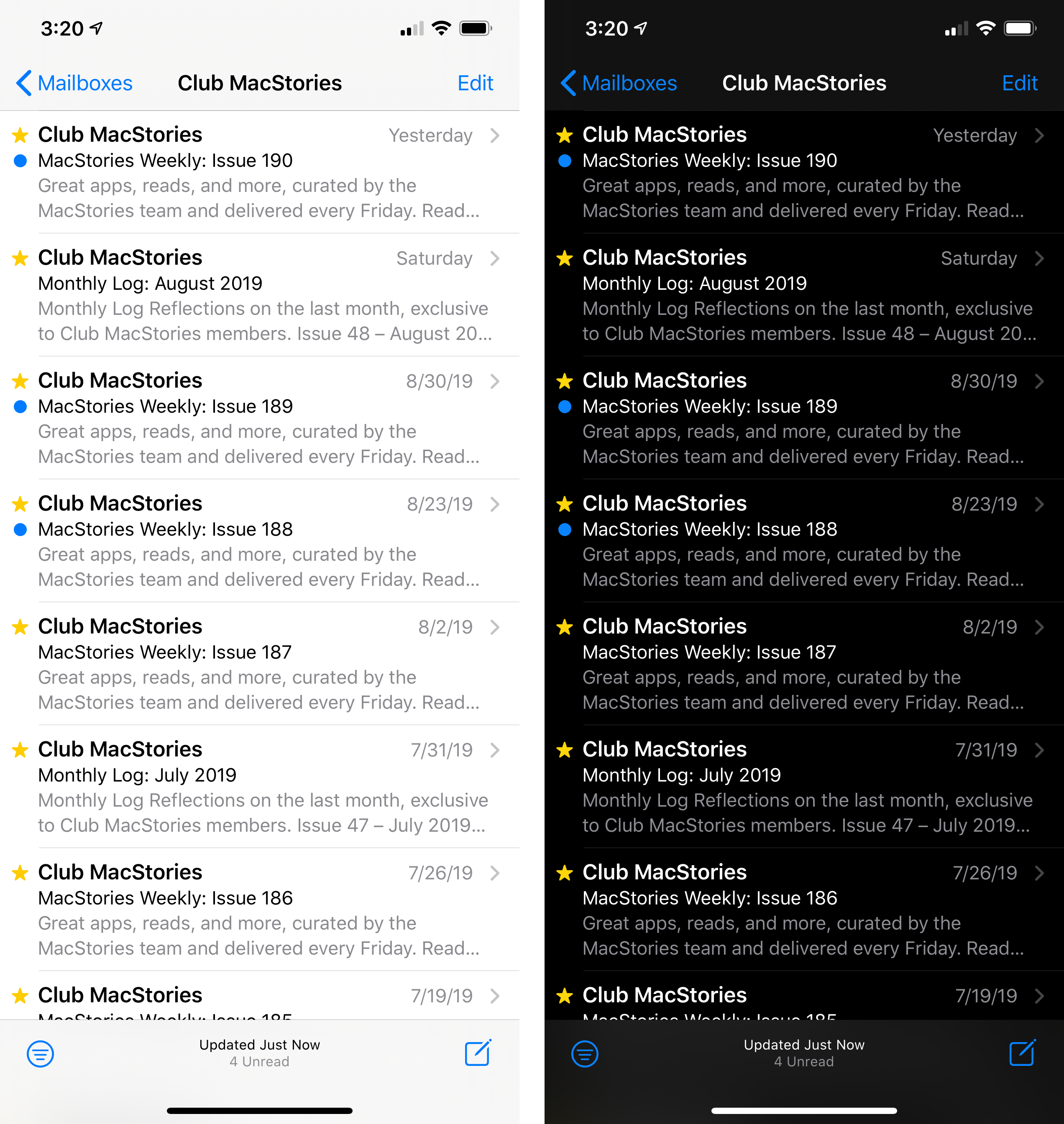
In the light version, the color blue – used for the unread indicator and toolbar glyphs – has a value of RGB(0, 122, 255); in dark mode, the color blue has a slightly lighter shade with a value of RGB(10, 132, 255). Here’s where the two shades of blue sit on the color spectrum:
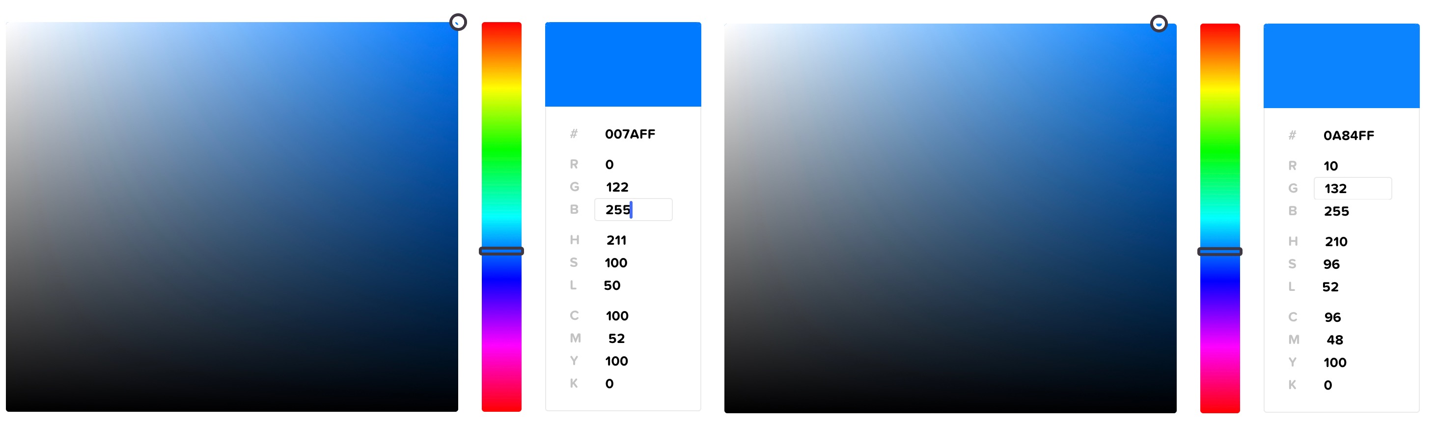
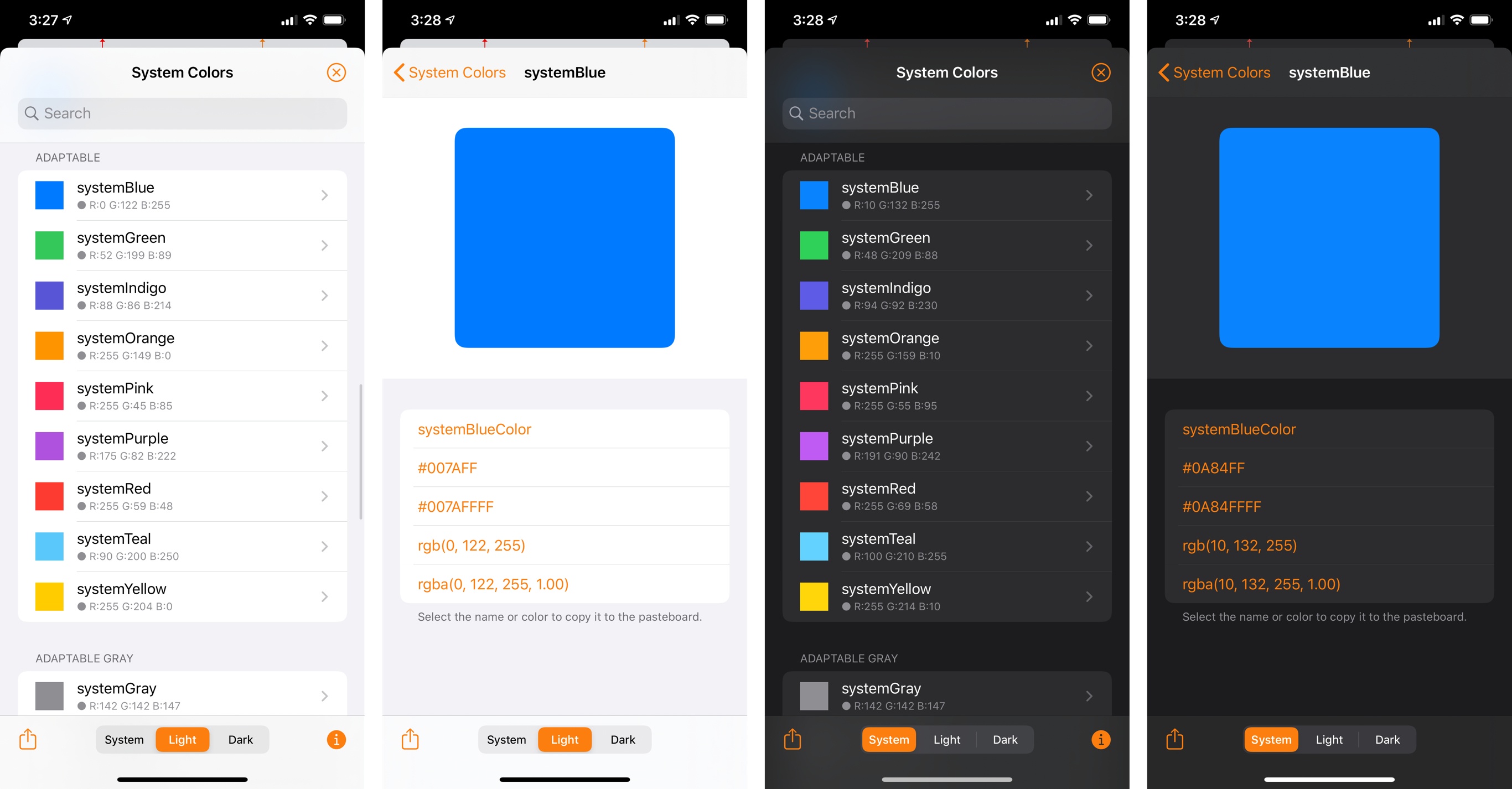
This happens because, as I mentioned above, dark mode isn’t a simple inversion, nor is it inverting the background color but leaving other colors unaffected. To achieve a more pleasing visual effect and enhanced contrast, Apple is using the semantic color “blue”, which is natively understood by iOS 13, and which comes with alternate appearances for light and dark mode. This is also confirmed by Adaptivity, a handy utility by developer Geoff Hackworth which can expose the underlying color values of the systemBlue semantic color employed by iOS 13:
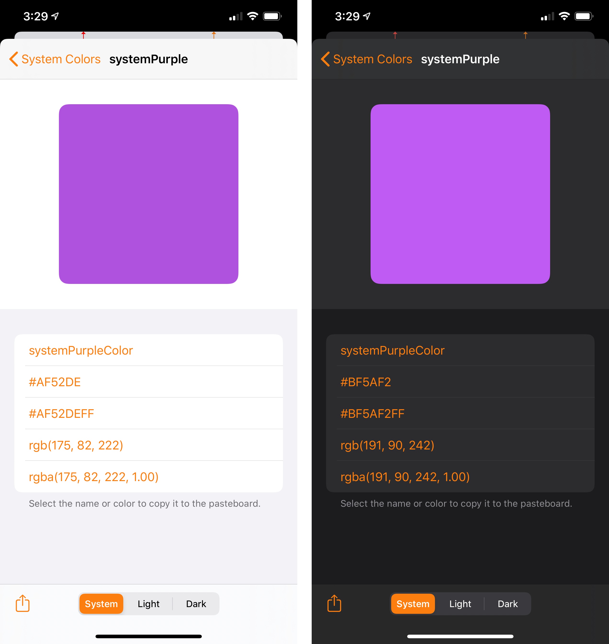
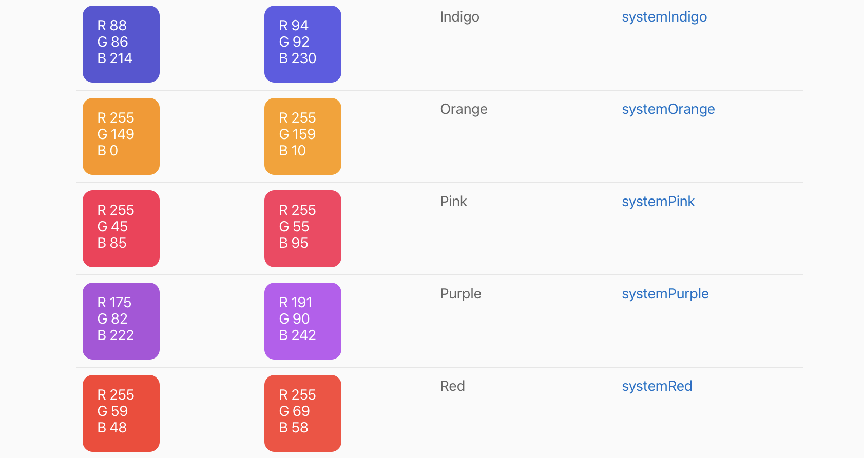
The same is true for systemPurple…
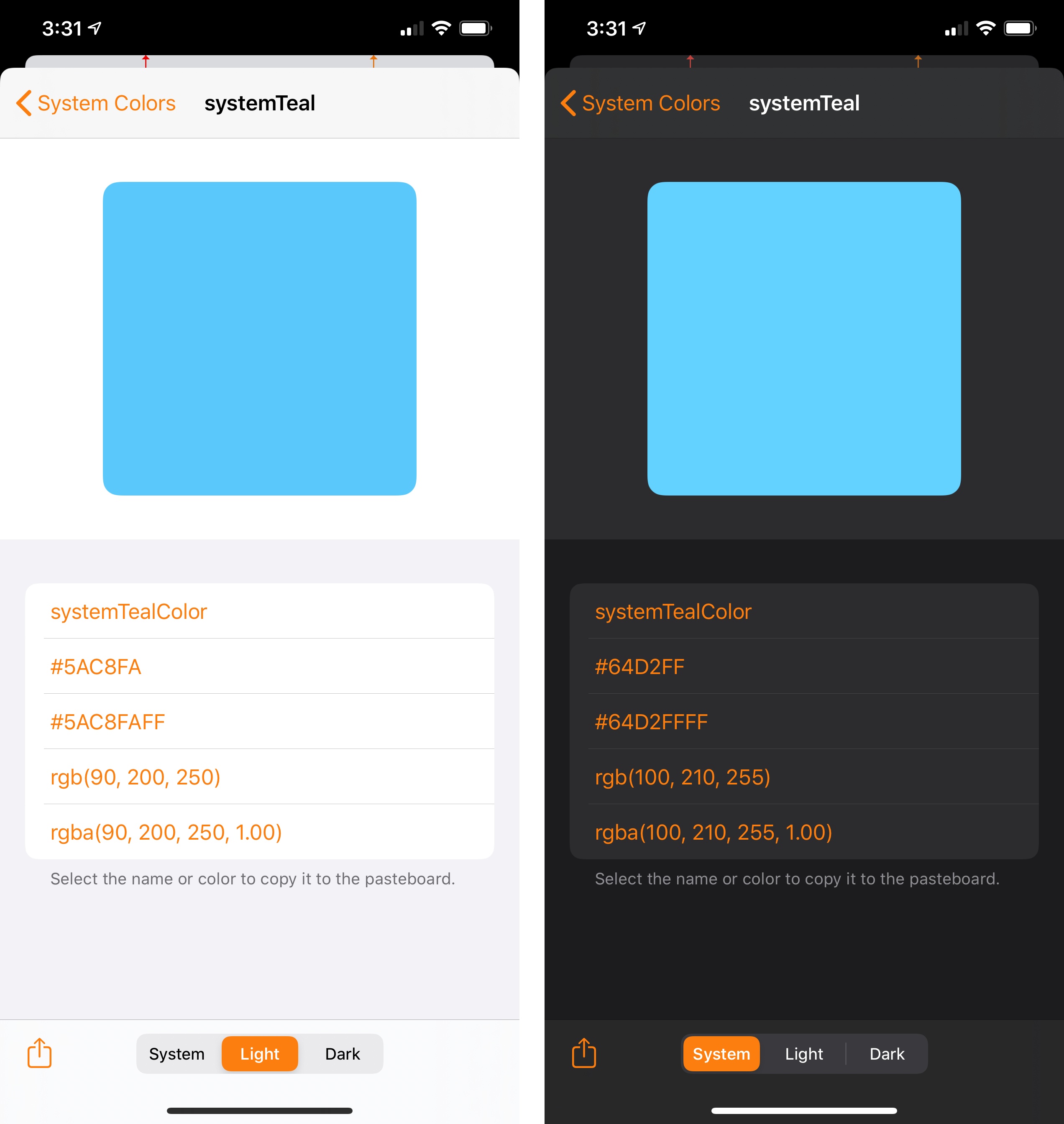
…systemTeal…
…and other colors, including the multiple shades of gray supported by the system, each with its alternate appearance for light and dark mode:
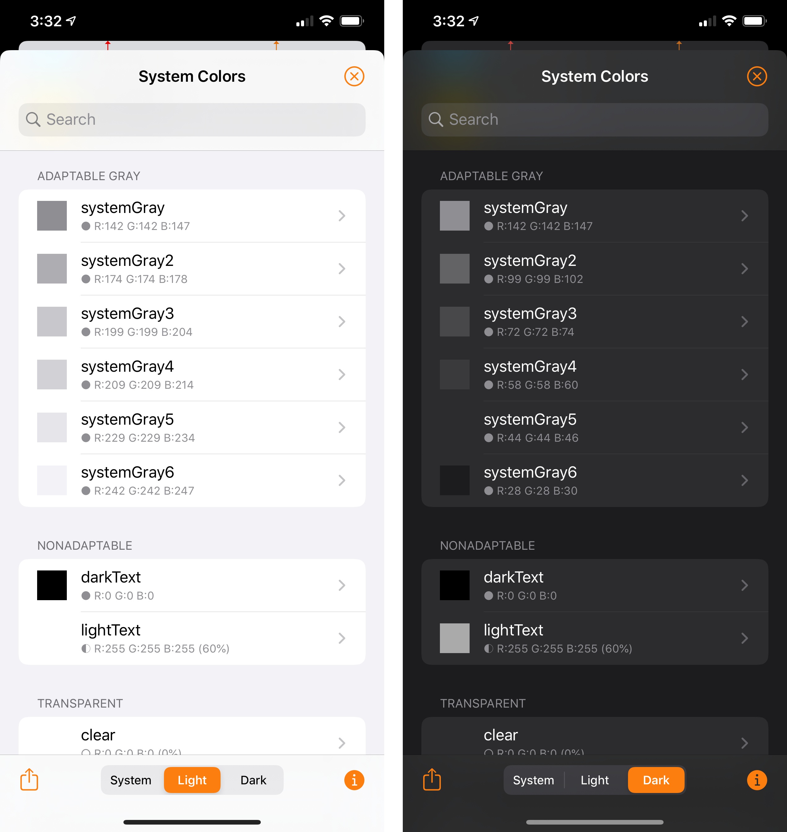
Once you realize how the semantic color system Apple has built works behind the scenes, you’ll start appreciating the many examples of it scattered across iOS 13, from the default background colors of views to separators between cells, scroll bars, menus, and other UI elements.
Here’s another example from Mail, featuring swipe actions that subtly change their colors between light and dark mode:
In iOS 13, Apple has built a whole “dictionary” of semantic colors that developers can use in their apps, which should remove much of the overhead involved with picking colors that look good, are legible, have enough contrast in dark mode, and work well in different accessibility conditions. Apple’s semantic colors do all of this “for free”.
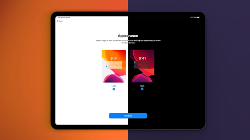
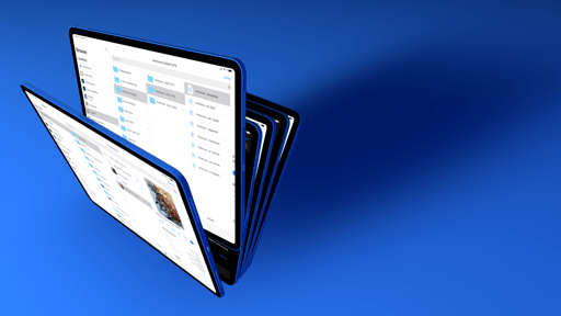
Developers can, of course, create their own semantic colors as well, and they can also supply a separate set of image assets for dark mode support. Apple, for instance, has designed new system wallpapers that come with alternate versions for iOS 13’s two appearances.
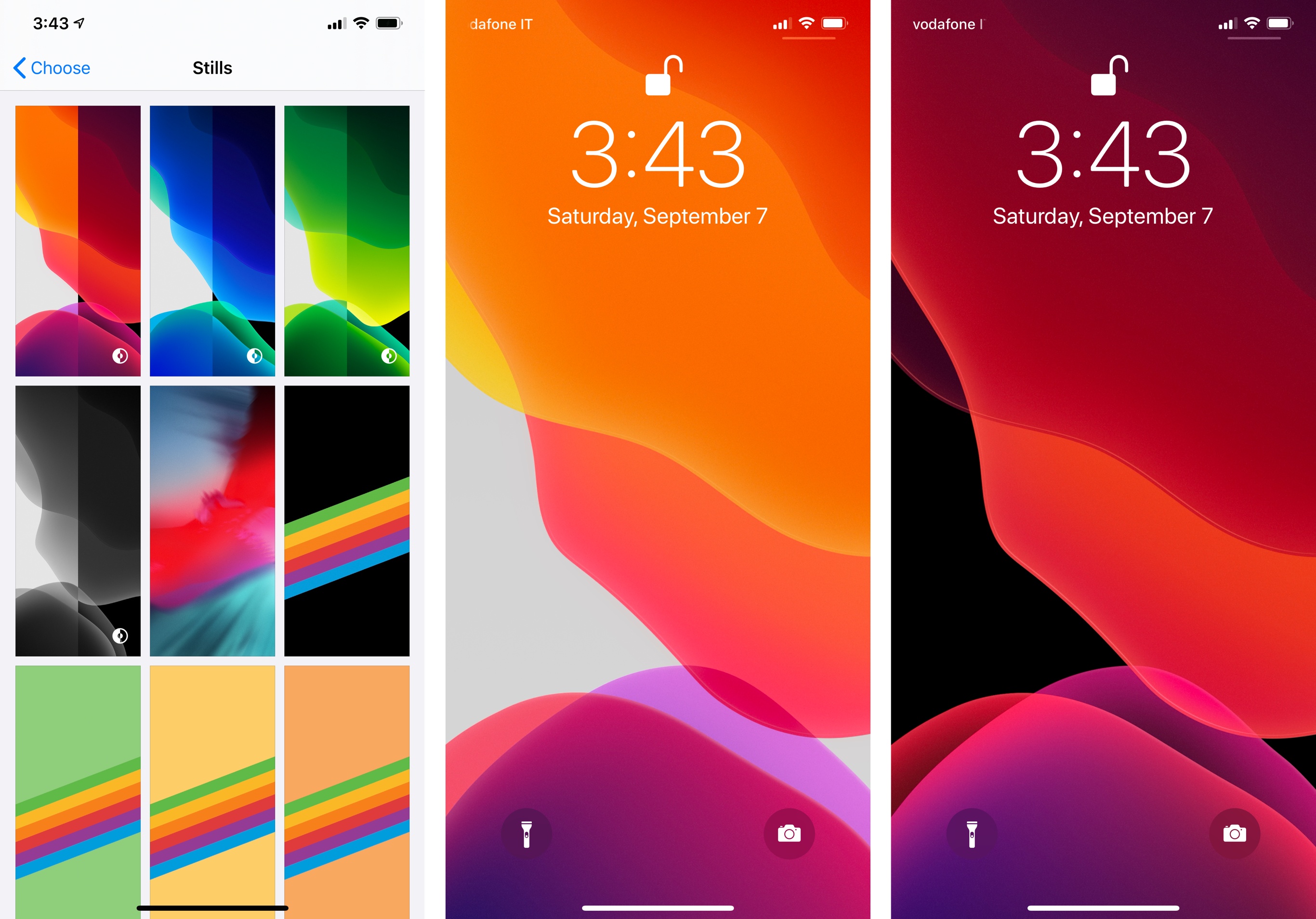
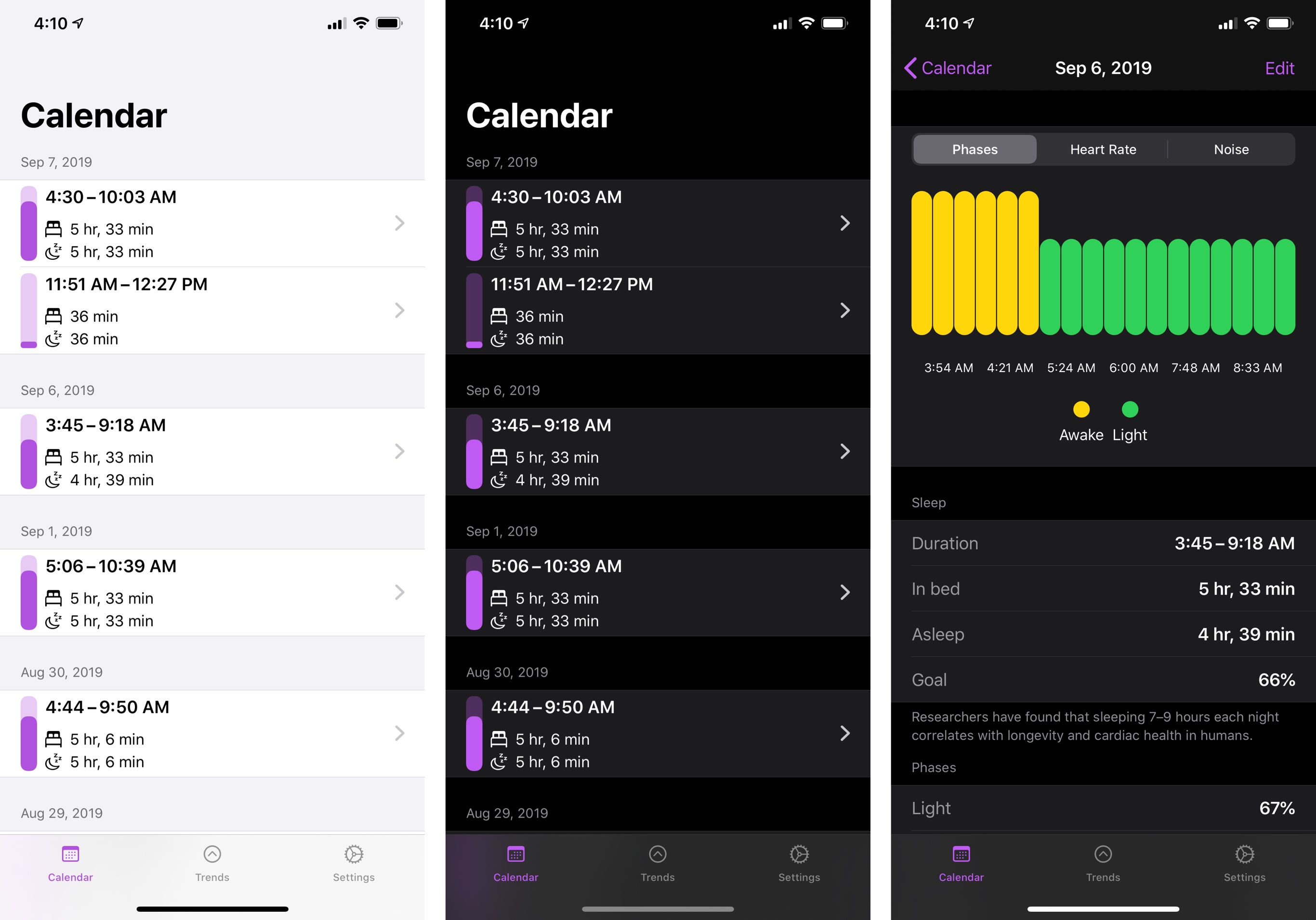
System wallpapers that support alternate versions for dark mode are indicated by an icon in Settings.
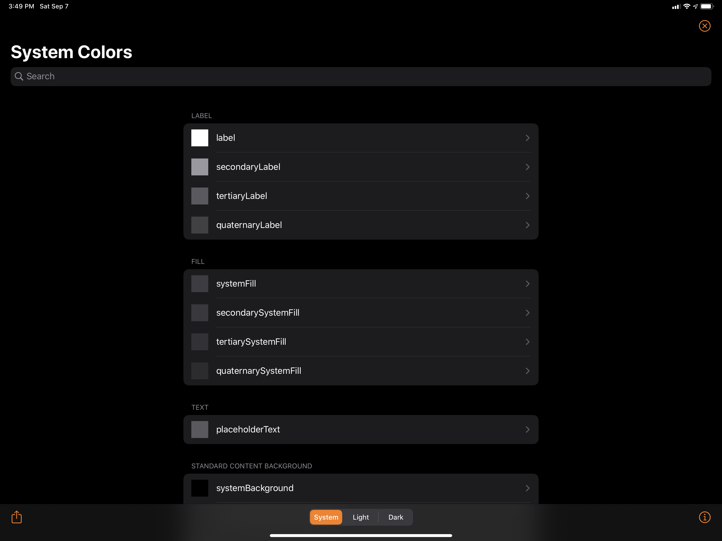
There’s an additional layer of sophistication involving dark mode’s color palette and its idea of interface hierarchies. Colors can have multiple levels: text labels, for example, have four levels of color in iOS 13, and each can be used depending on the hierarchical state of an interface displayed onscreen.
Apple is drawing from lessons learned from macOS Mojave: dark mode doesn’t exclusively rely on drop shadows to visually communicate layers of the UI; instead, it leverages “elevated” colors that stand out against a dark background and combines them with vibrancy (also improved in iOS 13) to keep text legible and provide better separation between apps.
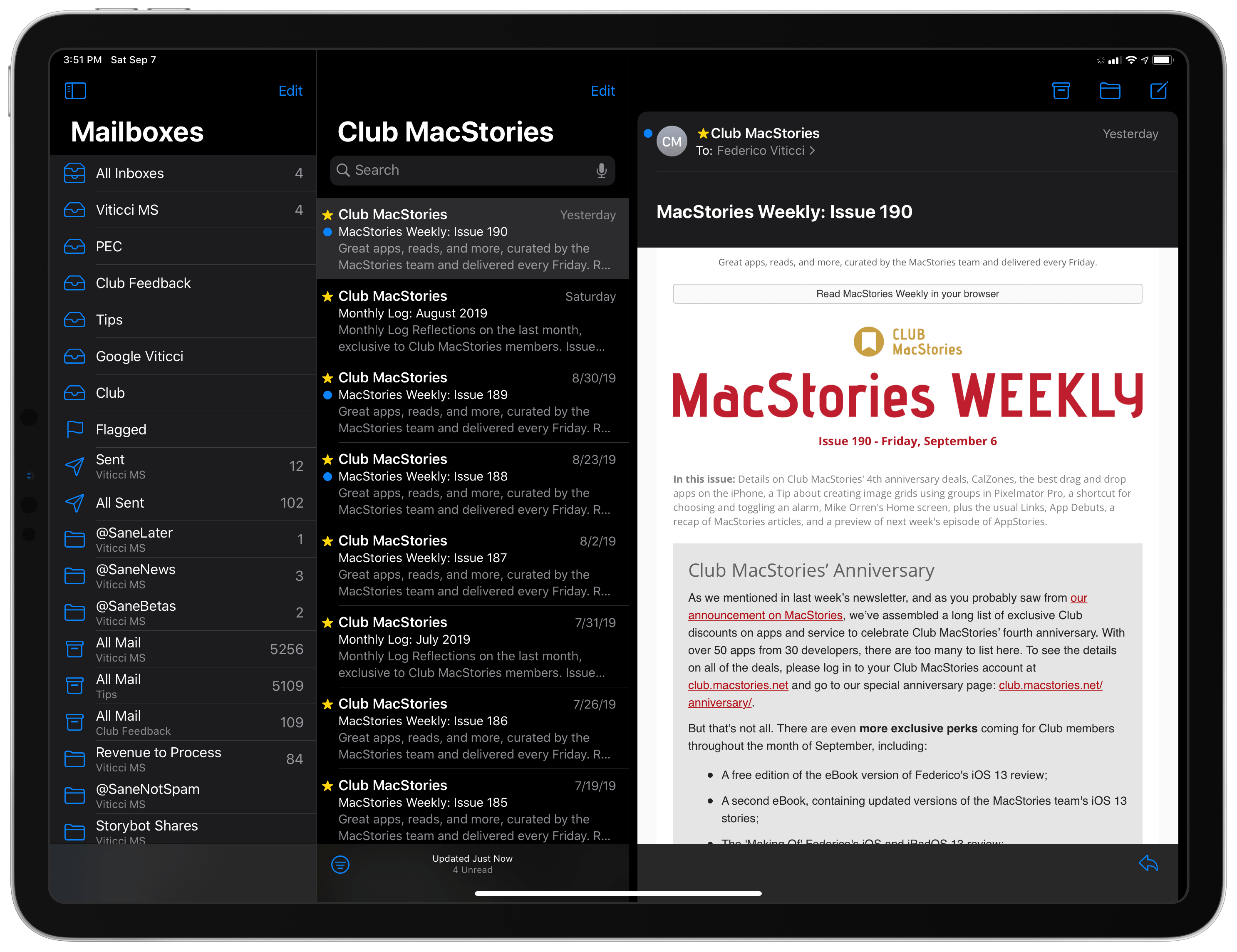
This is particularly evident on iPad with Split View or when an app spawns multiple layers of UI, such as when a modal sheet or composer panel comes up. Here’s a good example of the concept of hierarchies and color levels in practice: when used in full-screen on iPad, the Mail app uses pure black as the background color for certain areas of its UI, which helps build the illusion that a single app is bleeding into the edges of the display.
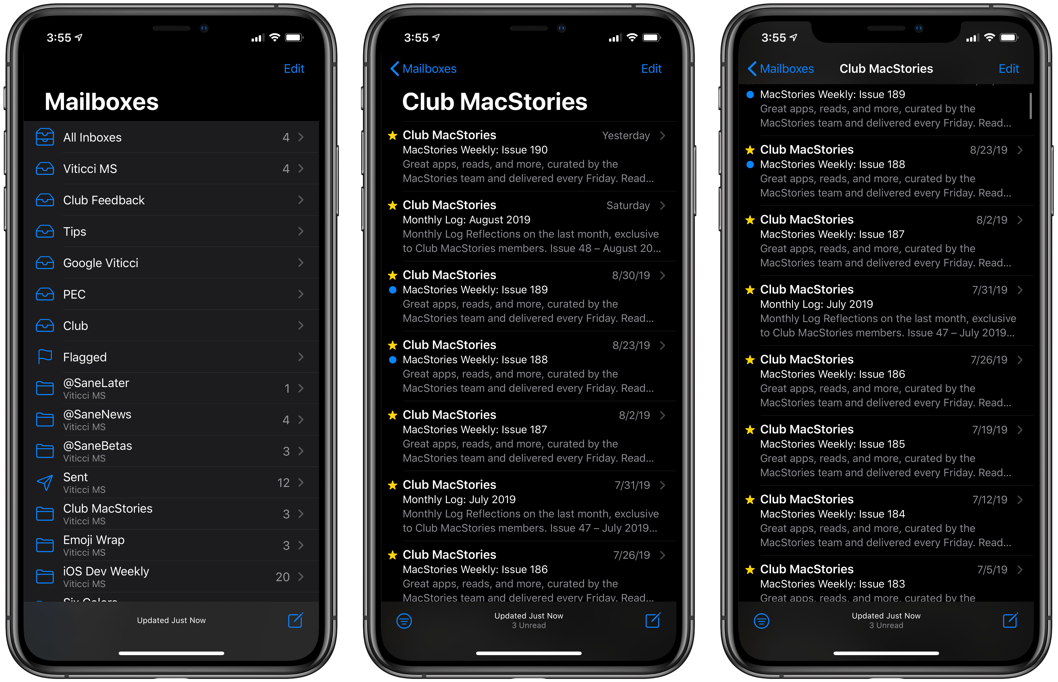
However, when a second app is added in Split View, pure black becomes dark gray: Mail no longer considers itself the primary and only app in this multitasking space, switching its color palette accordingly.
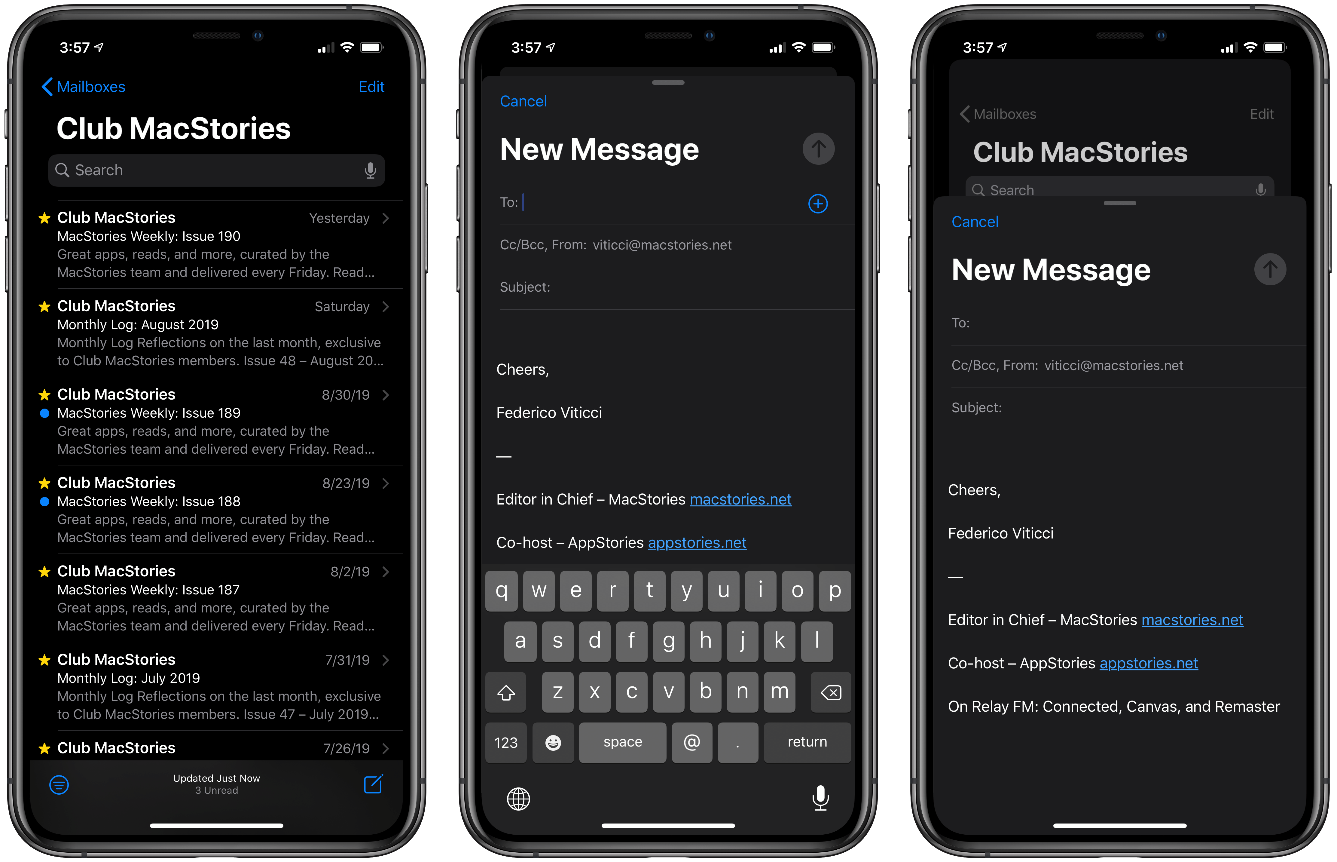
This implementation of UI layers in iOS’ z-index and how they translate to colors doesn’t only apply to Split View, though. Mail for iPhone uses a pure black background for its large title bar in the initial Mailboxes screen. The black color seemingly blends into the bezels of the device on Super Retina Displays; when the user scrolls down into the list of mailboxes and content moves up, the large title recedes into the bar and vibrancy, along with one of the new materials in iOS 13, is used to separate the title bar and underlying table view.
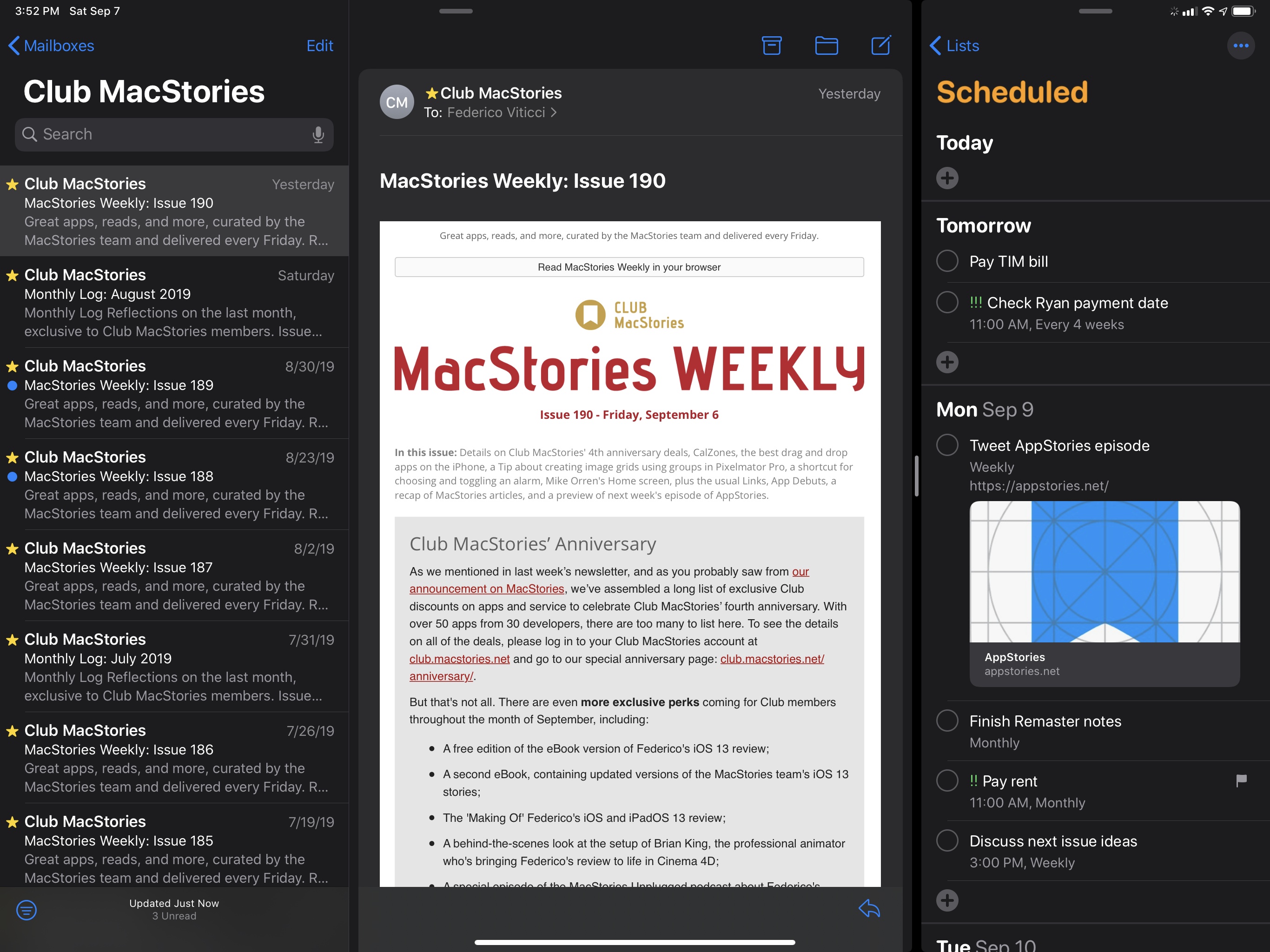
Going back to the pure black title bar: when you tap the composer button in the bottom right corner, iOS 13 uses the new modal sheet presentation style (more on this in the next section) to load the composer UI as a card on top of Mail’s root screen. And in doing so, the pure black background automatically switches to a secondary dark gray color that creates a “stacked” appearance at the top of the screen, which hints at the presence of another screen underneath the current modal view.
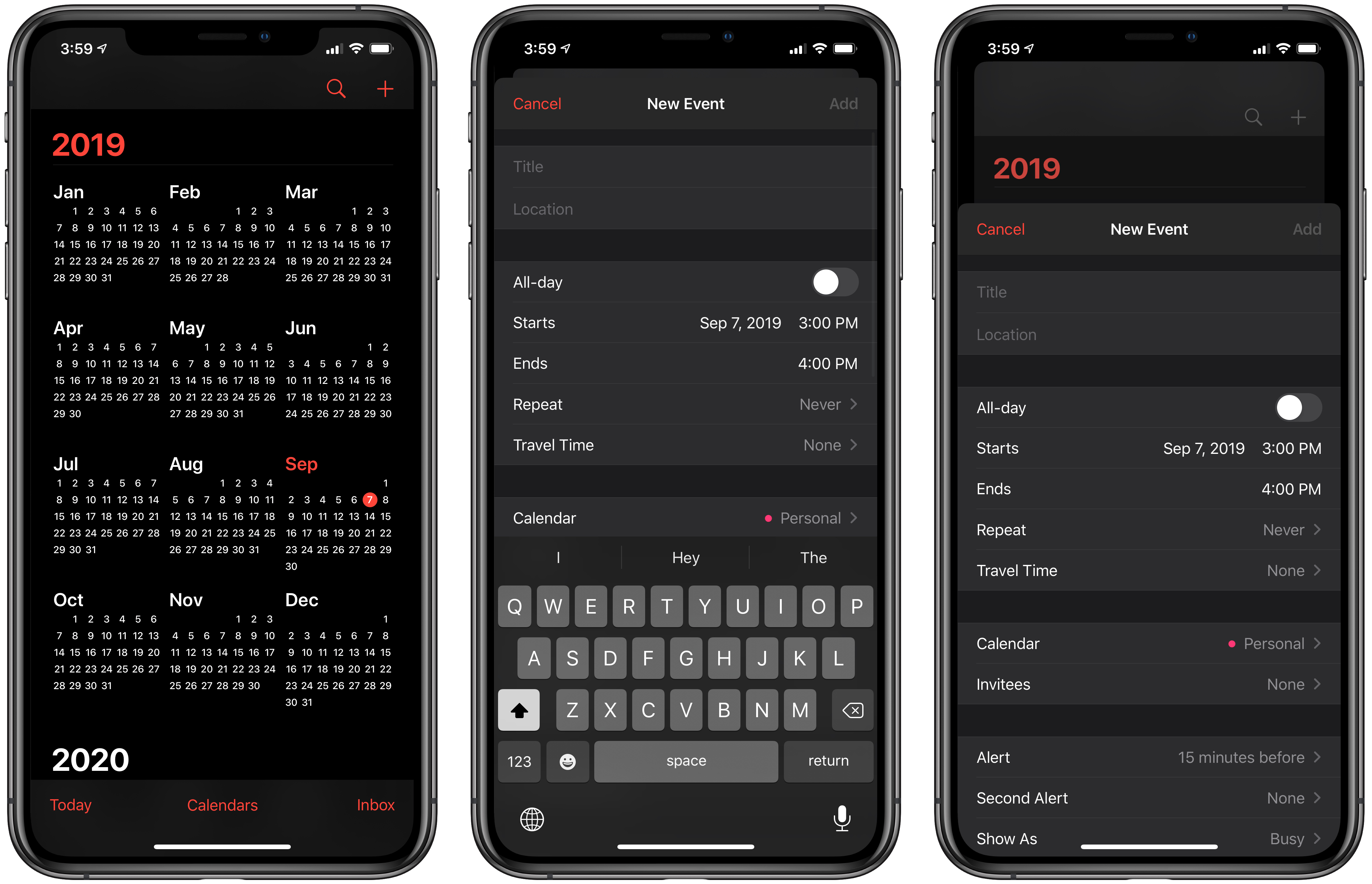
The same behavior carries over to Calendar in dark mode:
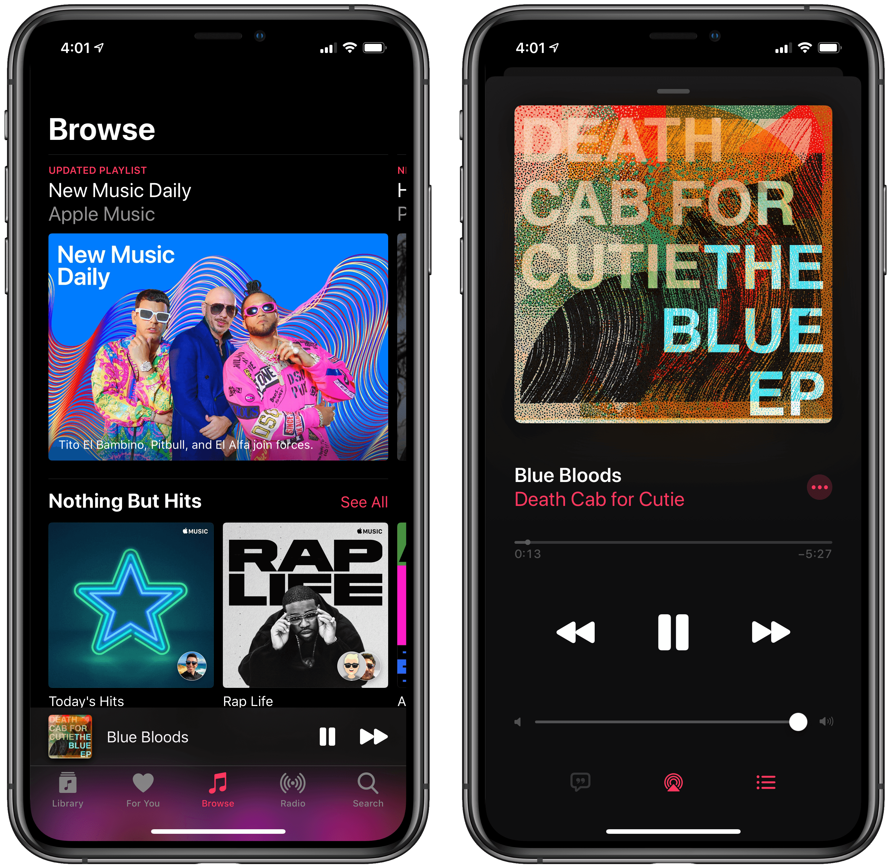
It also works in Music when the Now Playing screen pops up:
I’m simplifying here, and there are several other examples of semantic, hierarchical colors in iOS 13, but this should give you an idea of how, in designing dark mode, Apple didn’t merely “flip a switch” to turn everything black.
Even more than on macOS, a lot of thought was put into building a dark appearance for portable devices that are used by a diverse audience with a spectrum of preferences, professional needs, and degrees of visual impairments. The result is a refined, tasteful system that shows a profound understanding of the role of color in user interfaces (not a surprise given Apple’s pedigree in this field) and which demonstrates how iOS 7’s design language, for all its initial faults, is now enabling this kind of interface customization. Had Apple not rethought iOS’ design language around clarity and a content-first approach, I don’t think we’d be able to enjoy dark mode in its thoughtful implementation today.
All of this, however, begs the question: how much work will it be for developers to properly support dark mode in their apps? The answer is complicated.
In the short term, because developers can ask the system whether dark mode is enabled or not, I expect a lot of apps to retrofit their existing dark themes and make them compatible with dark mode, even though they may not adhere to all the guidelines proposed by Apple in terms of color and hierarchy.
Depending on the level of complexity in a third-party app that has long offered its own custom dark mode, it might make more sense for developers – especially indies – to not invest time and resources into rewriting their dark themes to mimic Apple’s behavior down to individual colors. And honestly, that approach will likely be good enough – I don’t think most users will notice the subtle discrepancies between Apple’s and third-parties’ dark appearances.
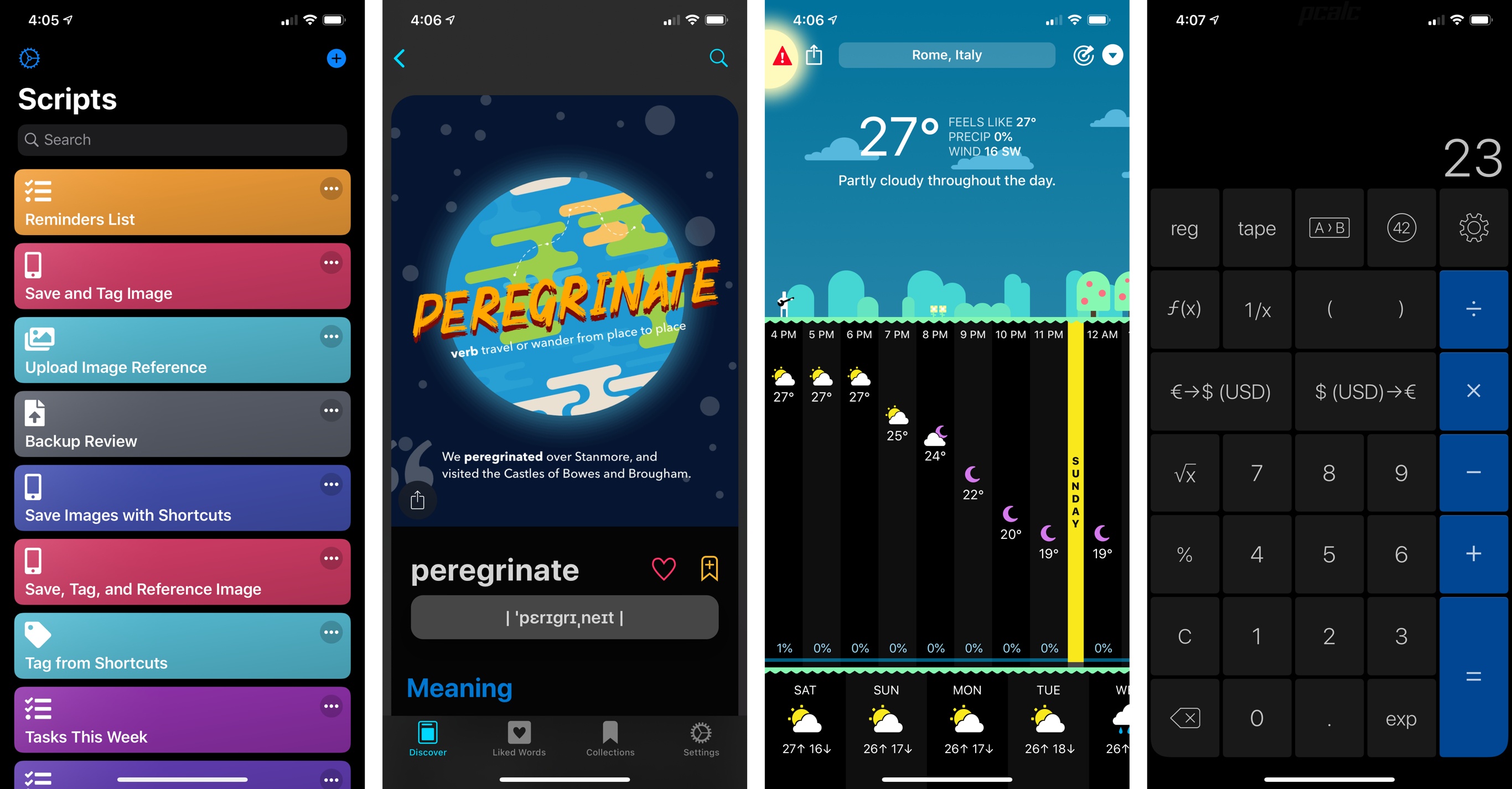
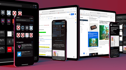
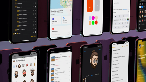
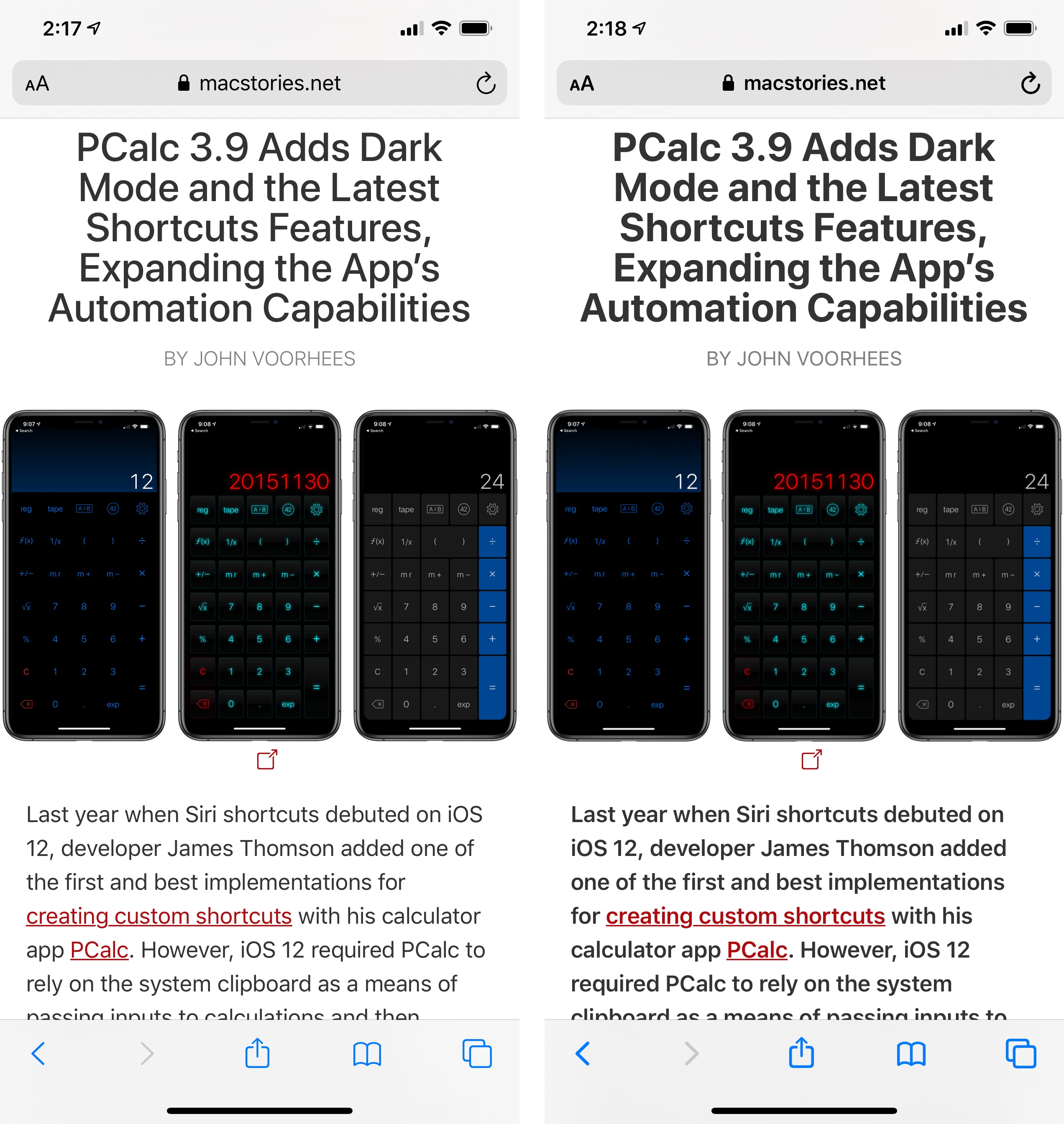
From left to right: Scriptable, LookUp, CARROT Weather, and PCalc running on iOS 13 with support for native dark mode.
Looking ahead at new apps (which may be designed with SwiftUI, which supports all of this by default), it’s a different discussion altogether. For the majority of new apps built for iOS 13, it wouldn’t make much financial sense to spend time replicating work Apple has already done for semantic colors, color hierarchies, and other conditions that iOS 13 covers natively in UIKit and SwiftUI. For this reason, I expect new apps – again, especially from small teams and indies – to be consistent with the dark appearances we’re seeing in Apple’s apps for iOS 13. Coming up with a similar framework from scratch is a lot of work when Apple has already solved the same problems with their semantic color system.
I don’t fear a world where all apps come with dark modes that look similar to each other: there are plenty of ways for developers to brand their apps and make them visually differentiated besides dark mode. In fact, if implemented well, a homogenous dark mode environment will only benefit users, who will get a consistent behavior across apps for iPhone and iPad, for different screen sizes and flexible multitasking contexts.
NapBot, a new CoreML-powered sleep tracker for iOS 13, was written in SwiftUI and supports dark mode out of the box.
Ultimately, using dark mode is a matter of personal preference. Personally, I still like to use iOS and iPadOS in light mode most of the time, enabling dark mode only when necessary at night if I don’t want to wake my girlfriend or prefer a more relaxing and subdued color palette in front of my eyes. There are some valid accessibility-related arguments on the downsides of dark mode; based on my personal experience, I find dark themes in Apple’s apps vastly superior to anything I’ve tried in third-party apps over the years, but I still find dark mode hard to read and more straining on my eyes over long periods of time due to its inherent lower contrast between text and other UI elements.
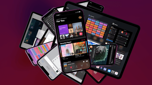
Even though I may not be using dark mode much on my devices, I recognize that it was a long-awaited feature, and I’m glad it shipped in iOS 13. I also have to admit that, from an aesthetic perspective (and despite a few downsides), its true black color looks gorgeous on OLED displays, particularly for apps such as Music and Photos, where colorful content pops out of dark backgrounds and shines front and center. From a technical standpoint, the system crafted by Apple’s design team is remarkably well thought-out; I’m curious to see what the impact on third-party apps will be.
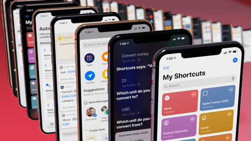
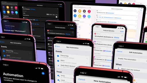
Cards
iOS 13 expands the idea of modality in user interfaces by repurposing a design element that Apple first shipped in its media apps: cards. In iOS 13, the “sheet” presentation style now uses a card appearance that only partially covers an underlying view, creating a “stacked” appearance that dims the background and suggests additional layers of navigation are available beneath the current screen. The new style is used in a variety of system apps and it’s the new default setting for third-party apps as well.
We’ve seen this presentation style in Music, Podcasts, and Mail before as a custom enhancement to those apps; as a system feature in iOS 13, the behavior of the card appearance has been made consistent across apps and more clearly defined by Apple.
Cards can be dismissed in three ways: the user can tap a button (such as ‘Done’ or ‘Close’) to dismiss the view; the card can be grabbed from its top edge and pulled to the bottom of the screen to close it; if the content displayed within the card is scrolled to the top, swiping down anywhere inside the card will dismiss it.
Interacting with a card on an iPhone XS Max.Replay
As you can see from the video above, these gesture-based dismissal methods facilitate one-handed interactions with cards on iPhone, which I assume was one of the primary motivations behind the feature. As phones get bigger, not having to reach a button at the top of the UI to close a view is a welcome ergonomic improvement.
Visually speaking, cards do a better job than full-screen modals at providing context around navigation and nested views. Of course, Apple still thinks there’s a place for full-screen modal views in iOS – especially for tasks which maximize content or require the full attention of the user, such as Markup view mode when editing screenshots – but you’ll find that cards have been implemented profusely in iOS 13.
The only criticism that can be ascribed to cards regards customization. The new modal presentation style always has a maximum height that covers almost the entire screen: developers can’t set a custom height value to bring up a “half card” in the middle of their UIs, sort of like Apple does with the bottom panels in Maps and Shortcuts. For this reason, I don’t expect custom implementations of cards to disappear overnight; given the popularity of cards as a modern design trend and their ergonomic convenience, I hope to see Apple expand the developer toolkit for this API to allow for additional presentation styles in the future.
Cards are another way Apple is bringing more consistency to iOS’ design language by unifying interactions with modal sheets across apps. More developer customization options wouldn’t hurt, but cards are nevertheless a solid addition to the system: they look good, make navigation more contextual, and help in using large iPhones with one hand.
Context Menus
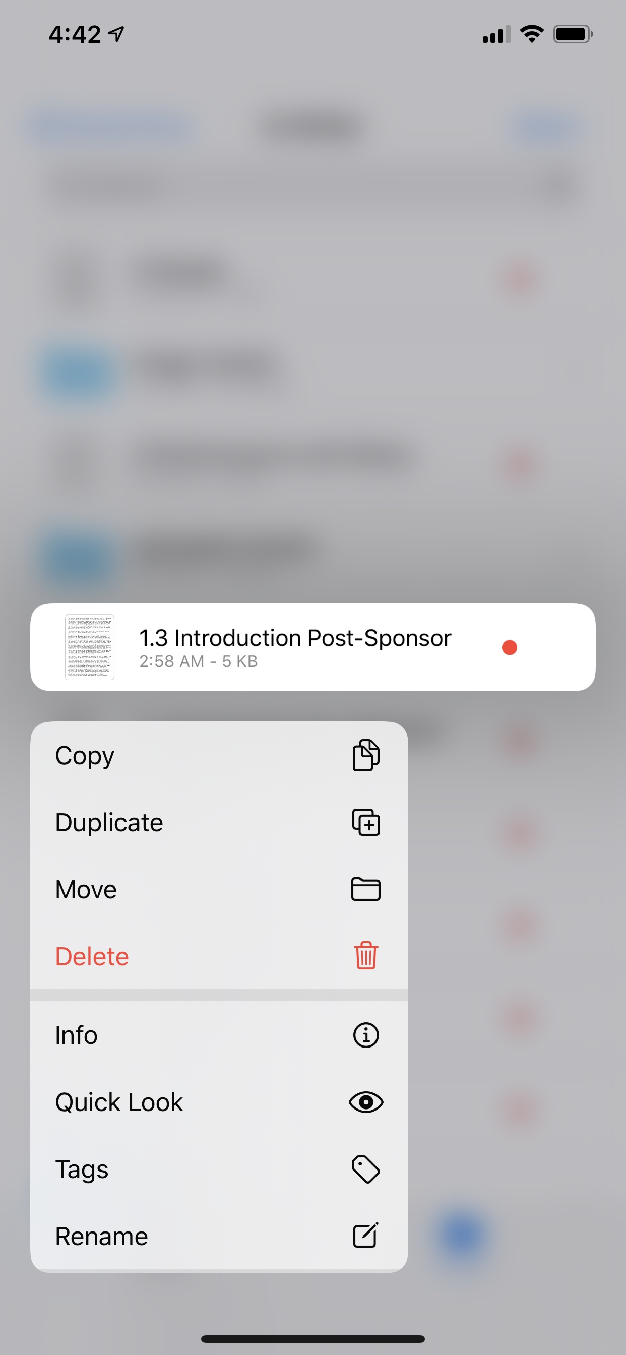
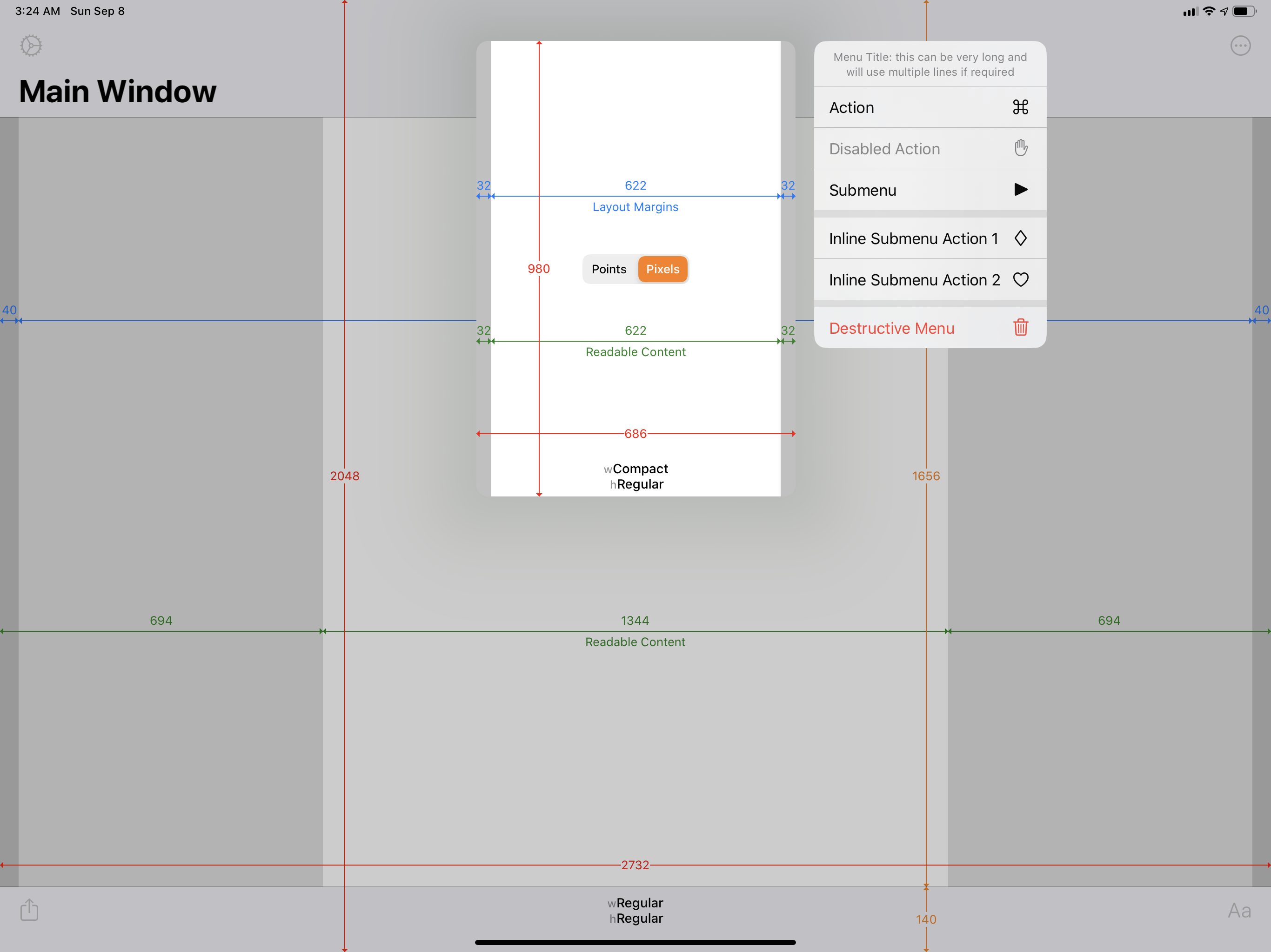
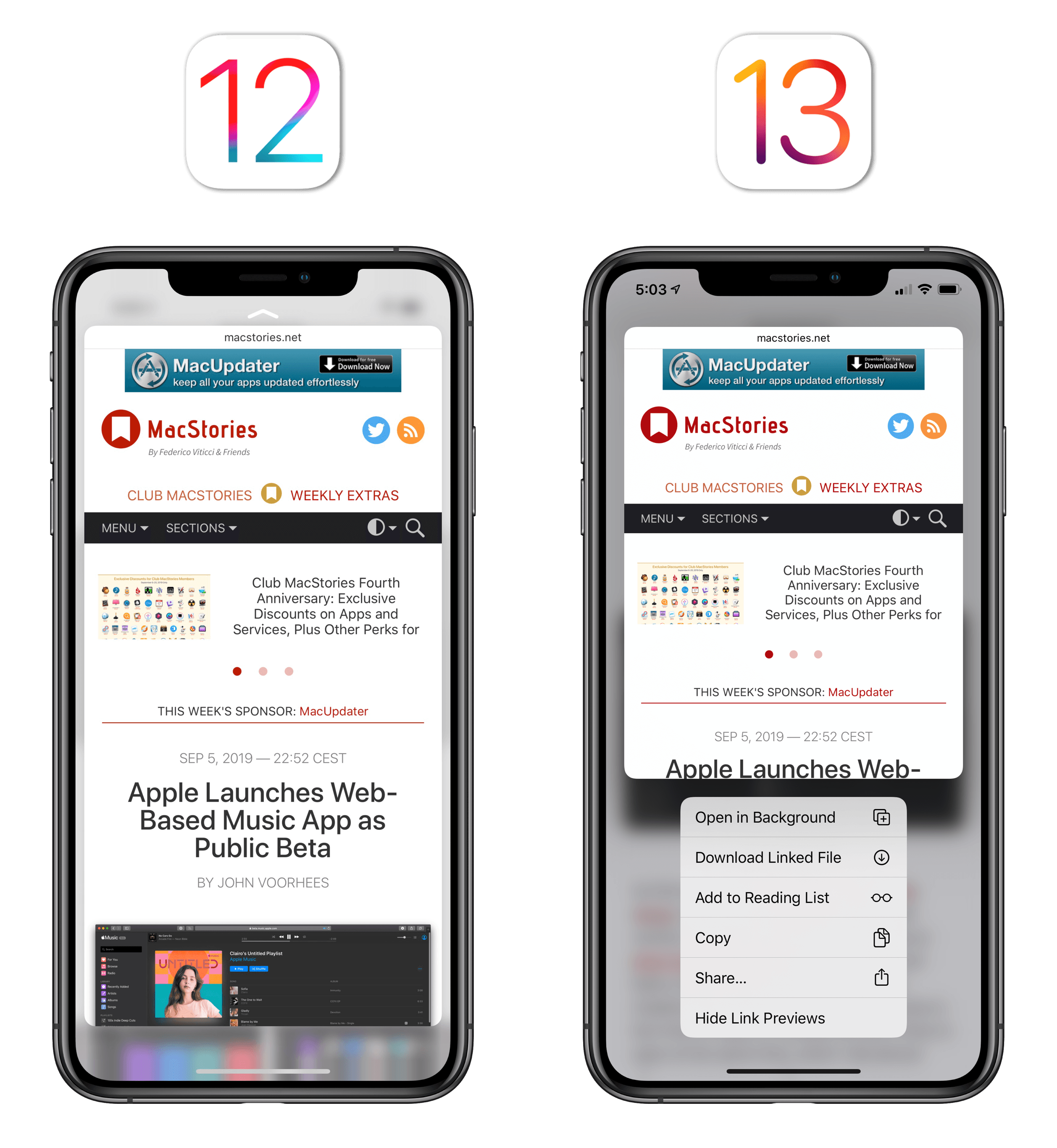
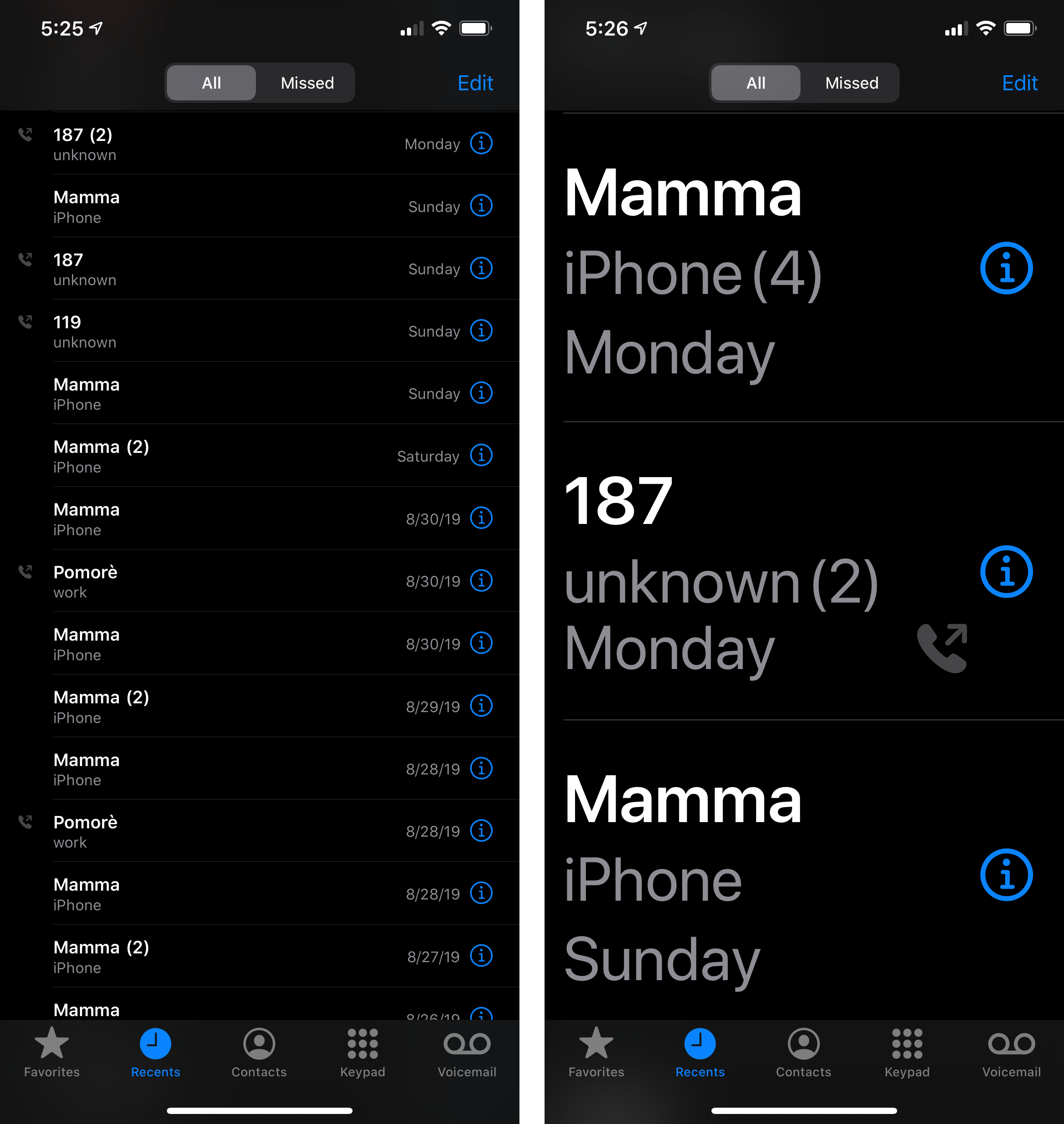
It’s best to think of context menus, another new UI element in iOS and iPadOS 13, not as a macOS-inspired change, but as Apple’s combination of peek and pop and actions embedded in the copy and paste menu. The word “context” sparks obvious memories of right-clicks and pointing devices, but iOS 13’s context menus couldn’t be farther from a desktop-like functionality. Context menus are, quite possibly, the end of 3D Touch, as well as a new way for apps to present action sheets.
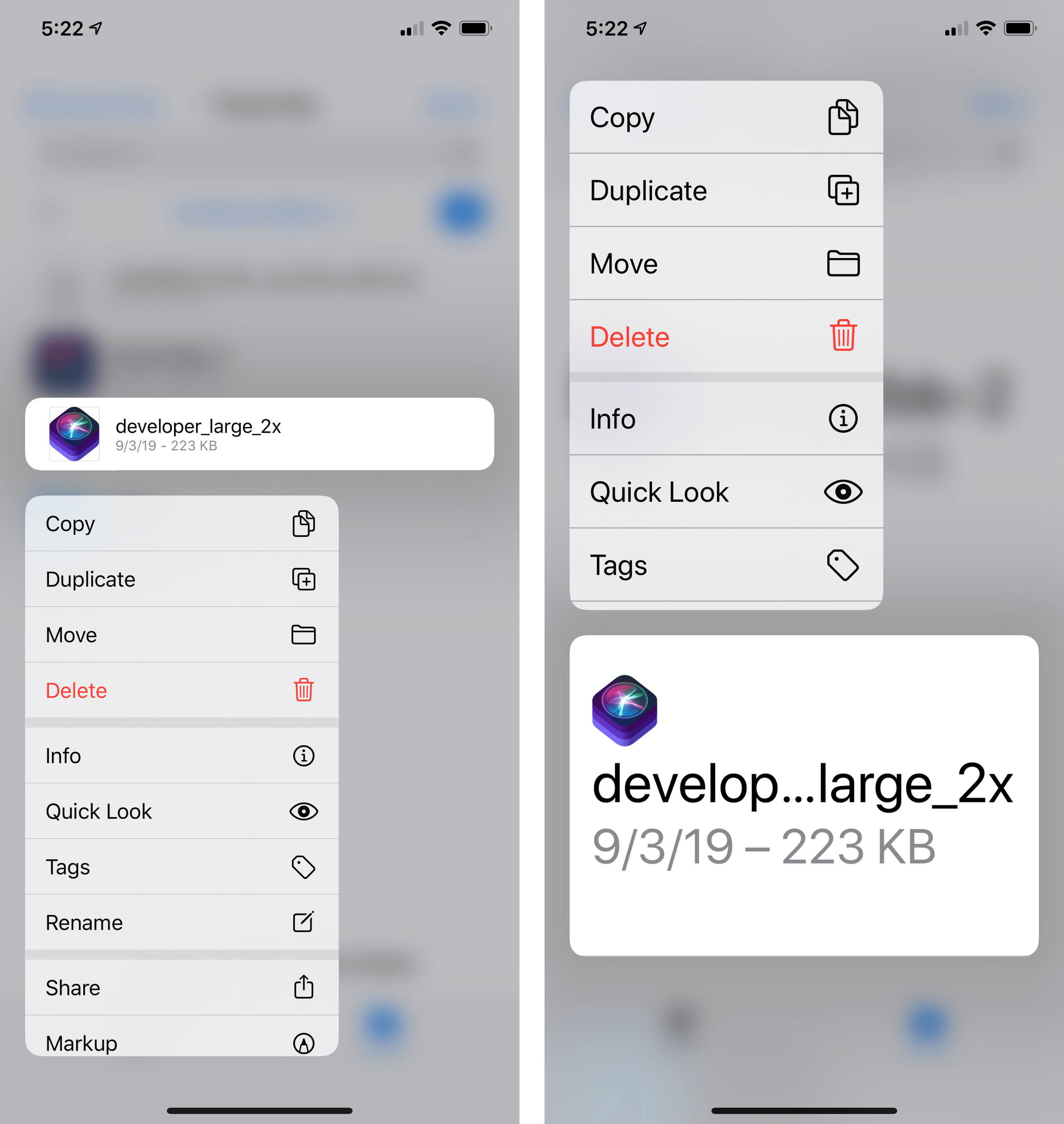
At a high level, a context menu in iOS 13 is presented when you long-press an item that supports additional actions or that offers a preview. Actions can include the classic cut, copy, and delete buttons that were previously shown in the copy and paste popup menu or elsewhere in an app’s UI; previews, like peek and pop, support all kinds of content, from webpages and photos to Mail messages and iMessage threads.
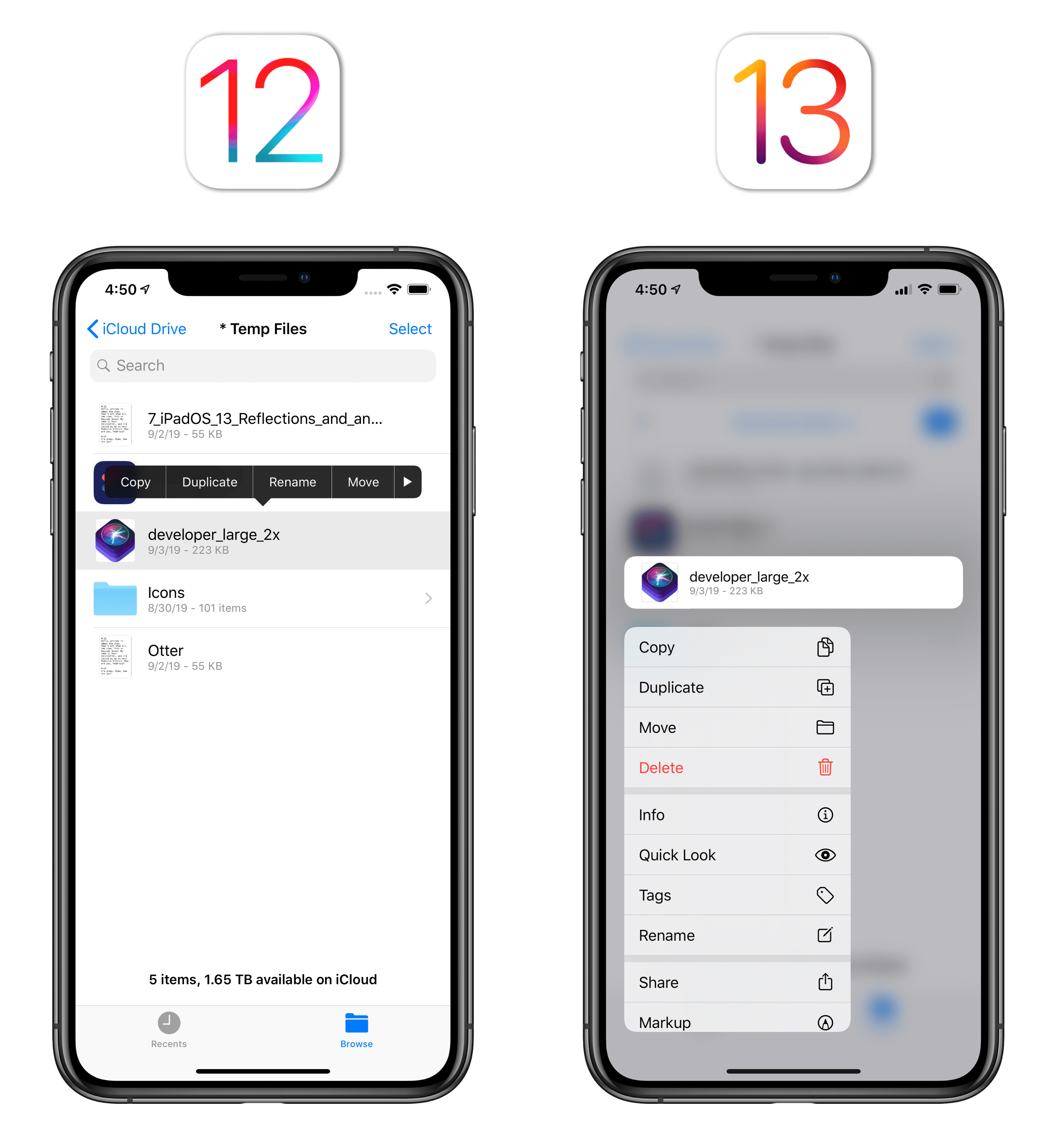
Files.
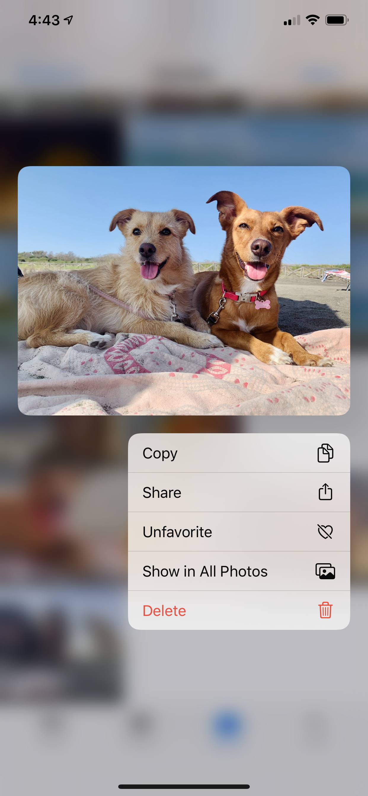
Photos.
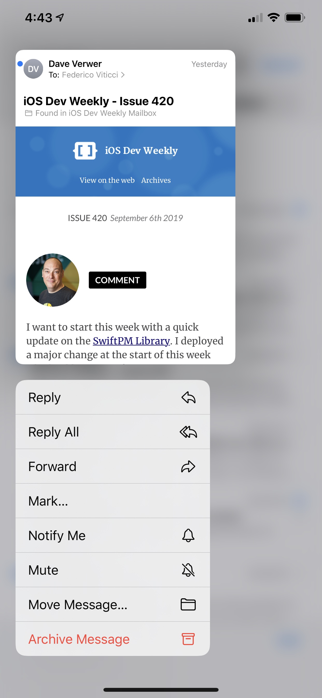
Mail.
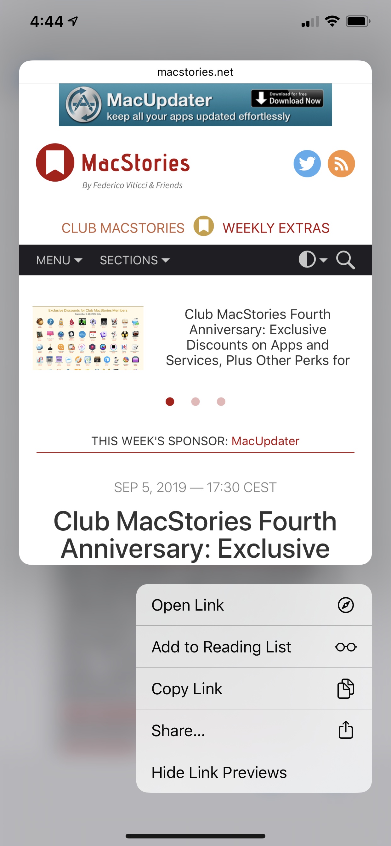
Safari.
Notes.
Messages.
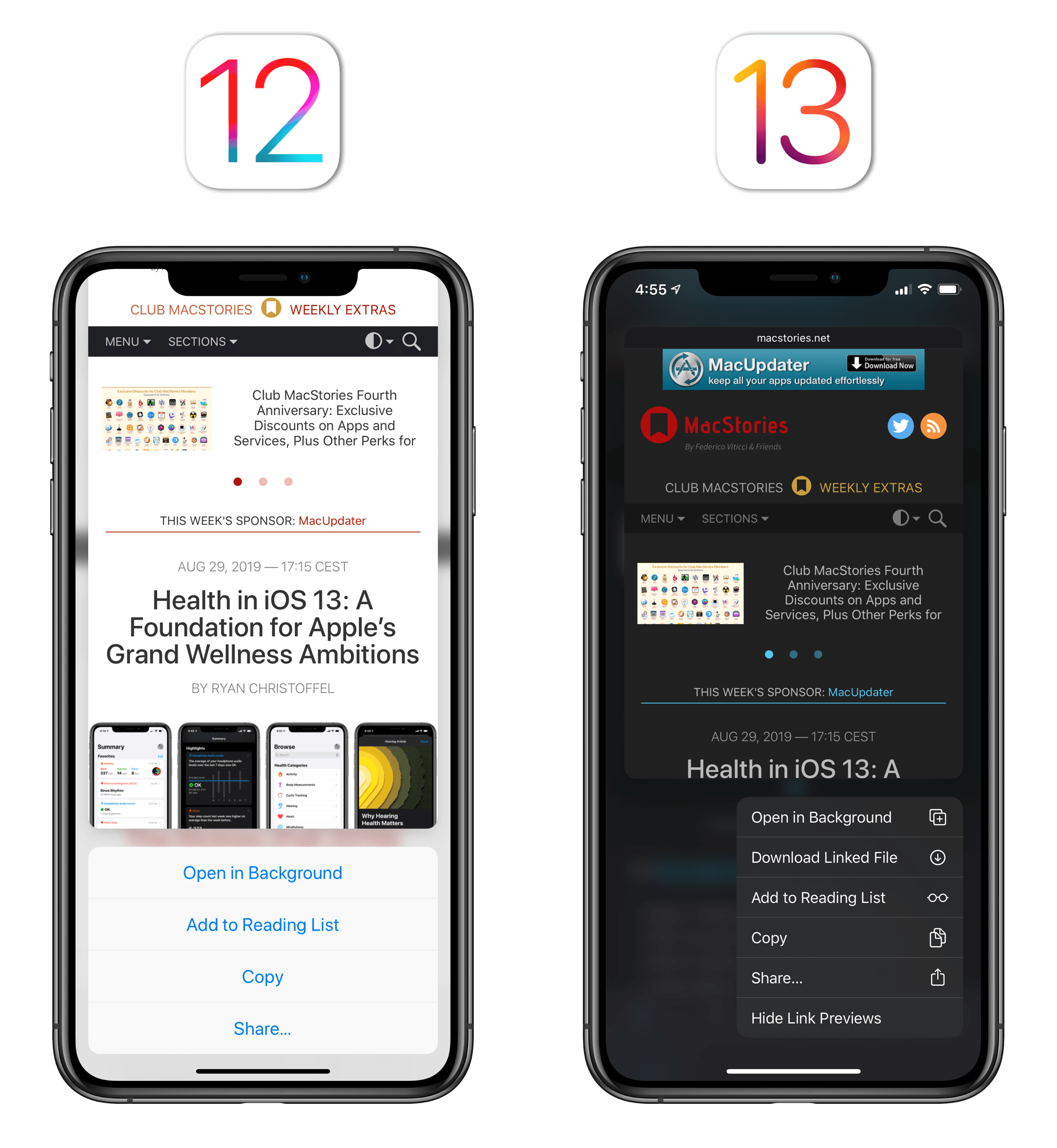
There are some key differences between iOS’ old peek and pop preview system, the copy and paste menu, and iOS 13’s new context menus. First of all, context menus show more actions at once in a list: each action has an associated glyph on the right side; it’s easier to discover actions by scrolling a context menu than it was to tap buttons in a copy and paste popup overloaded with additional actions; and, context menus support disruptive actions (displayed with a red color) as well as sub-menus and separators between actions. A context menu is presented immediately, in its entirety, following a 3D Touch press or a long press, and it’s more visually differentiated than Apple’s previous takes on action sheets.
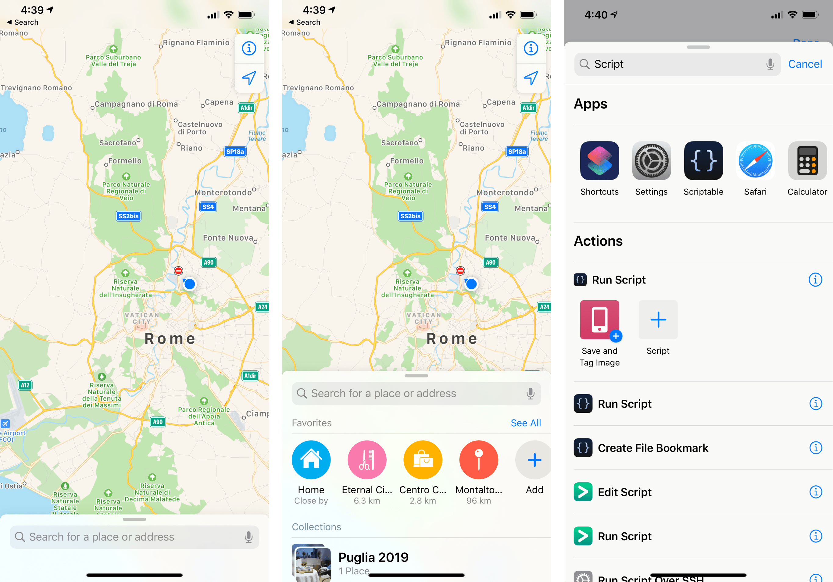
Context menus support dark mode, disruptive actions, and sub-menus, such as the one implemented in Scriptable.
Second, because context menus have replaced peek and pop and older action sheets across all of Apple’s devices and apps in iOS 13, they work everywhere, including iPhones and iPads that do not support 3D Touch. For the first time, iPad users have access to a preview system for links and email messages that is consistent with the iPhone.
Furthermore, while peek and pop displayed a preview first and forced you to swipe up to reveal contextual actions, previews and actions are always shown together with context menus. The preview is optional (it’s possible to have a context menu that only consists of actions), and the system also supports stacking the preview and actions vertically (with three actions or fewer) or horizontally (with actions on the side).
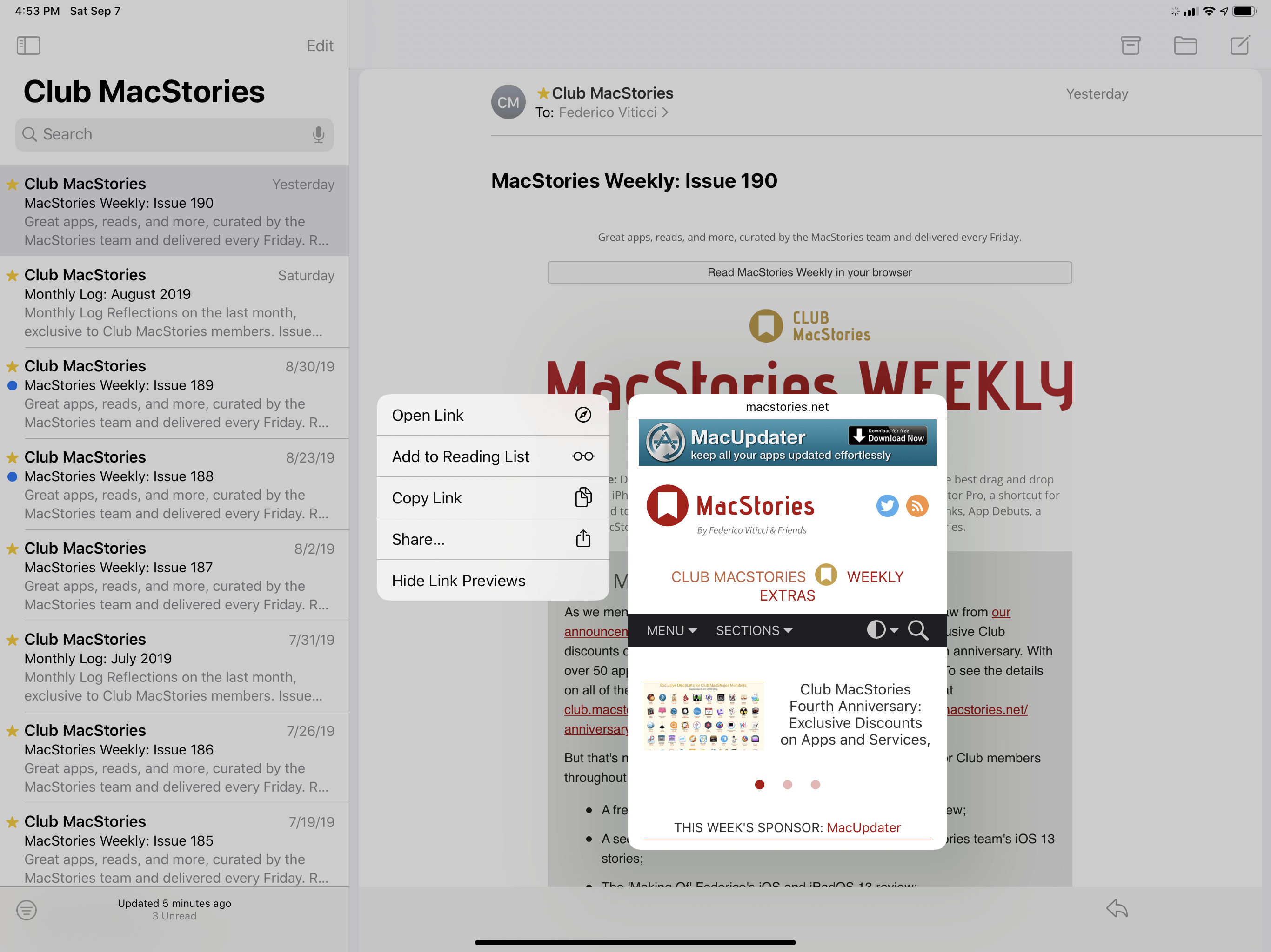
Since context menus share the same activation gesture as drag and drop (a long press), they had to be designed around the possibility that the user may either want to preview or perform actions on the content they’re pressing or drag it away. There are a couple ways Apple worked around this scenario. If you long-press an item and the context menu comes up but then you change your mind and realize you want to drag it instead, you can just drag it away and the context menu will disappear, creating a drag item.
A context menu can become a drag item in iOS 13.Replay
Alternatively, it’s possible to initiate drag and drop without triggering a context menu first. It’s very subtle, but if you pay close attention to how items in iOS 13 react to a long-press, you’ll notice how they shrink before “pulsing” back and opening a context menu. If you start the drag gesture shortly after holding down an item while it’s shrunk, it won’t open the context menu.
You can also start drag and drop without showing a context menu first.Replay
I’ll admit right away that I’m sold on the idea of context menus as I believe they bring some much needed consistency to action sheets. Over the years, third-party developers have implemented a variety of contextual menus – some of them based on injecting actions into the copy and paste menu, others displaying entirely custom UIs. Apple’s proposed solution scales across the iPhone and iPad, is more accessible, supports dark mode by default, and, more importantly, lets the copy and paste menu go back to what it was originally designed for: copying and pasting during text selection.
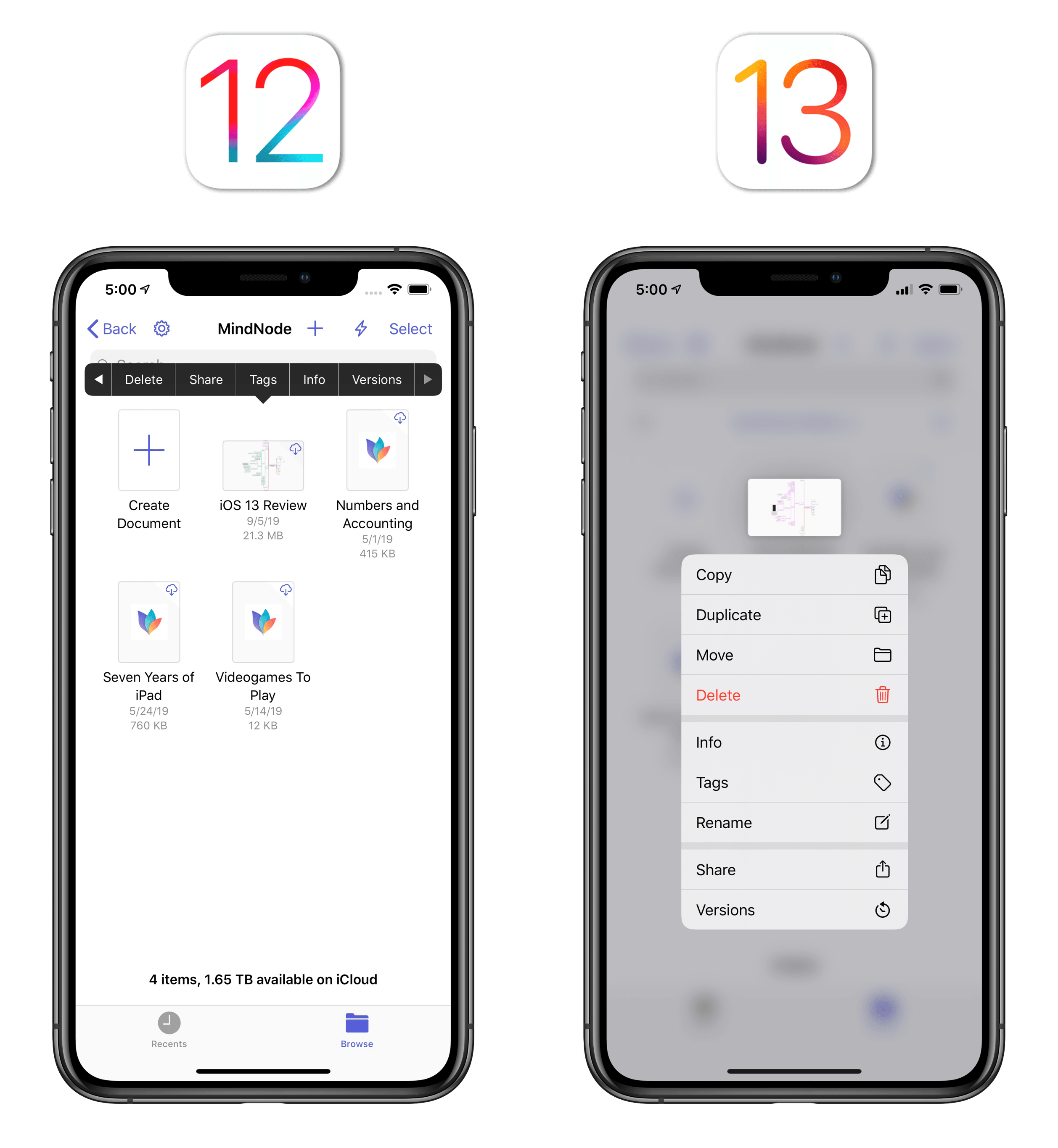
Apple has done the right thing rethinking most of their apps around context menus in iOS 13; I even noticed that old apps (not compiled for iOS 13 yet) that used to rely on the copy and paste menu for custom actions (built using UIMenuItem and UIMenuController) get automatically upgraded to context menus in iOS 13 if their root view is the Files document browser.
That said, as a fan of 3D Touch, I don’t think context menus are objectively superior to peek and pop yet, particularly for previewing webpages. First, while peek and pop didn’t expose actions right away upon pressing an item, it displayed a larger preview that took better advantage of the iPhone’s limited display size, and actions were only a quick swipe away. From a mere preview perspective, I found the size of the peek and pop window more comfortable to read than its context menu counterpart.
Additionally, the whole point of peek and pop was leveraging 3D Touch’s pressure level recognition to enable multiple layers of interaction in a single gesture (the separate “peek” and “pop” stages). The new preview displayed in a context menu, however, is a one-level-deep gesture: after pressing an item to open a context menu that contains a preview, you can’t “pop” that item to open a full-screen view without lifting your finger off the screen, as was possible with 3D Touch before. Once a context menu preview is open, you have to lift your finger and tap the item to open it in full-screen.
This, to me, was one of the unsung advantages of 3D Touch: thanks to pressure recognition, it embedded multiple commands within the same gesture, thus aiding one-handed interactions on larger phones. Context menus trade the convenience of a large preview for actions displayed at all times, which is fair; what I don’t understand is why devices with 3D Touch couldn’t keep a variation of the peek and pop gesture. I’m guessing that, in a world without new 3D Touch-enabled iPhones, it’s easier to pretend it never existed – a damnatio memoriae for an iPhone feature Apple would like us all to forget about.
Let me be clear: I prefer having context menus available across the iPhone and iPad, with support for rich previews and actions, rather than be stuck with 3D Touch on iPhones alone. At the same time, it’s worth pointing out that 3D Touch’s peek and pop system was designed around a faster gesture and had a larger preview. Even though its replacement is superior in many ways, I think it’s okay to miss what 3D Touch was good at.
Are there ways for Apple to improve context menus by borrowing from 3D Touch? For starters, particularly on iPads and the iPhone XS Max, the preview window could be bigger – it does feel absurdly small on a 12.9" iPad Pro.
Furthermore, Apple should ensure that context menus work in all instances where users might expect them to: for instance, long-pressing a link in Messages doesn’t bring up a webpage preview (this used to work with 3D Touch); the same gesture in Reminders displays a ‘Large/Small Images’ attachment control button for links, but not a rich preview for the destination webpage. Lastly, if Apple is getting rid of pressure sensitivity in future iPhones for good, they should at least maintain backwards compatibility for peek and pop on iPhones that do have 3D Touch, and integrate its multiple pressure levels with context menus’ preview window.
Despite my criticism and comparisons to 3D Touch, I believe context menus are poised to become one of the most useful additions to UIKit in years. Particularly on iPad, which never offered 3D Touch, context menus simplify interactions that required developers to either shove actions into the copy and paste menu or write custom contextual menus from scratch (not to mention rich previews). The consistent activation and presentation of context menus across apps brings a welcome new UI layer to iOS and iPadOS; judging from Apple’s examples and third-party apps I was able to test this summer, I have a feeling context menus will enjoy widespread adoption among developers.
SF Symbols
There’s a reason iOS 13’s context menus look consistent between different apps: beyond the appearance of the individual cells and shared activation method, their button labels are often accompanied by SF Symbols, a collection of 1,500 glyphs designed by Apple and made available to developers for free. SF Symbols match the visual characteristics of the San Francisco typeface and behave like fonts as well.
According to Apple, designing and releasing SF Symbols became necessary when they realized that their previous glyph set (which was not available for developers to use) was too thin for dark mode; iOS 12’s old toolbar icons, for instance, likely weren’t legible enough against dark backgrounds. It’s easy to imagine why by comparing the same icons between iOS 12 and iOS 13:
The “thin and sharp” aesthetic that sprung forward with iOS 7 didn’t sit well with modern Apple’s affair with bold typography, rounder elements, and more approachable buttons. The last vestige of Jony’s original iOS 7 vision has been on its way out for quite some time: thicker strokes, rounded corners, and an overall “friendlier” tone are back in fashion with glyph designers at Apple. iOS 13 dispenses with thin and angular glyphs throughout the system, and does so in a way that’s consistent with San Francisco and designed with accessibility in mind.
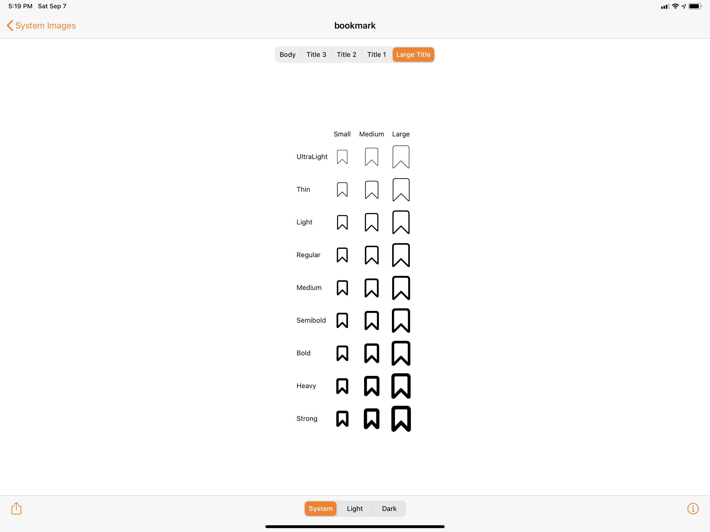
SF Symbols come in three sizes (small, medium, and large) and support 9 weights, from Ultralight to Strong, just like San Francisco fonts.
Symbols have embedded baseline values that allow them to follow iOS’ Dynamic Type setting: if you make the system’s text size larger, SF Symbols can scale along with fonts by gaining a thicker stroke and larger size – all while remaining crisp on Retina displays and legible in both light and dark modes. This automatic accessibility tie-in is a strong argument in favor of SF Symbols, which you’ll find used in app toolbars…
…context menus…
…or other glyphs throughout iOS:
I’m not a developer, but if I were, I’d welcome the release of a free glyph set with 1,500 symbols to choose from that’s baked into the system and supports various display modes, including larger text sizes, out of the box. SF Symbols are another example of Apple chipping away at iOS’ design imbalances: all of Apple’s apps now offer a common take on toolbar icons and other glyphs, and it’s smart of the company to open this up to developers. Good riddance, iOS 7 glyphs.