Shortcuts
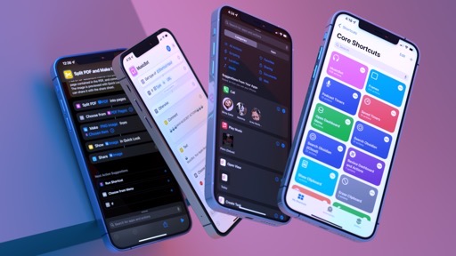
For the first time since the transition from Workflow to Shortcuts in 2018, updates to the iPhone and iPad versions of the app weren’t the priority for Apple in a major release of iOS and iPadOS.
In case you missed it, the big story this year is the long-anticipated arrival of Shortcuts on the Mac with a native app for macOS Monterey. Prioritization of desktop, however, doesn’t mean Apple has foregone improvements to the original Shortcuts app for mobile devices. In fact, the company has turned the need to sketch a vision for the future of automation on macOS into an opportunity to also rethink some of the built-in capabilities of Shortcuts on all platforms.
As a result, development of the Mac app has influenced updates to Shortcuts for iOS and iPadOS 15 with new actions and changes to the editor, which bring consistency to the experience, as well as integrations propelled by the Mac, which have been reimagined, once again, for the unique nature of the iPhone and iPad. There’s no major rethink of Shortcuts for iOS and iPadOS this year; instead, we’re witnessing an expansion of Shortcuts toward more system features and apps – and we have Mac users to thank for it.
Editor Changes
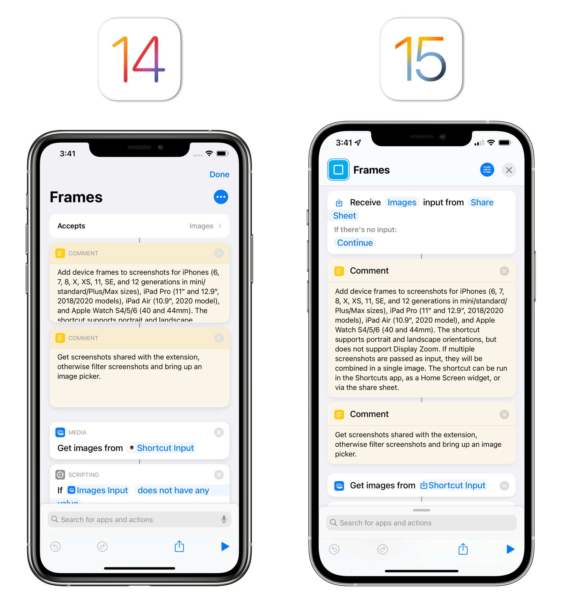
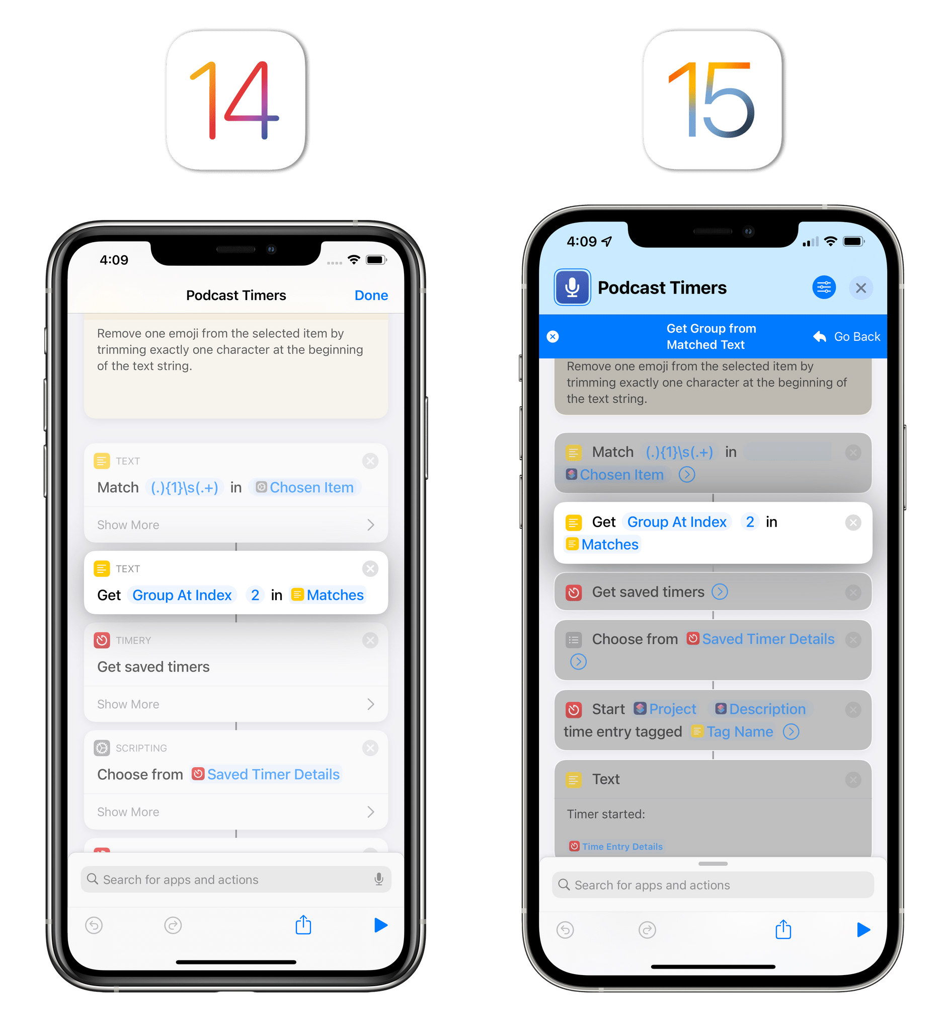
It all starts with the Shortcuts editor, which has undergone a redesign aimed at making actions more compact – thus fitting more onscreen at the same time – while maintaining legibility and clarity.
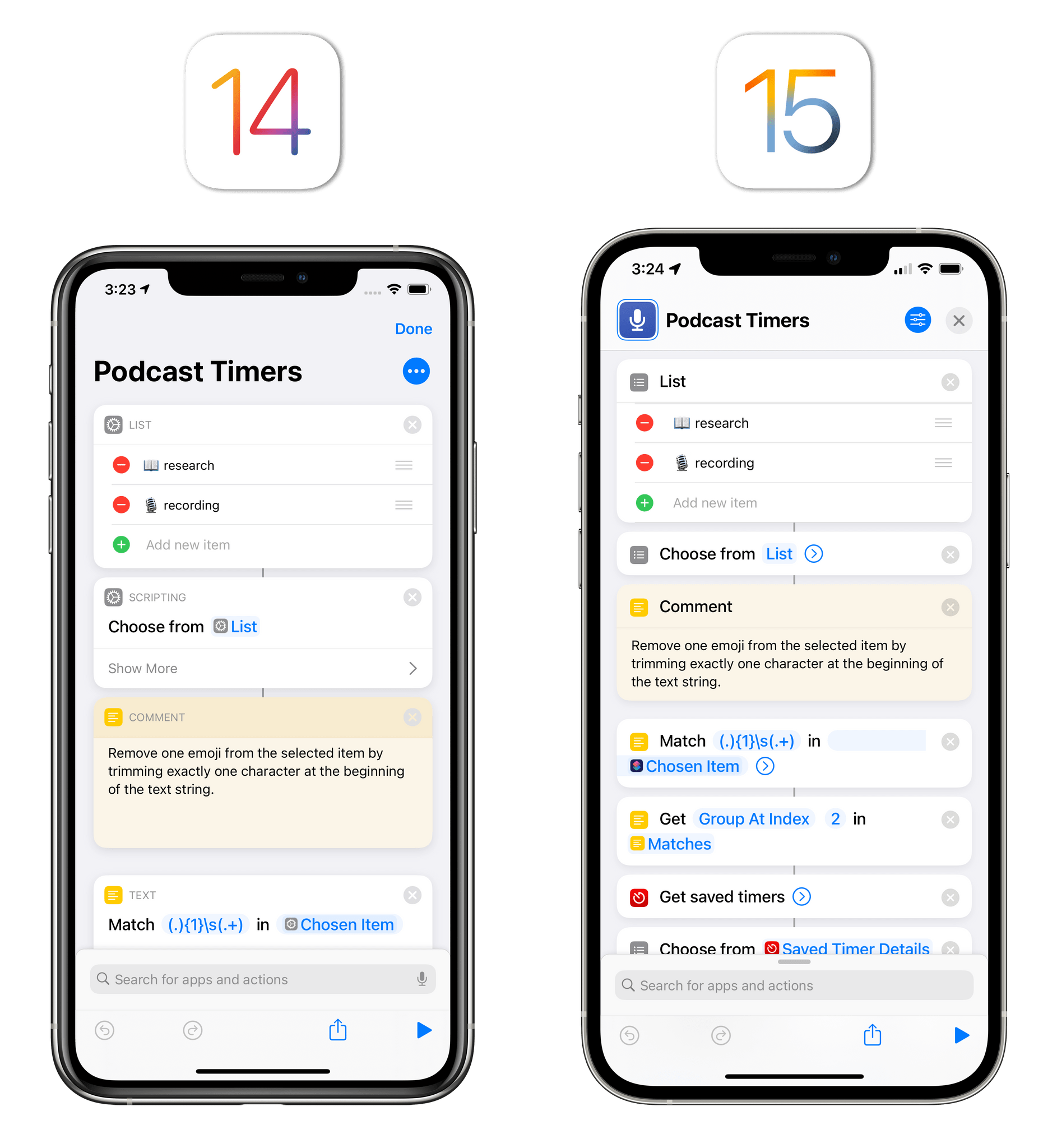
Building upon the parameter-based design introduced with iOS 13, the Shortcuts editor in iOS 15 features shorter actions, made possible by removing the category label of each action and displaying their icons next to the action’s title and parameters. By eliminating an entire row dedicated to the action icon and category, Apple has reduced the height of actions without sacrificing their descriptions; more actions are also displayed in minimized mode by default, with a chevron that lets you expand the action block to reveal more options. The difference these changes make when looking at the editor is remarkable:
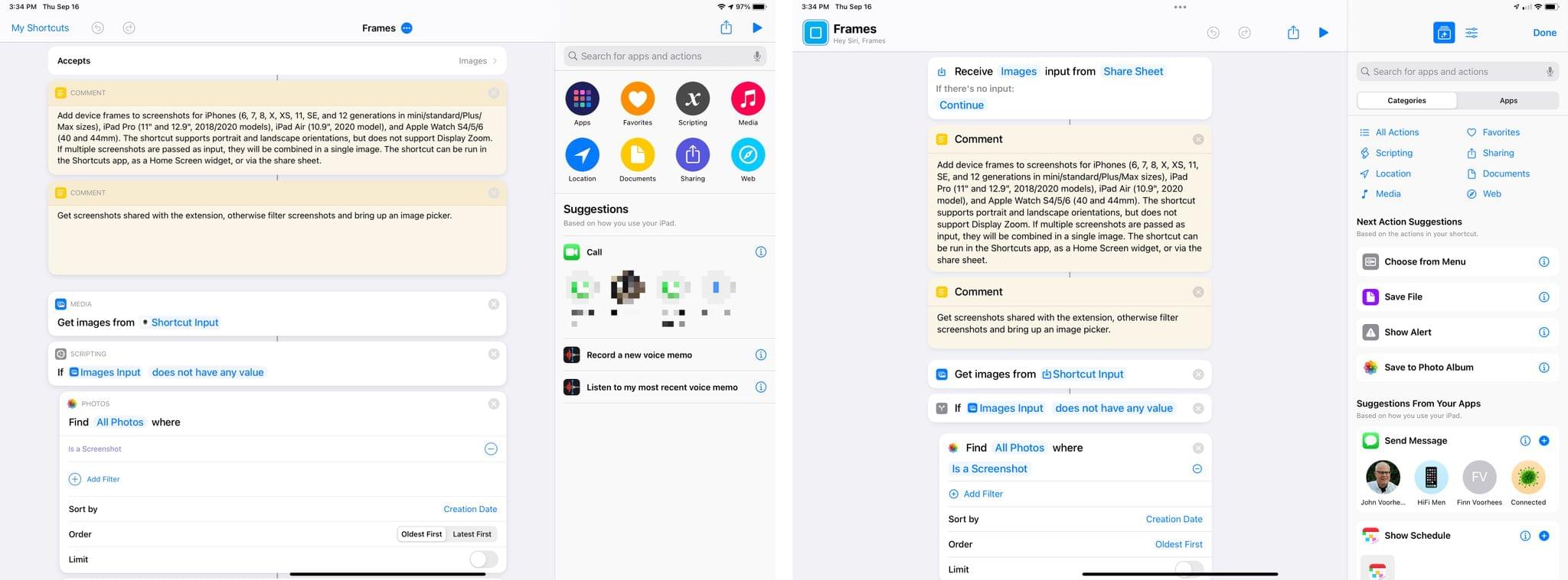
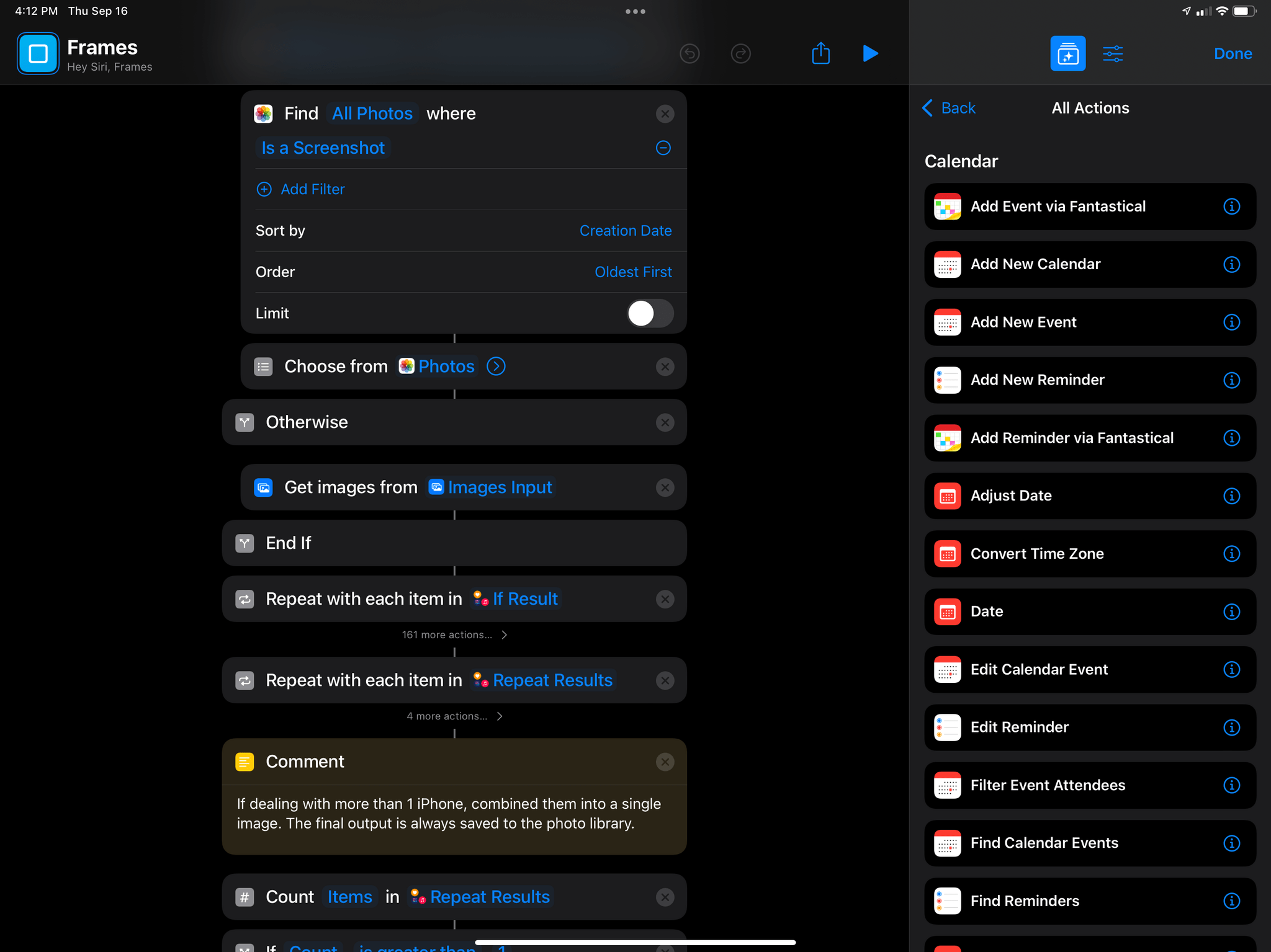
Where the old Shortcuts app for iPhone could barely fit four actions onscreen at the same time, you can now easily see 6-7 actions in Shortcuts for iOS 15 without having to scroll the page. This is even more apparent on iPad, where the larger screen allows Shortcuts to display a greater number of actions than ever before:
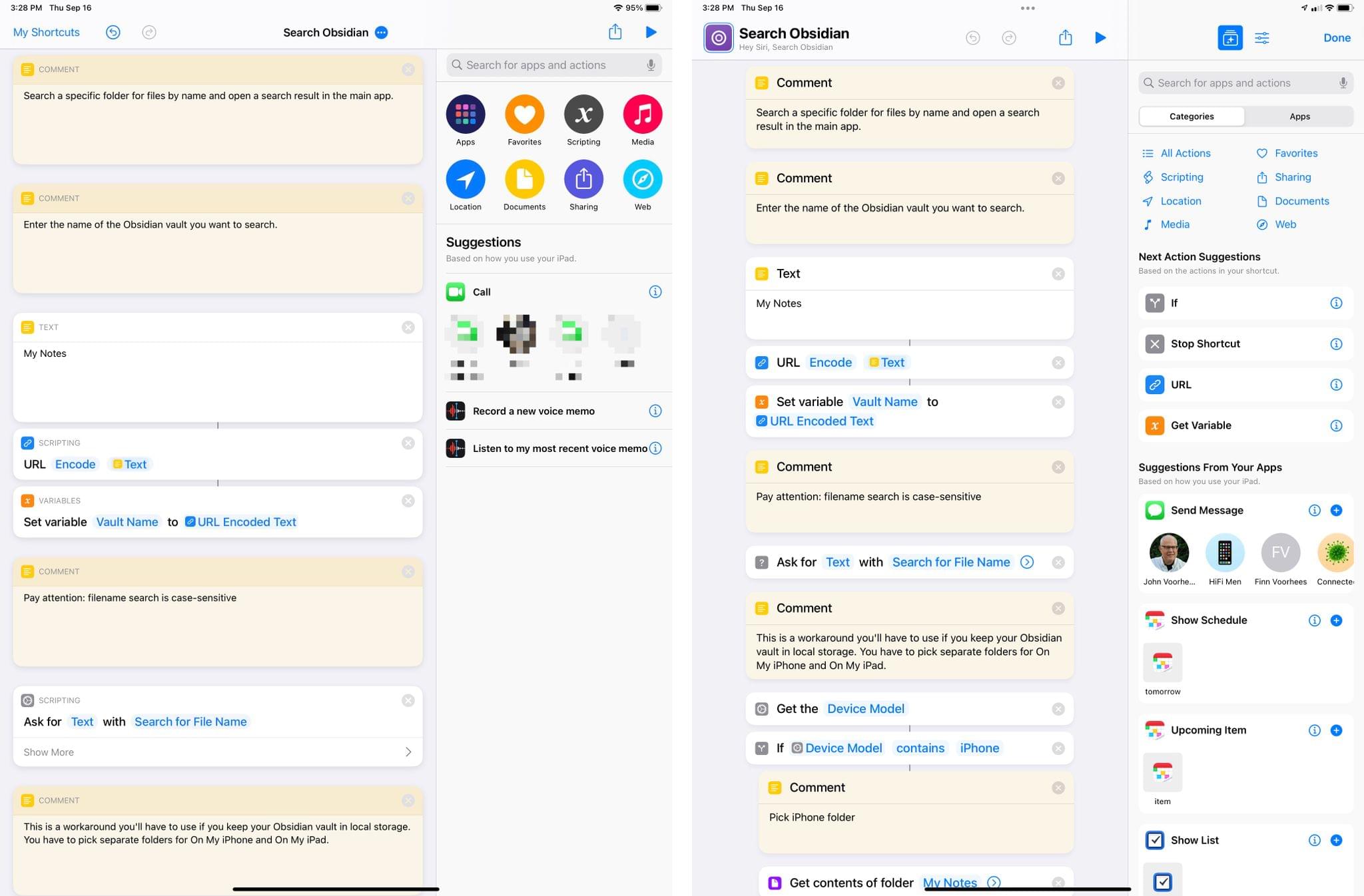
The iPadOS 14 editor (left) could fit 8 action on a 12.9” iPad Pro in portrait mode; the iPadOS 15 one can fit 12.
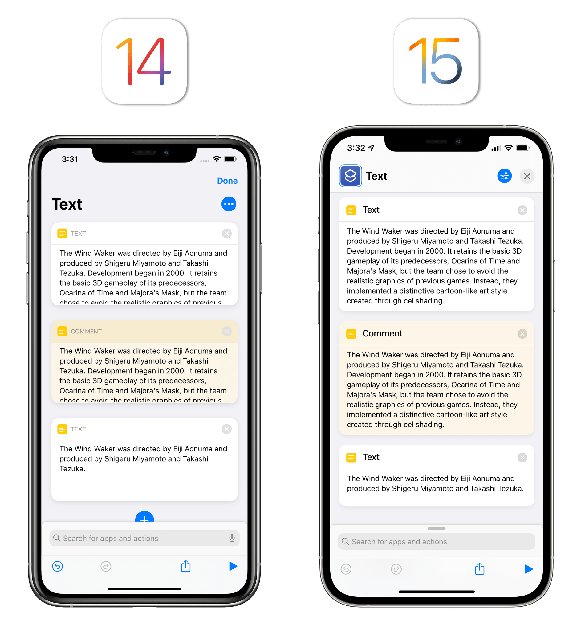
Along with more compact actions that require less vertical space and revamped iconography for many of them, Apple also revised how ‘Text’ and ‘Comment’ actions are displayed in the editor. Previously, their size was fixed. Even if a Text action only contained a few words, it’d take up as much editor space as a similar action with three sentences inside it. In iOS 15, both Text and Comment actions expand dynamically based on their contents: if they contain a short snippet of text, they’ll be displayed as a small cell within the editor; add a longer string of text, and they’ll grow taller to avoid cutting it off.
I prefer this approach since both actions make better use of the editor, and they play an important role in slimming down shortcuts and fitting more actions onscreen.
On iPad, the sidebar displayed on the right side of the editor has undergone a redesign that, besides visual tweaks, introduces new ways to browse actions and manage a shortcut, which I’ll cover below in Action Library. As I’ll also cover in Shortcuts Settings, Privacy, and Sharing, the sidebar on iPad now lets you switch between actions and shortcut settings without opening a separate window.
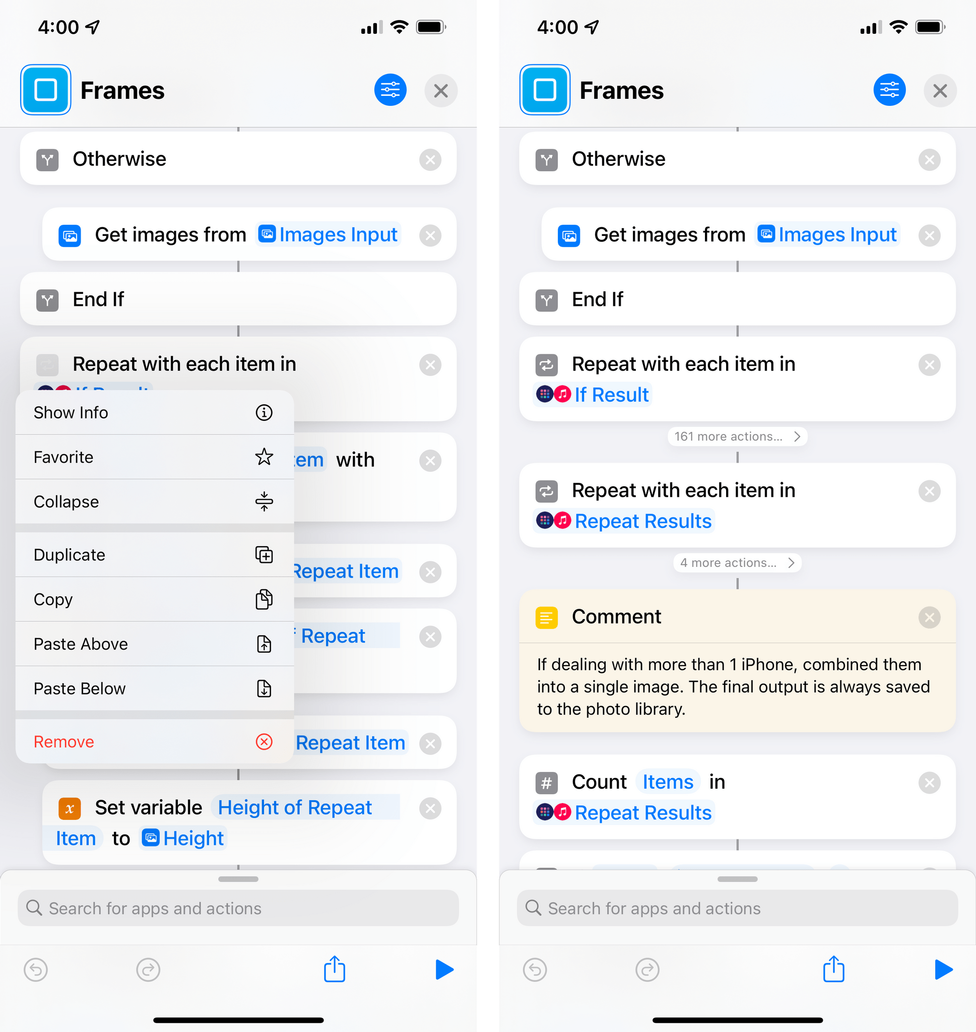
In one of the (many) additions for power users this year, Shortcuts for iOS and iPadOS 15 now supports folding for entire blocks of actions. This is especially convenient when you want to scroll long shortcuts that span hundreds of actions: in any block that contains nested actions (such as If, Choose from Menu, Repeat, etc.) you can now press a ‘Collapse’ button that will fold the entire block, saving vertical space in the editor.
As someone who’s created his fair share of shortcuts comprised of hundreds of actions over the years, I’ll let you imagine how happy I am to see block folding (which even persists across app relaunches) come to Shortcuts.
Shortcuts Input
The other big change to the Shortcuts editor in iOS 15 revolves around dealing with input for shortcuts that can receive data from the share sheet, Apple Watch, or, new in iOS 15, what’s displayed onscreen, which I’ll cover later in the New Actions section.
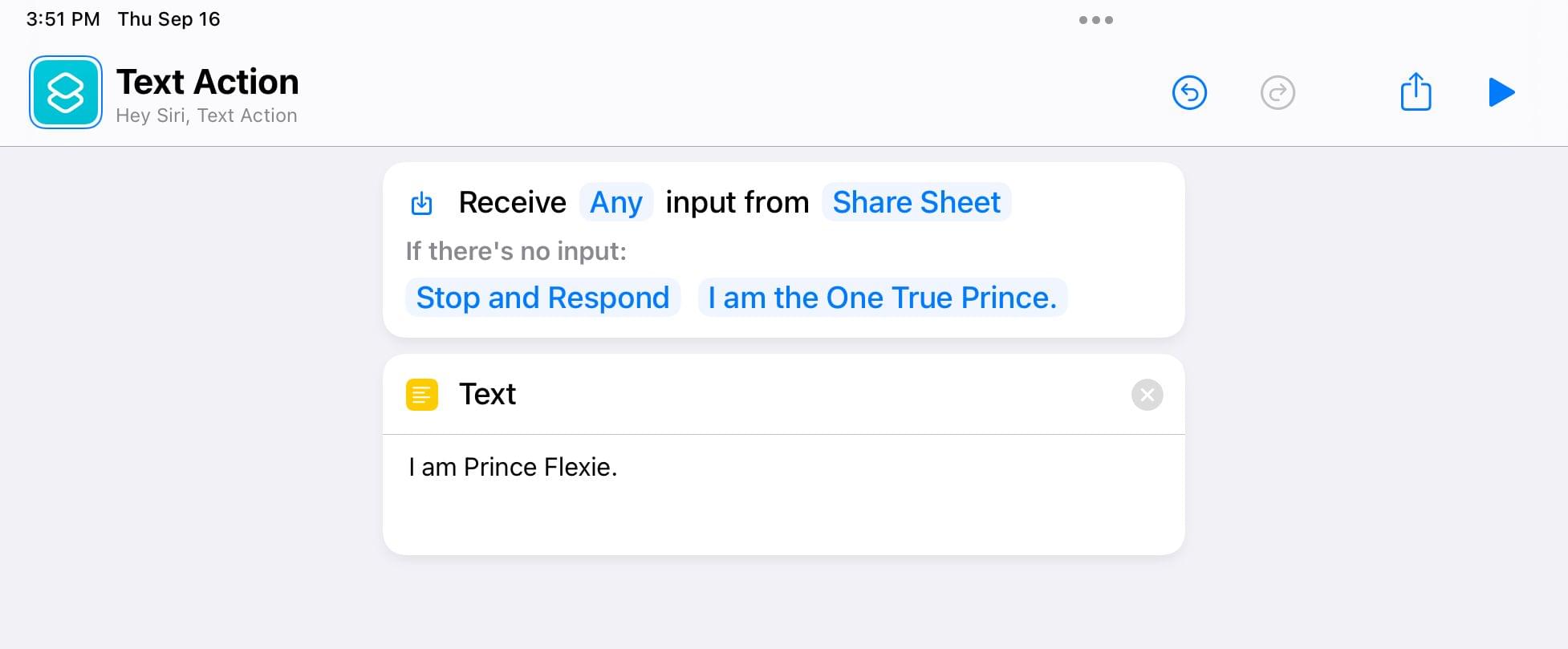
There’s a new look for the input type passed to a shortcut at the top of the editor: rather than a button that can be pressed to open a simple list of input types, the input menu now looks like an action with multiple parameters you can press to configure different aspects of a shortcut’s input.
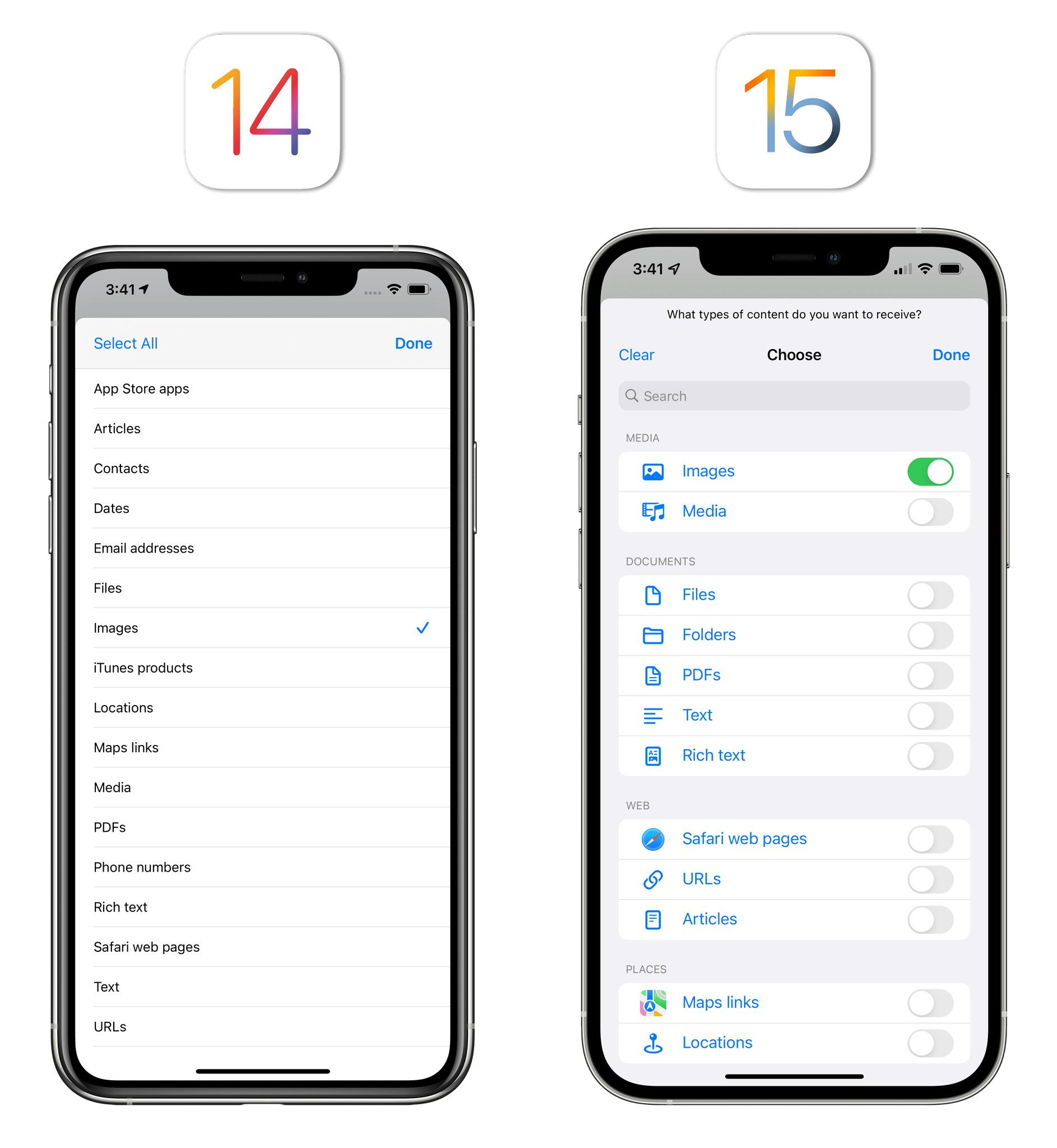
The list of content types that can be passed to a shortcut has been completely redesigned. Input types are now organized with categories such as media, web, and documents, and they each have an icon that better differentiates them in the list; additionally, there are toggles to enable specific input types, and you can filter the list by name with a search bar. This page feels much more “professional” than the basic design from iOS 14, and I like how similar content types are grouped together.
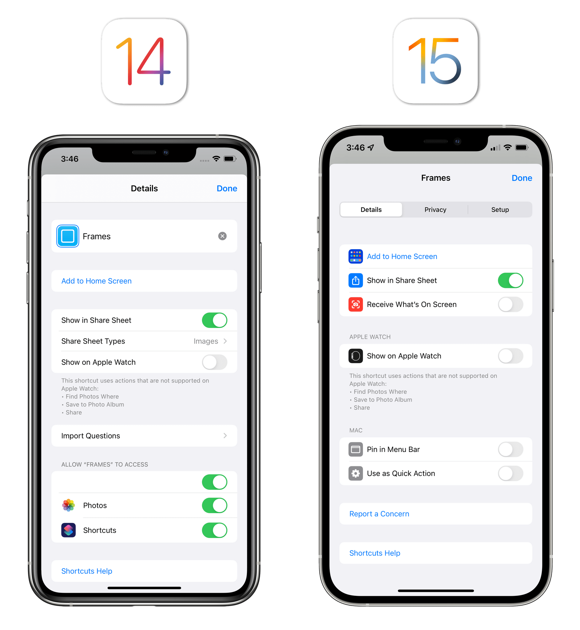
Furthermore, the ‘Details’ screen that allowed you to configure each shortcut’s settings, import questions, privacy options, and more in iOS 14 has been split into three standalone pages in iOS 15: Details, Privacy, and Setup.
I’m going to cover the Privacy and Setup pages in Shortcuts Settings, Privacy, and Sharing, so let’s focus on the revamped Details screen for now. This is where you can configure how a shortcut can be triggered on iPhone and iPad, whether it should be installed on Apple Watch, and what activation methods you’d like a shortcut to support on macOS Monterey. For iOS and iPadOS, you can now choose between share sheet and what’s onscreen; as we’ll see later, the latter is a new Siri functionality in iOS 15 that is also a standalone action in the updated Shortcuts app to get deeplinks from content displayed onscreen without manually pressing a button in the share sheet.
Unfortunately, it’s still not possible to assign a system-wide hotkey to shortcuts on iPad; I have to believe, however, that whenever Apple gets around to adding that option, it’ll be a new setting on this page. Overall, I’m a fan of the superior organization of shortcut settings and details in iOS 15, which makes the app look and feel like a more mature automation suite for advanced users.
Speaking of power users, Shortcuts for iOS 15 introduced a variety of new ways for dealing with those times when a shortcut that expects input isn’t sent anything.
Previously, this kind of error-checking routine was up to the user to implement, usually by adding a conditional block that said ‘If Shortcut input does not have any value, do this’. In iOS 15, the new shortcut input UI comes with a built-in parameter labeled ‘If there’s no input’ that lets you choose four different actions to perform automatically:
- Stop and respond
- Ask for
- Get clipboard
- Continue
The first one is an alert you can customize with a message; the third and fourth options are pretty self-explanatory; the second one is interesting. If you choose the ‘Ask for’ option, you can configure a shortcut to prompt you to manually pick one of the following content types in case no input has been passed to a shortcut that requires it:
- Files
- Text
- Date
- Photos
- Contacts
- Email address
- Music
- Phone number
I like this approach since it makes it much easier to put together shortcuts that dynamically adapt to whether you’ve shared something via the share sheet or not. All of this could be done manually before by constructing a conditional block, picking the right variables, and adding actions to pick content if it was nowhere to be found in the input; with this built-in option, Apple removed the need to assemble those 5-6 actions yourself, making the process easier for novice users and more customizable for experts.
Variable Inspector
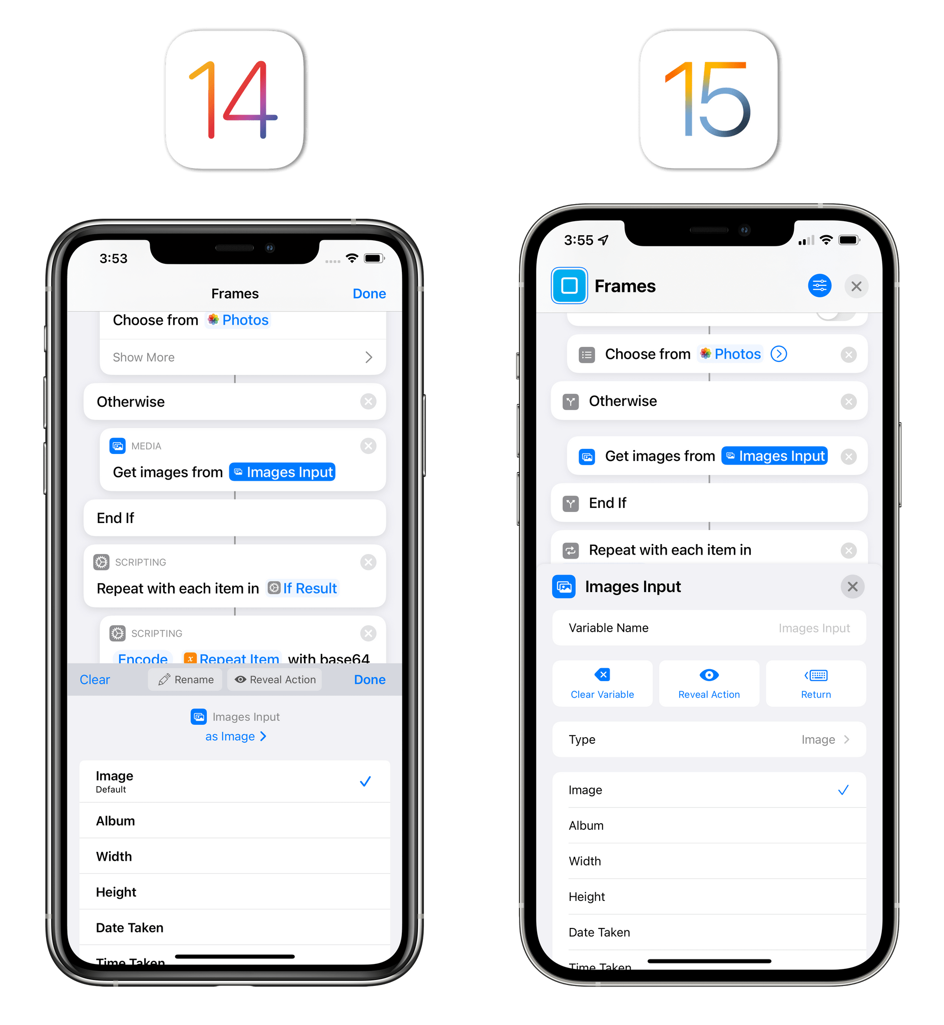
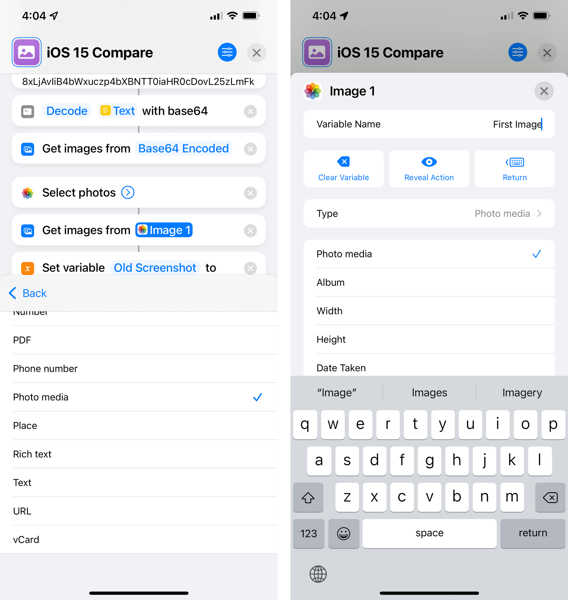
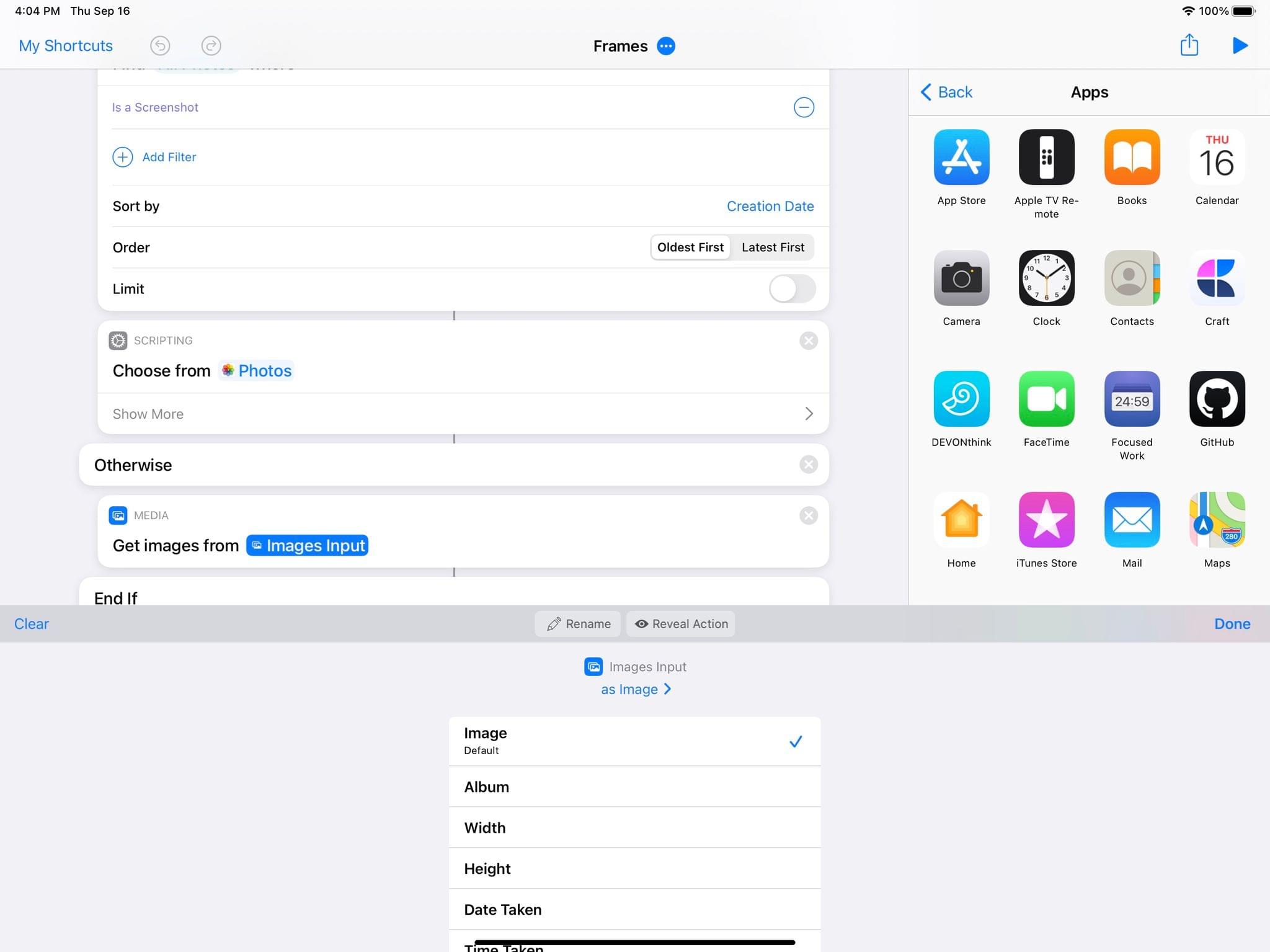
Another holdover from the old Workflow app that has been completely redesigned in Shortcuts for iOS 15 is the variable inspector. Available by tapping any variable or magic variable in the editor, this screen used to be displayed as a half-height panel at the bottom of the screen on both iPhone and iPad. It was perfectly functional, but it crammed a lot of features into a compact design, from renaming and clearing variables to changing variable types and details. As with shortcut settings, Apple took the arrival of Shortcuts on the Mac as an opportunity to rethink this panel with a full-page design that makes it easier to navigate and inspect different settings.
On iOS 15, the variable inspector is now a full-screen panel with a standalone field to rename a variable, plus dedicated buttons to clear a variable from a field, reveal the associated action, and hitting Return so you can continue typing next to a variable in a text field. All these options were available before, but they weren’t explained as clearly. The variable type is now a separate button as well, which takes you into a nested page with all the possible types you can coerce a variable into; as before, details you can extract from a variable are displayed at the bottom of the inspector.
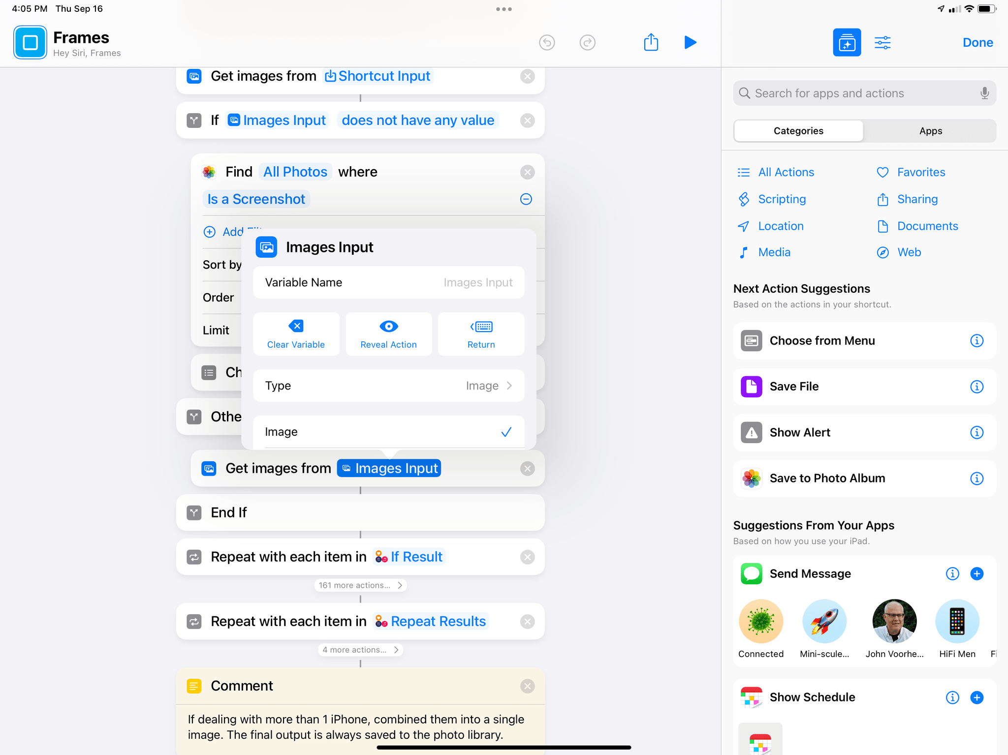
On iPad, the inspector has gone from being a panel that filled one third of the screen to a native popover.
One detail I like: revealing a variable in the editor has a new look in iOS 15. When you hit the ‘Reveal’ button in iOS 14, all it did was slightly dim other actions and highlight the one that generated the variable. In iOS 15, the dimming is a lot more prominent in the editor, and you get a blue bar at the top of the screen, underneath the title bar, that shows you the name of the action along with buttons to close this mode or return to the variable inspector.
Not only is this design easier to understand than before, but the feature itself is also more reliable, allowing for a seamless back and forth between the editor and variable inspector that just wasn’t possible in iOS 14.
Action Library
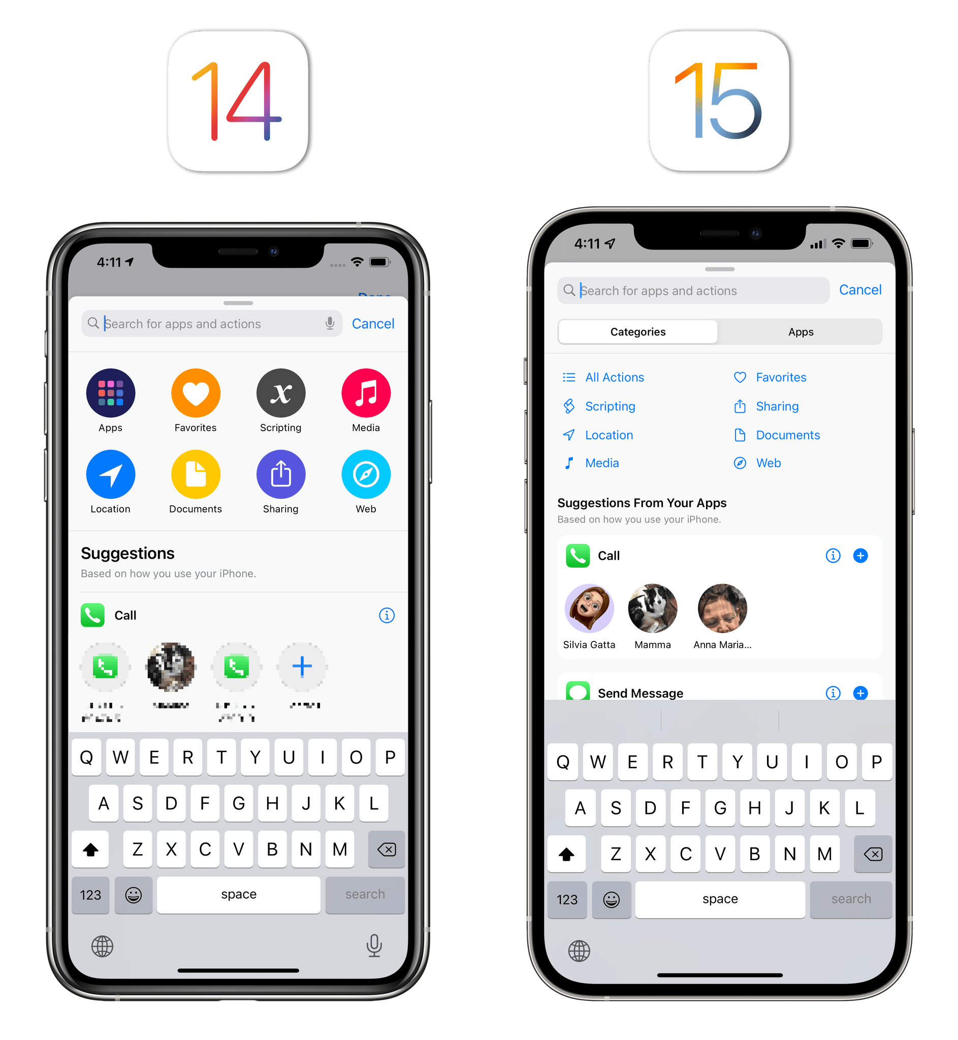
Not much has changed for the action library in iOS and iPadOS 15. The top section of the library has been redesigned with a more compact look that eschews large colorful icons in favor of smaller, blue-tinted glyphs. I don’t understand why Apple needed to suck all the fun out of this area of the app to replace some nice icons with smaller, duller versions of them. The old design felt more user-friendly and easier to navigate; I consider this one a regression from iOS 14.
I do like, however, the new separation between Categories and Apps with a segmented control at the top of the library. To make this possible, Apple turned the previous ‘Apps’ category (the one that shows you a grid view of all the apps you have installed) into a separate screen, and they replaced its category with ‘All Actions’. This means that, at long last, there’s now a way to view all Shortcuts actions – including third-party ones – in a single list sorted by category in alphabetical order. I still prefer to find actions by manually searching for them, but I like this change.
