Podcasts
I’ve been alternating between Castro and Spotify9 as my podcast clients lately, so I’m not in a position to properly judge Apple Podcasts. John uses it and likes it a lot; I find its interface clunky, don’t like how the queue works, and still find the lack of audio effects a weird omission from the app.
This year, Apple Podcasts is taking a page from Apple Music by copying two features that Spotify has had for a while: “faster” search and the ability to share timestamped links.
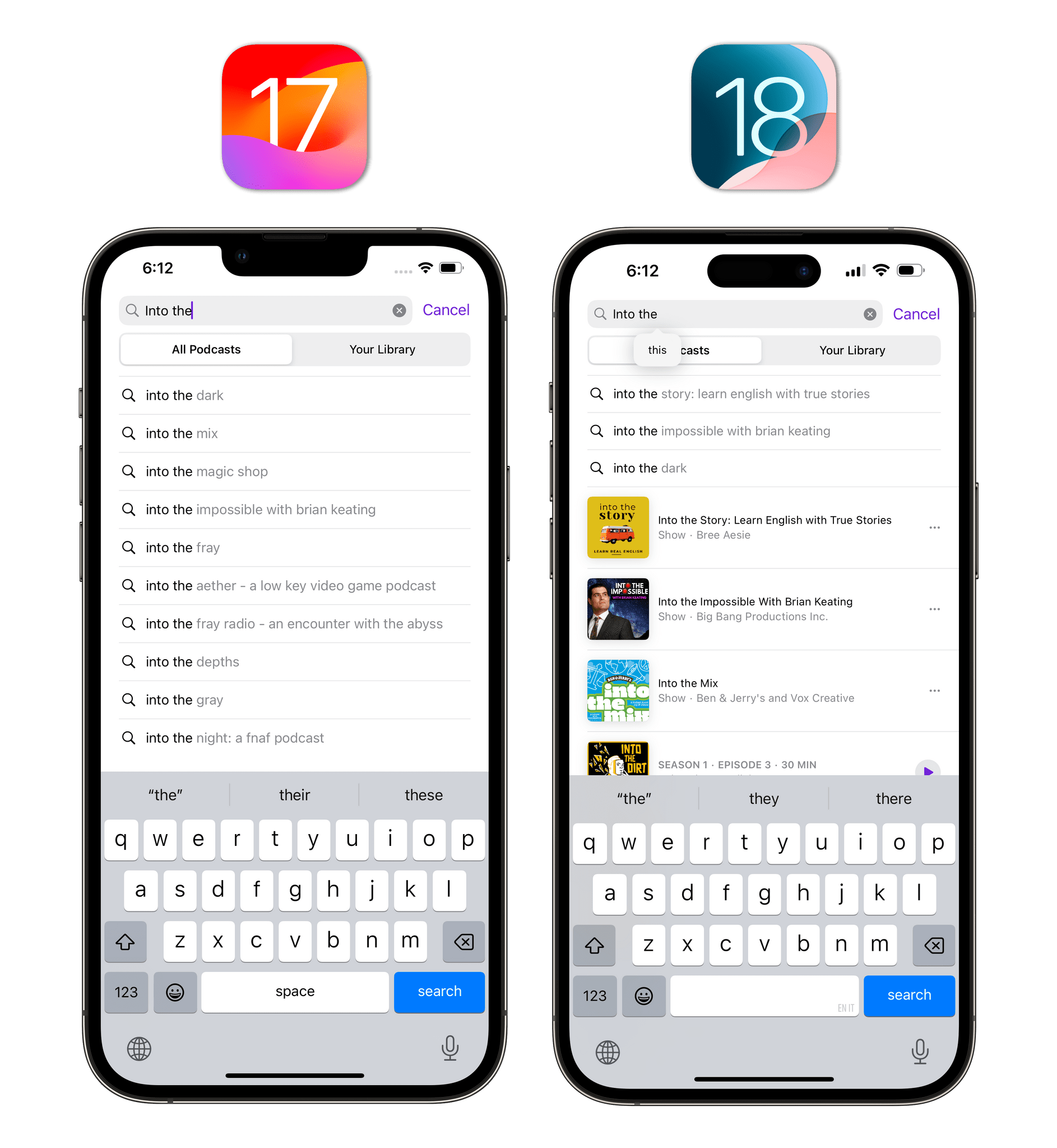
The quotes around “faster” in reference to search are necessary since, in my experience, search in Podcasts for iOS 18 has only been marginally quicker than iOS 17. Some search results come up slightly faster than before, and they show artwork in search results, but they still don’t appear nearly as quickly as they do in Spotify.
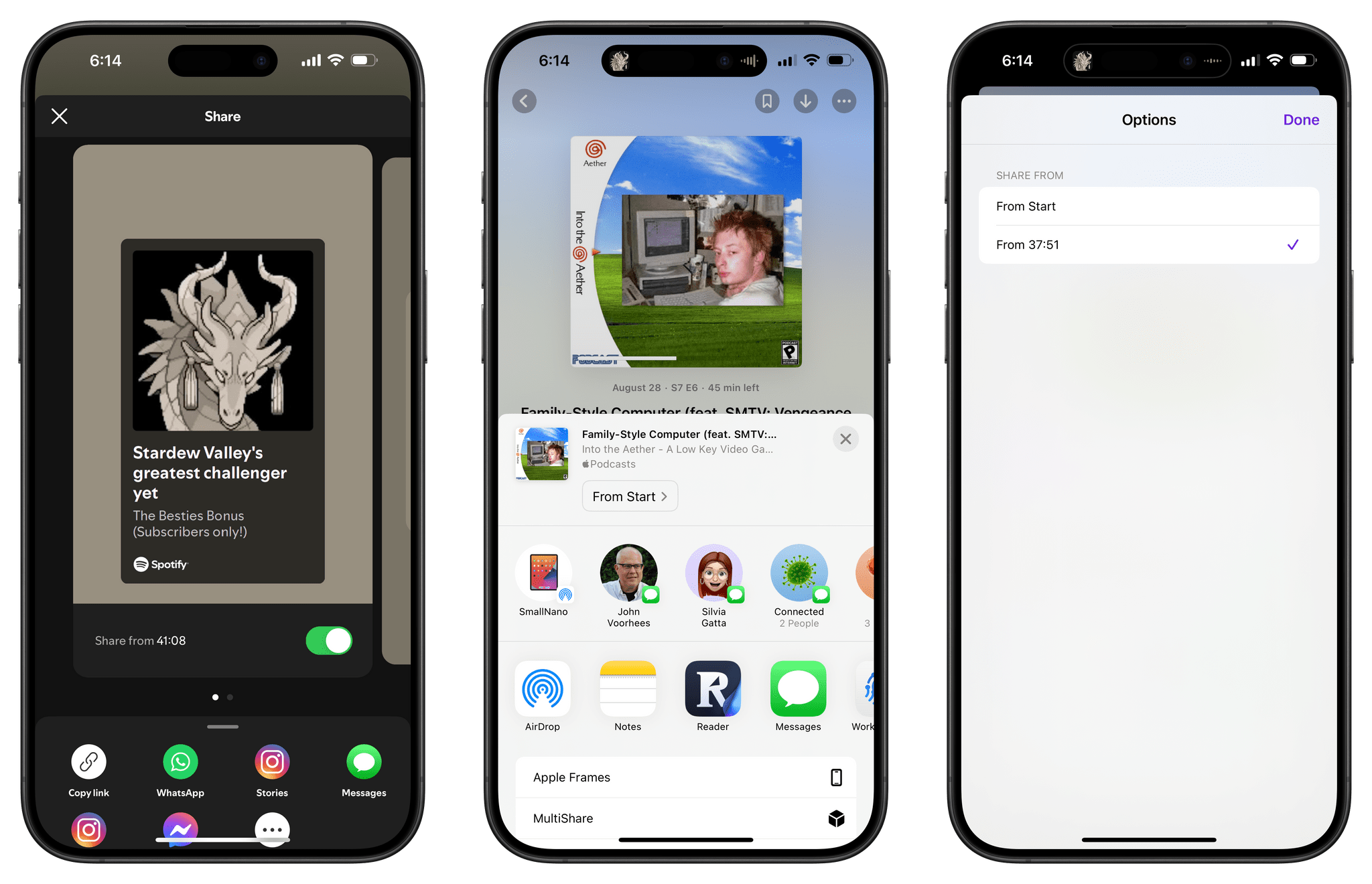
Being able to share timestamped links to specific moments in podcast episodes is neat, but also less intuitive than Spotify. In Spotify, you get a nice-looking screen with a toggle that clearly tells you how to share from a specific moment of the episode; in Podcasts, you have to share an episode, then in the share sheet find the small button that says ‘From Start’ and choose the timestamp in a separate popup window. Like the rest of the Podcasts UI, it’s a clunky interaction that could be so much faster and more discoverable with a different design.
The more I explore the landscape of the modern podcasting industry as a creator and listener, the more I realize how antiquated many parts of the Apple Podcasts experience are. I have to agree with Brendon: the latest improvements to Apple Podcasts feel like great additions for the 2005 version of podcasting – too little, too late for where the rest of the industry is going.
Reminders
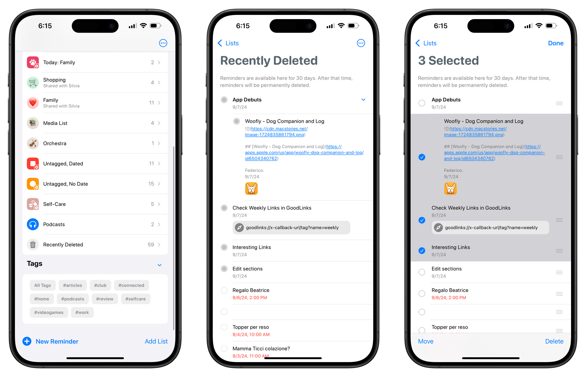
Aside from its integration with Calendar, the Reminders app is having a relatively quiet time this year. Underneath the rest of your lists, you’ll now find a ‘Recently Deleted’ list that shows tasks you’ve deleted over the past 30 days. From there, you can permanently delete these items or restore them by moving them back to a list.
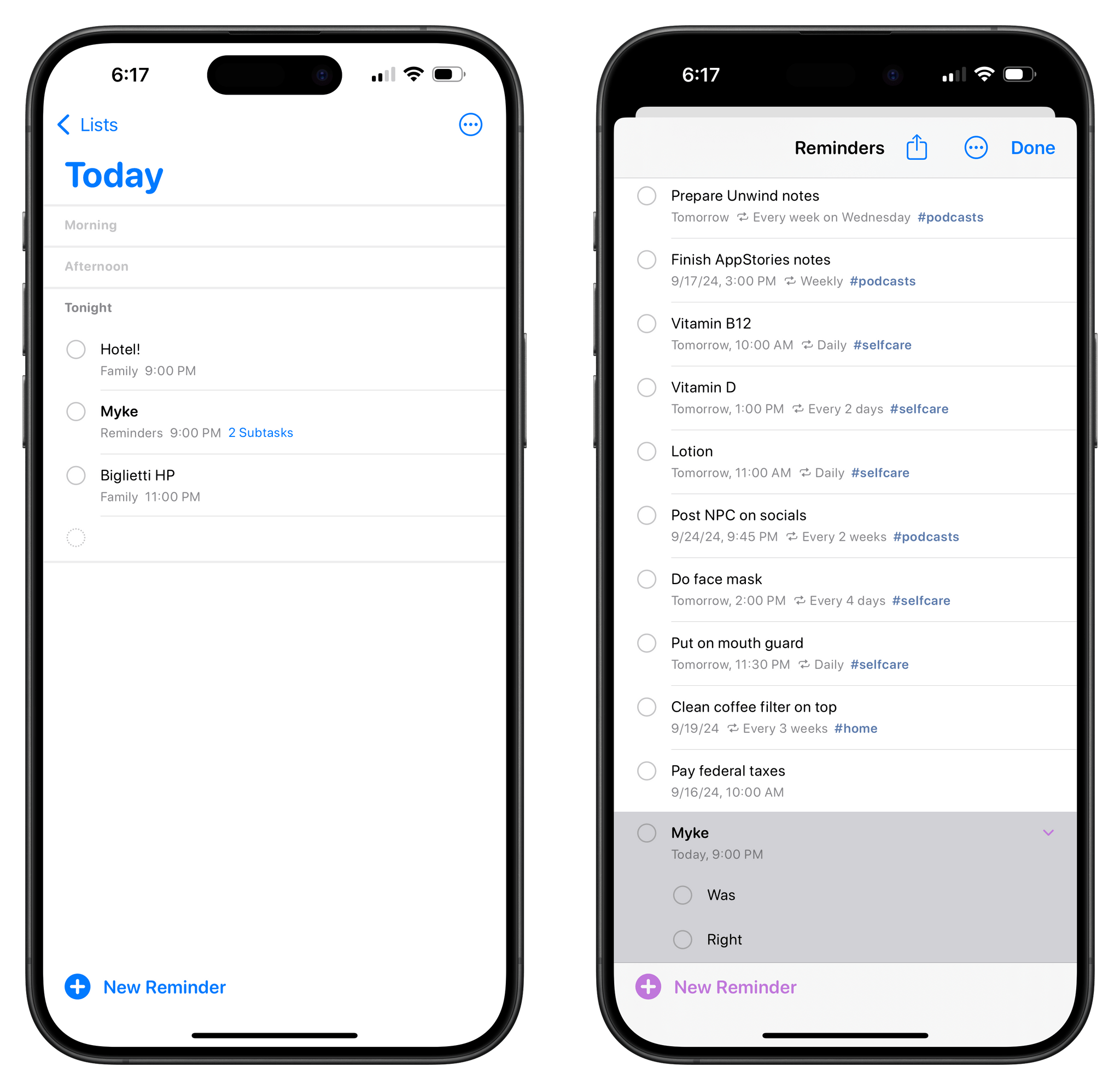
Before iOS 18, subtasks couldn’t be displayed in the Today, Scheduled, and custom smart lists, which was an odd limitation that’s been rectified this year. If a task contains subtasks and appears in one of those lists, it’ll get a blue ‘Subtasks’ badge that you can tap to view those subtasks in their original list. I don’t understand why Apple can’t just show subtasks in a smart list without the need to open a separate view, but, hey, I’ll take the button over not seeing subtasks at all.
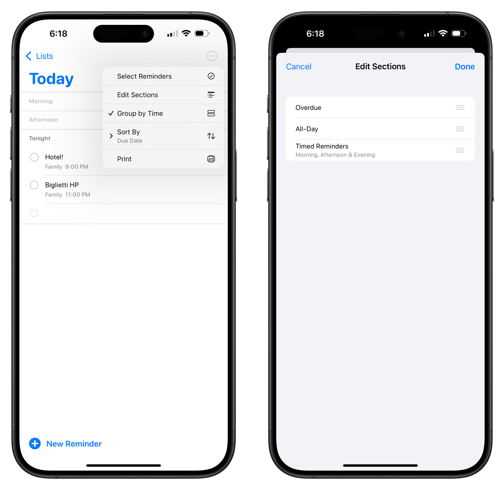
Speaking of the Today page, you can now reorder its sections so that, for instance, ‘Overdue’ and ‘All-Day’ are placed above ‘Timed Reminders’. You can access the ‘Edit Sections’ screen via the ellipsis menu in the Today page.
Support for automatically-sorted groceries via natural language has also been expanded to include more languages. Sadly, Italian is not among them. You can choose to set the grocery list language automatically or pick one from the supported languages by visiting Settings ⇾ Apps ⇾ Reminders ⇾ Add Language under ‘Grocery Categorization’.
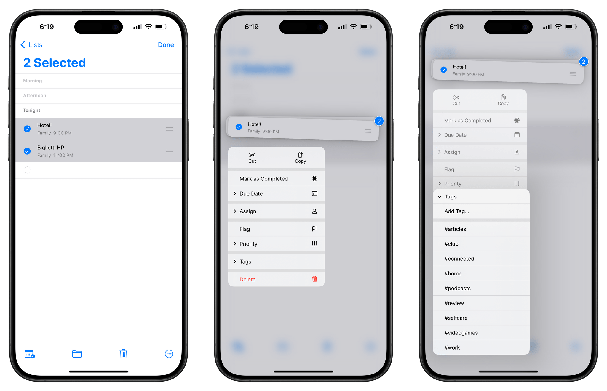
Lastly, you can now select multiple reminders and long-press them to see a context menu with options for all the selected items. These include the ability to tag all selected tasks, create a new section out of them, indent them, or change their due date and priority.
Reminders is a more serious and powerful task manager than most people give it credit for. I continue to be impressed by the constant evolution of this app, and I’m glad I decided to switch back to it as my main to-do app earlier this year.
Settings
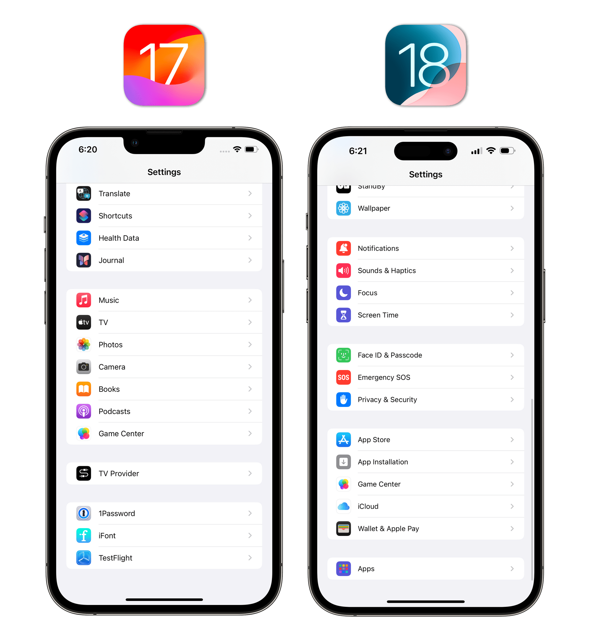
The Settings app underwent a small reorganization this year. As previously seen on visionOS, all settings for apps have been moved into a dedicated Apps subpage that you can access at the bottom of Settings’ main page. I was a fan of this approach when I saw it in visionOS, and I think it also makes sense on iOS and iPadOS as a way to separate top-level settings from app-related preferences.
Of those top-level settings, some pages like General, Bluetooth, and Cellular now come with introductory cards at the top of the screen that explain the options you’ll find:
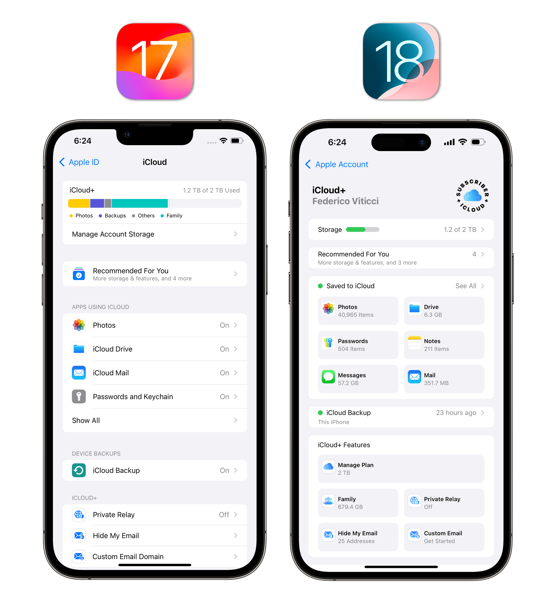
From a visual standpoint, the biggest shake-up occurred in the Apple ID section. For starters, it is now called ‘Apple Account’, a name I prefer. Second, the entire iCloud page has been restructured to emphasize how much cloud storage is being used by various apps and iCloud+ services. There’s even a fancy new ‘Subscriber’ badge in the top-right corner that should make you feel good for giving your money to Apple every month.
This page doesn’t actually offer anything new that couldn’t be found previously, but the design is less boring than before and makes it easier to understand where paid storage is going, which is something I appreciate.
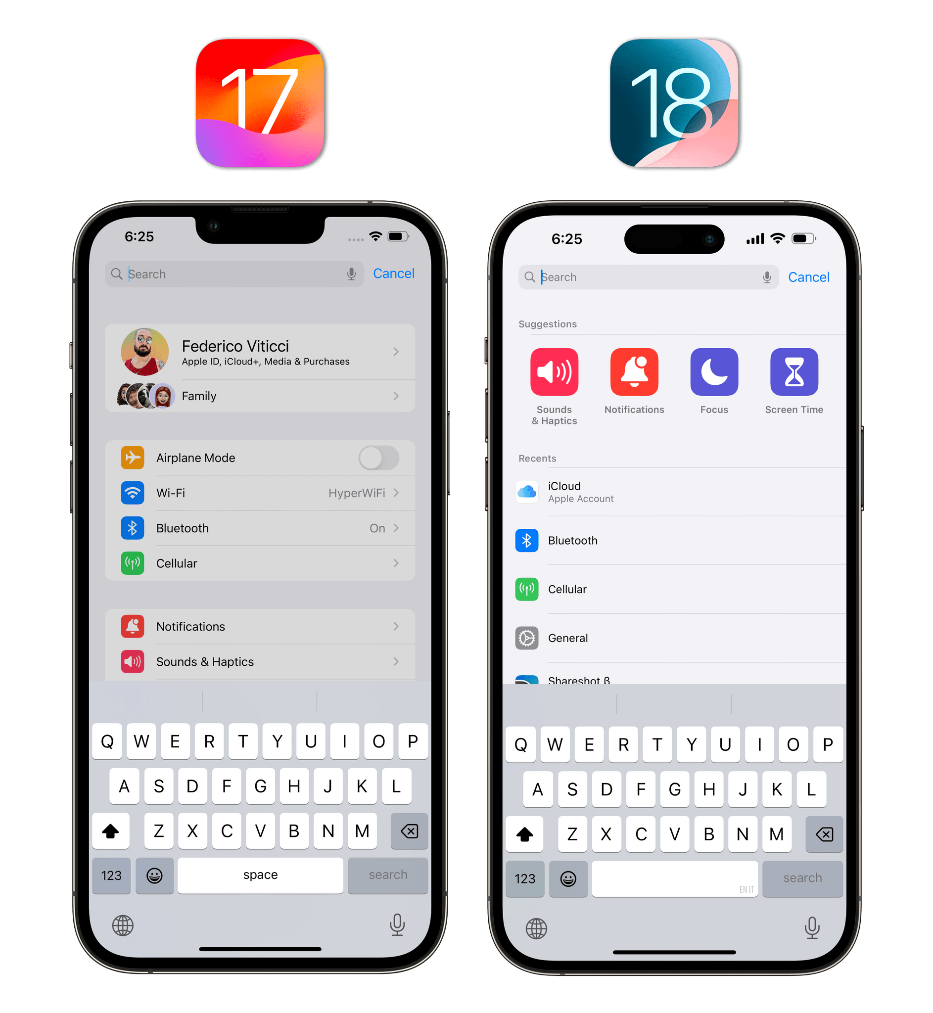
Lastly, I’ll point out that search in the Settings app has been improved with the addition of suggestions, more colorful results, and shortcuts to recent searches.
Shortcuts
Apple is busy building a large language model that uses App Intents to let Siri perform actions across different apps, so I wouldn’t blame them for skipping major new functionalities in the Shortcuts app this year. Not that previous years were incredible on this front, but at least they have a proper excuse this time around. Surprisingly, however, there are some nice new things in the Shortcuts app for iOS 18.
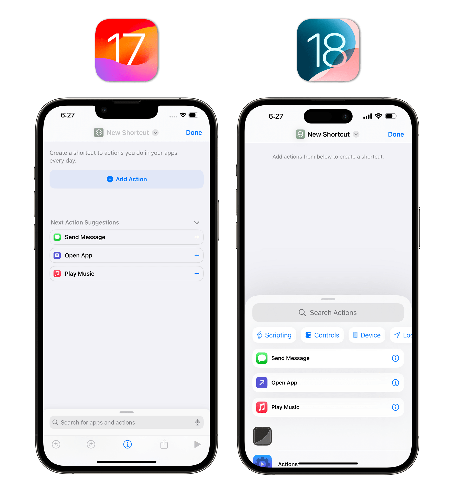
When you create a new custom shortcut, the app’s start screen is more user-friendly than before: rather than leaving you staring at an empty page with a blue ‘Add Action’ button, the iOS 18 version pops up the action drawer by default, immediately showing you some suggested actions and categories you can browse. Getting started with an empty shortcut has always been the app’s steepest learning curve, and I think this new design may help.
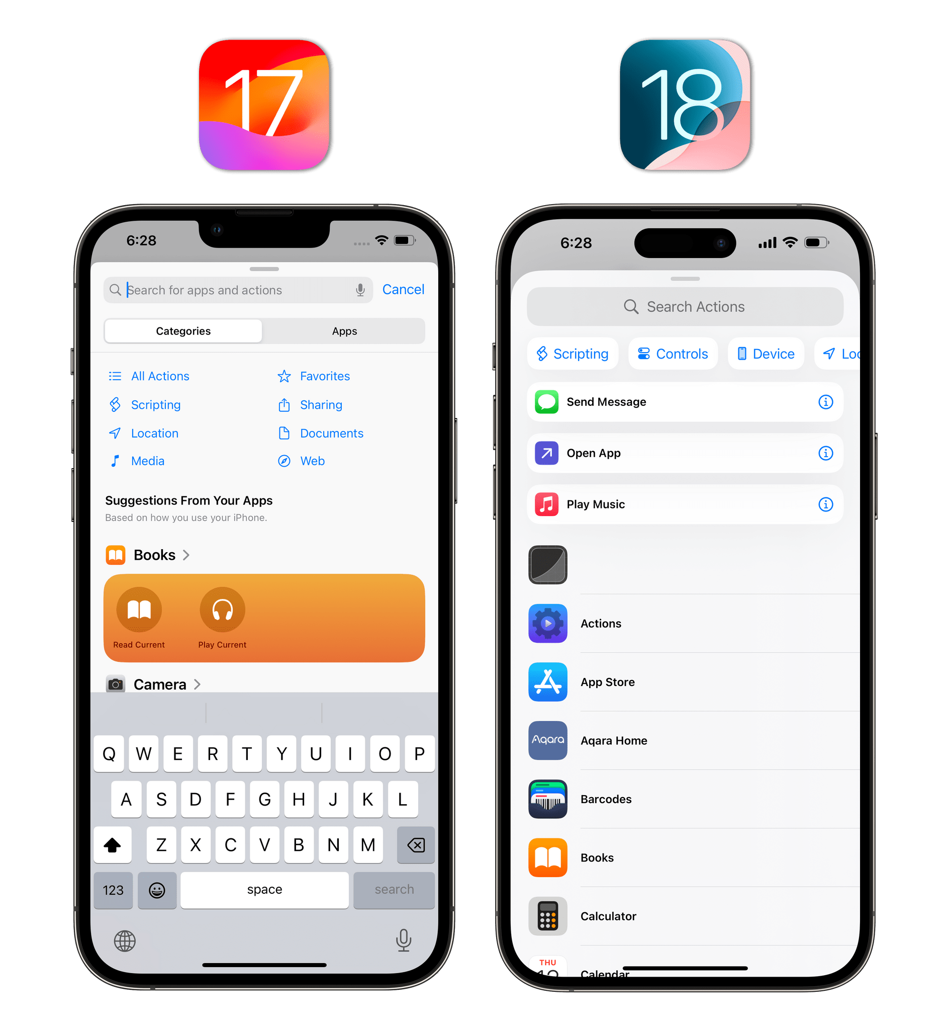
The action library itself has been redesigned with an emphasis on apps, but I also like what Apple did to categories. The separation between ‘Categories’ and ‘Apps’ is gone; there is now one screen in the library, which defaults to showing you all of your installed apps and their actions. Categories are now accessible from a scrollable row underneath the search bar, and they basically act as filters for the library page: select one, and it goes into the search field, filtering the library to show actions that belong to that category.
Combined with a reorganization of actions across all categories, I believe Apple landed on their best Shortcuts library design to date – an important achievement given the fact that the most powerful showcase of Apple Intelligence will revolve around Shortcuts actions and App Intents.
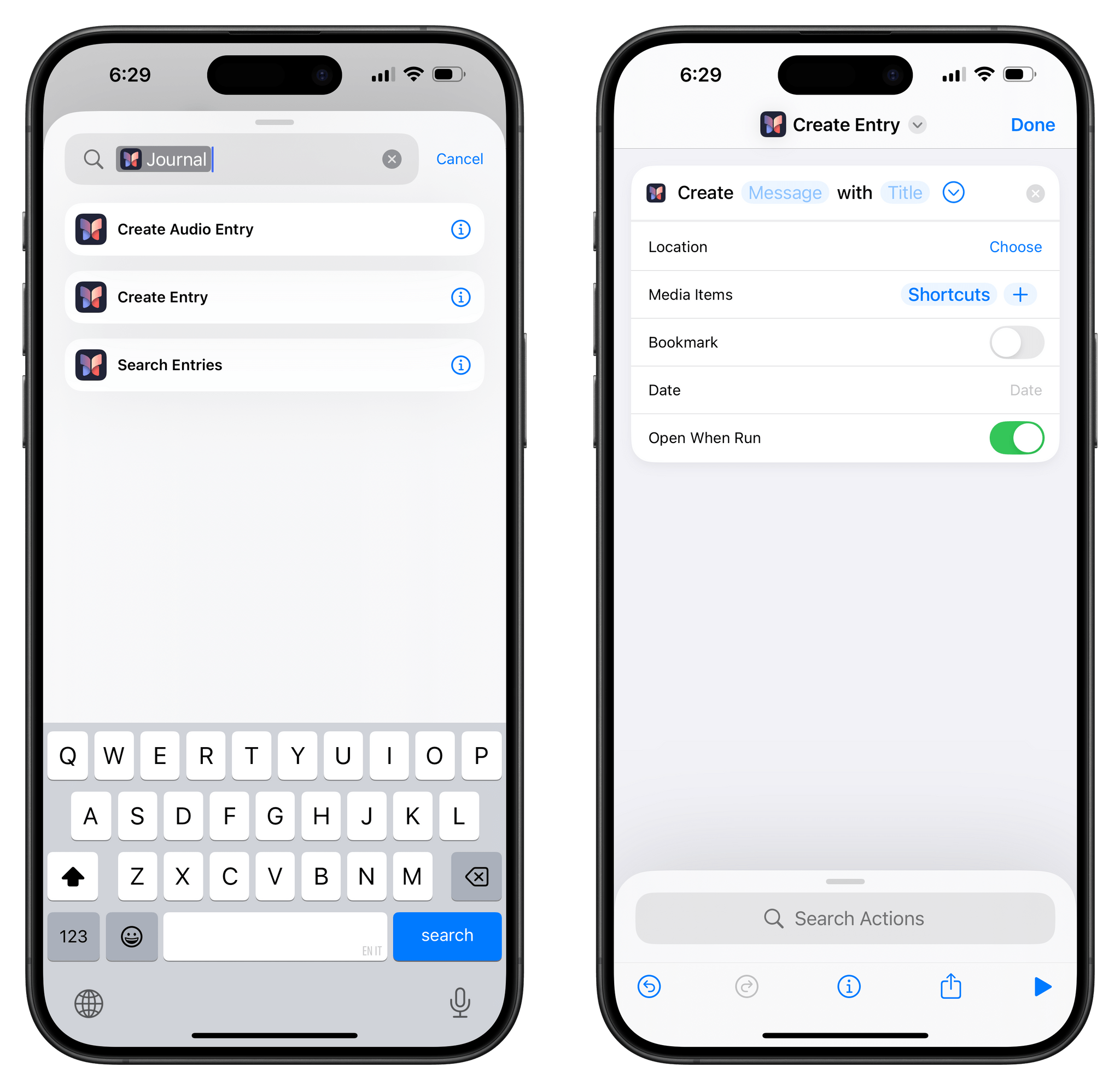
There are also some new built-in actions in the app. With ‘Create iCloud Link for Shortcut’, you can programmatically get an icloud.com shareable URL for any shortcut in your library. There are also new Journal actions to search for text in the Journal app, start a new audio entry, or create a new text entry. Impressively, the latter supports multiple parameters for an entry’s date, location, and media attachments, as well as the ability to set it as a bookmark.
For the power users out there, there is a new ‘Add Shortcut to Home Screen’ action that lets you add any existing shortcut directly to the Home Screen. What’s nice about this action is that it supports variables for custom titles and icons, meaning that you could, for instance, create an automation that runs through an entire folder of shortcuts, fetches icons from an iCloud Drive folder, and batch-adds everything to the Home Screen.
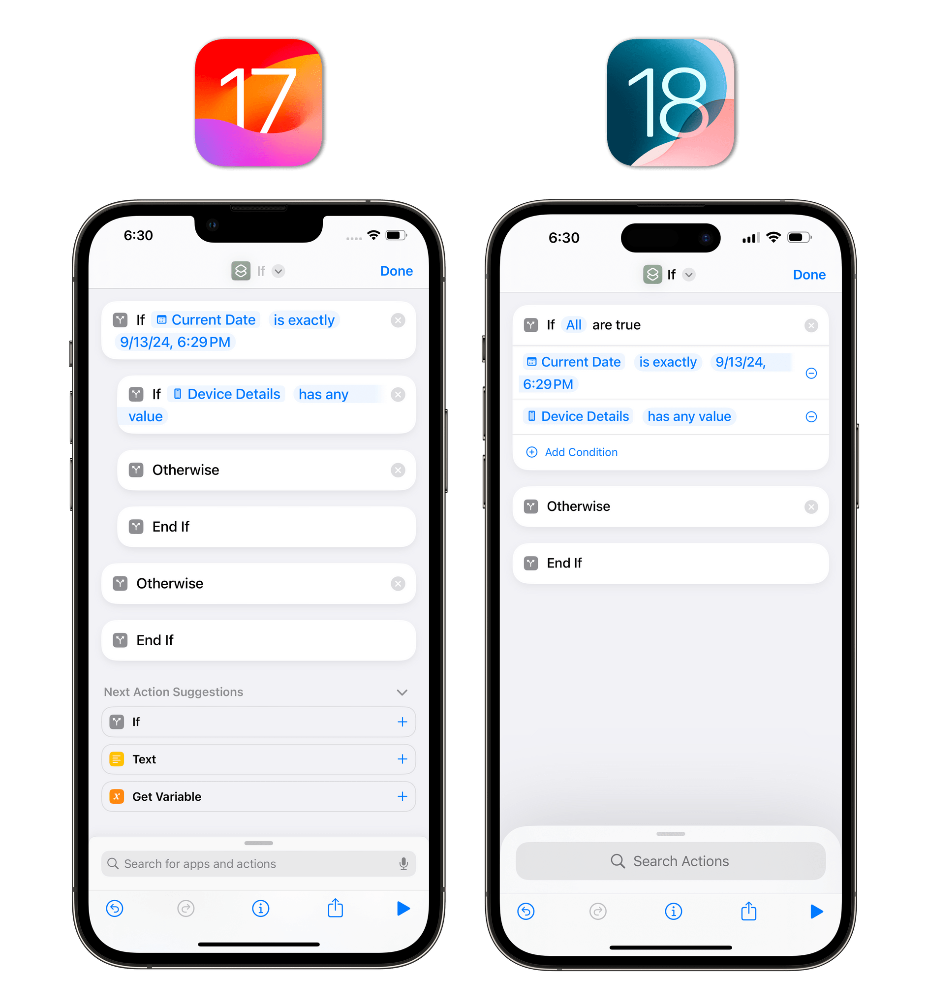
Also for advanced users, ‘If’ blocks now support compound conditions, meaning that you can add multiple conditions to the same ‘If’ action and choose whether ‘Any’ or ‘All’ of them need to be true for the actions inside the block to be executed.
This kind of conditional flow was possible before by manually nesting multiple If blocks within each other, but that always resulted in ugly indented blocks in the shortcut editor that hurt legibility. The new multi-condition support is much more elegant and readable, and it’s something I’m going to use a lot.
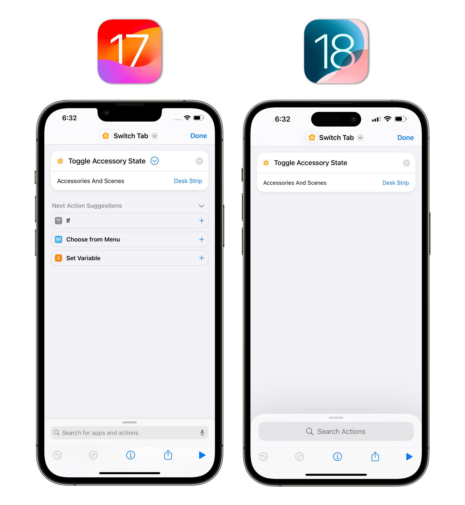
The Home category of actions comes with a new ‘Toggle Accessory State’ action that can switch a device between states instead of requiring you to explicitly set it ‘on’ or ‘off’. For instance, this action is great to quickly toggle the power on some lights or your TV.
Interestingly, as you can see above, this action will also sync back to and work on iOS 17. The action does not show up in library search on the old system, but it does function. I don’t recall another instance of a new Shortcuts action that was also compatible with a previous version of iOS; I’d love to know what Apple did here.
Weather
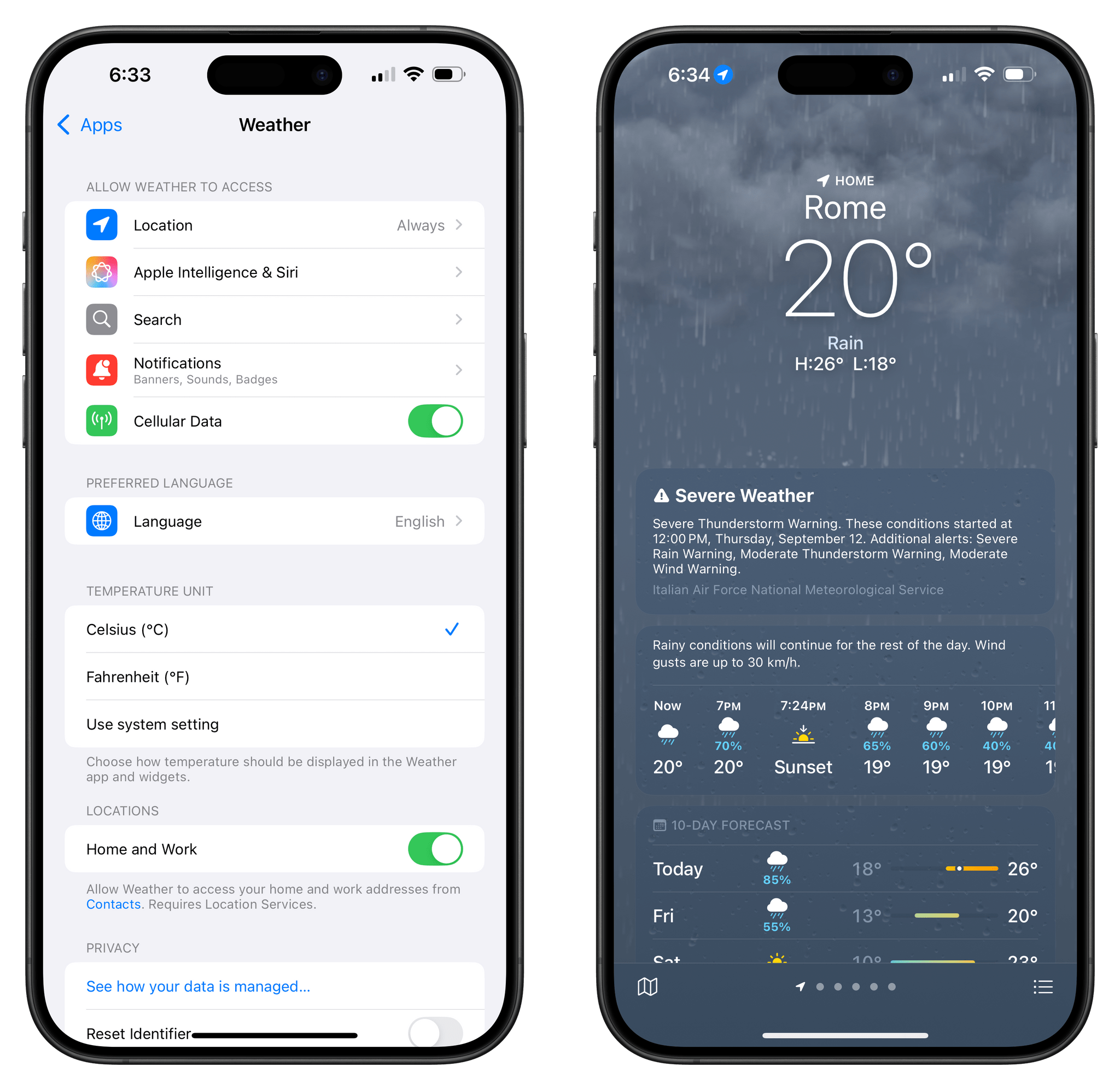
The only change in the Weather app this year is the ability to check the weather for separate home and work locations. To use this feature, make sure to update your contact card in the Contacts app so that it has separate addresses for home and work. Once that’s done, the Weather app will tell you which location you’re seeing a forecast for at the top and bottom of the main page.
You can also control the Weather app’s access to separate home and work locations in Settings ⇾ Apps ⇾ Weather.
- Every couple of years, I try Spotify as an Apple Music alternative. Historically, I’ve always returned to Apple Music after a while. This time, the combination of my newfound distaste for Apple's services (their tax on creators pushed me to reconsider how much money I give Apple each month) and recent improvements to Spotify make me feel it in my bones that I'm going to stick with it. As part of this experiment, and given the direction the podcasting industry is going and MacStories' growing family of shows, I'm trying to take podcasts on Spotify more seriously. Hence why I'm dogfooding the experiment by actually using Spotify as my podcast app. ↩︎
