Customization: Home Screen and Control Center
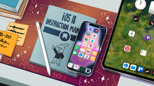
With iOS and iPadOS 18, Apple is entering a second phase of customization for its modern platforms: after widgets and Lock Screens, the company is now turning its attention to icon customization, Home Screen layouts, and functional customization of Control Center. And as expected, there’s a whole developer narrative to unpack here.
Goodbye, Legacy Widgets
Before we get to what has changed in the realm of Home Screen customization, let’s talk about what has been discontinued: legacy widgets. Originally introduced 10 years ago in iOS 8, legacy widgets predated iOS 14’s Home Screen widgets and could only be placed in the Today View, accessible from the leftmost side of the Lock and Home Screens.1 In iOS 18, those widgets are gone; if you still had some of them installed on your devices, they’ll be unceremoniously removed as soon as you update to iOS or iPadOS 18.
To be fair, the writing has been on the wall for legacy widgets for quite some time. It was clear when Apple introduced modern widgets on the iOS Home Screen that the future was WidgetKit, a technology that would go on to enable widgets on the iOS Lock Screen, iPadOS, macOS, and even watchOS. Apple hasn’t introduced any new features for legacy widgets in several years, and the company has been steering developers toward adopting modern widgets with WidgetKit since iOS 14 in 2020.
While the removal of legacy widgets shouldn’t surprise anyone who’s been paying attention to iOS in recent years, it does raise the question of whether or not WidgetKit-based widgets will ever become as powerful, interaction-wise, as the legacy ones. Put simply, despite their many limitations, legacy widgets allowed developers to build more interactive controls and cram them into smaller layouts than what’s possible with modern widgets. You don’t need to look too far online to find threads with several examples.
Understandably, the removal of legacy widgets is not an ideal scenario for users who still rely on them. At the same time, I believe the company is doing the right thing in moving full speed ahead with WidgetKit, which I hope will continue to grow to support more interaction types.
Home Screen Customization
Alright, let’s get to the good stuff.
With iOS 18, the Home Screen is undergoing its biggest set of changes since iOS 14. For the first time ever, Apple is giving users more control over icon placement on the Home Screen, going beyond the limitations of the classic grid. And there’s more: the company is also embracing icon customization with new ways to make icons bigger, turn them dark, or even tint them with any color you want. As I’ll explore below, there are some limitations still in place, but these changes represent a substantial rethinking of the Home Screen and how it can be customized nonetheless.
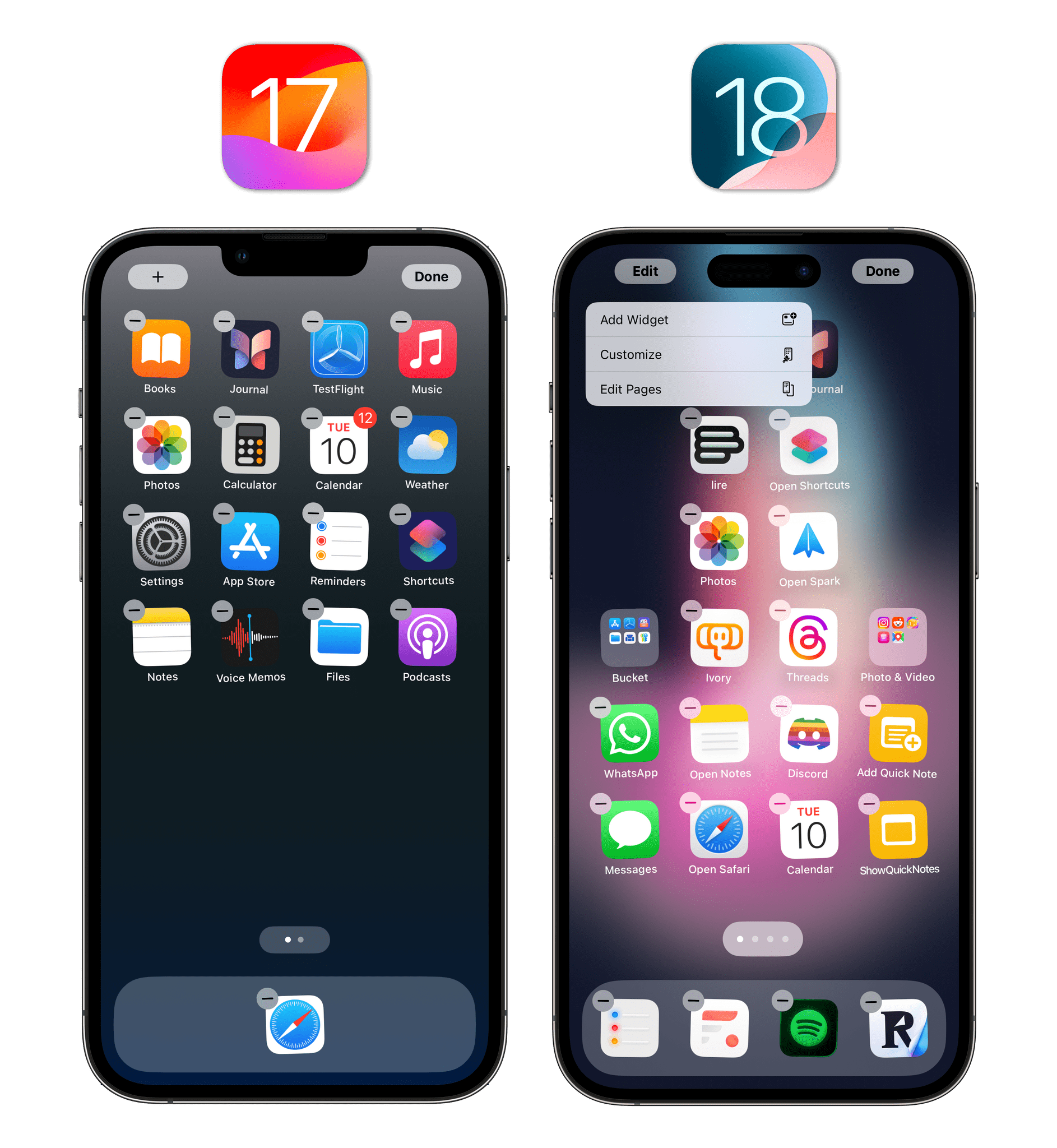
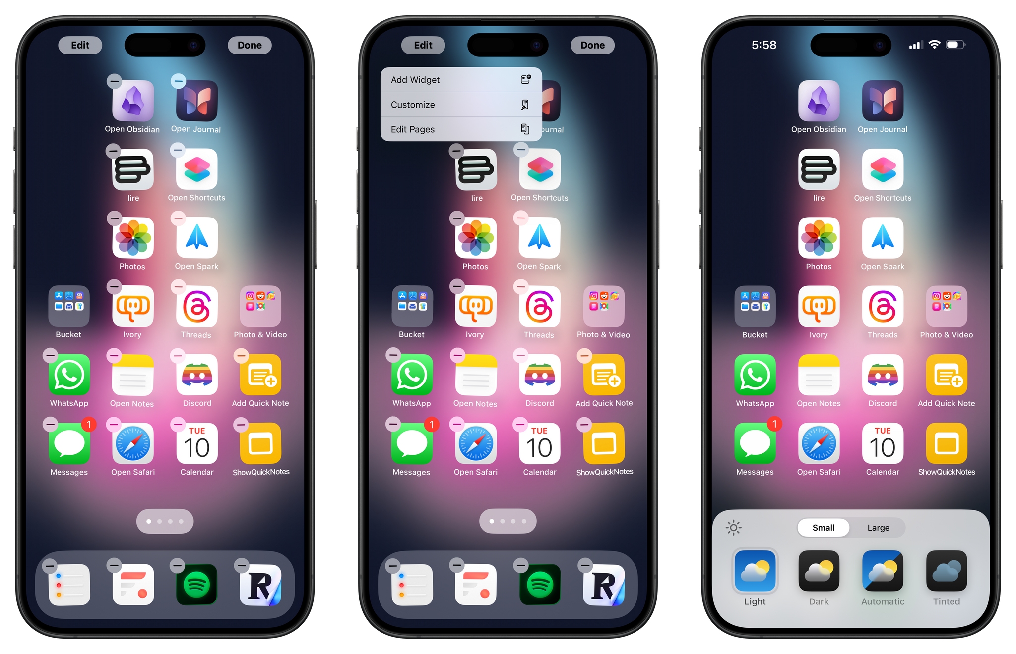
Let’s start from very foundation of the Home Screen: jiggle mode. Long-press on any empty spot on the Home Screen, and you’ll see that there’s a new menu to enter customization mode. Previously, there was a lone ‘+’ button to add widgets; it has been replaced by an ‘Edit’ button that opens a new submenu. The menu contains options to add widgets and edit pages (both existing features of iOS) as well as the brand new entry: Customize.
The Customize menu is reminiscent of the color and font picker previously seen on the Lock Screen, and it’s displayed as a sheet that pops up from the bottom of the screen on iPhone.
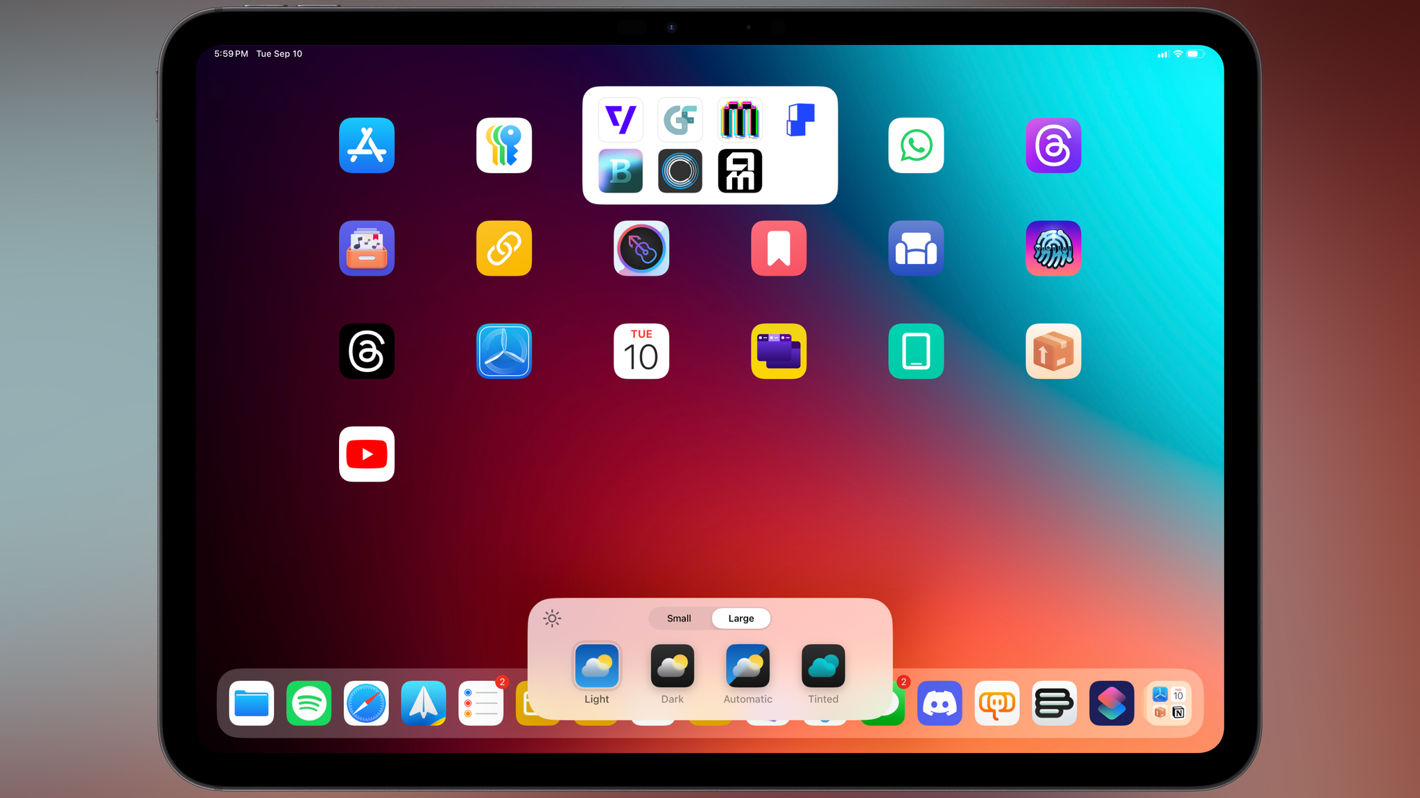
In a break from tradition, the same new Home Screen features seen in iOS 18 are available in iPadOS 18 as well this year; on the iPad, the Customize menu is a floating card docked at the bottom of the Home Screen:
I’ll talk about the new options in the Customize menu later in this chapter. Before we get to icon colors, we need to keep talking about jiggle mode. It’s all grown up now, and it’s ditching its training wheels to let us place icons anywhere.
Well…almost anywhere.
Flexible Layouts
Ask anyone who’s ever made a serious effort to customize their iPhone’s Home Screen, and you’ll hear a common refrain: why can’t I place app icons wherever I want?
The iOS Home Screen has long abided by the Steve Jobs-era rule that icons must be arranged in an evenly-spaced grid that starts from the top left corner and flows down to fill the rest of the page. There cannot be empty spots between icons, and users cannot create empty rows or columns anywhere. Even when Apple introduced Home Screen widgets in iOS 14, icons still had to adhere to the grid’s structure and reflow around widgets.
It’s funny because, if you think about it, having to follow an icon grid on a device that lets you create multiple Lock Screens, put together custom shortcuts, and modify the behavior of a physical button seems so…silly in hindsight. I mean, of all dogmas that iOS must follow, why did we get so hung up on a grid of icons in the first place? Android has offered the ability to place icons anywhere for years. Even more incredible is the fact that Apple’s longstanding rule created a sub-economy of utilities for creating blank icons or widgets to simulate the effect of more dynamic Home Screen layouts. Wild.
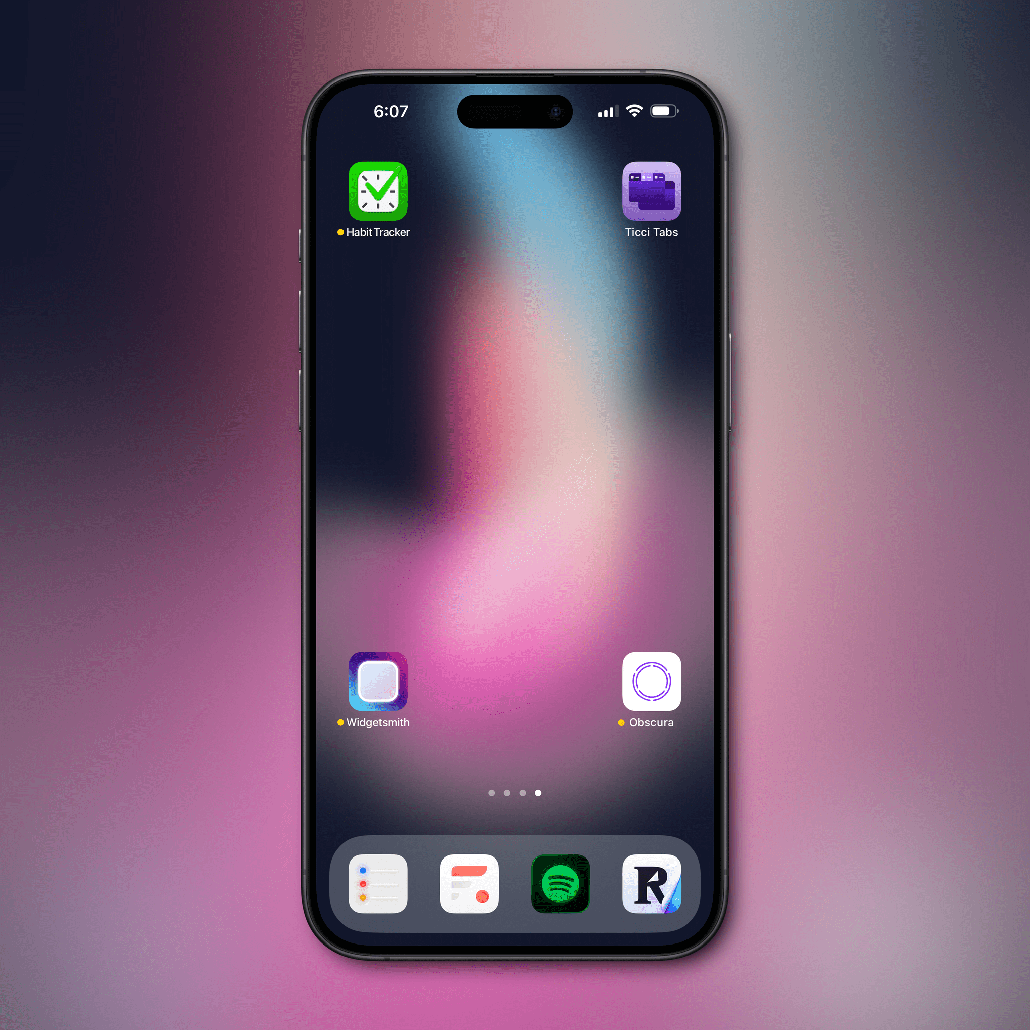
What do you call it when Apple Sherlocks utilities that were meant to address the limitations of the operating system? Ah, yes: progress. And progress we did. At long last, iOS and iPadOS 18 let you grab an icon (or a group of icons at once via drag and drop selection) and place it anywhere you want on-screen.
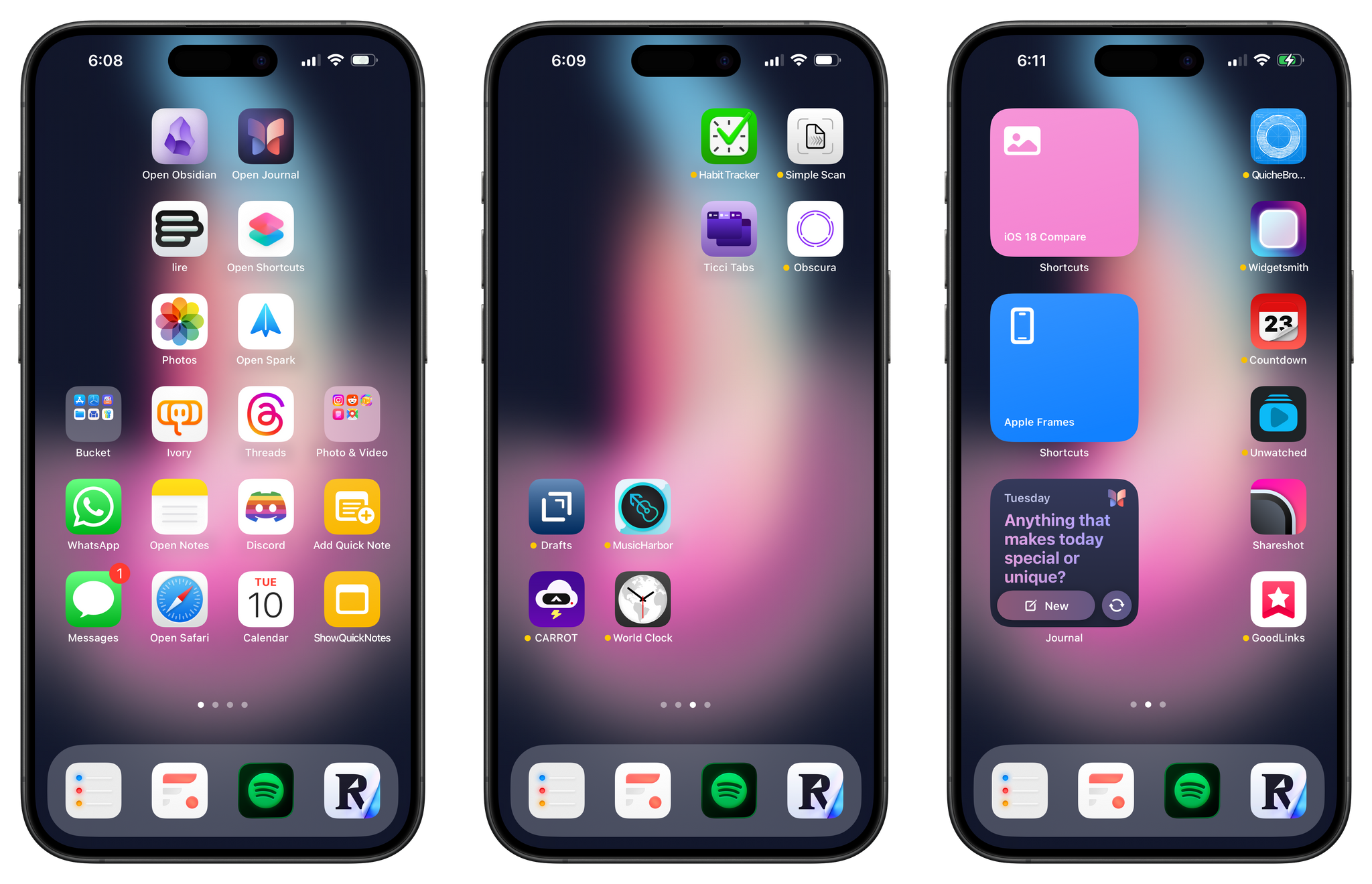
Want to place two icons next to each other smack dab in the middle of the page? You can:
How about four icons, one for each corner of the Home Screen? Yep:
Want to come up with even more peculiar icon layouts with, say, two columns of icons in the middle of the screen, or clusters of four icons in each quadrant? The iOS 18 Home Screen lets you do all of this:
These changes are welcome, long overdue, and I’m certain that iPhone users with more creativity than yours truly will devise innovative layouts that look better than anything I put together here. There still are, however, arbitrary limitations on how icons and widgets can be moved around on the Home Screen that I want to call out. These virtual restrictions are different between the iPhone and iPad, and each platform has its own quirks; I’ll showcase some of the iPad-specific oddities in the next chapter.
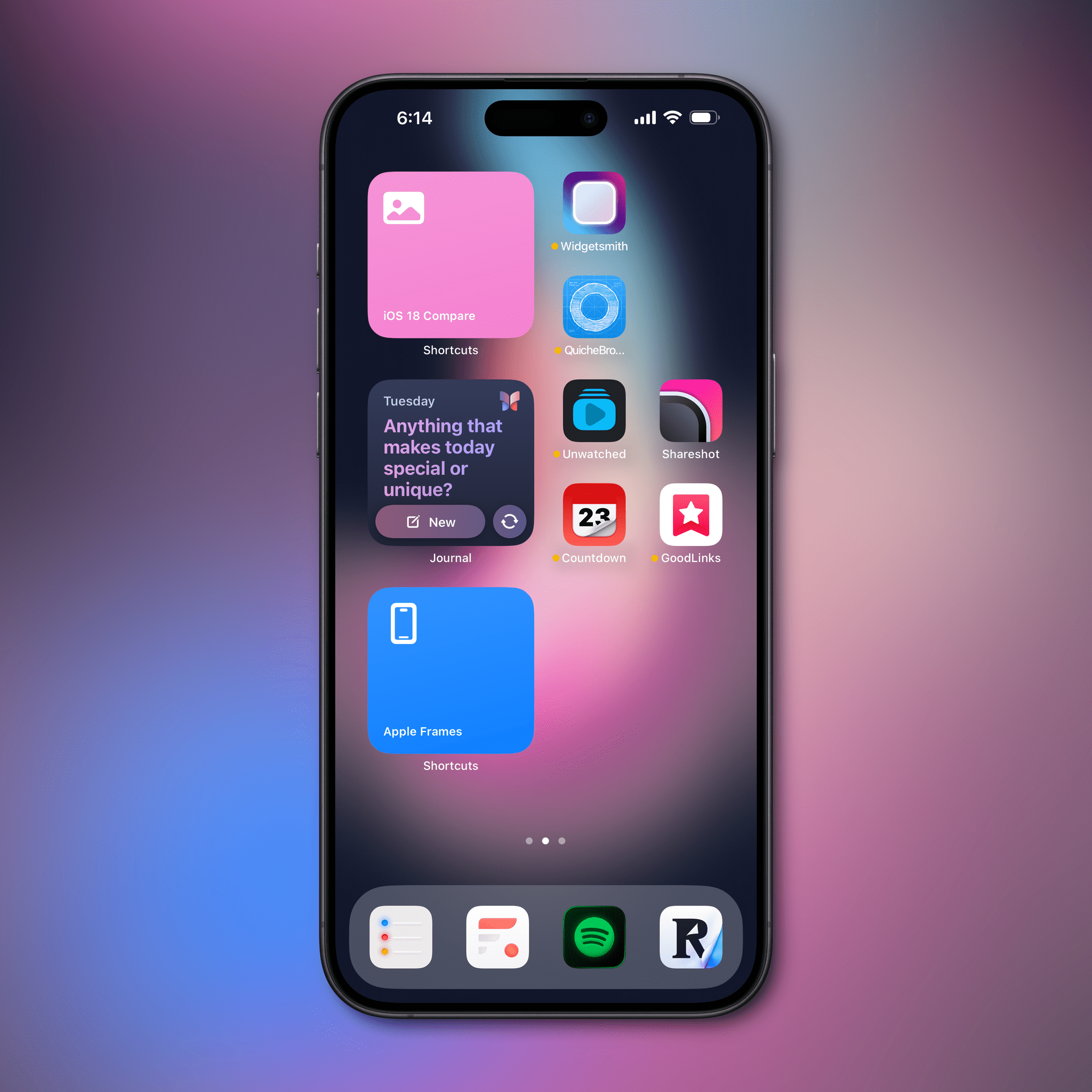
On the iPhone, you can’t place a small widget between two columns of icons; a small widget must always be surrounded by two icons or an icon plus an empty spot. For example, in the screenshot below, I want to place the (new) Journal widget in the center of the screen, surrounded by a column of two icons on each side:
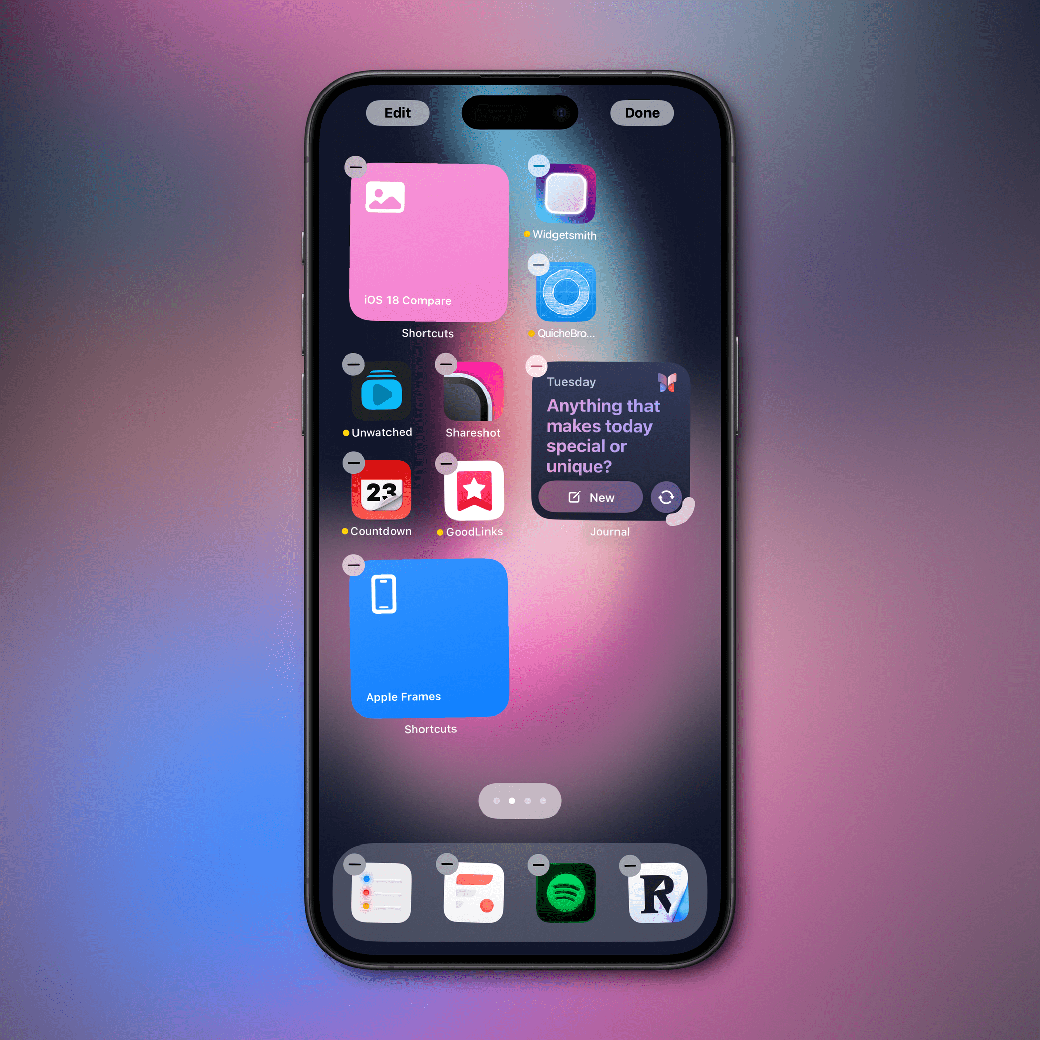
But I can’t. If I move the widget next to first column of icons, the entire group of four icons will move to the opposite side of the screen:
And I’m wondering…why? Why give users the ability to freely place icons and widgets almost anywhere without getting all the way there?
While we’re on this topic, I should also note that the current widget sizes have gotten a little long in the tooth. On iOS, we’ve had the same small/medium/large configuration since iOS 14, and I think it’s time for Apple to shake things up with more shapes and size options for developers. I’d love to see an extra small rectangular widget size, or perhaps column-style widgets that display information vertically.
Despite some lingering limitations on icon placement and widget sizing options, I consider the more dynamic iOS 18 Home Screen layout a success. Apple managed to keep the ideological sanctity of the iPhone’s icon grid while opening it up to users’ creativity, and that’s a great thing in my book. The new system keeps the underlying grid system, so it’s difficult to make something that looks bad or chaotic, but in allowing empty spots between icons, it opens up more personalization possibilities for everyone.
An almost Android-like level of customization combined with the design ethos of iOS is very much a theme for me this year, and the new iOS 18 Home Screen is yet another reflection of it.
Resizable Widgets
iOS 18 provides a solution to a longstanding limitation of Home Screen widgets: the need to delete an existing widget if you want to replace it with the same one of a different size. Now, both iOS and iPadOS 18 come with Mac-like support for resizing widgets without deleting and re-adding them; in reality, the implementation here is even superior to the version previously exclusive to macOS.
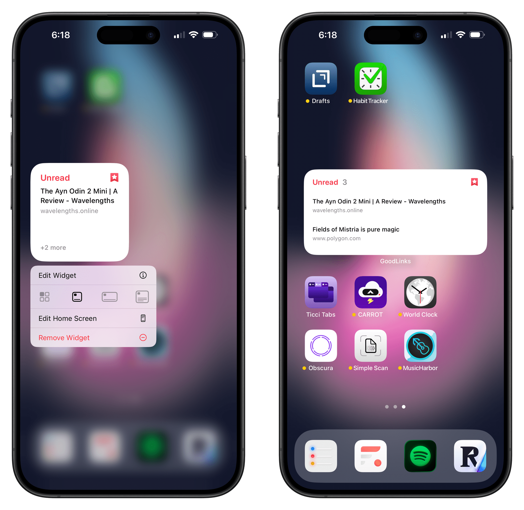
When you long-press on a widget in iOS 18, if it supports multiple sizes, you’ll see different shape outlines below the ‘Edit Widget’ button in the context menu. For instance, this GoodLinks widget supports small, medium, and large sizes on the iPhone:
Just like on macOS, you can now choose one of the supported sizes, and the same widget will resize directly on the Home Screen, reflowing surrounding app icons and widgets accordingly. This is great, since it allows for greater widget flexibility without the clunky operations of the past.
Even better, though, is the fact that iOS 18 also lets you resize a widget down to its app icon and vice versa. Tap the leftmost button next to the shape outlines, and a widget will turn into the associated app’s icon; likewise, long-press an icon, and you’ll be presented with options to turn it into one of the widgets offered by the app.
Resizing widgets and icons on the iOS 18 Home Screen.Replay
You don’t even have to use the context menu: if you’re in jiggle mode, a drag handle will appear next to widgets that support resizing, allowing you to freely pick between three sizes on iPhone – and four on iPad:
Resizing widgets on the iPadOS 18 Home Screen.Replay
As you can imagine, I’m a fan of flexibility here, and I wasn’t expecting the ability to move back and forth between icons and widgets. These options will come in handy when trying different Home Screen layouts and deciding between various widget configurations.
- Technically, these widgets were officially called Today View extensions. ↩︎
