Large Icons
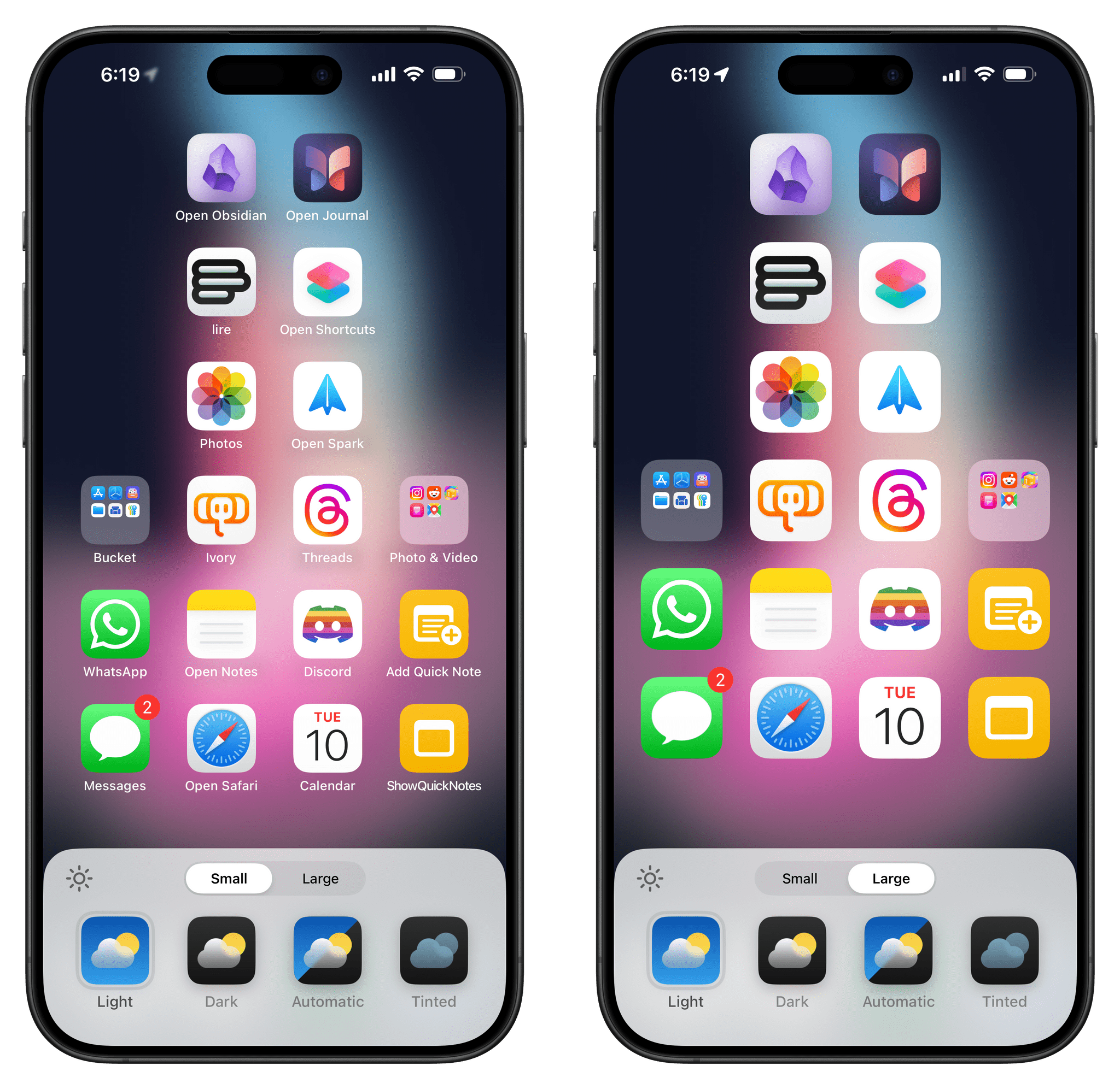
Now, let’s get into that new customization menu for the Home Screen by talking about the first new option it enables – large app icons. Spoiler: I’m a fan, and I use them, but they’re definitely a choice, and I wish Apple added a third option to the mix.
At the top of the Customize menu, there’s a segmented control to switch between small and large icons. Small icons are the ones you’ve always used on your iPhone; large icons are simply bigger versions of them. Once enabled, this feature makes icons appear larger and closer together. It also removes icon labels and any blue or orange dots next to those labels for a cleaner look.
Like I said, this is certainly a look that not everyone will like. Personally, I’ve gotten so used to it over the past three months that I can’t imagine going back to smaller icons and having their names always shown on my Home Screen. I also like that artwork from my favorite apps is bigger.
That being said, I think Apple should have made icon labels an option separate from large icons. Users should be able to keep small icons and choose to hide their text labels. I hope this feature will be added in a point update later in the iOS 18 cycle.
Icon Colors: Dark Mode and Tinting
We now get to the part of this review that might just be summed up as, “This is not for me, but I’m happy it’s in there for other people regardless”. In iOS 18, you can choose to make Home Screen icons and widgets dark, or apply a custom tint color to all of them using a color picker.
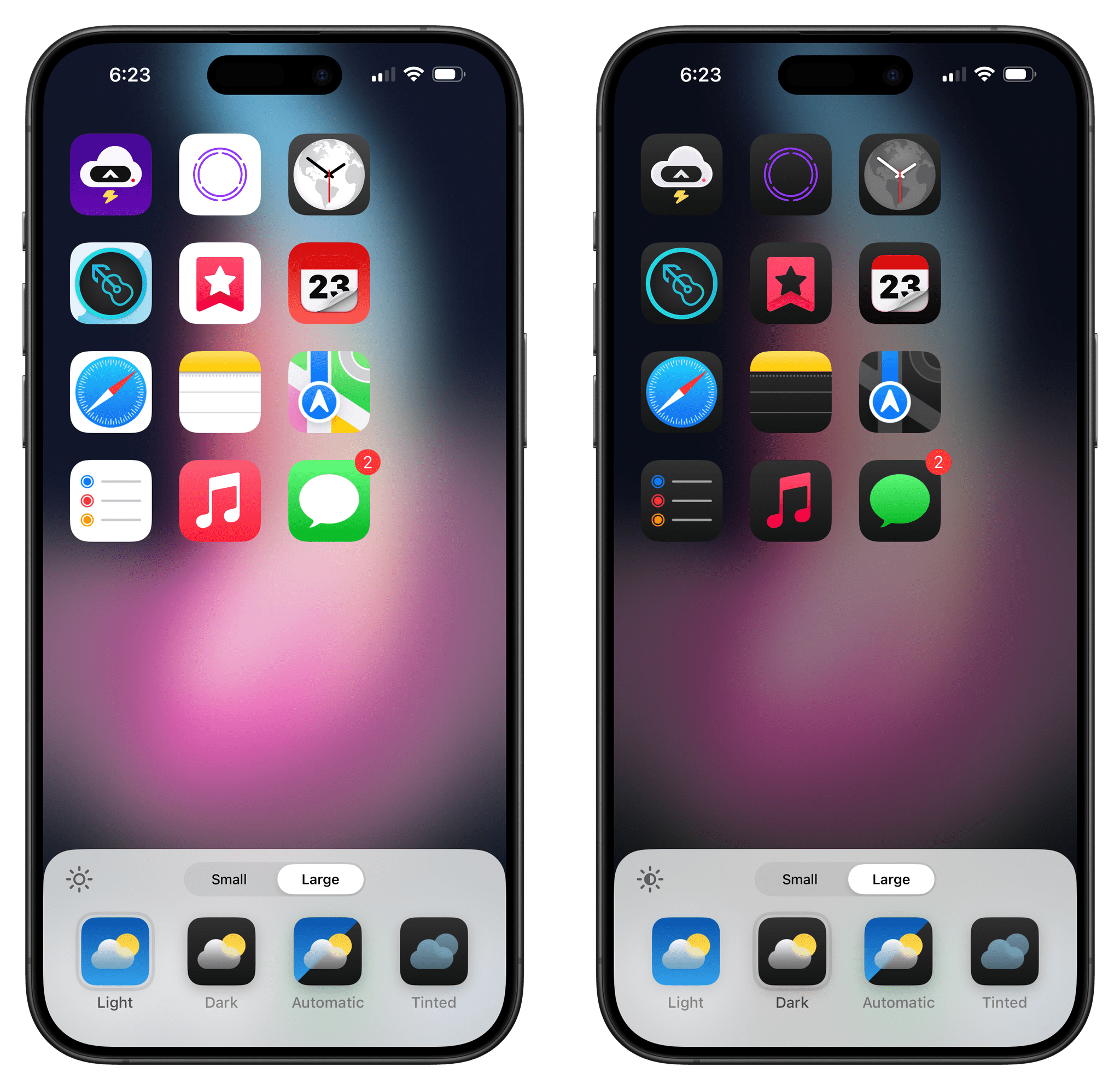
By all accounts, the idea makes sense: a lot of people like to use their devices in dark mode all the time, and when they do, they probably want their Home Screens to match the dark appearance of the operating system. Five years after the introduction of native dark mode for the iOS interface, there is now native dark mode for Home Screen icons too. You can choose to manually enable dark icons, or it can be automatic so that when dark mode is activated, icons switch to their dark versions as well.
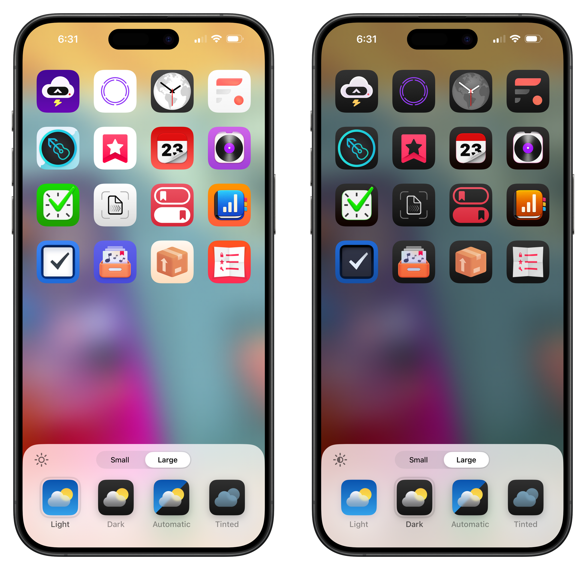
To make dark icons possible across a large spectrum of apps, Apple has done a couple of things. For starters, they’ve provided developers with guidance and new tools to specifically design dark versions of their icons that they can embed in their apps. While Apple’s system apps follow the basic guidelines and mostly swap white backgrounds with dark ones and apply more muted colors to enclosed glyphs, I’ve seen third-party developers come up with more interesting and fun takes on dark mode icons. Be on the lookout for third-party apps that don’t simply ship dark icons with inverted colors but instead offer dark icons with carefully chosen hues and ornaments that vibe with the system’s dark appearance.
But what if a developer doesn’t explicitly add support for iOS 18’s dark icons to their app? In that case, the system tries its best to intelligently modify a light icon so that it looks good as an automatically-generated dark one.
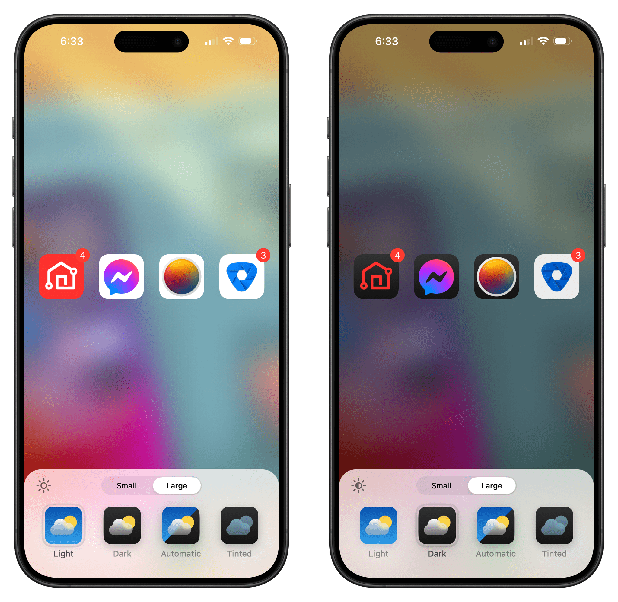
iOS 18 can automatically create dark icons for apps that haven’t been updated for the new OS yet, but it doesn’t always work, as seen with the Meta View icon above.
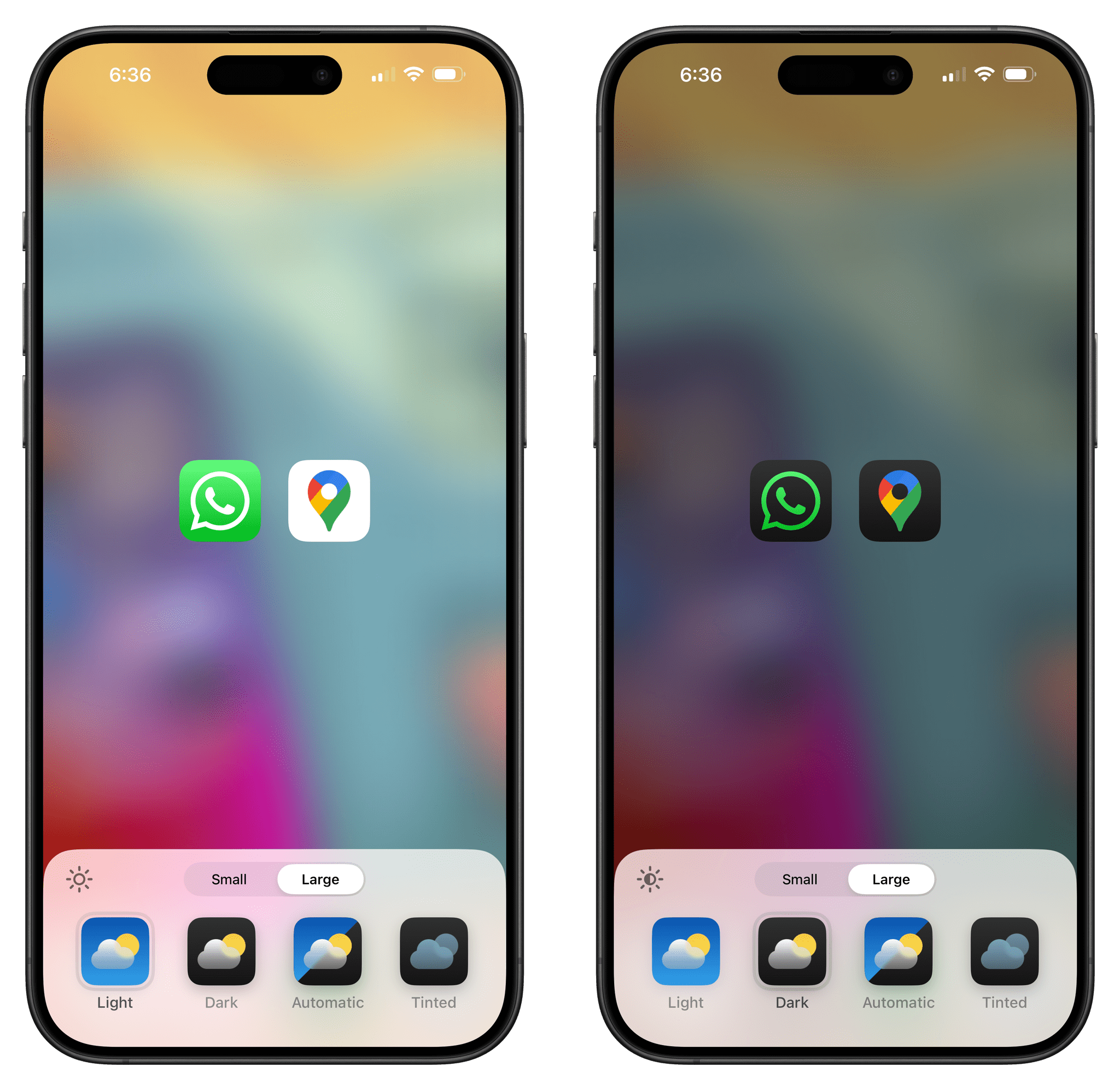
Look at the following examples I captured ahead of iOS 18’s release with the iOS 17 versions of WhatsApp and Google Maps. WhatsApp’s icon features a green background with a white glyph, and Google Maps’ icon has a white background with a colorful glyph. When dark mode is enabled, iOS 18 automatically extracts the key green color from WhatsApp’s icon (which is actually a gradient) and makes it the main glyph color in the dark icon. For Google Maps, the system switches the white background to dark gray and keeps Maps’ colors mostly intact; it only ever-so-slightly dims the yellow color, but the alteration is imperceptible.2
I don’t know how, exactly, Apple fine-tuned their algorithm that switches light icons to dark ones, but I have two thoughts about it.
First, it’s a clever system that ensures the majority of app icons on users’ devices will support the new dark appearance in iOS 18 even before they get officially updated for the new OS. There are still going to be plenty of instances where icons won’t be supported by Apple’s color inversion algorithm, though, which is why I hope third-party developers get onboard with this new iOS 18 feature quickly.
Second, automatic conversion of icons to dark mode is part of a bigger design narrative in iOS 18: Apple is not so religious about keeping the original vision of icon designers anymore. In fact, this is part of the updated agreement for third-party developers on Apple platforms. At any point, users or the system may alter an app’s Home Screen icon by either making it dark or – as we’ll see below – tinting it with any color they want. We’re moving on with the times, and I’m in favor; however, as someone who started using the Mac back in the days of the delicious generation of apps and carefully rendered 3D icons, this feels like a drastic change nonetheless.
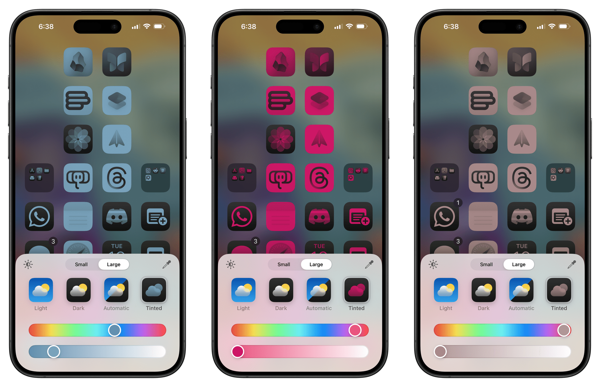
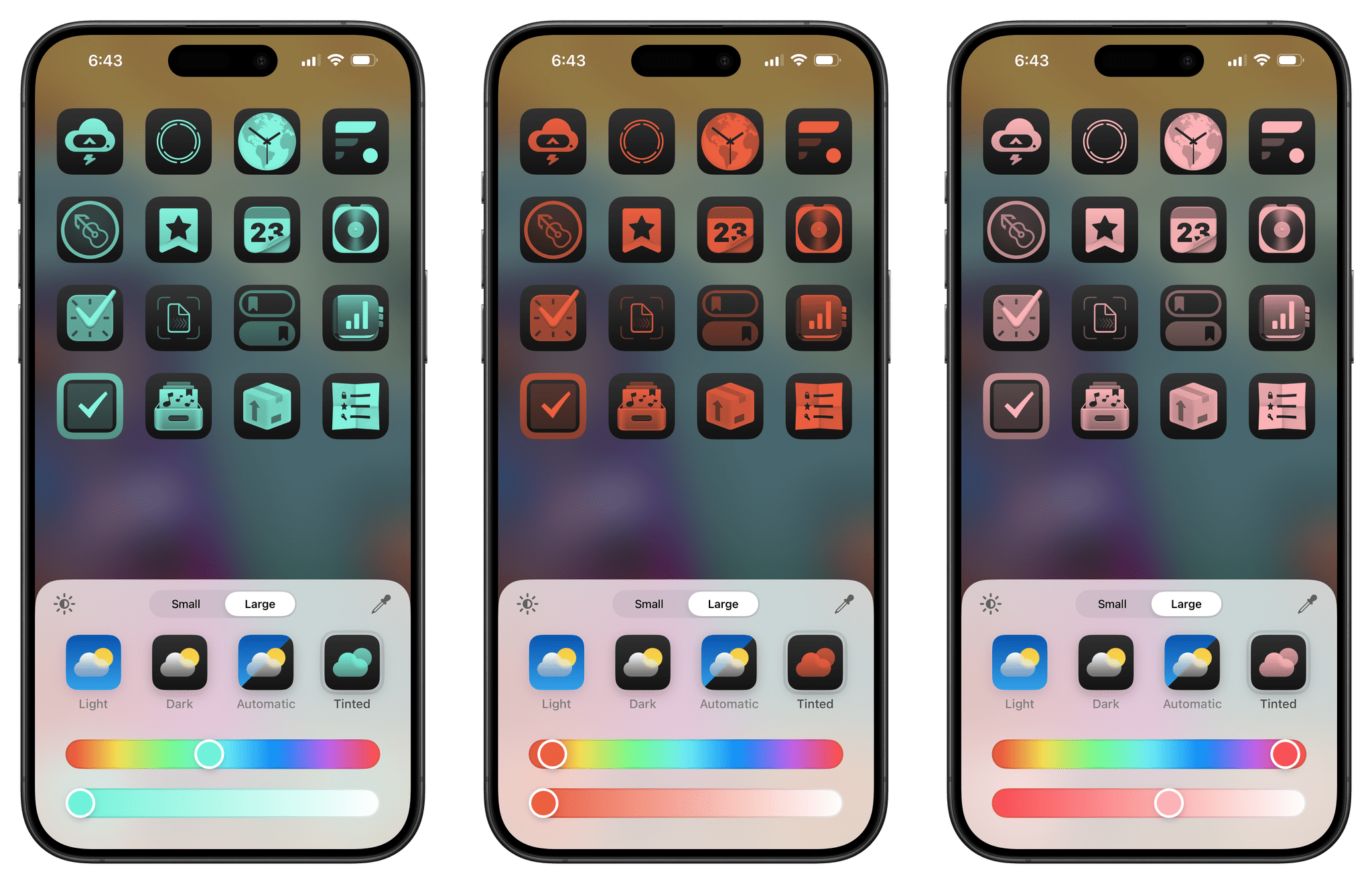
It’s with this context in mind that we now get to the most visually-contested functionality of iOS and iPadOS 18 – icon tinting. The concept is fairly simple: from the same Customize menu, you can select the last item and choose to make every icon on every Home Screen any color you want. There’s a color slider, an intensity slider, and an eyedropper tool to extract a specific color from the Home Screen to use on icons.
My opinion is equally simple: the results of this feature are generally atrocious, there should be more options to tint only certain icons, and even when I do manage to find a color combination that looks passable, this is not my style. iOS 18’s tinted icons remind me of digital brutalism. At the same time, I guess some people may appreciate this feature and craft wallpaper and icon combos that look alright; for this reason, I’m glad Apple added the functionality, even if it’s not for me.
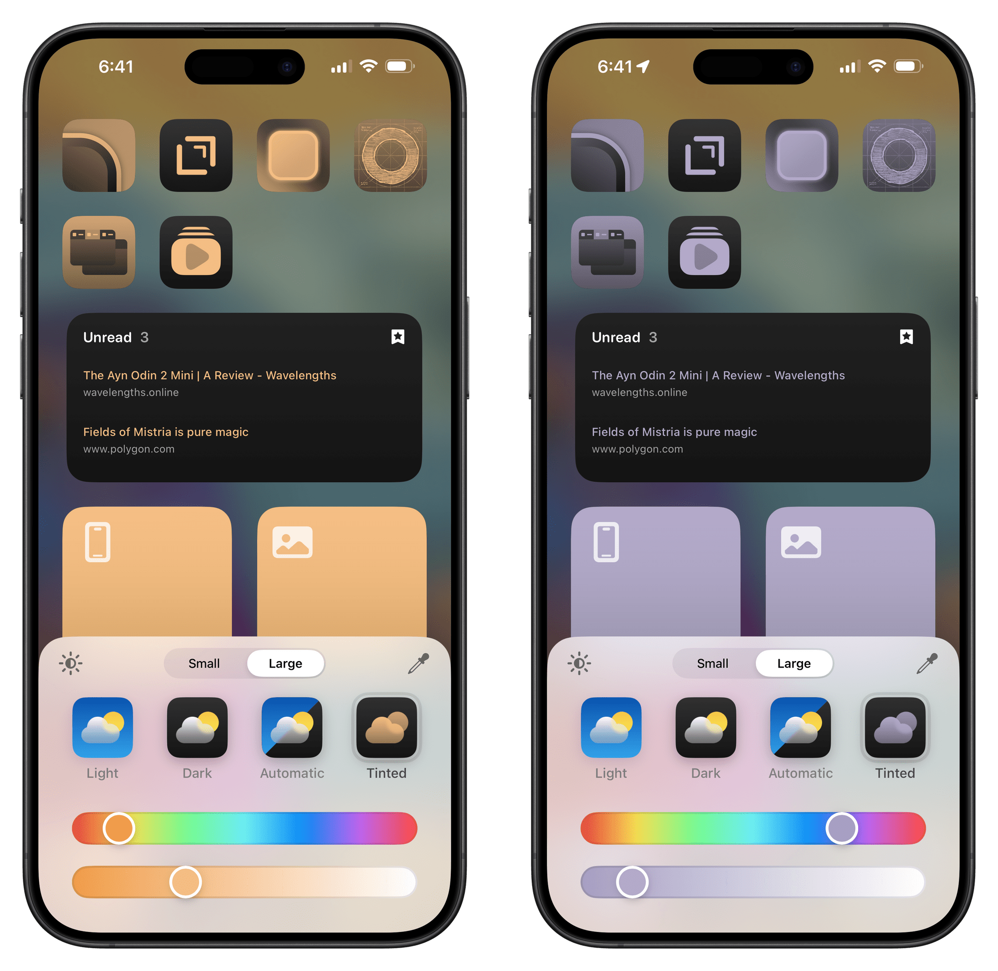
Color tinting also applies to widgets. There is a way to create decent results by extracting colors from the wallpaper and tweaking their intensity, but I’m not a fan.
For now, a lot of tinted icons also look bad because their developers aren’t explicitly supporting tinted variants in iOS 18. Apple is giving developers a system to separate background colors from tintable elements in their icons. When apps support this new rendering mode, the results can be decent enough, as seen in the examples below:
My problem with tinted icons right now is that, unlike the Lock Screen, it’s entirely possible to make something that looks downright horrible, either because you picked a gaudy color or because an icon hasn’t been optimized for tinted mode. In the latter case, the resulting tinted version will look like an overlay of color has been spread on top of the original icon, removing most of its identity and contrast between elements.3
But the thing is, it would be hypocritical of me to be in favor of more user controls and customization only when those features suit my taste. And since, ”De gustibus non est disputandum”, if some people like using tinted icons, so be it. It’s one more customizable aspect of the iOS Home Screen that will resonate with others instead of people like me.
By the same token, if the argument in favor of system-wide icon tinting is that users should be able to whip up any color aesthetic they want, then Apple should have gone all-in with this option in iOS 18. The biggest limitation of the feature is that it’s an all-or-nothing affair: you either tint all of your icons, or you don’t tint any of them. You can’t, say, make all your finance apps green, social apps blue, and productivity apps red. The system does not let you apply colors on a per-icon basis; it doesn’t even let you apply tinting on a per-page basis.
From the outside, it almost looks like Apple chickened out at the last second and omitted the obvious ability to tint icons individually. If the goal was to offer a native, free alternative to the multi-color icon packs teens download from Gumroad or TikTok videos, this feature will fail them with its lack of controls for individual icons and pages.
Icon tinting is not for me, and I’m never going to use it in its current flavor. Regardless, I’m glad Apple is exploring uncharted territories with visual customization, and I hope they iterate on this functionality in the short term, without waiting until iOS 20 in 2026.4
Minor Lock Screens Changes
As we’ll see in the next section, there is a big change coming to the iOS 18 Lock Screen with the ability to finally swap out the flashlight and camera buttons with other types of native controls. Before we get to that, however, I want to mention two smaller changes to the Lock Screen this year.
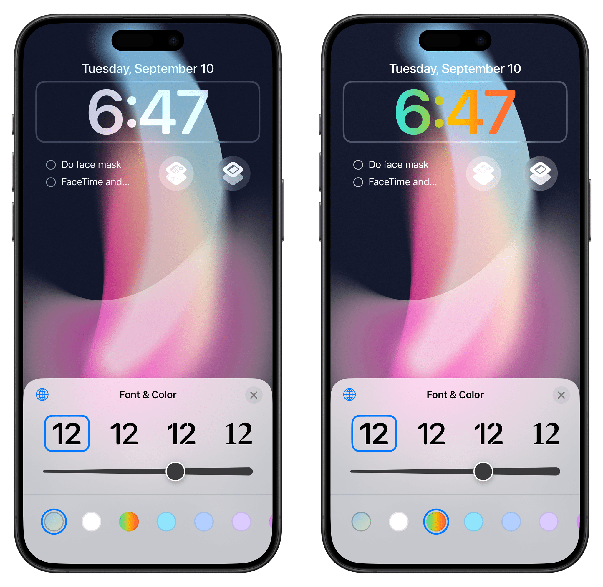
The first one is a new rainbow color option for the clock. Unlike other options in the color picker, the rainbow only applies to the clock and does not tint widgets. That’s too bad; I would have liked to see my reminders on the Lock Screen in six colors.
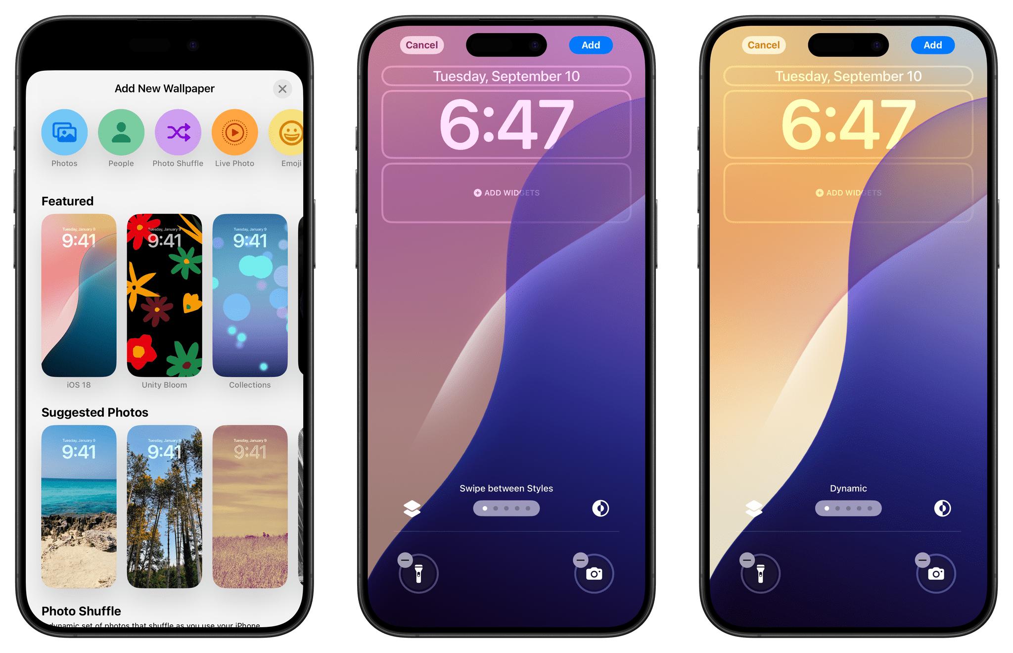
The second new feature is the ‘iOS 18’ wallpaper, a colorful, wavy wallpaper that has one unique characteristic: it comes with a ‘Dynamic’ setting that lets it change colors based on the time of day.
If you like this style of wallpaper but get bored too easily with just one color combination, then this option is for you. Without you doing anything, this wallpaper will dynamically change colors to keep things fresh.
- I had to check with a color picker that the yellow color was indeed changing. ↩︎
- The difference between a non-optimized tinted icon and an optimized one for iOS 18 can be fairly dramatic. ↩︎
- Simply writing "iOS 20" made me feel older than Stephen. ↩︎
