iPadOS 18
Until a couple of weeks ago, I didn’t know if I was going to write a dedicated iPadOS chapter for this review. As you’ll see further down below, there are only a couple of iPad-specific features worth covering in a standalone chapter outside of the broader context of iOS.
This is the second year in a row that we’ve seen Apple barely touch iPadOS. And like last year, there’s a plausible excuse this time around, too: some might say that Apple in 2024 was too busy with Apple Intelligence to pour more resources into iPadOS – a platform which, as I’ve covered before, is in dire need of a fundamental rethink to get the basics right.
The more I thought about it, though, the more I realized that there should be a chapter for this very reason – to point out how little Apple has done for iPadOS, and to remind Apple folks reading this review that it is a shame.
While the company is busy finding an identity for its expensive headset without a strong app ecosystem, building swiveling HomePods with a screen, and following the rest of the industry in an LLM-measuring contest for who’s got the biggest model, iPad users like me are just here, shrugging off another year of almost no new features, still enamored with a platform that Apple seemingly develops by inertia as an expensive passion project.
That’s the thing about the iPad and iPadOS: it’s still my favorite computer Apple makes, and I wouldn’t use anything else as my main computing platform. But sometimes, it feels like iPad users like me are an anomaly, a glitch in a system that doesn’t want to see the iPad as anything even remotely resembling a desktop-class computer.
I don’t want to rehash everything I wrote back in May, which still holds true today. Instead, let’s talk about the few iPad-specific features in iPadOS 18.
Home Screen and Control Center
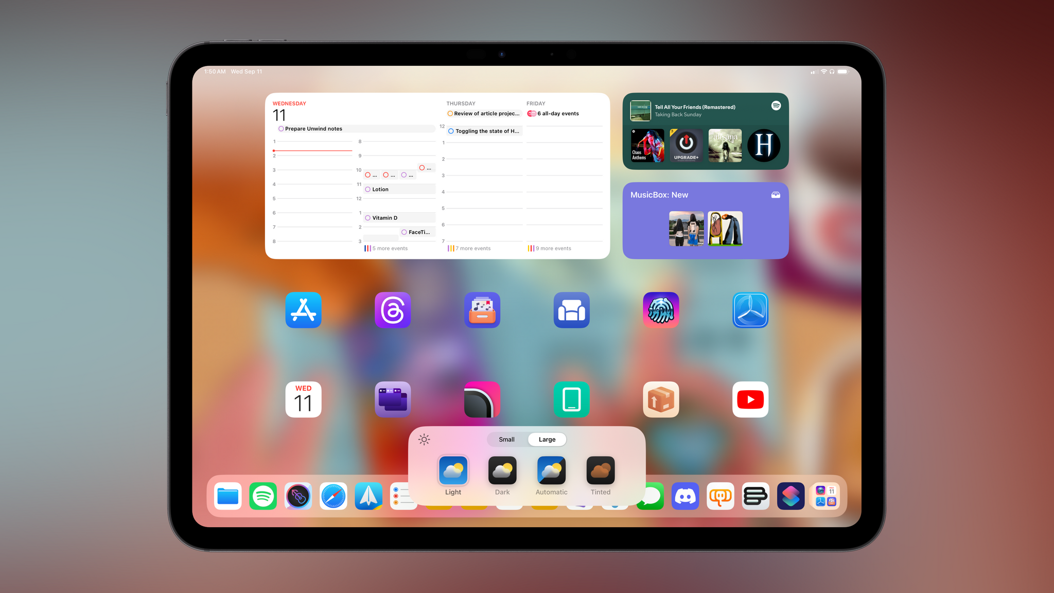
In a break from tradition, iPad users won’t have to wait until iPadOS 19 to take advantage of the new features introduced in iOS 18. Dark and tinted icons, the ability to place icons anywhere, and the new Control Center are also launching on iPadOS 18, and there’s…very little to say about them that I haven’t already shared in the previous chapter.
While it’s a bit absurd to be in a situation where one has to be grateful that the iPad hasn’t been left behind, here we are. On the Home Screen front, the Customize menu pops up from the bottom of the screen like a floating card but otherwise contains the same options seen on iOS:
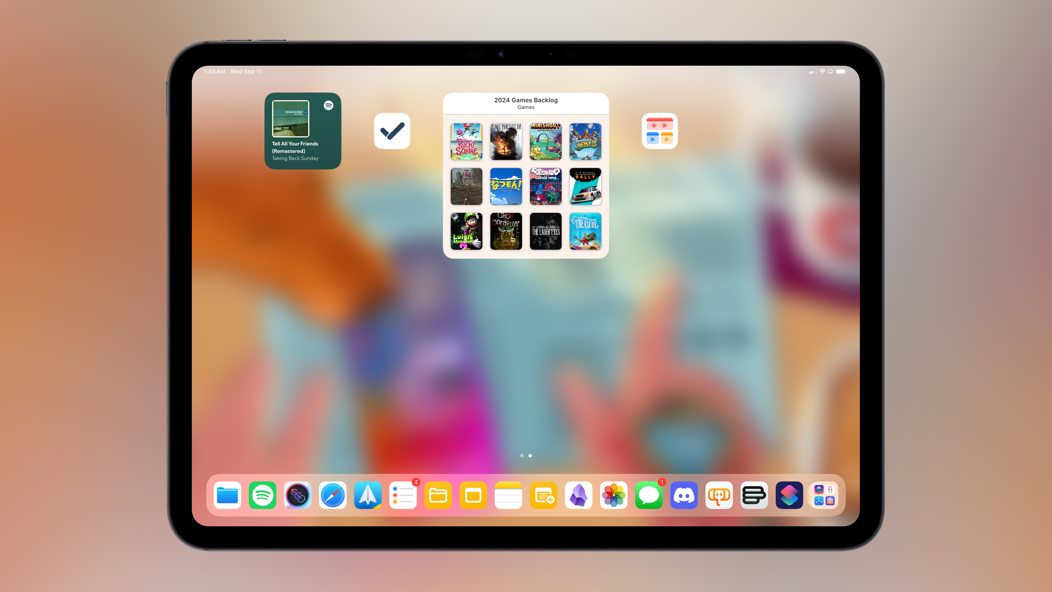
As far as rearranging icons goes, iPadOS comes with its own set of quirks. On the iPhone, you can’t put a small widget next to a single icon; here, you can only put a single icon in between widgets – you can’t put two icons between them. Does this make sense to anyone?
I don’t have anything else to share regarding the iPadOS Home Screen that I haven’t already explained in the previous chapter. “At least we have it this year” is the takeaway, I suppose.
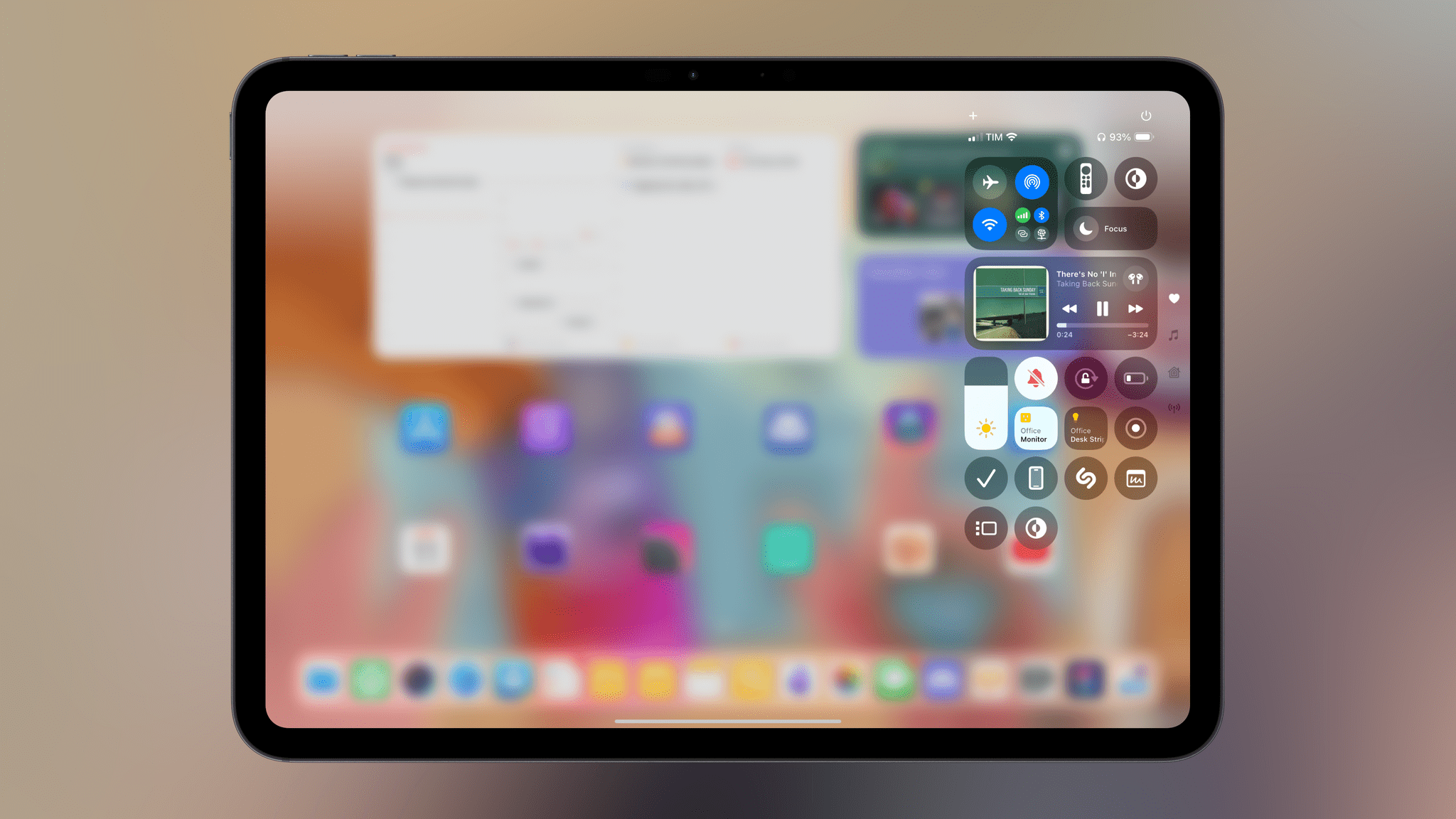
Moving on from such high praise, we also have the new Control Center on iPad, and it’s…the iPhone version, tucked in a corner of the screen:
Now, you may wonder: “But Federico, if the iPad’s screen is larger than an iPhone’s, why is Control Center still a narrow column that blurs everything else? Why aren’t multiple pages shown as columns?”
Dear reader, I wish I had an answer for you. It’s not just that Control Center doesn’t sync between devices, it’s the narrow column and the stubbornness of this design that kills me. There is a large canvas that could be used for bigger controls, multiple columns, and interesting layouts to turn Control Center for iPad into a dream dashboard-like product. Instead, all we got is a lazy port of the iPhone version.
But hey, at least you can still hit Globe + C to invoke Control Center from an external keyboard! (You still can’t navigate items with the arrow keys.)
Sidebars and Tab Bars
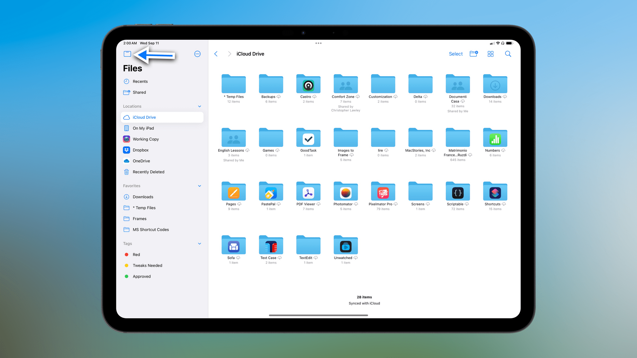
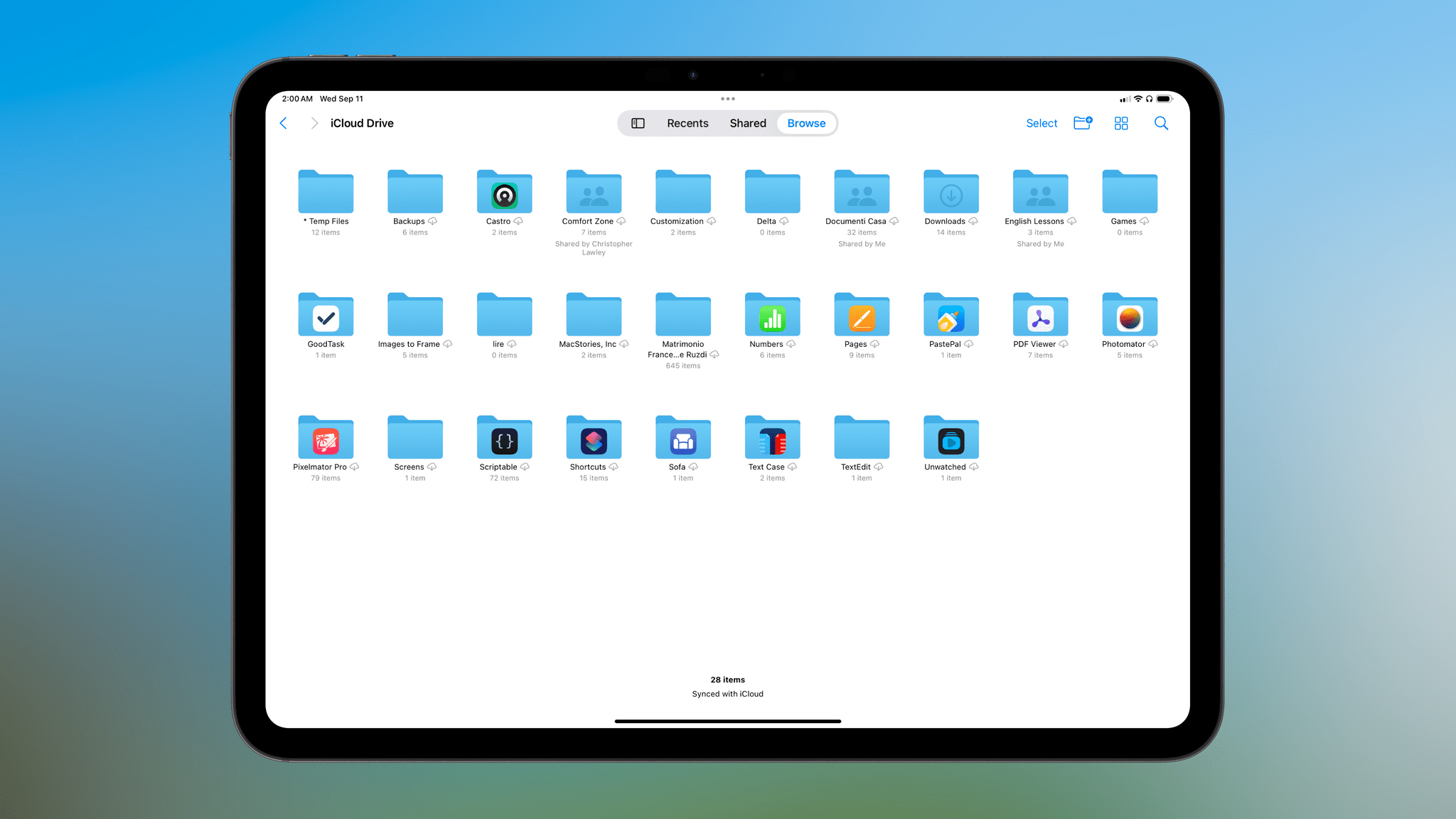
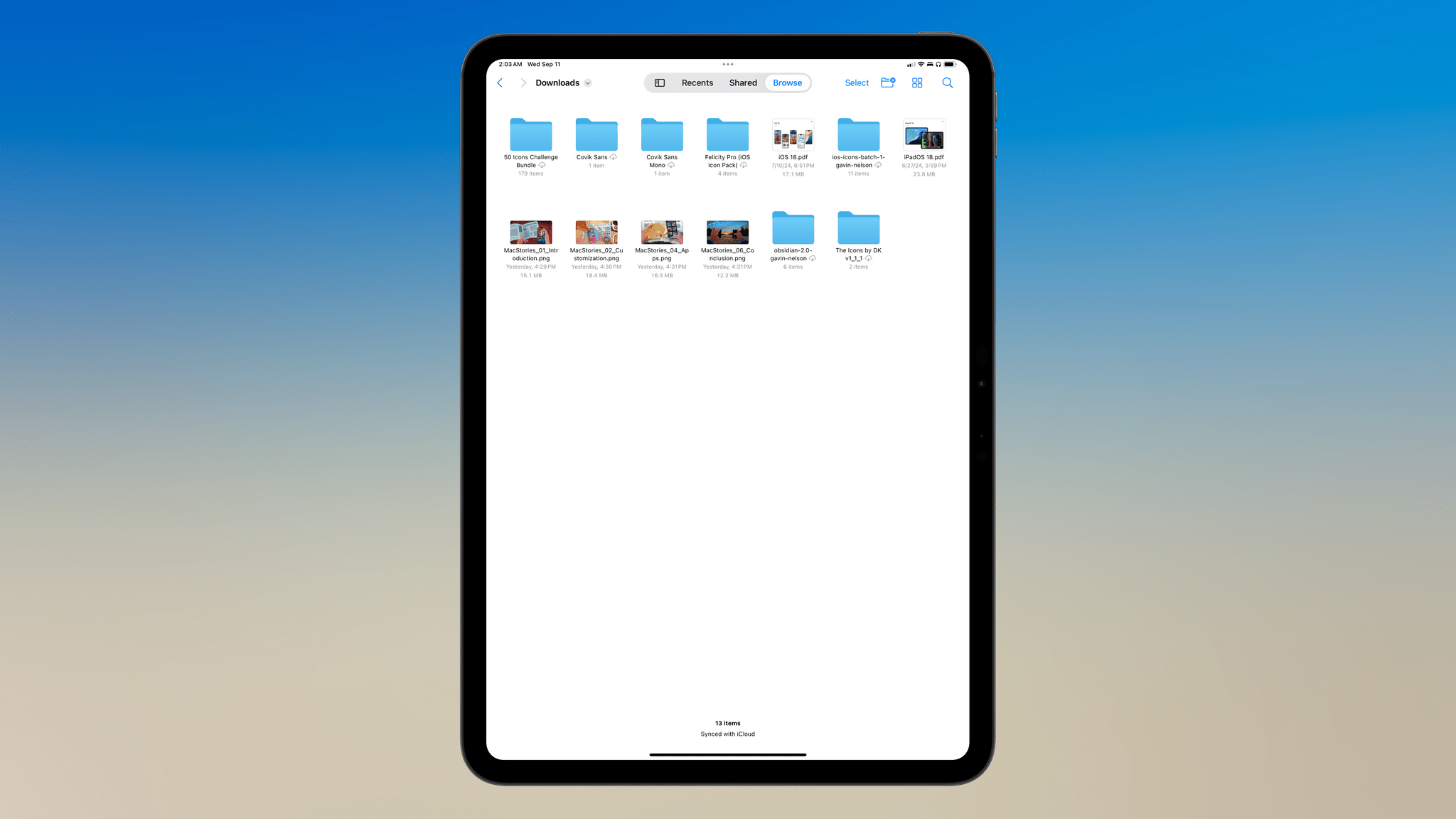
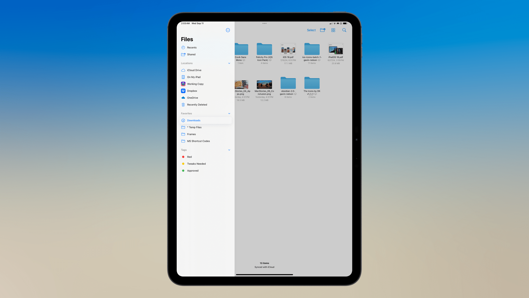
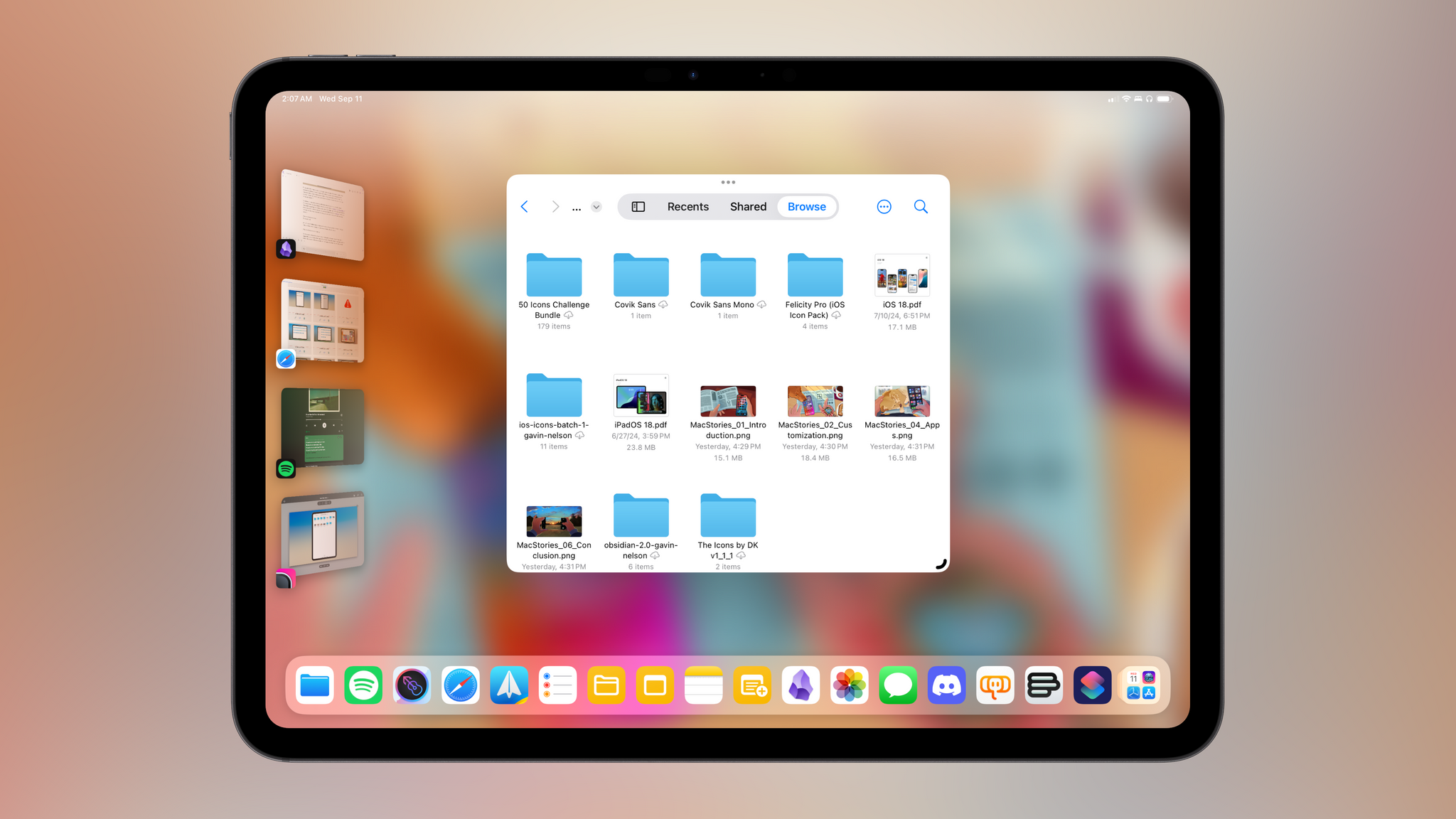
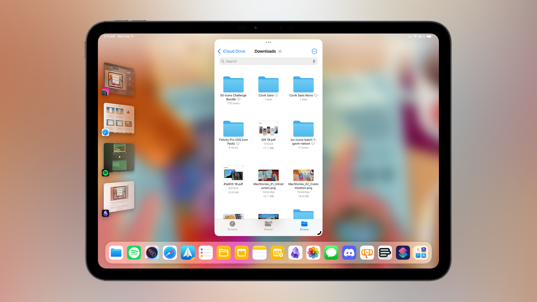
I wrote about this new iPadOS feature back in June, and I’m as unconvinced by it now as I was back then. iPadOS 18 introduces a new, optional navigation mode that can coexist alongside native sidebars: tab bars. By activating a toggle in the top-left corner of a sidebar, users can collapse it into a more compact tab bar at the top of the screen that saves horizontal space and boils navigation down to fewer items. A good example of this feature in practice is in Files, where you can toggle between the existing sidebar and the new tab bar:
As you may expect, the new tab bar is enabled by default when an app is turned to portrait orientation; the sidebar is still accessible, albeit with a modal appearance.
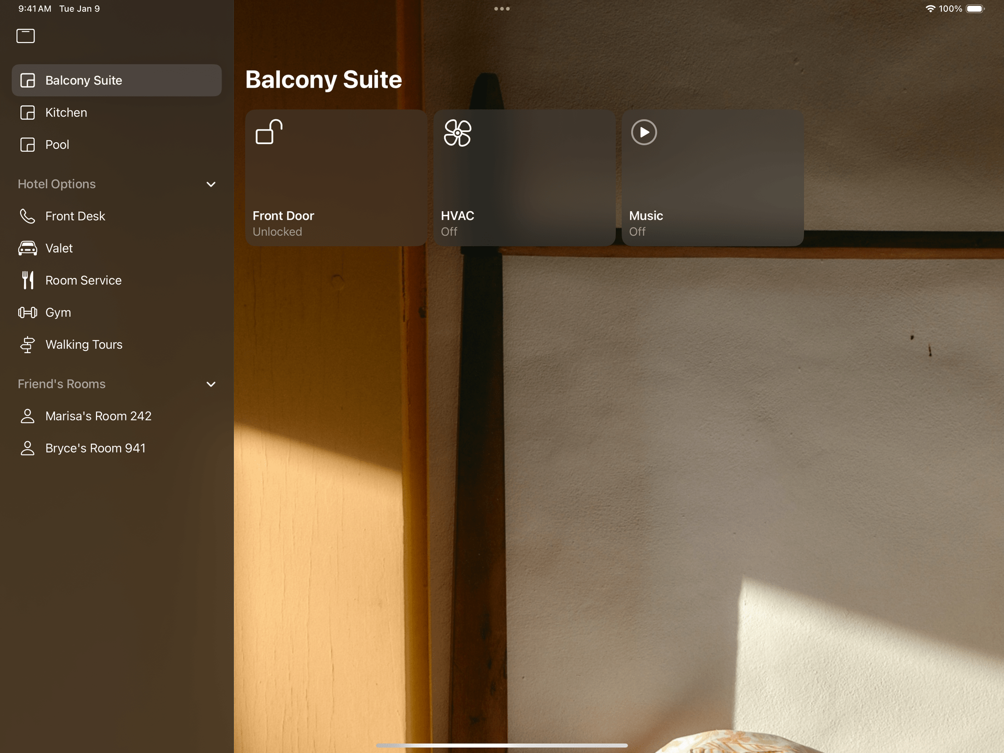
Thanks to this review’s sponsor, the excellent DetailsPro app for iOS/iPadOS designers and developers, I was also able to commission a prototype app (which you can download and test for yourself here) that showcases the transition between sidebar and tab bar in action. As you can see in the images below, iPad app developers can still create sidebars with custom glyphs and sections:
At any point, the sidebar can be collapsed, with primary sections ending up in the new tab bar. The tab bar is customizable and allows for navigation across multiple sections:
The new iPadOS 18 tab bar sounds like a good idea on paper. It’s a smart system that automatically reflows between sidebars and tab bars, saves horizontal space when necessary, and puts more emphasis on content when activated. So why is it that, this summer, I’ve seen so few third-party developers adopt it this summer and I’m not too enthusiastic about it myself?
For starters, the new tab bar comes with some notable trade-offs, including fewer affordances than old-school bottom tab bars or even modern, iPadOS 14-style sidebars. Tabs don’t support glyphs and text labels being used together, their appearance doesn’t always scale well to international scripts, and since both tab bars and toolbar items are now clustered in the same area of a window, you can easily end up with the following scenario:
With a “regular” bottom-oriented tab bar (which is still supported in iPadOS 18 if you make a window small enough), the above issue simply doesn’t occur:
For this reason, it doesn’t surprise me that third-party developers haven’t rushed to support the new tab bars in their apps. It also doesn’t help that Apple’s implementation in iPadOS 18 has been wildly inconsistent, with two apps adopting the new tab bar with completely different results.
The most versatile and feature-complete version of the tab bar I’ve seen is in the updated Music app coming next month with iPadOS 18.1. In the app, not only can you transition at any point from sidebar to tab bar, but this flavor of the tab bar is customizable. Click the ‘Edit’ button in the sidebar, and in addition to rearranging or hiding entries in the sidebar, you’ll also be able to drag shortcuts to your favorite sections into the tab bar. If you add multiple entries, the tab bar even lets you scroll inside it to view more items.
Music has the best implementation of iPadOS 18 tab bars, but I still prefer classic sidebars.Replay
I love the implementation here: you’re not forced to use either mode, but if you want to use the new tab bar, you can even add your favorite playlists or Apple Music sections in there. Tab bar customization is an official API available to third-party developers too.
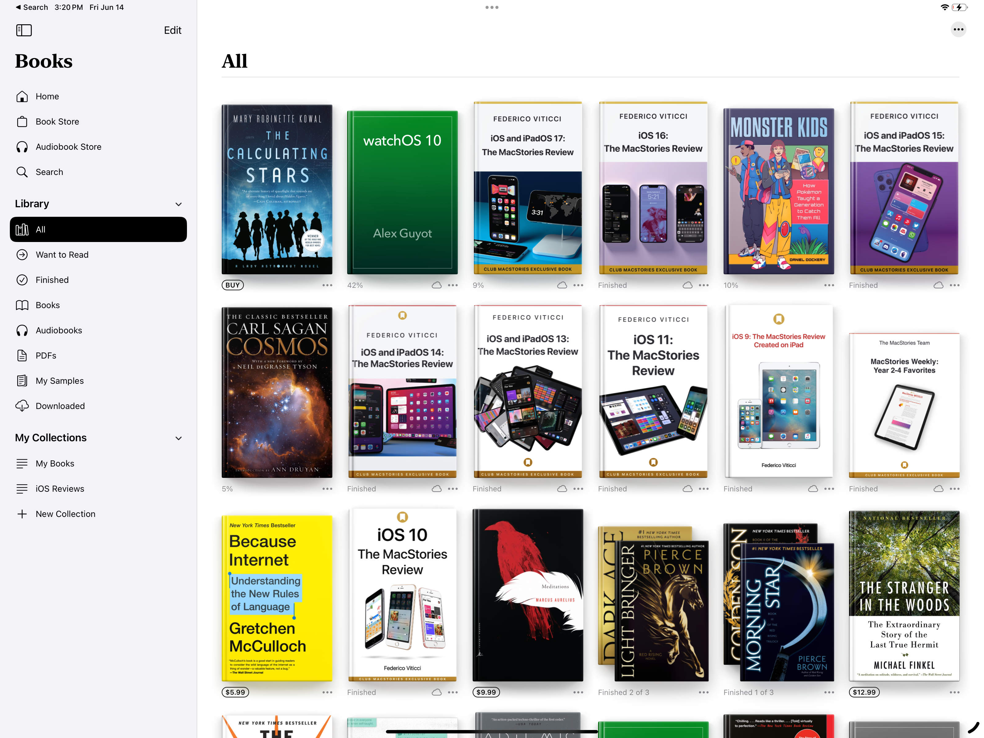
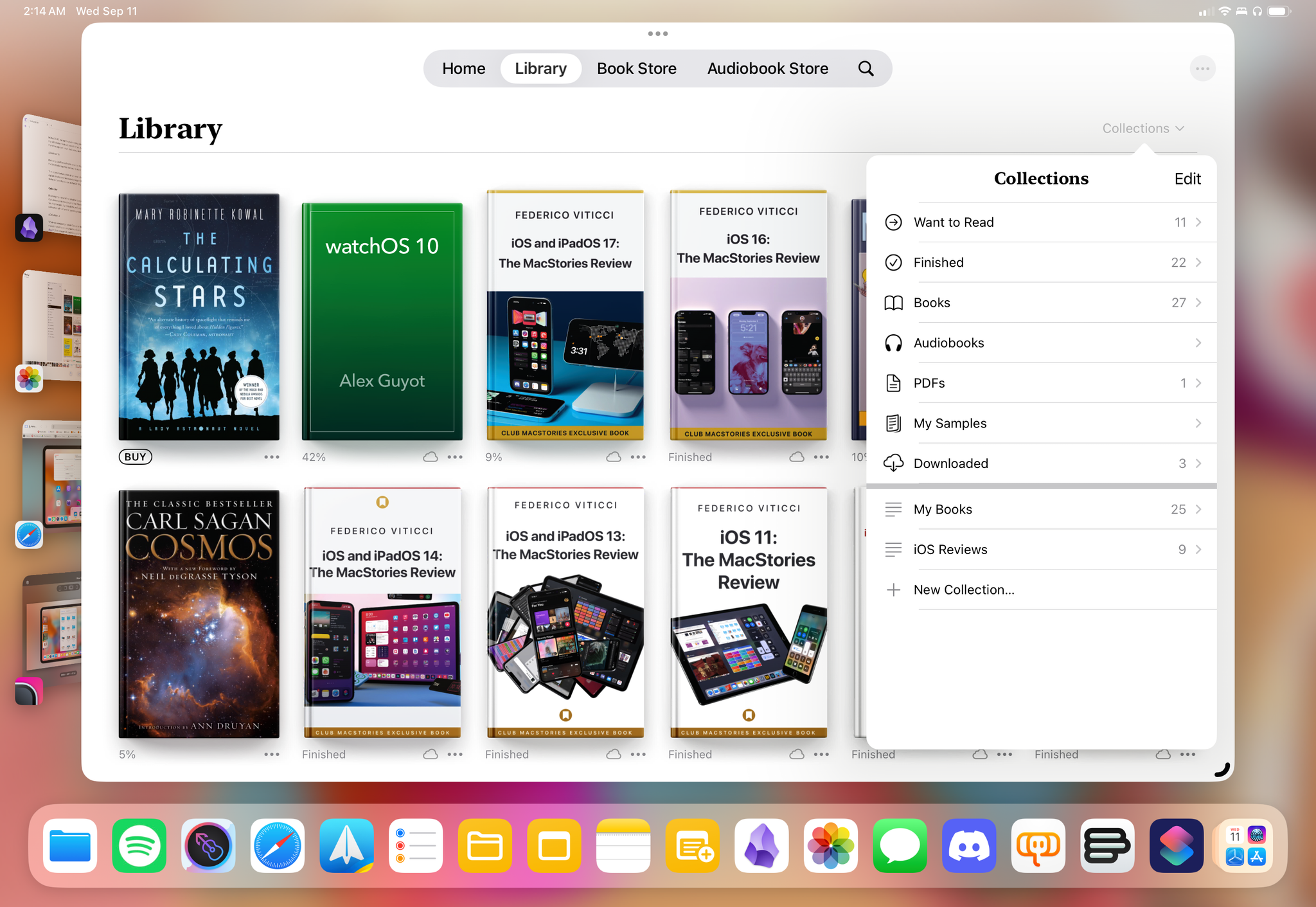
Concerningly, however, adoption of new tab bars in Apple’s apps suggests that the company may also see them as a way to oversimplify iPad interfaces in an era when the iPad user base is asking for more flexibility from iPadOS. Take a look at what happened to the Books app, for example: in iPadOS 17, it featured a sidebar with easy access to sub-sections for collections:
In iPadOS 18, the app has been redesigned with a new tab bar and no option to switch back to the old sidebar mode. As a result, if you want to view collections now, you have to find them in a popover inside the Library view.
I honestly don’t know how to describe this change. Before iPadOS 18, did anyone think that the Books app was too hard to use and had to be simplified?
The inconsistent adoption of tab bars in Apple’s iPad apps is perplexing, which may explain developers’ hesitance to support the feature. I’m curious to see how this will shake out over the course of iPadOS 18’s life cycle.
Calculator
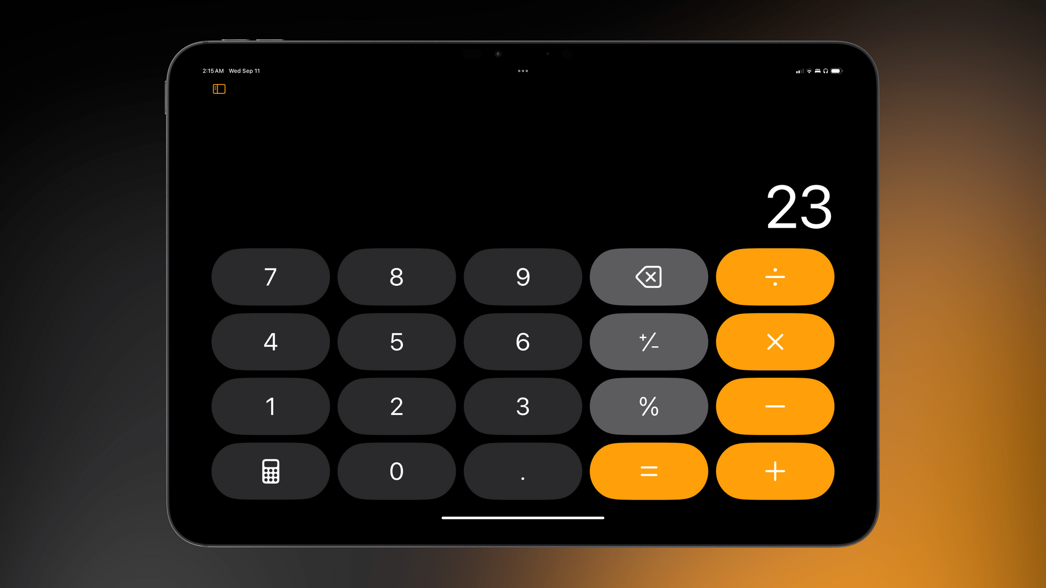
Following the arrival of the Weather app on iPad two years ago, it is now time for the Calculator app to move beyond the iPhone and Mac with a dedicated tablet version. As you might expect, by default it’s, well, a giant calculator that lets you perform basic calculation with either the touch keyboard or an external one.
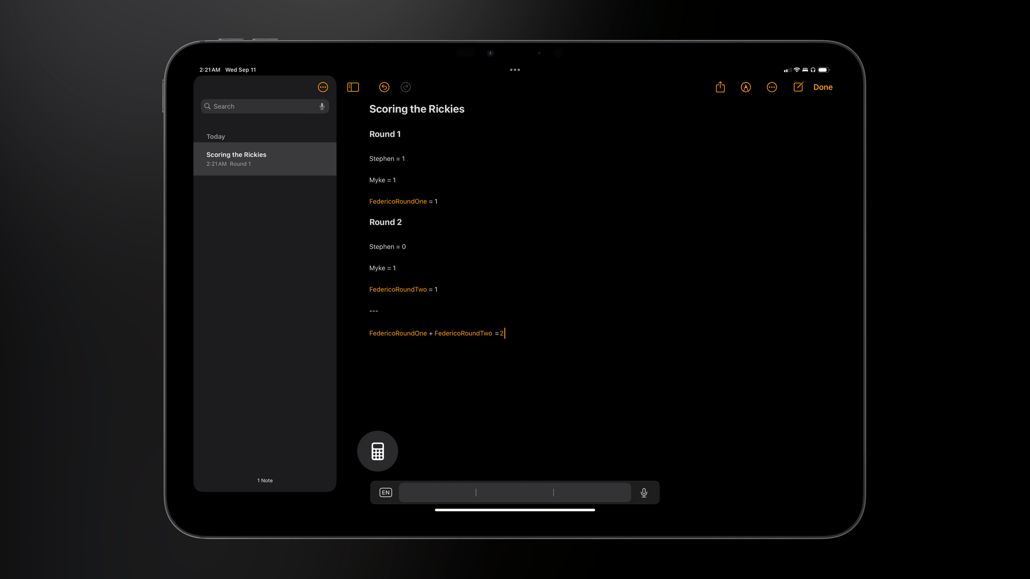
What was unexpected about Calculator finally coming to iPadOS was Apple’s decision to make it more than an enlarged rendition of the iPhone UI. As John covered in a separate story, the company turned Calculator for iPad into something greater than a mere port with the addition of Math Notes, a blend of Notes and Calculator that lets you write down – either via the Pencil or the keyboard – calculations in plain text and have results magically appear after entering the equal sign.
I’m not the target user for Math Notes, and I won’t repeat what John already explained in his standalone article. Suffice to say, however, that I think turning Calculator into a full-featured product is a fantastic idea to make it worth the wait. I’m particularly impressed by the two-way integration between Calculator and Notes. It’s another example of Apple cross-pollinating its apps with features shared between two different interfaces with a common data store that adapts to each app. We got a first glimpse of this sort of integration years ago with Stocks and Apple News; it continued with News and Apple Music , then Podcasts and Apple Music; and this year, we’re getting Math Notes in two apps, Reminders in Calendar, plus phone call transcriptions in Notes.
Whether this is the beginning of a new trend amongst Apple’s apps, it’s difficult to say now. But you can bet it’s something I’ll be watching closely over the next several months.
The New Document Browser
I chronicled all of my struggles with file management on iPadOS in my story from May, and as we established at the outset, this review won’t rehash all of those problems. All you need to know is that iPadOS 18 offers very little to address those issues.
With that in mind, would you believe me if I told you that the one document-oriented change in iPadOS 18 is aimed at facilitating…branding for apps?
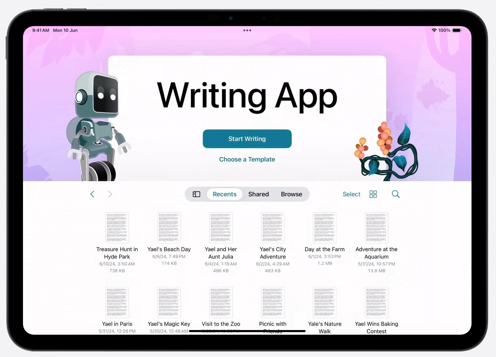
That’s right. For the first time since its introduction in iOS 11, the document browser embedded within apps doesn’t have to look like the Files app anymore. Instead, developers can now display the name of their app and a logo, add primary and secondary buttons, and use any graphical background they want.
I mean, don’t get me wrong: the new document browser looks nice. But it’s like buying nice sheets for a bedroom that has a mold problem. Common sense would suggest you take care of the insalubrious air first. And yet, for all the file management issues of iPadOS, Apple thought now would be a great time to let developers add mascots to their document browsers.
Fine, I lied. I am going to repeat one small bit from my iPadOS story in May:
I started using the iPad as my main computer when I was stuck in a hospital bed and couldn’t use a laptop. I kept using it because once you get a taste of that freedom, it’s hard to go back. I will continue using it because none of the alternatives match Apple’s hardware quality, app ecosystem, and pure delight. But loving something doesn’t mean ignoring its flaws. And iPadOS is a flawed operating system that still doesn’t get the basics right and, as a result, drags down the entire product line.
I rest my case.
