Photos
Beyond customization and Passwords, I’d argue that the other notable change in iOS 18 is the redesigned Photos app.
As I wrote on MacStories two months ago, I was wrong about the new Photos at first. Having used iOS 18’s Photos app every day since June, not only do I think Apple managed to invent a new design paradigm for SwiftUI-based, library-centric apps on iOS, but they’ve also created an app that is going to help people rediscover old memories more effectively and serendipitously than before.
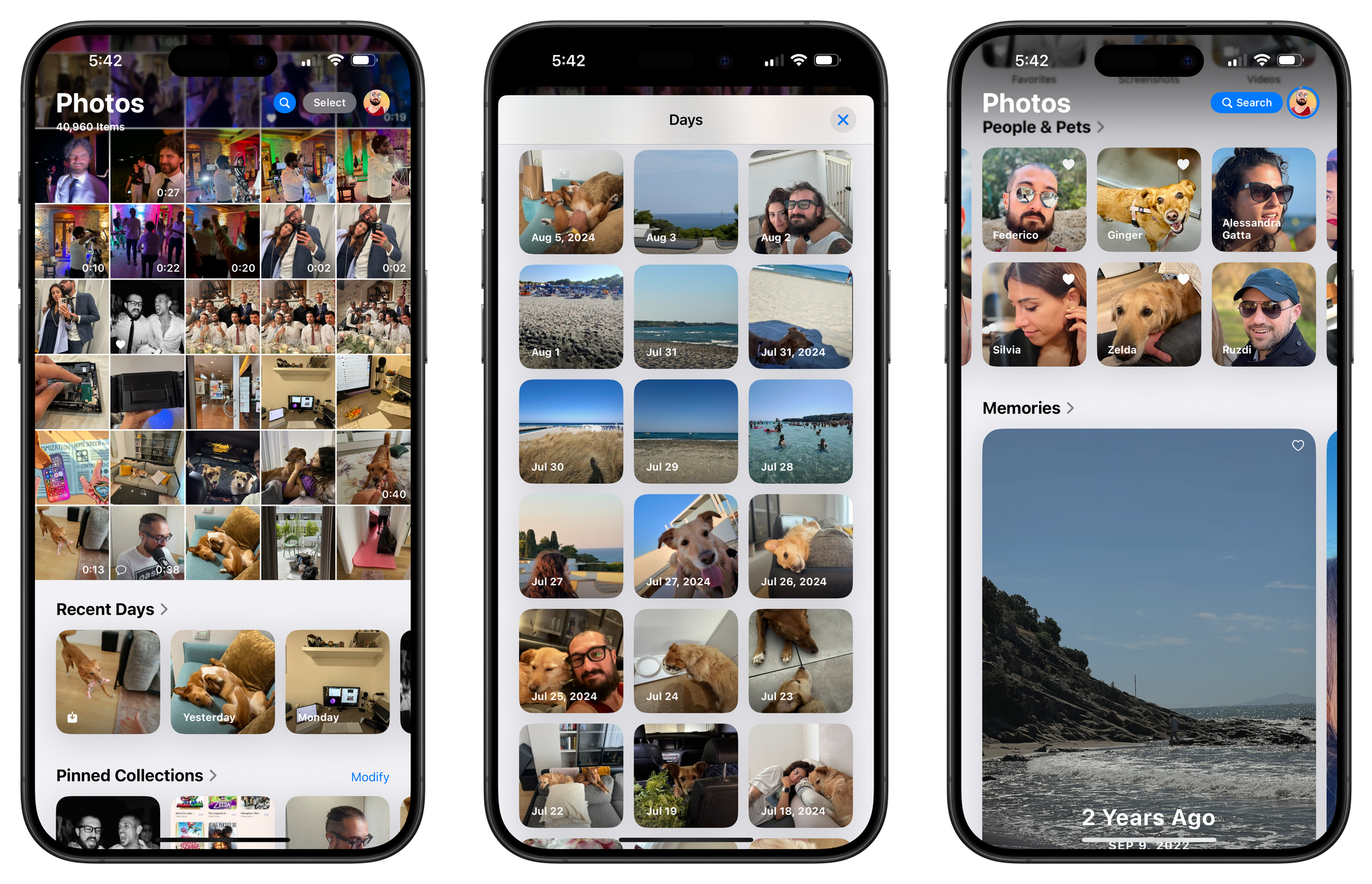
The concept behind the new Photos app is fairly straightforward to grasp, yet antithetical to decades of iOS UI conventions. Rather than splitting different app sections into multiple tabs, everything has been collapsed into a single page that you can scroll to move from your library to various kinds of collections and suggestions. And that’s not at all; this fluid, single-page layout (which is powered by SwiftUI) is also highly customizable, allowing users to fine-tune which sections they want to see, and in what order, below the classic grid of photos.
It’s easy to understand why the move from a tabbed interface to a unified single-page design may – at least in theory – bolster discovery inside the app: if people aren’t using the app’s other sections, well, let’s just move all of those sections into the screen we know they’re using. Or, think about it this way: we already spend hours of our lives discovering all kinds of digital information – news, music, memes, whatever – by scrolling. Why not use the same gesture to rediscover photos in our libraries, too? (Kind of like the opposite of doomscrolling, if you will.)
With the new Photos app, I think Apple designers have achieved an ideal balance between tradition, discovery, and customization.
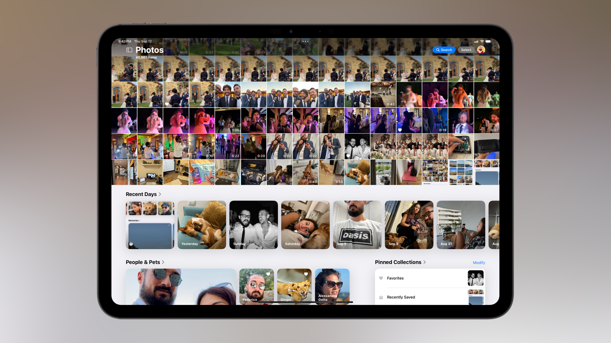
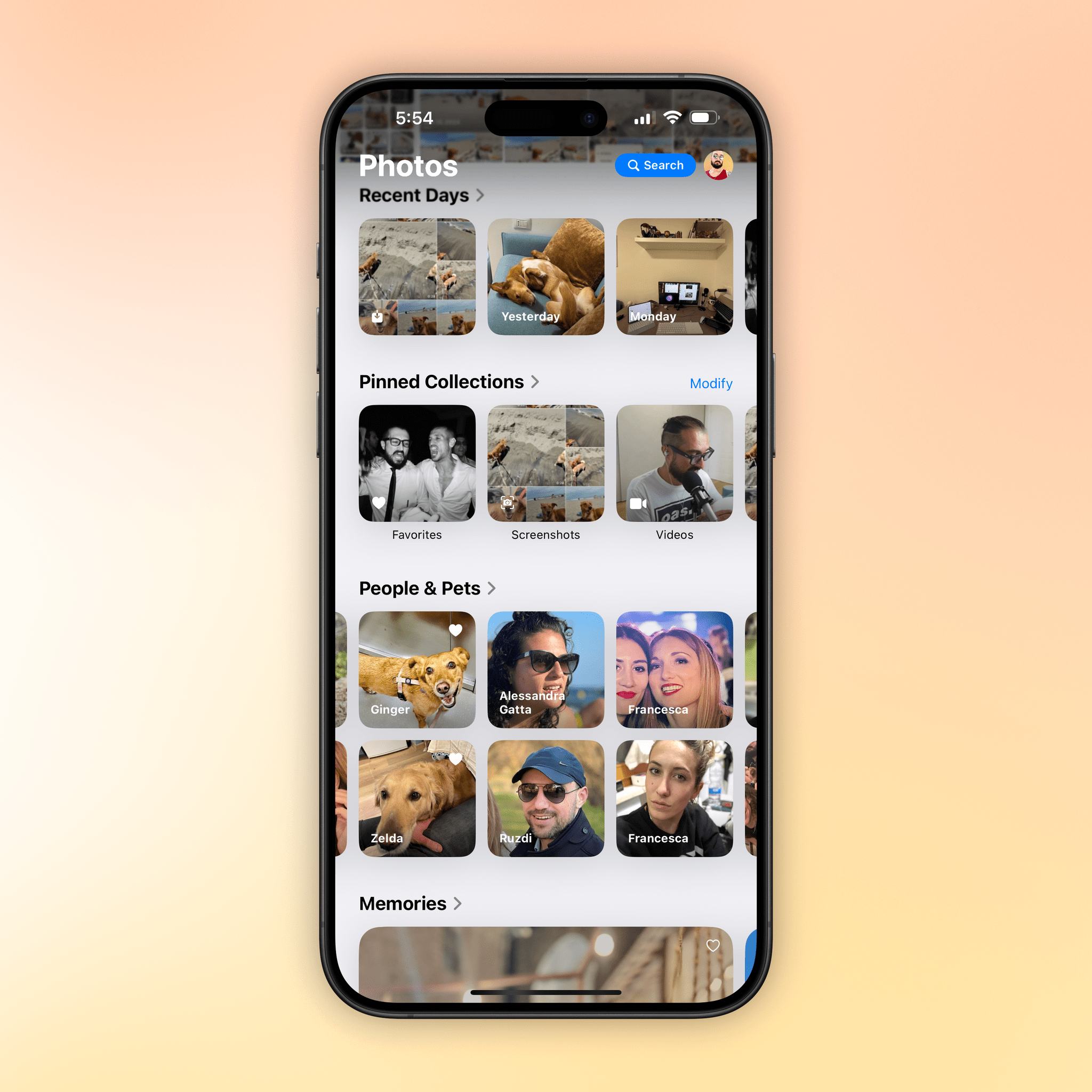
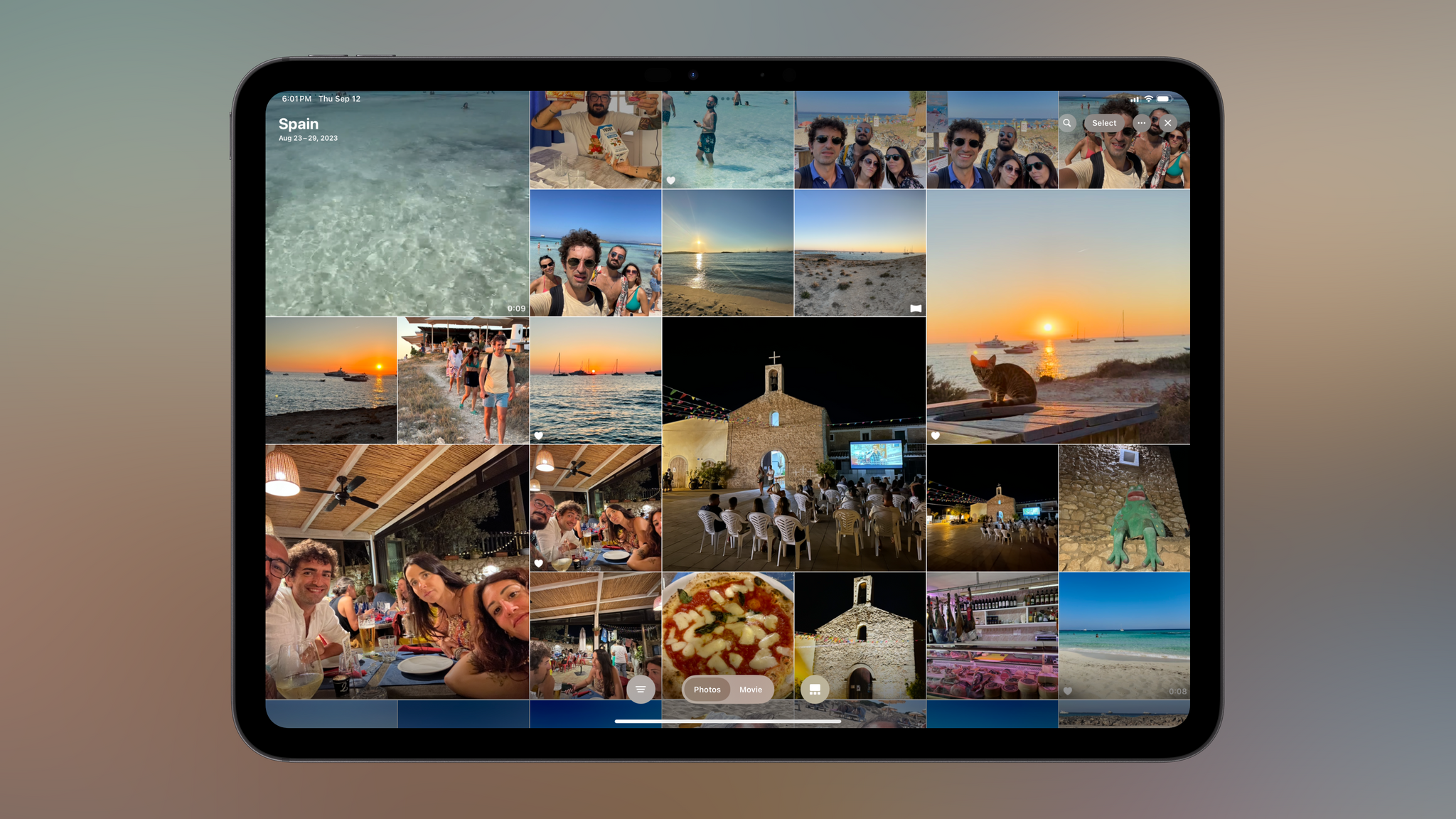
When you open the new Photos app, you’ll still see your usual grid of recent photos and videos at the top, occupying roughly 70% of the screen on iPhone; I’d say it’s about 60% on an iPad Pro in landscape.
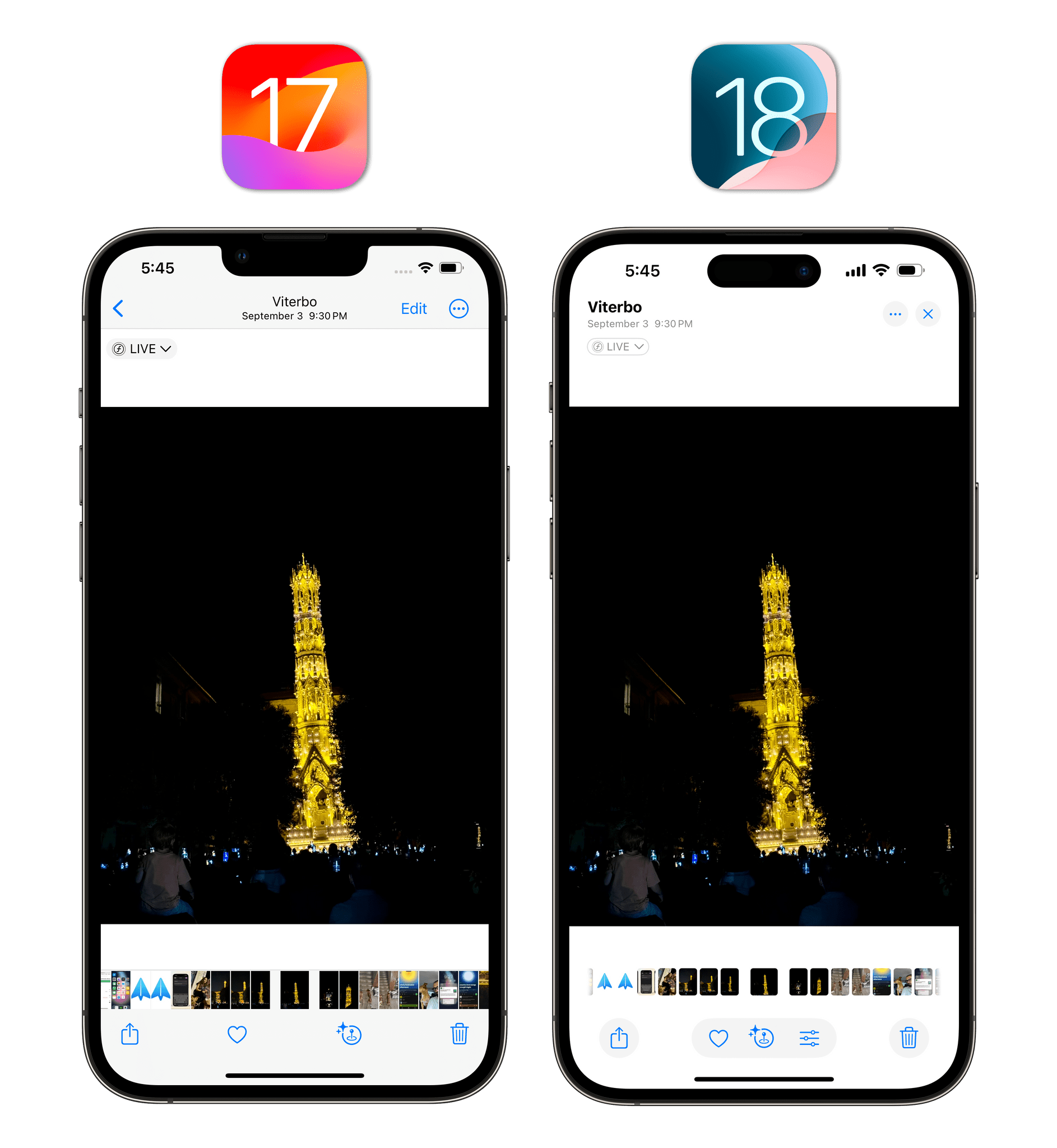
This “truncated grid” behaves like before in that you can tap on individual photos or videos to open them. Doing so will reveal the slightly redesigned preview screen, where the ‘Edit’ button has been relocated to a bottom toolbar and the photo’s location and date are more prominent in the upper-left corner. In another break from iOS UI conventions, buttons also have a circular gray outline around them.
Below the grid, the app will automatically compile smart collections for recent days (where only the best shots are highlighted, removing stuff like screenshots and receipts) as well as your favorite people and pets. So if you’re looking for the photo you just took, you can still find it in the grid, but there’s also a chance something else may catch your eye down the page and entice you to explore.
Let’s go back to the grid for now. It can be expanded to full-screen with a swipe down, revealing an incredibly smooth transition:
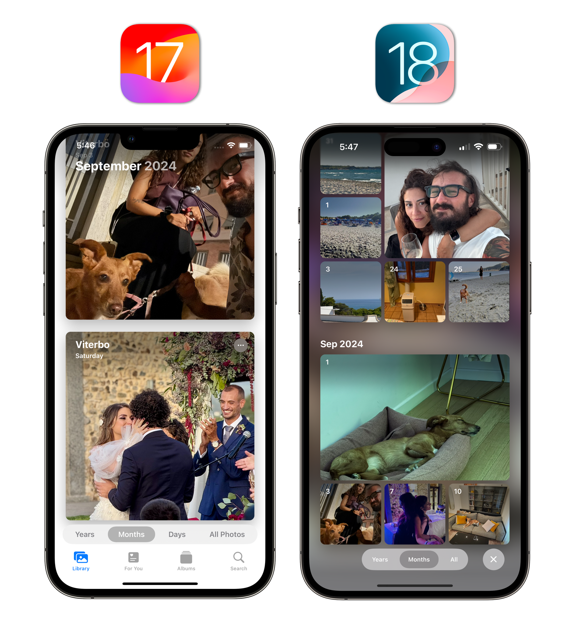
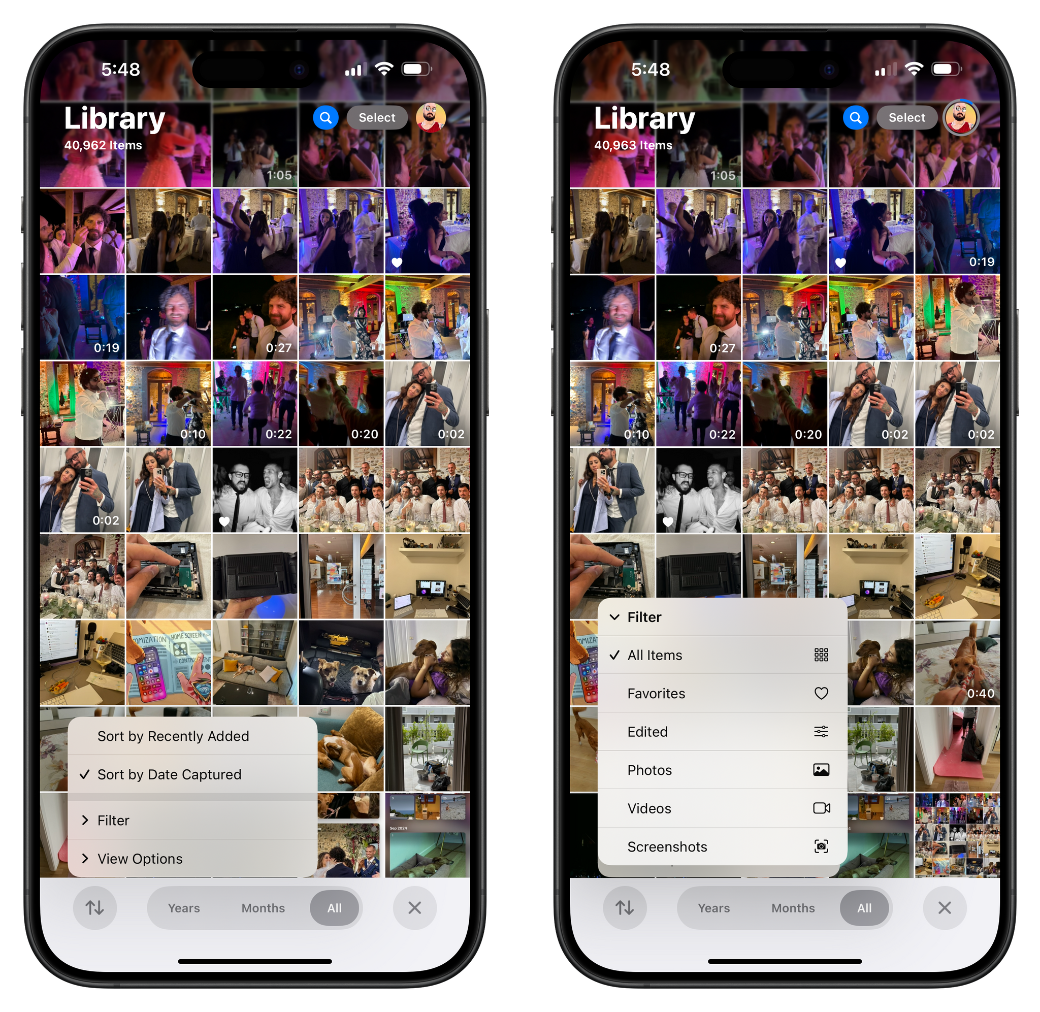
Once in the full-screen grid, you’ll see a new segmented control to switch to the Years and Months views as well as a menu for sorting options and new filters. I particularly appreciate the new design of the Months view, which eschews a column layout in favor of a dynamic grid of covers of different sizes, each indicating the day a photo was taken.
Filters aren’t completely new in iOS 18, but they’ve been condensed into a single menu, and there are more options than before. First, you can sort by Recently Added or Date Captured (the default choice); then, you can also filter the library for screenshots, an option that wasn’t available in iOS 17. A lovely detail here is that if you filter for screenshots but then also select the ‘Videos’ filter, ‘Screenshots’ will automatically turn into ‘Screen Recordings’.
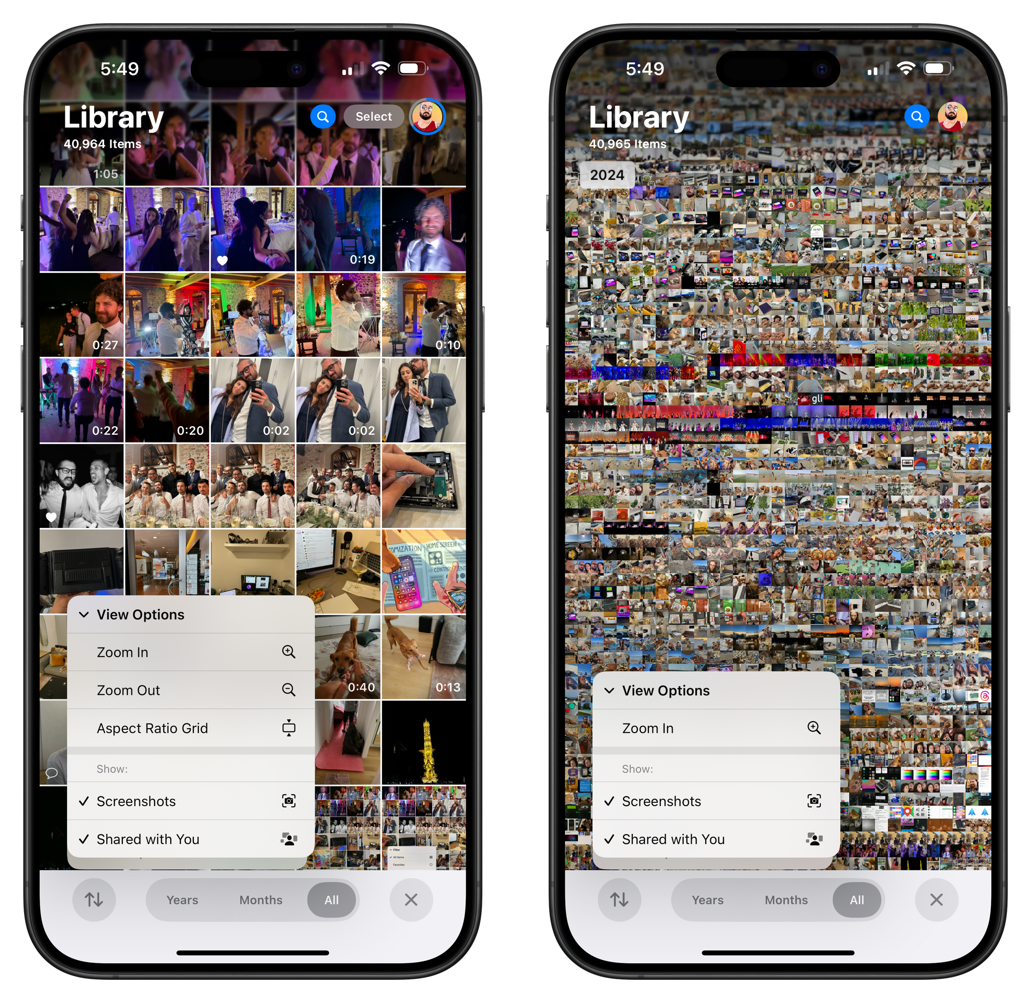
There’s also the ability to do the opposite and filter out screenshots from the grid view. This can be done via the ‘View Options’ submenu, which contains controls for the zoom and aspect ratio of the grid, too. Once again, most of these options were in Photos before, but now they’re easier to find.
So that’s tradition: if you want to keep using the Photos app as a grid of photos, you can, and the app supports all the features you know and love in the grid, such as long presses to show context menus and drag and drop. This is where Photos bifurcates from the past, though: at any point, you can keep scrolling below the grid to discover more, or you can spend some time customizing the look of the app to your needs and preferences.
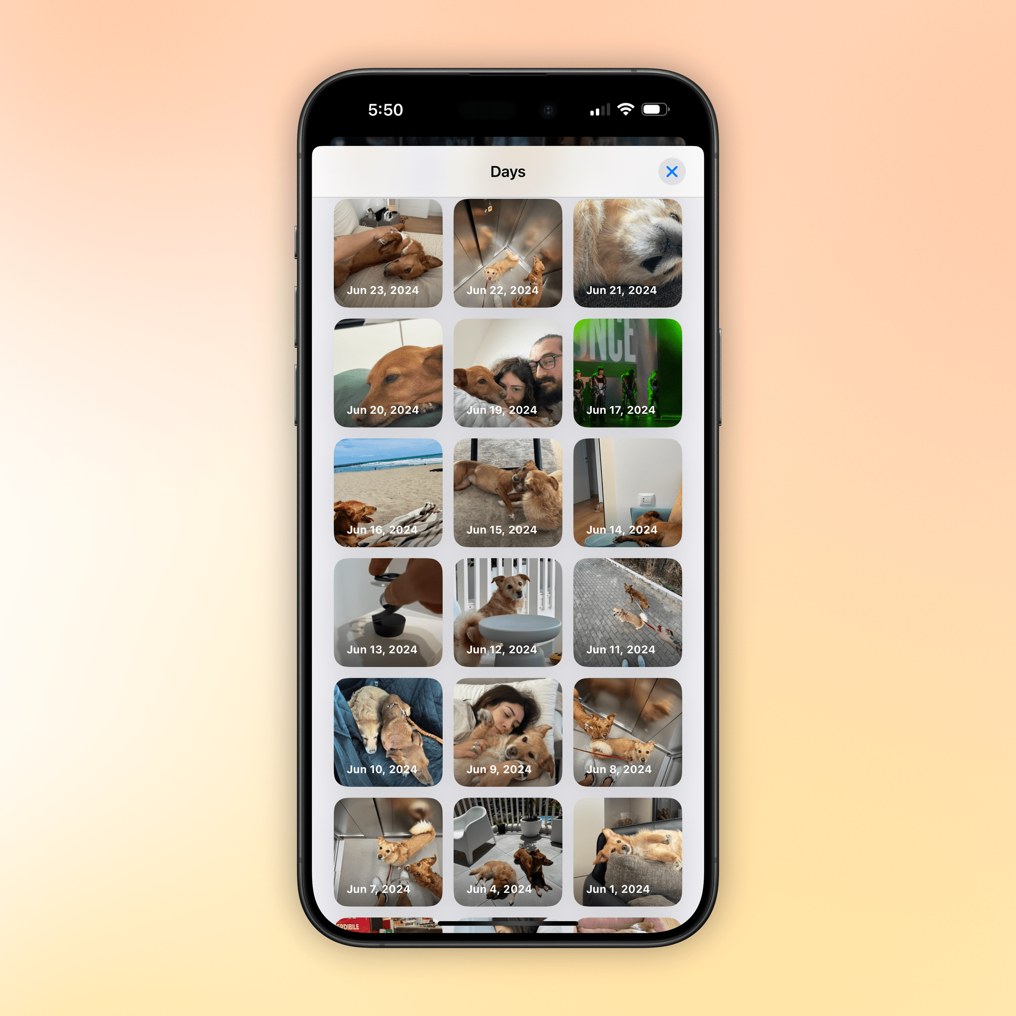
I’m a fan of Recent Days, which is a section below the grid that groups photos by day and sort of serves as a visual calendar of your life. Apple’s algorithm, in my experience, does a great job at picking out a key photo from a particular day, and more often than not, I find myself swiping through this section to remember what I did on any given day. Stuff like screenshots and photos of receipts are automatically hidden from Recent Days, so when you open a particular day, you’re presented with a good-looking summary view that only features actual photos.
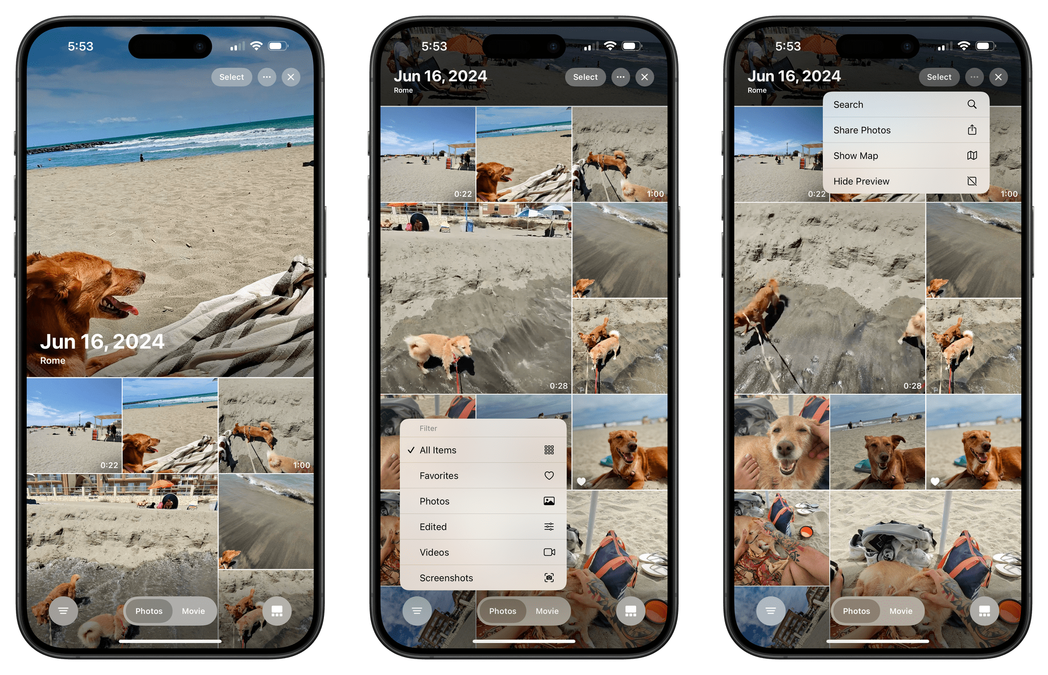
Once inside a day view, you can make a movie out of it, show all the items for the day instead of just the summary, show the day’s photos on a map, or share them. Sharing photos from this view to the Journal app is a great way to create an entry with all the best photos from that day.
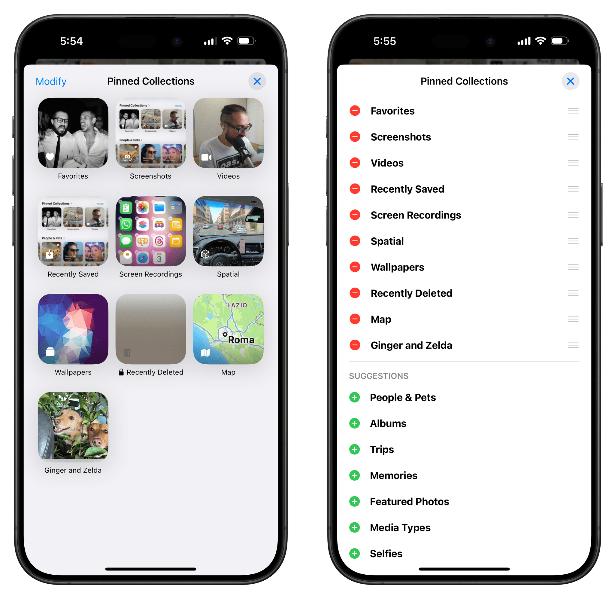
I also like Pinned Collections, another new section that’s effectively a user-customizable space for shortcuts within your Photos library. You can pin anything in here: media types, specific albums, specific trips (which are now curated by iOS 18), photos of your pets, photos of particular people, photos of groups of people and/or pets (also new in iOS 18), and more. Thanks to Pinned Collections, I’ve been able to design my own list of shortcuts to specific sections and media types in Photos that work with the way I use the app.
Since I created several pinned collections, I also appreciate the fact that I can tap on the title to open a window with a grid showing all the items I’ve pinned. This interaction – tapping on a section title – works for all sections in the new Photos app.
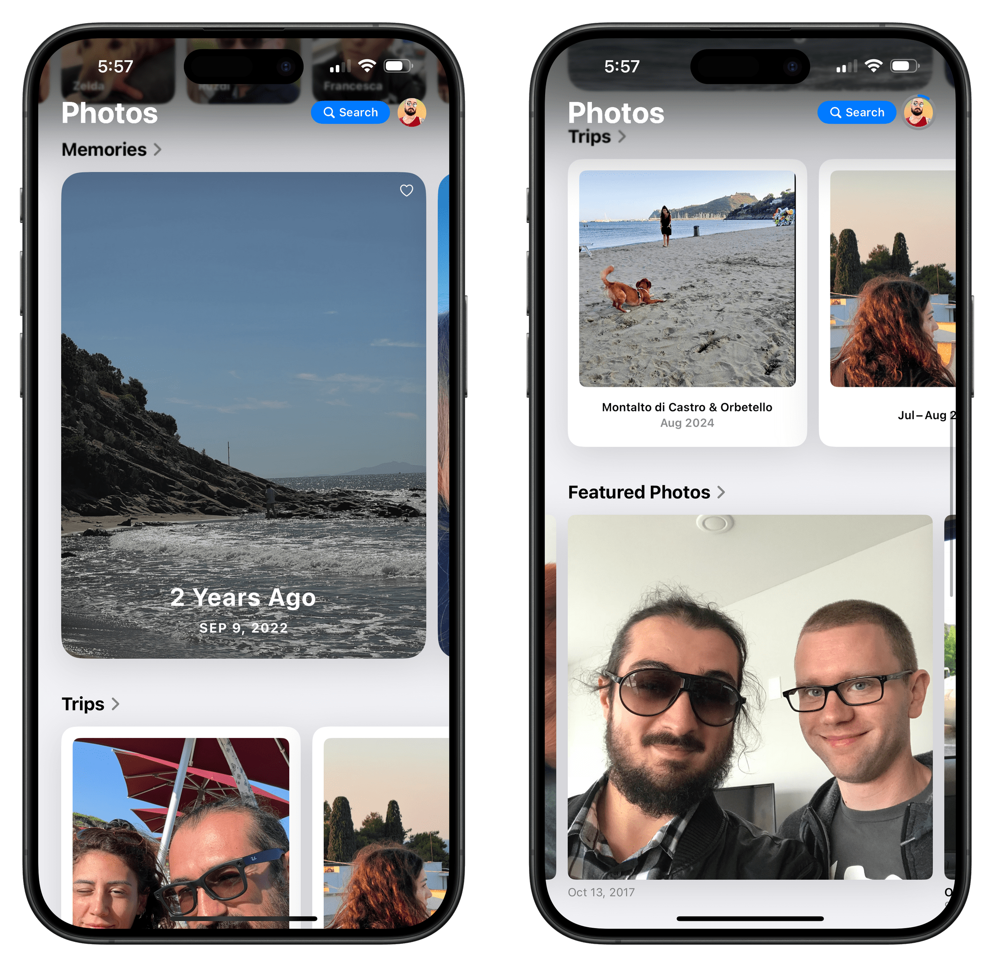
The rest of the Photos page contains some familiar faces. There are albums and shared albums (which now display a cover photo at the top when opened), memories, featured photos, and utilities.
The Utilities category has been greatly expanded in iOS 18. Now, in addition to imports, duplicates, hidden photos, and recently deleted photos, it also helps you find the following:
- Receipts
- Handwriting
- Illustrations
- QR Codes
- Recently Saved/Viewed/Edited/Shared
- Documents
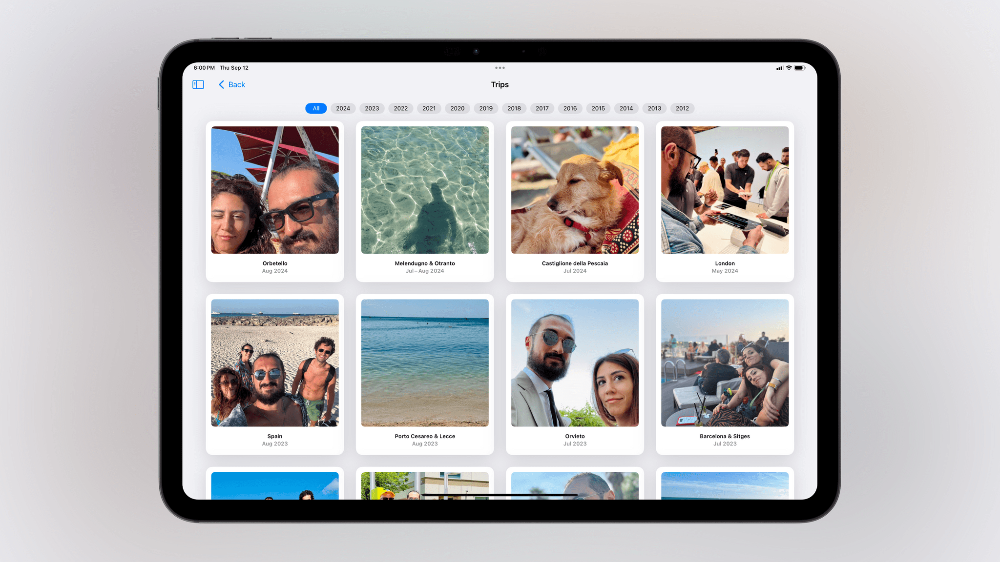
Another type of smart collection that Photos in iOS 18 can create is Trips. After analyzing your library, the Photos app will intelligently determine when you went out of town and which events qualify as “trips”. These trips are then catalogued by date, and you can browse all trips by year in a dedicated Trips view.
Preview cards in the Trips view animate as you scroll, and looking at them, I always feel a sense of nostalgia and sweetness for days gone by; those cards almost feel like animated Polaroids of your life. You can open each trip to reveal the same “album-style” view seen in Recent Days and other collections within the app.
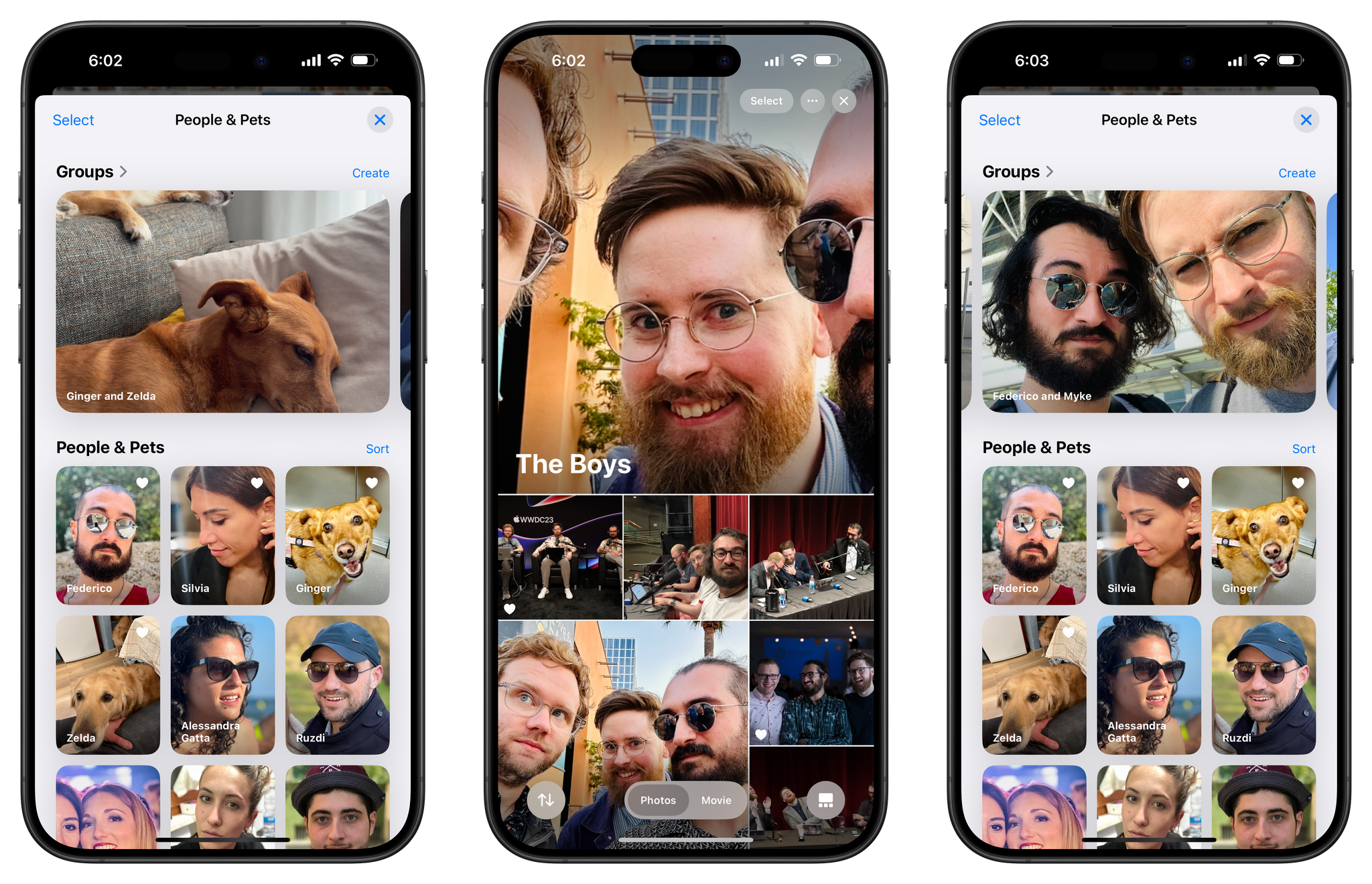
Groups of people and pets are also new in Photos, and as with other sections, some of them are curated automatically by Photos, but you can also manually create new ones yourself. In my experience, Photos has done a good job creating groups for me and Silvia, me and my friends, and me and my dogs. However, I wanted more, such as a group for me, Silvia, and both dogs, and a group for me, Myke, and Stephen called ‘The Boys’. The Photos app allowed me to create both, and they will be automatically populated over time as more photos matching those subjects come in. Of course, I can also make these groups pinned collections for faster access.
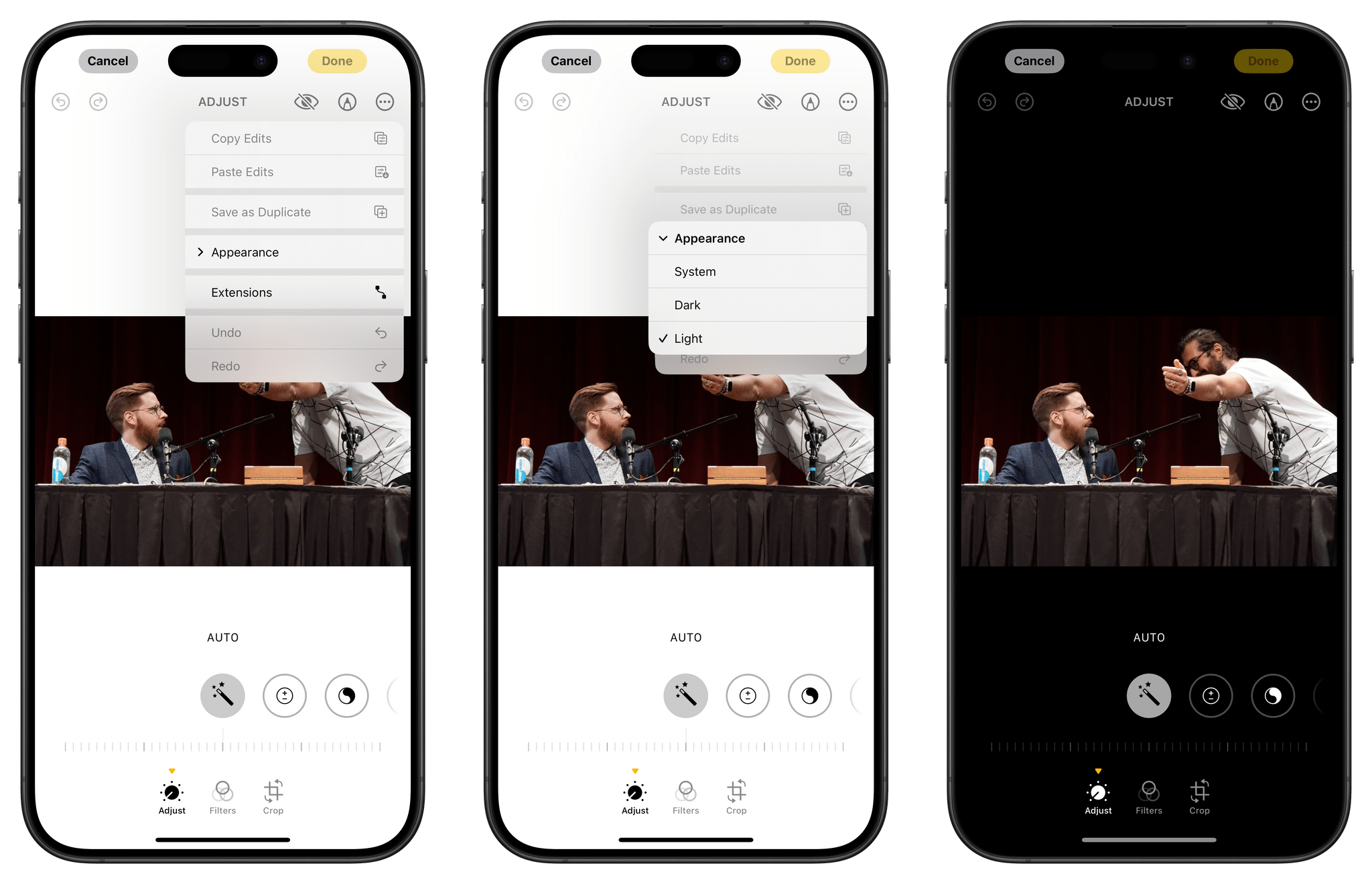
Beyond collections and the single-page design of the app, there are a few more features I wanted to mention in this review. The photo editing UI now defaults to respecting the system’s appearance: it’ll be white if you’re in light mode and black if you’re in dark mode. Obviously, given the “customize everything” approach in the app, there is an ‘Appearance’ toggle that you can use to override the system’s appearance.
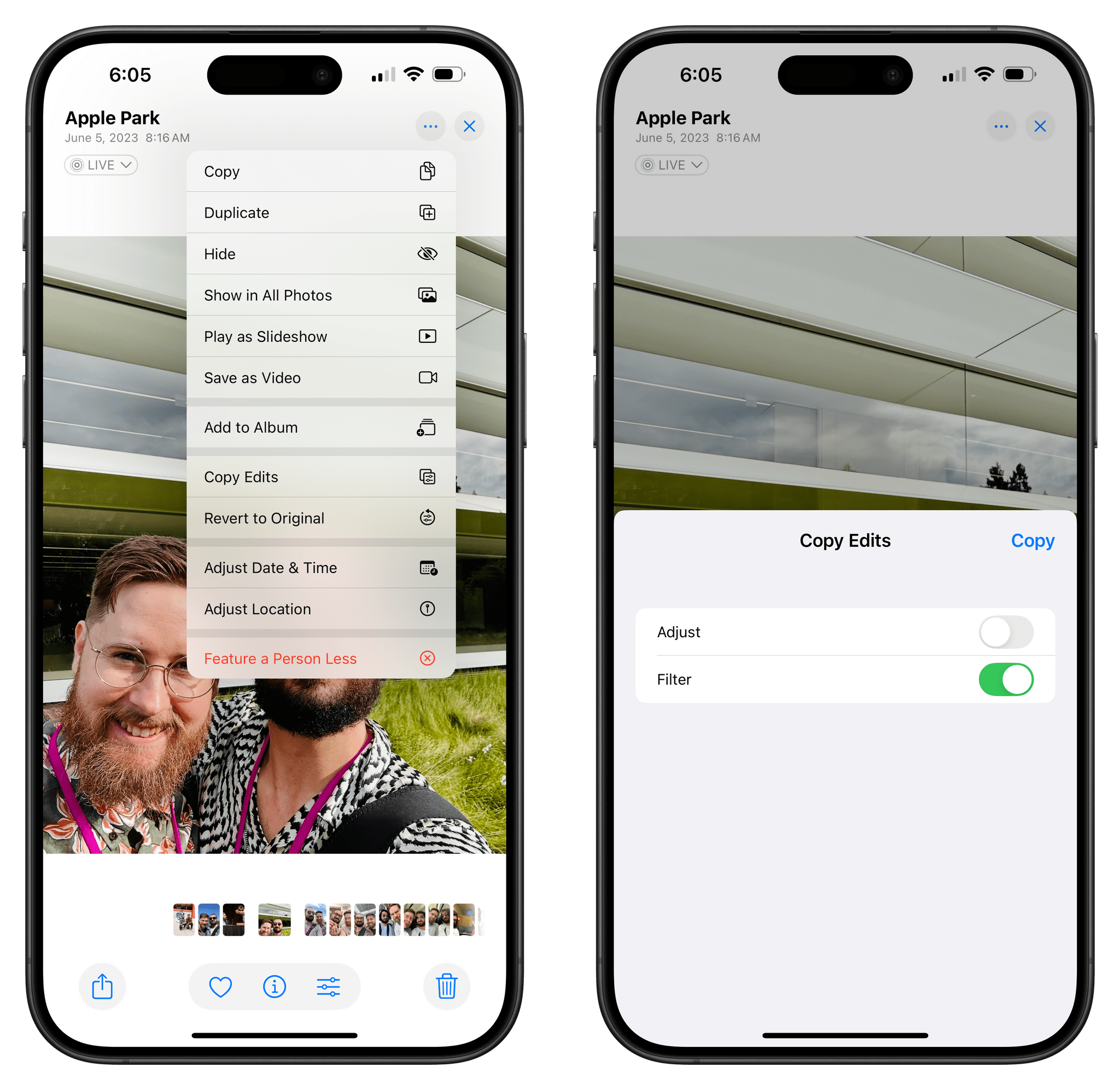
When copying edits to a photo or video, you now have the option to selectively choose which types of edits you want to copy. This is great for those times when you want to copy only three out of five edits you’ve made, for instance, and I like the UI Apple designed for it.
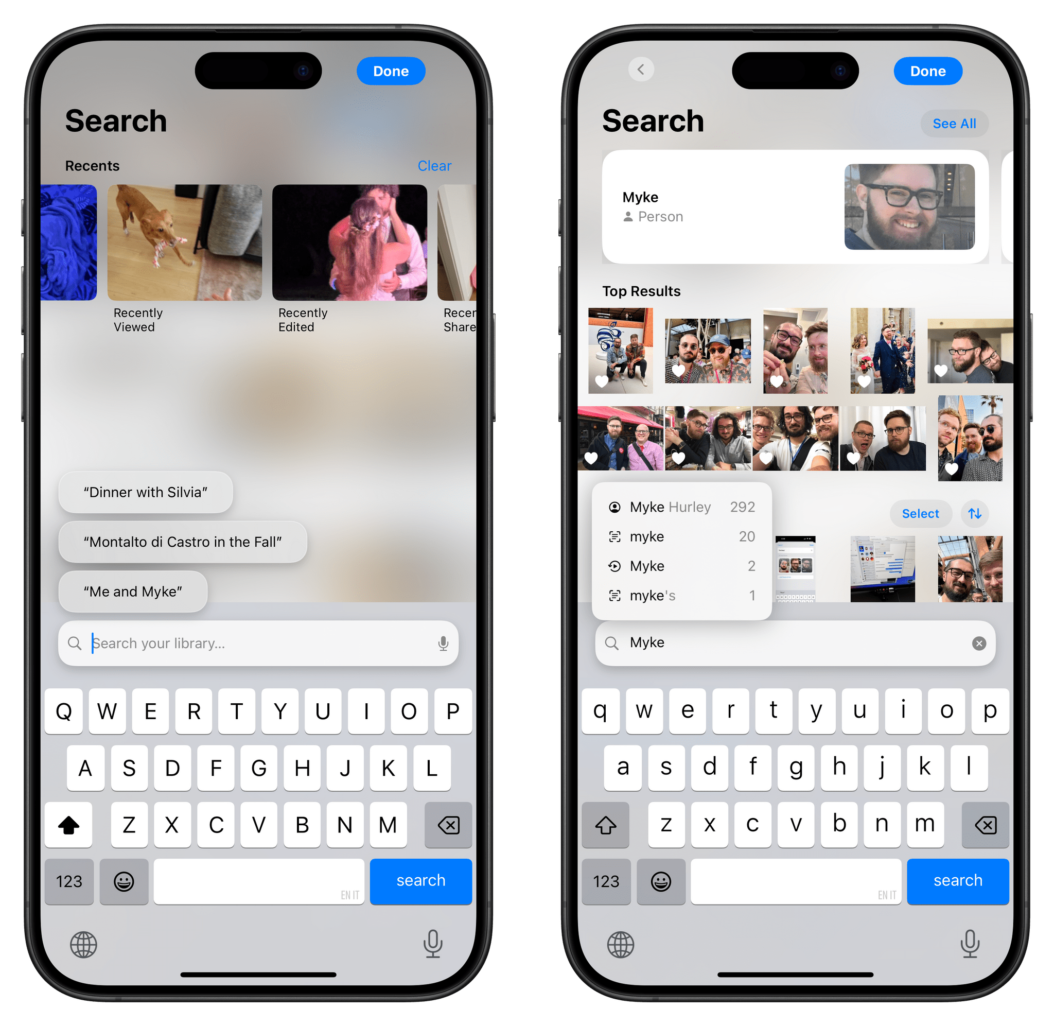
Lastly, the search experience has also changed this year, but not as much as Apple would like you to think. There is a new design for the search screen, but functionally, it still updates results and provides suggestions as you type, refining results and suggested queries based on what you’re entering. What’s different is that some results (such as people) are presented more prominently at the top, and the app provides some suggestions before you start typing, which is nice, but not a big deal. Personally, I think the addition of recent searches to this page had a bigger impact on my usage of the app.
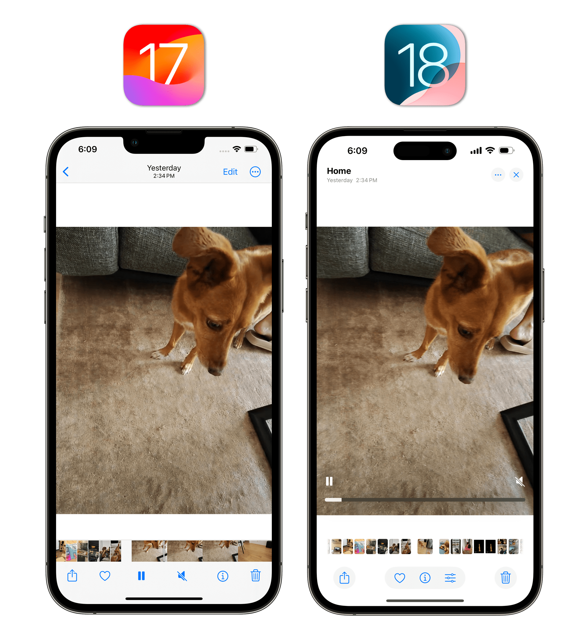
The one Photos change I’m not sold on so far is the new video scrubber UI. Compared to iOS 17, the Photos app in iOS 18 has lost the accordion-style control that allowed you to precisely scrub to a point in the video based on frames in favor of a thin progress bar reminiscent of the system video player.
On one hand, there’s something to be said for the consistency of video playback controls on iOS, which are now the same between Photos and other apps. On the other hand, I found the old scrubber more comfortable to grab and easier to operate; I feel like I can’t be as precise as before when I want to jump to a specific portion of a video, which I also cannot identify beforehand since the progress bar doesn’t offer frame previews. I think this is a regression, and I’d like Apple to go back to the old interface.
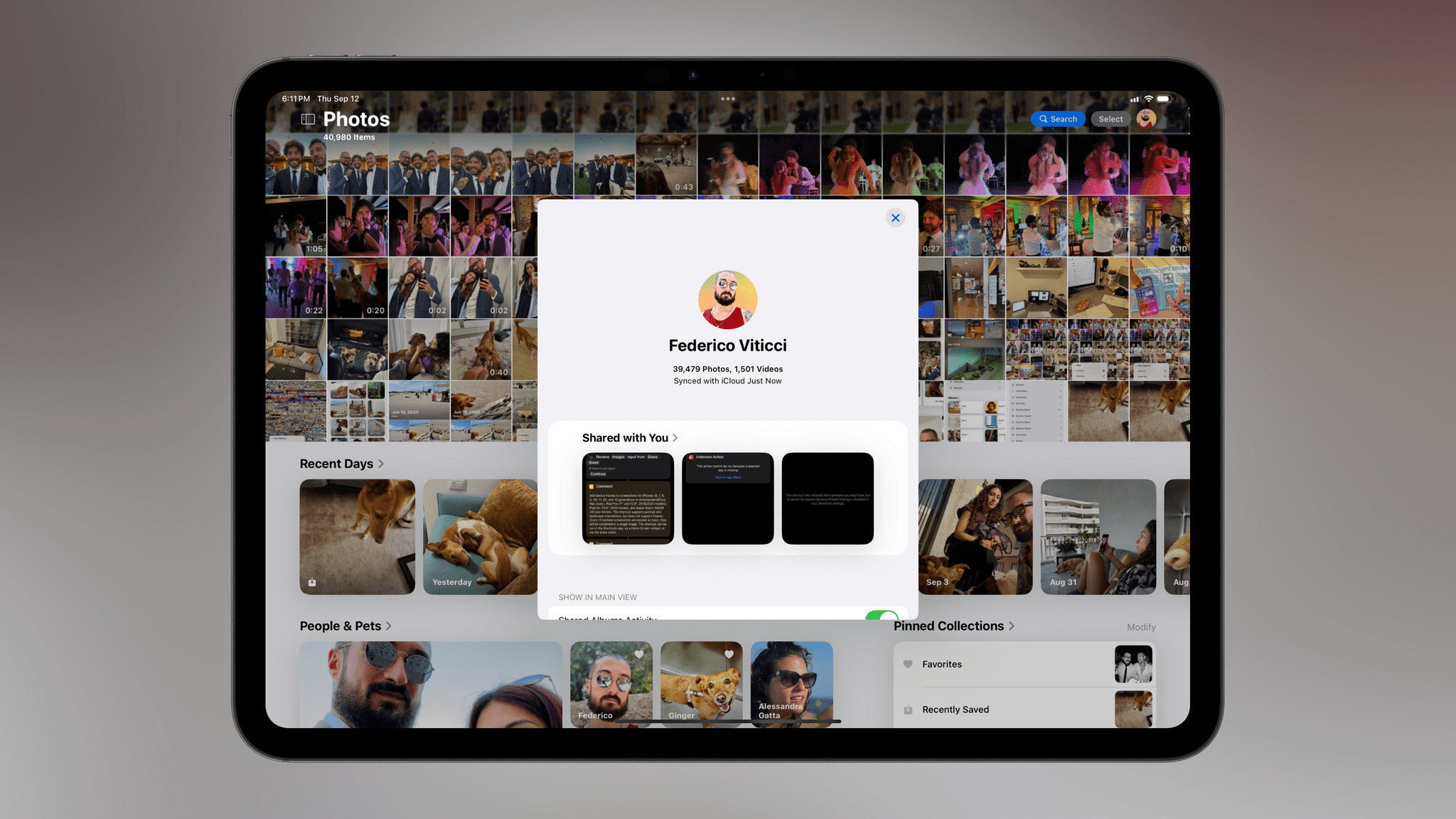
Some Photos preferences previously found in Settings have also been incorporated into the main app. Tap on your profile picture in the top right, and you’ll see a new window that includes all items shared with you, details about the number of items in your library and sync status, view options, and controls for featured content and holiday events.
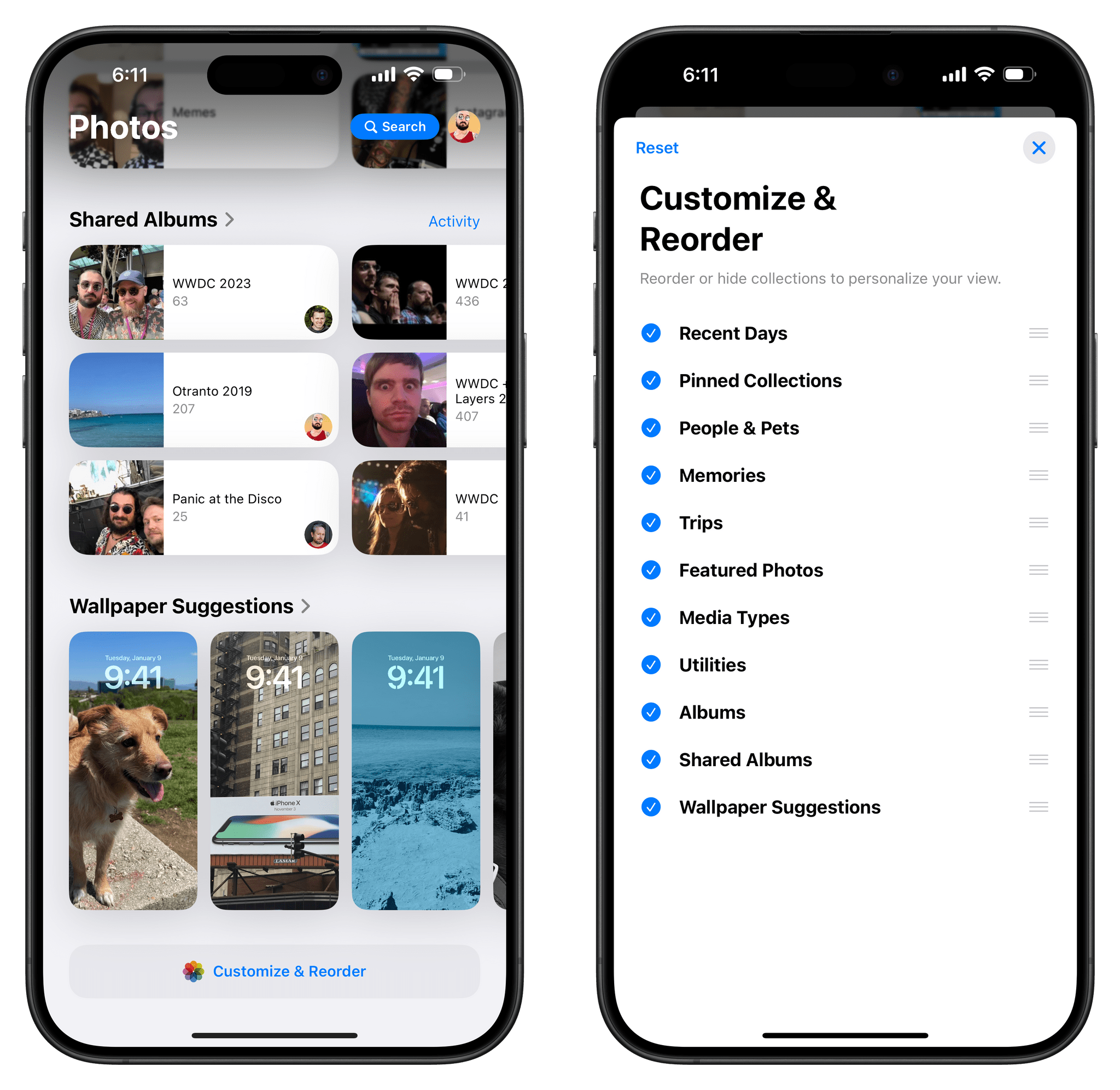
Finally, I want to point out the fact that all the collections and sections I mentioned in this story can be freely rearranged, hidden, and placed wherever you want below the grid. Scroll to the very end of the Photos app, and you’ll find a ‘Customize & Reorder’ button that lets you control where everything should be positioned based on your personal preferences.
Earlier in the summer, I thought Apple was going to revert Photos’ drastic redesign like they did with Safari three years ago; instead, they adjusted it based on user feedback, but they stuck with their underlying vision, and I think that was the right call. I do miss the carousel at the top of the screen that I covered in my first impressions story in July and still hope Apple will bring it back eventually. All things considered, though, I believe the company landed on a solid redesign that turns Photos into more than just a bucket to browse your photos. Now, it’s something more like a destination where you can take pleasure in rediscovering memories.
I think Apple has created something special here. The new Photos app allows me to see recently-taken pictures like before; at the same time, it also gives me an easier, less disorienting way to discover forgotten moments and memories from my library that are continuously surfaced throughout the app. And at any point, I can choose to customize what I see and shape the app’s experience into something that is uniquely mine.
I was skeptical about iOS 18’s Photos app at first. Today, I’m a believer.
