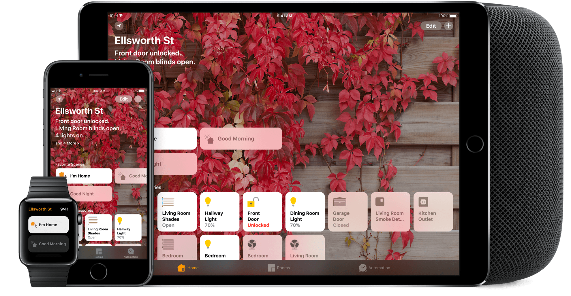
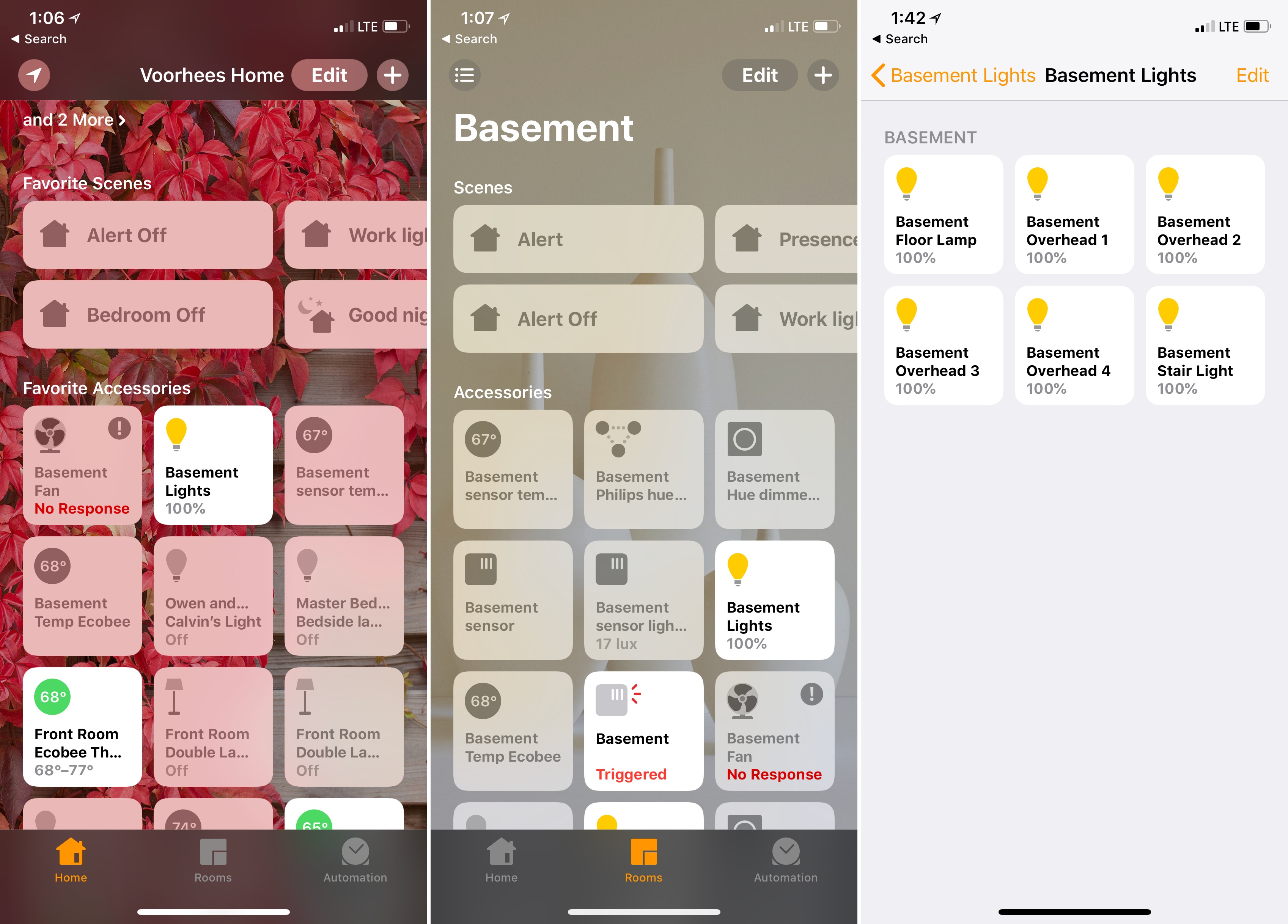
I’ve spent a lot of time experimenting with home automation gear since late last year: lightbulbs, light strips, electrical plugs, and door sensors, among other things. Most of the devices I’ve tested support Apple’s HomeKit APIs and those that don’t, I plan to integrate with Homebridge. That means I’ve also spent a lot of time in Apple’s Home app, and despite poking around in every corner of the app, I still find it frustrating and hard to use.
Last week, I tried to configure something new in my studio that illustrates several of the Home app’s problems. I have several Hue lights: there’s one over the steps leading to my workspace, four recessed ceiling lights, a floor lamp, and a desk lamp. It’s a lot of lights, but my studio is in the basement, and the lights help keep it from feeling like a cave.
I set the lights up as a group in Home and trigger them with a motion sensor. As soon as I open the door to the basement, the lights come on. I added a Hue switch on the wall as a shortcut for turning the lights on and off too.
I recently got an Elgato Eve door sensor for my back door. I figured it would be nice to know when my wife and son got home in the afternoon if I’m working away with the door closed, listening to music, and don’t hear the back door open. I can get alerts from the sensor on my Apple Watch and iPhone, but I thought it might be fun to also turn the Hue light on my desk red when the door opens as a visual cue. That turned out to be harder than I anticipated.
My first mistake was figuring that I should create an automation workflow based on the ‘A Sensor Detects Something’ option, which was wrong. Sure, I was automating an Elgato door sensor, but the correct option was ‘An Accessory is Controlled.’ Opening a door and triggering the Elgato device struck me as closer to walking past a motion sensor than turning on a light or a fan, but I noted the behavior and didn’t dwell on the meaning of ‘controlled’ too long.
The second mistake I made was thinking I could customize the settings of a group of accessories from within an automation workflow without affecting the group. My group of lights has a default state that defines brightness and color. However, once a group of lights is set up in Home, it’s as though it’s a single light. Add the group to a workflow, and you can turn them on and off as a group, but adjusting the settings of individual lights overrides the group’s settings. I backed out of automation and tried a third time.
This time I tried adding a scene. I’d like to say I got the setup right the third time, but I didn’t, though I think it helped me understand better why groups are so deeply buried in Home’s UI. I had forgotten that after a group is set up, its component accessories are no longer available in Home’s UI. This makes sense if you have a lamp with two bulbs in it that you always want to come on at the same time and behave in the same way, but it’s a limitation that greatly reduces the utility of groups because it means the individual accessories that make up a group cannot be added separately to scenes. I backed out of the partially built scene realizing that I had to reconfigure my group.
The solution was to ungroup my desk lamp from the rest of my lights in the studio and set up a scene that turns the desk lamp red and a workflow that triggers that scene when the back door opens. The trouble is, scenes have a very limited concept of state so my lamp can’t be toggled back to its prior color using an automation workflow or by toggling the scene manually. I could add a timer to the automation to turn the desk lamp off after a certain amount of time, but I don’t want to turn off the light, I want to turn off the scene, and you cannot attach timers to scenes. Instead, I needed another scene to return the desk lamp to its original settings.
You probably get the point by now. Home is both too complex because of the way it splits things into rooms, zones, groups, scenes, and automations and too simple because it lacks features like robust state awareness and, in some places, timers. However, the problems with the Home app run even deeper. They are compounded by a generic UI and complex navigation.
Home automation devices vary widely in type and functionality from a simple electrical plug that is either on or off to thermostats that control heating and cooling throughout your home. The trouble with Home’s UI is that everything is represented by the same gray square or rectangular tiles.
Devices have square buttons that are arranged in a grid. Each button includes a small icon, the name of the room to which it’s assigned, the device’s name, and its state. It’s a design that makes device buttons nearly impossible to distinguish from one another at a glance. When something is turned off, everything is gray against a gray background, which requires too much effort to find the right tile. Device names longer than 9 or 10 characters are truncated too, which makes giving unique names to similar devices difficult.
When an accessory is turned on, the experience is a little better. The button turns from gray to white and the icon gets a splash of color, although certain devices like temperature sensors that cannot be turned on or off are always gray. The icons help but depending on the type of device, there are relatively few to choose from, which limits their utility.
Scenes are distinguished from accessories by their rectangular shape. There are more icon choices for scenes, and their shape allows for more descriptive names, but otherwise, they suffer from the same issues as accessory buttons.
Home also involves more tapping and swiping than most apps. Rooms are accessed by swiping back and forth, though they are also available from a menu button in the top left corner of the screen. That same menu button accesses Room Settings, which is where you go to create a zone too. Individual accessory settings and groups are accessed by using 3D Touch or long-pressing a device’s button and then tapping a ‘Details’ button.
Aside from being somewhat hidden in the UI, what makes groups of devices and zones so confusing is that they are supersets of accessories and rooms, yet are created from the settings of the individual parts from which they are built. Moreover, groups are treated visually the same as individual devices and zones are completely hidden from view. It’s a mishmash approach that obscures the hierarchy of devices and spaces, making the app harder to use than it should be.
Fortunately, if you find Apple’s Home app frustrating, there are good alternatives. My favorites are Home – Smart Home Automation by Mattias Hochgatterer and HomeDash by Marcus Reul, which Federico recently wrote about in New Apps for 2018. However, if you’d like to stick with Apple’s free alternative, I’ve got a few tips and things to keep in mind that should help you navigate the app:
- Accessories and Sensors: Home treats most devices as accessories. Only truly passive devices like temperature sensors or motion detectors that don’t require any direct interaction are considered sensors.
- Groups: Groups are collections of certain types of accessories like lights that should only be used if you want to treat multiple accessories as one device. If there’s any chance you might want to adjust the settings of one accessory independently of others using a scene or automation, don’t group it; set up a scene instead. If you do want to set up a group, press the button for an accessory, tap ‘Details’ and look for the ‘Group with Other Accessories…’ button.
- Scenes: Scenes are collections of accessories (not sensors). Accessories can be included in multiple scenes and with different settings. However, once triggered, a scene cannot be reversed. To ‘undo’ a scene, you need a second scene.
- Automations: Automations are workflows that trigger accessories or scenes based on people leaving or arriving, a time of day occurring, an accessory being controlled, or a sensor detecting something. Automations can turn off accessories after a certain amount of time passes, but they cannot undo scenes.
- Zones and Rooms: Zones are collections of rooms that can be used in commands to Siri. For example, I have lamps in two different bedrooms on the second floor of our house set up as a zone called ‘Upstairs,’ which lets me tell Siri to ‘Turn off the lights Upstairs.’ The same sort of command works on a room level too. Zones and rooms do not play a direct role in scenes or automation workflows.
The Home app is a reminder that we are still in the early days of HomeKit. The problem with Home is that it fails to successfully abstract away complexity with its simple, uniform UI. Instead, the app obscures spatial and device hierarchies in a way that makes complex setups more confusing than they should be. Third-party apps are one solution to Home that could free Apple to focus on the simpler needs of the majority of its customers, but they’re not a complete solution to Home. The app still needs a redesign that better reflects the hierarchy of spaces and accessories and makes it easier to access settings and distinguish accessories from each other. As someone who has been frustrated by Home, despite using it often, I hope it’s near the top of Apple’s list of apps to improve as part of iOS 12.


