As a part of the MacStories Apps Tree event, I had the chance to interview Louie Mantia, icon and UI designer at the Iconfactory. You can find his official website here, and some of his works at the freeware section on Iconfactory’s website.
This is the first of many interviews and guest posts that I’ll publish on MacStories during this week. Enjoy! ;)
Hi there! Can you please introduce yourself to MacStories readers?
Hello! I’m Louie Mantia, an icon and user interface designer currently working at the Iconfactory in Greensboro, North Carolina.
How did you interest in design - especially icon design - get started?
I remember 10 years ago, I became very interested in computers. I didn’t have a Mac yet, but I began to customize anything I could on my computer. Over the course of the next four years, I started to skin my PC to look like a Mac. I used themes from Javier Ocasio, which were in turn ported versions of Max Rudberg’s OS X themes. I had a dock, large icons on my desktop, and Konfabulator (which was the closest I could get to Dashboard). I made my own graphics for things I couldn’t find, and eventually made icons as well, mostly hard drives and folders.
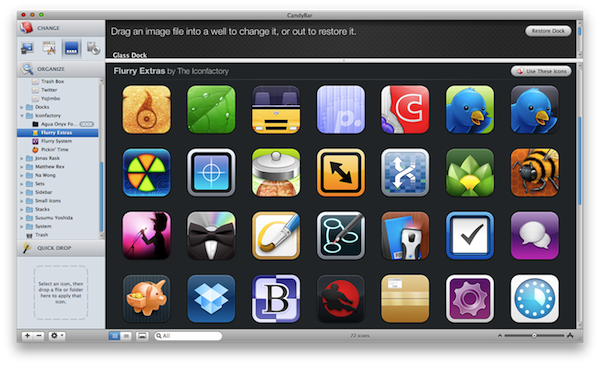
The Flurry icon set. It was a huge success, there’s no doubt about it. How long have you been working on it? How’s working with David Lanham?
Flurry started as a project because I started to realize that I didn’t want to put certain apps in my dock based solely on their shape or color. Personally, I don’t generally organize my apps in my dock based on purpose, but how the icons seem to fit side by side. I took what was learned with iPhone and Dashboard, then David (Lanham, here’s his website) and I decided to make an icon set based around this principle: uniformity. If all icons had a certain constraint, such as rounded squares, even icons with drastically different colors or objects inside could look perfectly fine next to each other.
Working with David is great, as we both have our own strengths. For example, not all icons were done entirely by just one of us, some were a joint effort.
What would be a typical process for you when starting out a new design project?
Typically, I gather all information and ideas from the client and sketch out any ideas they wanted to see as well as some of my own. Sometimes they know exactly what they want. Sometimes they’ll know it when they see it, which means I’ll be sketching for a little while.
After we decide on a concept, I’ll start rendering the icon. I’ll draw the basic shapes and put in color and get feedback, then keep revising until complete and the client is happy. Of course, it changes with each project, but roughly, that’s how it goes.
Where do you find inspiration?
I find inspiration everywhere. I get a lot of ideas from culture, life, and my imagination. A lot of times my work is a representation of something real or an improvement on something else.
I find that it is important to just look around you. Often when in a sketching phase, I just spend a while looking at lots of things. I study objects, and find out why they work so well with form and color. Learning from other work is paramount when designing new things.
Has Mac OS changed the way you design / work?
I got my first Mac in 2005. It was a white iMac G5. I was insanely impressed with the design and it was about time I got myself a real computer. Using a Mac and OS X has been crucial to me working because I can stop worrying about the computer and focus on my work. I don’t spend a lot of time fixing or tweaking things, but instead I actually use my computer.
Which apps do you use most to create your works?
I primarily use Photoshop when designing, though I find limited use in Illustrator where I draw shapes I will then import back into Photoshop. Since Photoshop has vector capabilities, I’m not constrained to use Illustrator.
Do you have a “favorite” icon among the ones you’ve designed?
I think my favorites would be the Ive Drive icons, though I’m also pretty fond of M-O and the Frenzic Finder icon.
Is there something of Mac OS X interface you’d change? Or do you think it’s already perfect as it is?
Mac OS X is nearly perfect, but I’d like to see the option for a dark iChat list. I’ve had to replace a 30” Apple Cinema Display due to image persistence in the display, as I keep that window open. Also, I’d like to see Mail organize the sidebar a little better. All account inboxes are at the top, though their folders are in groups beneath. I wish the inboxes were grouped with each account folder instead.
Can you please describe us your workstation?
At the Iconfactory, I have a Mac Pro with 30” and 20” Apple Cinema Displays, which are in the corner of an L-shaped desk. On both sides, I have an array of toys and books. I use my 30” ACD for iChat, Safari, Mail, CandyBar, Photoshop, and Illustrator while using my 20” for extra Photoshop palettes, Twitterrific, and On The Job. At home, I have a glass L-shaped desk with a 30” ACD on one side and my 13” MacBook Pro in the corner on a Rain mStand.
What would you like to receive for Christmas this year?
I’m dying to get my hands on the 24” LCD Cinema Display. But I could always use some more toys or LEGO.
Thanks for chatting with us!
No, no, thank you!


