Windows
The design of the menu bar is a combination of new and updated functionality integrated with design changes that provide a cleaner, less cluttered menu bar that recedes into the background. The changes to windows are different. The core structure and functionality of windows are the same in Big Sur as they were in Catalina, but their changes are no less important.
Using layout, typography, and color, Apple has reimagined one of the most basic building blocks of the Mac’s operating system – and I’m enthusiastic about the new design. Big Sur’s windows are cleaner, more readable, and complement Apple’s other operating systems in a way that makes macOS feel like part of a family of OSes and not just the Mac’s OS.
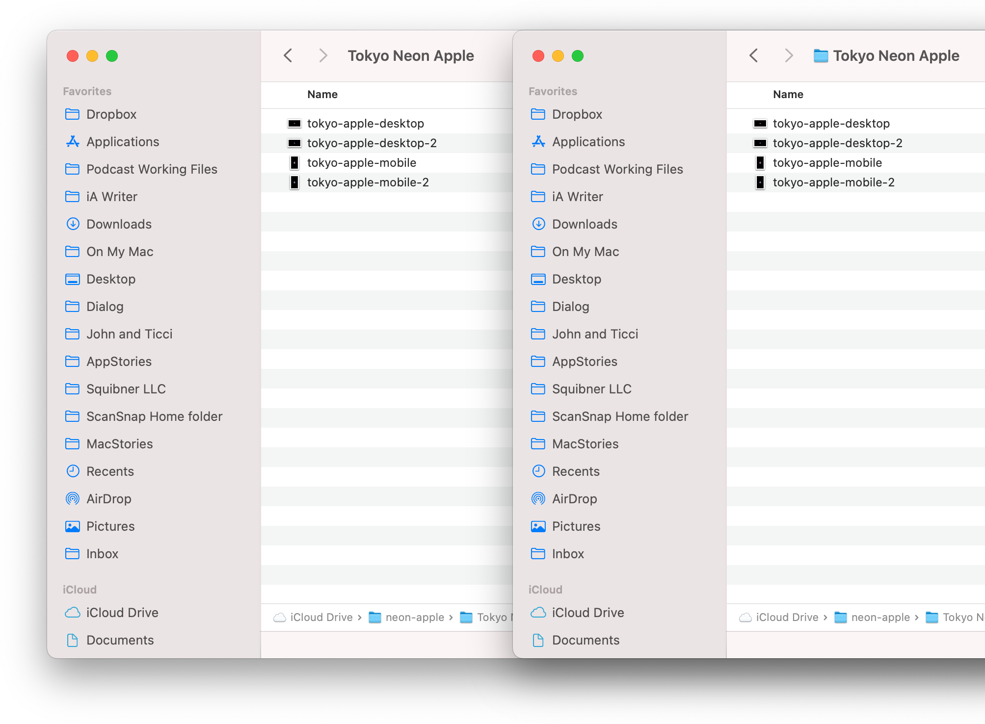
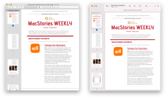
The Finder’s proxy icon is hidden in Big Sur (left), but animates into view when you hover over a window’s title (right).

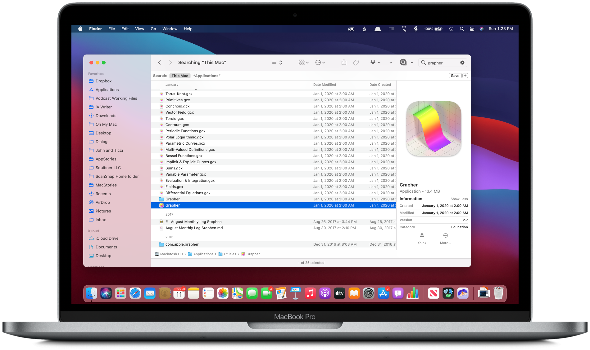
The Finder window is a terrific example of how Big Sur window titles are left-justified, toolbar buttons are borderless, and search controls are often collapsed.
There’s a lot to unpack with Big Sur’s windows. The toolbar is taller, but its iconography feels more compact without button borders. The title bar is gone. Instead, the window’s title is in line with the toolbar’s buttons and left-justified. The title bar’s proxy icon representing an open file is still available, but now, it only appears when you hover over the window title, animating into view after a short delay along with a caret that lets you pick a new save destination. If the animation is too slow for you, hold down the Shift key make it appear immediately, which has the added advantage of making the entire title area part of the draggable proxy and expanding the file’s title if truncated. The corners of windows, as well as nearly every other rectangular element throughout Big Sur, are more rounded than before too, lending them a more organic, softer feel than macOS 10.

LookUp (left) and MusicHarbor (right) are excellent examples of upcoming third-party apps that have evolved from tab bar-based iOS apps to use the Mac’s sidebar.
Translucent sidebars now span the full height of the window, interrupting the toolbar and any status bar or other elements along the bottom edge of the window. Within the sidebar, the ability to collapse sections of textual information serves Big Sur’s goal of reducing information density, too, allowing users to focus only on what’s important to them. The changes have the effect of shifting a user’s focus from the top edge of a window to the left side where content navigation is emphasized. In fact, if you squint a little, where previously a Finder window loosely resembled an index card with the title neatly centered along the top edge of the card, a Big Sur window is more like a book or a sheet from the Cornell note-taking system.
The use of color has changed too. Window chrome is far less pronounced. Where once there were multiple shades of gray to highlight the top and bottom frames of windows and their sidebars, now everything is considerably lighter. Light mode on Big Sur is very white. Dark gray chrome is gone, replaced by subtler shades to offset sidebars and other elements.
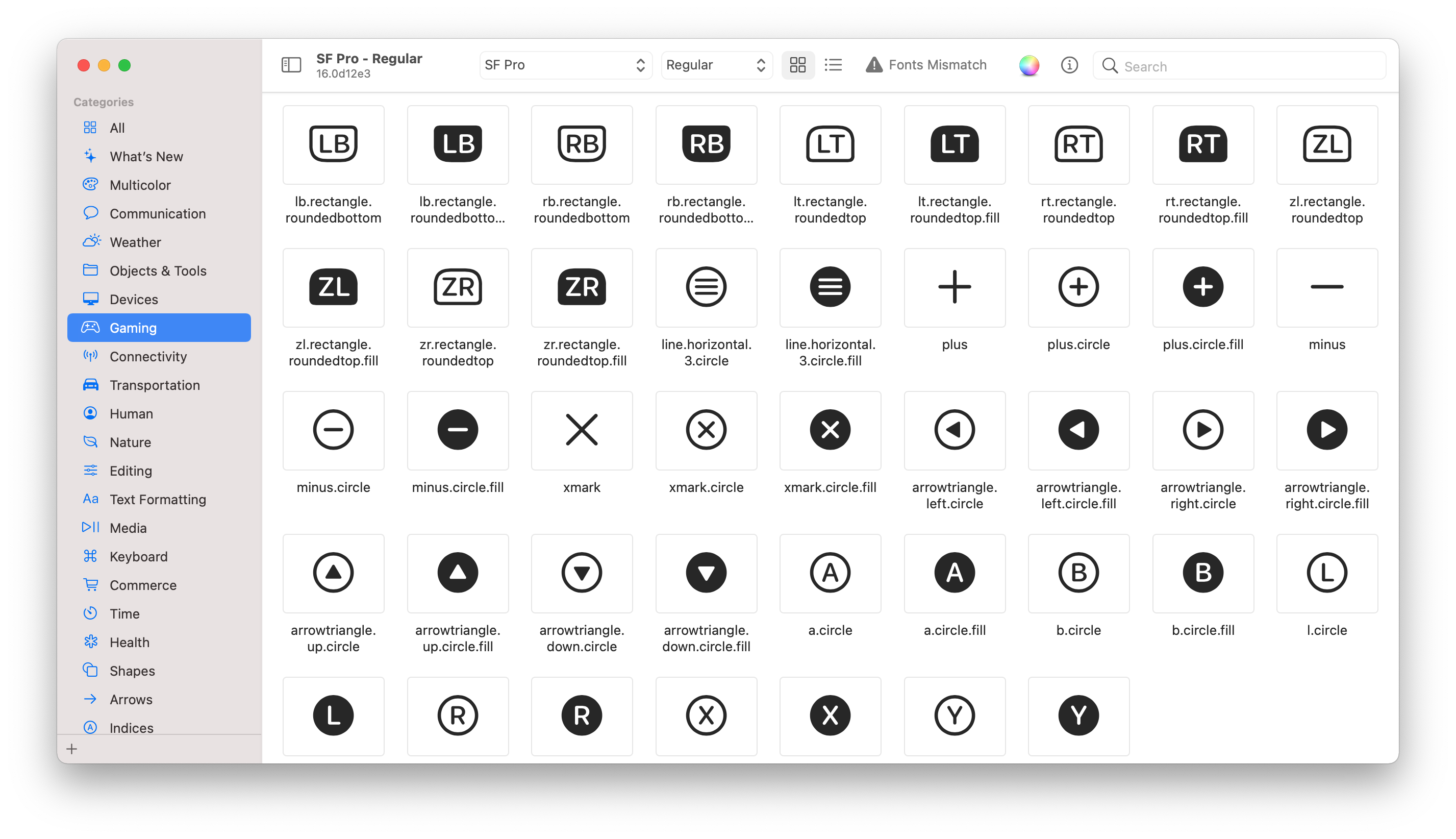
Window sidebars and toolbars use Apple’s library of SF Symbols, which were designed to work side-by-side with Big Sur’s system typography.
Color has also been drained from toolbars and the iconagraphy of tabbed preferences windows, which now feature glyphs from Apple’s SF Symbols 2 icon set and its 750 new symbols for Big Sur, over 150 of which are multicolored. Toolbar buttons have been reduced to monochrome gray icons that sit on an uninterrupted expanse of white in light mode without any indication of the bounds of the buttons.
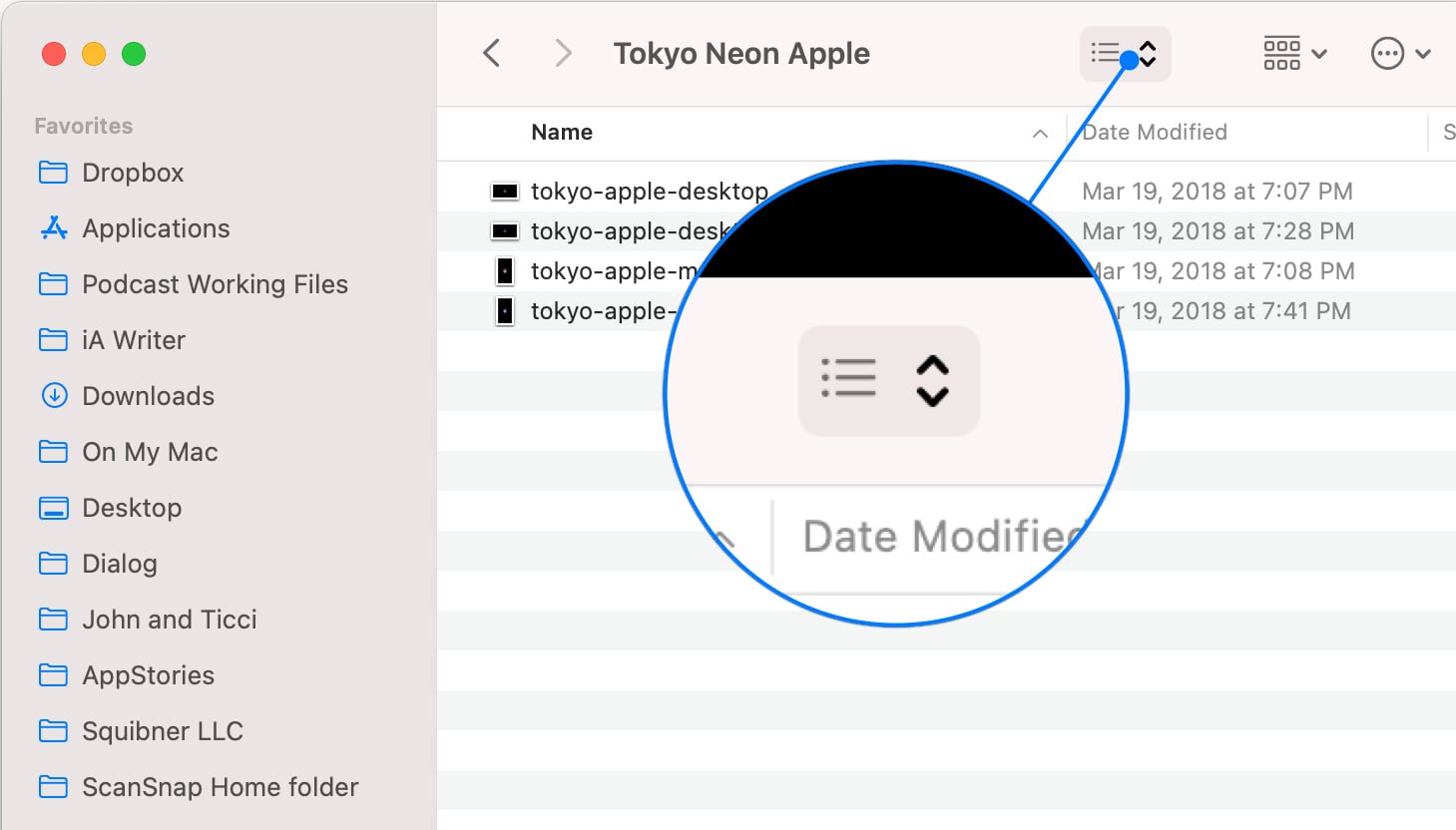
Hovering over toolbar icons reveals that they are buttons in a way reminiscent of how the pointer works on iPadOS.
Only when hovering the pointer over a glyph is it highlighted to identify it as a button. The effect bears a loose resemblance to the recent addition of pointer support to the iPad, though without the more exaggerated animation or magnetic snapping you’d find there. In apps like Mail, the visual density of toolbars has been further reduced by eliminating search fields, which have been replaced with a simple search icon that expands into a search field when clicked, although other apps, like Preview, retain a full search field. The new toolbar style feels lighter weight than before, preventing from competing for attention with the content of the window.

Even Music’s sidebar, which already ran the length of the app’s window, stands out in Big Sur with its use of the app’s icon color in the sidebar.
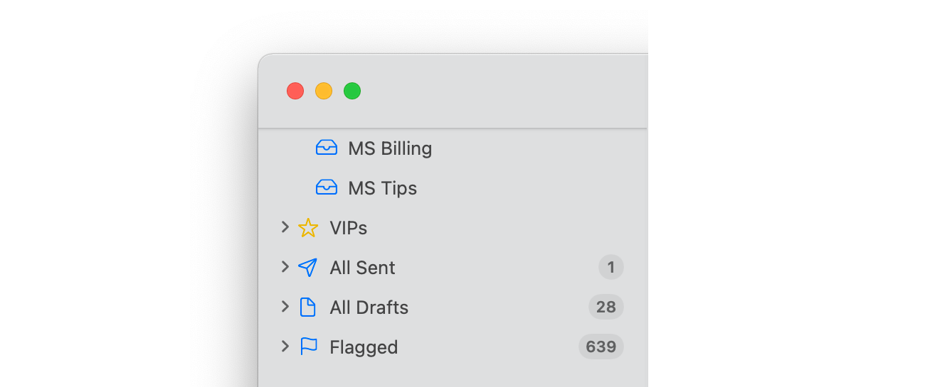
Although color has been eliminated from many parts of the window chrome in Big Sur, it still plays an important role in window design. To anchor the sidebar visually as the starting point for browsing content, Big Sur uses color paired with the SF Symbols iconography. Each glyph is designed to work with Apple’s San Francisco font, both in style and weight. Developers can assign an accent color to their app to serve as a unifying visual that helps guide the user and differentiate one app from another. For example, Mail uses blue for most of its sidebar icons, while Music uses the same coral shade found in the app’s icon. The same accent colors extend to the text selection indicator and controls like sliders.
The same accent colors extend to the text selection indicator and controls like sliders if your Highlight color is set to Accent Color in the General section of System Preferences. If your Highlight color is set to something else, the sidebar and elements like checkboxes and drop-down menu controls retain their developer-specified color, but selected text will use the color you pick.

Accent colors extend to other UI elements like text fields, checkboxes, drop-down menu controls, and buttons. A Smart Playlist dialog in Catalina (left), Big Sur (right).
Developers aren’t limited to a single color in the sidebar, though. Mail’s star icon marking VIP messages is yellow, and Smart Mailboxes are identified with a gray gear. It’s a system that allows for color variance when called for by a feature, with a fallback to the default color that matches the app’s branding.
Whitespace is used by Big Sur to make information more glanceable, and windows feel more expansive too. Toolbar icons feel more compact without button borders, but the toolbar itself is taller, adding padding around the icons that visually separates them from content in a manner that makes them more legible. The same is true for the sidebar, where the text is spaced out vertically more than before.
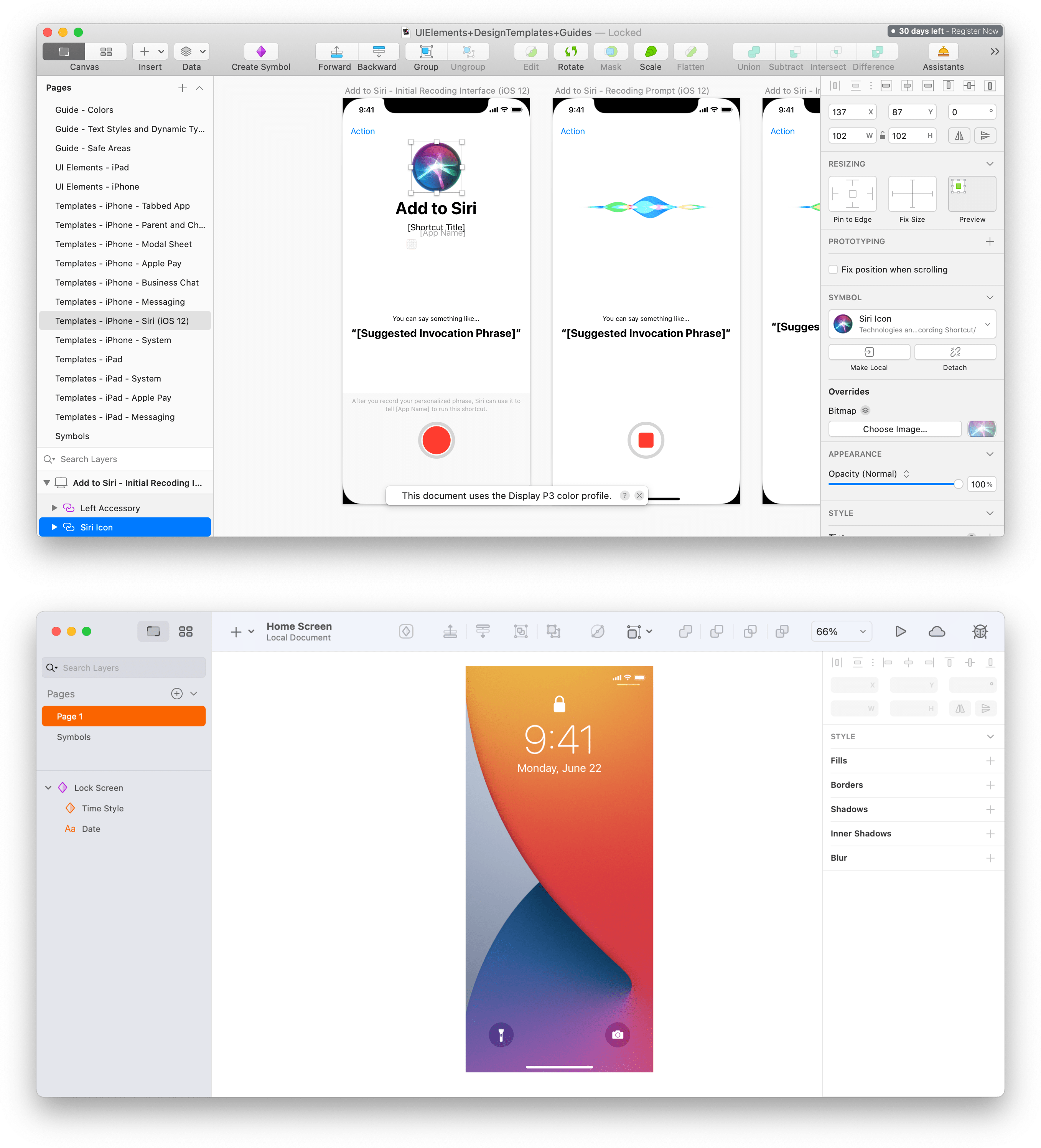
The new window design works on a wide range of Mac apps from Mac Catalyst apps from Apple and third parties to more complex AppKit apps like the beta of Sketch 70, which has been redesigned for Big Sur. Sketch 70’s beta retains the same functionality but with a more approachable clearer look. Among other things, the redesign incorporates a sidebar that runs the height of Sketch 70’s window, a taller, simplified toolbar with icons that bear a resemblance to Apple’s SF Symbols glyphs, and orange accent color that echoes the app’s icon. I like what the beta of Sketch 70 a lot. The toolbar has been rethought to accommodate the window’s title and in the process crafted a UI that looks more modern and less busy than before, which makes it more approachable.
Sheets, Alerts, and Controls

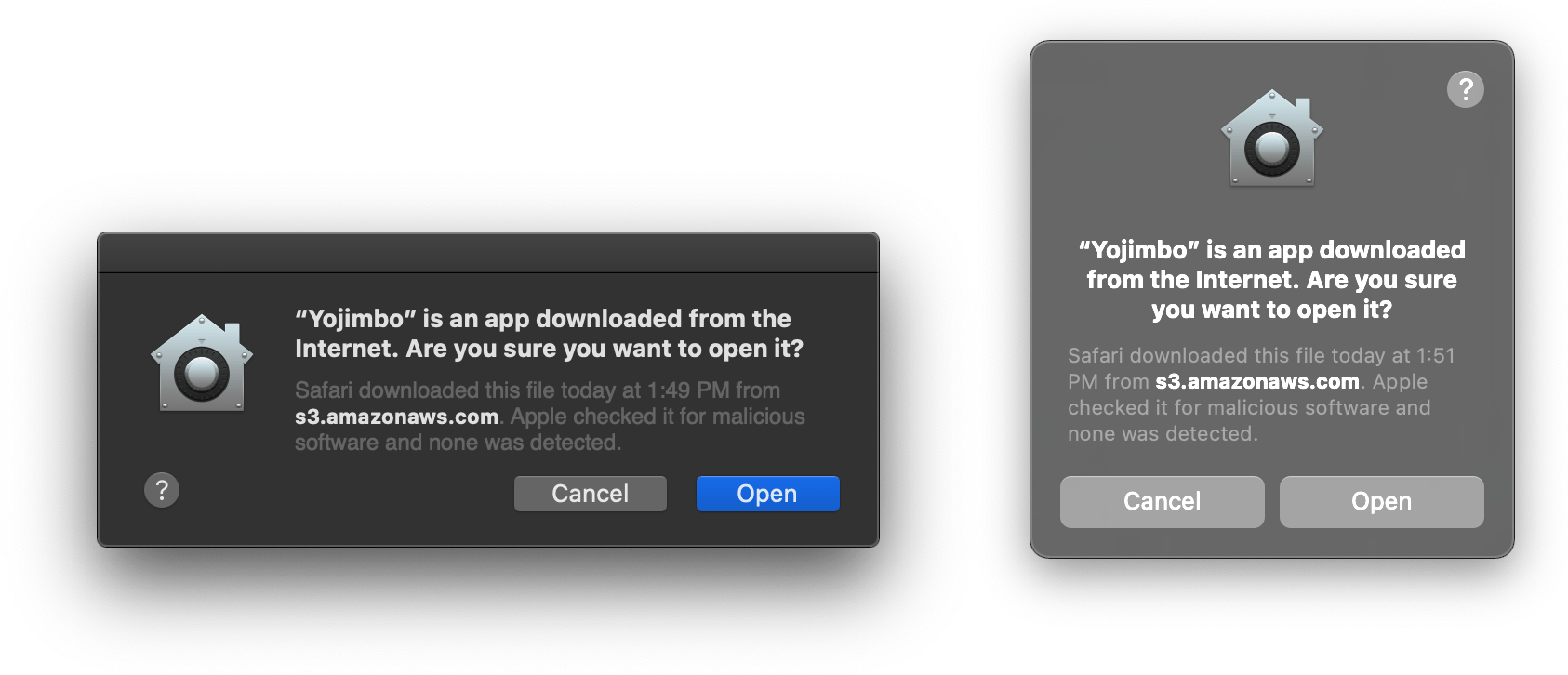
Sheets associated with a window no longer extend from the toolbar (left), but hover above the window, which is dimmed (right).
Sheets and Alerts have been updated for Big Sur too. Sheets previously extended down from an app’s toolbar like a window shade being closed. Big Sur detaches sheets, so they float in the center of a window, which is dimmed, causing it to recede into the background visually. Sheets also have a cleaner look now that is devoid of borders or bezels. Alerts have gained a more card-like look in Big Sur and use centered text, which is the layout used on the iPad and iPhone. Both sheets and alerts have also added rounded corners like Big Sur’s windows.
The centered text of alerts has been criticized as less readable. That’s true if an alert contains large amounts of explanatory text, but if you look at the system alerts used in Big Sur, short, single-sentence messages dominate throughout. With shorter text, readability is far less of a problem, and what alerts may lose in readability, they gain in consistency and familiarity with the way they are used in iOS and iPadOS. Both are small changes, but serve the overall design direction of the update and fit quite comfortably and neatly into it.
Apple has even subtly tweaked standard controls like sliders and checkboxes, and the ‘Add People’ option in the share menu for sharing iCloud Drive files has been changed to the more straightforward ‘Share File.’ The changes are slight but demonstrate the depth of thought and attention to detail that has been applied throughout the OS.
Spotlight and Siri
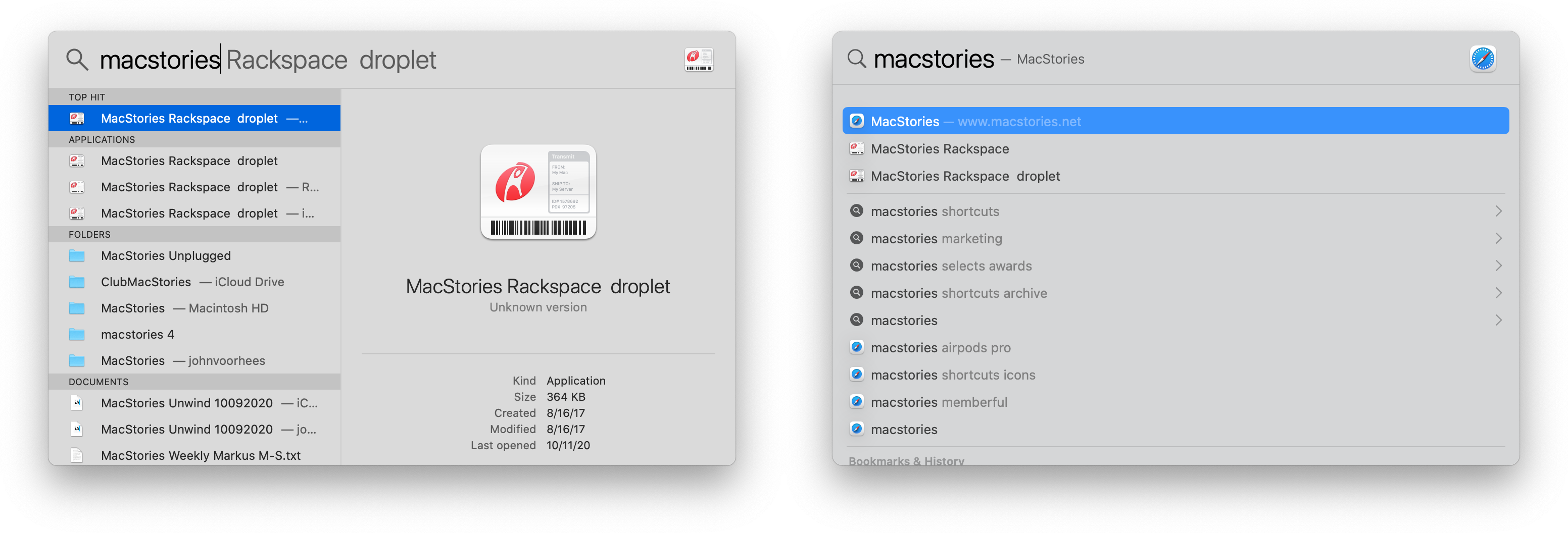
The design and functionality of Spotlight and Siri have been updated too. I don’t use Spotlight often, but in my tests, the results returned by Big Sur appear faster, more comprehensive, and easier to navigate. In Catalina, Spotlight generated a list of files, organized by type with a preview on the right side of its UI. Big Sur dispenses with the preview loading immediately. Instead, a compact list of results is generated that is organized by type. Click once to load a preview and twice to open a document.
Like iOS and iPadOS 14, Spotlight on Big Sur incorporates web search suggestions in its results, as you can see from the screenshot above, along with Spotlight search suggestions that are tailored to what’s on your Mac. For example, in the screenshot at the beginning of this section, typing ‘MacStories’ suggests ‘MacStories selects awards’ as a Spotlight search suggestion. Clicking on it reveals relevant documents, notes, and other items on my Mac, whereas clicking one of the suggestions marked with the Safari icon opens a Google search (my default search engine) for the suggested search terms in a new Safari tab. Apple says that Spotlight’s technology also powers the Find functionality in Safari, Pages, Keynote, and other apps.
According to Apple, Siri can answer more questions directly in Big Sur and handle more complex queries because it sources answers from across the Internet. Siri has lagged behind iOS and iPadOS for some time, so it’s good to see Apple spending time improving it, although the claimed improvements are too vague to meaningfully test independently.
Since the introduction of the Mac, Apple has used design to tear down barriers between users and computers. Good design makes computers less intimidating through visual metaphors that resonate and are familiar.
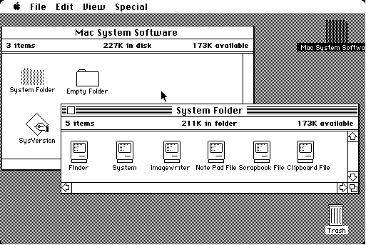
The original Mac pioneered many of the interface idioms that helped transform the computer from a device that required expertise to a tool that’s accessible to anyone. Elements of the Mac’s innovative graphical user interface endure today. The desktop, windows, folders, buttons, pointer, and so many other elements that made those early Macs approachable play the same role on modern Macs.
However, interface design isn’t created in a vacuum. It’s a reflection of the history that came before it, the tastes of the moment in which it is created, and the capabilities of the hardware underpinning it. At various times, the design of Apple’s UIs on all of its platforms has been influenced by technology that constrained or liberated what was possible and swung from one end of the fashion spectrum to the other.
What I find fascinating about Big Sur’s design is that it’s a remix of so much of what has come before. There are echoes in Big Sur’s icons of the skeuomorphic, Delicious-generation style that reached its zenith 15 years ago, and the translucent Vibrancy effects introduced with macOS 10.10 Yosemite are more pronounced today than ever. Yet it’s also impossible to pin a few influences on Big Sur and declare it a hybrid.
macOS 11 applies the design ideas of the past to create building blocks that are as tactile as they are purely digital. Big Sur’s roots in the Mac’s past form a familiar, tried and true foundation. However, it’s the synthesis of depth, translucency, and layers along with the use of vibrant color, organic rounded corners, and judicious use of whitespace, that combine to fashion something entirely unique, making clear that Apple is declaring a new era for the Mac.
I’m not surprised that we got a redesign of macOS with Big Sur, but I am surprised at its extent. In a year when Apple is in the midst of migrating all of its apps to work with Apple M1 Macs, sticking with a design closer to Catalina would have been a safe, understandable choice. I’m glad, though, that Apple took a bolder approach that complements the character of the changes coming with Apple M1 Macs. It’s a design for a new kind of Mac, one that leverages the traditional strengths of the platform and promises to draw on what the company has learned from over a decade of iPhones and iPads to reinvent the Mac.


