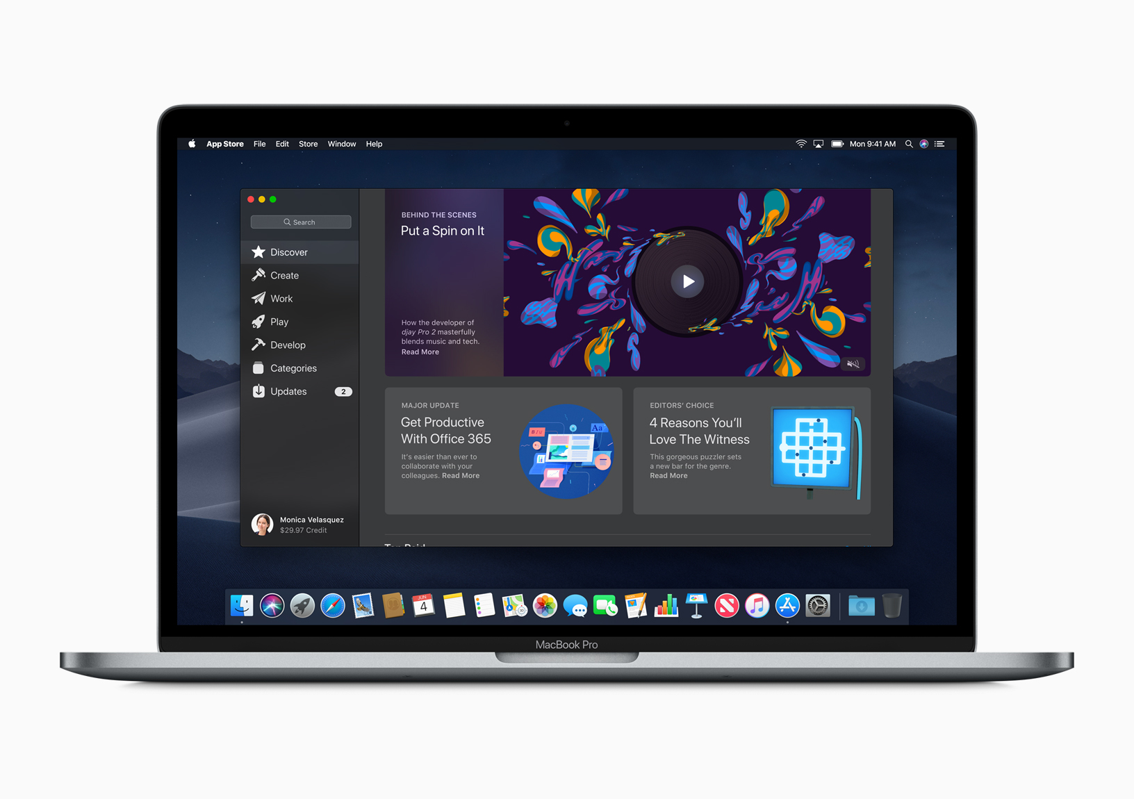
I went to San Jose this June not expecting much from macOS. After all, it’s a mature OS that already did what I need. My expectations were reinforced by rumors and leaks that Apple would introduce a Dark Mode and the fact that High Sierra introduced several significant foundational changes to macOS. I concluded that Mojave would focus primarily on a design refresh.
I was wrong. Dark Mode is the most visible and one of the most significant changes to macOS, but Mojave is much more than a UI refresh. Dark Mode and Mojave’s other system updates include productivity enhancements that have made meaningful improvements to the way I work on my Mac.
It took some time to acclimate to Dark Mode, but now I prefer it. As much as I like Dark Mode though, the most important changes to macOS have been those that surface existing functionality in new places making them more useful than in the past.
Mojave adds a collection of Desktop, Finder, and screenshot tools that are notable for the way they meet users where and how they work. It’s a functional approach to computing that has had a bigger impact on my day-to-day workflow than other recent updates to macOS, even where the Mojave updates provide new ways to do things I could already do before.
There’s a lot to cover in Mojave, so I’m going to dive right in and dispense with explaining how to set it up. Apple has a whole page devoted to the topic that you can explore if you’d like. Instead, let’s start by considering how Mojave’s Dark Mode.
Dark Mode and Accent Colors
Dark Mode
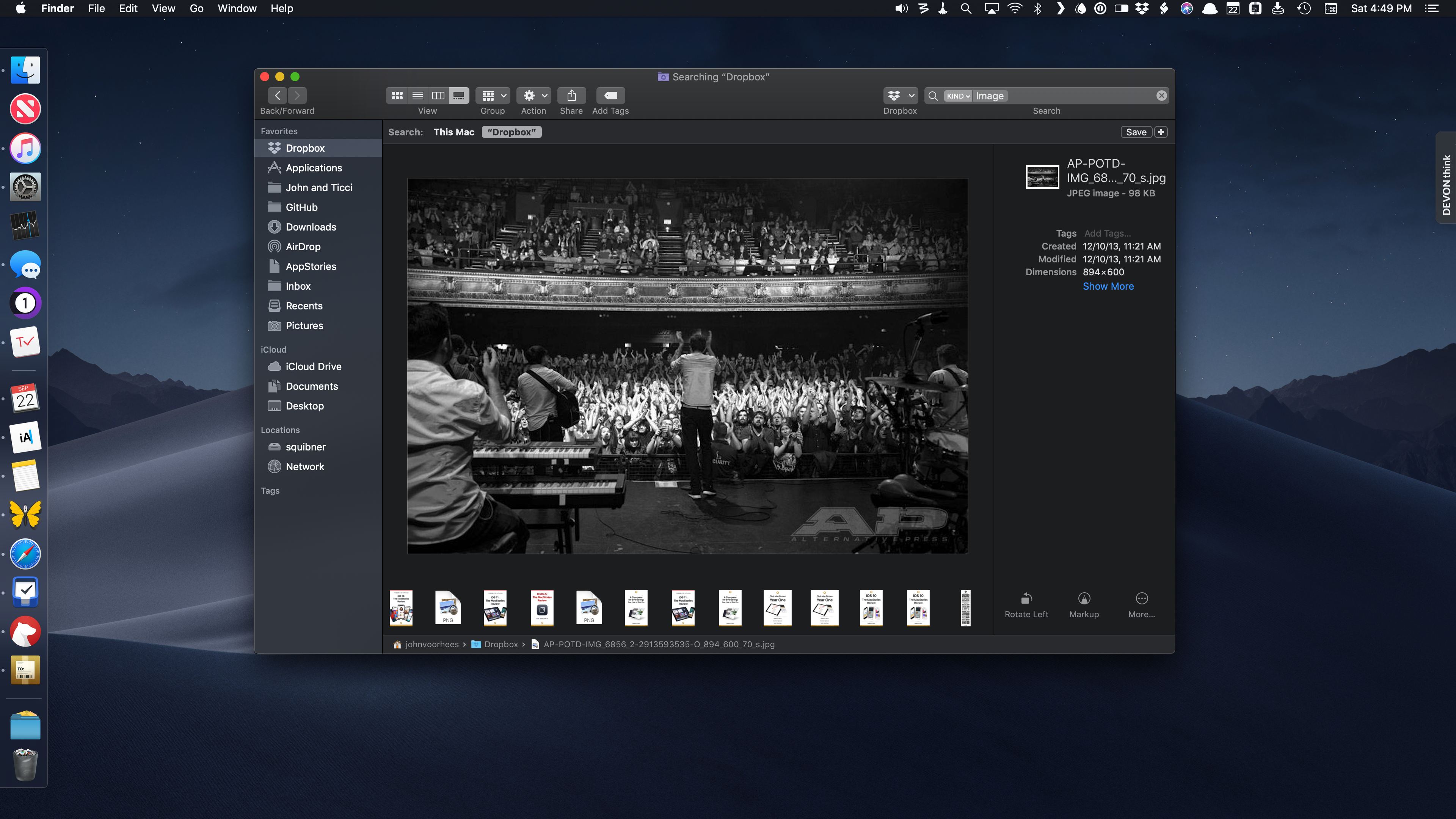
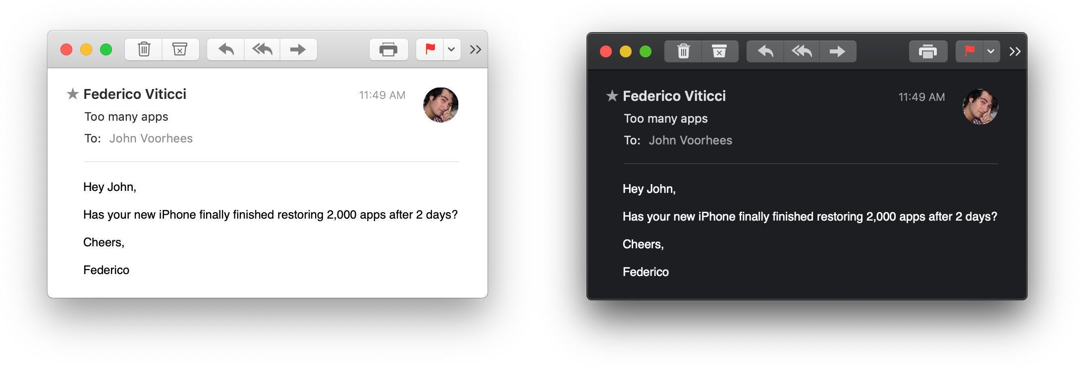
Dark Mode, which can be enabled from the General section of System Preferences, is the natural place to start because it’s the feature that will be in front of you all day long as soon as it’s enabled.
Enabling Dark Mode.Replay
Dark interfaces have been available in Apple’s pro apps like Final Cut Pro and Logic Pro for years. One advantage of dark UIs is that they emphasize the content rather than the app, which is useful when editing video or photos. Dark UIs also eliminate the harsh glare of a white screen in your eyes if you spend long hours in front of a screen.
Some of the benefits of dark UIs may be merely psychological too, but after two years in front of a dark theme in Ulysses, I’m convinced that it’s been easier on my eyes. I also prefer dark themes aesthetically.
Since installing Mojave and spending a lot of time exclusively in Dark Mode, I can report that it takes time to get used to, but it’s grown on me. At first, I felt like I had a harder time identifying overlapping windows because it was harder to see their drop shadows. Over time that feeling has faded, and I plan to stick with Dark Mode going forward.
Before enabling Dark Mode, any time I would switch away from Ulysses’ dark theme to something with a bright white background, the abrupt change was jarring. That problem is improved with Mojave, but it’s not likely to be eliminated anytime soon I’m afraid. That’s because when you turn on Dark Mode, the appearance of third-party apps only changes if their developers have implemented Dark Mode. It’s not automatic.
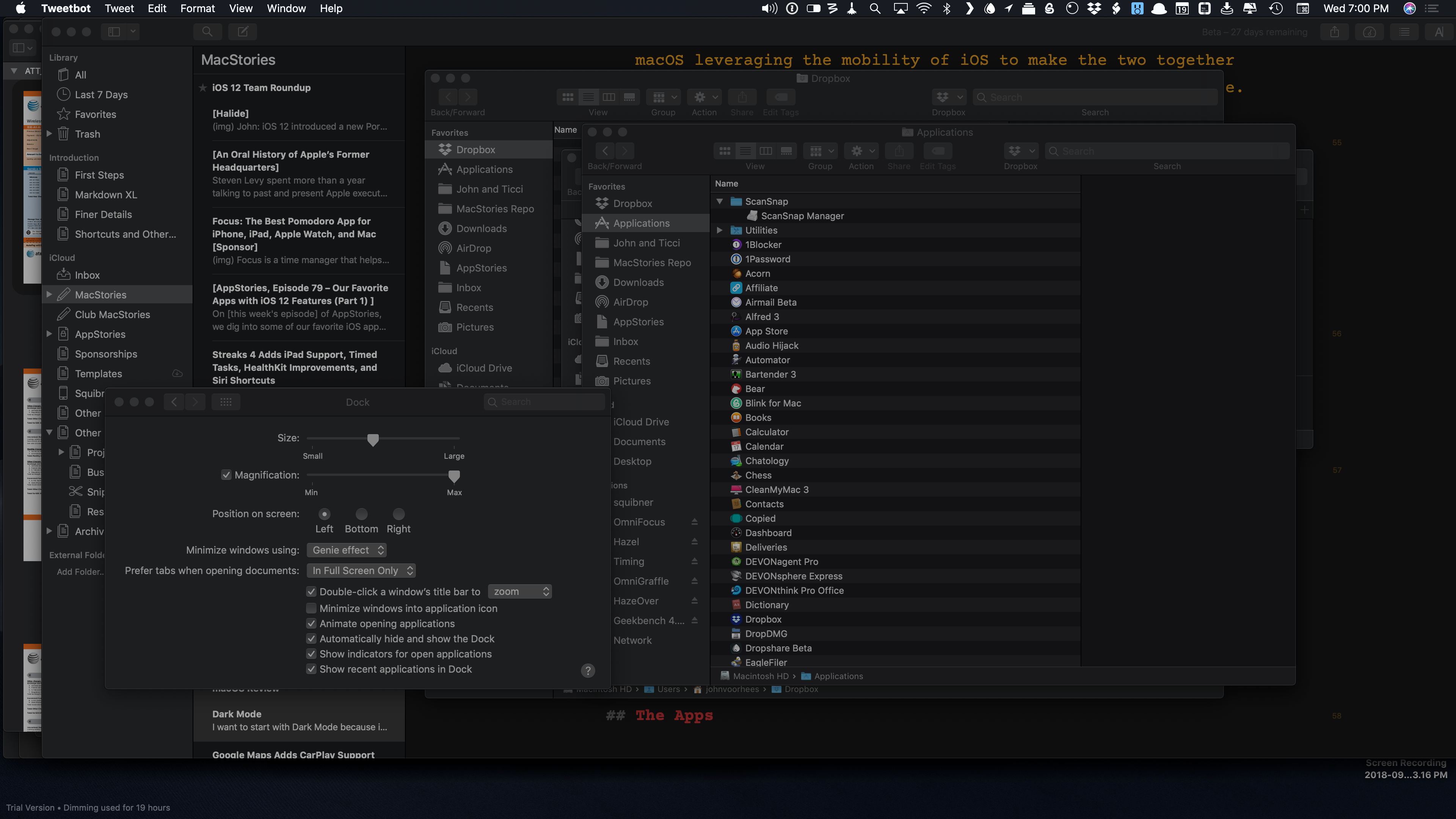
This means you’re likely to have apps that don’t support Dark Mode on your Mac right away. The good news is that developers seem to recognize that if they don’t implement Dark Mode, they are going to stick out like a sore thumb. As a result, many have already made the transition as you can see in the gallery of third-party apps with Dark Modes that I’ve collected below.
Dark Mode won’t be for everyone, but I expect many people will prefer it, and for them, finding apps that support Dark Mode will become a priority. I also suspect that the number of people who run their Macs in Dark Mode full-time will be large enough that third-party developers who don’t implement it run a substantial risk of causing users to look for alternatives to their apps.
The reason Dark Mode isn’t automatically applied to all apps is that it’s not as simple as making the window chrome dark gray. There is a lot going on to make Dark Mode work. If you look closely, the grays change depending on the colors behind them. Apple is using the color of images on your Desktop and behind what you see to subtly tint the window chrome, so the grays harmonize with the rest of the environment. Even the drop shadows beneath the windows, the icons in toolbars, and the Dock’s trash can change between Light and Dark Modes to provide a cohesive experience for users.
Because it’s not a trivial implementation detail, it may be a while before your favorite apps support Dark Mode. Even then, however, not everything will be dark. Apple explained to developers at WWDC that some apps, like like photo browsers and video editors benefit from always being dark, but there are exceptions. Apple believes that other apps still benefit from the contrast of a white background and dark text, which is an option in Mail for example. In Mail, you can switch the message compose window to white, but I prefer that to be dark too and have not yet run across a situation where I want an app to run with a light-colored background.
Although Apple suggested that it can be appropriate to make content areas like Mail’s message composition window light, I don’t like it in the few apps I’ve seen take that approach. I hope that, like Apple, they too provide the ability to switch to a dark content area.
I also appreciate apps like Acorn that provide a setting to allow users to switch between system-selected Light or Dark Mode, always-on Light Mode, or always-on Dark Mode or support themes, which allows for the same sort of customization. I haven’t seen many apps that take Acorn’s approach, but I like the choice it gives users to customize their Mac environment.
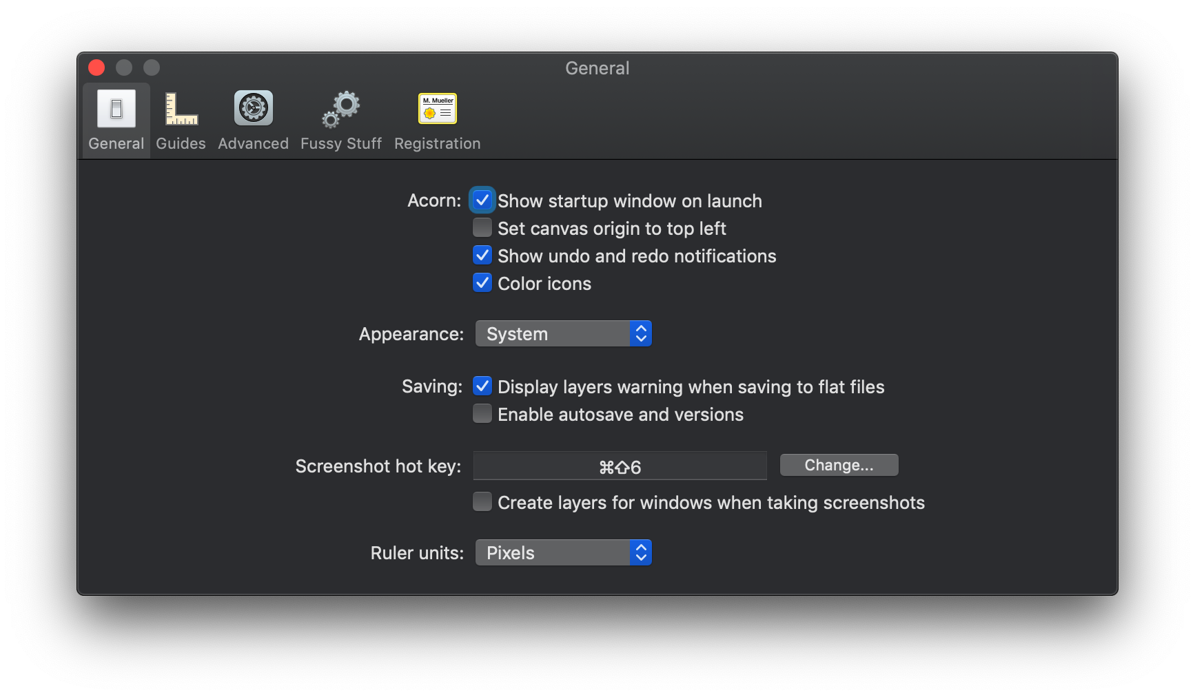
Acorn gives users the option to follow the system-set appearance or force Light or Dark Mode regardless of system settings.
Safari is another app where you’ll see a lot of white. Although the window chrome is gray, the web content is whatever color the publisher decides to make it. Navigating to sites like The New York Times, with its predominantly white background, feel like having a flashlight shined in your eyes after you’ve been using Dark Mode for a while.
Applied system-wide, Dark Mode was hard to adjust to initially. Now though, I don’t want to go back. That’s been especially true since early September, one of the busiest times of the year at MacStories when my hours in front of a screen got longer. It won’t be for everyone, but if you decide to try Dark Mode, give it a while to sink in before calling it quits.
Accent Colors
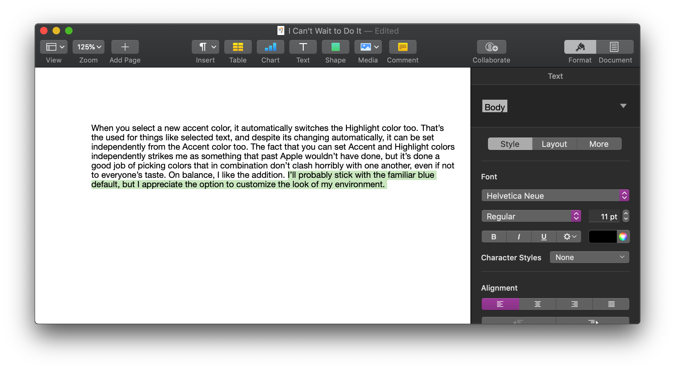
Also new in Mojave are Accent colors. Set to blue by default, these are the colors used by macOS to indicate that a radio button or other controls have been selected. In addition to blue, there are options for purple, pink, red, orange, yellow, green, and graphite, which was also previously available with blue as an ‘Appearance.’ Each shade looks a little different depending on whether you’re in Light or Dark Mode.
When you select a new Accent color, it automatically switches to the corresponding Highlight color too. That’s the color used for things like selected text, and despite its changing automatically to match the Accent color, it can be set independently after the fact, which strikes me as something that ‘past Apple’ wouldn’t have done. Still, the company has done a good job of picking colors that in combination don’t clash horribly with one another, even if some combinations won’t be to everyone’s taste. On balance, I like the addition. I’ll probably stick with the familiar blue default, but I appreciate the option to fine-tune the look of my environment.
The Desktop
The Dock
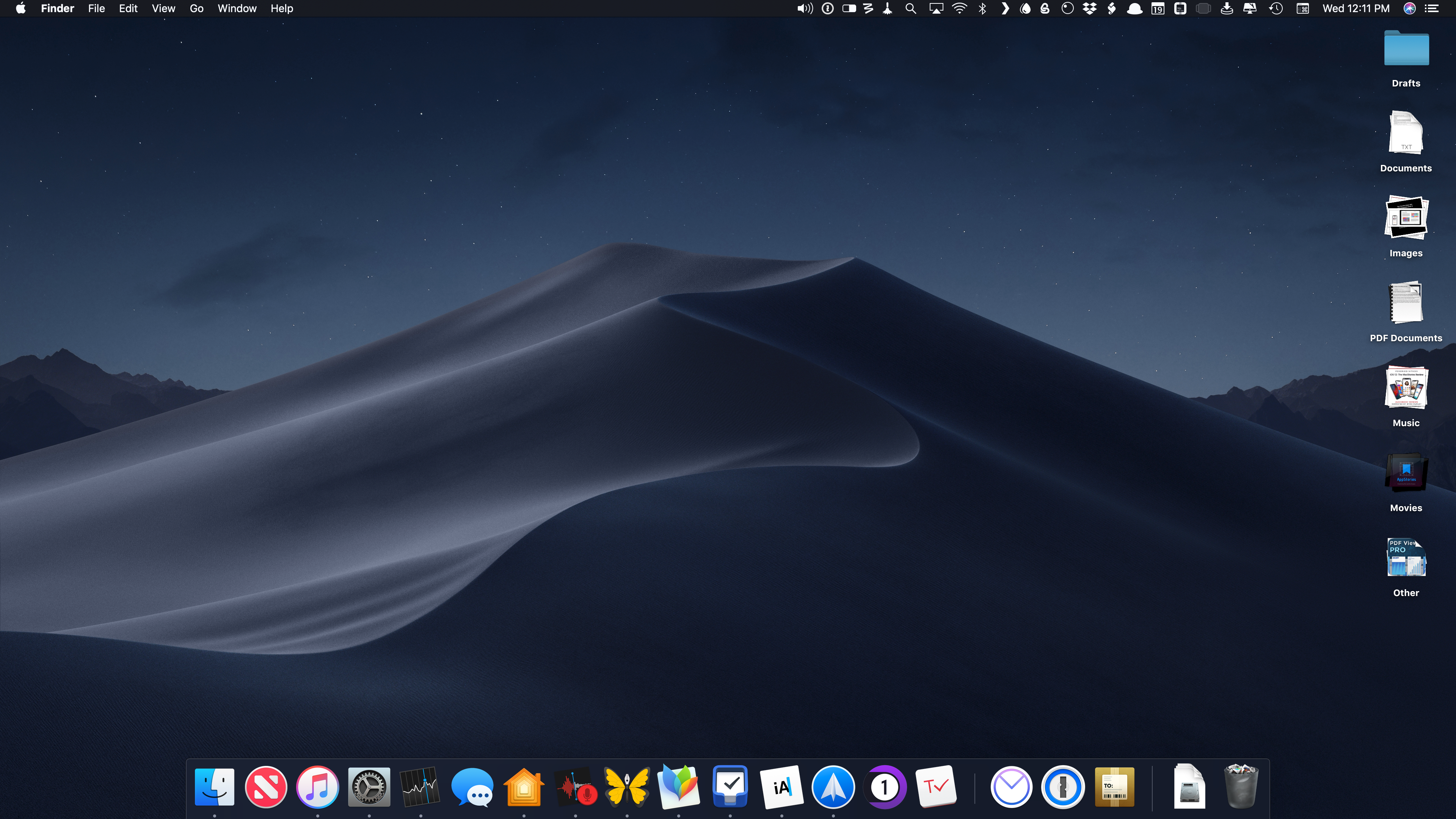
Airmail, 1Password, and Deliveries are recently used apps separated from the rest of the Dock by a short divider.
The Dock received the same Dark Mode treatment as the rest of the OS, though you can no longer only set the Dock and menu bar to a dark appearance in Light Mode. The Dock also inherited a handy feature from iOS: in the Dock section of System Preferences, there is now an option to show your most recently opened apps at the far right end of the Dock, or the bottom if your Dock is pinned to the side. Recent apps are separated by a divider that’s not quite as tall as the one used to separate Downloads and the Trash from your apps. Unlike iOS, the recent apps section of the Dock is not limited to just three items.
Wallpapers and Hot Corners
Mojave adds two dynamic wallpapers that change during the day and can be found in the Desktop and Screen Saver section of System Preferences. One called Mojave shows a dune in the Mojave desert as the lighting changes throughout the day, transitioning through 16 different images. The second dynamic wallpaper is called Solar Gradients, which is a more abstract wallpaper that connotes the time of day through color gradients.
Alternatively, you can choose from a selection of nine other static wallpapers. Two are static versions of the daytime and nighttime Mojave dynamic wallpaper, and the remaining seven include a variety of desert scenes captured at different times of day, providing a nice spectrum of colors and brightnesses that work well in Light or Dark Mode.
The Desktop and Screen Saver section of System Preferences is also where you can set hot corners to perform system actions when you move your pointer into a corner of the screen. With Mojave, Apple has added the option to lock the screen, which for people who work in an open environment with sensitive information will be a nice alternative way to lock down your system before stepping away from your Mac.
Stacks
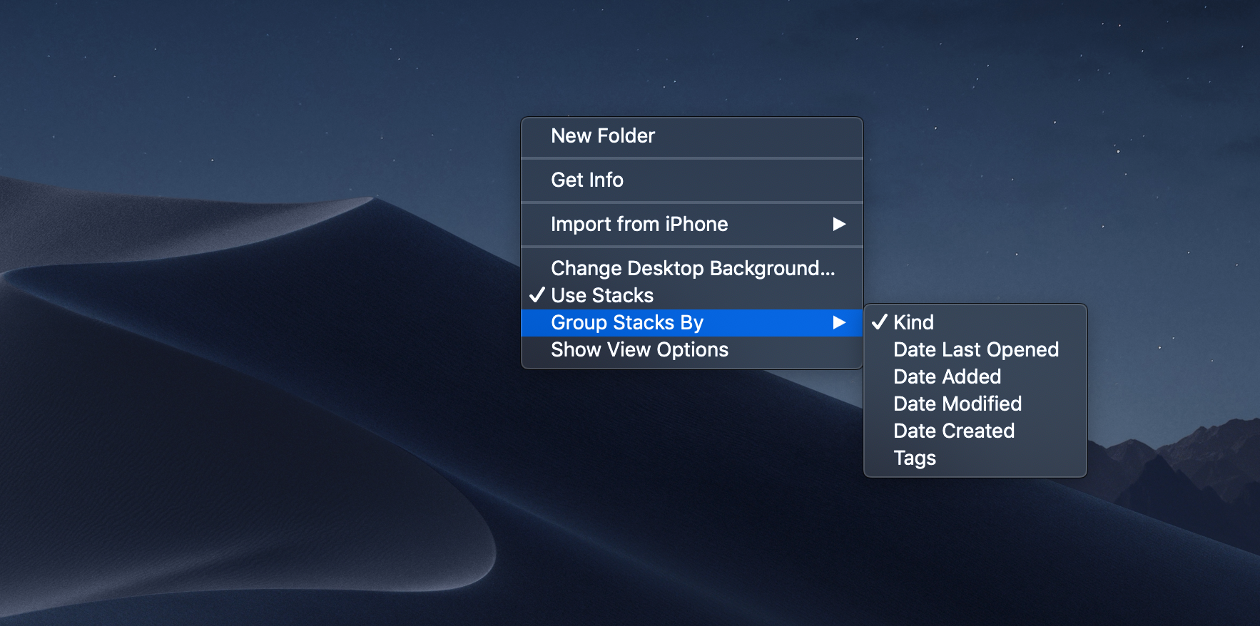
In a nod to the fact that many people park files and folders on their Desktop in a cluttered, chaotic mess, Apple has created Stacks. Stacks can be accessed by right-clicking the macOS Desktop and enabling the ‘Use Stacks’ option. As soon as you do, whatever jumble of files and folders you have scattered across your Desktop animate to the right-hand side of the Desktop, ordering themselves into neat piles. Folders aren’t stacked, but are neatly lined up too.
Organizing files with Stacks.Replay
Stacks can be organized by kind, date last opened, date added, date modified, date created, and tags. You can scrub through items in a stack with a two-finger horizontal swipe on a trackpad. The file thumbnails can be a little small for this to be effective when files look similar, but it works surprisingly well for images and video files.
Clicking on a stack expands it in place between your other stacks so you can see the icon of each file it contains. If you’ve got a large stack, expanding it can extend rows of files far across your screen. At the end of the expanded rows will be any stacks below the one you expanded, which can be confusing until you understand what’s happening. Once expanded, you can use Quick Look to preview a file or do anything else you could previously do with a file on the Desktop. Click on the downward facing arrow icon above the first file in the expanded stack, and your stack will be collapsed again.
Expanding a Stack to view its contents.Replay
I like that Apple has recognized the ways many people work on their Macs and have provided a tool to tidy up the Desktop a bit. I often park files for projects that are in process on the Desktop. It’s rarely more than a dozen or so files that I clean up at the start of the next week, but sometimes it gets more out of hand. In either situation, I’ve benefitted from stacking files (usually by kind), which has made it easier to find what I need quickly. The feature works best with a limited collection of files and folders, but even if you have dozens of files on your Desktop, Stacks is a quick and painless way to bring some order and organization to them.


