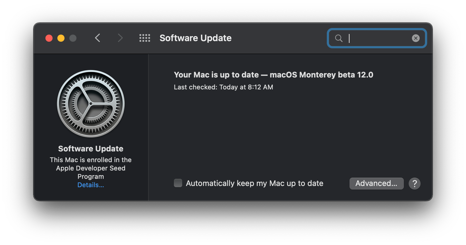
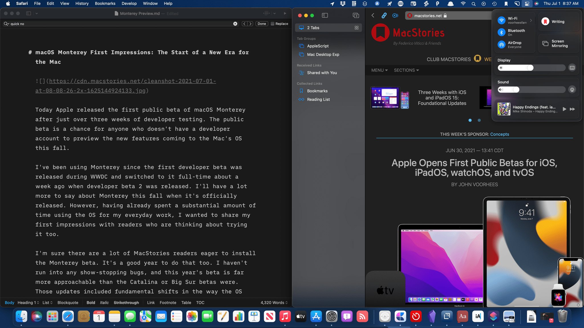
Today Apple released the first public beta of macOS Monterey after just over three weeks of developer testing. The public beta is a chance for anyone who doesn’t have a developer account to preview the new features coming to the Mac’s OS this fall.
I’ve been using Monterey since the first developer beta was released during WWDC and switched to it full-time about a week ago when developer beta 2 was released. I’ll have a lot more to say about Monterey this fall when it’s officially released. However, having already spent a substantial amount of time using the OS for my everyday work, I wanted to share my first impressions with readers who are thinking about trying it too.
I’m sure there are a lot of MacStories readers eager to install the Monterey beta. It’s a good year to do that too. I haven’t run into any show-stopping bugs, and this year’s beta is far more approachable than the Catalina or Big Sur betas were. Those updates included fundamental shifts in the way the OS worked that made the update uncomfortable for some users. There’s some of that in Monterey, but less than in the past couple of years. Instead, Monterey introduces a collection of enhancements to existing system apps and new cross-system feature integrations that make the update useful immediately. Coupled with the debut of Shortcuts on the Mac, there’s a lot in this year’s beta that I’m sure MacStories readers will enjoy testing.
To Apple’s credit, much of Monterey feels like a natural extension of the OS’s existing features and system apps, even in the early betas. Focus, Quick Note, Live Text, and AirPlay to Mac all fit into that category, feeling right at home with the rest of the OS. However, that’s not universally true. I think Apple has overshot its target with Safari in some respects, which is disappointing in no small measure because there are also meaningful innovations coming to the browser this fall that have already been useful in my daily web browsing.
Of course, I’m also very excited about Shortcuts for Mac. If you’ve used the automation app on the iPhone or iPad and have a Mac, I don’t know how you couldn’t be eager to try the app. If you rely on Shortcuts as I do, Monterey is a very big deal that, even early in the beta cycle, delivers on the promise of a unified vision of automation across Apple platforms.
The Shortcuts team has done a remarkable job of ensuring that many of my everyday shortcuts already work without needing me to do anything. Combined with deep integration of existing scripting systems, Monterey backs up the statement made onstage at WWDC that Shortcuts is the future of automation on the Mac. There’s still work to be done before Shortcuts is as powerful as other Mac automation solutions, but the app is off to an excellent start.
Before diving into what it’s been like to work full-time with Monterey, it’s worth stepping back and considering where macOS has come from over the past few years. In many ways, Monterey feels like the third act of a story that’s played out since the introduction of Catalina. That update was a little unsettling. It was clear macOS was heading in a new direction, but the destination was unclear.
With the introduction of M1 Macs, improvements to Mac Catalyst, and Big Sur’s design changes, macOS’s destination began to come into focus. The OS was being aligned more closely with Apple’s other OSes through a combination of design and underlying technologies to create a continuum that respects device differences but unifies user experience across the entire lineup.
I don’t think I’d go so far as to declare Monterey the conclusion of macOS’s three-act drama. There are elements of tying up the loose ends left over from the prior two releases of the OS. However, we’re also seeing the first tangible examples of where the Apple silicon era will take the Mac even as the company continues to migrate the machines to its own SoCs.
One thing’s for certain, though: the sometimes awkward evolution of macOS over these past few years and the adjustments required to move the Mac and iPad into closer alignment are bearing fruit. For the first time in memory, Apple is releasing features across all of its platforms at once. The days of waiting for features that start on one platform to make their way to others seem to be coming to an end. That’s terrific news for users who will be able to move more freely between platforms without a steep learning curve, eliminating a lot of the frustration of the past.
With that, let’s dig into some of the details that I think will have an immediate impact on readers who download the macOS Monterey public beta.
Proceed With Caution
It should go without saying that you shouldn’t install the Monterey public beta without a good backup strategy. That means more than just backing up your data. A data backup is critical, but I also mean that you should have a plan if something goes terribly wrong because of the beta.
I’ve been on the Monterey developer beta since it was first released at WWDC, and I haven’t had significant issues. During the first developer beta, I had a couple of apps that crashed on launch, and Shortcuts was flakey, but those problems largely disappeared since then with the release of beta 2 a week ago. As a result, I expect the public beta will be stable for most people too.
Still, your experience may differ. I’ve got a set of apps that I use every day that work, but that doesn’t mean others will. I’ve also continued to experience periodic Safari crashes and Bluetooth peripherals dropping their connections fairly regularly. What I’m saying is, don’t expect everything to work perfectly. I’ve got a high tolerance for living with these sorts of bugs since this isn’t my first beta rodeo, but if that sort of thing bothers you, consider waiting for the official release in the fall. No official release ships without its own set of bugs, but the situation will undoubtedly improve between today and the fall.
Safari
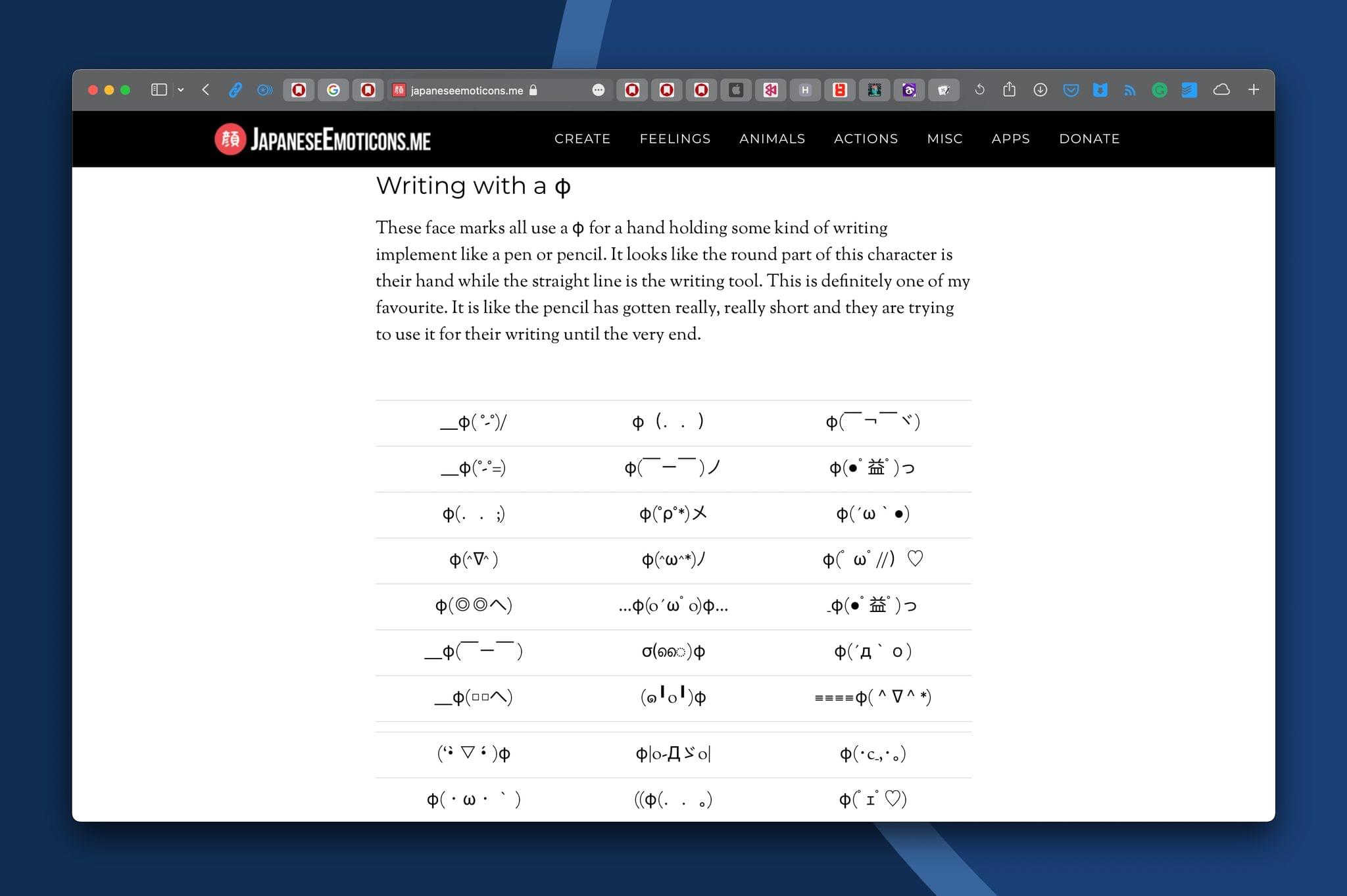
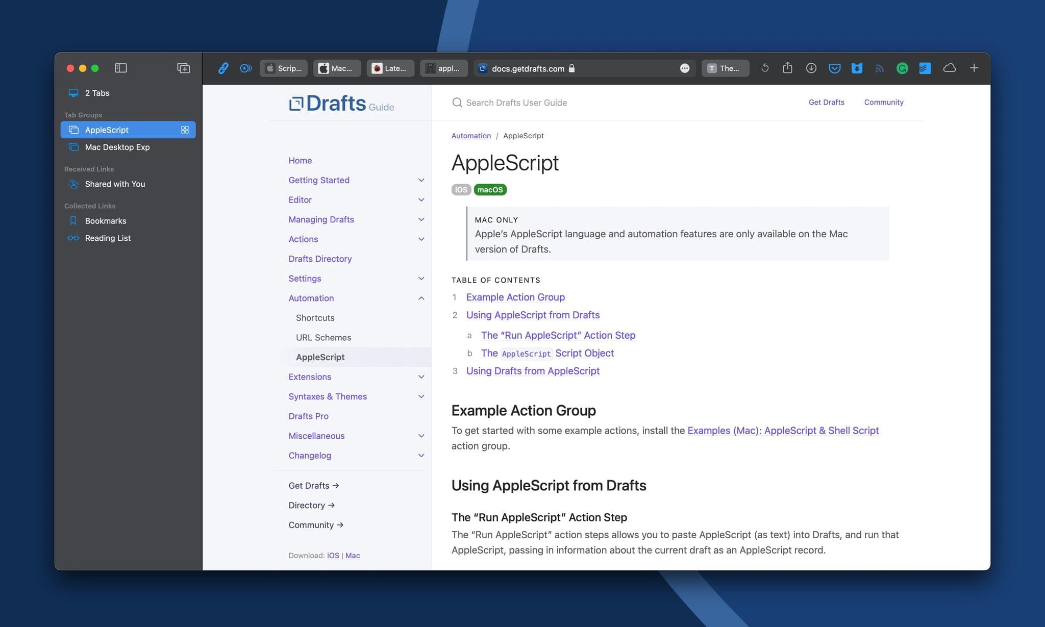
Which of those MacStories favicons in the tab bar is the homepage and which is our image uploader? Your guess is as good as mine.
There’s no system app that I spend more time in on my Mac than Safari. My text editor is probably the only other app that beats it in terms of sheer hours used every week. There’s a lot to like about parts of what’s changed in Safari, but I can’t say the same about all of the changes to Safari because the streamlined tab bar is a design that causes more problems than it solves.
Apple has combined Safari’s tab bar and toolbar into a single strip that it refers to as the streamlined tab bar. By combining the two bars at the top of the browser’s window, the company has opened up more vertical space for content, which is a small, but welcome win if you’re using a Mac with a small screen, but it’s not a change that I think is worth the usability cost it imposes.
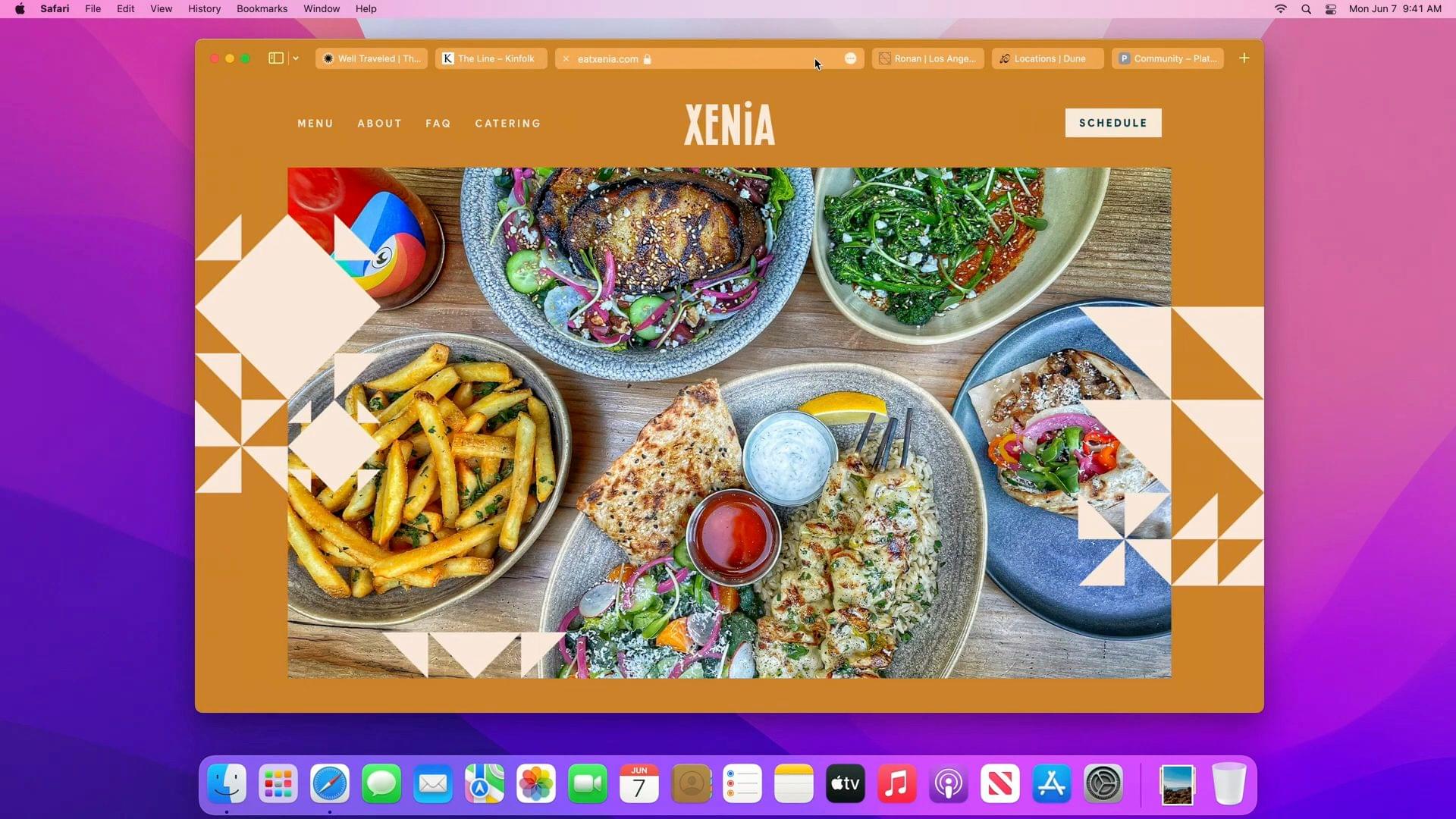
The tab bar’s new design looks great, but the practical reality of using it is less exciting. Source: Apple WWDC keynote.
The streamlined tab bar looks fantastic if you’re flipping between two or three tabs with beautiful photography. The combination of the unified tab bar and toolbar and the way Safari extends the background color of a website to the top of the browser’s window deemphasizes window chrome, putting the user’s focus on the content.
The trouble, however, starts once you’ve opened several tabs and installed a handful of web extensions, which I expect is closer to the way most people use Safari. By cramming two toolbars worth of features into a single strip, there are simply too many things competing for limited horizontal real estate. Depending on your Mac’s screen size and the number of Safari extensions you have installed, it can become difficult to tell one tab apart from another before you reach a dozen open tabs.
Buttons for reloading a page and sharing a URL that used to be in Safari’s toolbar by default have been hidden behind a three-dot More button to conserve space. The More button also includes Safari Reader, bookmark, Quick Note, and the Privacy Report. That’s a lot behind one button, but given the unified tab bar and toolbar, it’s not surprising Apple went this route.

Although Apple’s built-in toolbar buttons adjust to account for the color that extends to the toolbar from a webpage, web extension buttons don’t seem to, which is problematic for a site like Macworld, which is close to the color used for extension buttons.
The trouble is that even after removing buttons like Refresh and Share, which I don’t think should have been hidden, there’s still not enough space for more than a dozen or so tabs before it becomes difficult to tell them apart. Apple has already made some changes during the developer beta that address some of the early complaints, but the changes also highlight the design corner the company has painted itself into. Now, when you hover over the Smart Search field, a refresh button appears. You can also customize the toolbar to add back dedicated Refresh and Share buttons. I’m glad to see Apple trying to address some of the early concerns about the new toolbar design, but adding buttons back to the toolbar makes the tab situation worse by taking up more horizontal space.
Bottom line, I’d like to see the unification of the tab bar and toolbar rolled back or an option added to settings to turn it off. I applaud the effort to free up more space for content and also appreciate the more unified look afforded by the extension of websites’ colors to the tab bar, but the usability cost of cramming so much into one horizontal strip is too high.
On a more positive note, I love the new Safari sidebar and its introduction of tab groups. As I explained earlier this week for Club MacStories members in our monthly newsletter, I didn’t understand tab groups at first. They seemed like bookmarks by another name, but there’s a fundamental difference. A bookmark takes you to the same URL every time, whereas tab groups simply save the state of a group of tabs at a particular point in time. If you revisit a tab group later and navigate to different webpages, that new state is what you’ll find the next time you open the tab group.
I’ve found that tab groups are a fantastic way to deal with interruptions and long-term projects. If I have several tabs open and something comes up that requires me to dive into a bunch of new tabs, I can quickly save my existing tabs before digging into the new task. That way, I can pick up right where I left off when I free up. Tab groups are also perfect for those times when you start researching a topic and suddenly find yourself with more tabs open than you can deal with, allowing you to resume later when you have more time. Instead of being bookmarks by another name, tab groups are an excellent complement to them.
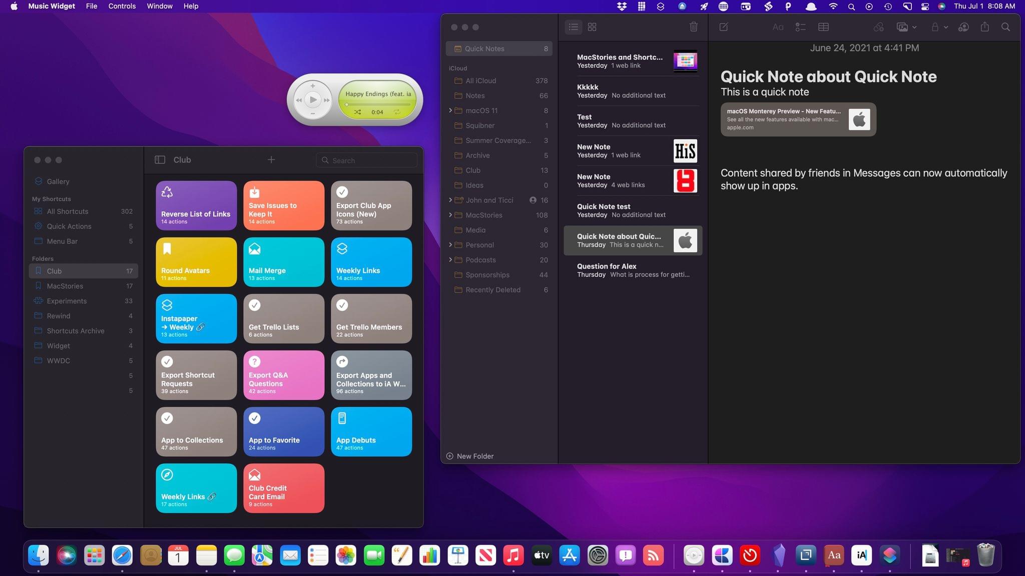
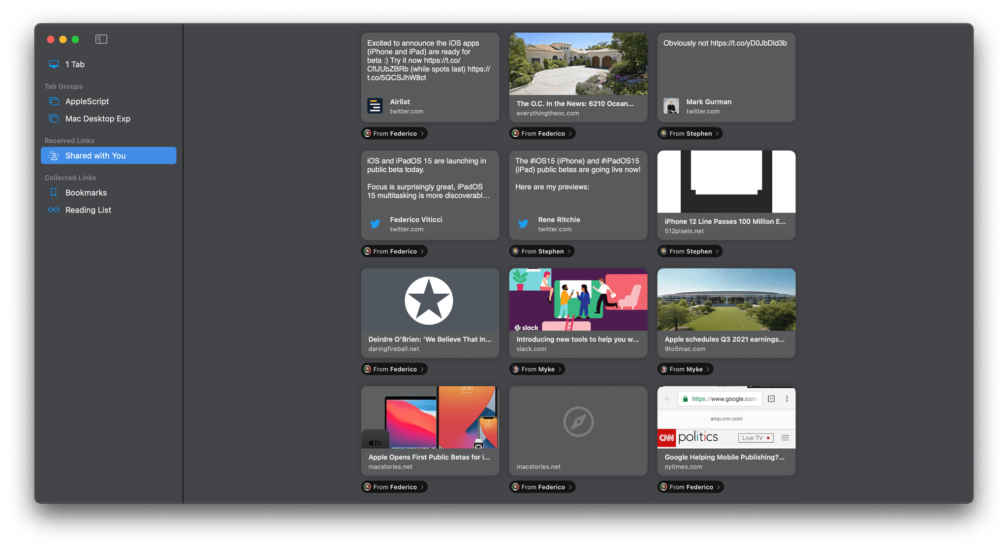
I also appreciate the addition of Reading List and Bookmarks to the sidebar, which makes it a one-stop-shop for navigating the web. I’m less thrilled with the new ‘Shared with You’ section in Safari. Shared with You is a new feature available across the iPhone, iPad, and Mac that collects media shared with you in Messages in dedicated sections that have been added to News, Safari, Photos, TV, and, on iOS and iPadOS, Music. I appreciate the effort to extract media from Messages, which eliminates the need to scroll back through message threads to find it, but I’d like an option to hide the section because, in the case of web links, I already have systems in place to save them.
Safari has also gained some new privacy features. Intelligent Tracking Prevention now prevents you from being tracked by your IP address, and iCloud+ includes a VPN-like service called iCloud Private Relay for browsing the web more securely and privately. We’ll have more on iCloud Private Relay later this summer, and I’ll cover it more fully in my review this fall, but in my initial testing, turning the feature on slows my Internet connection to about half of its normal speed. That may be unavoidable due to the way the feature’s architecture is designed, or it could be a beta issue; it’s too early to tell for certain, but I’ll be checking in on the feature from time to time and will have a better sense of what’s going on later.
I started this Monterey preview with Safari because it’s one of the most used apps on my Mac, which I suspect is also true for many MacStories readers. Although it’s still early in the beta cycle, I’m not sold on the new tab bar. I’m hoping that some clever design tweaks make the design more palatable, but I’m not optimistic that it’s the sort of thing that can be fixed with a tweak. For some people, the changes will be too much, and they’ll move to another browser. I get that, but for now, I plan to continue to use Safari to see if the situation improves, or I’m able to adapt to the changes, but also because I expect that just like iOS and iPadOS, Safari will work best with the next tentpole feature of Monterey I want to cover: Shortcuts.
Shortcuts for Mac
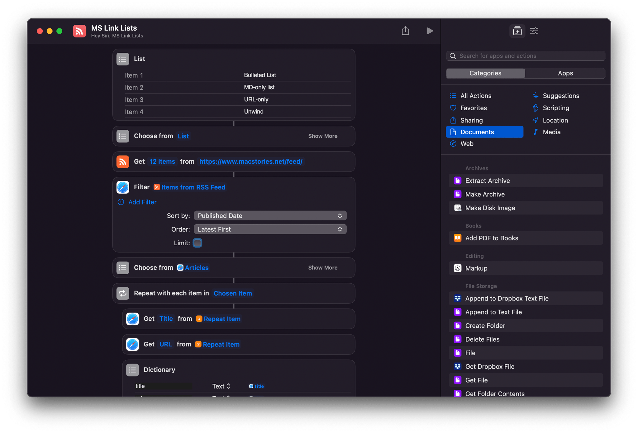
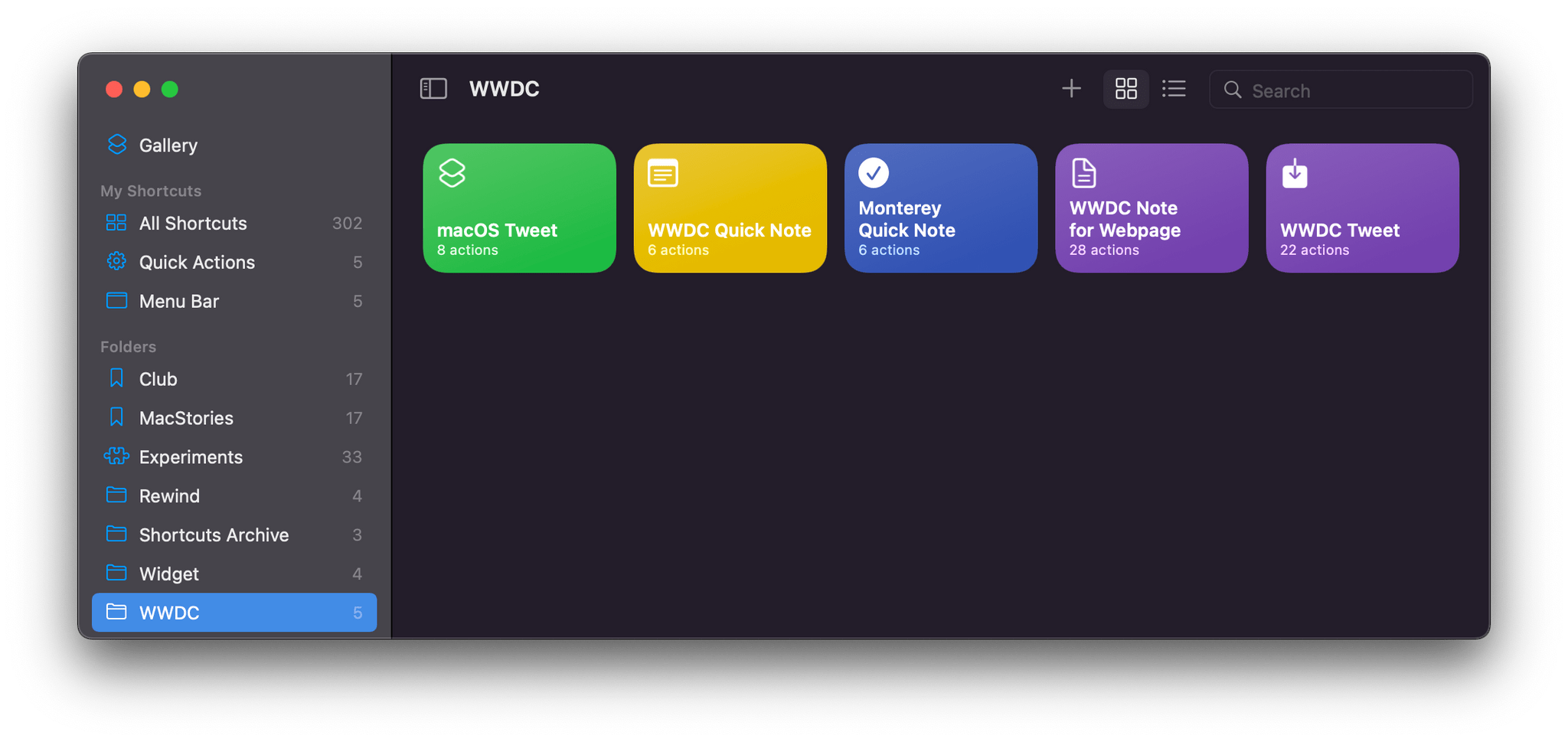
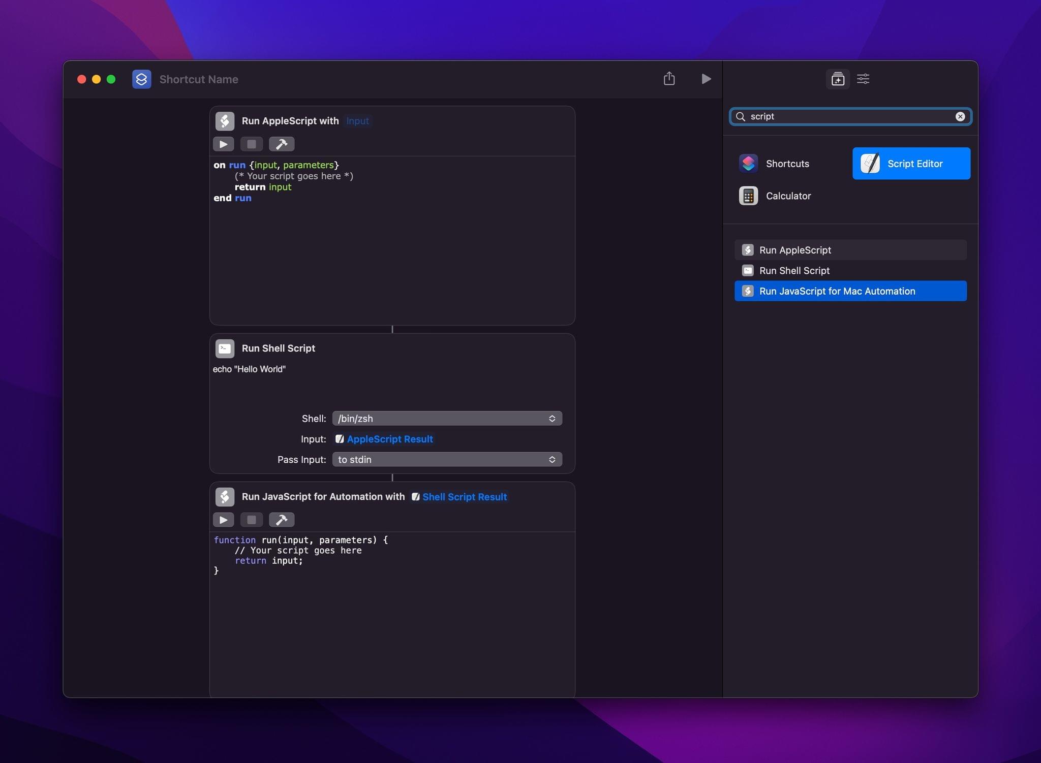
If you’re jumping into the public beta to try Shortcuts for Mac, you’re in for a treat. A lot of the shortcuts I’ve built on iOS and iPadOS and that are available in the MacStories Shortcuts Archive just worked when I tried them on my Mac for the first time. That makes the brand new Mac system app a great addition to Monterey straight out of the box. On top of that, the ability to run AppleScript, shell scripts, and JavaScript for Automation inside shortcuts was enabled last week, and in my testing so far, it works as you’d expect. The interface for the scripting actions resembles Automator, so anyone who has used that before will feel right at home.
Also, Shortcuts has its own AppleScript dictionary and command line interface, allowing you to trigger shortcuts from any app that supports those scripting systems. That means, for example, that you can build shortcuts into apps like BetterTouchTool, Hazel, and Keyboard Maestro via scripting before the developers of those apps have done anything to build native support for Shortcuts into their apps. It’s a two-way automation street that opens up a lot of possibilities immediately and is one of the most exciting aspects of Shortcuts on the Mac along with the many other ways they can be triggered, including from the Finder, Services menu, Touch Bar, Dock, menu bar, and keyboard shortcuts.
That said, I have run into some issues, particularly with web actions. There’s a new action that grabs the current URL of the active Safari tab that works, but some of the web and Safari actions that came over from iOS and iPadOS don’t work yet. It’s a limiting factor that you can try to work around with scripting, but they’re also the type of actions that should work across all platforms, so I expect they will before long.
Still, there are plenty of actions that will be familiar if you use Shortcuts on the iPhone or iPad, as well as all-new Mac actions worth exploring too. Many of the Mac-specific actions have been adapted from Automator and include options to do things like find, resize, and move windows, mount and eject disks, create disk images, label files, connect to servers, hide and quit apps, and even import audio files into the Music app, which is impossible on iOS and iPadOS. In other words, there’s already a lot to play with and try even before third-party developers start building Mac-specific actions for their apps. That makes the public beta a terrific way to get a head start with Shortcuts for Mac because, based on my conversations with developers, we’re going to see a lot of them incorporate Shortcuts actions into their Mac apps, which will expand the app’s automation options even further in the fall.
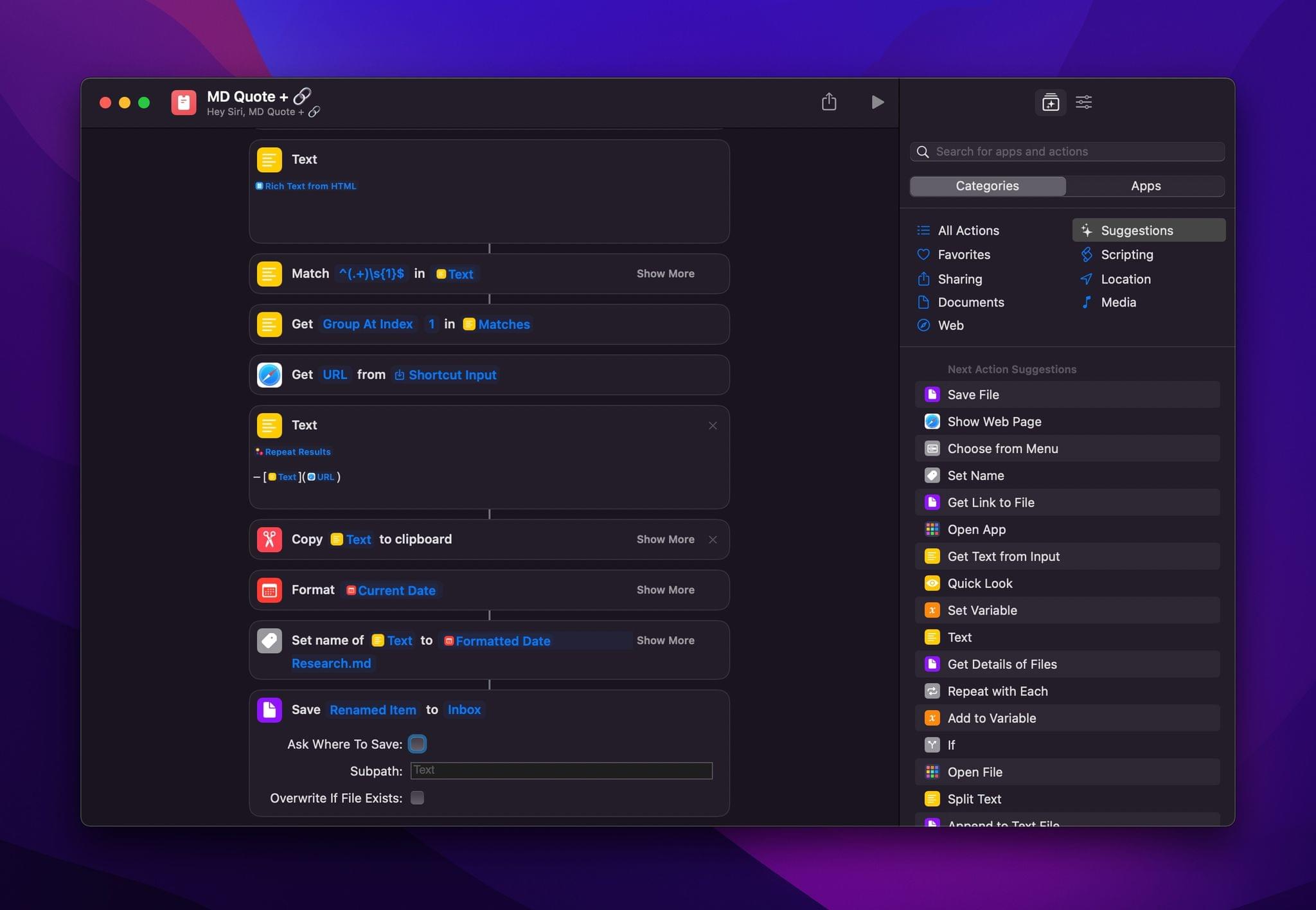
Beyond the actions available in Shortcuts for Mac, I’m a fan of the redesigned shortcut editor, which is similar to what you’ll also find in iOS and iPadOS 15. The highlight is the improved action panel that makes it easier to browse through available actions than before. It’s smart to provide a familiar experience for existing Shortcuts users, and I love the fact that on the Mac, I can open a Shortcuts editing window next to one of Federico’s Club MacStories articles as I adapt bits and pieces of his shortcuts into my own.
However, Shortcuts for Mac still needs some polishing in some areas. For example, as far as I can tell, you can copy and duplicate actions, but you can’t paste them into another shortcut, although you can accomplish a copy and paste by dragging and dropping an action between shortcuts. That’s the sort of thing I expect will get addressed in due course, but it’s worth keeping in mind that there are still some limitations to what you can accomplish in these early betas.
Focus
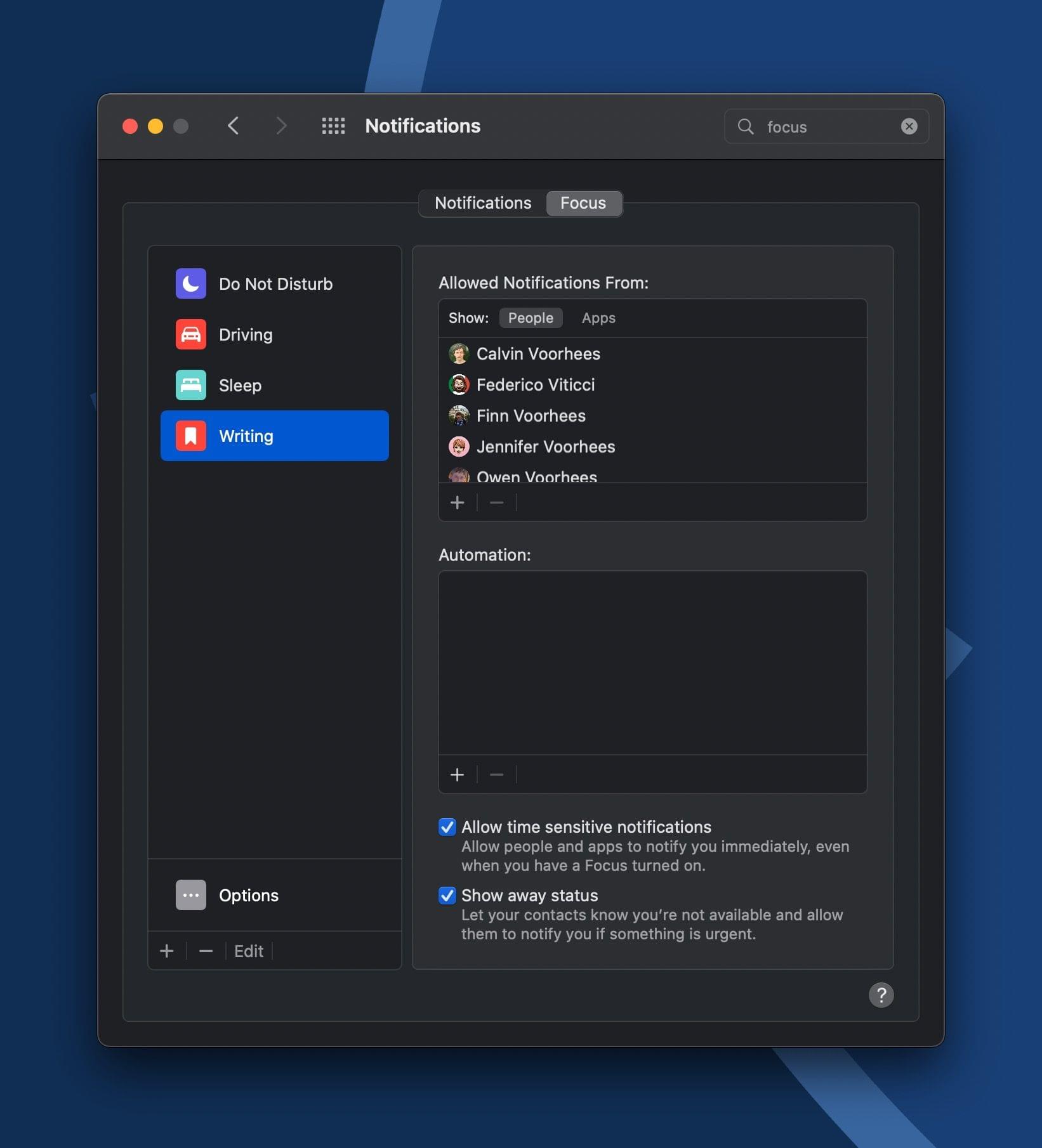
I wasn’t expecting to enjoy the new Focus feature as much as I have. A lot of thought has gone into Focus, which allows for finely-tuned setups that highlight what a simple, blunt tool Do Not Disturb was. There’s more to Focus than specifying who and what apps can interrupt you in certain contexts, but even just that unlocks a tremendous amount to control over the barrage of daily notifications everyone receives.
My first experience with Focus was a solo drive back home from Northern Michigan after a trip to visit family. I love CarPlay for trips like this, but I’ve never liked how a busy group thread can be distracting as I drive, so I set up a very simple Driving Focus Mode that allowed Messages notifications through from a handful of people as I drove home listening to an audiobook. By the time I arrived home, I knew I had to dig in deeper with Focus.
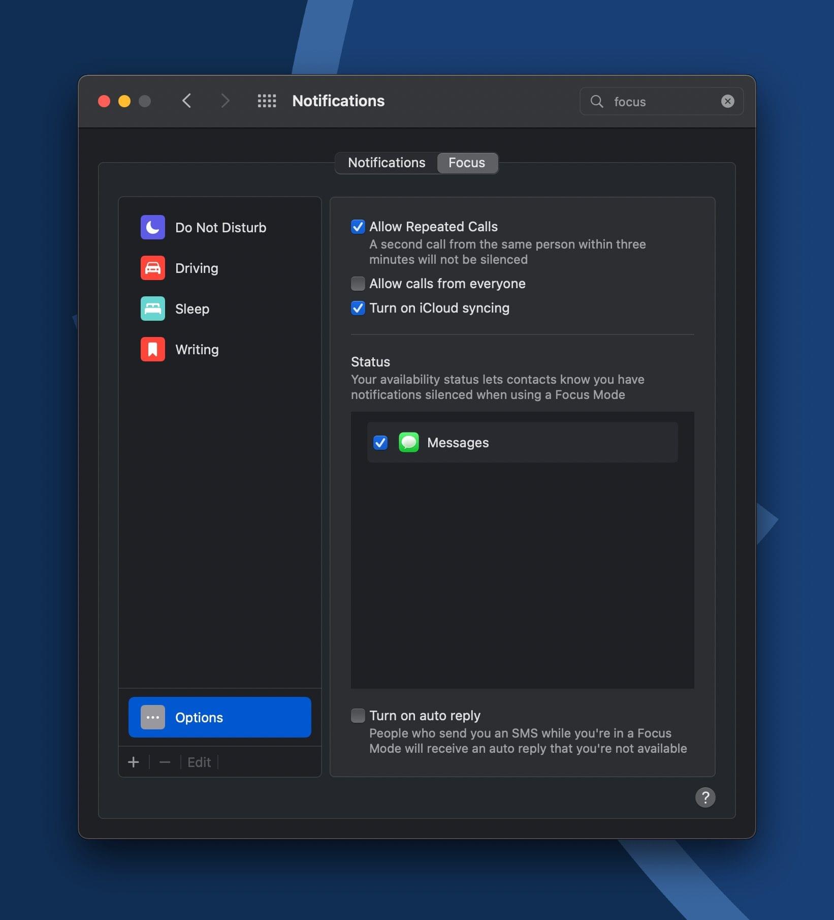
For an in-depth look at what is possible with Focus, be sure to read Federico’s iOS and iPadOS 15 preview. Many of the features are the same on the Mac, and he’s spent more time building a Focus mode Home Screens on his iPad, which I have yet to try, so I won’t cover the same ground again here. But even if you don’t combine Focus with Shortcuts, there’s a lot of power here that is easy to take advantage of with little effort. In addition to specifying which apps and people can reach you, Focus lets people know when you’re unavailable. For anyone who contacts you via SMS, you can set up an auto-responder. Also, turning on a Focus mode on one device turns it on every Apple device you own, which I absolutely love.
With the attention paid to Focus this year, I wish Apple had reconsidered the notification changes made in Big Sur. Notifications themselves are easier to identify at a glance in Monterey because they feature larger app icons and profile pictures for Messages notifications. However, the Notification Center layout hasn’t changed at all. It’s still behind the clock and shares space with widgets, which doesn’t do either any good. If I catch a notification out of the corner of my eye that I think is something for which I was waiting, I will go into Notification Center to read it, but most of the time, I leave it alone and unused. With so much real estate available on most Macs, there’s got to be a better way of organizing and displaying notifications.
Quick Note
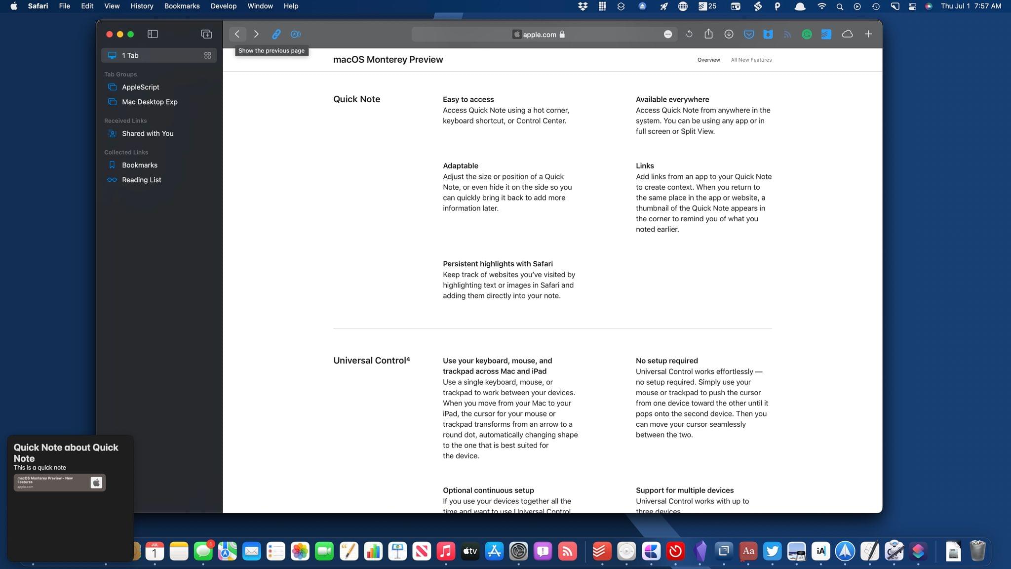
When you return to a Safari webpage for which you’ve added a Quick Note, a thumbnail pops up that you can click to open the note.
Quick Note is a feature that speaks directly to my never-ending quest to find a better way to collect and retrieve research material. The feature isn’t limited to Safari, but that’s where I’ve found it most useful so far. With text selected on a webpage, you can add a new Quick Note or add to an existing one, which highlights the text in Safari and drops the highlighted text and a link into the Quick Note. The highlighting is persistent, meaning that once you highlight a section of a webpage, it will still be highlighted when you return. In addition, a thumbnail of the Quick Note pops into view when you revisit a linked page, making it simple to reopen the related note.
My biggest hangup with Quick Note isn’t a problem with the feature, but with Notes itself and the fact that it’s not straightforward to export the data inside notes to another app. Still, I plan on spending more time this summer exploring ways I can incorporate Quick Note and the rest of Notes’ new features like mentions and tags into my daily workflow.
AirPlay to Mac and Live Text
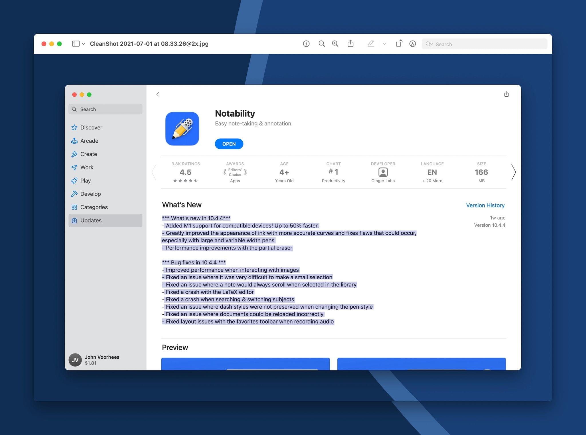
With Live Text, I can grab unselectable text from an App Store window immediately after taking a screenshot of it.
Finally, I want to mention AirPlay to Mac and Live Text. Monterey supports AirPlay to a Mac wirelessly or over a wire. So far, I’ve only used the feature to play music on my Mac from my iPhone, but that’s something I’ve wanted for a long time. I’ve always imagined that Handoff would come to the Mac at some point, and perhaps it still will, but AirPlay is a good alternative. If I’m listening to something in my car on my iPhone, I love that I can pass it to a HomePod as I enter the house, picking up where I left off. AirPlay isn’t the same since the music continues to stream via your iPhone or iPad, but the end result is close enough for my purposes. It’s worth noting, too, that the feature isn’t limited to audio. You can play video and mirror an iPhone or iPad’s screen to your Mac.
Live Text, which is also available on iOS and iPadOS, makes the text in images selectable, allowing you to copy and paste it, perform lookups, and translate it. The feature works with the Photos app, Quick Look, screenshots, and even images that appear in Safari.
There are two scenarios where I expect Live Text will come in handy regularly. I have family members who insist on sending me screenshots instead of links to webpages for things they’d like me to buy or check out. With enough text in an image, Live Text will make finding the related webpage faster and easier. I also like that the feature works with screenshots because it will allow me to do things like take a screenshot of an app’s App Store description, which isn’t selectable in the app, and then copy and paste the text from the screenshot into my notes for later reference.
The journey that macOS has been on since Catalina has been fascinating. It’s been one that has given a lot of long-time Mac fans heartburn at times, but that’s always the case with this sort of big transition. I’m encouraged by what I’ve seen in Monterey so far. The fact that so many of the features I will be writing about this fall are the same ones that Federico will be writing about in his iOS and iPadOS review is an indication of how far the Mac has come in the past few years.
Far too often, macOS lagged behind innovations introduced on the iPhone and iPad. This year, more than ever, though, Apple’s platforms seem to be moving together in a coordinated way. That’s thanks to the evolution of the Mac’s chip architecture and changes to how apps are built. The result is that it’s never been easier for developers to make apps for all of Apple’s platforms instead of specializing in one or two.
I’ve still got a lot of things to try and test as I work my way through all of this year’s changes to macOS. However, it’s already evident at this early stage that despite some missteps, Monterey is the first macOS release that extends the groundwork laid by Catalina and Big Sur. With Monterey, we’re seeing the first new system features and app updates that were designed for an Apple silicon era that promise to erase technical and historical barriers that made building apps across multiple platforms more difficult than it ever should have been.
You can also follow our 2021 Summer OS Preview Series through our dedicated hub, or subscribe to its RSS feed.


