System Apps
One of the bright spots of this year’s OS updates across every device is that Apple’s system apps are more in sync with each other than ever before. In the past, it wasn’t unusual for changes made to an app on the iPhone to take a year or more to make their way to the Mac. This year is different.
With very few exceptions, the features added to Mac system apps are the same across iOS and iPadOS 18, too. So instead of covering the same changes twice, Federico and I have divided up system apps between our reviews. You’ll find our coverage of the following apps, which are also available on the Mac, in Federico’s review of iOS and iPadOS 18:
- Calculator
- Calendar
- Home
- Messages
- Music
- Notes
- Photos
- Reminders
- Weather
Likewise, unless otherwise noted, the changes to Safari, Maps, and other system apps discussed below apply to the iOS and iPadOS 18 versions, too.
It’s great to see system apps moving in lockstep in this year’s OS updates, although I would have liked to have seen Shortcuts add personal automations and more system actions. As I argued two years ago:
…if Shortcuts is to become the default way to automate tasks on the Mac, there needs to be steady, yearly progress to make macOS and its default system apps as Shortcuts-friendly as possible.
That hasn’t happened, but perhaps some progress will be made as part of the Apple Intelligence features coming in 2025. For now, though, what I said in my macOS Sonoma review remains true:
At this point, Shortcuts for Mac is beginning to feel a lot like a modern version of Automator – a neglected, dead-end tool that never fulfilled its potential. Perhaps next year will be different, but I’m no longer optimistic it will be.
Still, there are significant updates to Safari and Maps, plus the brand-new Passwords app to cover, so let’s take a look at what you can expect from each.
Safari
There’s probably no system app more important to macOS than Safari. Sure, Finder is necessary to navigate the file system, but I’d wager that few users think of Finder as an app. Safari permeates everyday life for most people in a way that few other apps do, whether it’s planning a trip, researching a topic, reading the news, or working in a web app. As a result, users are sensitive to small changes, making it difficult to update Safari without upsetting somebody. This year, that’s me with one exception.
Video Viewer
 using video viewer puts the video front and center, dimming out the rest of the YouTube page.](https://cdn.macstories.net/cleanshot-2024-09-06-at-17-19-31-2x-1725657746093.png)
Watching Brendon Bigley’s Wavelengths using video viewer puts the video front and center, dimming out the rest of the YouTube page.
For my money, the best new feature is Safari’s new video viewer. The more I use it, the more I miss it when I’m on my laptop, which is still running Sonoma. When you come across a video on a webpage, you can activate the video viewer from the unnamed multi-purpose button in Safari’s address bar, which I am hereby dubbing the ‘Webpage Settings’ button. Once you do so, the video expands to take over most of the window, dimming the rest of the webpage behind a nearly opaque black overlay. Standard playback controls appear at the bottom of the video and fade away as the video plays, reappearing when you hover your pointer over the video. To exit the viewer, just tap the Escape key or return to the address bar and toggle it off with a click. It’s an excellent way to watch videos on the web, but it’s the little touches that make it even better.
My favorite detail about the video viewer is that it automatically enters Picture-in-Picture mode when you change your Mac’s focus to another app or switch Safari tabs. Return to Safari and the original tab, and the video pops back into the webpage. While a video is in PiP mode, you have options to close it, manually pop it back into Safari, or stop playback. However, you lose the ability to skip forward and back five seconds at a time using the arrow keys, which is disappointing.
There’s also a strange detail about video viewer that I don’t understand. If a video is muted, the option to activate the video viewer doesn’t appear when you click the Webpage Settings button. I can’t think of a reason why that is, but figured I’d mention it because the first time I tried to activate video viewer not realizing that the YouTube video’s sound was muted, I was confused at first. Another limitation is that only one video can be in viewer mode at a time.
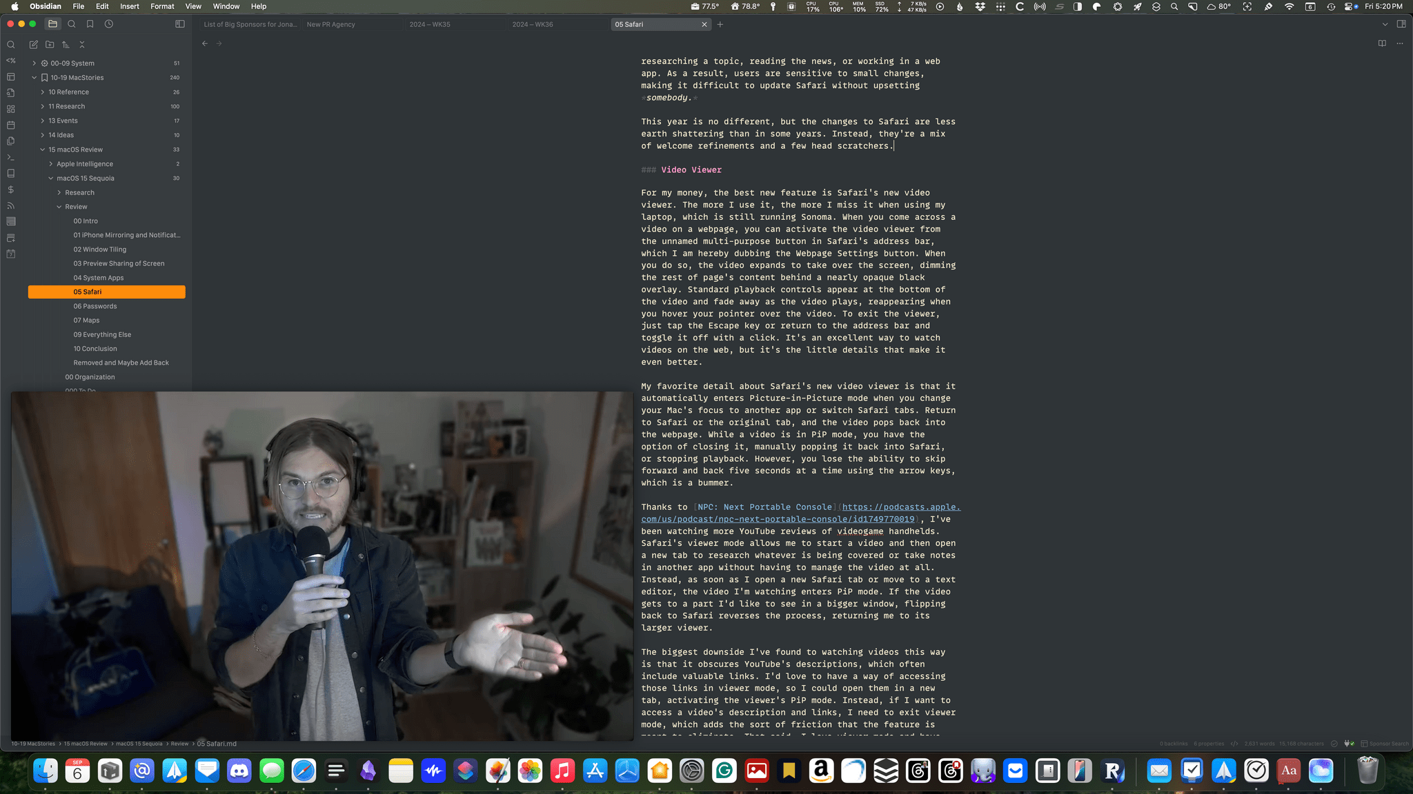
Switching to another tab or app automatically puts what you’re watching in Safari’s video viewer into Picture-in-Picture mode.
Thanks to NPC: Next Portable Console, I’ve been watching more YouTube reviews of videogame handhelds lately. Safari’s video viewer allows me to start a video and then open a new tab to research whatever is being covered or take notes in another app without having to manage the video at all. Instead, as soon as I open a new Safari tab or move to a text editor, the video I’m watching enters PiP mode. If the video gets to a part I’d like to see in a bigger window, flipping back to Safari reverses the process, returning me to its larger viewer.
The biggest downside I’ve found to watching videos this way is that it obscures YouTube’s descriptions, which often include valuable links. I’d love to have a way of accessing those links in viewer mode so I could open them in a new tab, activating the viewer’s PiP mode. Instead, if I want to access a video’s description and links, I need to exit viewer mode, which adds the sort of friction that the feature is meant to eliminate. That said, I love video viewer and have used it nearly every day this summer because it’s made watching videos meaningfully better.
Web Apps Get Extensions
Apple hasn’t publicized it anywhere that I’ve come across, but the web apps that you can create via Safari for Mac now support browser extensions. Web apps, introduced last year in macOS Sonoma, are another Safari update that I’ve found myself using daily. I have web apps set up for social media accounts and a variety of services we use to run MacStories, and they work great.
However, as first implemented, web apps left behind the growing universe of Safari extensions from third-party developers. That wasn’t an issue with most of the web apps I created, but over the past year, I’ve heard from a lot of readers who have one or two extensions that are closely tied to the work they do in their web apps. With Sequoia, most of your Safari extensions should show up in a line along the right side of a web app’s title bar next to the share icon. I say “most” because one of mine is missing, which I believe is due to the fact that it’s only available outside the Mac App Store. In any event, the extensions work just like they do in Safari itself, and while it may seem like a very small change, it will make a big difference for a lot of users who rely on web apps.
Highlights
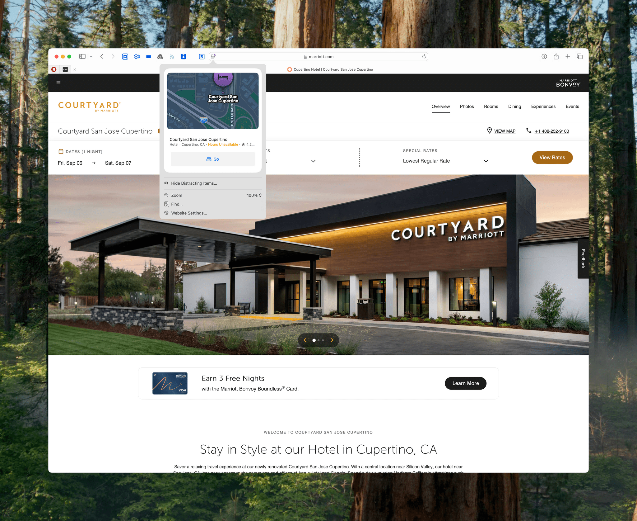
The feature Apple spent the most time talking about at WWDC is Highlights, a new US-only feature that spotlights important content from a webpage. Apple seems to be tackling two different problems with Highlights: the first is finding important information on a busy webpage, and the second is summarizing articles, which I’ll cover below in the context of Safari’s Reader mode. The example of the first problem used at WWDC was pulling the address, a mini-map, and a phone number from a hotel’s website. Apple also says the feature works with restaurants, landmarks, people, music, movies, and TV shows.
In my testing, Highlights works well for large national hotel chains but is hit-or-miss for smaller hotels. For example, if I visit the website for a Marriott, Hilton, or Sheraton hotel, a purple sparkles icon will appear over Safari’s Webpage Settings button indicating that there’s a Highlight available. Clicking the button pops up a map of the location with truncated details about it such as its rating and hours. Clicking on the map opens the location in the Maps app. Highlights results also include a button to get driving directions to the location in the Maps app.
The feature won’t work if you visit one of the sponsored links at the top of Google search results, which are usually from hotel booking aggregators, nor does Highlights consistently work with smaller one-off hotels. I’ve found a couple of smaller boutique hotels that Highlights worked with, but not any smaller local hotels outside of urban areas. I’d love to see this feature expand to include more hotels and other countries, but as it stands, Highlights is still a useful way to track down the basics of many U.S. hotels quickly.
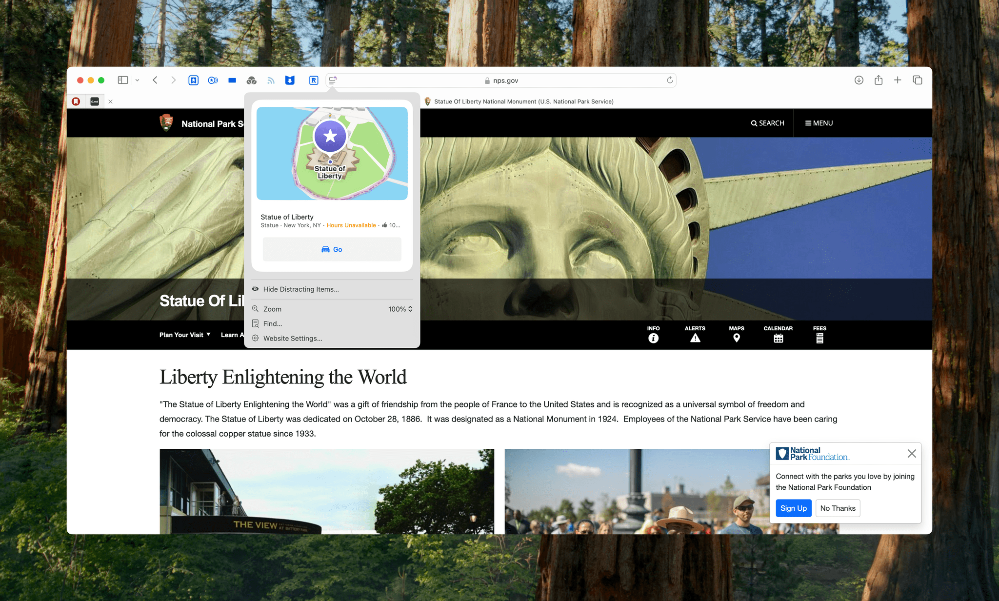
Highlights’ landmark coverage is hit-or-miss, too. For example, Safari will offer Highlights for the Statue of Liberty but not the Empire State Building. You’ll also get Highlights for Yankee Stadium, but not Bank of America Stadium where the Carolina Panthers play, or the Rose Bowl. As far as restaurants are concerned, Highlights can reliably navigate you to large chains, but other restaurant coverage is spotty.
Early in the betas, I couldn’t find any Highlights for people, music, movies, or TV shows. Those categories are still a little hard to find, but I’ve begun seeing the familiar purple sparkles more often over the past couple of weeks.
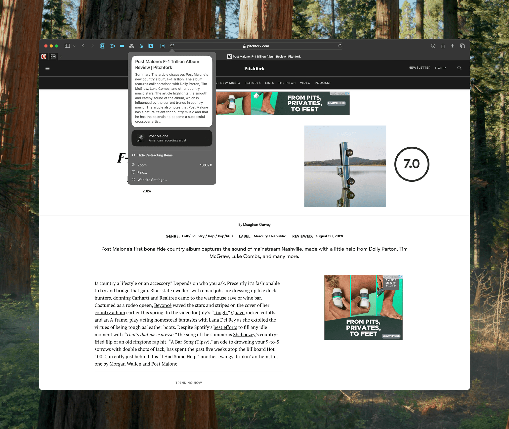
Although visiting music artists’ webpages has never triggered a Highlight for me, they’re starting to appear on review sites like Pitchfork. Sometimes Highlights link to sites like Wikipedia for more information about the artist, but other times, they link to albums in Apple Music.
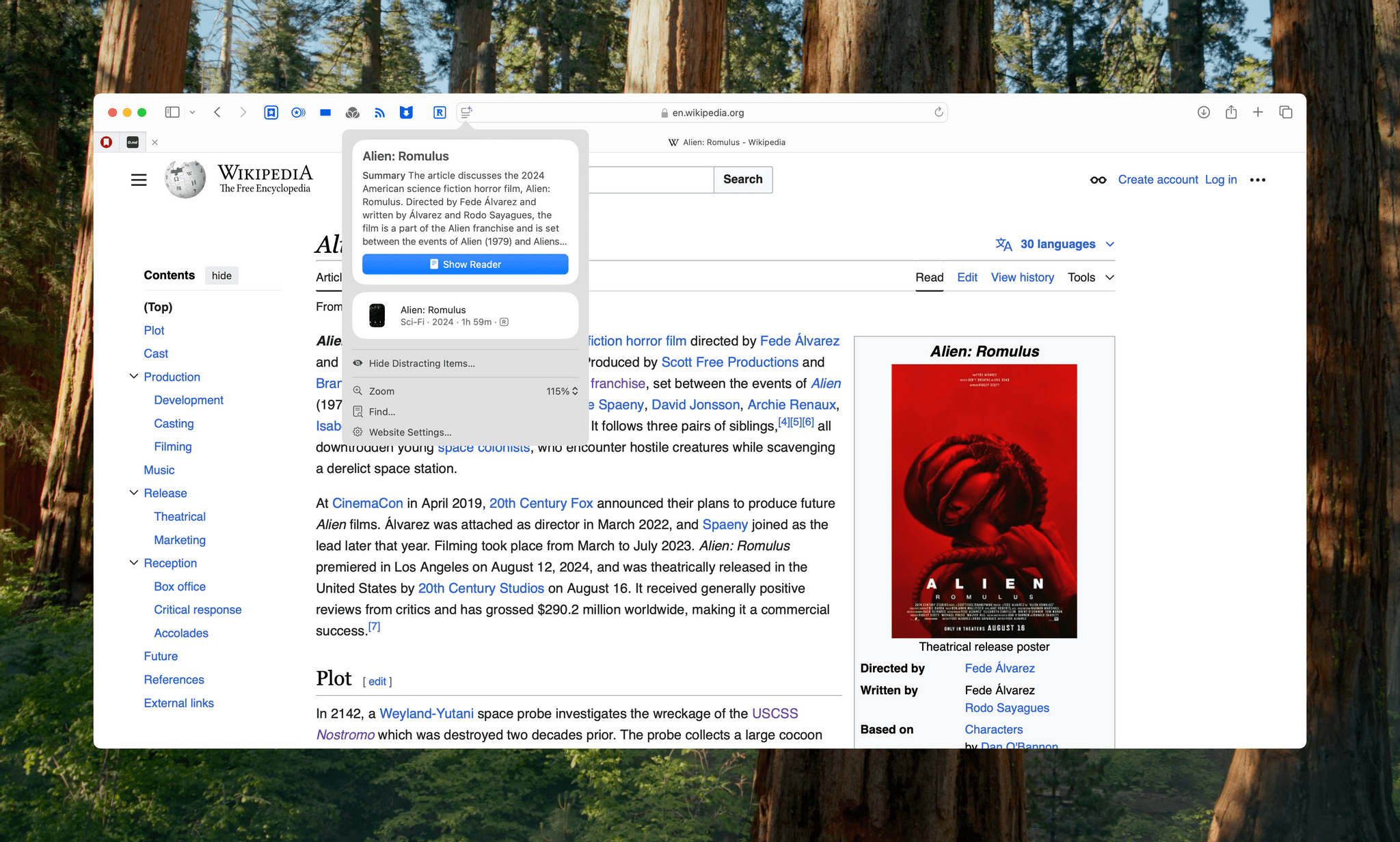
Movie and TV show Highlights have been hard to find, too, but I have seen examples on Variety, Vulture, and Wikipedia. However, I have yet to run into movie or TV show Highlights when watching trailers on YouTube or visiting IMDb. When they do appear, movie and TV show Highlights include basic information like genre, release year, and rating, and clicking on the Highlight opens Apple’s TV app if the content is available there.
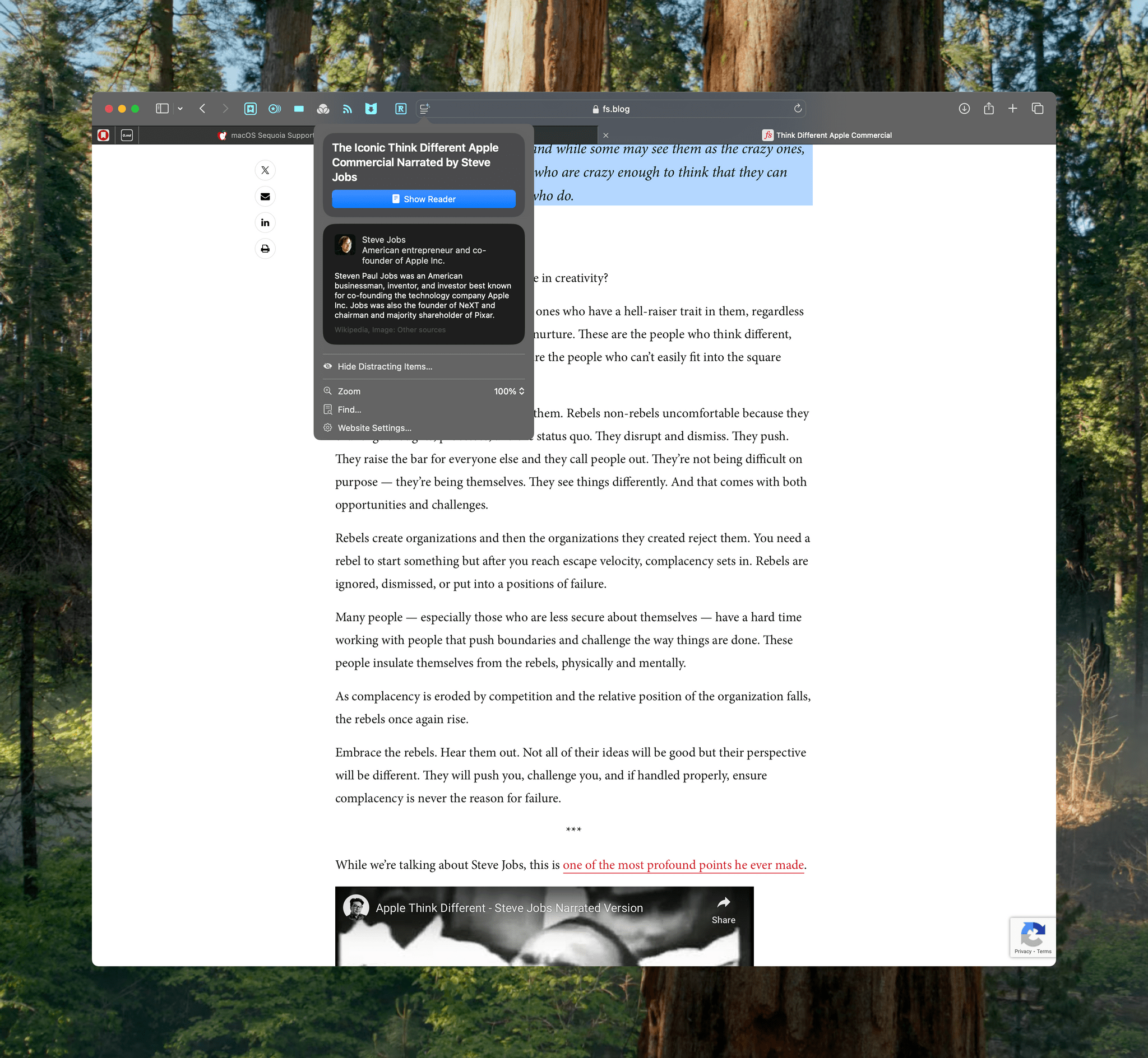
I was also able to find a Highlight with a short bio of Steve Jobs when I visited a website with an article about ‘The Crazy Ones.’
The bottom line is that if you have a road trip coming up and are staying at a major hotel chain in the U.S., Highlights is a handy way to get driving directions. The other available categories have potential, but the coverage is still too spotty to be something you can expect will show up regularly as you browse the web, limiting its utility.
Reader Mode
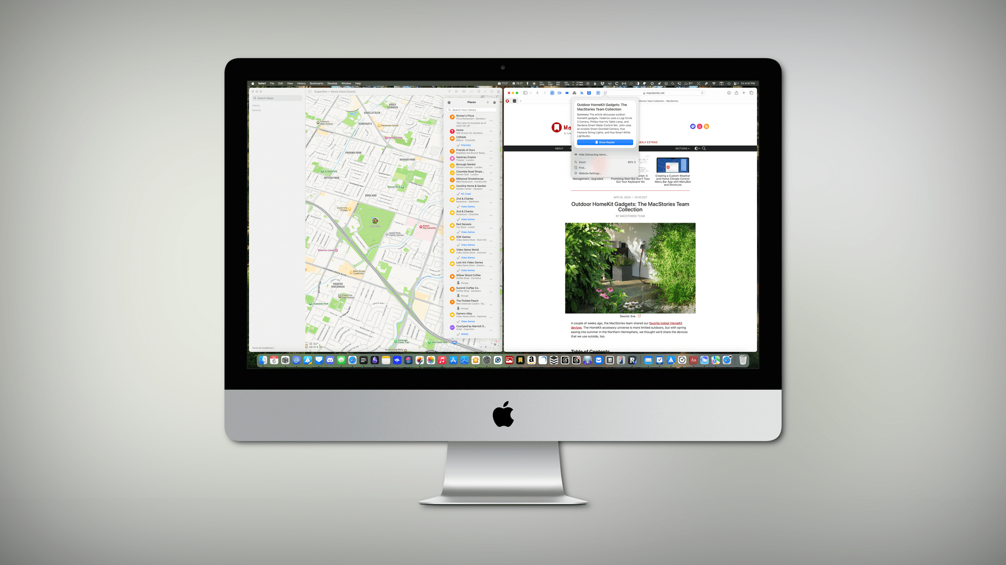
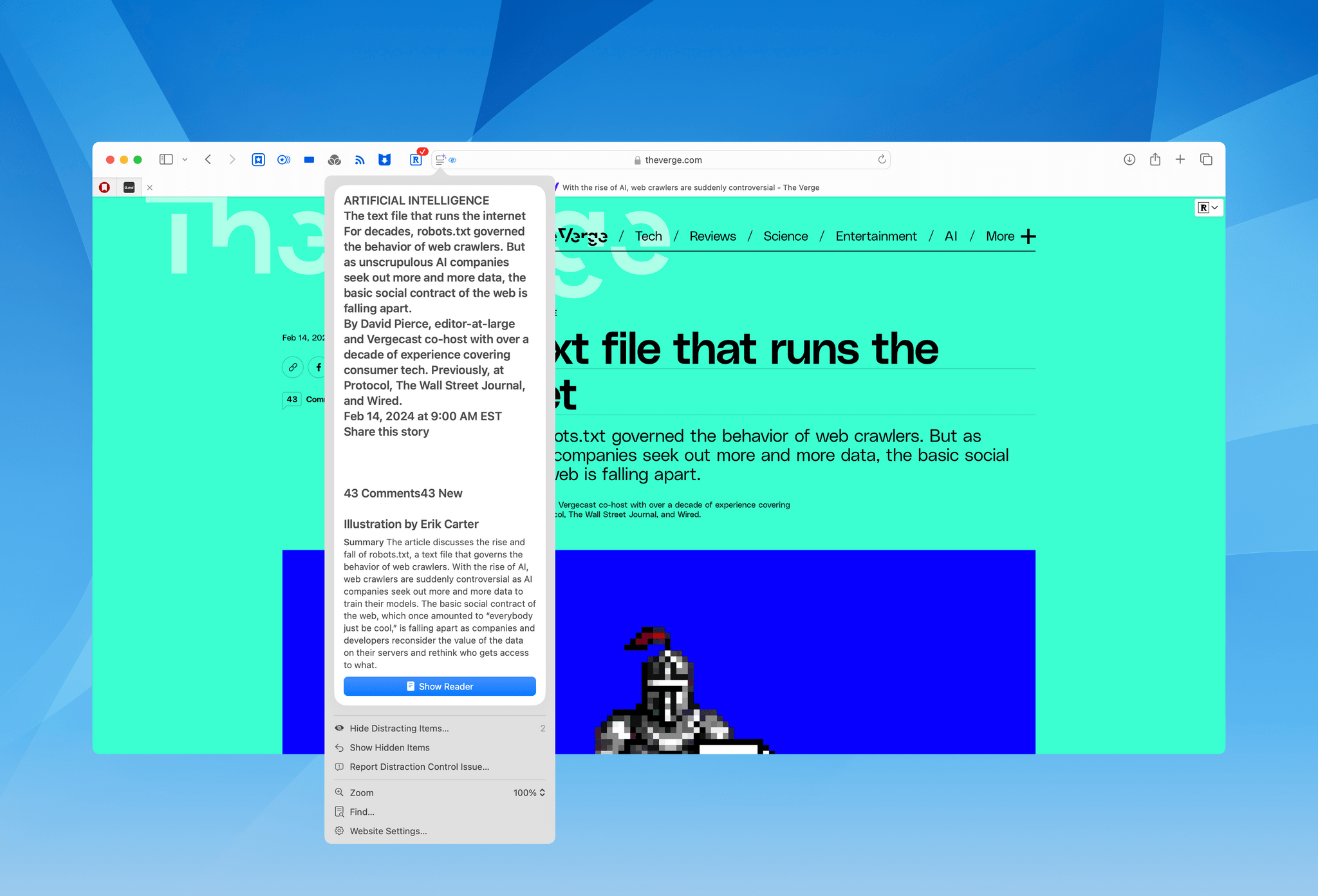
There’s actually one other feature of Highlights that I saved for this section because they’re so closely tied. Safari will often display its purple sparkles icon over the Webpage Settings button when you open an article. Click the button, and a summary of it will appear along with a button offering to open the article in Reader mode.
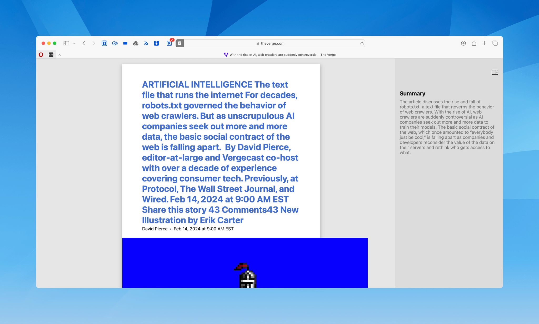
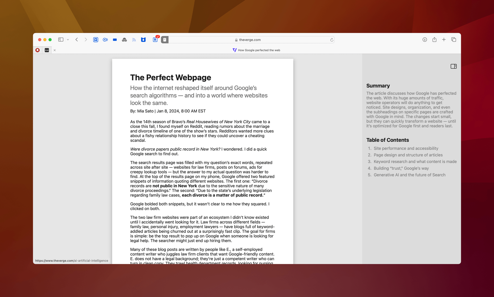
When you open Reader mode, the familiar stripped-down UI appears, but with a hideable sidebar on the right that includes a summary of an article and, in some cases, a table of contents. Like Highlights, I don’t find these summaries very useful.
First of all, they appear in far fewer articles than I expected. I’ve spent a lot of time comparing longform stories from sites like The Verge from similar time periods and on similar topics, and there doesn’t seem to be any discernible pattern for whether or not summaries appear. However, I have noticed articles that previously had no summaries gaining them later, so I suspect Apple’s web crawler is still indexing and summarizing in the background. As a result, article summaries may become more prevalent over time.
Summaries don’t always do a good job of parsing webpages. For example, David Pierce’s article for The Verge about robots.txt files pulls too much information into the article’s title. In contrast, Safari does a surprisingly good job with Mia Sato’s story (also on The Verge) about how the Internet molded itself to fit Google’s algorithms, despite the story’s atypical layout.
Moreover, the summaries are too short to be useful. In the examples above, Pierce’s robots.txt story is roughly 3,000 words long, while Sato’s on Google comes in at about 6,000. Both summaries are far too short to meaningfully summarize the articles, and surprisingly, the summary of Pierce’s story – which is half the length of Sato’s – is 80 words compared to Sato’s summary at 60 words.
Article summarization feel like a feature that was added because summaries are one of the things that AI is good at, not because anyone thinks you can effectively boil a 6,000-word article down to just four sentences. Perhaps Apple is being conservative with the length of these summaries to avoid copyright claims by authors, which would be understandable, but I’d prefer if it had abandoned the feature instead of shipping something with such limited utility.
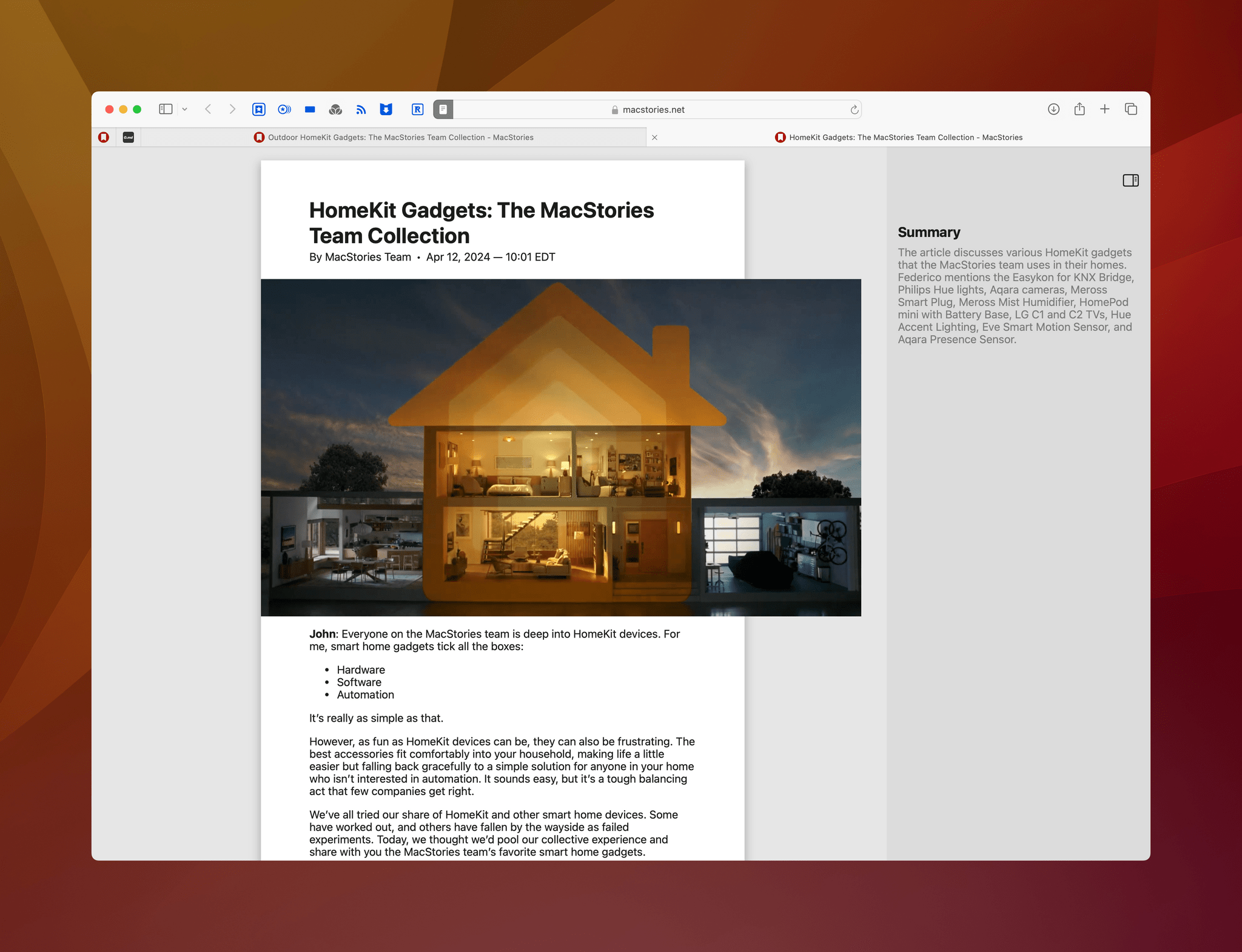
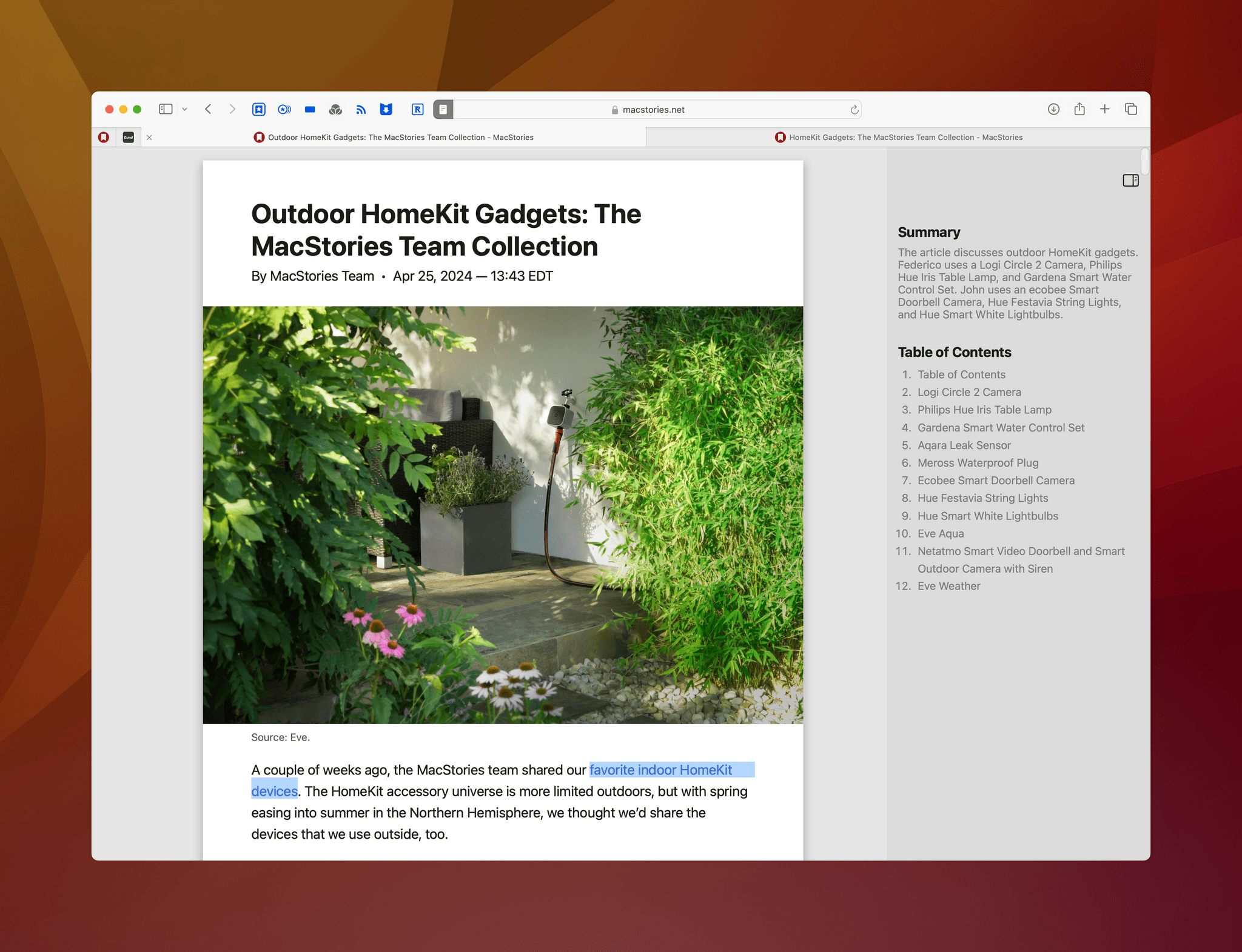
This and the next article on MacStories were formatted the same way, but one includes a table of contents, and the other doesn’t.
The second addition to Reader is that it sometimes includes a table of contents for articles. I say “sometimes” because it’s even harder to find an article with a table of contents than a summary. That seems to be because tables of contents usually appear in articles that are summaries themselves, which is already a somewhat rare thing, and only builds a table of contents if the article also uses H2 or H3 headers. Still, that doesn’t entirely explain when you can expect to see a table of contents because, of two identically-formatted MacStories articles about our favorite HomeKit devices – both of which were summarized – only one includes a table of contents.
When a table of contents does appear next to the Reader version of an article, it’s far more useful than a summary. As you’d expect, clicking on an entry in the table of contents jumps you to that part of the article, making it easy to skip around in a longer story. I’d like to see tables of contents added to a wider variety of articles because when they show up, they’re an excellent way to navigate the content.
It’s also worth noting that entering Reader mode used to take a single click on Safari’s Webpage Settings button. Now that the Webpage Settings button has been loaded with additional features, it takes two clicks, which is a lot if you spend as much time as I do in Safari. Fortunately, you can also enter Reader mode using ⌘ + ⇧ + R.
Distraction Control
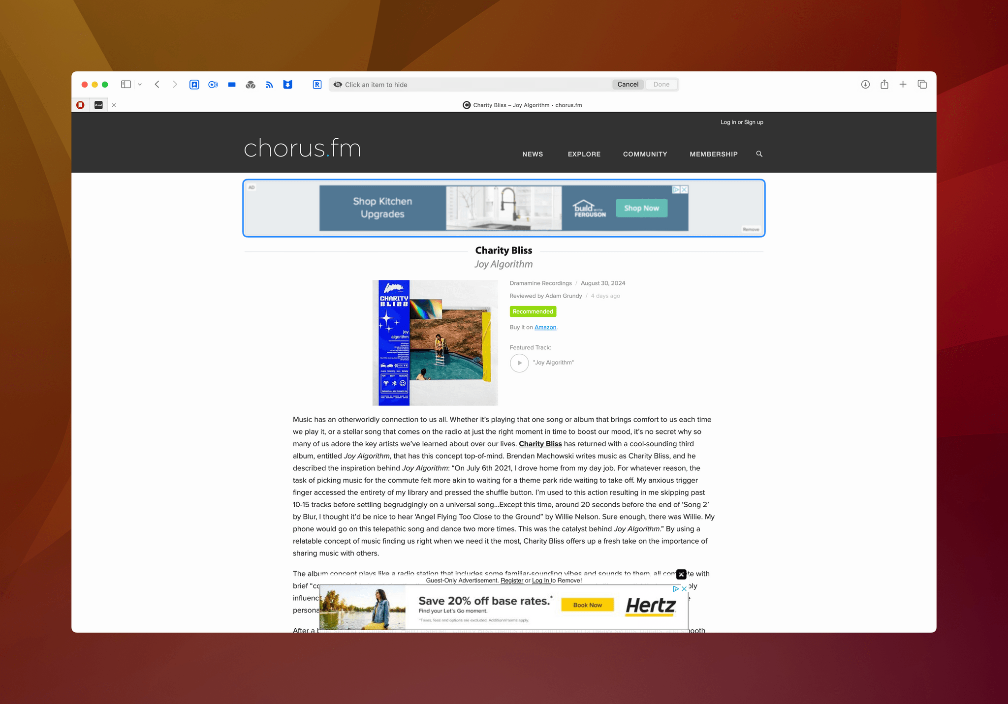
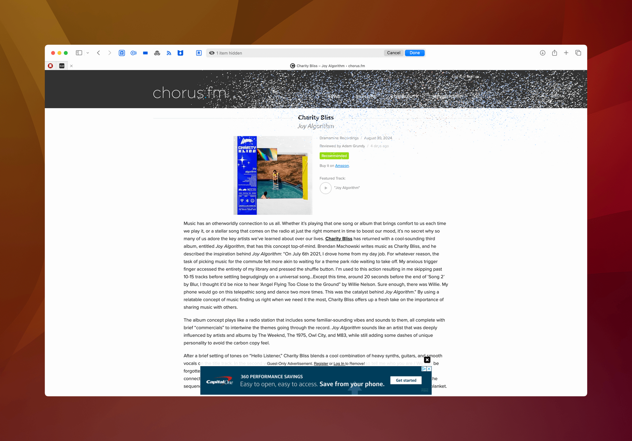
Distraction Control is yet another option chucked onto the increasingly-crowded set of features accessible from Safari’s Webpage Settings button. Click on it, and you enter a mode that highlights elements of a webpage as you hover over them. Click on whatever the highlighted element, and it disintegrates Thanos finger-snapping style. It’s a cool effect for a feature that I’m not sure anyone needs or wants.
Don’t get me wrong: the web is littered with pages full of nonsense that gets in the way of reading. But Reader mode already handles that well, whereas Hide Distractions is a chore to use. After activating the feature, you have to click on every element you want to hide, which can be a lot and isn’t very effective on sites that use infinite scrolling. Plus, elements that refresh periodically, like some ads, will return after a while anyway. Elements that are static will remain hidden between visits to a site.
Apple has been careful to say that Distraction Control is not an ad blocker, pointing to the fact that ads that refresh automatically come back after a time. I’d spin the feature a little differently. Distraction Control is a very effective ad blocker for sites that display static ads, but not a replacement for a third-party ad blocker that can handle dynamic ads.
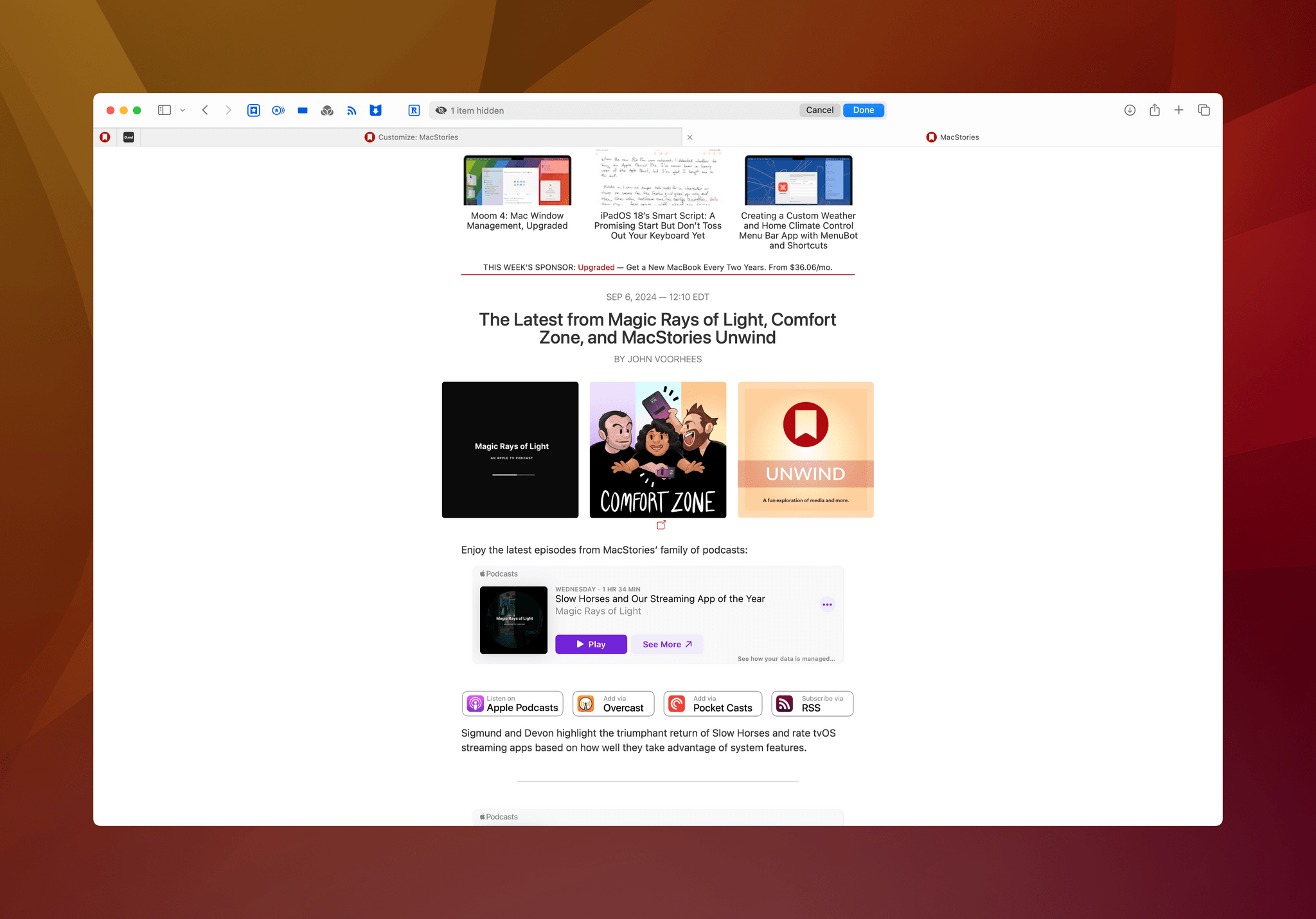
My concerns about Distraction Control are twofold. First, static ads – like the kind of ads we display on MacStories – are often chosen because they are less disruptive than dynamic ads. Effectively, Apple is penalizing sites that use less distracting ads by making them easier to block long-term than the dynamic variety. I’ve checked, and as things stand today, if someone hides a banner ad on MacStories, it will never reappear. That’s a problem if you’re running a website.
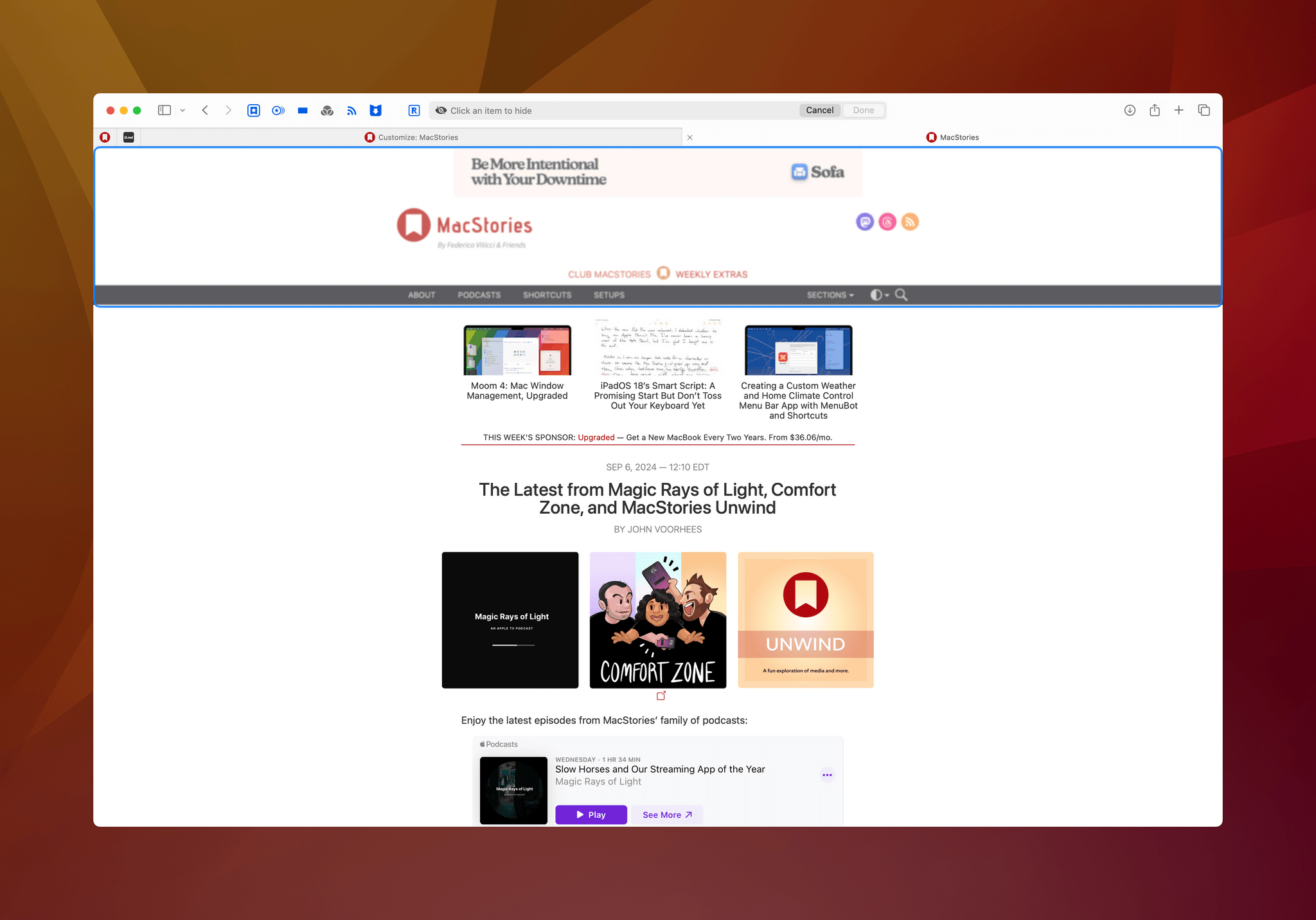
Hide the MacStories banner ad, and you lose the entire masthead as well as navigation controls, which isn’t great.
Second, Distraction Control is not very precise. If you try to hide the banner ad at the top of MacStories, it will wipe out the masthead and site navigation along with the banner. That’s a potential support nightmare we (and I suspect other sites) will have to deal with. I know from experience that ad blockers are the number one cause of complaints we receive that MacStories isn’t working correctly. Not that many people use third-party ad blockers, but with this feature built into Safari, I wouldn’t be surprised to see more people start hiding elements, leading to an increase in support requests.
But those are issues for people who run websites. As a user, Distraction Control’s utility is limited. I don’t think it gives me anything that isn’t solved better by Reader mode, at least for articles I want to read. Sure, it preserves more of a site’s layout, but it’s so much more laborious than entering Reader mode that I haven’t run into a situation where I prefer using it, except when I visit a site that has annoying overlays and similar elements to do something other than read. Like article summaries, Distraction Control’s limited utility makes it feel like a feature that might not have made the cut in a year with a more robust set of feature updates.
If it were me, I would have added the video viewer to Safari and extensions to web apps, and called it a day. Everything else feels underdeveloped, incomplete, or ill-conceived. Highlights has potential, but currently, the places where you’ll find it are limited. In contrast, Reader mode summaries and Distraction Control seem to be features in search of a problem. Perhaps they can be refined over time to become more useful, but as they stand, I’d like to have a setting to simply turn them both off to declutter Safari’s increasingly crowded Webpage Settings menu.


