John: The MacStories Selects Awards are our annual love letter to apps and the people who make them. Apps have become ubiquitous, seeping into every corner of our lives. They help us find a job and home, get work done, blow off steam, order a meal, and everything in between. With so many apps available in the App Store, though, it’s easy to take them and their creators for granted, which is why as the year comes to a close, we step back and pause to celebrate the MacStories Team’s favorite apps and the people who make them.
To say that bringing an app to life from idea to a fully-formed 1.0 is tough is a vast understatement, and 2020 hasn’t made the process any easier. However, as we survey the past year, the depth of innovative apps makes it clear that many developers poured themselves into their apps in 2020. The result was a list of MacStories Selects candidates that was longer than in any prior year of the awards.
We had a wealth of excellent apps to choose from this year for the seven categories the MacStories Team chose:
- Best New App
- Best App Update
- Best New Feature
- Best Watch App
- Best Mac App
- Best Design
- App of the Year
Along with the Readers’ Choice Award, which was chosen by Club MacStories members, that makes a total of eight award winners plus twelve runners-up. These are the third annual MacStories Selects Awards, which we debuted in 2018. As we did last year, we have also created beautiful physical awards commemorating the winners, which we will be sending out to each in a couple of weeks.
We also recorded a special episode of our podcast AppStories all about the MacStories Selects winners and runners-up. It’s a terrific way to learn more about this year’s apps.
You can listen to the episode below.
So, it’s with great admiration and respect for the developers who have persevered through a tough year to produce some of the best apps we’ve ever used that we present to our readers the 2020 MacStories Selects Awards:
Table of Contents
- Best New App
- Best App Update
- Best New Feature
- Best Watch App
- Best Mac App
- Best Design
- Readers’ Choice Award
- App of the Year
Best New App
Craft
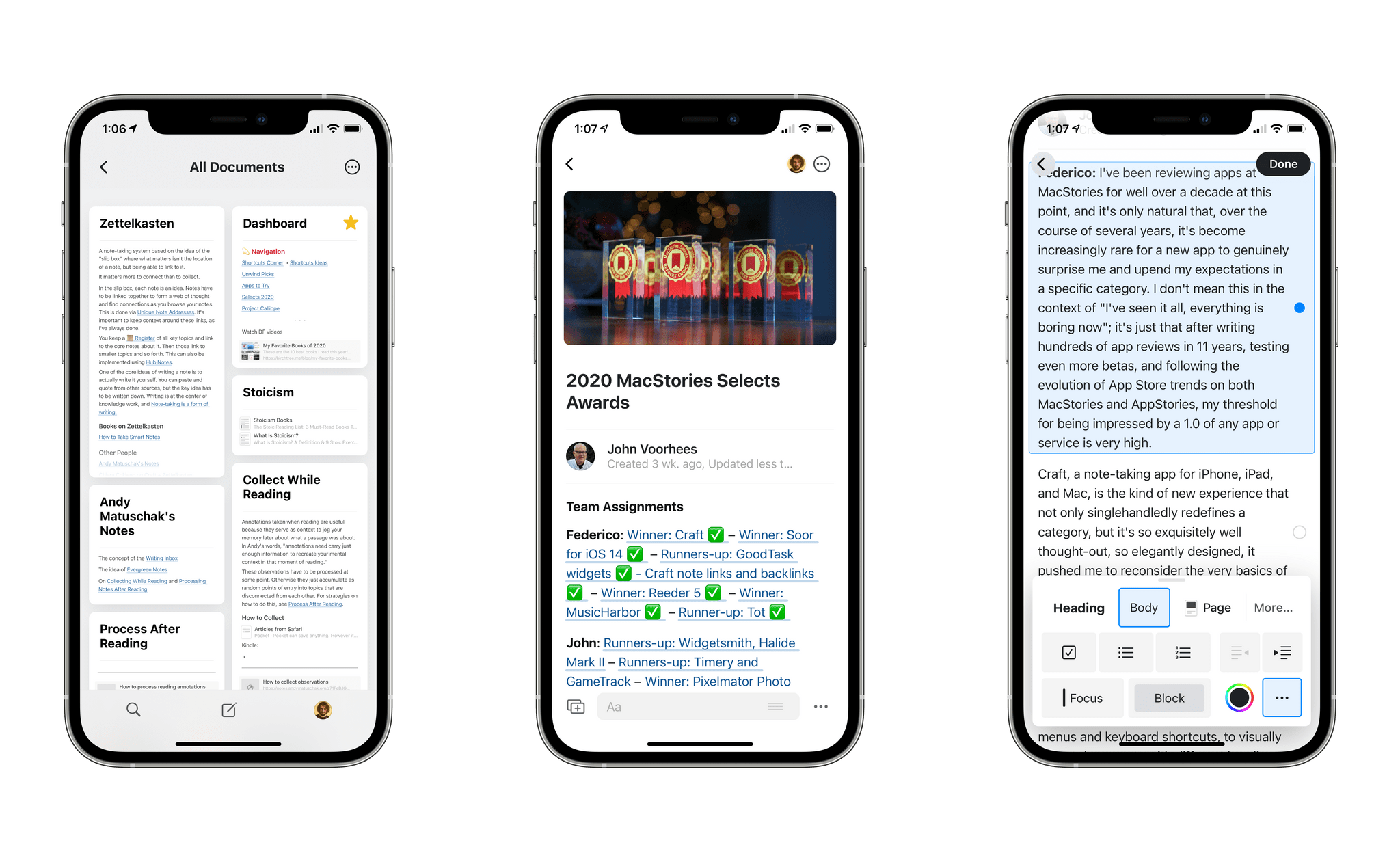
Federico: I’ve been reviewing apps at MacStories for well over a decade at this point, and it’s only natural that, over the course of several years, it’s become increasingly rare for a new app to genuinely surprise me and upend my expectations in a specific category. I don’t mean this in the context of “I’ve seen it all, everything is boring now”; it’s just that after writing hundreds of app reviews in 11 years, testing even more betas, and following the evolution of App Store trends on both MacStories and AppStories, my threshold for being impressed by the 1.0 version of a new app or service is very high.
Craft, a note-taking app for iPhone, iPad, and Mac, is the kind of new experience that not only singlehandledly redefines a category, but it’s so exquisitely well thought-out, so elegantly designed, it pushed me to reconsider the very basics of my note-taking workflow.
Think of Craft as a mix of Apple’s Notes app and powerful research tools such as Notion and, to an extent, modern alternatives like Obsidian and Roam. Craft allows you to take notes with a breadth of editing tools, which you can access via menus and keyboard shortcuts, to visually format documents with different headings and text styles. At the same time, however, Craft has adopted Notion’s block-based structure and slash-command syntax and rethought both for a native experience on Apple platforms that lets you create “modular documents” where everything can be linked together, become a nested page, or cross-referenced across folders. Because of this approach, Craft lends itself well to a variety of note-taking and research needs, including Zettelkasten-based workflows that require ease of capture, fast search, and the ability to seamlessly link different notes together.
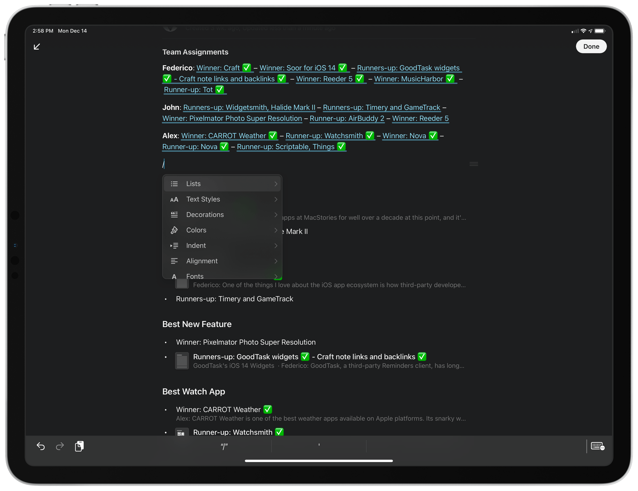
It all starts by tapping a single ‘/’ in Craft’s editor: as soon as you press the key, you’re presented with a menu filled with options to format text, insert media, create sub-pages, paste text or code blocks, and much more. This interaction is especially well suited for the iPad and Mac versions of Craft, where searching for different commands with a keyboard makes going from an empty page to a well-structured, elegant page a matter of seconds.
Craft isn’t just about a pretty user interface though: what truly stands out in the app is the ability to eschew the classic folder ⇾ note organization method and nest pages within documents to, effectively, create notes with built-in navigation. You’ve probably seen this before in Notion, but we found Craft’s implementation considerably more polished and, most of all, native to the iPhone and iPad. We’ve been taking advantage of Craft’s sub-page creation tools and linking capabilities extensively here at MacStories: I wrote my sections for this very story as pages in a Craft document; I also produced documentation for internal tools and our 2021 plans using a shared Craft workspace and the app’s diverse set of tools to format inline cards, rich links, pages, code blocks, and more.
There are several features I can’t write about in detail here, but which make Craft an exceptional tool for both quick notes and deeper research tasks: its universal search is incredible and lets you find any note or section of a note in a couple seconds; the app’s wiki links and backlinks (more on them below) are best-in-class for Zettelkasten workflows on iOS and iPadOS; its export options include Markdown, TextBundle, PDF, and even the ability to generate deeplinks for any page. The features that are currently missing from Craft (personally, I would love to see support for Notion-like tables in the app) are being addressed with a frequent release schedule, such as the recently added extension on the Mac and sub-folders.
We consider Craft the best new app of 2020 because its outstanding design is paired with the kind of maturity and attention to detail we don’t often see in 1.0 products. Craft is tangible proof that it’s still possible for an indie development studio to compete with more popular, VC-funded web services, offering powerful note-taking and research tools that are accessible in a native experience that fully supports modern iOS and iPadOS technologies. Craft is the most impressive 1.0 release we’ve tried in a long time and a pleasure to use on all Apple platforms, and it’s our favorite app debut of 2020.
Best New App: Runner-Up
Widgetsmith
John: iOS 14’s widgets ignited a Home Screen customization frenzy that few people saw coming and for which few were ready, except David Smith. His app, Widgetsmith, allows users to create a wide range of highly-customizable Home Screen widgets, including everything from calendars and reminder lists, to photos and health data. What’s more, the app allows you to schedule what shows up in the widgets you create throughout the day. It’s a unique feature that dramatically expands the flexibility of the app’s widgets.
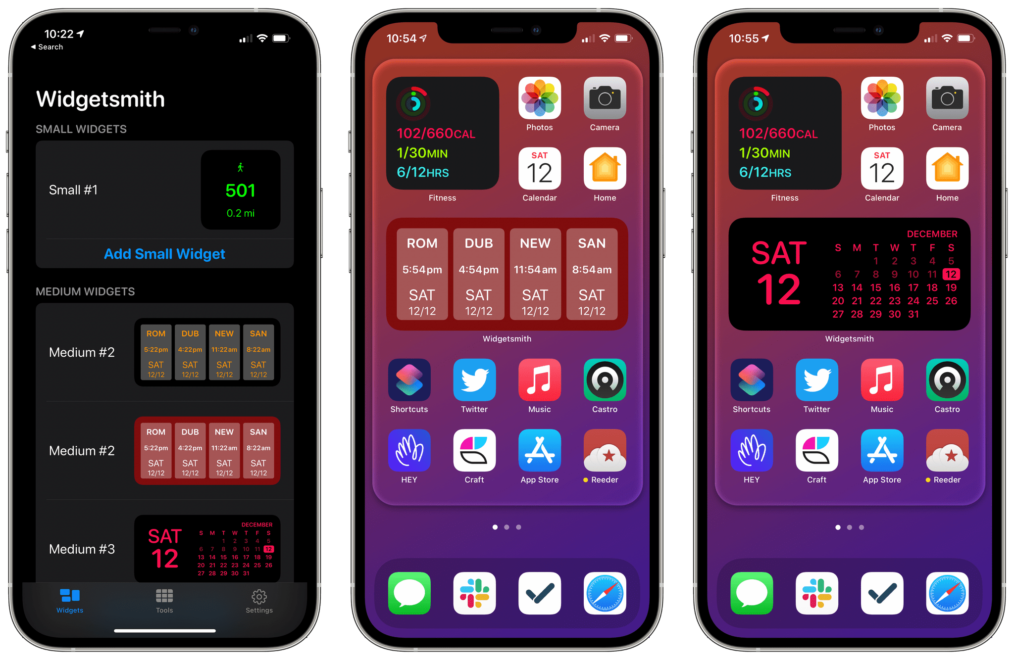
Widgetsmith allows you to design a wide variety of widgets that work well in a stack on your Home Screen.
If you’ve used Smith’s app Watchsmith, widget scheduling probably sounds familiar. That’s because Watchsmith, which was launched earlier in 2020, includes a similar feature that allows users to schedule when custom complications show up on their Apple Watch faces. The similarity is not a coincidence. The underlying technologies of widgets and Watch complications are similar, which gave Smith a head start on creating a system for creating custom widgets.
No one could have seen the tidal wave of interest in widgets coming, but Smith was ready for it. A veteran developer who has launched dozens of apps, Smith had Widgetsmith ready for sale as soon as iOS 14 was released. Smith may have had a sense that there was pent up demand for iPhone Home Screen customization from his work on Watchsmith, but he couldn’t have anticipated was that TikTokers would discover Widgetsmith, causing it to go viral. Suddenly, the app began climbing up Apple’s top free apps chart. That’s remarkable by itself, but even more astonishing was that the app stayed in that rarified company, outpacing household names like WhatsApp and Google, landing on Apple’s Top Free Apps of 2020 list, even though it was only released in September.
As we close out a year that has been difficult for everyone, Smith’s story should serve as a source of inspiration and optimism for developers. No one can manufacture a viral hit, but what the app’s story shows is that preparation and a keen understanding of the App Store coupled with good fortune can still put solo developers and small teams in a position to compete with some of the world’s largest corporations.
Best New App: Runner-Up
Halide Mark II
John: I’ve tried many iOS camera apps over the years, but none have struck the careful balance between being accessible to new photographers and powerful enough to satisfy discerning pros as well as Halide Mark II. Halide achieves that balance through careful, considered design and innovative features that elevate it above all of its competition.
The launch experience of a camera app is crucial. If you’re opening a camera app, you’re most likely doing so to take a picture, and any fumbling around with the app’s controls risks losing the shot. That’s not an issue with Halide. The app launches quickly, and all the crucial controls are laid out in a clear, intuitive way that’s ‘thumb-friendly,’ even on Apple’s iPhone 12 Pro Max. I’m also fond of the ability to dial in the exposure by simply dragging my thumb vertically over the app’s viewfinder.
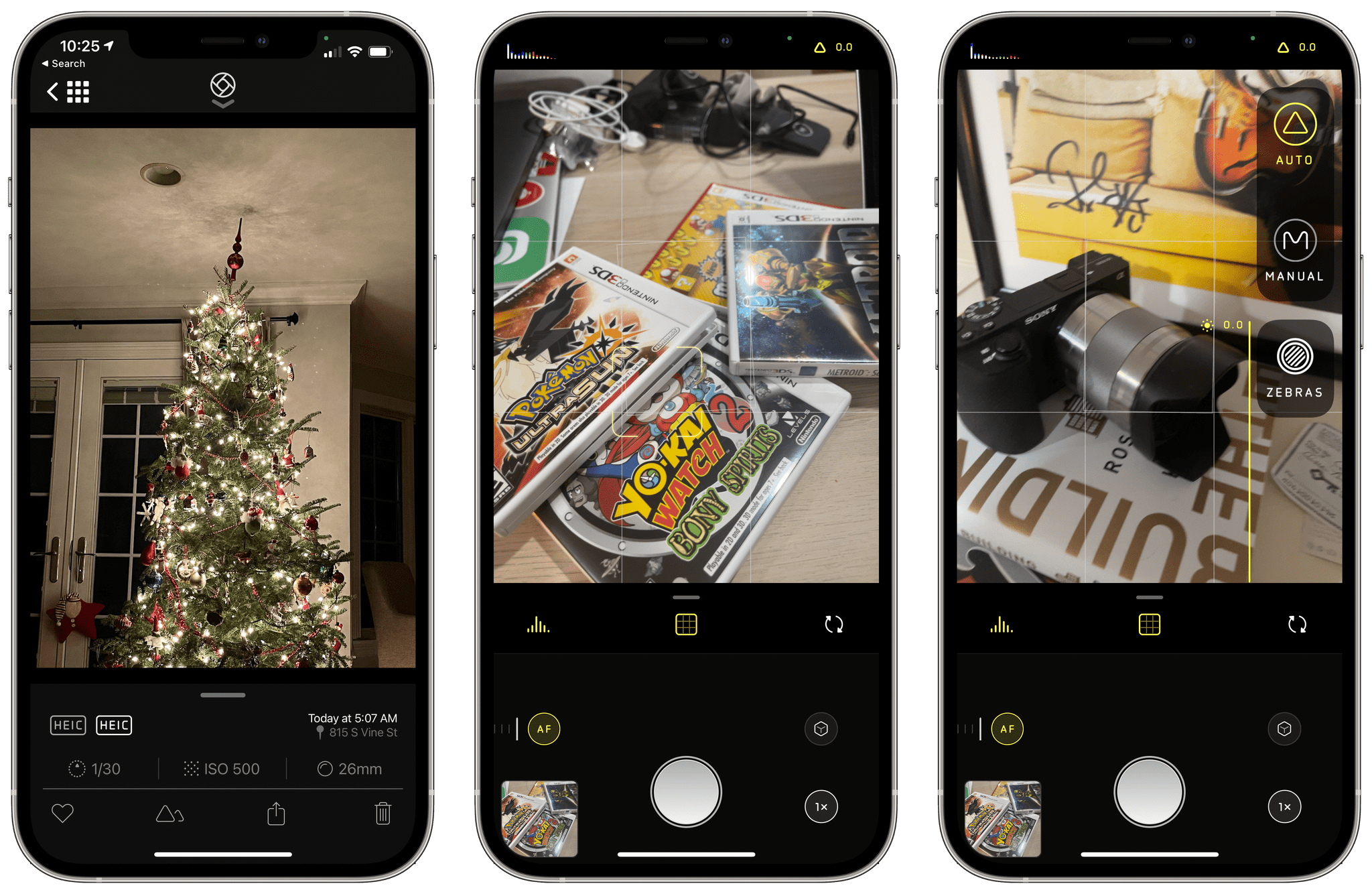
Halide Mark II takes what was already a great camera app and makes it a compelling choice for beginners and pros.
The pro photography features of Halide Mark II are as exceptional as its design. All the features you’d expect are available in the latest version of Halide, but what distinguishes it is the way it handles RAW photography. RAW format images preserve the greatest amount of image detail, allowing for greater editing latitude later. The trouble is, RAW photos often don’t look great straight out of your camera. Halide solves this with a feature called ‘Instant’ that can make a series of finely-tuned edits that are applied with a single tap. I’ve found that the results are often exactly what I want and when they aren’t, Instant has provided a great start, substantially simplifying the manual editing process.
The other big addition to Halide Mark II is ‘Coverage,’ a feature that takes RAW and JPEG images in quick succession to ensure the highest quality photo is captured in both formats. It’s a clever feature that gets around limitations in the way Apple’s camera APIs work that you can read about more in my review.
Like many people, I’ve spent far more time at home indoors this year than usual. Since its release, I’ve been experimenting a lot with Halide to improve my iPhone photography skills and as a way to get out of the house for a while. I haven’t traveled this year, but that’s worked to my advantage as I explore Halide’s pro features. I don’t have the pressure of getting a perfect shot or rushing from one location to another that I’d have on vacation. Instead, I’ve taken my time, strolling around the neighborhood, practicing in familiar environs, and getting ready for when I can travel again. If you want to get more out of your iPhone’s already terrific camera, there’s no better place to look than with Halide Mark II.
Best App Update
Soor
Federico: One of the things I love about the iOS app ecosystem is how third-party developers can leverage modern technologies to create functionalities that go beyond the default offerings of Apple’s own apps. We see this every year, and it’s part of the reason why, after over a decade, I still find writing about apps so much fun: thanks to Apple’s APIs and the App Store, it’s entirely possible for a single developer to launch apps that provide much more powerful alternatives to pre-installed software built by a huge corporation such as Apple. From Overcast and GoodTask to Drafts and PCalc, the list of examples goes on and on.
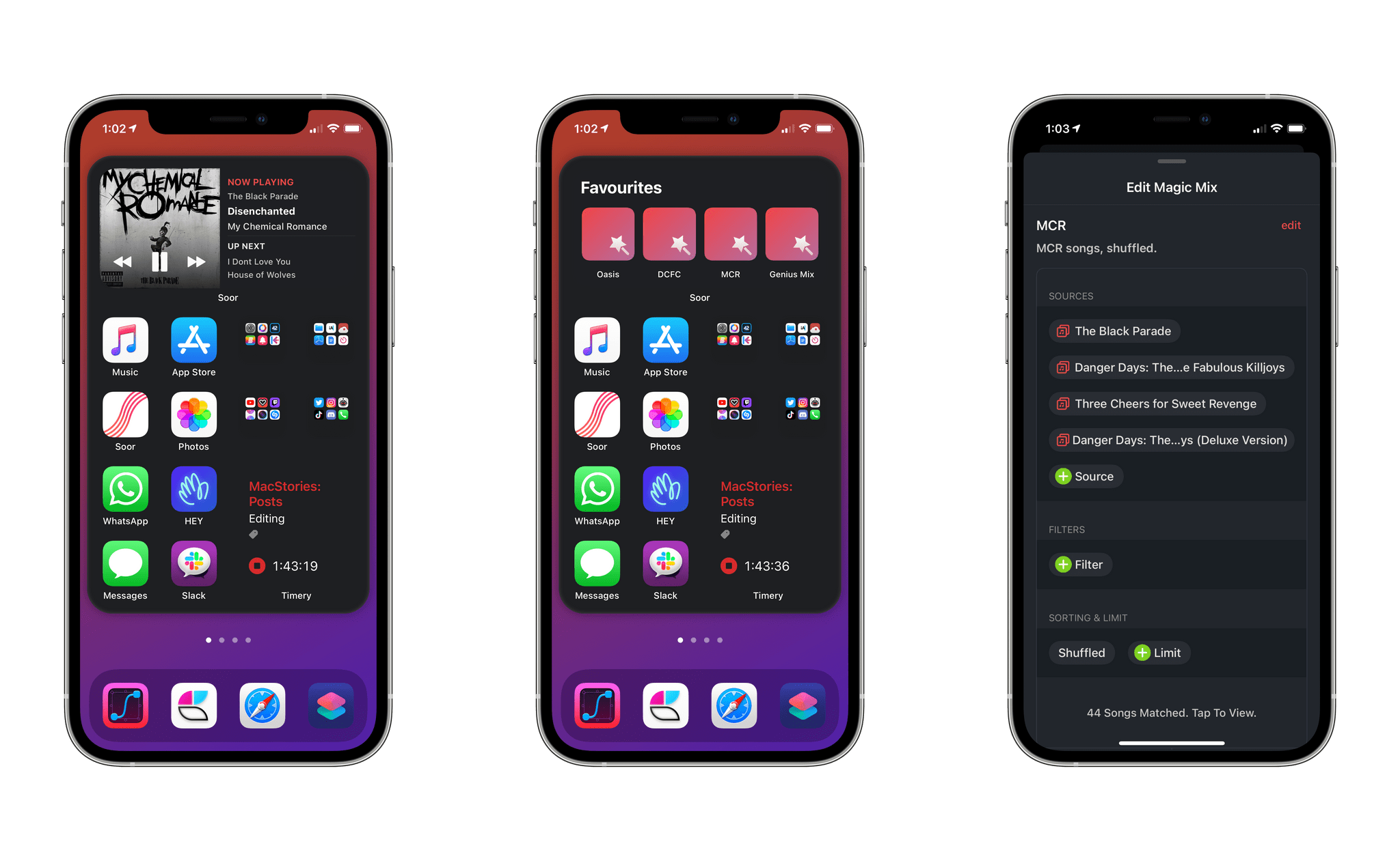
Soor, a third-party Apple Music client developed by Tanmay Sonawane, has long been the premier alternative to Apple’s Music app for users who seek a more customizable experience with support for smart playlists. But with the app’s iOS 14 update (version 2.1), Sonawane has gone above and beyond what Apple did with the Music app’s built-in widget: thanks to Soor’s widgets, you can now put an interactive mini player (with playback controls and dynamic artwork) on your Home Screen; you can instantly start playing any album or playlist marked as a favorite in the app; you can even shuffle a magic mix – Soor’s equivalent of smart playlists based on multiple filtering criteria – with just one tap.
Soor’s iOS 14 widgets have completely changed how I play and control music from my iPhone. With the Now Playing widget, in addition to being able to see what’s playing and coming up in my Up Next queue (Soor can use the system’s audio player, which means it shows the same items playing in the Music app), I can also play, pause, and skip songs from the Home Screen without opening Soor. In theory, this shouldn’t be possible: by design, iOS 14 widgets are non-interactive, and any tap on a widget should take you to a page in the associated app. Sonawane, however, found a workaround to support interactions on playback controls without launching the full Soor app, and it works beautifully. This is the Now Playing widget I would love to see Apple offer in the future, but it’s available now with Soor.
As I mentioned above, Soor offers much more than a Now Playing widget though. With its Magic Mix and Music Collection widgets, you can place dynamically-generated playlists you previously created in the app or any combination of albums, playlists, and artists, respectively, on the Home Screen for quick access. So while Apple’s default Music widget is limited to showing you recently played items with no support for customization whatsoever, Soor puts you in direct control of the music shortcuts you want to see on the Home Screen. Thanks to these widgets, I’ve been able to create a personalized first page with launchers for my favorite artists as well as a Genius Mix, which is a smart playlist that shuffles songs I like. And the best part: since they’re based on the same technology employed by the Now Playing widget, tapping these items won’t open the Soor app either, so you can play any album, playlist, or mix inline within the Home Screen, with just one tap.
Thanks to the vibrant nature of the App Store ecosystem, we often see and write about developers who challenge the status quo and create apps or features that make our devices more powerful, customizable, and intelligent. With their fantastic combination of beautiful design, customization, and unique functionalities, Soor’s music widgets are the best you can find on iOS 14, and our favorite new feature of 2020.
Best App Update: Runner-Up
Timery
John: Timery, the time tracking app by Joe Hribar that integrates with the Toggl service, is deeply embedded into my daily workflow. I don’t bill my time, but I still track it to understand long-term trends.
Timery was our pick for Best New App in 2019 because of its thoughtful implementation of Toggl features, excellent implementation of the latest iOS technologies, and deep understanding of users’ needs. Version 1.0 was the result of many months of development and iteration that culminated in a terrific 1.0 experience. Hribar didn’t, however, rest on the success of that initial release. Throughout 2019 and into 2020, Timery continued to receive regular updates expanding its Shortcuts support, refining its design and Today widget, and adding additional features.
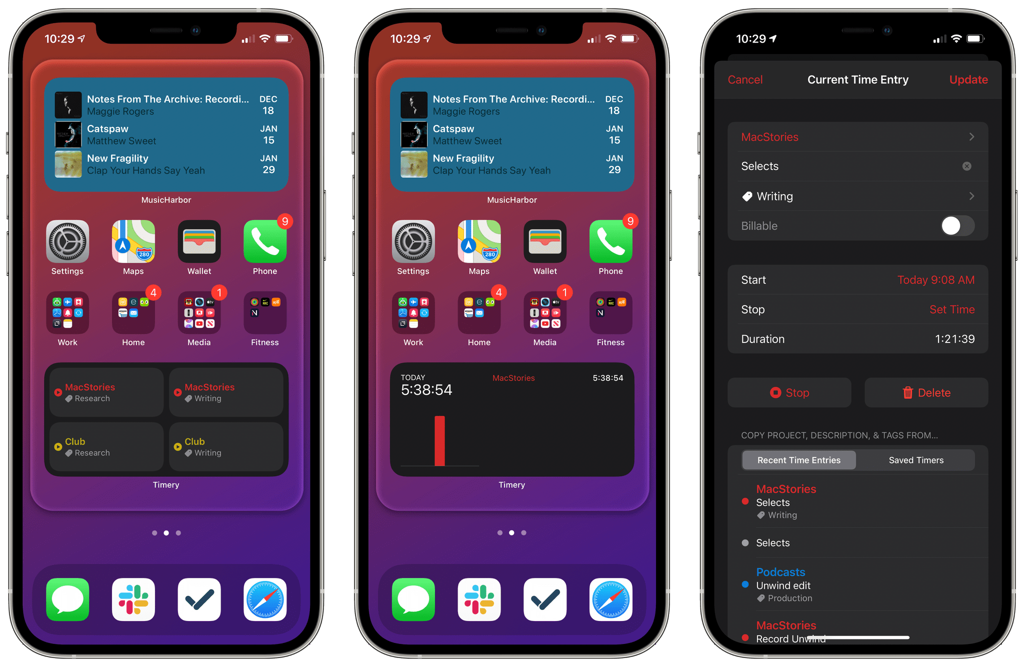
iOS 14 means Timery’s widgets are no longer as interactive as before, but the app’s trio of new widgets more than makes up for it in new functionality.
When widgets were announced at WWDC this year, the message from Apple was mixed. Widgets were coming to the iPhone’s Home Screen, but they would no longer be interactive. As excited as I was about widgets, it seemed as though they would come at the expense of the Timery widget on which I’d been using to start and stop timers for months.
That fear was unfounded. Timery’s widgets had to change to accommodate iOS 14, but they are so well implemented that I haven’t missed the old one at all. The latest version of Timery offers widgets, allowing users to quickly access saved timers, check the status of currently-running timers and monitor overall time tracked. The mix of widgets offers new functionality, and with iOS 14’s ability to put multiple widgets from the same app on your Home Screen, the overall experience is superior to the previous system.
The Time Tracked widget also fulfills my longtime hope that Timery would add reports to the app. I think there’s still more that could be done with dedicated reporting functionality, but the Time Tracked widget gets me most of the way there as a fast way to get a sense of where I stand on time logged each week.
Timery is a fantastic example of an app built with care, attention to detail, and an understanding of its users. Joe Hribar knows that there’s lots more to effective time tracking that starting and stopping timers, and Timery’s users are the beneficiaries. I can’t wait to see where Hribar takes Timery in 2021.
Best App Update: Runner-Up
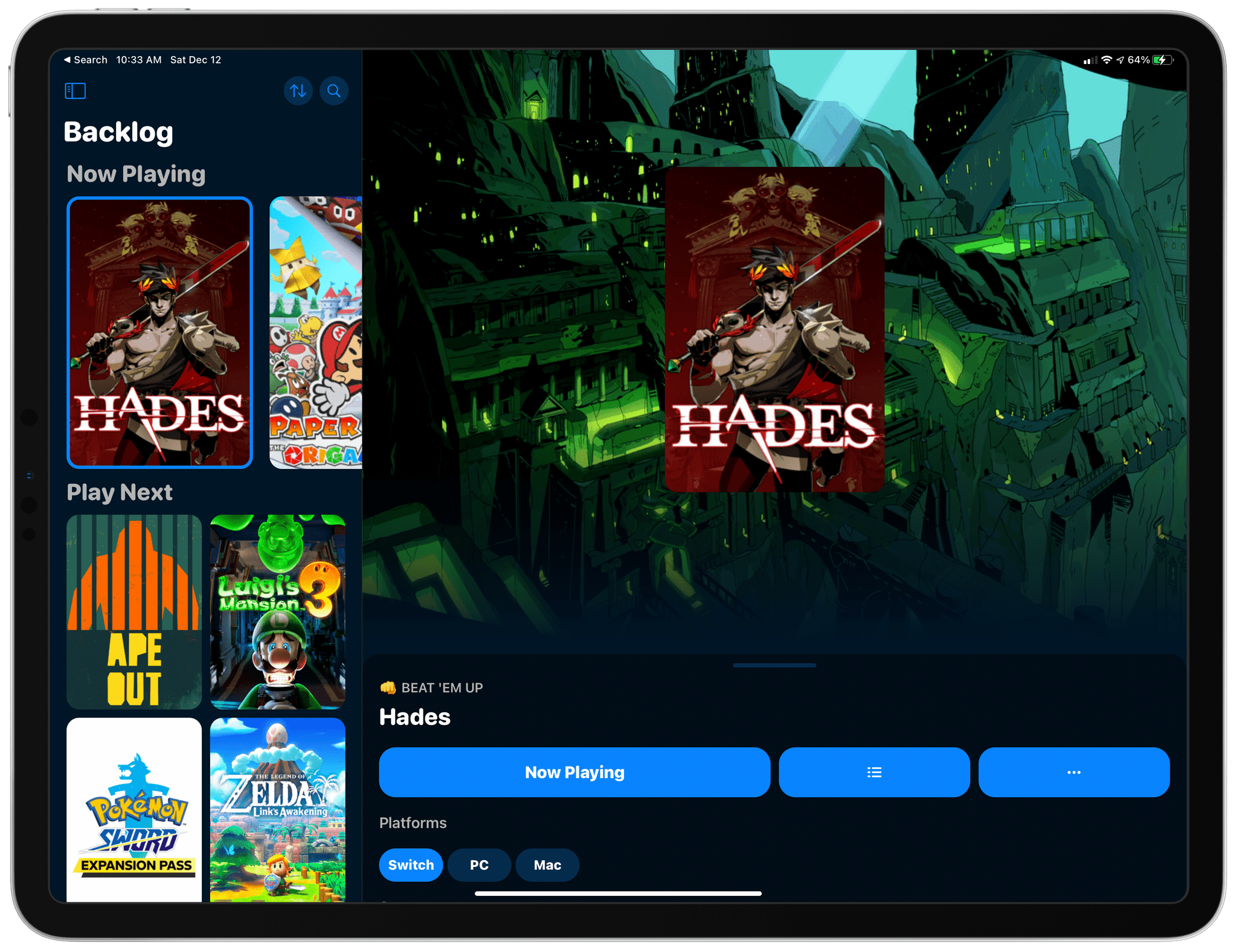
GameTrack
John: GameTrack demonstrates how independent developers can leverage Apple’s latest iOS and iPadOS technologies to build better apps and expand their audiences. I’ve been a fan of GameTrack, which allows users to discover, track, and share videogames since its initial launch, but with Apple’s OS updates this fall, developer Joe Kimberlin-Wyer has transformed the app into something special.
There are all sorts of apps on the App Store for creating lists to track media. Some are general-purpose apps that combine several types of media into a one-stop app, and others, like GameTrack, take a more focused approach. There’s merit to both types of apps, but for videogames, GameTrack demonstrates why a focused app is so often superior.
At the core of what makes GameTrack compelling is its adoption of Apple’s new iPad sidebar and widgets, which I covered in depth in my review earlier this year. The sidebar implementation not only gives GameTrack a modern, familiar feel on the iPad, but it paved the way for bringing the app to the Mac as a Catalyst app. A someone who uses all of Apple’s platforms on a daily basis, it’s been wonderful to access GameTrack from my Mac. It’s not where I use the app most often, but the convenience can’t be beaten if that’s the device I’m using.
I’ve also enjoyed GameTrack’s widgets. Apps that track lists of media like GameTrack are easy to lose track of if you don’t open them often. However, with widgets, I’ve set up a dedicated videogame Home Screen on my iPhone with the iOS games I’m playing and a stack of widgets that includes my Now Playing and Upcoming lists from GameTrack. It’s a nice one-stop destination when my mind turns to the videogames I am playing or want to play next. Thanks to the terrific ways to discover new games and the beautiful use of videogame artwork, which I covered in my review, GameTrack occupies a central role in my gaming life.
Best New Feature
Pixelmator Photo, ML Super Resolution
John: It’s easy to see why Apple has spotlighted Pixelmator’s apps in its presentations recently. Each is powerful, easy to use, and adopts the latest technologies, which make the apps a pleasure to use.
Machine learning is one of those technologies that Apple has been touting for quite a while now, but it is often difficult to conceptualize the difference it makes until you try something like Pixelmator Photo’s ML Super Resolution, our MacStories Selects Best New Feature for 2020. ML Super Resolution debuted on the Mac in Pixelmator Pro at the end of 2019 and came to Pixelmator Photo on the iPad in 2020. The feature upscales low resolution using machine learning to increase an image’s size without compromising its clarity.
Machine learning is used throughout Pixelmator’s apps to power their photo editing features, but ML Super Resolution is one of the most useful and compelling demonstrations of machine learning that I’ve seen. The feature can increase an image’s resolution up to three times whether you’re editing one image or batch editing multiple photos.
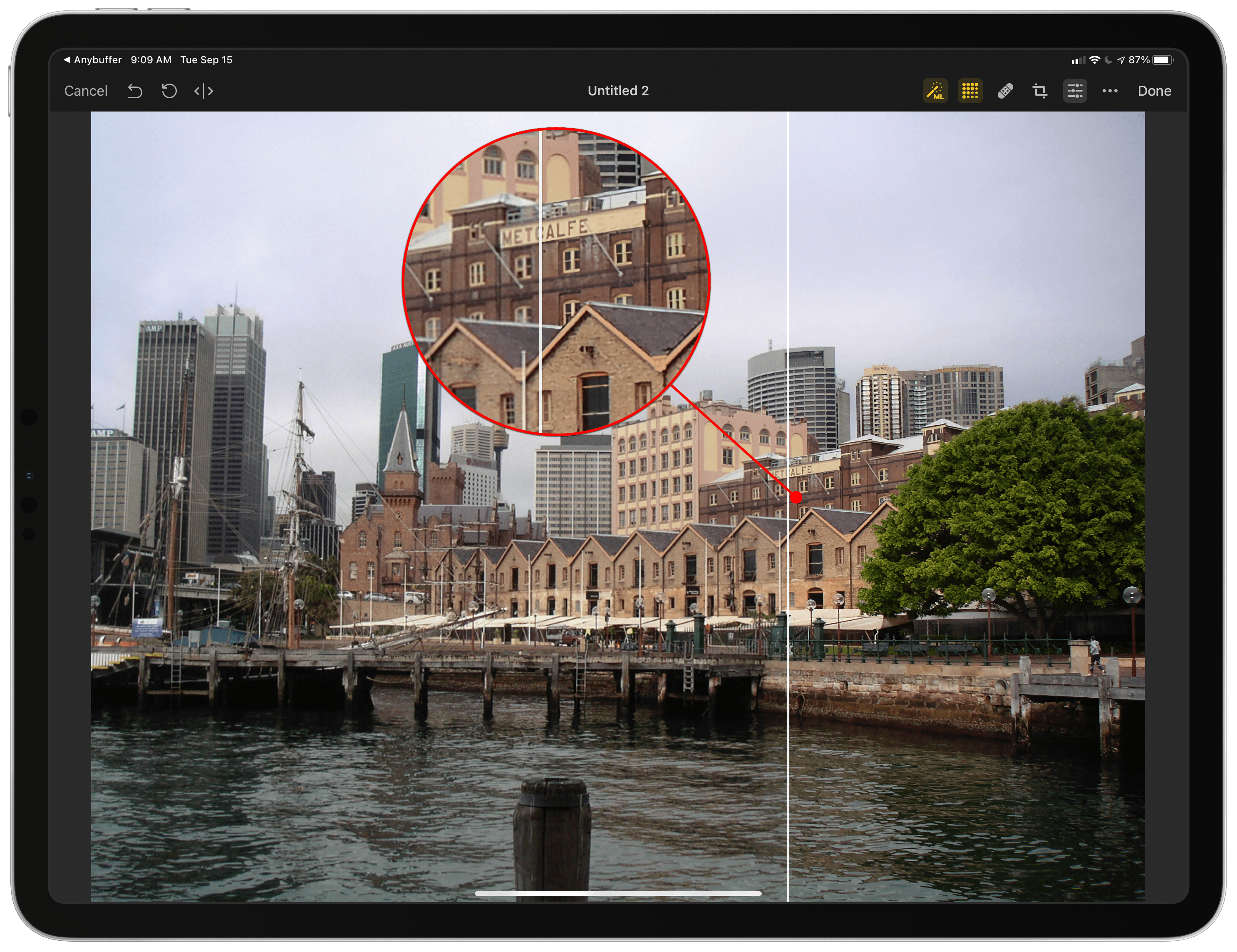
ML Super Resolution pulls out details in the Sydney waterfront that were difficult to see in this low-resolution photo from 2007.
I’ve used ML Super Resolution to take frame captures from old videos and increase their resolution to something compatible with the image sizes we use on MacStories. I’ve also enhanced old vacation shots taken with older, low-resolution digital cameras like the shot above from a 2007 trip I took to Australia.
What’s exciting about features like ML Super Resolution is that they extend computational photography beyond what is built into Apple’s Camera app, bringing it to photo editing workflows. Without understanding the algorithm underlying the feature, users can simply tap a button, and thanks to the power of Apple’s latest iPads, breathe new life into low-resolution images. If you’re sorting through old pictures over the holidays, keep ML Super Resolution in mind: it’s a terrific way to revitalize old memories.
Best New Feature: Runner-Up
GoodTask’s Widgets
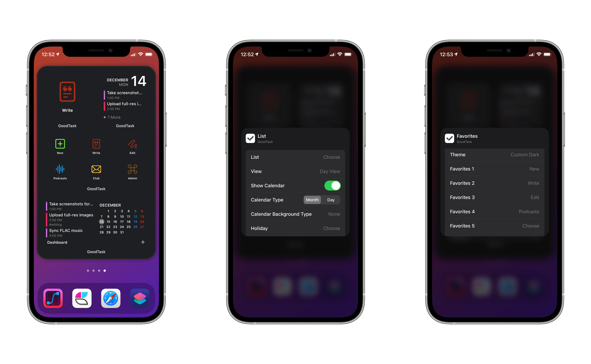
Federico: GoodTask, a third-party Reminders client, has long been a MacStories staff favorite thanks to its deep customization options and support for advanced features such as smart lists, personalized quick actions, and tagging. Created by indie developer Hanbum Kim, GoodTask has built a loyal following of dedicated users over the years who can even create and share their own custom themes for the app.
Earlier this year, GoodTask brought support for iOS 14’s new Home Screen widgets, and it did so by fully taking advantage of widgets’ configurable options that enable users to fine-tune the content and layout of widgets on their iPhone and iPad. GoodTask’s iOS 14 widgets offer the most powerful, versatile take on task management widgets we’ve seen on Apple platforms yet. The app’s widgets are entirely modular and customizable: you can pick exactly which lists, calendars, or smart lists you want to display in a widget; you can then set layout options, including the ability to display a mini-calendar in medium and large widgets; you can even create your own theme just for widgets, so you can ensure they play well with your Home Screen wallpaper.
But that’s not all: besides displaying tasks and events, any quick action previously set up in GoodTask can become a “launcher” widget that opens the app and executes a specific action; these commands include creating tasks with pre-filled information, which means you can, effectively, create personalized task presets and display them as a grid of icons in a widget.
The power unlocked by GoodTask’s new widgets is unparalleled among task managers for iPhone and iPad, and it’s a perfect example of the degree of flexibility granted to developers by Apple’s WidgetKit framework.
Best New Feature: Runner-Up
Craft’s Wiki Links and Backlinks
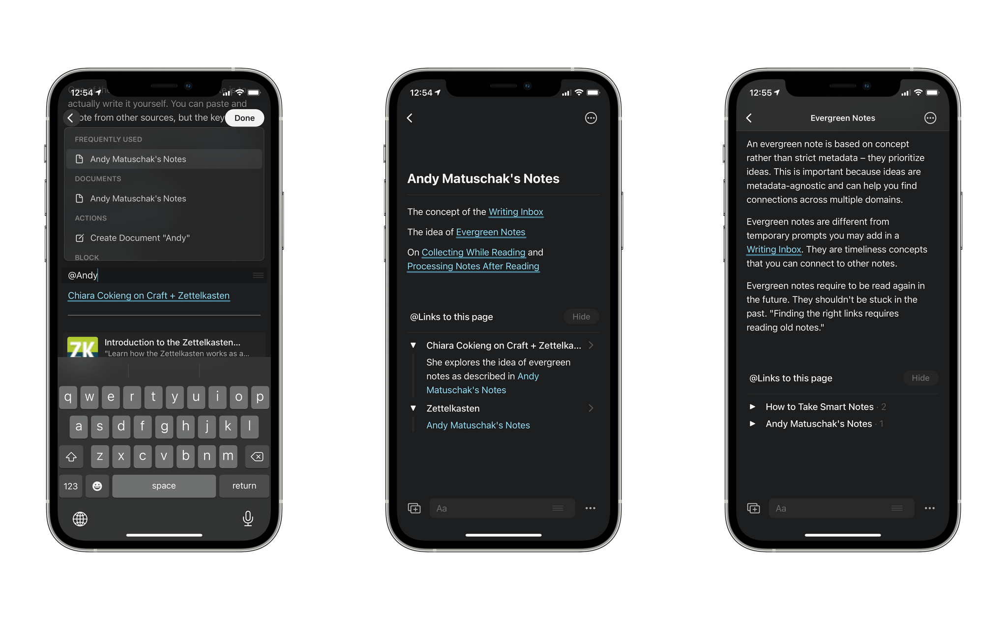
Federico: As I mentioned in our Best New App pick, one of Craft’s features is the ability to link to other notes contained in the same workspace. Other apps have offered support for wiki-style linking to other notes before (see: Bear and Notion); what sets Craft’s implementation apart is support for linking to any section (including individual paragraphs) of any note and displaying backlinks to the original document in a linked note.
The latter is a functionality that very few apps offer (currently, Notion supports it everywhere and NotePlan 3 offers it in the Mac version of the app) and is at the core of note-taking setups built around the Zettelkasten method, which is having a resurgence in 2020. Craft’s approach to note links and backlinks is terrific: type ‘[[’ or ‘@’ and the app will bring up a search box that lets you find and link anything you want, including notes, pages, cards, or paragraphs of another note or even the current document; then, at the bottom of the linked item, you’ll see a ‘Links to this page’ section that lists all the notes that are linking to the document, allowing you to jump back to them. You can even hover with the pointer over a note link to preview its linked section with a popup card.
Support for note links and backlinks means Craft can let you build your own network of notes over time, which is ideal for students and academics seeking to make sense of their vast collection of notes on different topics. Craft has taken the complexity out of this feature thanks to link auto-completion and a collapsible backlink section, and it’s the best implementation of these advanced functionalities I’ve seen to date.
Best Watch App
CARROT Weather
Alex: CARROT Weather is one of the best weather apps available on Apple platforms. Its snarky weather robot personality is a hilarious and unique take on weather reporting, and the app is consistently updated so it always remains modern. While CARROT’s iOS app generally receives the most attention, the CARROT team’s Apple Watch app is also top-notch.
I keep the CARROT Weather Apple Watch app as a complication on my main watch face. The app supports every size of complication, and the data displayed by each complication can be fully customized within the CARROT Weather app on your iPhone. On day one of watchOS 7’s release, the CARROT Weather Apple Watch app was updated to support multiple complications on a single watch face as well as watch face sharing.
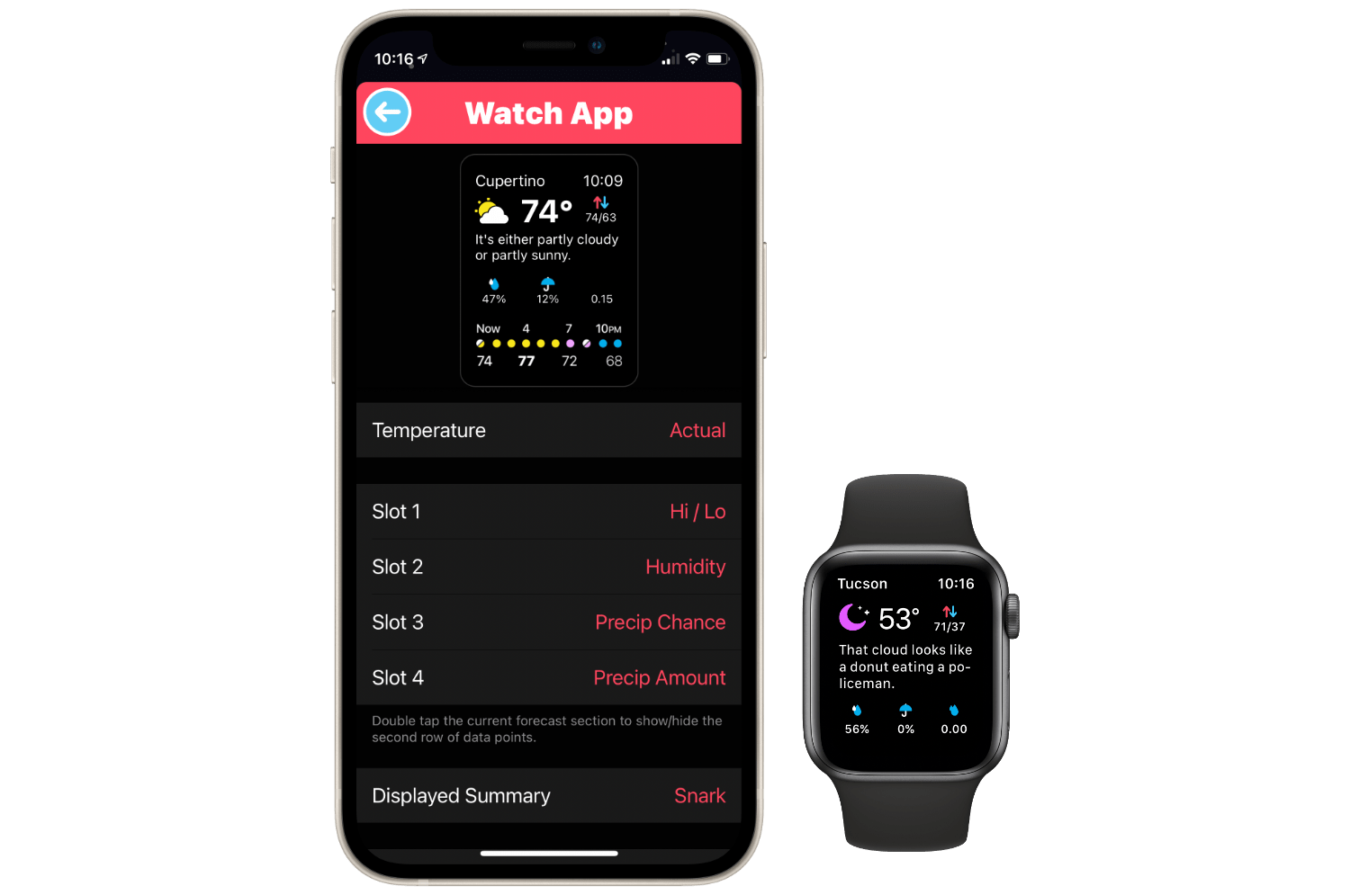
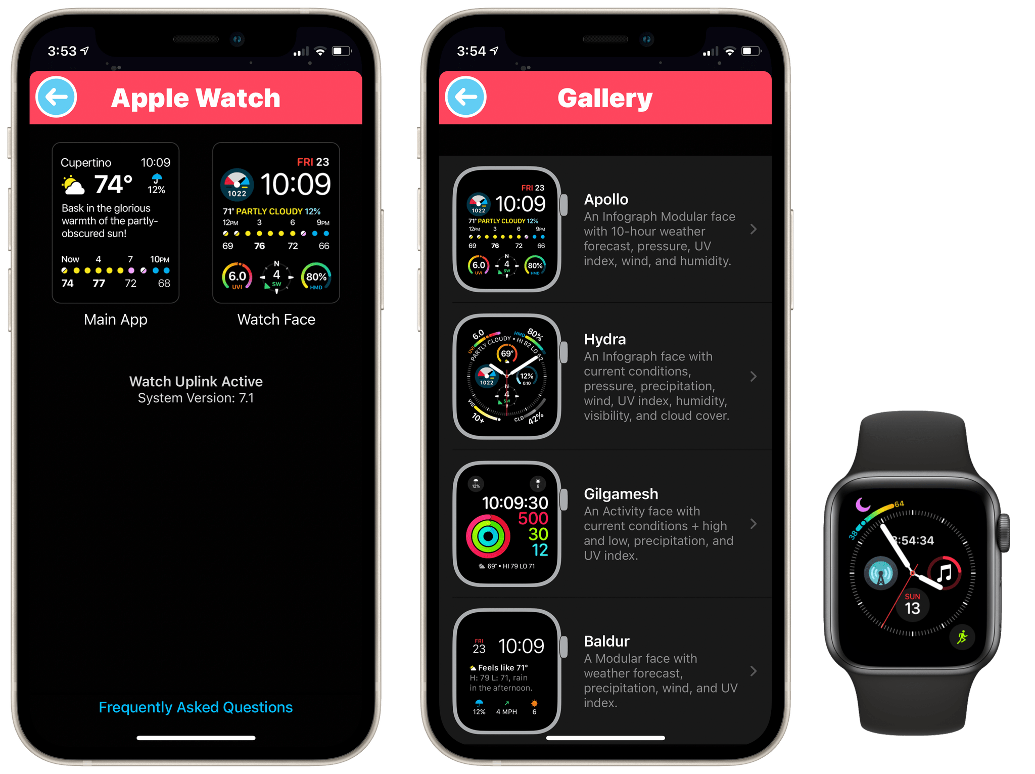
The level of customization allowed on the CARROT Weather Apple Watch app is truly unparalleled in its category. From the CARROT Weather app on the iPhone, you can open Settings → Apple Watch to get access to the customization options. There are two sections here: ‘Main App’ and ‘Watch Face.’ From the ‘Watch Face’ section, you can create fully customized watch face complications — including choosing up to two data points (temperature, high/low, precipitation chance, etc.), the timeframe, and the type of gauge for Apple Watch Series 4 and higher complication styles. Any complications that you add from the app join the default set of 20 complications that you can already pick from. Nearly any kind of weather data can be surfaced on your watch face using this app.
The other option from the iOS app’s Apple Watch settings screen, ‘Main App,’ allows customizing the actual Apple Watch app itself. The app will always show the temperature at the top and an extended forecast at the bottom. However, you can choose whether you want the temperature to be the actual value or the “feels like” value. You can also enable or disable the “snark” from CARROT’s evil weather robot personality. Between the temperature and the forecast, you can customize four different slots of weather data. Pick anything you’d like from CARROT’s set of data points, and organize them in your preferred order. These customization options ensure that anyone can make CARROT Weather on Apple Watch into exactly the kind of weather app that they prefer.
Another touch I like is that CARROT has gone above and beyond to make sure that you can troubleshoot finicky Apple Watch sync issues. Most settings changes for Apple Watch apps are supposed to “just work,” which of course means that there’s no clear path forward when they inevitably mysteriously don’t work. The CARROT team understands that sometimes the Apple Watch just doesn’t get automatically synced.
When you make changes to complications, you’ll see a new button appear on the ‘Watch Face’ settings screen in the CARROT iOS app which says ‘Sync Changes to Apple Watch.’ Press this and CARROT will attempt manual sync, which usually works. When even the manual sync fails, the app will let you know about the failure in plain English and advise you to restart both your iPhone and Apple Watch and try again.
I had this failure happen once while playing with these settings and the restart on both devices fixed it — I probably wouldn’t have tried that step right away if CARROT hadn’t suggested it. Even after all these years Apple Watch syncing just doesn’t work entirely flawlessly. On top of the wonderful app design, it’s great to see CARROT Weather acknowledging the Apple Watch syncing reality and doing everything it can to help its users out.
Best Watch App: Runner-Up
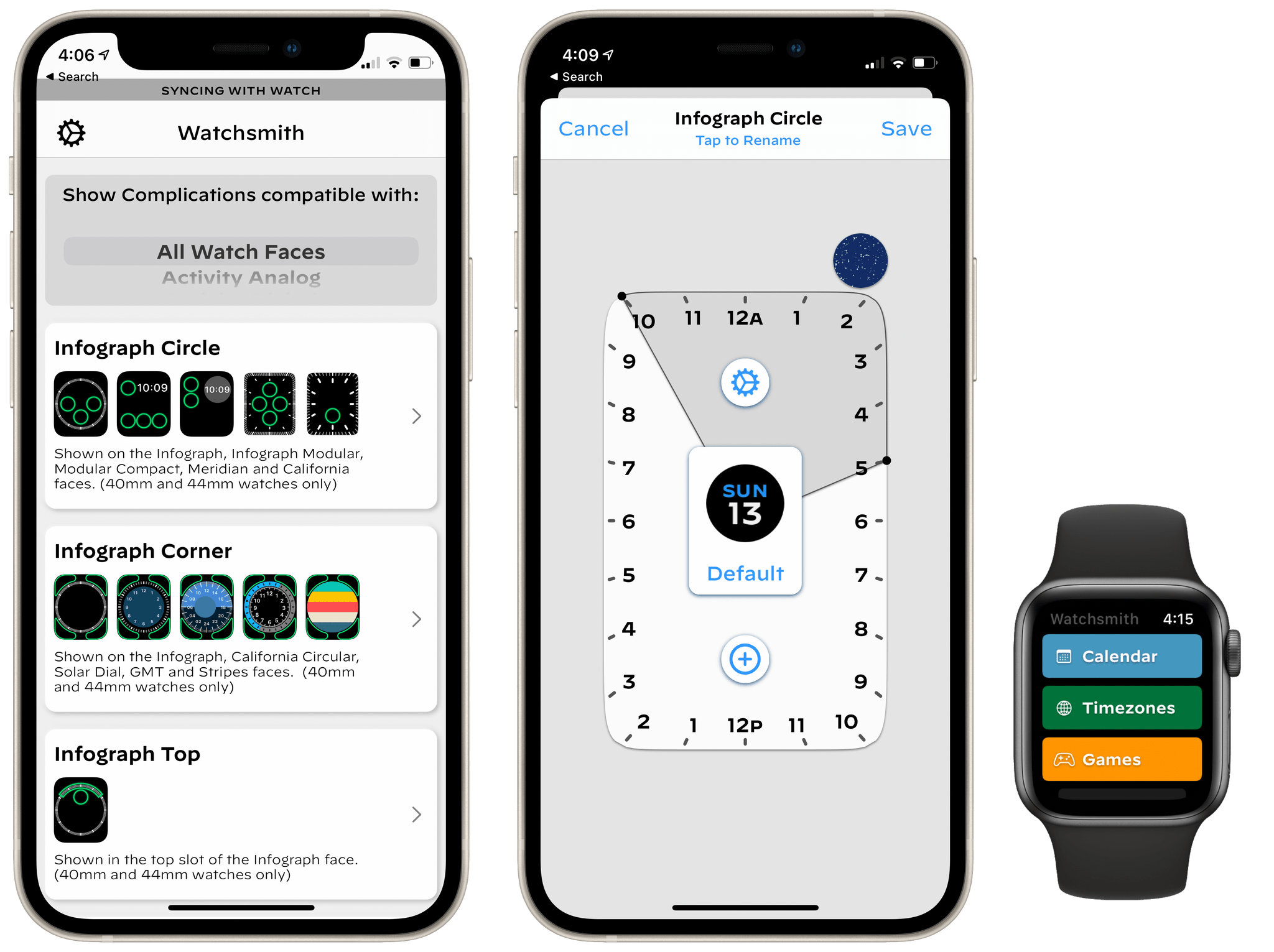
Watchsmith
Alex: Watchsmith, another app by David Smith, was the predecessor to Widgetsmith. The two apps share many similarities, but Watchsmith is an app for building custom Apple Watch complications.
Watchsmith was released in April of this year, but the app really hit its stride with its watchOS 7 update in September. That update brought support for adding multiple custom complications of the same size class to a watch face, which greatly increased the app’s potential.
Watchsmith can now be used to design as close to a custom watch face as we can get. The app is incredibly versatile. If you want to use it to fill just one or two complication slots on your watch then you can do so, or you can go all-in and create a full Watchsmith-styled face. Watchsmith for iOS is where you should go to create all of the complications that you’d like to use, then edit a watch face on your Apple Watch and you’ll be able to select from them.
The Watchsmith watchOS app itself exists as a bit o a grab bag of useful features. You can monitor workouts, track your heart rate, compare timezones, play a few mini-games, and more. The app is worth taking a look at if you’ve mostly only used its complications before now.
Best Mac App
Nova
Alex: Good code editors are a rare commodity. I’ve spent years searching for an editor that perfectly fits my tastes, but it wasn’t until this year’s release of Nova that I finally found one that satisfied me.
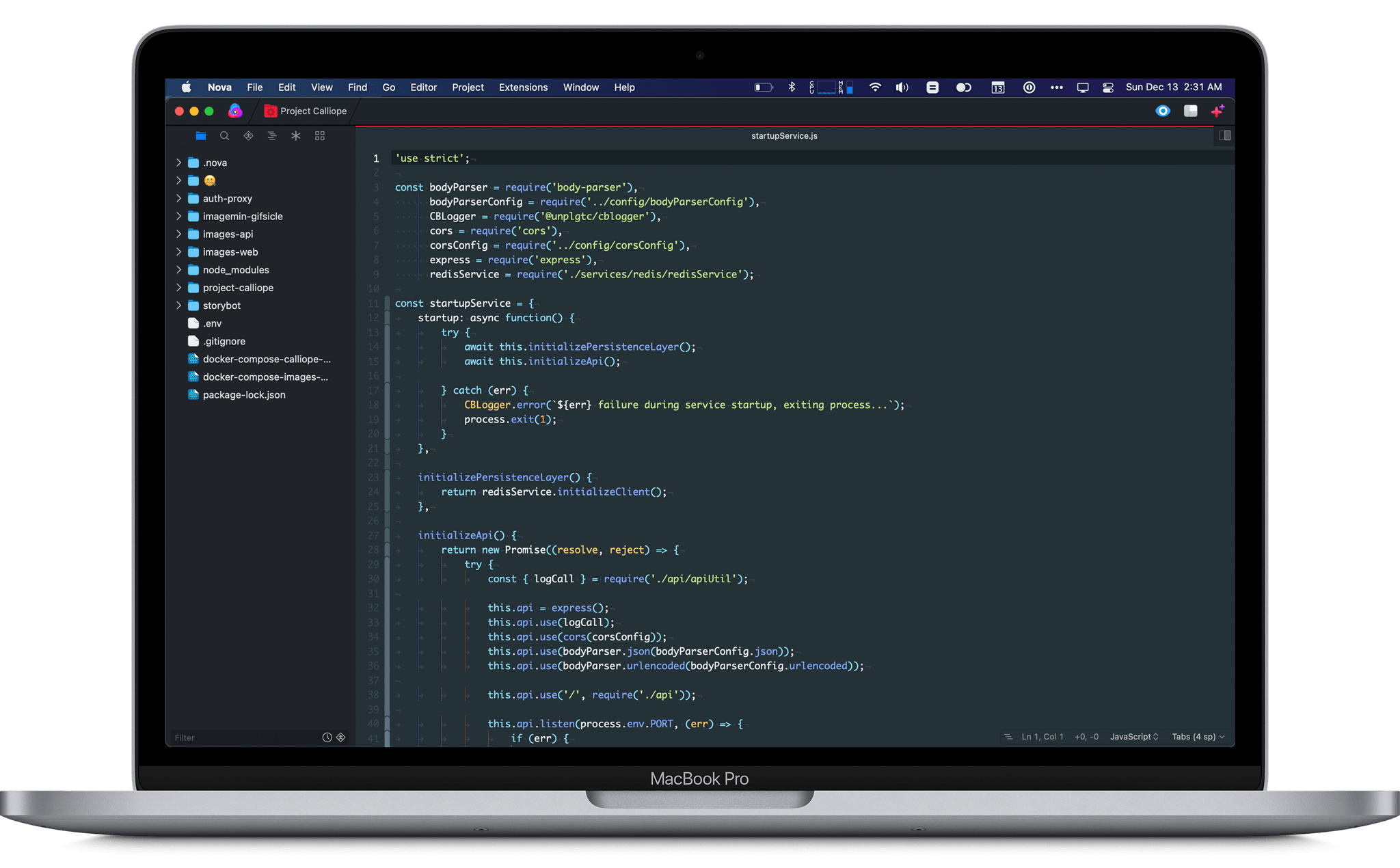
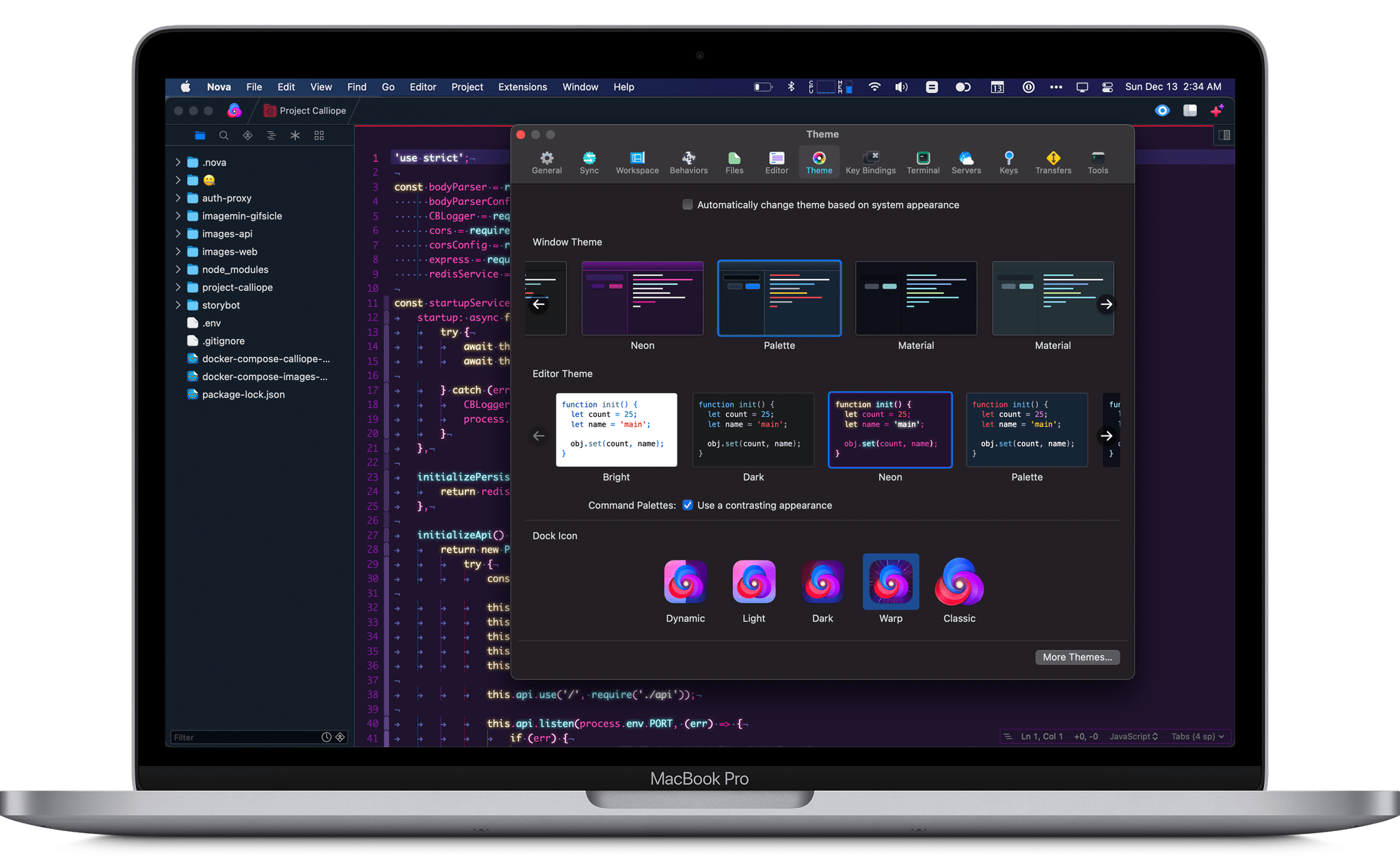
For starters, Nova is a truly Mac-like app — which should come as no surprise given that it’s made by the classic Mac app development studio Panic. Nova is designed from the ground up for macOS, and it shows. The app will fit perfectly into the workflow of any Mac user who needs it, supporting all the expected keyboard shortcuts and sporting a familiar sidebar layout.
To personalize its Mac-like interface, Nova supports a robust theme system that allows any developer to find a color scheme that they feel at home with. Fonts can be customized too, as can a host of minor editor settings which all exist within the Preferences window. On that note, just having a Preferences window is a minor victory — most other popular code editors these days don’t even bother to support such a simple macOS affordance as this. Sublime Text and Visual Studio Code, the two popular editors I’ve most recently coded with before Nova, both store settings as a series of JSON files which you can edit to change settings. I wish I was joking.
Speed is another factor that often goes out of the window as code editors grow more advanced. The more features added, the more editors tend to get bogged down. Computer fans spin up and beach balls appear more often than it seems like they have any right to when you’re just writing code. A few months ago I felt like this was just the cost of doing business on modern feature-rich editors. Then came Nova, and Nova is fast and efficient. My laptop fans no longer spin up for no reason when I’m doing nothing but writing code. Code completion suggestions don’t take seconds to load. Everything in this app just flies, and it feels amazing.
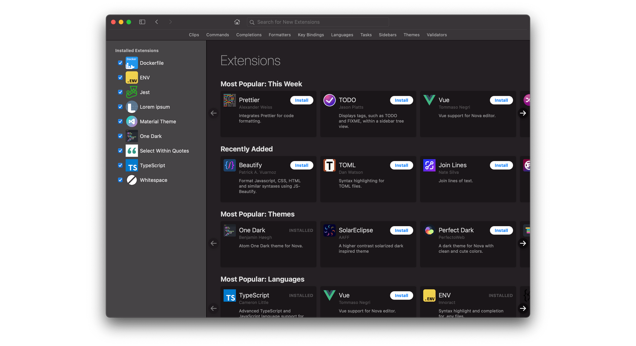
Panic didn’t sacrifice features for speed, though. While Nova’s stock configuration is fairly minimal, the app supports a rich and growing library of “extensions” which augment it with more specific capabilities. You can add code completion suggestions for your favorite coding language, new commands for the menu bar, validators that automatically standardize your code format, themes, and more. It’s possible that if you add enough of these then the app might slow down, but if that’s the case I have yet to find the tipping point. I currently have nine extensions installed and the app’s performance remains just as fast as ever.
An important distinction to note is that Nova is a code editor, not an IDE. You won’t find advanced software development capabilities here such as a debugger or advanced compilers. If having such things built into your code editing environment is a requirement for you then Nova probably isn’t what you’re looking for. That said, I find IDEs to be the most bloated, slow behemoths of all. I like to keep my code writing in a blazingly fast editor like Nova and just use Terminal or dedicated debuggers to manage the more complex areas of software development. Your mileage will of course vary based on what kind of development you’re doing, but Nova’s initial feature set should be more than enough to cover many users’ workflows.
As a software developer who loves the Mac but doesn’t actually write software for Apple’s platforms, I’ve been starved for a Mac-like editor for far too long. Panic’s Nova is an amazing breath of fresh air, and I highly recommend it to any developers out there. The app is still new, so the extension library isn’t as all-encompassing as some similar offerings from more tenured editors. The extensions are sourced from the community, though, so if you’re a developer then you can always write your own extensions. I think the experience of working with Nova every day would be worth the effort.
Best Mac App: Runner-Up
AirBuddy
John: Mac utilities that enable functionality that I wish Apple provided but doesn’t is one of my favorite categories of apps. There are a rich history and deep catalog of apps that fit that description on the Mac, but one of my favorites, which I reviewed earlier this fall, is this year’s update to AirBuddy by Guilherme Rambo.
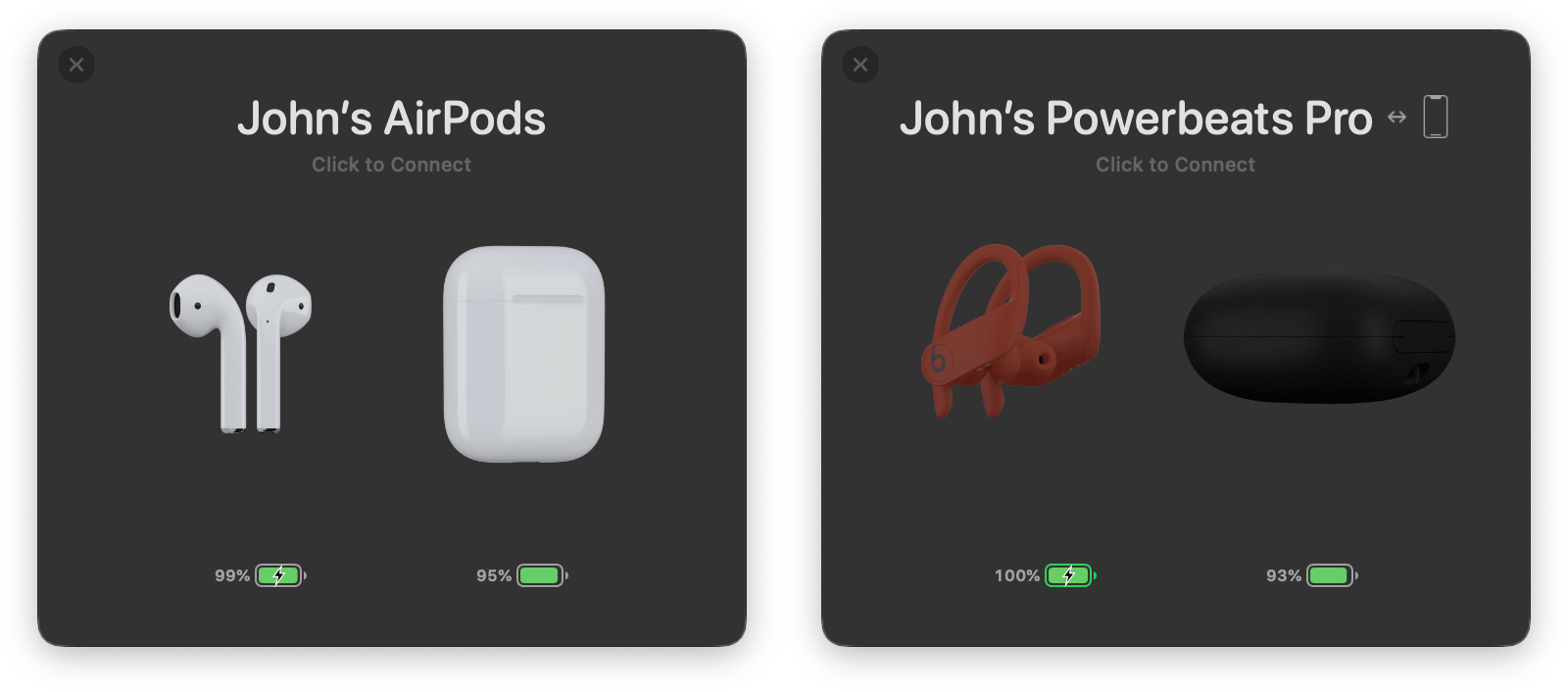
AirBuddy 2 makes managing Bluetooth devices dead simple. One of the primary uses of the app is connecting AirPods and wireless Beats headphones to your Mac. The menu bar app’s UI takes a page out of Apple’s iOS playbook by presenting you with a beautifully-animated window when you open your AirPods’ case or turn on your Beats headphones near your Mac, allowing you to quickly connect them and see how much charge you have left.
Version 2 of the app goes much deeper, though. It includes a Big Sur widget that resembles the battery widget on iOS and iPadOS that reports on the battery levels of your Mac, nearby iPhones and iPads, and accessories like keyboards and trackpads. Also, if you run AirBuddy on two Macs at the same time, the app allows you to smoothly transfer connected accessories like keyboards, mice, and trackpads from one Mac to the other. For anyone who has ever worked on two Macs at once, it’s a big time saver.
AirBuddy fills a gap in the Mac’s functionality that Apple has left wide open. With so many devices relying on rechargeable batteries and Bluetooth for connectivity, AirBuddy’s usefulness has greatly expanded since it was first released, making it one of those apps that I’ve come to rely on and have installed on the Macs I use.
Best Design
Reeder 5
Federico: Design is a difficult quality to evaluate in apps these days. When we say that a particular app has a “great design”, do we mean it in the sense that it’s unique and unlike anything else we’ve tried? Do we associate good design with exuberant visual flairs and sophisticated user interfaces? Or does “great design” imply that an app is consistent with Apple’s guidelines for a specific platform and works in a familiar, intuitive manner that we immediately understand?
In our opinion, great design on Apple platforms in 2020 spans the full spectrum of all the aspects mentioned above. And this year, no other app encapsulated all the qualities of great design on iOS, iPadOS, and macOS better than Silvio Rizzi’s Reeder 5.
Reeder has been around for well over a decade at this point: the app first came out in 2009, the first year I started MacStories. Reeder was one of the first reviews I remember, and I have fond memories of following the app’s evolution throughout the years. Even though the RSS market filled up with some fantastic options (both in terms of services and clients) after the demise of Google Reader, Rizzi’s Reeder always remained a beacon of excellent design as the result of attention to detail, personality, usability, and fluid interactions.
It’s hard to pinpoint a single design-related trait that makes Reeder emerge from the vast sea of app debuts and updates we evaluated in 2020. Reeder requires a holistic consideration of its user experience to understand why there’s something special about it. From the way the refresh indicator animates in the top toolbar and smooth transitions between panels on iPad to the way Safari View Controller is integrated with the article list and ridiculously smooth scrolling that doesn’t drop a single frame even when you have hundreds of headlines to sift through, Reeder 5 is an absolute pleasure to use.
Reeder walks a fine line of blending custom UIs (such as the menu to adjust article properties) with native elements such as context menus, and it succeeds in creating an aesthetic that is both uniquely Reeder-y but also consistent with Apple’s HIG and its platforms. Reeder’s design also lends itself well to the app’s different use cases: Reeder can now be used both as an RSS client and read-later app, and the app’s elegant, responsive, unobtrusive interface works just as well for skimming headlines as it does for laying back and spending a couple hours reading articles saved in your queue.
We’ve tried several RSS readers over the years, but we always come back to Reeder. There’s always been something magical about Rizzi’s creation (itself an accomplishment – it’s rare to find apps that have been maintained by the same developer for over a decade), but version 5.0 is Rizzi’s best work yet.
Best Design: Runner-Up
Nova
Alex: We already touched on Nova’s excellent Mac-like design for its Best Mac App win, so it’s no surprise that Panic’s editor nabbed a spot in the Best Design section as well. It’s obvious that Nova’s interface was carefully considered, from the theme system to the small design touches throughout the interface.
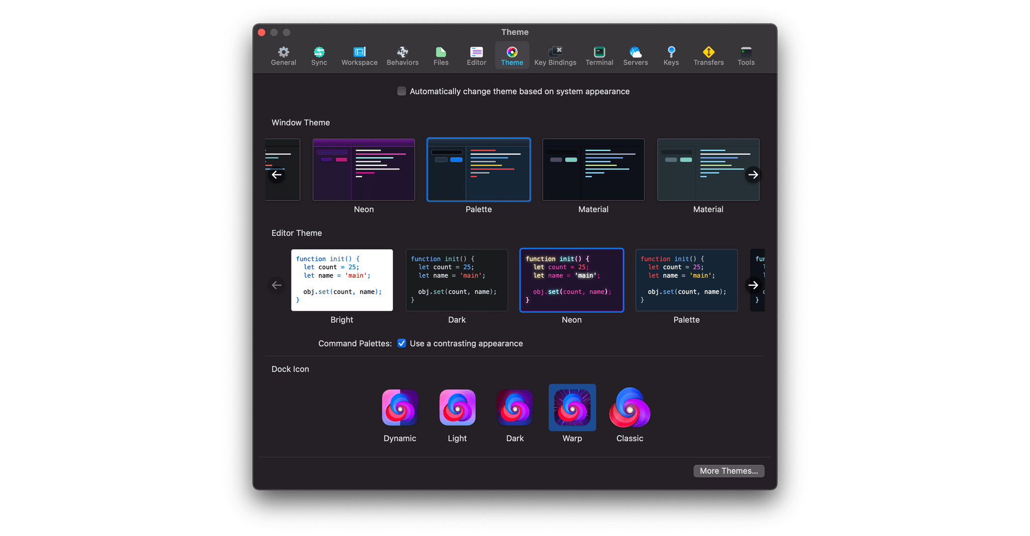
Nova’s themes can be accessed from the ‘Theme’ section of the Preferences window. The app includes four themes by default: Bright, Dark, Neon, and Palette. Extra community themes come in the form of extensions from the extension library, and once they’ve been installed you can enable them from the ‘Theme’ preference pane. Themes are set separately for the text editor itself and for the window chrome around it. This enables a wide variety of possible combinations and ensures that everyone can get the app looking just the way they want.
Zooming into the app, you’ll find a bar on the left of the editor which can be clicked to fold code sections up, and a button at the editor’s top right which will split your document into two side-by-side panes. Split panes can be used for live-previewing HTML pages, editing a document in two sections at once, or as a terminal or file browser. The app’s left sidebar includes nine sections, but you can customize which sections are available as quick-access tabs at the top by dragging-and-dropping them. Everything feels utterly natural and works exactly the way you expect it to.
My favorite design touch is that the sidebar’s file browser is just a standard macOS file browser. I can ⌥-drag files to duplicate them, I can press Return to edit file names, I can drag things to the system trash, and I can drop things in from Finder windows. This might sound obvious, but in the world of code editors file browsers never operate as they should. Every aspect of Nova was designed for the Mac.
Readers’ Choice Award
Reeder 5
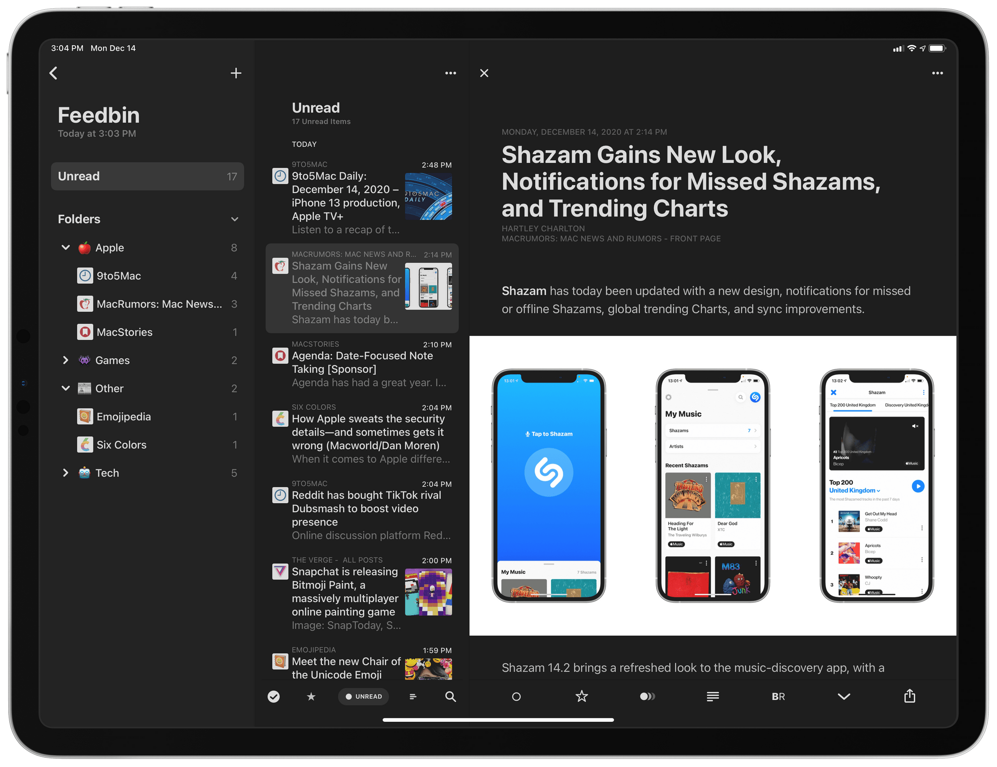
John: It’s not hard to see why Club MacStories members overwhelmingly chose Reeder 5 as this year’s Readers’ Choice Award winner. The app, which received a big update in 2019 and was a runner-up in the MacStories Selects Best App Update category, got another big update in 2020. Version 5, which I reviewed in October, takes what was already one of the premier RSS clients for the iPhone, iPad, and Mac and extended the features without compromising the app’s beloved design, which we recognized with the Best Design award this year.
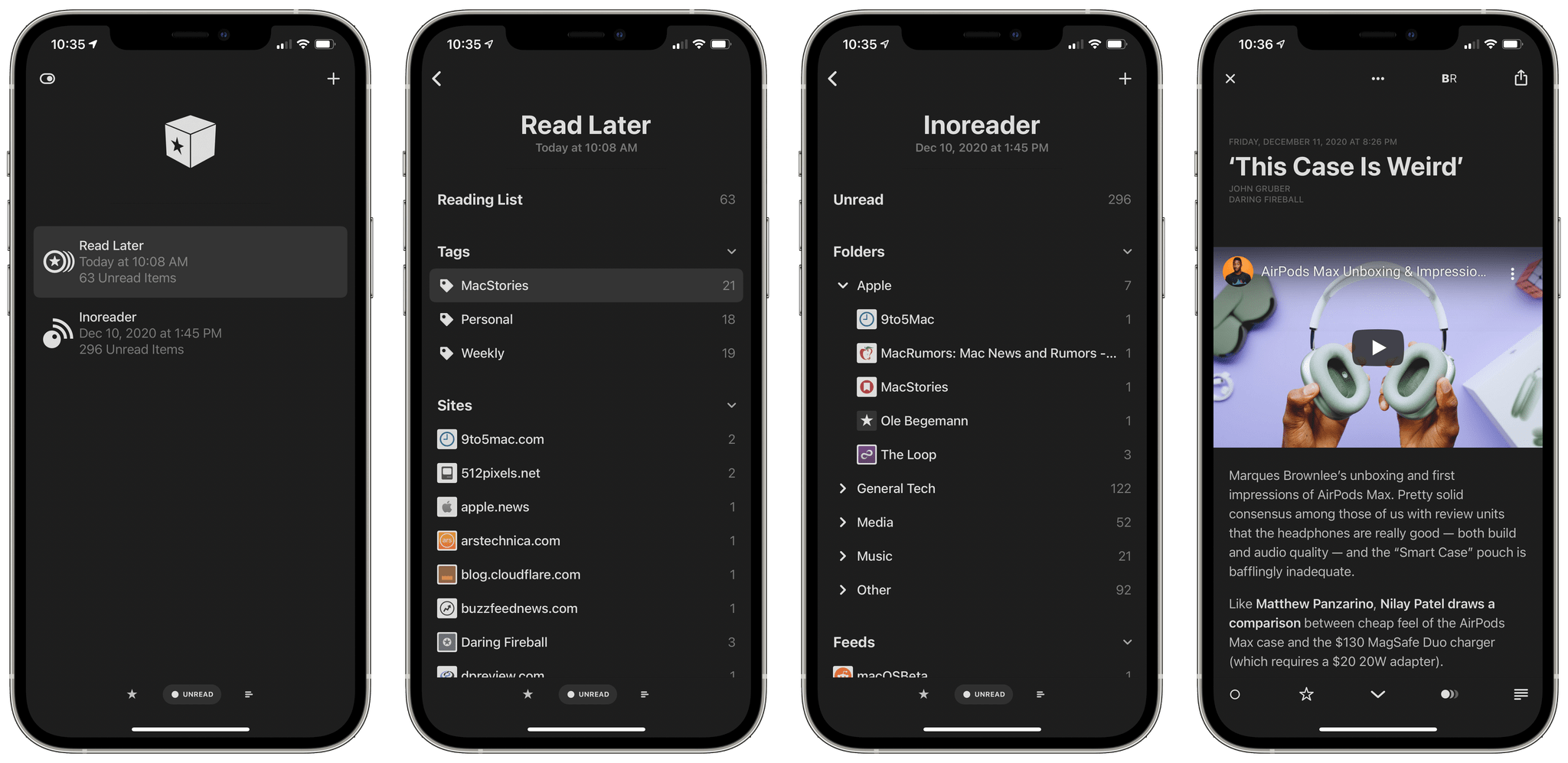
The extra level of organization provided by tags in Reeder 5’s Read Later service is my favorite new feature of the app this year.
First, users no longer need a third-party RSS sync service to use Reeder. Instead, they can sync feeds through iCloud at no additional cost. The change is a big step forward that makes the app useful to a wider audience. For some people, like those of us on the MacStories Team, RSS is an integral part of our work. We’ve used third-party RSS services for years both to sync our feeds across multiple apps and for the additional features those services offer. But for many other people who use RSS as a convenient way to catch up on their favorite sites, a paid sync service doesn’t make sense. With iCloud sync, Reeder is a terrific choice for more users than ever before.
Second, Reeder 5 extends the app’s built-in read-it-later service with tags. The feature, which was introduced in Reeder 4, is a place where you can store articles for later, but the first iteration was just one big bucket of articles. With Reeder 5, users gained the ability to tag articles, making it easy to organized saved items in a way that works with the way they read. I use tags to separate personal and work reading and stories I’m considering for links in MacStories Weekly from other work-related articles. It’s a simple tag taxonomy, but one that has made Reeder’s read-it-later service much more valuable to me since the update.
Reeder 5 is a fantastic app that embodies so much of the sorts of apps we value at MacStories. It’s an amazing blend of impeccable design, combined with a thoughtful feature set that makes it a pleasure to use every day, which I was so glad to see that Club MacStories members appreciate it too.
Readers’ Choice Award: Runner-Up
Scriptable
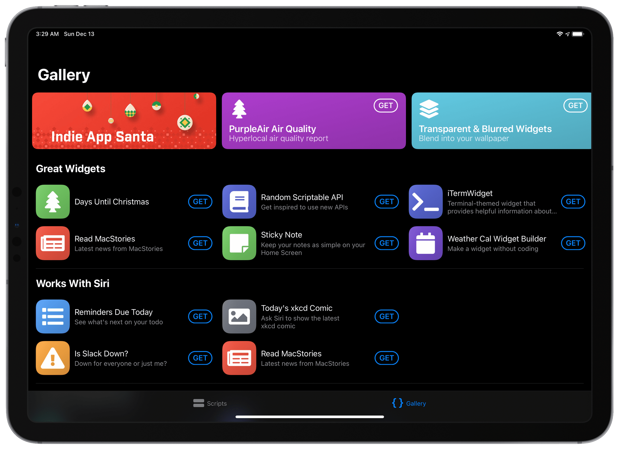
Alex: Scriptable is a code editor for iOS and iPadOS which provides access to system features via JavaScript APIs. When combined with the app’s excellent Shortcuts support, Scriptable empowers users with access to highly advanced automations that wouldn’t otherwise be possible.
Scriptable developer Simon Støvring has maintained a steady stream of updates throughout this year. In particular, Scriptable’s impressive 1.5 update brought support for iOS and iPadOS 14 — including custom widgets and new ways to interact with Shortcuts without even launching the Scriptable app.
Given Scriptable’s unparalleled custom automation capabilities, it’s no surprise that MacStories readers hold the app in high esteem. Scriptable patches some of the flaws in Shortcuts’ code-less automation vision, which makes it an indispensable tool for many modern iOS and iPadOS workflows.
Readers’ Choice Award: Runner-Up
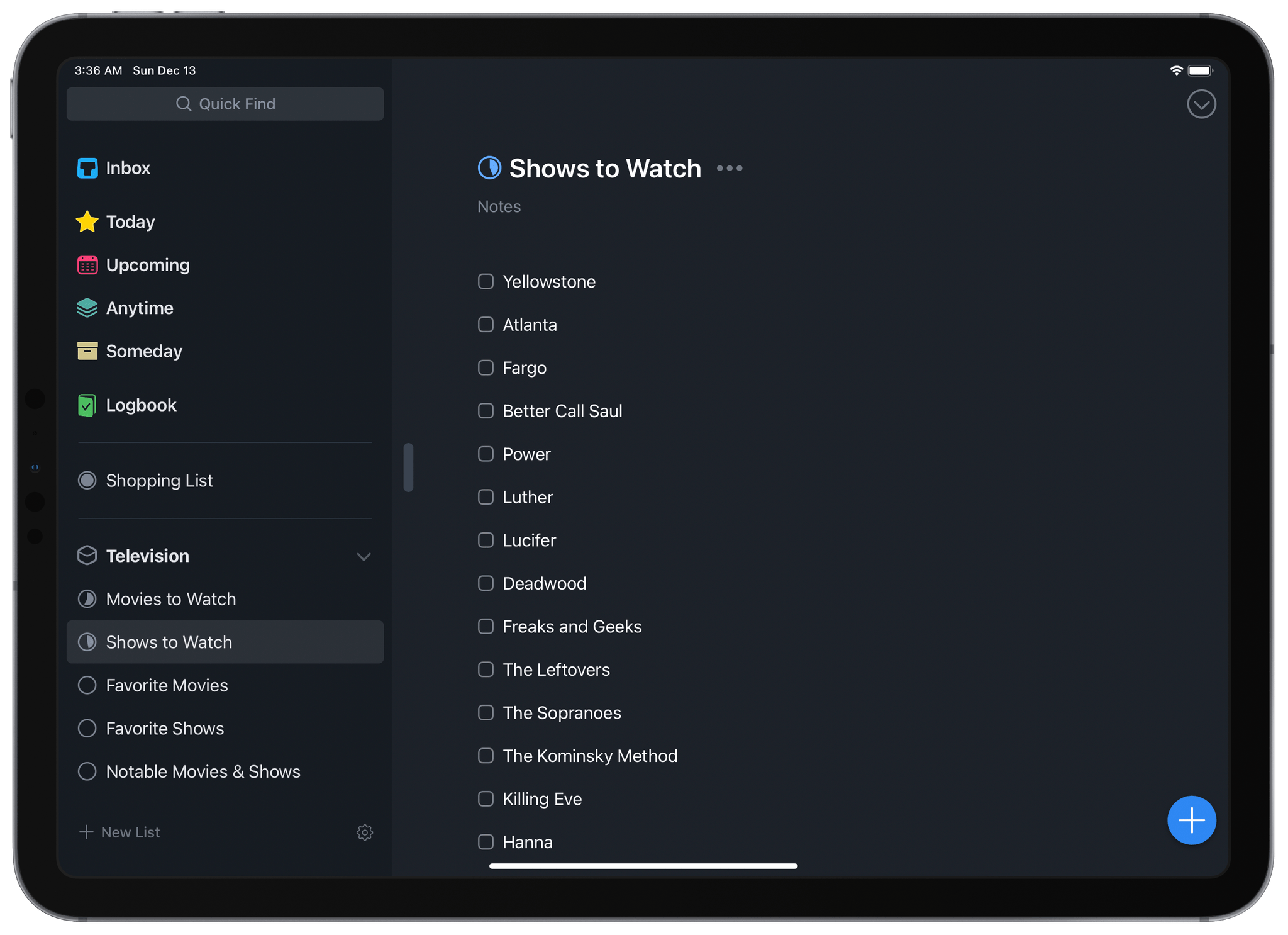
Things
Alex: Things was a runner-up for our Readers’ Choice Award last year as well. While the app still hasn’t quite managed to nab the pole position, it continues to be one of the top apps for MacStories readers. There are many task managers on iOS, but few can go head-to-head with the beautiful design that Things debuted with Things 3, and has continued to build on ever since.
Throughout the last year, Things has continuously been updated to support the latest features of iOS, iPadOS, and watchOS. In March, Things fully revamped its watchOS app to bring it into the modern era. Just one month later they added support for the new cursor on the iPad’s Magic Keyboard. This September, Things was ready on day one with an iOS and iPadOS 14 updates that included all-new widgets and task creation via Scribble.
MacStories readers love Things for a reason. As they’ve proven time and again this year, Things’ developer Cultured Code is dedicated to maintaining their task manager as a first-class citizen across all of Apple’s platforms.
App of the Year
MusicHarbor
Federico: When we evaluate candidates for MacStories Selects’ most prestigious award – the App of the Year – there are several factors we take into consideration and discuss among ourselves. What are the apps we enjoyed the most during the year? Which ones do we rely on for our daily tasks and workflows? Is there one in particular that received major updates with support for modern APIs on all Apple platforms? Which app masterfully executes on a unique idea and combines it with accessible, intuitive design?
MusicHarbor, created by indie developer Marcos Tanaka, meets all these requirements. In the dark, challenging times of 2020, this third-party utility that helps you stay on top of new music releases by your favorite artists is the app that – to quote Marie Kondo – brought us the most joy. And it did so while adding support for Apple’s latest iOS and iPadOS APIs, integrating with Spotify in addition to Apple Music, and expanding to another platform – macOS – thanks to Apple’s Mac Catalyst.
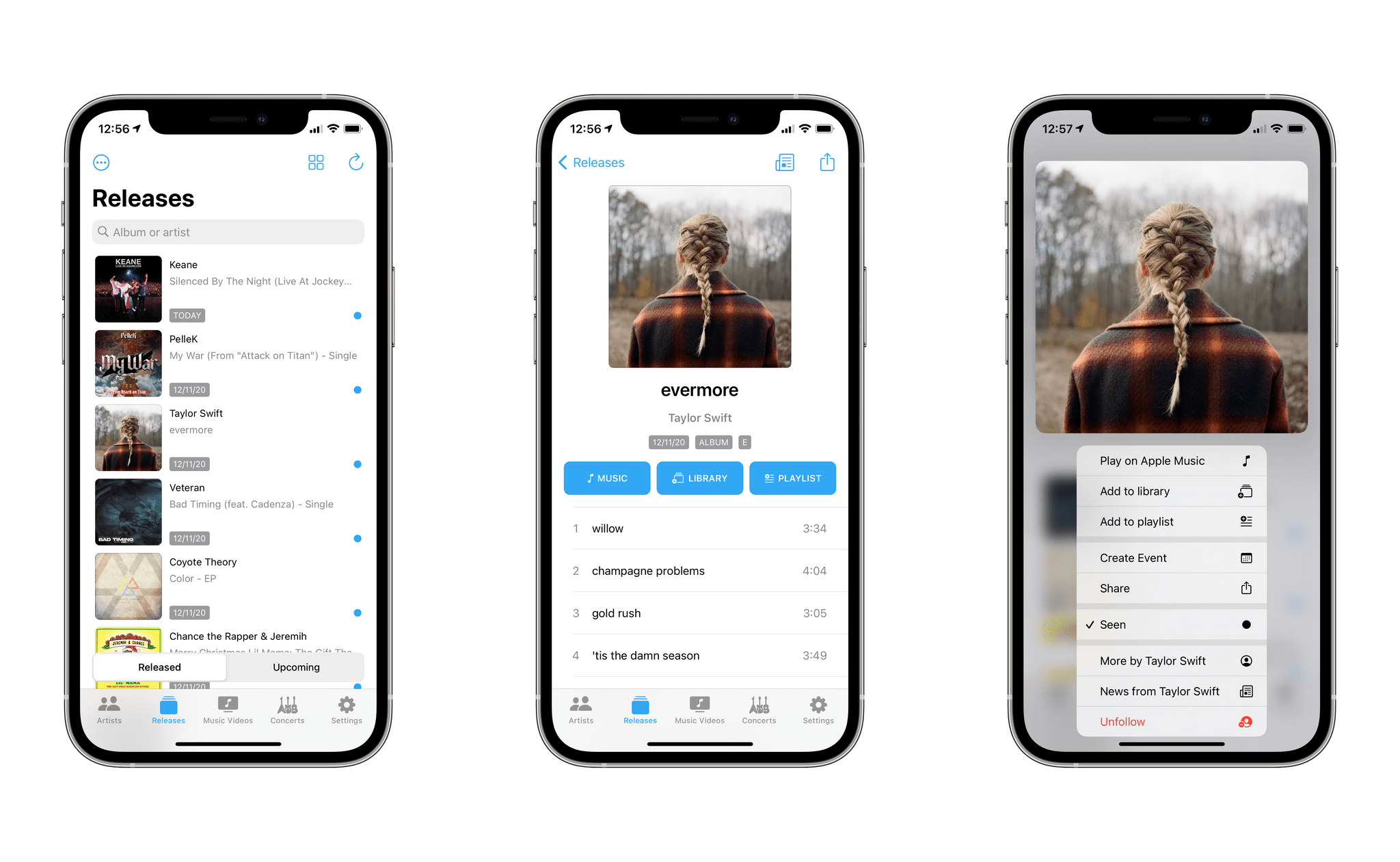
I first wrote about MusicHarbor in November 2019. In my story, I explained how MusicHarbor managed to fill the void left by Record Bird, the app I once used to keep track of new and upcoming music releases before it was shut down. MusicHarbor offered exactly what I wanted: after scanning my Apple Music library, the app allowed me to keep track of all singles and albums recently released by artists in my library as well as browse upcoming releases in a separate section. MusicHarbor provided me with an easy-to-use interface for a feature Apple never bothered to add to their Music app (which still doesn’t offer an ‘All Releases’ page) while, at the same time, integrating with Apple Music to open song/album pages or save items to one of my playlists.
MusicHarbor developer Marcos Tanaka could have easily kept the same features of the original version of the app I reviewed last year, and I’d still be using it today. What’s remarkable about MusicHarbor, however, is that despite 2020 and having pretty much captured a niche on the App Store, Tanaka managed to refine the app’s core idea, add more integrations, and expand MusicHarbor’s scope without fundamentally altering its nature.
Now at version 4.1.7, MusicHarbor is the rare example of an app that has grown a lot while feeling like the same utility to existing users. As I noted above, MusicHarbor now supports Spotify, so you don’t have to be an Apple Music subscriber to scan your library and browse new music releases. The app also lets you “redirect” items to more streaming services via its integration with the Odesli service; if you want to view a new release by, say, Miley Cyrus on YouTube Music rather than Apple Music, you can do that.
The list of new options and features Tanaka added around MusicHarbor’s central idea goes on though – and this is the kind of judicious iteration and thoughtful craft we love to see in indie developers who understand what making apps for Apple platforms in 2020 means. On iPad, MusicHarbor employs the new system sidebar for iPadOS 14, which speeds up navigation across sections of the app, such as the Music Videos page, which aggregates all new music videos from your artists available on Apple Music. On iOS 14, iPadOS 14, and macOS Big Sur you can find new MusicHarbor widgets and discover new and upcoming music releases at a glance. There’s a new compact layout and list view option on the iPhone; there are several parameter-based Shortcuts actions to fetch data from the app and build custom shortcuts for music releases. You can now read album reviews and music news from MusicHarbor. And as John covered on MacStories, MusicHarbor’s upgraded iPad foundation has made for an excellent Mac Catalyst app, which now lets you find and browse music releases directly on your Mac.
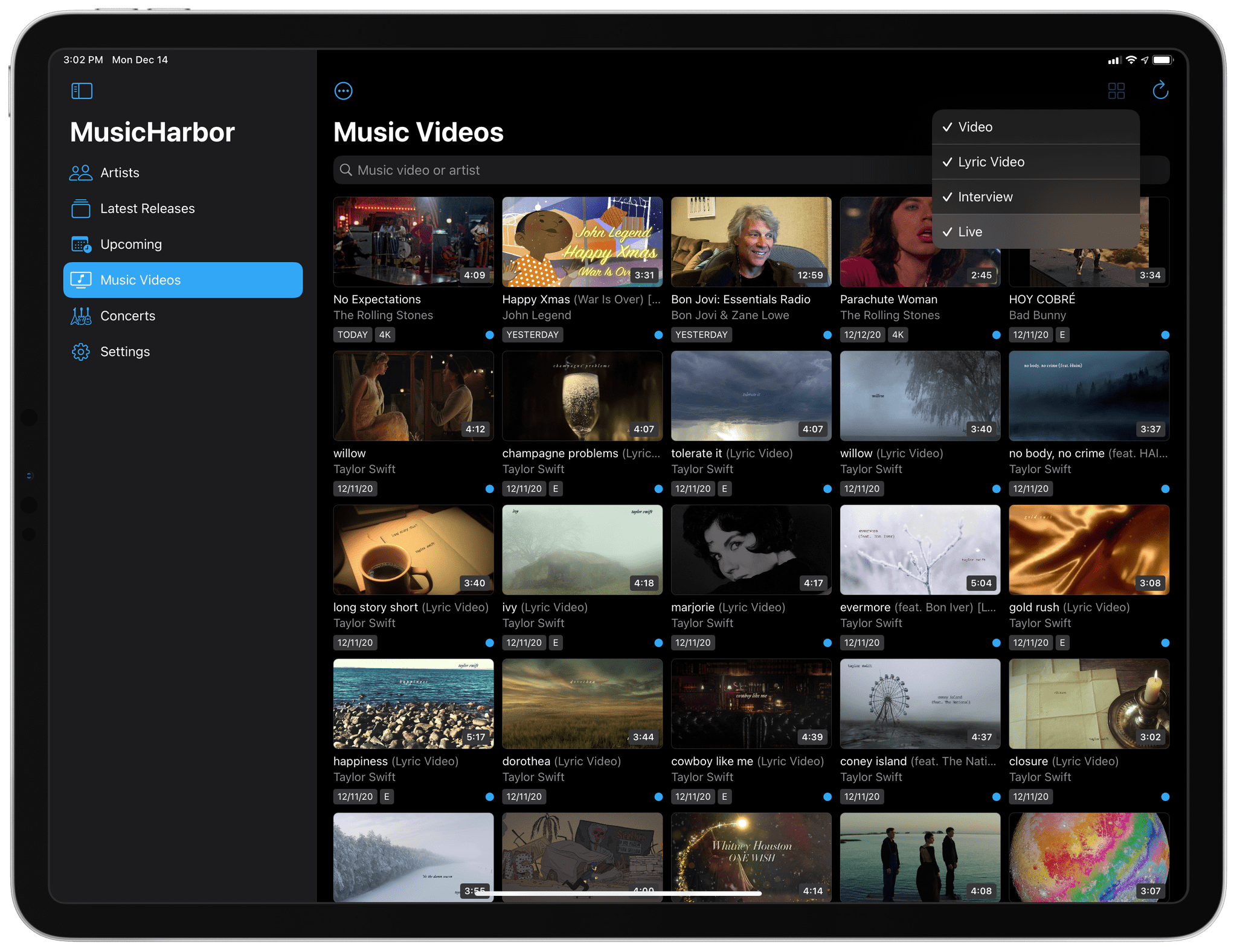
MusicHarbor offers convenient options to filter releases and music videos by type – something Apple Music can’t do.
MusicHarbor easily deserves an award on its technological merits alone: no app does a better job at letting you discover new music, and it’s the foremost example of a modern app for Apple platforms in 2020. But there’s another, perhaps intangible, yet pervasive quality to MusicHarbor that makes it stand out among all the apps we used, tested, and wrote about this year: during the challenging times we’re living, opening MusicHarbor and seeing new releases from our favorite artists feels like hope. Beyond the technical minutiae and design tweaks and new features, MusicHarbor’s very essence reminds us how, in times of great difficulty, humans can still come together and create art. It reminded us that music can fill any silence. And it reminded me that, no matter how hard the challenge, an indie developer can still pour their heart and labor into a product that makes our days even just a little bit better.
For all these reasons, MusicHarbor is our App of the Year 2020.
App of the Year: Runner-Up
Tot
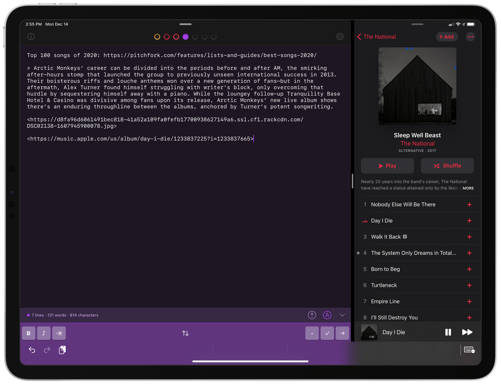
Federico: Tot by The Iconfactory is the scratchpad I didn’t know I needed until I started testing the app earlier this year. Available for iPhone, iPad, and Mac, Tot puts a unique spin on the note-taking app genre: rather than organizing your notes in folders or projects, in Tot you only see seven dots at the top of the app’s window. These dots represent the seven scratchpads you can create in Tot, each assigned a different color. And that’s it. Tot was designed to provide you with an effortless, reliable scratchpad for bits of text you need to temporarily store before pasting or sharing them elsewhere. Whether you use it from the Mac’s menu bar, on your iPhone, or on iPad with Slide Over, Tot is a fast, lightweight solution to enter text that doesn’t demand anything from you.
What I appreciate most about Tot – and the reason why I find myself opening this app dozens of times each day – is the clarity of the idea and the restraint it takes to design a product with a limited scope in 2020. In the age of Notion and Slack, the paradox of making software today is that it’s easier to say “yes” to everything and end up with an app that ostensibly looks like a note-taking utility but also happens to support Kanban boards and relational databases; the temptation to ship features just because they’re technically possibile is high. The way I see it, it’s harder to do what The Iconfactory accomplished with Tot: find a core idea, refine it to the extreme, and build an app around a single, clearly defined functionality that doesn’t attempt to solve all the problems in your computing life.
Tot does one thing, and it does it better than anything similar I’ve tried. I use the app to store links, quick calculations, blocks of code, and passages of text I may need again in a few minutes or hours. Tot isn’t the place where I “organize” my notes: it’s where I relieve my brain of the pressure of holding transient information that needs to be acted upon in the near future. Tot supports modern features such as iPad multitasking, keyboard shortcuts, custom fonts and themes, and it can also switch between plain and rich text editing modes. Tot’s simplicity and elegance are refreshing traits to find in a modern utility for Apple platforms in 2020, and it’s one of the apps I found most useful over the last 12 months.


