In some ways, iOS 6 is not a major update. And yet, in others, it’s possibly the biggest thing to happen to iOS since iPhone OS 1. Both of these assertions have far-reaching consequences for the users, third-party developers, and Apple itself.
In June, soon after the official announcement and preview of iOS 6, I concluded my general overview of the software with four questions. Looking back at that article now, those questions are more relevant than ever.
- “Will the App Store redesign also bring new curation and search features, as many developers asked?”
- “We didn’t quite get the “silver” system theme that was rumored; Apple seems to be moving towards blue gradients as a standard UI element, but not everyone’s liking the change for toolbars and status bars. Will they reconsider or improve upon today’s beta in terms of looks come Fall 2012?”
- “With a new iPhone likely to be released in October, will we see even more features being added to the OS to take advantage of the new device’s hardware?”
- “Will Google release a standalone Maps application?”
The answer to three of them is “no”. The last one – whether Google will release a standalone Maps application for iOS on the App Store – could be a “most certainly yes”, but we don’t know any more details.
iOS 6 is a controversial release, in that through the following days we’ll likely witness several news outlets and independent bloggers declare Apple’s doom or absolute genius, depending on the Internet clique they choose to side with. I think that, in this case, the truth lies somewhere in the middle – a gray area that needs a calm and thorough consideration. At the same time, I also believe that the “controversial” nature of iOS 6 needs to be analyzed for its various facets and reasons of existence. Why did Apple choose these features for iOS 6? What does the user make of it?
I have been testing iOS 6 for the past weeks, and I have (slowly) come to the conclusion that there’s no easy way to cover this update with a traditional review strategy. Instead, I have decided to take a look at the software from multiple perspectives, understanding the possible implications, downsides, and improvements for each one of them.
While last year I would have answered to the question “Should I upgrade to iOS 5 right away” with a resounding “Yes”, this year I’m not so sure about the “right away” part.
iOS 6: The Developer
If you’re a third-party developer who makes apps for iOS, you should be relatively excited about iOS 6, and I don’t think I need to tell you why. The developers I spoke with about iOS 6 told me that, in this release, there are some great changes, ranging from little goodies that fix long-standing annoyances of the SDK to bigger, new, and more important APIs. It was a shared sentiment among the developers I contacted that there will be plenty of room for experimentation as soon as the update’s adoption rate rises to a level where going iOS 6-only can be considered.
Take, for instance, the additions to the Event Kit framework. Starting today, you’ll begin to see apps integrating with Apple’s Reminders, as, thanks to iOS 6, third-party apps can directly access Reminders data. Apps can now view and share to-do lists in the Reminders app, with options to create and modify reminders, assign due date and priorities – even set location and time-based alarms. I have personally tested a couple of upcoming updates to popular third-party apps that implement the new Event Kit framework, and it’s a great addition.
It’s easy to understand why. By accessing Apple’s Reminders app and its data, developers are essentially given access to a “platform” for to-dos and alerts that syncs through iCloud on the iPhone, iPad, Mac, and, now, the web. Think of all those “simple to-do list apps” that have populated the App Store for the past four years: now, instead of implementing their own sync mechanism (which has costs both in terms of realization and future development) or having to rely on external services like Dropbox, they can just add Reminders support and get all the benefits of iCloud. iOS users know how Reminders works; instead of choosing the syncing system they prefer, it’s likely that, with iOS 6 and third-party support, users will simply pick “an interface” for their Reminders. Don’t like how Apple’s Reminders presents your lists? You can try another app that has (more or less) the same functionalities, with a different design. Just like users have been able to pick their preferred calendar client, with iOS 6 they’ll have options for “Reminders clients” as well.
While Event Kit is the most “user facing” addition to the SDK, there are several other improvements worth mentioning. iOS 6 has native Facebook integration: like Twitter in iOS 5, users can sign into their Facebook accounts from the Settings, and start posting status updates, media, or links to Facebook without the need of a dedicated client. Developers who want to integrate Facebook into their apps will be able to leverage single sign-on to let users quickly log-in with their Facebook credentials, as they are already saved on the device. Furthermore, this new social framework can essentially give any app decent Facebook features thanks to “share sheets” – little pop-up menus that enable users to post to Facebook from anywhere on iOS. It means developers won’t have to create their own custom Facebook login systems anymore.
There are other notable additions to the SDK, such as In-App Purchases for any kind of iTunes content (music, books, etc); Smart Banners for Safari, a way to easily redirect users to the App Store if they visit a developer’s webpage; new Camera APIs with access to face detection and exposure (among other things); and, obviously, APIs for Passbook and Maps, Apple’s two new apps in iOS 6. Not to mention improvements to layout and presentation techniques, which will pave the way for richer, more engaging apps that use text-based lists less and employ “more visual” elements such as tiles and grids.
But developing apps that take advantage of iOS’ latest features would be useless without a platform to promote them and sell them.
The App Store
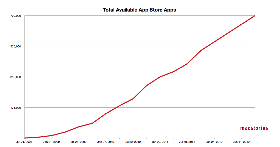
In May I took a look at the first four years of App Store, speaking to various third-party developers about their experiences and concerns with Apple’s ecosystem, then counting 600,000 apps for iPhone and iPad, and now well over 700,000 according to recent data from Apple. Among the several suggestions and critiques made by developers, nearly all of them expressed their wish for a more social, truly curated, and more searchable App Store that would supersede the structure Apple imagined in 2008.
(Click for full-size)
The App Store has grown exponentially over the past four years, and the overall presentation of software needs to take in account the sheer number of different apps available to users today. At the same time, Apple shouldn’t simply use automated algorithms to showcase noteworthy apps – it should give less importance to charts (which can be easily tricked) and “curate” software more with custom sections, weekly picks, and recommendations.
iOS 6 only partially addresses these concerns, and, unfortunately, makes some functionalities of the App Store inexplicably worse.
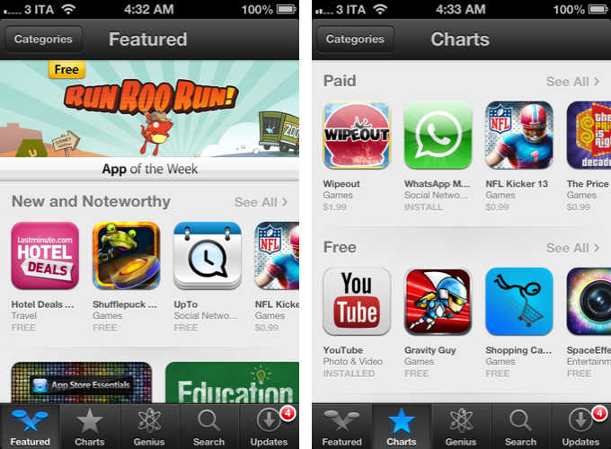
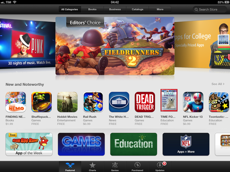
On iOS 6, the App Store has a new look. Gone is the black, flat look of the bottom tab bar to leave room for dark gray, almost Tapbots-like tabs with a subtle 3D effect. The blue toolbar, a marquee graphic element of iOS since 2007, is also gone in favor of the same dark gray scheme that, App Store aside, has been implemented in the iTunes Store as well.
In terms of content organization, the front page has been completely redesigned both on the iPhone and iPad. Sharing the same “Featured” name as the pre-iOS 6 days, the four banners that were displayed at the top as small images (iPhone) or rotating galleries (iPad) have been replaced by a swipable carousel of larger images that, on the iPad, sports a Coverflow-like interface design and animations.
Below the featured gallery, Apple is now showcasing “New & Noteworthy” apps alongside “What’s Hot”, a custom section that changes every week, and a second set of swipable “mini banners” for things like “Education” and “Apps Made by Apple”. On the front page, there’s obviously room for Apple’s recently relaunched “Free App of the Week” and “Editor’s Choice” initiatives.
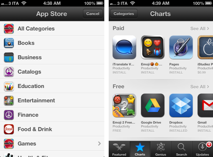
Apple’s reshuffling of App Store content and sections doesn’t stop at the front page. The tab bar, the primary way of navigating the App Store, has been reorganized to always show five areas of interaction: Featured, Charts, Genius, Search, and Updates. The most visible change is that Categories are gone from their spotlight position in the tab bar, replaced by Charts, and that Genius, once relegated to the front page’s top toolbar, is now an active element always looking for the user’s attention. This change is interesting for two reasons: first, it seems to suggest Apple wants to invest in its Genius algorithm more, perhaps hoping it’ll prove to be a feasible system to bring personalized app recommendations to the user. I can’t confirm this theory, as the Genius section I tested with the iOS 6 GM for this review was completely unusable – tapping on the “Not interested” buttons didn’t do anything – so I’m not sure how Genius is supposed to work. Better algorithms for automated, personalized recommendations were among the developers’ wishes for iOS 6, so we’ll see how this will play out in the next months.
More importantly, the inclusion of Charts in the bottom toolbar speaks to Apple’s preference for displaying content that is doing well in the Top Charts, rather than new apps available inside specific categories. Previously, there used to be a “Top 25” tab and another one for Categories; now, the Charts tab is immediately after Featured, and Categories have disappeared from the tab bar.
Everything’s not lost, though. Single categories are still accessible on the iOS 6 App Store: in the revamped Charts area, you can view the Top Free, Top Paid, and Top Grossing charts for a single category by tapping the Categories button in upper left corner; once in there, you’ll be able to choose the chart you want to consult, and tap “See All” to view all results in a list with infinite scrolling (in my tests, laggy and slow).
The good news for developers is that, with iOS 6, browsing single categories (not their top charts) may now be more accessible and visible to the end user: whereas in iOS 5 some always ignored the Categories tab in the bottom bar, a button to access every category is now available directly from the front page; on the iPhone, the button is clearly labelled “Categories”, and on the iPad there’s a series of tabs at the top starting with All Categories, then Books, Business, and a “More” button to display other Categories in alphabetical order. Following this new organization scheme, it seems like Apple is trying to position the front page – the Featured tab – as a “front page of all categories”; going further down into the category list will open a “mini front page” with New, What’s Hot, and Paid sections. In iOS 6, the lack of sorting options for categories persists, as there’s no way to sort items from a specific category by price, release date, or any other parameter.
In theory, the changes mentioned so far may sound like a definitive improvement over the iOS 5 App Store. Unfortunately, in actual testing, it does seem as if the new App Store layout engine was, at best, rushed and unpolished. Generally speaking, scrolling performance isn’t good: lists, carousels, charts, horizontal lists – they all stop working every once in a while, requiring a forced restart of the App Store application. Too, there are inconsistencies across the entire visualization of content: in the iPad’s Charts area, three charts are displayed in landscape mode – Paid, Free, and Top Grossing. This column layout is, at first, intriguing, but while using it you’ll notice that lists don’t scroll particularly well. Because the main window is split in 3 columns, to scroll back to the top of a list quickly you’ll have to tap on the portion of status bar relative to a section; this system is consistent with the behavior of Settings.app on the iPad (also a multi-column layout), but on the App Store, the gesture is sometimes unresponsive.
I’m not alone in thinking the App Store on iOS 6 needs serious improvements before being ready for an optimal and stress-free customer experience. As the app is an HTML wrapper for content and styles Apple can fix “server-side”, there’s hope Apple will push fixes to the App Store without software updates. For now, however, the new App Store feels like a step backwards in terms of speed and reliability, and this is not good news for third-party developers who need users to pleasantly browse and discover software through Apple’s storefront.
Searching For A Better Search
So far, I have covered the content reorganization process that went into the iOS 6 App Store, and mentioned some of the changes developers once wished for, but that didn’t come with this new version. Let’s now touch upon the other two most important changes of the iOS 6 App Store: how apps are presented, and search. And let’s start with the good news.
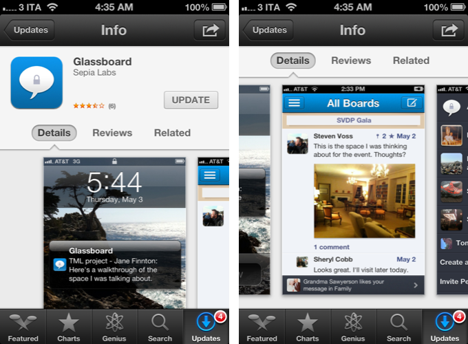
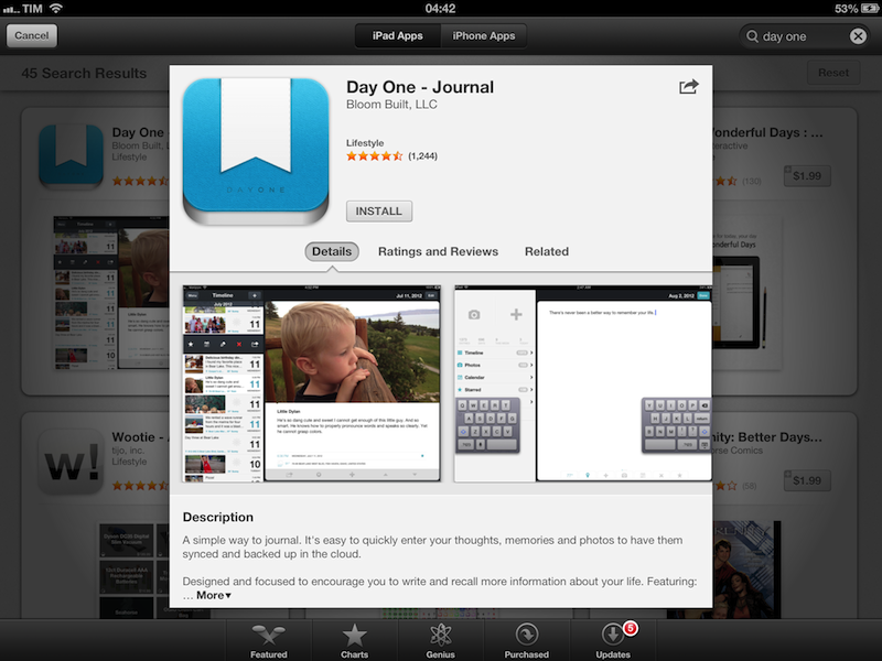
Tapping on an app’s icon in the new App Store reveals a completely redesigned, cleaner, and full-featured description view with more options. On the iPad, this window is modal, offering a simple way to go back to the main store interface.
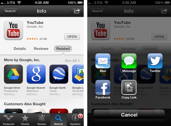
The new description view is organized in two areas: at the top, icon, name, rating, Buy and Share buttons. In the lower portion of the window, there are three tabs for Details, Ratings and Reviews, and Related. Personally, I believe the new app description window is the best change Apple brought to the App Store, with some clever touches that should help both users and developers alike. Separating “Details” from “Rating and Reviews”, for one, allows for a cleaner design that actually has more information displayed in each area.
The Details view starts with a swipable gallery of screenshots; on the iPhone, swiping on the first screenshot will automatically scroll the window down, placing the three aforementioned tabs at the top; if you want, you can tap on screenshots to display them in full-screen mode. Description and What’s New are located below with a “More” button to expand the text inline; regardless of whether an app is available as an update or not, the changes of “What’s New” are now always visible for every app. Trying to understand the latest changes to an app was one of the most common annoyances of iOS, and I’m glad this has been fixed in iOS 6.
Underneath the new and integrated Description area, Apple is displaying information about an app (Seller, Category, Updated, etc), Developer Info, and, a new feature, Version History. This is a particularly welcome addition, as it lets you check out the full changelog of every version of an app released to date, from the most recent one to the oldest. Version History is instrumental to showing the developers who are really committed to the development of an app, as opposed to those who release an app, forget about it, and never update it. I personally try to avoid applications that haven’t been updated in a while, as they imply their developers don’t care about them much. Simultaneously, Version History provides an effortless and precise way to check whether or not a functionality you’re looking for has been added to an app.
Overall, I’m a fan of the new Details area. I believe it does a much better job at describing and showing an app’s feature set than the old App Store did.
The current Ratings and Reviews tab, on the other hand, is a mixed bag. Its top section is promising, with a prominent Like button to recommend an app on Facebook. This is one of the perquisites of integrating Facebook at a system-wide level, and it is a simple, yet effective way to share an app’s direct link with your friends. But directly below the new Facebook Like button there’s the actual user-written reviews…which I never read. I know most users take a peek at reviews to instantly see whether or not an app is good, but, in my experience, I always stumble upon customers complaining about prices (usually within the range of $3) and missing features no one said would be available. So, I don’t read reviews.
The third tab, “Related”, hosts the familiar “Customers also bought” recommendations we’ve previously seen on iTunes.
But, in my opinion, the best change Apple brought to the single app view isn’t a tab, or a new design, or some new algorithm. It’s a button. Specifically, the new Share button in the top right, which allows you to send an app’s link via email, Messages, Twitter, and Facebook.
All these new actions – visualized through the new, more visual and icon-oriented share sheet of iOS 6 – should dramatically increase the ease of sharing for customers, possibly driving more sales towards developers. The “Copy Link” action is also a long-time coming, a “finally” that I though I’d never say about the App Store.
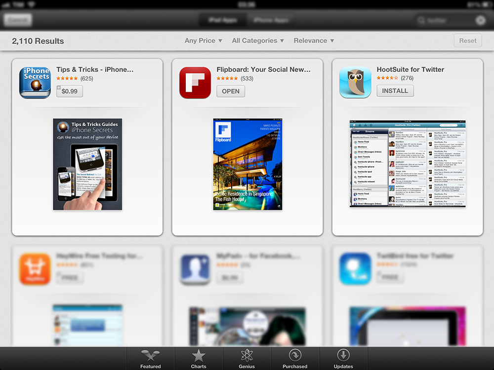
And then there’s Search. In a somewhat curious attempt to bring a mix of Genius UI and Chomp to search, results are now displayed as “cards”. These new cards show the first screenshot of an app inline, giving an immediate idea of the kind of software a user is about to check out. Alongside the screenshot, icon, name, and ratings are also displayed, as well as a button to Buy/Download (or Open, if the app is already installed on the device). While this sounds great, there’s a big problem with such a UI revamp – this problem:
On the iPhone, only one search result is displayed per page; to move to the next results, you have to swipe. On the iPad it gets slightly better: Apple has abandoned the integrated iPad Apps & iPhone Apps interface for separate tabs (iPad Apps is the default one) and the aforementioned cards; thanks to the iPad’s larger screen, 6 cards are shown simultaneously. At the top, there are also search filters, which are still mysteriously absent from the iPhone’s App Store.
The issue I have with this new interface for searching App Store apps is both conceptual and technical. Firstly, I believe that, on the iPhone, limiting a page to displaying only one result goes against the very idea of searching: for instance, imagine if Google only displayed one link per page, or if iTunes on the computer only visualized the “top hit” result, forcing you to swipe to see more. On the iPhone, the new App Store search interface has an information density problem that, at the moment of writing this, still hasn’t been given an option to return to the classic list view. Whereas the old App Store search visually suggested that, yes, various results were available for your query, the new search UI forcibly puts the focus on the first result alone. We’re moving from 5–6 results displayed on a screen to just one, and I’m not sure swiping horizontally will be as intuitive as simply scrolling to load more results. Surely, it’ll be more tiring.
Second, the new search interface just doesn’t work as advertised from a technical standpoint. Perhaps Apple will improve it with fixes on its remote servers (again, just like the other annoyances mentioned above), but as of right now, swiping between results is far from an optimal experience. On iOS 5, the “infinite scrolling” Apple used for search more or less worked as expected: if you had a decent Internet connection, you could see results (app names and icons) load within seconds. On iOS 6, cards are slow to swipe through, animations sometimes fail to finish properly, and, depending on your Internet connection, it’ll take a few seconds to load results next to the first few cards you’ve loaded. Overall, swiping between cards isn’t nearly as fast as scrolling through a vertical list of results.
I find the iPad version to be a viable compromise. Cards are obviously being used, but at least six of them are always visible, both in landscape and portrait modes. Instead of swiping, you have to scroll to load more cards, and, generally, the system seems to perform better on the iPad than the iPhone. Also, the search filters available on the iPad help considerably in refining your search and get to the results you want (or need).
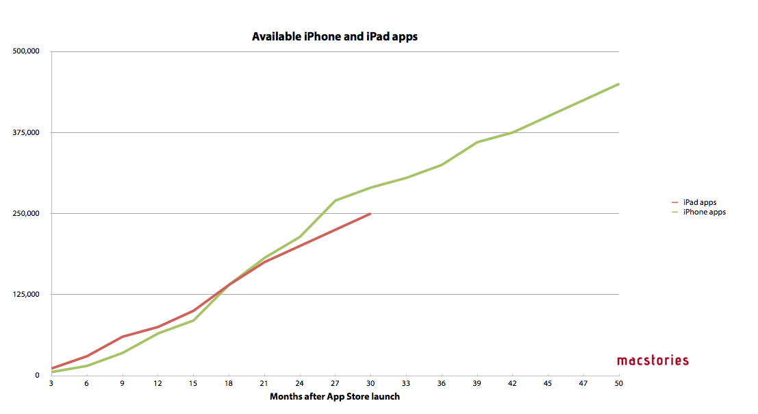
I think I get why Apple is switching to the cards layout for search. By turning results into cards, they’re enlarging tap areas making it, in theory, easier for the user to tap on a result without accidentally loading another one. Simultaneously, by placing the first screenshot of an application inline with search results, they are trying to somewhat increase the “recognizability” of apps – which, to date, have always been associated with their icons on the App Store. And yet, for as much as I’m trying to understand Apple’s reasoning with cards, I can’t help but have the feeling the feature was rushed out of the door. The current display of cards on the iPhone doesn’t seem to make sense as a search interface: it works on the iPad, and I can say it does work for Genius, where you’re consciously going through a list of recommendations one by one, manually. But App Store search, with over 450,000 apps exclusively made for iPhone, isn’t suited to cards – an interface paradigm that clashes with the act of looking for information while getting a rapid overview of it. Can you imagine cards being applied to the Top Charts?
The underlying problem goes even deeper: if Apple had a perfect search algorithm that managed to always find exactly the kind of app a user was looking for, cards could work better. They wouldn’t be a great alternative to lists, but users would notice the issue less if results were top-notch. But Apple doesn’t have perfect search results right now. Apple doesn’t even have good search results, as the algorithm they’re using returns the most curious choices on a variety of queries. The YouTube app is the fifth result for “YouTube”; “Apple” doesn’t return apps made by Apple (which also happens to be a section inside the App Store); looking for “Twitter” places Tweetbot around the #20 position, with a bunch of games and Instagram apps before it. And then there’s stuff like this still happening on a weekly basis, cluttering search with software the users don’t need.
If cards are meant to highlight the first results, then those have to be state-of-the-art results. But nothing has changed from May: search is still dumb. And now, on the iPhone, it’s got a new interface that makes it even worse.
For The Developers
On the technical side, iOS 6 comes with some great changes for developers. Additions to the SDK such as the new Event Kit framework and Camera APIs will allow them to build cool new features and apps, whilst Facebook integration will undoubtedly prove to be a solid way to let users enjoy social functionalities without being annoyed by login screens and confirmation dialogs. On the other hand, though, there are still some lingering issues and questions that developers will have to keep in mind while considering iOS 6. In spite of the numerous improvements, several developers I talked to were still largely unsatisfied about the current state of iCloud storage, which keeps posing various challenges for developers of document-based apps or software that needs to sync large and complex databases across multiple devices. Others were more skeptical about starting to require iOS 6 from their users, as they’ll need to see what the new OS’ adoption rate will look like before making the jump to developing iOS 6-only apps. Hopefully, with over-the-air updates, the majority of active iOS users will update within the next few weeks.
Developers I contacted welcomed Apple’s approach to Facebook integration, which will hopefully help them register more sales thanks to users actively sharing links to their apps from iOS devices. Overall, they also appreciated the (many) subtle tweaks Apple made to the App Store’s system-wide integration on iOS 6: for instance, iTunes links received via email will now open a modal window to download an app immediately from Mail, rather than yanking out users to the App Store. Moreover, Apple is now allowing users to download app updates without entering a password (thus likely increasing the percentage of users who upgrade to the latest version of an app), and it is displaying a “New” badge on the icons of newly-downloaded applications.
However, developers are concerned by App Store search on the iPhone, and the constant changes Apple is making to its search and ranking algorithms, which, despite Apple’s efforts, haven’t so far drastically improved the accuracy of App Store results. With over 700,000 available apps and a new interface, developers who make a living out of selling software hope Apple is listening.
iOS 6: The Company
It’s easy to look at iOS 6 from Apple’s perspective: self-preservation.
Since Steve Jobs came back to the company in 1997, Apple has increasingly prioritized control over features in some key areas of its products and services. Control over the software that is sold on the App Store. Control over the dock connector and accessory market for portable devices. Control over software updates, not dictated by the carriers anymore. Control over the user experience, with guidelines on what is possible to do with apps for the iPhone and iPad.
Sometimes, however, in order to ensure basic functionality for a product, Apple had to give up some of that control, either because they were not ready with their own alternative, or because the market didn’t have any possible alternatives. Samsung played a big role in providing components for the iPhone up until this year, when Apple decided to look at other options, besides making the A6 processor a truly custom core. On iOS, they baked Google Search into Mobile Safari because it was (still is) the world’s most popular search engine, but in iOS 5 they started implementing more specific third-party services (such as Wolfram | Alpha) to provide users with more accurate, precise, and immediate results while at the same time slowly moving away from Google.
In iOS 6, Apple went ahead and removed YouTube and Google Maps from the operating system, offering their own, new standalone Maps application.
For Apple, there can only be one big fish in the pond: themselves. Therefore, most of Google’s legacy built-in functionality had to go. But once again, Apple had to compromise on other things.
They had to choose the lesser of two evils. With iOS devices selling millions of units every month and an iPhone 5 coming soon (and off to a great start), should have Apple allowed Google – its biggest competitor in the mobile OS space – to keep a strategic position on iOS with built-in apps and search? Or, would it be better to cut deals with the smaller guys – Wolfram, Yelp, OpenTable, Yahoo, Rotten Tomatoes – to build a more focused search that happens outside of Google’s system? Should have Apple allowed Google to keep making money off search queries performed through Mobile Safari?
As we’ve seen, Apple chose the second option. They touted Google integration in the iPhone introductory keynote and used most of their services until they needed them; once they lost their leverage – e.g. Google built a strong mobile platform of its own – they had to look for alternatives. Which are still based on third-party services they don’t own, but that they likely can control more thanks to better deals, agreements, and lack of conflicts of interest (Yelp doesn’t make smartphones or mobile OSes).
They started from Maps. By using a bevy of third-party services and licensed data, they built an experience they can control. Not just in terms of visual appearances – Apple developed the Google Maps app, but they couldn’t modify the Maps tiles for example – they effectively created a pipe to turn the location of iOS users into aggregate data they can use to develop more in-house location services for the future. Think crowd-souced traffic database, only on a much larger scale with much more information available about users’ location, habits, devices, and preferences. Just an example: by aggregating Maps and usage data, Apple could monitor what percentage of iPhone owners visits certain retail chains in the US, cut deals with those chains, and convince them to provide Passbook offers for loyal customers who have an iPhone. This is the kind of data that, before, Google would have likely kept for itself to build better services and more lucrative advertising deals. That was money and control on the user experience drifting away from Apple.
Similarly, every search users performed on iOS used to go exclusively through Google. Starting with iOS 5 and even more with iOS 6, Apple is offering an alternative way of searching: Siri.
For some kinds of data, Siri is more focused and to-the-point than Google’s mobile search results. For restaurant reviews and reservations, for instance, Siri offers a more elegant interface for browsing available options around you; for sports information and players’ data, the Apple-designed Yahoo Sports integration is better-looking and faster than finding updated stats on Google.com; for questions about movies, geography, or word definitions, Siri is quicker than going to Safari to type your question. Like Graham explained in August, this has increased Apple’s reliance on third-party services, but the company has managed to keep their branding as minimal as possible, making users think these queries are, in fact, happening thanks to Apple. And for all we know, the data processed by Siri uses other services’ databases, but goes through Apple’s pipe. Again: control on data, and control on the user experience. For the time being, Apple sees this as an acceptable compromise. The lesser of two evils.
“Right from day one, the Weather, Stocks, YouTube and Maps apps were inherently powered by Yahoo and Google – but the apps were designed by Apple and there was no overt branding. Weather and Stocks to this day exhibit just a single, Y! icon in the corner, whilst there was very minimal branding in the YouTube and Maps apps. Similarly, all the services that are integrated with Siri feature small and subtle branding that is almost invisible at a glance.”
- The Rise Of Third Party Services And Fall Of Google In iOS
Obviously, Apple wasn’t ready to completely eliminate Google from the position of default search engine for Safari, and probably never will – Google’s dominance in the space far exceeds the probability of another search engine gaining the same amount of users and data in the short term. But Apple can take steps to make Google as invisible as possible, all while “guiding” users towards workflows and interactions that don’t require Google at all.
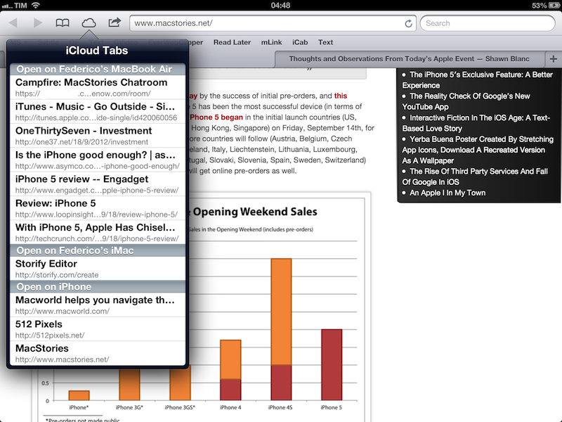
In Safari for iOS 6, a new tab opened on the iPad won’t automatically place the cursor in the search bar – it’ll place it in the address bar. And speaking of the search bar: it doesn’t have “Google” (or Yahoo, or Bing) written on it anymore. Just “search”. It’s subtle, but it’s the kind of change that suggests search itself is a feature, not Google’s search. Other Safari features, such as iCloud Tabs and constant bookmark synchronization, will allow people to keep the websites they visits always available across devices, thus decreasing the need for searching again. And as mentioned above, Siri should prove itself worthy of consideration for some types of search – those that Google still hasn’t fully optimized for the instant-on, get-results-fast nature of mobile.
Apple can’t do everything. They can’t build hardware, software, and services while simultaneously think about search, sports, weather, restaurants, mathematical computation, and social. Not even with $100+ billion in the bank can they afford to put their proverbial level of focus and care on dozens of different skills at once. They need partnerships. And they need to pick them carefully. The right horses to ride going forward.
iOS 6 is the epitome of a company that has set out to find an equilibrium between data and presentation, control and user experience.
To build a stronger structure, sometimes you have to start over. From the foundation. To ensure its long-term survival and expansion in key areas such as location and search, after iOS 5 Apple found itself wondering whether they should:
1) Ditch Google Maps and offer something of their own, or
2) Keep on improving iOS with major new “tentpole” user features without rethinking anything.
All while (3) providing developers with new APIs to build apps for the richest software ecosystem on the planet.
The first option would have given them data and control, at the cost of complaints from users who would find out Apple Maps aren’t nearly as full-featured and accurate as Google Maps yet (personally, I don’t believe the theory that it could have been Google to pull out of the iOS deal).
The second option would have kept users happy: everybody loves new features. However, it would have put the future of the platform at risk, at least in some areas.
As for the third option: it’s really obvious – the best thing Apple can do is to give developers more and better tools to build apps for its ecosystem.
As the principle goes, among three favorable options only two are possible at the same time. Rethink core functionalities, Offer major new user features, Keep developers happy: Pick two.
iOS 6: The User
We talk about Apple’s self-preservation plans and company strategies, but the flip side is – people don’t care about this stuff. This is nerd talk at its finest – details that we, as tech writers, focus on because we’re striving for details and reporting accuracy. But those millions of people who buy an iPhone every month don’t care about Apple’s deals with Google and the importance of Siri to shift away from Google search. They don’t know about ad revenue, APIs, or aggregate data.
Let’s get real. People just want things to work. We, the tech press and the nerds, care about the gossip and details going on behind the scenes. But the rest of the world doesn’t. My friends, your friends, your neighbor and that guy who’s friends with your brother-in-law – they use their iPhones. They don’t want to know about the drama of the people who make them.
As a user, I find iOS 6 to be a different kind of upgrade than, say, iOS 5 or iOS 4. The latest two major updates to iOS brought OS-redefining user additions like multitasking, folders, Notification Center, Siri, iMessage, and Reminders. And before them, iPhone OS 2 and 3 introduced the App Store and copy & paste. Apple has a history of bringing major, user-facing features to iOS with the new version it releases every year.
iOS 6 swaps the Maps application with a new one, adds Facebook integration on the lines of iOS 5’s Twitter one, and then focuses on refining everything else.
Some parts of iOS 6 are painstakingly refined. Which isn’t a surprise given that, at this point, this operating system has been available for five years, and in development for many more.
The Things I Like
Safari, already a fine browser, is now even faster thanks to JavaScript improvements, has full-screen support for landscape mode on iPhone, and can contain more tabs on the iPad (up to 24, available inside a popover). I already liked the possibility of syncing Safari tabs across my Macs running Mountain Lion, but as I expected in my review, iCloud Tabs’ full potential is only truly revealed when you start using the feature across OS X and iOS. Now I find myself seamlessly opening pages I had on my Mac while reading on the iPad, and vice versa.
The speed improvements of iOS 6’s Safari are noticeable and impressive, and I like subtle refinements and additions such as the possibility to simply copy a URL (finally) and the fact that new tabs on the iPhone aren’t appended at the end anymore.
iOS 6 comes with a new “share sheet” that offers a visual replacement for many of the “action/sharing buttons” that, previously, used to trigger list-based, vertically-oriented textual menus. The new sheet offers a grid-based, iOS-inspired sharing menu for Safari, with icons for Mail, Messages, Twitter, and Facebook, as well as Print, Bookmark, or Reading List. The sheet has also been implemented in Photos, allowing you to share an image to Photo Stream or assign it to a contact, among other options. It works in Notes, every app that uses the “Open In…” feature and has been updated for iOS 6, and even Maps.
Tracing the path Apple took to achieve immediacy and user-friendliness with app icons, the new share sheet makes sharing and opening files into other apps faster and more intuitive. It’s a reasonable change.
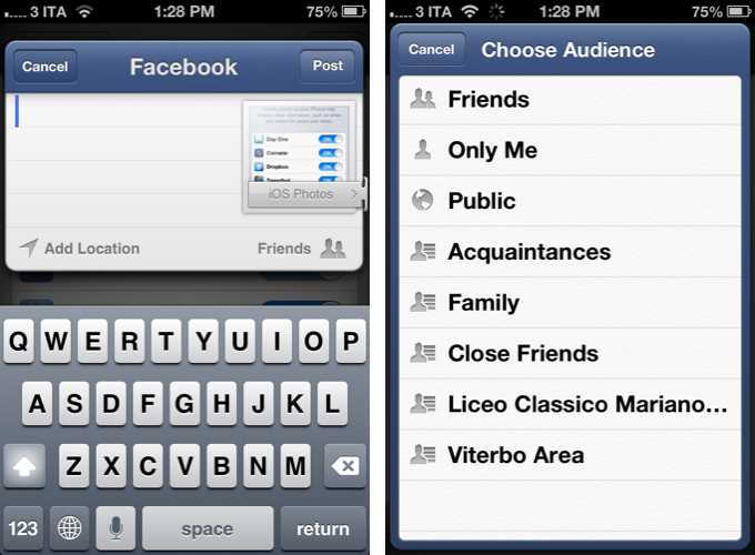
Facebook integration means iOS 6 can officially “talk” to the social network I use every day to keep in touch with my non-geek friends who don’t use Twitter. While I have mentioned the implications for apps and developers, from a user’s perspective I appreciate the simplicity of Facebook sharing in iOS 6. It works exactly like iOS 5’s Twitter integration, only with a different color scheme and more privacy options. Since I started testing iOS 6, I have used the new “Tap to Post” Notification Center widget to quickly send status updates to Facebook, but I’ve also uploaded pictures from the Photos app. I like how Apple made Facebook’s complex privacy settings as simple as a “Choose Audience” toggle that lets me set updates to Public or Friends-only.
While the new Facebook app is a terrific improvement over the old version, I still prefer using iOS 6 if I need to send off a quick update or photo. Because I have had a bad experience with letting other services mess with my contacts, I haven’t activated the option to “Update Contacts” using Facebook and the iOS Address Book. Single sign-on will be huge for game developers and video discovery apps with a social component.
Mail received the same VIP feature I outlined with Mountain Lion. I use this functionality sporadically. Instead, I’m glad to see things like separate Archive / Delete (tap & hold to reveal both options), possibility to attach photos and videos to a message, and easier draft access (tap & hold compose button) finding their way to Mail in iOS 6. The “attach media” feature is particularly interesting, as it’s been implemented through the standard copy & paste menu and it’s somewhat reminiscent of an old concept for an iOS Services Menu that I’m still looking forward to (maybe someday).
As a user, I appreciate Apple’s renewed interest for well-presented, understandable privacy settings that are simple to control and change at any time. In older versions of iOS, you could see apps that were accessing your location or Twitter accounts. Following this year’s Address Book privacy fiasco, Apple went back to the drawing board and designed an entirely new Privacy section that clearly lists apps that are accessing your location, contacts, calendars, reminders, photos, Bluetooth Sharing’s features, Twitter and Facebook accounts. You can revoke permissions at any time, and everything is elegantly presented with app icons and no complicated menus or poorly-worded dialogs.
And then there’s the huge list of minor improvements, hidden features, and subtle refinements that Apple has been adding to almost every aspect of the OS. It almost feels as if Apple looked in every corner, listened to users’ feedback, and fixed all those little and not-so-little things that, for years or months, have annoyed iPhone and iPad users. Separate “send” and “receive at” email addresses for iMessage; phone number support for iMessage and FaceTime on devices like the iPod touch and iPad, through iCloud; Notification Center in the cloud, with unread notifications automatically dismissed if read on another device. And there’s more: per-account Mail signatures with HTML support; Lost Mode for Find My iPhone and iCloud.com; FaceTime on 3G (it worked reliably in my tests on 3 Italia’s network in my town); the totally-reworked iTunes Store with previews that keep playing even if you navigate sections and close the app.
And many, many other things that we’ve collected in a separate post.
The Things I Don’t Use
Just because iOS is getting some new features it doesn’t mean I have to use them all. For as much as I’m intellectually curious and I like to know about new things, there are some functionalities that I just can’t fit into my workflow and routine.
Do Not Disturb isn’t for me. Located in Settings, DND allows you to set a “quiet mode” for calls and alerts. If a device is locked, they will be silenced and a moon icon will appear in the status bar; then, when you’ll turn off DND, they’ll be there in Notification Center waiting for you to catch up. Apple really cared about the details for Do Not Disturb: there’s a setting to always allow calls from Favorite contacts (or a group) even if DND is on, and another that will let the second call in a row from the same person within three minutes go through DND’s wall. As you can imagine, there’s also a scheduled option to, say, automatically activate DND at night, so you won’t be bothered by calls or sound alerts.
For various personal reasons, if a call comes in at night, not only do I want to be disturbed, I have to make sure I can wake up to answer and see what’s going on. I don’t get random accidental calls at 4 AM, so if my mom is calling at that time of the night, I want to know why. Similarly, if I’m meeting someone but my doctor is calling, he’s got to come to terms with that – I have to take the call. Do Not Disturb is not for me, because, by nature, I want to know why people are looking for me. But I can see why this feature will appeal to a lot to users who aren’t like me.
Similarly, while I know it’ll be great for some people, the “Remind Me Later/Reply with Message” feature added to the Phone app isn’t for me. I don’t receive that many phone calls throughout the day to be honest, and the ones I do get are either from my parents, my doctor, or a friend of mine.
I’d rather just let the phone ring and go to voicemail than send a text to my friend saying “Can’t talk right now…Ti richiamo tra poco”. Because, personal preference aside, my iPhone is set to English, yet my friends are Italian, and Settings.app doesn’t let me modify the first string of the “Reply with Message” option. So, I’ve ended up with a mix of strange-sounding, possibly-cool-for-some-people messages that begin with “Can’t talk right now…” and end with “scusa mamma ho da fare”. I actually sent one of these to my dad, and it was awkward. I’ve always thought combining Italian and English sounded kind of weird.
I recently migrated my entire photo library to Dropbox, and set up an automated workflow to send new photos to the service from my iPhone, iPad, and Mac. For this reason, I am not interested in trying out iOS’ new “Shared Photo Streams” feature, because I know I wouldn’t use it. With a shared Photo Stream, users can set up a private album to share with their friends (via email) over iCloud; members of a shared Photo Stream can “like” photos, post comments, and check out everything on the web or from their iOS devices. It is a pretty neat feature – it also supports notifications for new comments – but I have chosen to trust someone else with my memories.
If I were a parent or a teacher, I’d be excited about the new Guided Access functionality introduced in iOS 6. As part of the OS’ Accessibility improvements, Guided Access can limit an iOS device to just one app by disabling the Home button and even certain tap areas of the UI. I have played around with it a little, and I see how, for many, this will change the way iOS devices are handed over to kids.
Panorama sounds cool, in theory. It’s a new feature of the Camera app that lets you save “panoramic shots” by capturing 240 degrees of what’s around you in one single motion. The software will then take care of processing the images, stitching them together, and it’ll try its best to make sense out of the small details that make up the 28+ megapixel photos you’ll have in your Camera Roll. In actual testing, Panorama has been nothing more than a “cool thing to check out once” for me, maybe because I don’t typically think about taking panoramic shots with my iPhone. I have been trying apps like Pano and 360 Panorama over the years, but I kept coming back to Instagram or Apple’s Camera.
From what I’ve seen, Panorama seems to work as advertised with good light conditions, but I have some doubts about Apple’s claims that it can figure out the correct exposure on its own. Maybe so with the iPhone 5.
Passbook
On paper, Passbook is all kinds of promising. A new app in iOS 6, it wants to collect all your boarding passes, loyalty cards, movie tickets, gift cards, and more in a single place. It’s not a payment system by itself: rather, it’s an iOS-enhanced solution to collect redemption codes and tickets issued by others (such as United Airlines, Starbucks, Fandango) and use them when appropriate. Instead of keeping cards in your physical wallet, you can set up Passbook to become your central repository for this kind of content. Developers can build Passbook-compatible cards and tickets using bar code formats such as QR (as well as PDF417 and Aztec) and a set of APIs that, among other things, will allow them to add or update passes in a user’s Passbook.
Potentially, Passbook could be the first step towards the “digitalization of your wallet” many have been predicting for the past years. It’s not NFC – it’s a software solution that uses bar codes and iOS technologies to transmit information about you to a retailer or organization that issued a pass. However, in spite of its theoretical potential for all the parties involved (including Apple), I can’t have more than a brief description of what Passbook is, because I haven’t been able to try it. The Passbook app links to a section of the App Store listing Passbook-compatible apps, which, in the period during which I tested iOS 6, weren’t available. I’m sure users will see apps adding Passbook support starting today, but being based in Italy, I’m also more skeptical in regards to the time Italian users will have to wait before trying Passbook. When it comes to this kind of innovations in retail and local institutions, Italy is typically behind the curve with slow adoption times and bureaucracy restrictions that prevent small businesses from embracing the latest technologies and innovations. I don’t know when we’ll start seeing names like Trenitalia, Alitalia, Spizzico, or Autogrill add Passbook support; based on what I’ve heard so far, there haven’t been any discussions about this, so don’t hold your breath for major Italian organizations adding Passbook support soon.
My hope is that private companies like Ryanair and individuals will set an example for the rest of Italian businesses and organizations to follow. My girlfriend runs a local dance organization that’s based in a gym here in Viterbo, where there are also Pilates and Yoga classes. If she and the gym owner decided to support Passbook, they could set up a “loyalty system” for the oldest members with discounts and monthly promotions. They could update the passes over the air, send push notifications, and give passes to new members via email or a webpage. This would be incredibly easier, engaging, and fun than the current pen-and-paper system they use for loyalty cards and discounts. Or again, there’s a friend of mine who, every year, organizes a series of cultural events here in Viterbo during the summer; instead of tickets – or in addition to – he could set up iOS passes, relying on geofences to send push notifications to an iPhone’s Lock screen when people are nearby the area of the event (there are several locations with multiple “stages” to choose from).
I hope that forward-looking individuals, private companies, and small-business owners will consider experimenting with Passbook. I hope that initiatives like Passdock (made in Italy) will promote the adoption of this technology for organizations that don’t want to hire developers to set up a one-time event or gift card.
Passbook can be a lot of great things, but I can’t use it right now.
The Things I Don’t Like
For all the improvements that went into Mail, there have been some changes that I don’t really understand or appreciate. Firstly, pull to refresh. Initially created by Loren Brichter for Tweetie, pull to refresh went on to become the de-facto way to check for updates in all kinds of applications. And now, following various open-source takes on the subject and a patent held (but not enforced) by Twitter, Apple has decided to use pull to refresh in Mail.
I have two issues with Apple’s implementation. Since its inception, pull to refresh was used as a clever method to check for updates in a list of messages sorted vertically from newest to oldest. It was perfect for a Twitter client: as users reached the top of the timeline, they could continue scrolling to check for updates and load new tweets. But since pull to refresh gained popularity, developers started abusing it in all sorts of ways, defeating its original purpose. I can’t help but have the same feeling about Apple’s use of the feature – that is somehow forced and that’s been added only because “users are now familiar with it”. This, however, doesn’t necessarily mean that pull to refresh is the right metaphor for checking emails: while displayed in the same vertical orientation, email is not Twitter. I am not checking for new messages every 20 seconds while I’m waiting in line, and even if I was, email refresh times are still slow compared to Twitter.
If I had to nitpick, I’d say the implementation itself feels off. In the original pull to refresh, and in the several iterations by other developers, the “refresh” action is triggered when you release the pull animation. Instead, Apple’s version starts refreshing the main view as soon as you pull beyond a certain threshold, no matter if you’ve released your finger off the screen or not. It’s a minor detail, but it’s something I’ve immediately noticed after years of pull to refresh in other apps.
My second problem with Mail is the “swoosh” sound for a message that’s been sent. Up until iOS 6, the sound effect used to go off after a message was actually sent – e.g. when the “loading bar” had been completely filled and the message was really off the server. In iOS 6, for some reason, the “sent” sound plays as soon as you hit Send, even if the message hasn’t been sent anywhere yet. This change has had a series of repercussions on my email workflow already. For instance, on a couple of occasions I thought I had sent a message – the sound played – but I really didn’t, because I had poor 3G and my connection was slow. Even worse, if for some reason you lose your Internet connection right after hearing the “swoosh” sound effect, your message won’t be sent at all, and it’ll be saved in the drafts. I think playing Mail’s sound effect in advance is confusing, as users have associated it with a message that’s really been sent. Imagine if Apple decided to do the same for Messages.
On iOS 6, the phone number and email address you use for FaceTime are synced across your devices. While this sounds great in theory, I had to disable FaceTime on my iPad, as I kept experiencing a bug that would let my iPad keep ringing even if I answered a FaceTime call on my iPhone. I hope Apple fixes this in the next few days now that iOS 6 is public.
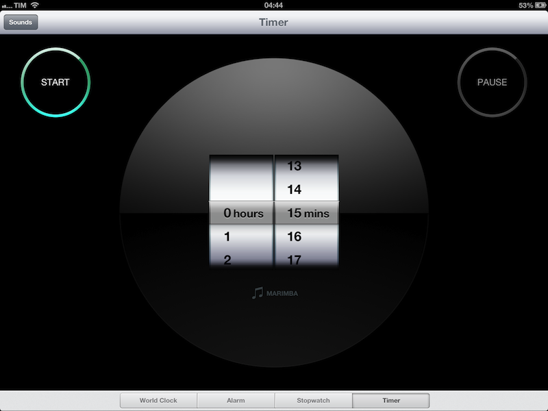
The iPad finally has a Clock app on iOS 6. Like the iPhone app, it is divided in four areas: World Clock, Alarm, Stopwatch, and Timer. The first two are really good looking: World Clock takes advantage of the larger screen to display multiple cities on a planisphere with time and weather information. You can scroll between clocks at the top, tap on one to bring it up in full-screen, and the world map even displays areas of light and dark. Alarm is interesting, too, as it uses a calendar layout to visualize all the alarms you’ve activated for the week. There is a visual consistency between World Clock and Alarm.
Stopwatch and Timer, on the other hand, feel like were made by someone else for another app. While the same sections in the Clock app for iPhone somehow fit together with the rest of the app, on the iPad they share a completely different UI approach in stark contrast with World Clock and Alarm. They have flat, round, glowing buttons that I haven’t seen anywhere else on iOS, and that seem to be taken straight out of a post-modern microwave oven control system. I won’t get into a debate about digital interfaces and skeuomorphism here, but to me, the Timer UI is especially baffling as it’s completely different from any other iPad UI Apple has designed to date.
Speaking of design, iOS 6 brings a new option to the system status bar, which can “blend” with the top bar of applications using a different shade of the same color. This is up to developers to implement, and you can see it in action in Apple apps like Settings and Mail on iPhone. I am not a fan of this UI choice: I think that, in most cases, it diminishes the contrast between status bar data (time, battery, etc) and the background, whist simultaneously making it more distracting and “in the way”. I like the simplicity and elegance of Safari and Maps, which use the new blue gradient and silver UI, respectively, with a black status bar that is easy on the eyes.
I agree with the explanation Loren Brichter wrote back in June:
Philosophically the beauty of these devices is that because they are a screen, they become whatever you are doing with them. Minimizing extraneous hardware, and extraneous system interface elements should be a goal. A distracting status bar is antithetical to that.
Siri
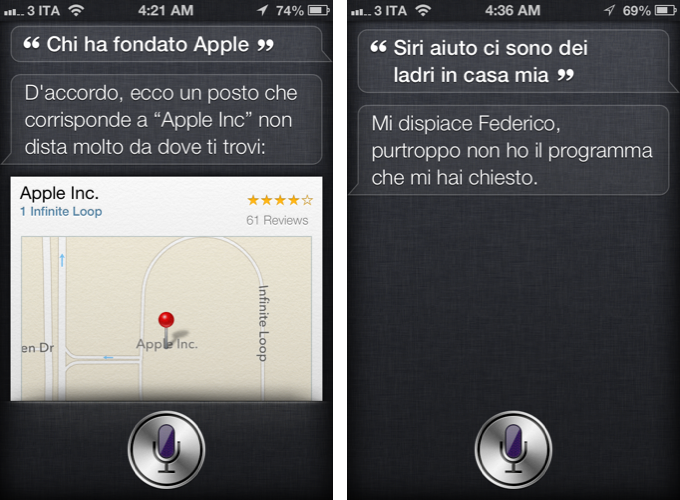
Italian is a difficult language to master. Being a Neo-Latin language, it comes with several lexical and grammatical rules related to affixes and suffixes for genre, number, and tense, definite, indefinite, and partitive articles, prepositions, word accents, pronouns, and many, many other complexities that not even most Italians know. Put simply: it’s incredibly hard to build a software that understands the meaning and context of what we’re saying, like Siri, in Italian.
I approached iOS 6’s Italian Siri with a mix of cautionary curiosity and skepticism. I haven’t been really using Siri in English, since I would look completely out of place here in Italy, talking to Siri in English in front of my friends and family. Plus, it just wouldn’t be natural. I was looking forward to the Italian version of Siri to speed up some common actions like sending a message, checking the weather, or finding a gas station nearby.
I won’t go into the details of the Italian words and expressions that Siri doesn’t understand or is unable to process. But I will say this: during the period I tested iOS 6, when Siri wasn’t down due to server issues (and there were many), I noticed that it struggles to keep up with the many ways of asking for something in Italian. Because Italian is an inflected language, verbs have conjugations; and because verbs have those grammatical variations, when you start mixing them with pronouns, prepositions, and auxiliary verbs, you can get to the same sentence in dozens of different ways – all of them being syntactically correct.
As I expected, the “beta” of Italian Siri isn’t meant for “commands” that go beyond the grade of complexity marked by Apple in the “example phrases” of Siri’s information popover. In my tests, commands built with simple verb-object-time structures like Apple’s demo ones were okay for Siri (although it often failed to recognized them correctly, and I don’t have a strong dialect), but other sentences – spoken like an Italian normally would with prepositions, pronouns, and articles – didn’t go through. Italians reading this right now know what I mean. Try dictating a message with Siri using “che” (the that Shawn Blanc recently mentioned) with a subordinate clause – it won’t parse it, because it doesn’t understand we’re using an indirect speech with prepositions, which need to be excluded from the actual message.
For commands issued with moderately complex “real” Italian sentences and schemes people use on a daily basis, this first version of Siri is a letdown. Neo-Latin languages are hard to figure out for actual people, and Siri has a long way to go as a virtual Italian assistant.
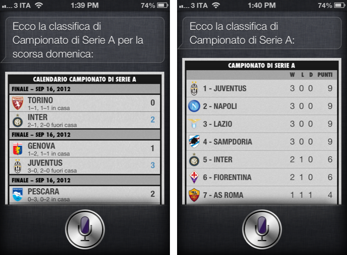
With simple do this/do that commands, I’m actually quite impressed by the additions Apple brought to Siri in iOS 6. When it worked, I was able to check on Serie A results and player stats (curiously, players didn’t have profile pictures), open apps, get movie information and watch trailers. I also managed to check on some restaurants in my town using the new Yelp integration, but unfortunately the Yelp database in Viterbo is very limited, there aren’t many reviews – let alone photos – and restaurants here don’t support OpenTable reservations.
Overall, if you keep the sentence structure simple enough, the new features of Italian Siri mostly work. And they’re nice.
I have found two big issues with Siri, besides questionable support for Italian. The first one is the fact, that, if you keep your device set to English (like I do), but Siri in Italian, it can get confused with the two languages. For instance, sometimes I get movie descriptions in Italian, other times in English, and turn-by-turn navigation, spoken by Siri, will be in English in spite of Siri being set to Italian. It’s confusing, as Maps’ English interface overrides Siri’s Italian setting.
My second issue is Maps.
Maps
For a complete overview of Maps, I recommend you check out Cody’s extensive look at the application. Instead, these are my impressions of Apple’s new Maps in Italy.
Above, I wrote that users just want stuff to work. They don’t care about deals between companies or the strategic importance of moving away from Google. Many of those who will upgrade to iOS 6 will find a worse Maps application than the one they used to have.
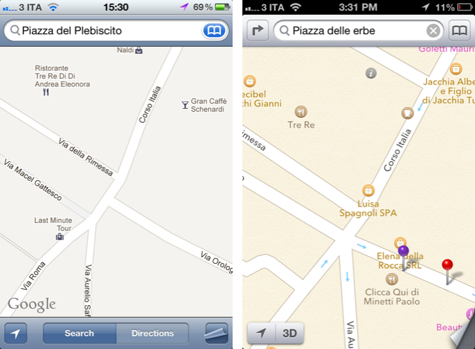
Apple Maps are pretty. The standard view is all vector-based, so you can zoom in and out without losing any detail. Their icons are colored and nice. But besides that, just about everything else is a step backwards from Google Maps here in Italy, and especially in my area.
When zooming out, major road names aren’t displayed on the map; Google spends a great amount of time computing the data they have available, trying to understand traffic, signs, and directions based on the footage they have stored on their computers. In my area, names of less trafficked roads pop up earlier than other major roads and intersections; the labels are “too close” to each other; the satellite view has less detail than Google’s. Maybe Apple Maps have “less clutter” when compared to Google Maps; but I still don’t understand how they choose which road names to display first – less important roads shouldn’t show up when zooming out of view.
The label for Viterbo has the same size of the ones from nearby smaller villages. Sometimes its label disappears completely from the map.
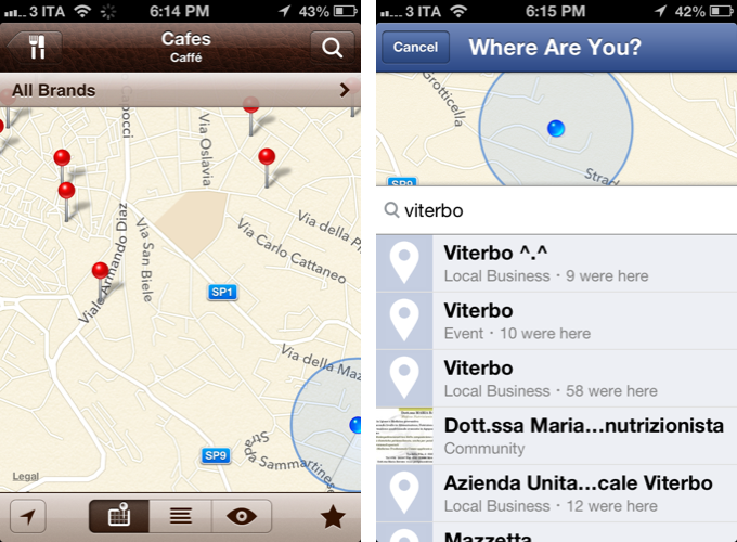
Every once in a while, looking for a location in Viterbo takes me to another city in Italy, although I entered the name correctly. Occasionally, this happens with local businesses too: I hit the “Locate” button, type in the name of a store in Viterbo, and suddenly I’m in Rome.
In Viterbo, Google had basic support for traffic information and alternative routes. In spite of the option I activated, Apple Maps never showed me traffic in Viterbo, nor did they offer me to consider other routes. I checked in other, bigger Italian cities, and traffic was supported there, alongside multiple routes. This gives me hope support for more cities is coming.
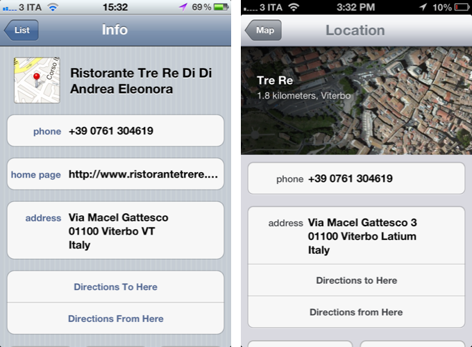
Local business search is inferior to Google Maps. Apple has nicer icons to differentiate businesses, but the results are fewer and out of date. I did some research, and it turns out, while Google is using PagineGialle.it for its business listings – PagineGialle is biggest provider in Italy, which almost every business owner considers using to show up in search – Apple is using data from other sources, such as Acxiom. This explains why Google Maps has recent results and information (phone numbers, URLs) for businesses that are still running, while Apple Maps has several outdated results with basic info like phone numbers and webpage addresses often missing.
Even worse, Apple Maps doesn’t know of the existence of several institutions in my town like schools and government offices. Google does.
It’ll be interesting to see if, alongside a standalone Maps app, Google will also release an SDK for developers to integrate in their apps. Because Maps is a system framework on iOS, every app that uses Map Kit will automatically switch from Google Maps to Apple Maps in iOS 6. This is a fundamental change for AR apps like Where To, or, in general, other apps with a strong location component.
Where To and Facebook using Apple Maps, no app update needed.
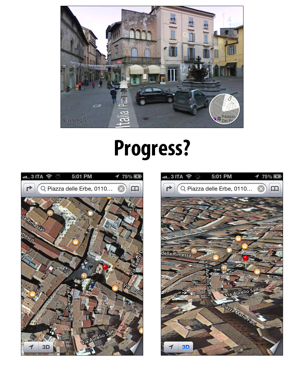
What’s really bad, in my opinion, is the removal of Street View from iOS. I used Street View all the time to explore cities I wanted to visit and to get the general idea of what walking and driving around there would be like. Now, Apple has its own take on 3D-browsing, which is called Flyover and it’s an aerial 3D representation of major city areas in satellite view. Meaning, you won’t get to “virtually walk” through actual photos of a city, you’ll see a 3D rendering of some cities that Apple is supporting today (with a “flying around” animation Scott Forstall really seemed proud of). And it’s even a poor representation, with slow loading times, laggy animations, and a weird “apocalypse effect” if you try to zoom in too closely.
Don’t look at Apple’s promotional images – try it for yourself.
Ghost cars?
Google’s version of Piazza del Popolo in Rome Vs. Piazza del Popolo after a nuclear disaster according to Apple.
If you try to use Flyover like Street View – as a way to see how walking around a city would be like – prepare to do a lot of pinching, zooming, and panning around that, most of the time, iOS 6 won’t recognize correctly. As a side note, you could use iOS 5’s Street View with one hand.
And if Flyover isn’t available in your city, like in Viterbo (for context, here’s the current coverage of Street View around the world), you’ll get an ugly, flat, “3D” satellite view. If 3D buildings aren’t supported, the 3D button shouldn’t be available at all.
Even if Flyover had better imagery, animations, and was faster and more responsive, I don’t think it would be as useful as Street View. It’s a cool toy. But to get the job done – to explore cities as humans would – I have to use Street View on my computer. Humans drive and walk, they don’t fly. Flyover sounds good on marketing material – “stunning 3D images with animations!” – but in actual usage, it’s terrible.
Michael Degusta wrote an excellent overview of the Google features Maps is losing in iOS 6:
On the plus side, at least people are getting turn-by-turn directions and Apple’s Flyover feature in exchange, right? Not so fast: 20 countries (population: 3.2 billion) are losing transit, traffic, or street view and getting neither turn-by-turn nor Flyover. The biggest losers are Brazil, India, Taiwan, and Thailand (population: 1.5 billion) which overnight will go from being countries with every maps feature (transit, traffic, and street view) to countries with none of those features, nor any of the new features either.
It gets worse. Even in countries where turn-by-turn and/or Flyover are available, the iPhone 3GS, iPhone 4, and the 4th generation iPod touch won’t support them. These devices are owned by tens of millions of users who may update over-the-air when prompted, only to find they’ve lost features and haven’t even gained any of the marquee Maps features in return.
And this is where I come back to my initial point. People want their devices to work. Normal people use these things to plan trips, go to work, wake up in the morning, catch the bus to go to school. These devices have changed and improved many aspects of people’s lives. We’re not playing games here anymore. The tech press is so entrenched in itself, we have forgotten normal people use their iPhones and iPads not for “reviews” and “exclusives” – they use them to do stuff. To get the kids to school on time. To learn a city’s landmarks and must-see locations before going there.
How are we going to tell these people that, because of Apple’s strategy, they’ll have to cope with an inferior version of Maps?
How do we tell students that public transit directions are no longer, that they’ll have to use separate “App Store apps” – which aren’t available yet?
Can we justify Apple Maps in the name of the greater good?
Personally, I can’t. Because while I could go on and let my friends read the “Company” section above and try to make them understand that, yes, that’s why Apple had to ditch Google, the truth is – they don’t care. They are going to update to iOS 6 because they’re curious, just like everybody else, and they’re going to ask about “the Maps app that doesn’t work anymore”.
They won’t say “Yeah, but at least Apple has more control now”.
They won’t say “At least Apple’s icons are nicer”.
Those are things bloggers like me write. The “normal people” will hate that the new Maps app isn’t as good as before.
And we’ll have to tell them that “It’ll get better soon”. Because it’s not great since day one.
It’s time we stop giving Apple a free pass on everything. Enough with the sugar-coating. Earlier this year, someone argued that the privacy fiasco was actually a good thing because it could have been worse on Android. What kind of explanation is that? It was bad, period. With Maps, I have a similar black & white view. The current version of Maps is, from a data standpoint, a step backwards from Google Maps, with the exception of turn-by-turn navigation, which is a great addition.
As a tech writer, I understand the importance of Apple’s new Maps, and I applaud their decision to build their own solution for the future. I also understand that, while Apple could have licensed some Google technologies such as Street View and public transit directions to include as options in the new Maps, they didn’t want to.
As a user, I can’t help but think that this needed more time, that maps simply aren’t ready in many areas, and that Google Maps was just better.
The Trilemma
As the saying goes, you can’t please everyone. When you’re building software and you’re targeting multiple audiences at once, you can’t build at the same level for all of them. And that’s how I see iOS 6.
For the most part, Apple built iOS 6 for itself and to guarantee the prosperity of certain areas of the OS. Areas such as search, increasingly shifting to Siri, and location. As a reflection of these actions, Apple gave new goodies to developers, as they understand the importance of a healthy developer ecosystem that sets iOS apart from the competition. And last, Apple refined iOS 6 for the users, polishing many inconsistencies but lacking the Notification Center and iMessage breakthroughs of iOS 5. From this perspective, I’d say that, of three favorable options, Apple mainly focused on two: the company and the developers.
That’s not necessarily a bad thing. Users don’t need to learn a new UI or app every year, especially when they’ve become accustomed to how things work. Adding features for the sake of adding is not innovation. Users want their devices to keep working with the same degree of functionality, which is why I see Maps as a real, tangible problem today. But this doesn’t mean iOS 6 isn’t a notable update. iOS 6 is a good improvement over iOS 5 with several welcome refinements and additions like Facebook, more languages for Siri, and a faster Safari.
In my opinion, iOS 6 has, right now, worse Maps and App Store search; especially for Maps, if you rely on features like Street View and public transit directions, I can’t recommend the update until an official Google Maps app comes out.
For everything else, iOS 6 improves on almost every aspect of the operating system, and sets the stage for a stronger platform in the future.


