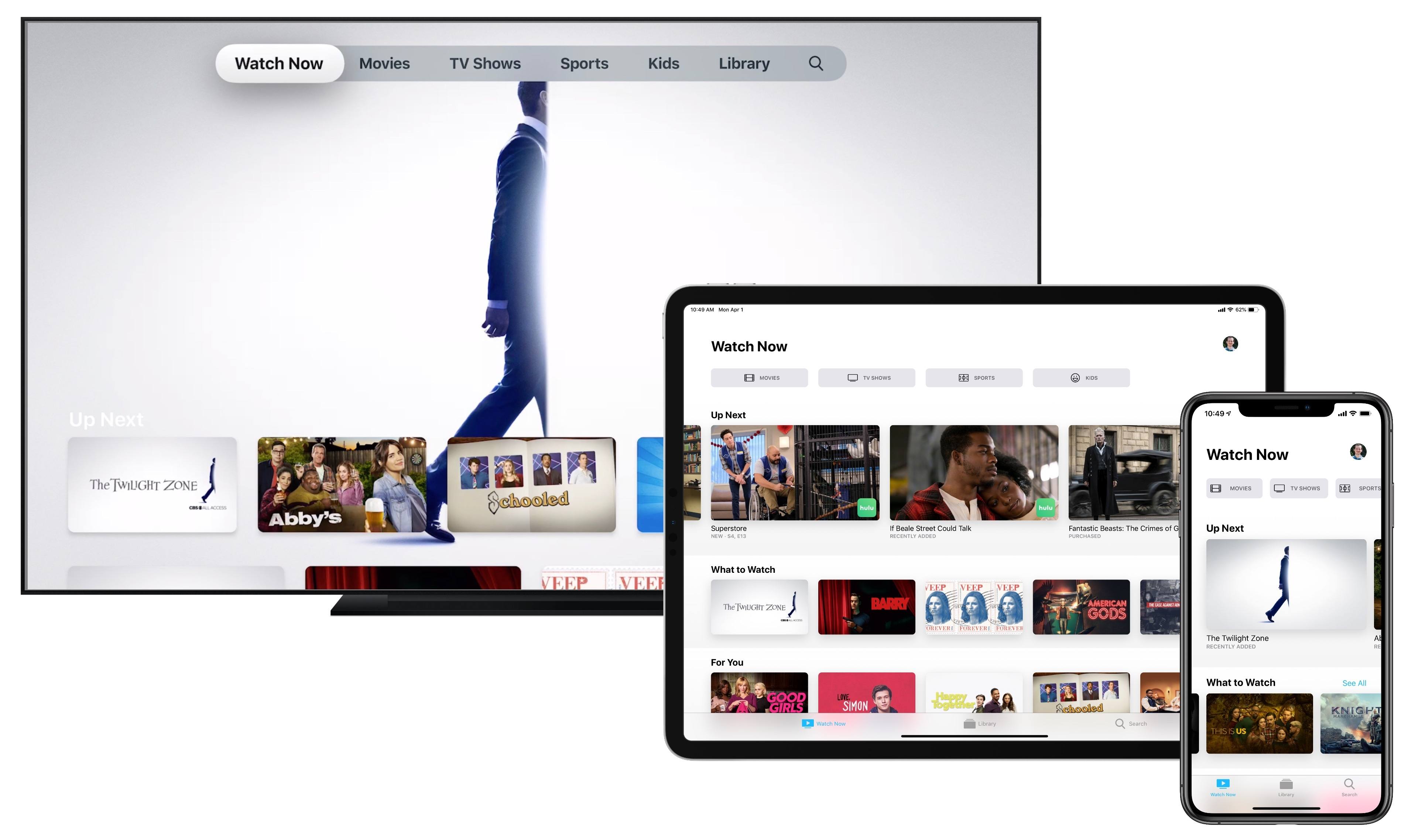
Apple’s TV app is getting a makeover, and just in time for its expansion to smart TVs and third-party streaming devices. The new app is coming first, of course, to Apple’s own hardware: the Apple TV, iPhone, and iPad will be updated in May with the new TV experience; the Mac will follow this fall.
I’ve used Apple’s TV app as my primary video hub since it launched in late 2016, so I was eager to get my hands on the updated app. Fortunately, I didn’t have to wait long – an early version of the new TV app is available now as part of the iOS 12.3 and tvOS 12.3 beta releases. Here are full details on all the ways it’s new and improved.
Channels
Originally, the TV app was built as a hub that integrated with external video apps to launch and track their content from a single location. While it did add value as a dedicated launcher and universal queue, there was lots of unnecessary friction innate to TV’s approach. You would have to download and configure each video app separately; many video apps would use their own custom players, which was never a good thing; finally, when you finished watching something, you would land not in the TV app, but in the browsing interface of the app you were just using. The first version of the TV app was still useful, but it was hamstrung by giving too much control to third-party services. That changes entirely with channels in the new TV app.
Channels give Apple and the TV app full control of the user experience. While the existing app-based integrations will continue to live on inside TV, for services that are on board with channels, such as HBO, Showtime, and CBS All-Access, there’s a much better TV experience to be found.
Currently the beta version of the new TV app includes just a few of the channels services that will ultimately be available upon launch, but these handful of options provided a sufficient testing ground to try out channels.
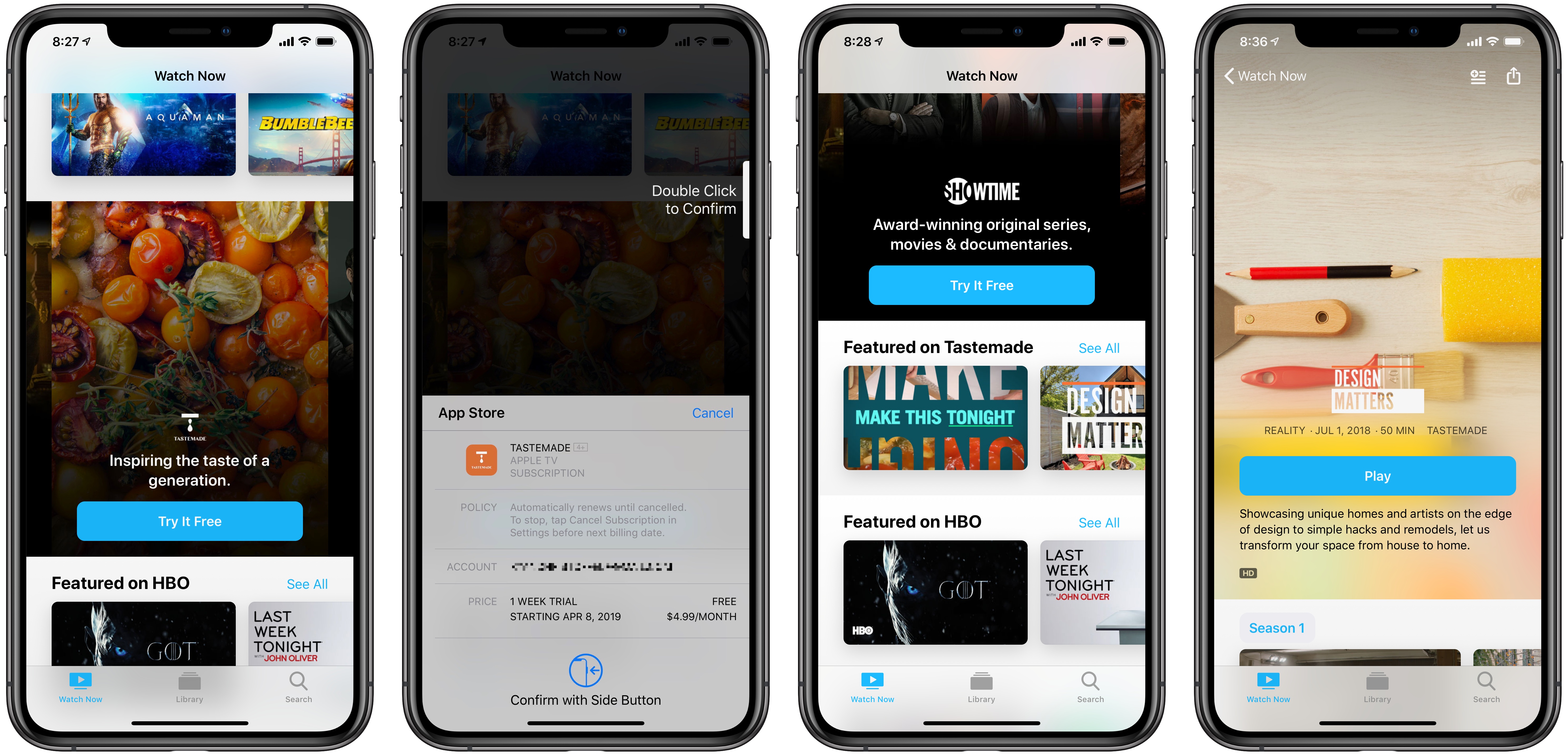
Watching content via channels takes just a couple taps. On my iPhone I hit the ‘Try It Free’ button for Tastemade, authenticated via Face ID to confirm my subscription with free trial, then a new section was immediately added to my Watch Now tab: ‘Featured on Tastemade.’ From here I could find any show that looked interesting and play it directly in the TV app.
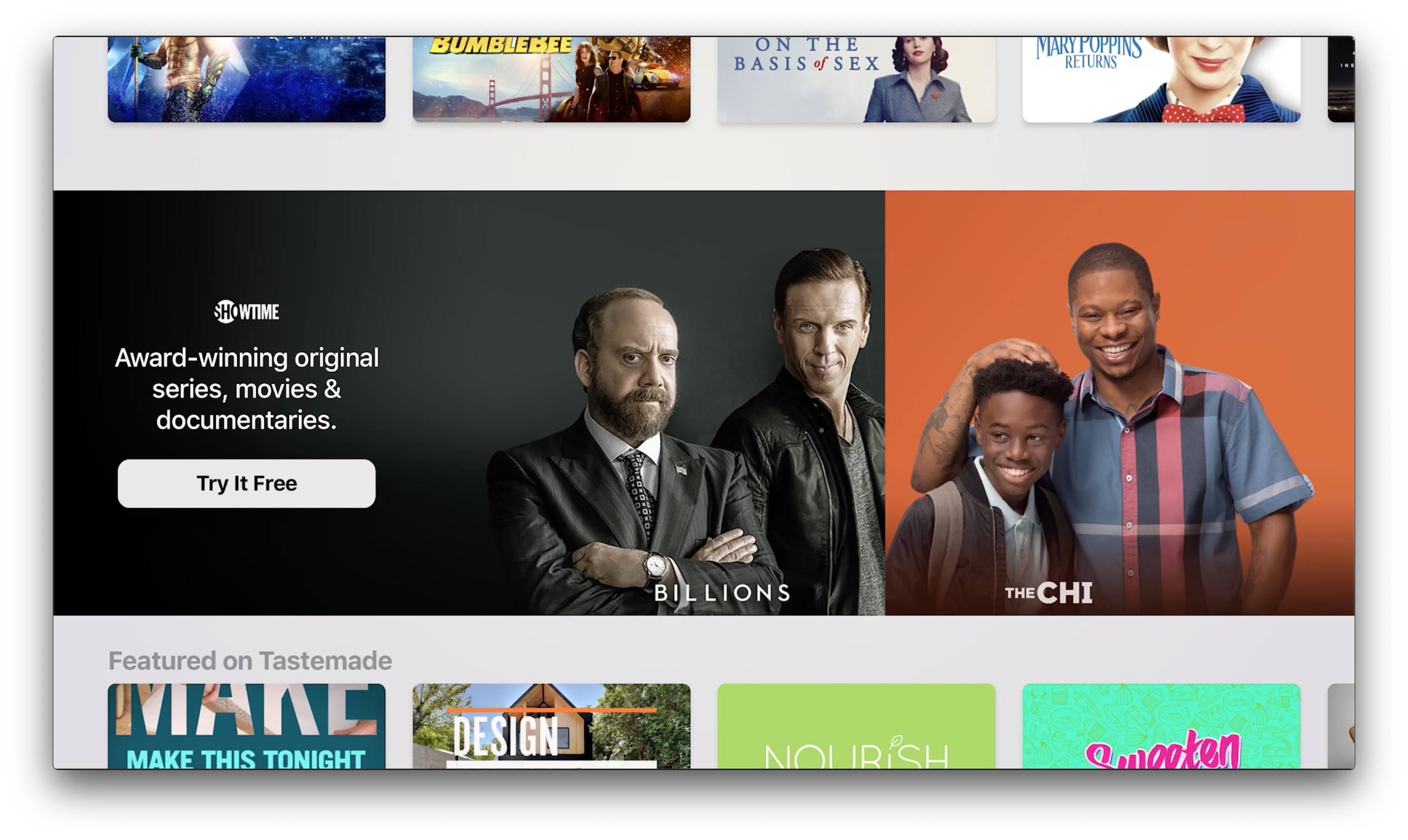
I signed up for Tastemade from the main Watch Now screen, but presumably in the future it will be easy to sign up for channels by first finding a show that looks interesting. For example, right now Showtime is available as a featured channel in TV, but when I select Billions and hit ‘Play,’ I’m prompted to download the Showtime app. I’m guessing before the beta cycle is up, that behavior will be changed to prompt a Showtime subscription directly inside of TV.
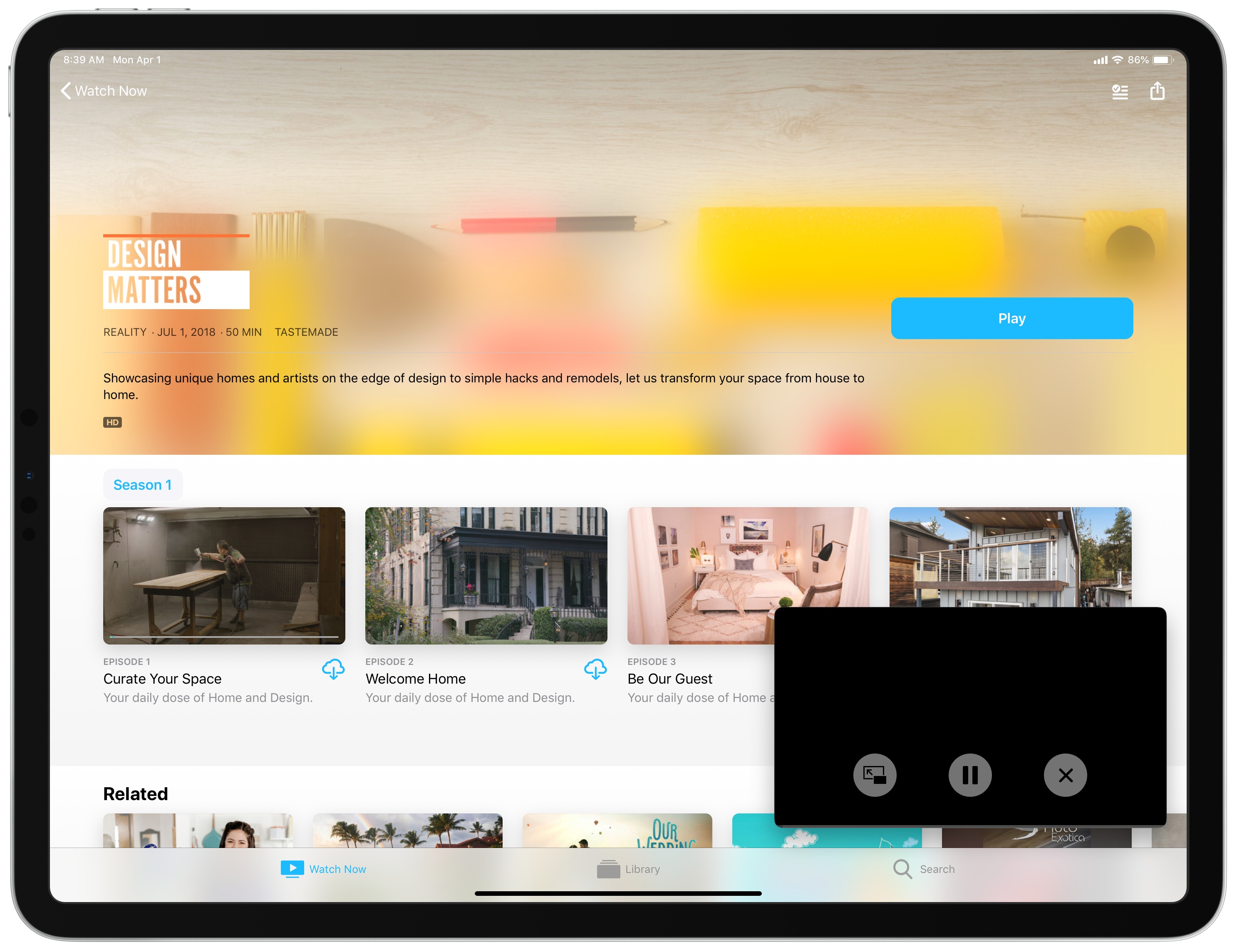
Even in this early version of channels, the new TV feature delivers not only in providing an easier setup flow, but also in granting a better watching experience. Videos play directly in TV, which means they load faster than before, and they support the default tvOS and iOS video players, offering a consistent experience no matter what you’re watching. One of the perks of the default player is that, on the iPad, you’re going to get Picture in Picture support for all channels content – a feature that’s hit and miss with third-party apps.
Another key channels feature is the ability to download any content offline on your iPhone and iPad. When I viewed show pages for Tastemade content, each episode included a cloud icon to download offline. The feature didn’t work in this early beta, but when it’s ready for prime time it will serve as a valuable differentiator for channels. Unfortunately, but perhaps unsurprisingly, the ability to download videos offline is nowhere to be found on tvOS; it appears to be iOS-exclusive.
Personalized Recommendations
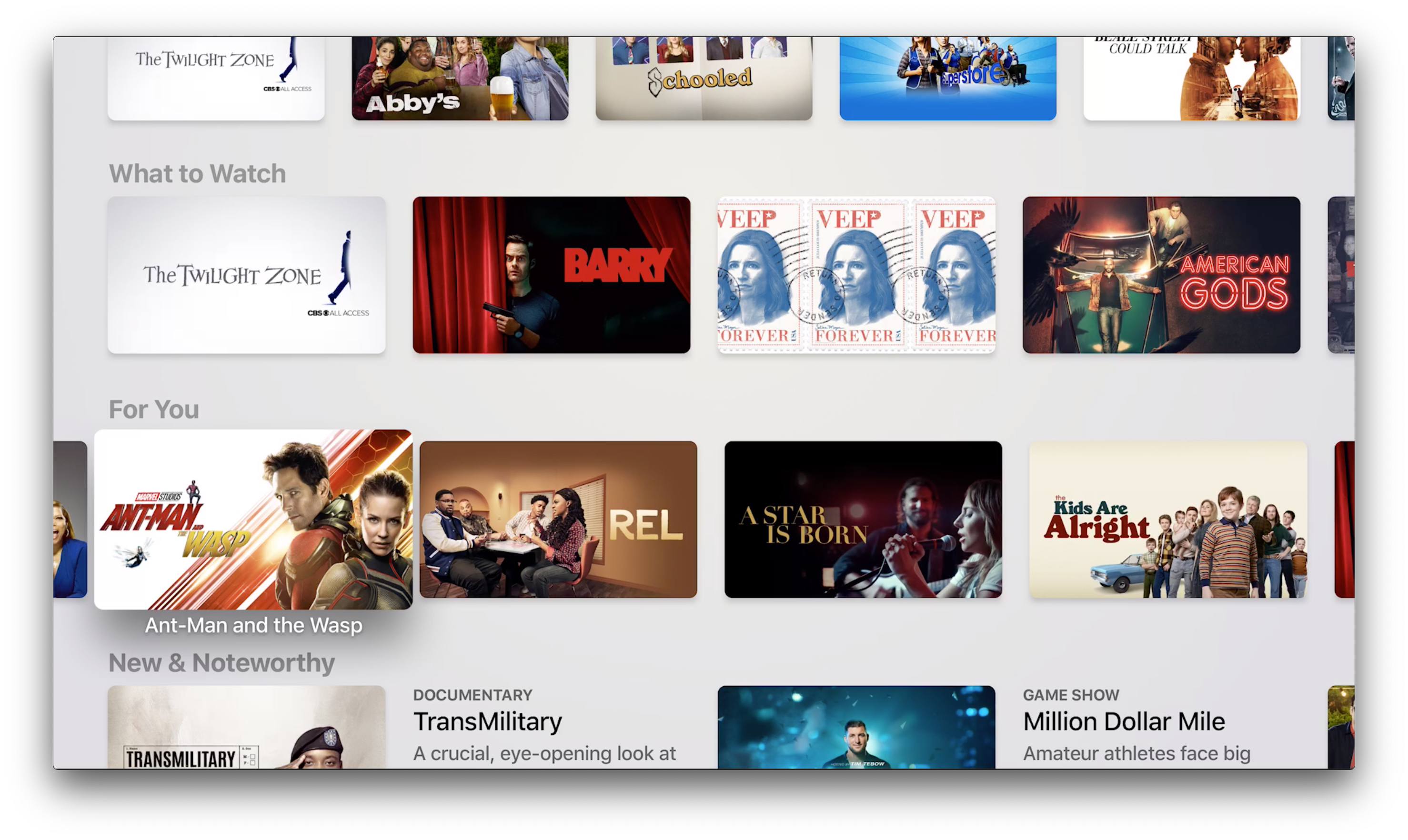
For the first time, the TV app is adding personalized recommendations. One place you’ll find these is in the new For You section of Watch Now, which includes show and movie recommendations based on your viewing history. Unlike in Apple Music and News, there’s no way to like or dislike suggestions to train Apple’s recommendation system, but perhaps that will come in time.
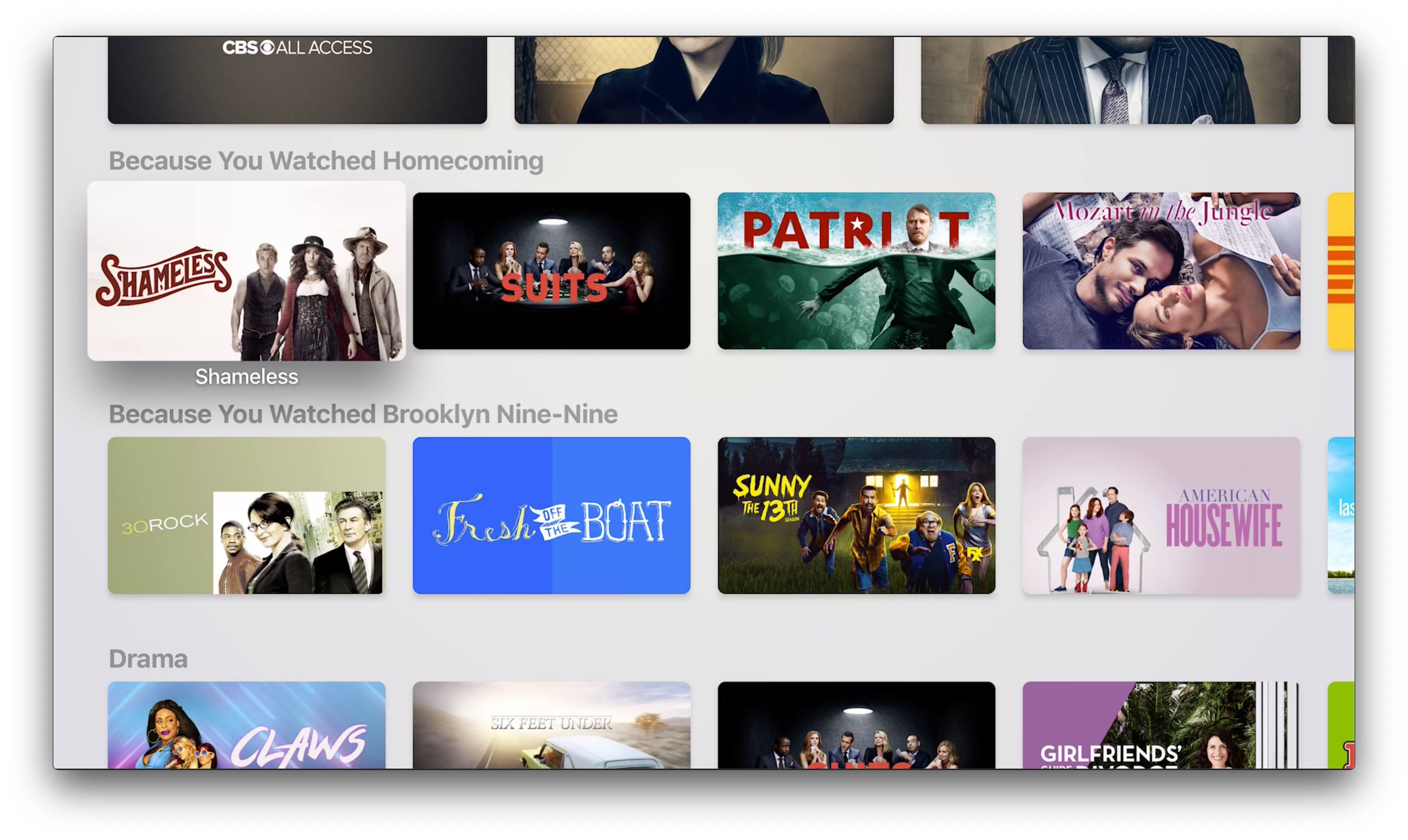
In addition to For You, the Watch Now screen contains other sections dedicated to recommending content similar to specific shows or movies you’ve watched. These are just like Netflix’s ‘Because you watched’ sections, collecting an assortment of recommendations that relate in some way to an individual show or movie.
New Design
If you used the previous TV app, the new one will feel entirely familiar. The basic layout is largely the same, with some tweaks to content cards, a reorganized tab structure, and finally a new browsing feature on Apple TV.
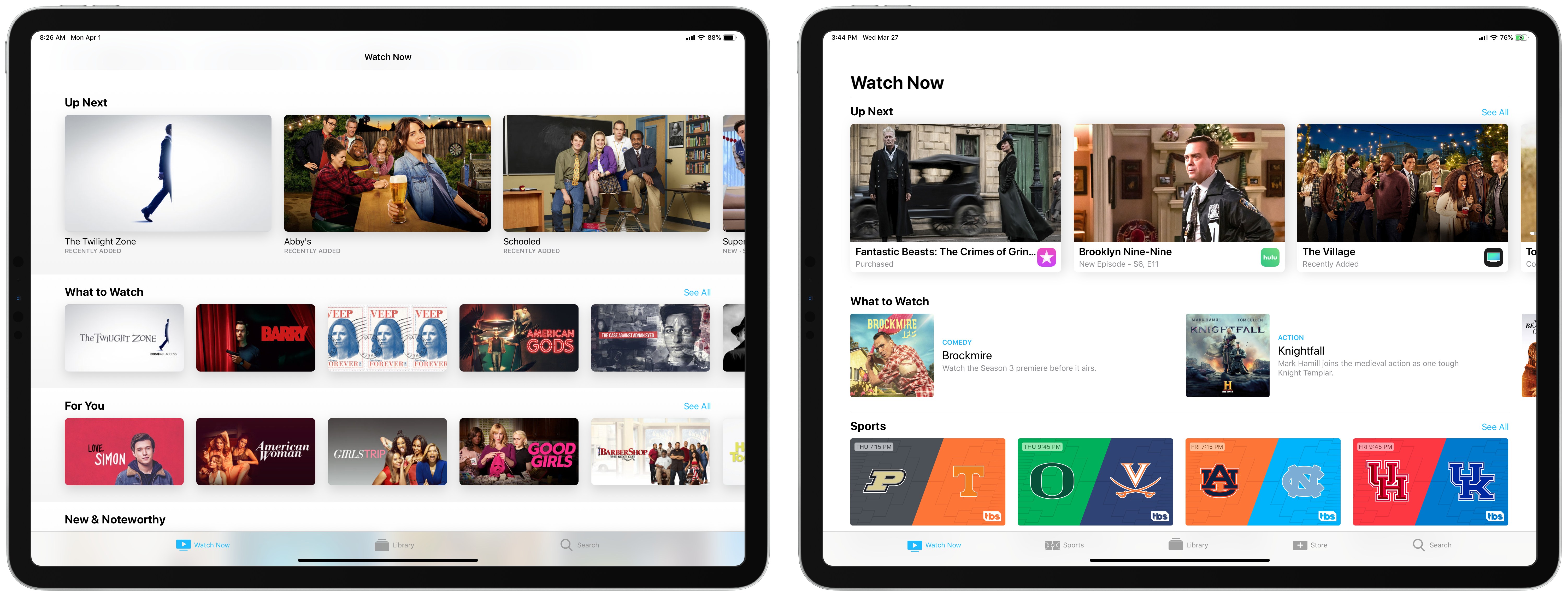
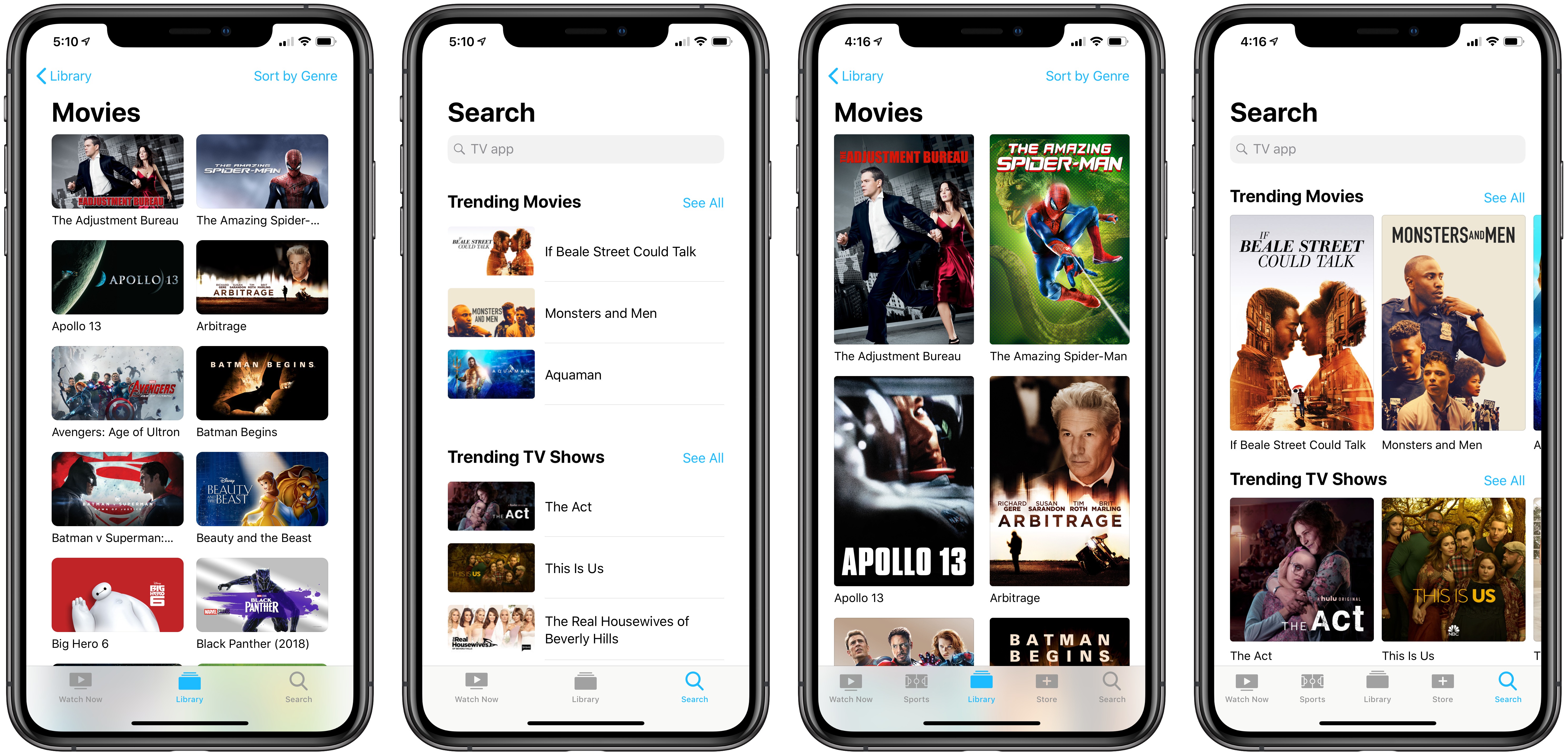
Apple has changed up the way content is displayed when browsing the TV app. Previously, movies were featured as vertical rectangles that resembled the shape of a film poster, while TV shows were displayed as squares. Now, that distinction between content types no longer exists in visual form. Aside from certain featured content that may be displayed differently, most every movie and TV show you’ll find is displayed as a rounded horizontal rectangle. Despite this removing the ability to easily distinguish between shows and movies, I think it’s a positive change on all devices because of the way it optimizes screen real estate to fit the most content on-screen at once.
On Apple TV, navigation of the app is done via a menu at the top of the screen that includes Watch Now, Movies, TV Shows, Sports, Kids, Library, and Search. On iOS, where a tabbed interface is employed, the only three tabs are now Watch Now, Library, and Search, while the Movies, TV Shows, Sports, and Kids screens can all be accessed from the top of Watch Now via a new navigation header. None of these screens are entirely new to the app, they’ve simply been reorganized in the navigation structure.
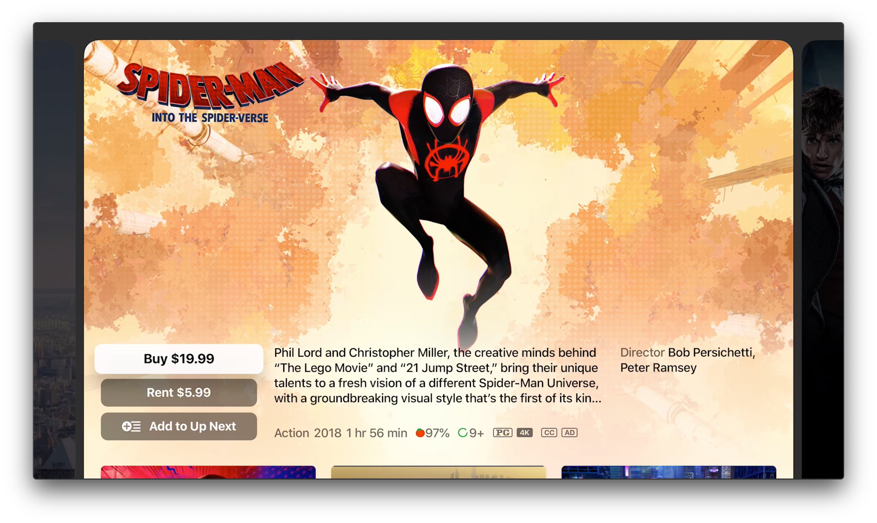
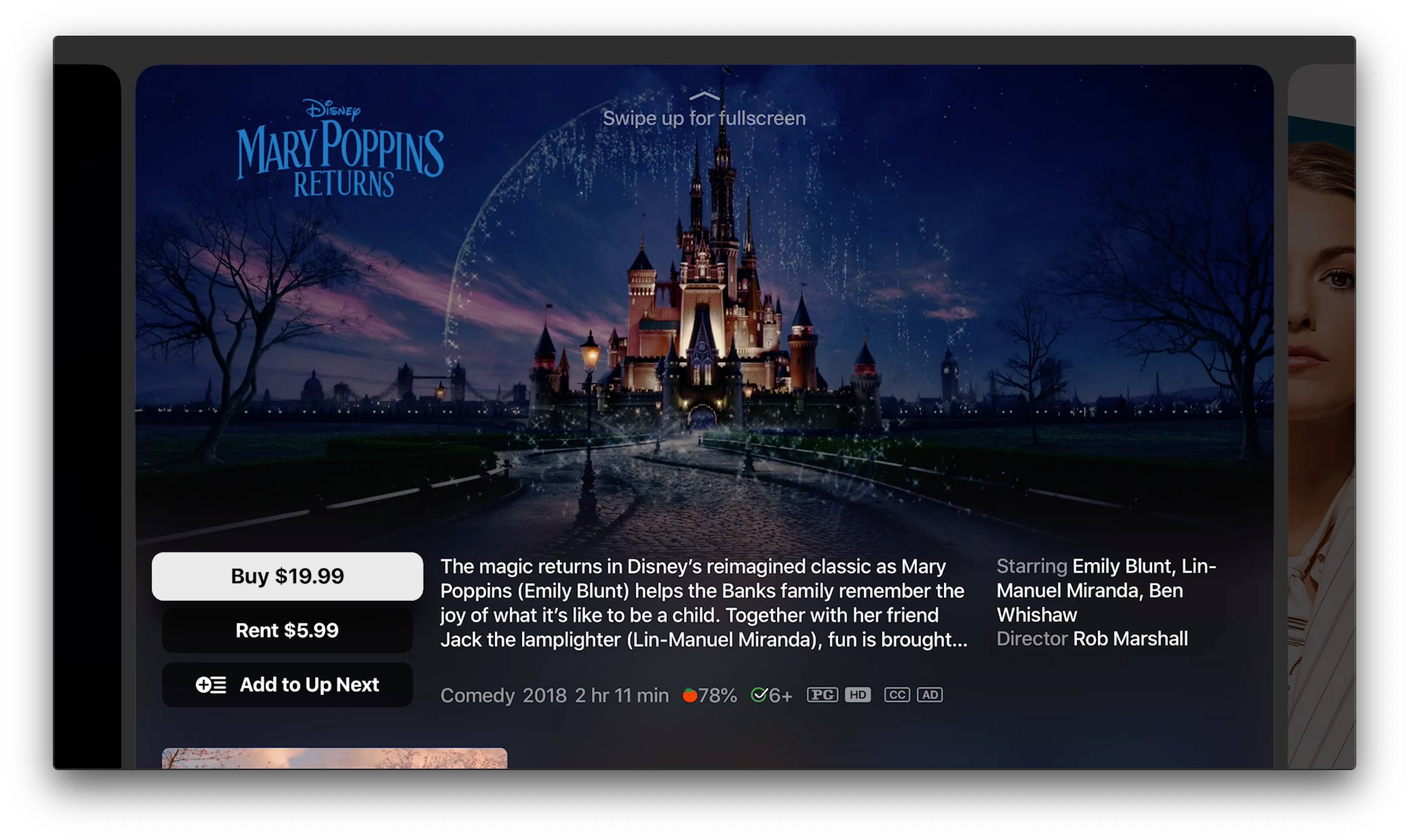
The tvOS version of the app features an exclusive new browsing feature, where you can swipe through videos in a collection with horizontal swipes on the Siri Remote. This feature was demoed on-stage at last week’s event, where it was presented as the modern equivalent of channel surfing. The main thing about the feature that stood out to me during that demo, however, was the auto-playing Aquaman trailer. Yes, Apple is introducing auto-playing trailers to the new TV app, but no, it’s not as bad as you may fear.
Unlike Netflix, where trailers start playing almost instantly as you browse them in the main app interface, in the TV app auto-playing trailers are limited to this full-screen browsing experience where you cycle through films one at a time; browsing titles from inside the main interface of the TV app won’t cause trailers to play, you have to first open the detail view of a video, and even then there’s a ~5-second delay before a trailer kicks off, which in practice feels much better to me than Netflix’s timing. While personally I’d prefer no auto-playing trailers at all, especially since trailers in a film’s detail view are already prominent and easily accessible, by limiting auto-play to the detail view and implementing the 5-second delay, Apple has mitigated the annoyances of auto-play almost entirely. One nice detail worth noting: after a trailer starts playing, you can swipe up on the Siri Remote to view the trailer in fullscreen.
A few other miscellaneous redesign details:
- While some thought Apple’s on-stage demo of the TV app featured a new color scheme, Apple was simply using the Dark appearance already available in tvOS; a Light appearance remains available as before. There’s no dark mode on iOS, but that may change later this year with iOS 13.
- News options like ABC News, CNN, and Cheddar have been removed from Watch Now and added to the TV Shows screen.
- Watch Now on iOS now features your Apple user profile in the top-right corner, similar to the App Store and Apple Music. This houses a quick way to view your current subscriptions, plus a list of all video apps currently integrated with TV, which you can toggle on or off; this list was previously available inside Settings.
Apple has made meaningful improvements to the TV app, particularly with the addition of channels and the consistent experience they provide. If you haven’t tried the app before, or you quickly gave up on its first version, Apple is hoping you’ll give TV another try. The new app will be the exclusive home of Apple’s forthcoming TV+ service, so if you plan to check out the company’s original content, now’s a good time to get familiar with Apple’s app. Despite its defects – namely, no Netflix integration and limited channels options – I think it delivers the most compelling unified TV experience available today.


