Apps
Despite the huge amount of design effort channeled into the fundamental interfaces of the operating system, I was surprised by how many standalone first-party apps Apple still got around to building for watchOS 3. None of these apps are particularly complex, and all but one of them already exists on iOS. Still, it’s good to see Apple moving more apps over to the Watch, and I particularly love the extremely simple design language that all of the new first-party Watch apps have in common.
Apple is leading the way forward in watchOS app design, building simple and straightforward interfaces so users can get in and get out. I hope to see third-party developers follow these trends with their own apps as well.
Reminders
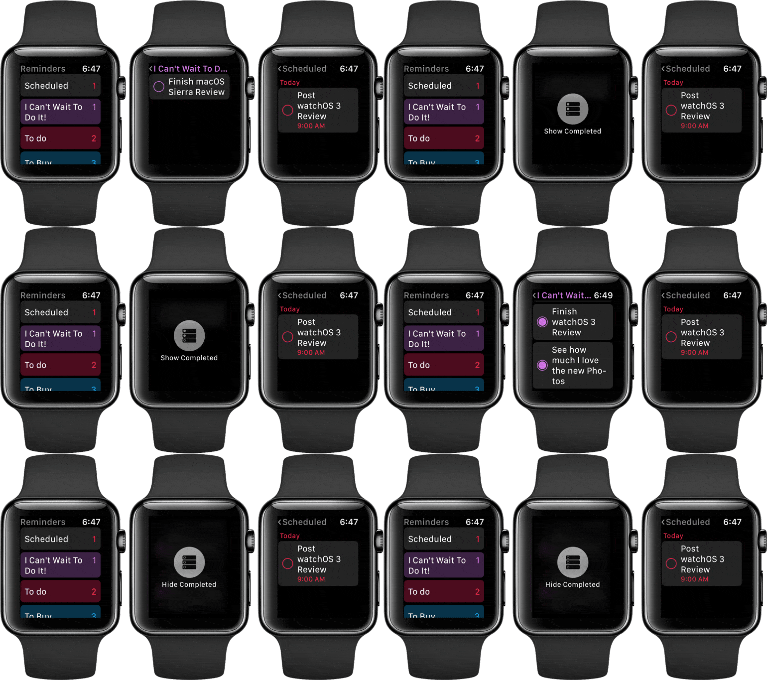
Reminders for watchOS is an incredibly simple app, including just three different views and with its only real functions being to check or uncheck reminders as completed. Opening the app will reveal the same group of reminder lists that you’re familiar with from its iOS counterpart (although, mercifully, without the paper-texture background). Each list displays its name and the number of incomplete reminders within it.
Tapping on a list will display a stack of reminders that have been added to it, each with an open circle on the side that can be tapped to mark the item as completed. Completed items will remain visible (so that you can uncheck them again if need be) until you return to the main view, or when the app is purged from memory.
If you’d like to see all completed items in a list, you can force press on the interface to reveal a “Show Completed” button, and tapping that will reveal them. Completed items show in the exact same way as incomplete ones (and will appear below any still-incomplete items in the list), except their circles are filled in. Tapping these circles will uncheck them and return the item to an incomplete state.
That’s it! Those are all the functions and views of the watchOS 3 Reminders app. The app does not support any explicit method of creating new reminders – it only allows marking and unmarking reminders that already exist. If you do need to create a reminder from your Apple Watch, you can of course do this in the same way you’ve always been able to: by using Siri. Once created with Siri, the reminder should show up in the watchOS Reminders app.
All-in-all, there’s really not much to say about Reminders for watchOS, except that I think it’s a pretty solid example of what a watchOS app should be like. The app is simple and to the point. It doesn’t waste time on extraneous functions or interfaces that users rarely will need or want on their Apple Watches.
I think that any third-party reminder app would need to at least add a button to create new reminders via the app, but the first-party one can get away without that option due to its tight integration with Siri. I suppose iOS 10 apps could use SiriKit to get this same advantage, but many users will likely be unaware of the option to interact with third-party apps via Siri, at least for quite some time.
Even for Apple’s Reminders, where users are far more likely to know about the ability to add reminders from Siri, I still feel like it wouldn’t hurt to include a Force Touch option to add a reminder manually. Sometimes using Siri isn’t practical, and with the new Scribble feature available it makes sense to expose interfaces for manually typing text. This seems like a natural fit for reminders in particular, as these are often very short messages that could be written out quickly and easily with Scribble. Force Touching on the main screen of the Reminders app currently does nothing at all, so the app even has space available were a “New Reminder” button could be added. Maybe next time, I suppose.
Beyond that minor nitpick, there’s not much else to complain about with Reminders for watchOS. The app is quick to load and quick to navigate, and it includes a launcher Complication so it can be added to watch faces for frequent users.
For watchOS apps, it’s always better to err toward too simple than toward too complex. Reminders falls at an acceptable point along this continuum, and is a solid addition to the stock watchOS apps.
Timer
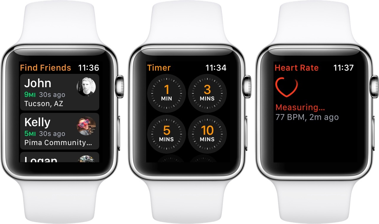
The Timer app has been completely redesigned in watchOS 3 to align with Apple’s extra simple design language. Rather than opening to a large circle and requiring you to spin the Digital Crown to set a number of minutes for your timer before you could start it, Timer now opens to a grid of timers, each with different common counts. If the timer you want to start matches one of them, just tap the button to start it. If you’re looking for a timer that is different from these, just scroll to the bottom and tap “Custom” to open up the old Timer interface and choose your own time.
The new Timer is just another example of watchOS apps designed to get to the point. The best apps on the Watch will prove to be those that need as little user interaction as possible to complete what user is looking to do with them.
Breathe
Breathe is a rare example of an app unique only to watchOS, not yet included on any of Apple’s other systems. The sole purpose of Breathe is to facilitate breathing exercises for Apple Watch wearers, and it is another great example of the simplicity that most watchOS apps should be shooting for.
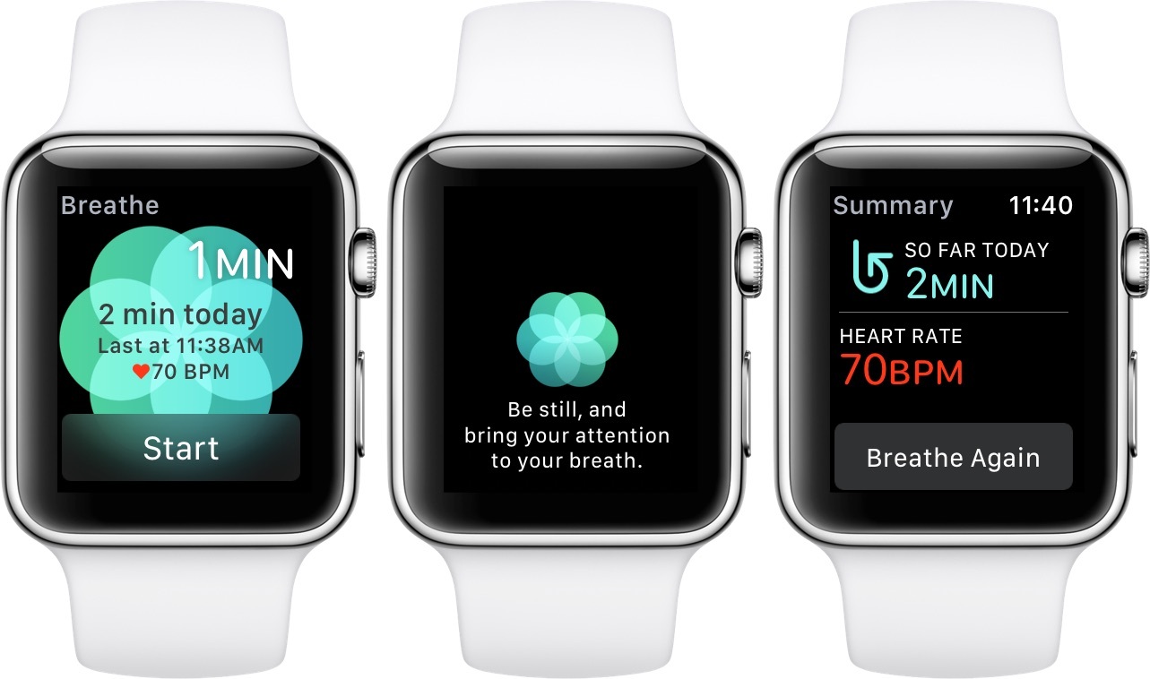
The Breathe app opens to a single page with a blue-green flower-like shape in the background. The large button at the bottom reads “Start”, and will begin a breathing exercise for the number of minutes specified in the top right. In the upper left you’ll see how many breaths will be taken throughout the exercise, and in the center are statistics on how many minutes of breathing you’ve done today, as well as what your heart rate was after the last exercise.
Spinning the Digital Crown while on the main screen will adjust the number of minutes (as well as the number of breaths) up or down. Once the setting is where you want it, pressing the Start button will begin the exercise.
Each breathing exercise consists of nothing more than breathing deeply in and out, with the Apple Watch setting the pace. When an exercise is begun, the Breathe app interface slides away, except for the blue flower. Below the flower the text “Be still, and bring your attention to your breath” fades in. After a few moments, the flower contracts, and then begins to expand while the words “Now inhale…” fade in. As the flower expands, the Apple Watch’s Taptic engine begins to vibrate, first quickly and then slowly as the flower grows close to filling the screen. Once the flower reaches its peak, it begins to shrink as the words “And exhale.” fade through.
From there, the flower continues to expand and contract, coinciding with taps from the Apple Watch, until the number of minutes specified at the beginning are up. As long as you match your inhaling and exhaling to the flower or the taps, then by the end of the exercise you will have taken the number of breathes specified at the beginning.
When the exercise completes, the words “Well Done.” fade through momentarily. Then the flower spins away, morphing into the twisted arrow shape that is the Breathe app’s icon5 and a summary of the interval shows up on the screen.
The summary shows the total number of minutes that you have spent on breathing exercises for the day, as well as your current heart rate following the exercise. At the bottom is a single button labeled “Breathe Again”, which will return you to the original screen of the Breathe app.
The only other aspect of Breathe are the new Time to Breathe notifications that are sent in watchOS 3. These are essentially the same as the Time to Stand notifications that you’re likely familiar with from watchOS 1 and 2 (those are still around too, if you haven’t turned them off by now).
Time to Breath notifications pop up throughout the day when you aren’t using the Breathe app regularly. They include a button to launch the Breathe app so that you can run a breathing exercise. Time to Breath notifications can be turned off in the Breathe app settings area of the iOS Watch app.
Overall, I’ve been surprised by how much I’ve enjoyed using the Breathe app. I don’t follow the Time to Breathe notifications, but I’ve left them on so that I get periodic reminders that the feature exists and is available to use when I need it. Personally, I’ve found that in times when I’m feeling excessively stressed, using the Breathe app can calm me and make me feel a bit better and more refreshed. I’ve even found them to be helpful for reducing headaches. Your mileage, I’m sure, will vary.
Breathing exercises aren’t for everyone. I’m not even sure that they’re really for me, as while I’ve mostly enjoyed them when I do them, I still haven’t been converted into someone who utilizes them every day. Still, even if you’re skeptical, I would encourage you to at least give them a shot when you install watchOS 3. You may be surprised by how much you like their calming effect. At the very least, it’s nice to have another option in your tool belt when life starts to feel overwhelming.
I think the Breathe app is great, and I love to see Apple expanding the number of possible ways for the Apple Watch to help people’s health, both mental and physical. I have no complaints with Breathe, but I would love to see an even deeper set of statistics at the end of an exercise. Help me compare my hearth rate before, during, and after the exercise. Show me the benefits of breathing for longer sessions. I’m sure Apple will get to these kinds of stats in the future, and I’m excited to see where this app goes, and how its received by users.
Home
The new watchOS Home app presents a list of any HomeKit devices you have connected, and allows you to tap on one to change or view its states. The app will also pop up with notifications when certain devices are triggered, such as a doorbell camera, and the notifications will have the live video from the camera directly on them.
The Home app is simple, but in my opinion, Apple didn’t quite go in the right direction with it. I’m trying to get more HomeKit devices to try out Apple’s system more rigorously, but for now the main home automation system in my home is SmartThings, and it offers a watchOS app as well. The SmartThings app only includes options for triggering “Routines”, SmartThings’ term for activating several preset settings on multiple connected devices at once. In general, I find this a better option for a watchOS app, as it allows getting more done at once, changing the home’s whole feel between preset modes. On the other hand, SmartThings’ app has no ability to deal with devices on an individual level, which sometimes is the only thing needed.
Comparing the two systems, I think a combination of Apple’s and SmartThings’ watchOS apps would make the best possible smartwatch home automation app. Expose whatever the system’s word for “Routines” is in the main screen, but enable switching over to a per-device mode of control via a Force Touch menu option. This kind of interface will be simple up front, and expose the controls to do the most at once. Yet behind an intuitive and quick menu it would expose the more granular controls that I often find myself wanting in the SmartThings watchOS app 6. Perhaps a third-party developer will be able to make an app like this for HomeKit using the new watchOS HomeKit APIs.
Heart Rate
The Heart Rate app has come about in lieu of the Heart Rate Glance going away. The app is nothing more than the single page that the Glance was, and opening it will automatically begin a measurement of your heart rate. If you miss the Heart Rate Glance, just place the Heart Rate app in your Dock to get the same effect.
This app is another case where I could see a slightly more complicated interface bringing something good to the table. I would love to see the Heart Rate app allow you to scroll down or swipe to the side to see some sort of over-time view of your heart rate data. Even just a daily average over the past week, or a few data points throughout the last few hours could be cool, and adding this would not overcomplicate the app.
Find My Friends
Find My Friends has been introduced on Apple Watch in watchOS 3. The app is very similar to its iOS counterpart, displaying a list of those who have shared their locations with you as its main page. Tap on a friend in the list to see an interface with their name, the city and state they’re in, how many miles from you they are, and a map on which their location is represented.
Scroll down and you can see the exact address of your friend’s location, as well as three buttons. The button with a picture of a car on it will open up the watchOS Maps app with a route set up from your location to theirs. The message bubble button will switch you to the Messages app and automatically open your conversation with this friend. Finally, the Contact button at the bottom will open up the friend’s contact information, which contains a button to call them as well as another message bubble button.
I think the watchOS Find My Friends app is great. I’ve got no real complaints, and nothing else I feel like the app should add. It does everything I expect and everything I need from it.
- I’m not sure why they didn’t just make the flower the icon – perhaps because it’s too similar to the Photos icon? ↩︎
- I should note that for my day job I work as a support engineer at SmartThings, so I know a lot about the system. I don’t think this impacts my opinion on these watchOS apps though. It seems clear to me that both Apple’s and SmartThings’ apps for watchOS bring different things to the table, and each is lacking in areas where the other excels. ↩︎


