Interface
For the most part the watchOS 4 interface has not strayed from the path set by watchOS 3, but there are a few notable changes that are worth a mention. Namely, the entire pairing interface on both the Apple Watch and the iPhone have been revamped, the Dock has been redesigned, and they’ve finally provided an option to replace the honeycomb home screen.
Pairing
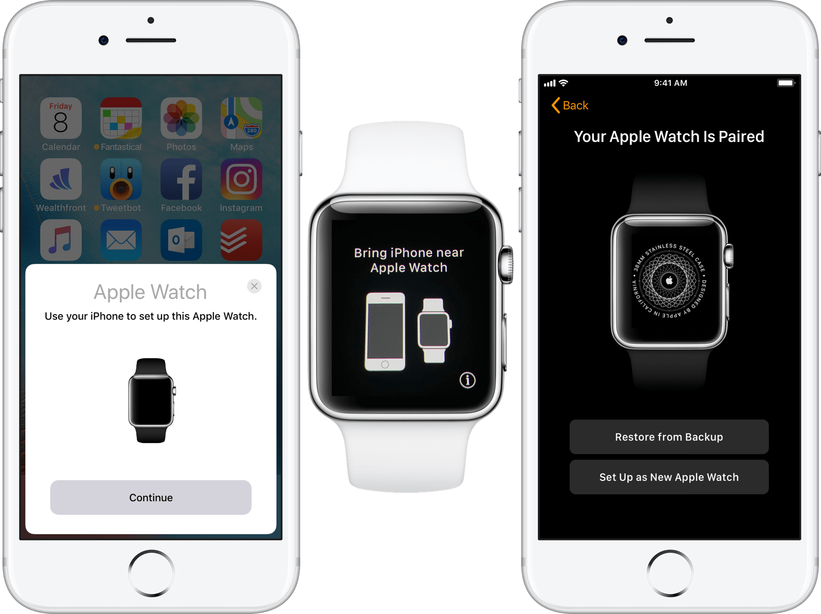
In watchOS 4 Apple has implemented a completely new UI for the initial pairing of an Apple Watch and iPhone. This begins with the communication between the two devices, where Apple seems to have borrowed heavily from whatever secret sauce they baked into the Bluetooth connection of AirPods. After turning on an unpaired Apple Watch, just hold it close to your iPhone to see a popup slide in from the bottom of the screen informing you of the nearby watch that is ready to pair. The watch, for its part, will show a screen with an animation of an iPhone moving close to an Apple Watch, and will rotate between languages every few seconds translating the phrase “Bring iPhone near Apple Watch.”
If you hit the Pair button on the popup on your iPhone it will launch the iOS Watch app and begin the pairing process. Alternatively, you can hit the small info button at the bottom right of your Apple Watch’s screen to pick a particular language and region before reaching a screen that directs you to manually open the Watch app on your iPhone. Once you’ve done so, tap the Start Pairing button on the watch to see the familiar particle ball visual that Apple Watches have always used for pairing. Point your iPhone camera at it and within a few moments the devices will be connected.
Once you’ve started this process your iPhone will show a screen requesting that you pick between restoring the watch from any old backups that may exist or setting it up as new. Following that are a few screens of logistics to get through. The main items are choosing a passcode for the watch, setting up Apple Pay, entering your Apple ID to enable Activation Lock, and reading about the Emergency SOS feature. After that, you’ll get the “Apple Watch Is Syncing” screen which informs you that you can continue using your phone and that you’ll get an alert when the sync is complete.
This is the point in previous versions of watchOS where the device would display a large, slowly filling progress circle, and you’d have to leave it alone for a while. In watchOS 4, Apple has really improved this portion of the process. You still get the progress circle, but it has now been shrunk down to take up less than a quarter of the screen. Underneath it is an interface titled “Apple Watch Basics,” and you can scroll down while the watch restores to see three different buttons labeled Display, Digital Crown, and Side Button.
Each of these three buttons can be tapped to start walking through instructions on how to operate the Apple Watch interface. The Display section shows an animation of horizontally scrolling cards, along with the instructions “Tap to select. Swipe to scroll and move.” (Emphasis Apple’s.) Swiping horizontally here moves to a second page which explain Force Touch with an animation, accompanied by the sentence “Press Firmly for more options or to change the watch face.” A Done button in the top left corner will return you to the main interface.
I won’t bore you with the details of the next two sections. They’re identical interfaces to the one described above, but they walk through the various functions of the device’s two hardware buttons. Overall, I’m impressed with this interface, and I love that Apple has figured out a way to turn the excruciating waiting period while a new Apple Watch goes through the initial pairing process into an interactive walkthrough on how to use the device. I think brand new users will get a lot out of this change. Restoring a new device from scratch is one of the only times in software where there is literally nothing else to do with that device — a perfect moment to capitalize on to make sure people aren’t missing any of the features that Apple has worked hard to implement.
Passcode
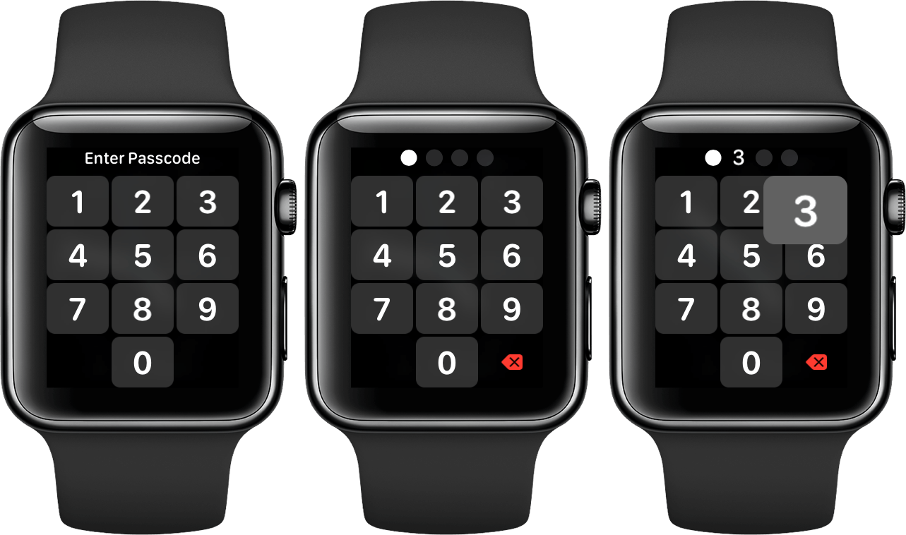
Once you’ve paired an Apple Watch you’ll be presented with the passcode interface each time you strap it onto your wrist. Apple has changed this interface for the third consecutive year, and thankfully it is continuing to move in a good direction. The tap targets, which last year were made bigger than their original implementation, have now been inflated even further. The delete button has been tweaked to a bright red color and shrunk down smaller than the rest of the buttons, although the tap target for it is the same size as the others.
Tapping each button will cause it to temporarily inflate, which is a good way to help you identify visually that you hit the right button while your finger is still on it. I’m not sure how well this would work as a design pattern in other parts of the Apple Watch UI, but it does strike me as an interesting idea. The small size of the Apple Watch screen makes it inherently difficult to know that you’re tapping what you think you are, and perhaps this brief expansion animation for tapped elements could be useful beyond the lock screen. In their current location these animations are particularly helpful if you catch yourself missing a tap target, as you can slide your finger around the screen to change your tap before lifting. Previously this wouldn’t have helped much because it was still hard to see what your finger was on, but with the expanding buttons under your touch you can get a much better sense of what you’re doing and make sure to release at the right point.
Dock
In watchOS 3 Apple introduced the Dock: a selection of up to 10 apps which would be easily accessible via the hardware Side Button and would also be kept in memory longer. The Dock replaced the old Friends interface, and thus finally provided a good reason for that second hardware button to exist at all. In watchOS 4 the Dock is still around, but Apple has made a few key changes.
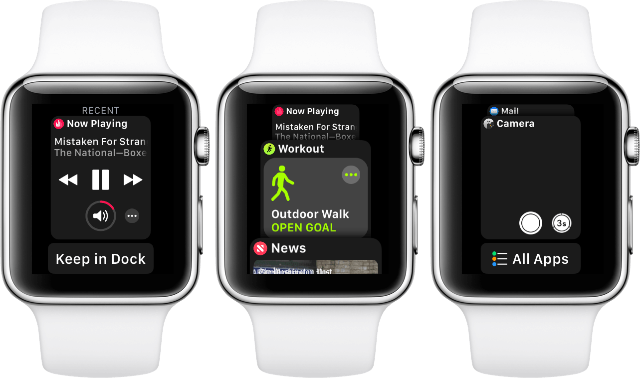
The biggest change involves the apps that are present in the Dock. Where watchOS 3 required specific user interaction to add new apps into this privileged list, watchOS 4 has relegated that to an option which is off by default. Instead, when you first install watchOS 4, your Dock will contain a list of the last ten apps that you accessed on your Apple Watch. It’s basically the same idea as the multitasking interface on iOS, minus being able to force quit apps from it.
Personally, I have switched my Dock back from showing most recent apps to showing favorites, and I think that most people interested enough to be reading this review should strongly consider doing the same. The reason that the multitasking switcher works so well on iOS is because the operating system has other convenient avenues for opening an app that has not been recently used. You can quickly access the home screen and open most of your frequently used apps in a matter of moments. If you’re looking for something buried in a folder then it’s also fairly quick and easy to just slide down the Spotlight view and type the name to look the app up. watchOS has none of these conveniences. The only good ways to make an app easily accessible on watchOS are to either add it as a Complication on your watch face (if you have an open slot and app supports a Complication in the correct size), add it as one of the few apps clustered directly around the watch face icon on the honeycomb home screen, or add it to your Dock. With so few methods for quickly accessing apps, changing the Dock so that it only includes recently used apps cuts off a major option here.
It may seem like this doesn’t matter if you, like most people, really only use a small subset of apps. That may be true for the most part, but if you only use a small subset then isn’t it nicer to position those yourself in the Dock and know that they will always be there when you need them? When the Dock is populated with your most recent apps and you need to access an app that you haven’t used in a long time, there are two options. First, you can open the Dock and scroll down to the bottom searching for it, then retreat to the clunky home screen interface if it’s not present. Second, you can skip the Dock altogether and just start the home screen search immediately, which will be much slower if the app actually was hanging around in the Dock somewhere. On the other hand, if your Dock is full of favorites, you will either automatically know that the app you want is in the Dock and exactly where it is in the lineup, or you will know that it isn’t there and you can start swiping around through the home screen sooner and get that over with.3
Furthermore, when you have the Dock set to the favorites option, it will display the last most recently used app which is not already a favorite at the very top of the interface, above the first docked item. That gives you a maximum of 11 apps to hold in the interface, and means that there’s always a shortcut to the most recent app if you ever need to temporarily switch back and forth with one that isn’t marked as favorite. Apple also includes an “Add to Dock” button at the bottom of this recent app’s card, so if you decide a new app deserves favorite status then you can add it quickly and easily from your watch (this button isn’t present if your favorites list is full).
Keeping the above advantages in mind, I really do think that populating the Dock with a list of most recently used apps is a better option for most users. This is because I’d bet that the vast majority of users never once took the time to manually organize their Apple Watch Docks in watchOS 3. By populating the Dock automatically, these users can get some use out of the interface without needing to put any time or thought into it.
Ultimately, I think Apple’s mistake here was diverging the Dock into two distinct choices rather than merging the ideas together. The watchOS Dock would be better if it were modeled after the new iPad Dock in iOS 11. The front part should be a list of a few favorites that the user can specifically choose, and the back part should be a list of most recently used apps. By default there could then be no favorites, so the Dock would just show recent apps in the same manner it defaults to in watchOS 4. However, users would also be free to set their favorite apps in stone directly from the Dock interface, if they ever felt the need to. This combination would leave the Dock the same for the majority of users, but allow those who actually want to to set favorites to do so without losing the definite convenience of still having access to a few recently used apps.
Apple is usually the company that figures out the best option and makes these kinds of decisions for us. Instead, they’re forcing us to choose strictly between two useful features rather than designing a better interface that incorporates both concepts. I’m hoping this changes in future versions.
Another part of the Dock interface that has been changed is the visual design and layout. In watchOS 3 the Dock was a horizontal list which unintuitively could be scrolled sideways using the Digital Crown — if you found that more convenient than swiping with your fingers. This interface definitely had its drawbacks — mainly that navigating from one side to the other required a lot of consecutive swipes and always felt imprecise. With watchOS 4 Apple has redesigned the interface to be a vertical-scrolling list of cards. The cards overlap so that more than one can be shown on screen at a time (again taking cues from the iOS multitasking interface), and the fact that they scroll vertically makes it much more intuitive to navigate the list using the Digital Crown. Each card can be swiped to the left to reveal a red “Remove” button which won’t force quit the app, but will simply remove it from the list. If you’re using the “most recent apps” Dock setting then a removed app will return to the list the next time you open it, but if you’re using the favorites option then you will just free up another space.
Beneath all of the cards is a button labeled “All Apps,” which exists so that when you scroll through your list and fail to find the app you’re looking for, you can then easily open your watch’s home screen to start the search there. This is a great shortcut which shows that Apple knows exactly how people will be interacting with this interface, although it also goes to show that Apple knows people will be searching their most recents list for apps that aren’t going to be present.
Overall, I like the new Dock a lot. The one visual complaint I have is that with so many apps having a dark theme, it can be a little difficult to differentiate between the beginning and ending of different cards, and I’ve accidentally tapped the wrong app on several occasions. That’s a minor issue though, and with the favorites option enabled I’m actually very happy with the Dock in watchOS 4. In the future I would love to see them unify the favorites and most recents options, if only because it makes me nervous to be relying on a non-default setting for a core part of how I use my Apple Watch. As long as that stays around, at least there’s an option for people who want to take more control over how they use their Apple Watch.
Home Screen
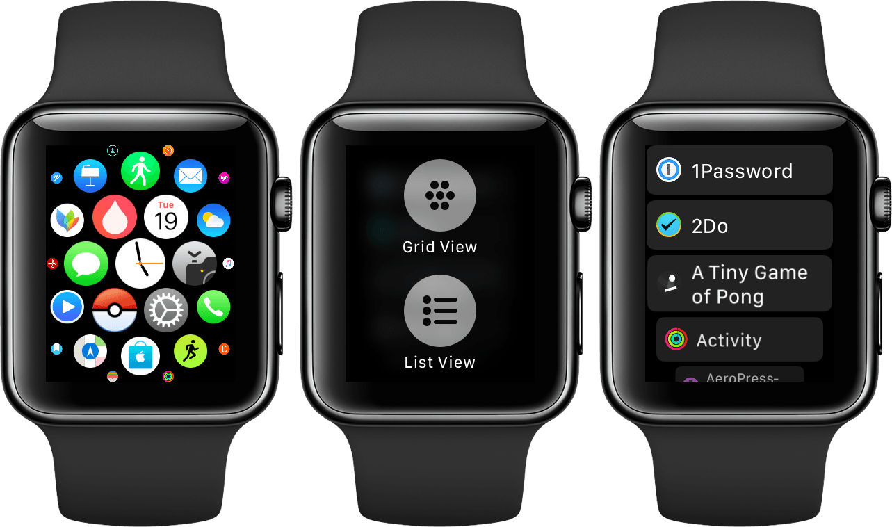
watchOS 4 brings with it Apple’s first crack at a rethinking of the disaster honeycomb home screen interface. This revolutionary new design is… a list. It’s also off by default.
That’s right — after three years the best idea that Apple has been able to come up with for an improved home screen interface for the Apple Watch is an alphabetical list of apps that you can scroll through from the top to find what you’re looking for. The saddest part is that I find this list significantly more effective than the honeycomb home screen ever was.
While the honeycomb interface is undoubtedly beautiful, usability-wise it is a train wreck. In my experience, if I want to open an app that isn’t positioned directly adjacent to the watch face icon, I end up in a frustrating game of app-themed Where’s Waldo? which often results in me giving up and using my iPhone instead. The Apple Watch home screen interface is simply not good.
Despite that, it remains the default in watchOS 4, which is particularly unfortunate now that they changed the default Dock interface so that most users won’t have shortcuts to get to their most-used apps. Thankfully, this time Apple has at least given us an alternative: Force Touch on the honeycomb home screen interface to expand the options to change between Grid View (honeycomb) and the new List View.
You can scroll through the list view by swiping or by using the Digital Crown, and while it may not be fast to get to an app that is lower down in the alphabet, at least you will have an immediate understanding of how far you need to scroll to find it.
There isn’t much more to say about the list view. It is a significant usability improvement over the honeycomb interface, but it’s still not great. This is by no means a simple problem for Apple to solve, but after all of the extraordinary user interfaces that Apple has designed over the years, I think that they can do better.
Maybe next year will bring the design improvement that I’m hoping for here. For now, at least we can take solace in a simple list.
Control Center
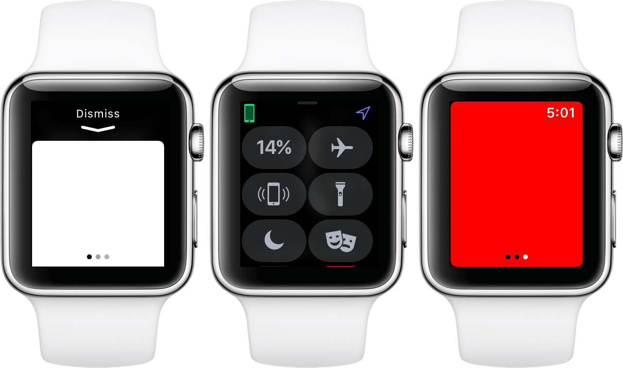
Control Center has seen some nice functionality improvements in watchOS 4. The interface itself is the same, but there is now a new flashlight button available, as well as a new location icon. The icon shows up in the top right corner, and indicates when an app is currently, or has recently used your location. Just like on the iOS Location Services page, a filled in icon means currently in use while an outline means recently used.
The new flashlight button is actually pretty awesome. If you recall from last year’s Apple Watch Series 2 announcement, one of the new features on the updated watch was that its screen could increase to a brightness of 1000 nits (really bright). With watchOS 4, Apple is taking advantage of this to enable using your watch as a flashlight.
Flashlight mode is enabled from Control Center by tapping the button with the picture of a flashlight on it. This will cause a pure white window to expand from the bottom of the display. At the top of this window is a downward-facing arrow with the word “Dismiss” above it, instructing you to swipe down to disable the mode. After a few moments, the window will slide up further to conceal the Dismiss button so that the entire screen of the watch is white.
Here’s the kicker: when then flashlight is activated the white display is actually pretty dim, but if you turn the watch to face away from you — as you will very likely be doing to use it as a flashlight — the screen will then increase to full brightness. Although this feature works on Series 1 Apple Watches as well, it’s even more effective on the super-bright Series 2 or Series 3 models.
Flashlight mode has three different settings, as indicated by the three faint page dots that can be seen toward the bottom. You can swipe the screen horizontally to switch between these modes. The first is the standard flashlight mode, which is nothing but a bright white screen. The second is a bright white screen which flashes. This is meant to be used by runners or other nighttime exercisers as a way to make yourself more visible to passing vehicles. The final option is a bright red display, which I think is supposed to be useful to draw people to you in an emergency situation.
I really like the new flashlight mode, particularly because of the cool way that Apple incorporated turning your wrist. This is yet another example of the company understanding how people are going to be using a feature, and building it to work best in those situations.
- Siri is of course another option for opening apps, but in my experience the virtual assistant is far too inconsistent on the Apple Watch to be counted on. Maybe this will change if you pick up a Series 3 with LTE, but even then using Siri is not always appropriate depending on the situation you’re in. ↩︎


