New Watch Faces
A watchOS update would not be complete without at least a few new watch faces for us to play around with. This year brings three: Kaleidoscope, Toy Story, and Siri.
Kaleidoscope
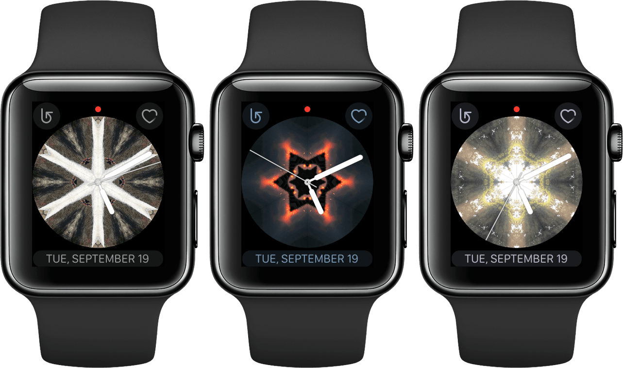
The Kaleidoscope watch face was widely dismissed out of hand during the initial watchOS 4 announcement, and to be fair I think these are entirely valid criticisms based on how Apple has marketed it. The Kaleidoscope faces that Apple is actively advertising are in a similar vein to the following:
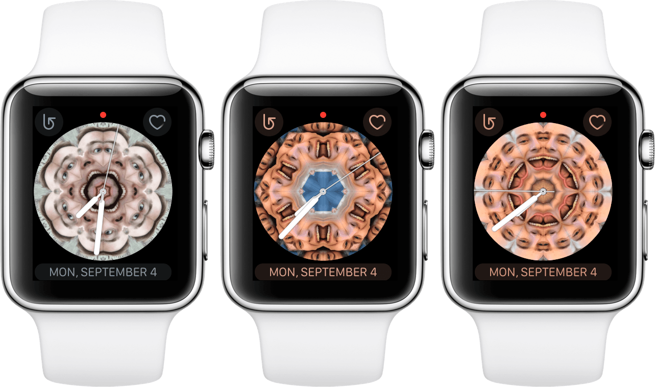
These kaleidoscope effects may seem intriguing at first, but they’re way too busy for my tastes. The colors are constantly shifting around but the watch hands are always white, so depending on when you look it may be extremely difficult to actually read the time. Also, since you can pick any source picture from which to create the kaleidoscope effect, there’s nothing at all stopping your from creating a travesty like these:
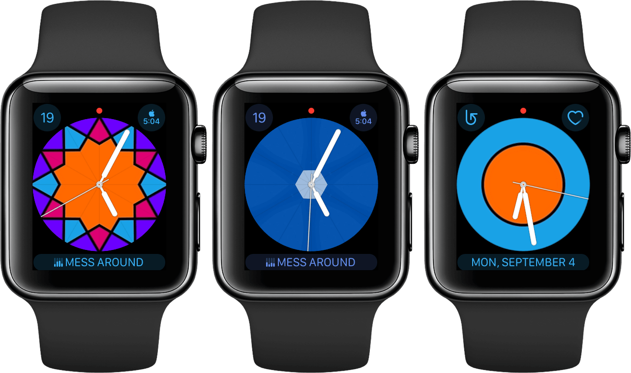
On the other hand, since we have the freedom to pick any image to be the background for the Kaleidoscope face, that means we can also pick images which work way better here. There are probably other examples that I haven’t thought of, but I’ve found that images which are pretty much just one or a few solid blocks of color produce a significantly less terrible effect. Consider the following:
These still aren’t among my personal favorite watch faces, but in testing them out I did enjoy the subtle changes of color throughout the day, as well as the ability to fidget with the spinner and see an interesting effect (spinning the Digital Crown on this watch face creates the same effect as twisting a kaleidoscope). Since the color blocks are clearly defined and untextured, they don’t cause excessive visual clutter, and they don’t affect my ability to read the time on my watch. The blue example above also shows how you can just pick a single block of color, maybe with a little bit of texture added, if you just want that as the background color on your watch face.
If you do decide that you want to try a Kaleidoscope watch face out, you can set it up by using the Create Watch Face extension when activating the share sheet for an image on your iPhone. This will let you pick between creating a new Photo watch face or a new Kaleidoscope watch face. After picking Kaleidoscope you’ll see the same interface that you get when setting up a watch face in the Watch app. You can swap between Facet, Radial, and Rosette kaleidoscope effects, and you can also pick which Complications will be shown on the face. Once you’re finished, hit the “ADD” button and your Apple Watch will automatically switch to the new face.
Kaleidoscope supports three different Complications, two small ones on the top and one large one along the bottom. This is almost the same setup as the Utility watch face, except that the two small Complications at the top are different styles than those used by Utility. In Apple’s parlance, Utility uses the ‘Utilitarian Small’ Complication class while Kaleidoscope uses ‘Circular Small’. I dislike Circular Small Complications because they are confined to a significantly smaller space than Utilitarian Small just so that they can fit into a circle rather than a square. A couple example results are that the Date Complication shows just a single number with no context, and the World Clock Complication has to make the text so small to fit the region and the time that they’re almost unreadable. Since I use both of these on my watch face, Kaleidoscope is ruled out for me on those grounds alone. The good news is that it can hold the Now Playing Complication along the bottom, so if you don’t have a problem with the top two then this could potentially be a new contender for you.
All things considered, I think the Kaleidoscope watch face has more potential than anybody expected. It’s not going to be for everyone, but there are some viable options for it that will look decent. The original reaction to this watch face may have judged it a bit prematurely.
Toy Story
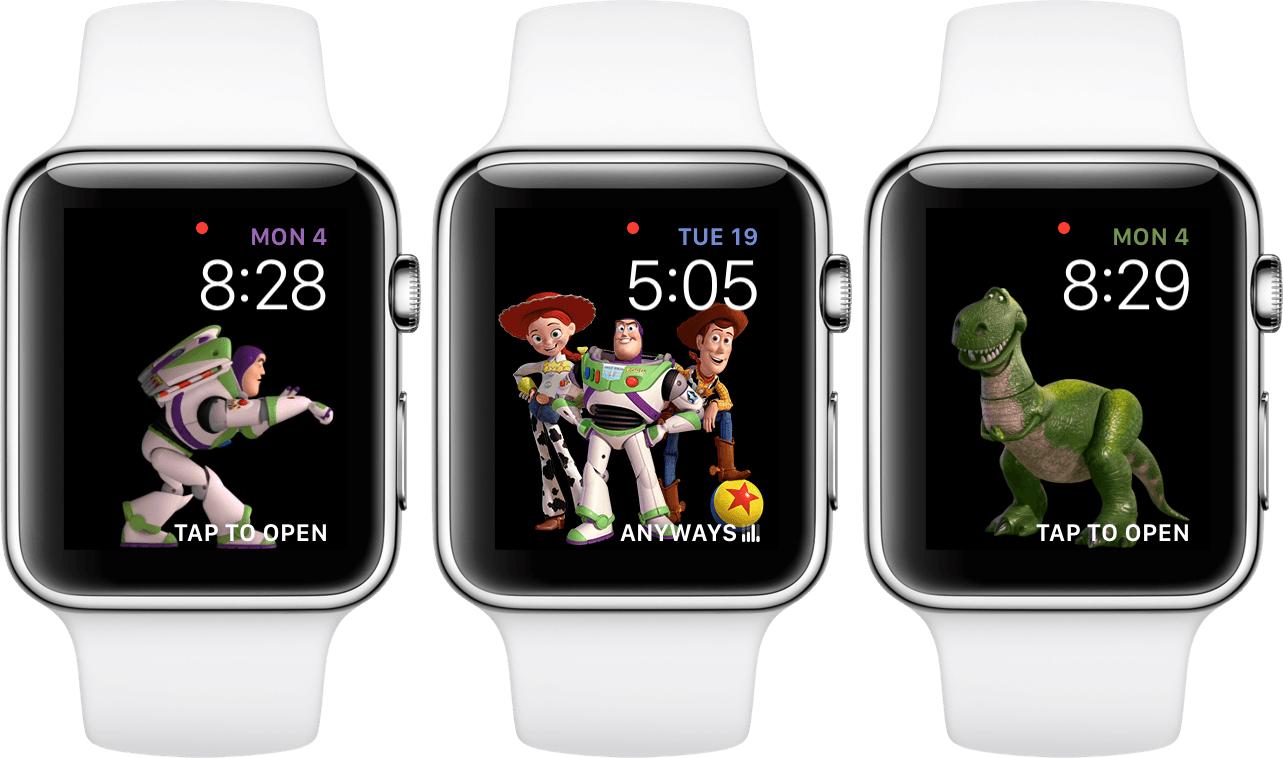
There’s not too much to say about the Toy Story watch face, as it’s pretty much what you’d expect. When you set this face up you can choose between four options: Woody, Buzz, Jessie, or Toy Box. The latter will randomly shuffle between a variety of characters from the movies, including the aforementioned three as well as Rex, Hamm, and Bullseye.
Once the face is active, each time you raise your wrist it will show a brief cutscene involving your chosen character, or a randomly selected character if you’re using Toy Box. Some of these are as simple as the character waving, tipping their hat, or pointing at the time in the top right. Other times it can be a bit more in depth, such as Rex running around balancing on top of a ball, or Woody flying a hang glider around. They don’t usually last more than 5 seconds, and you can actually tap on the watch face at any time to manually start another scene. As a small but nice touch, the highlight color on your active Complications will change based on which character is on screen: yellow for Woody, green for Rex, Purple for Buzz, and more.
This watch face includes two editable Complications. At the top, above the time, is a Utilitarian Small Complication which defaults to the current date. At the bottom is a Utilitarian Large Complication which defaults to being off. The Now Playing Complication’s ‘TAP TO OPEN’ text looks especially out of place to me on this watch face since tapping the face itself actually triggers a different action, but I digress.
At the very least the Toy Story watch face is an excellent new option for kids to enjoy, but I wouldn’t judge an adult for picking this one either. There’s no doubt that tapping the face to see these beloved characters run around a bit is fun. If you’re a fan of Toy Story (and come on, who isn’t?) then it’s probably worth taking this watch face out for a spin.
Siri
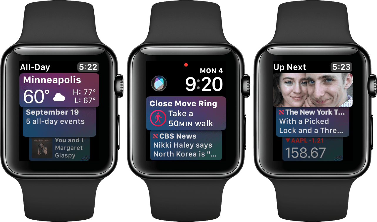
The Siri watch face is one of Apple’s headlining features for watchOS 4. It’s being advertised as an intelligent watch face which will show you the things you need to see when you need to see them. I really like where Apple is going with this, and I think that there’s a lot of potential for it to grow and improve. Unfortunately, in this initial version, I don’t think Apple has succeeded in fully realizing its vision for this watch face.
The Siri watch face is made up of a series of cards stacked on top of each other, and scrolling the Digital Crown or swiping on the screen will navigate the list up or down. Each of these cards comes from a different first-party app, and they will show items such as upcoming events in your schedule, Reminders that are due soon, news stories, activity prompts, and more. At the top of the interface you’ll find the time as well as two Complications — a Modular Small and a Utilitarian Small.4 By default the Siri watch face places the new Siri Complication in the Modular Small space, and the current date in the Utilitarian Small space. I left these defaults in my tests, as I feel like they fit the watch face pretty well. The Siri Complication is just a single-tap shortcut to activate Siri on your Apple Watch. If I were to stick with this watch face more permanently I would probably swap that one out since the device already has a couple just-barely-less-convenient options for activating Siri.
I really like the ideas behind the Siri watch face. Proactively figuring out and displaying the information that I want, when I want it, sounds like a perfect fit on a device that is all about glanceable information. If I could look at my Apple Watch and have it show me useful information that I need to know without me tapping the screen at all, that would be an unbelievably powerful feature. That’s what the Siri watch face is purporting to do, but at this time it just hasn’t quite gotten there.
For starters, the Siri watch face can currently only show cards from first-party apps. That immediately cuts off a majority of the apps that I use regularly from being able to supply any information to me. Worse than that, the cards that the Siri watch face chooses to show are consistently not at all useful to me. When the cards are useless, the utility of this watch face crumbles.
The best example I can give is the cards for the Breathe app. I have the Breathe reminders on still because, while I ignore most of them, every once in a while one will pop up when I’m in a mood where I could benefit from a quick break to just breathe. In theory my Apple Watch should be well aware that I almost never utilize these notifications, and yet my “intelligent” Siri watch face constantly displays a “Take a moment to breathe!” card among the top two cards in the interface. Since you can only see the top two cards without scrolling, 50% of the glanceable information for me is frequently wasted by this useless reminder. Eventually the Breathe card was showing up so often that I disabled it completely in the settings for this watch face (we’ll get to those in a moment).
Other examples of “relevant” cards that I consistently see: Apple’s stock price changes (I don’t own Apple stock and I don’t remember the last time I opened the Stocks app), random “Memories” from the Photos app, and the weather forecast for Cupertino ( I live in Minneapolis). I eventually figured out that I apparently needed to open the Weather app on my Apple Watch in order to make it sync up with the default location on my iPhone, but I still think the point stands. Regardless of what my default is, if this watch face is truly going to be advertised as intelligent, it should be able to figure out that when I glance at my watch throughout a standard day in Minneapolis, the current weather in a different city is probably not the most immediately relevant information.
The Photos card is a bit of a different case from the Breathe, Stocks, or Weather cards. I have on several occasions tapped on these and enjoyed seeing a random memory from a few years ago. That said, I think that this watch face should be smart enough to place cards like that one further down in the list. At any given time when I glance at my watch my most likely next action is to just lower my wrist again. This watch face should be optimized for that situation more than any other: give me the sort of glanceable information that I could most plausibly benefit from when I briefly look at my watch. Calendar events, reminders, and more can fit into that mold just fine. Photo memories, however, probably cannot. Instead, Photos and stocks and other non-actionable information5 should be shown lower down in the card list. If I’m already interacting with my watch by scrolling that list then there are far better chances that an old memory will catch my interest and I’ll take a moment to look at it.
As I mentioned above, it is possible to turn off individual data sources that the Siri watch face draws from. This can only be done from the Watch app on your iPhone by finding and tapping on one of your configured Siri watch faces. There you’ll find a list labeled ‘Data Sources,’ and you can flip any of them on or off. Since these sources are set on a face-by-face basis, you could in theory use multiple Siri watch faces with different settings for each one, such as configuring a work watch face versus a weekend watch face. That said, it would be even better if your intelligent watch face just knew when you were at work and displayed work information during those times.
I’m sold on the promise of the Siri watch face, but that promise is just not being fulfilled right now. I am optimistic though, and in future watchOS versions I think this watch face is one of the places to keep an eye on. If Apple can ever figure out how to make the data behind this feature actually intelligent then this could be a really great utility on the Apple Watch. I’d love to see support for third-party data sources added as well, but if Apple can’t even get the intelligence down for its own apps then I’m skeptical of how well it will do pulling data from third-parties. I hope that they can eventually pull this off.
- The “Modular Small” class of Complications are, unsurprisingly, the square Complications that you’ll find several of on the classic Modular watch face. These are a fair amount bigger than the other two classes of “small” Complications, but they are still technically a small size class and do not give you any different app options than you have from other small types. They will give a lot more space for the Complications that are available in the size though, so these are usually easily readable, which I like a lot. ↩︎
- If you’re someone who considers stocks to be actionable information, then you are also going to have way more reliable methods of keeping up with the stock market than an “intelligent” watch face. ↩︎


