I’ve made the case more than once that accessibility, conceptually, is not a domain exclusive to the disabled. Certainly, persons with disabilities will always be the target market for accessibility features, but I think many fully-abled people overlook the fact that accessibility features can help them too. To me, the canonical example is larger text. Yes, something like Large Dynamic Type is a boon to the visually impaired, but it can also benefit someone with aging or tired eyes.
In a similar vein, accessibility isn’t solely about discrete Accessibility features. While a big part of my writing involves reporting on iOS’ (and watchOS’) Accessibility features and how they affect users, I do make an effort to focus and write on the smaller aspects of accessibility. That is to say, I try to find accessibility in less obvious places – for instance, how technologies like Touch ID and Force Touch impact the disabled.
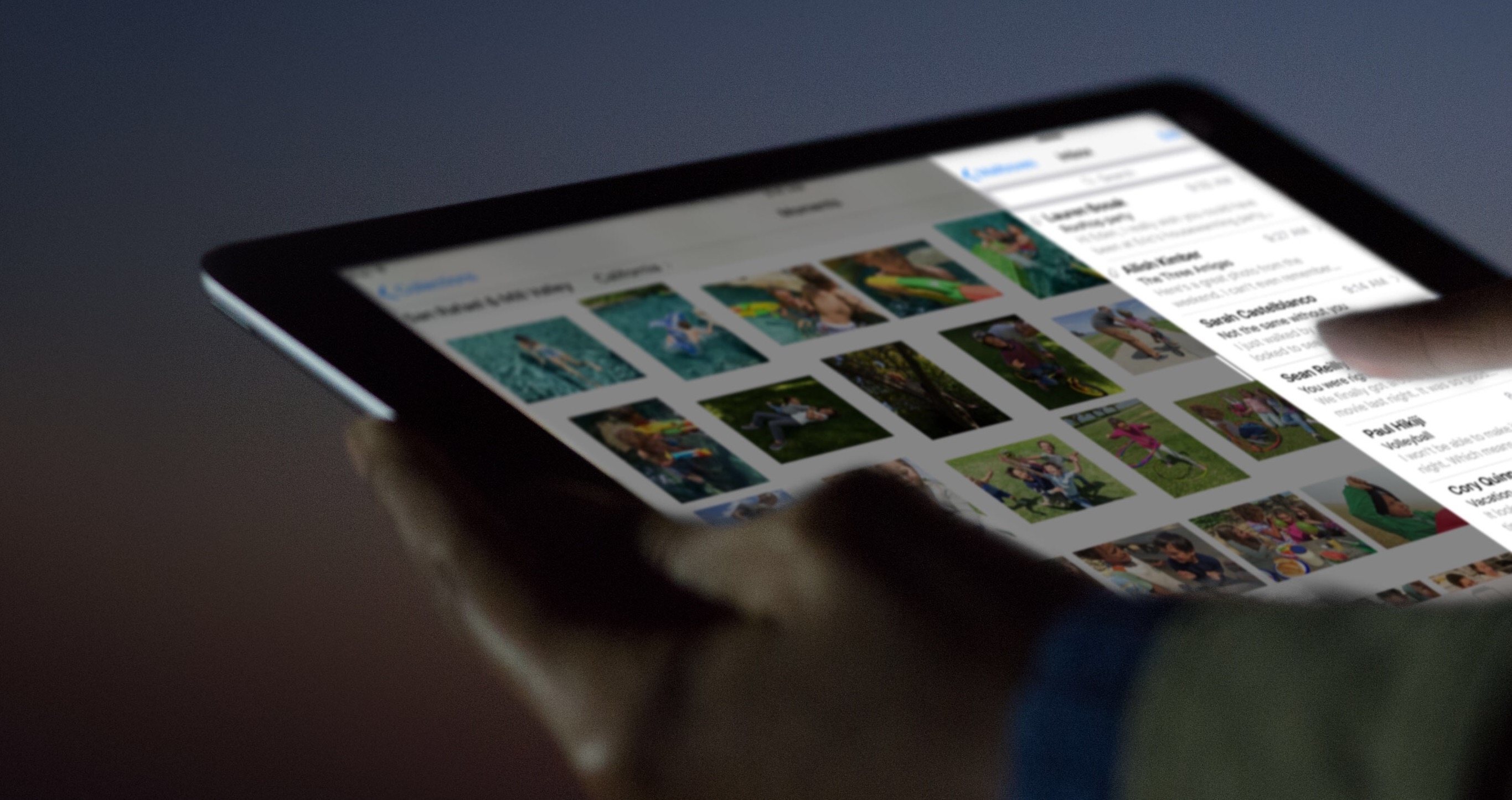
This concept has extended to my testing of the iOS 9 public beta throughout the summer. As I’ve gotten used to the new operating system on my iPhone 6 and iPad Air, I’ve come to notice several details that aren’t intentionally for accessibility, but nonetheless make the experience more accessible (and more enjoyable).
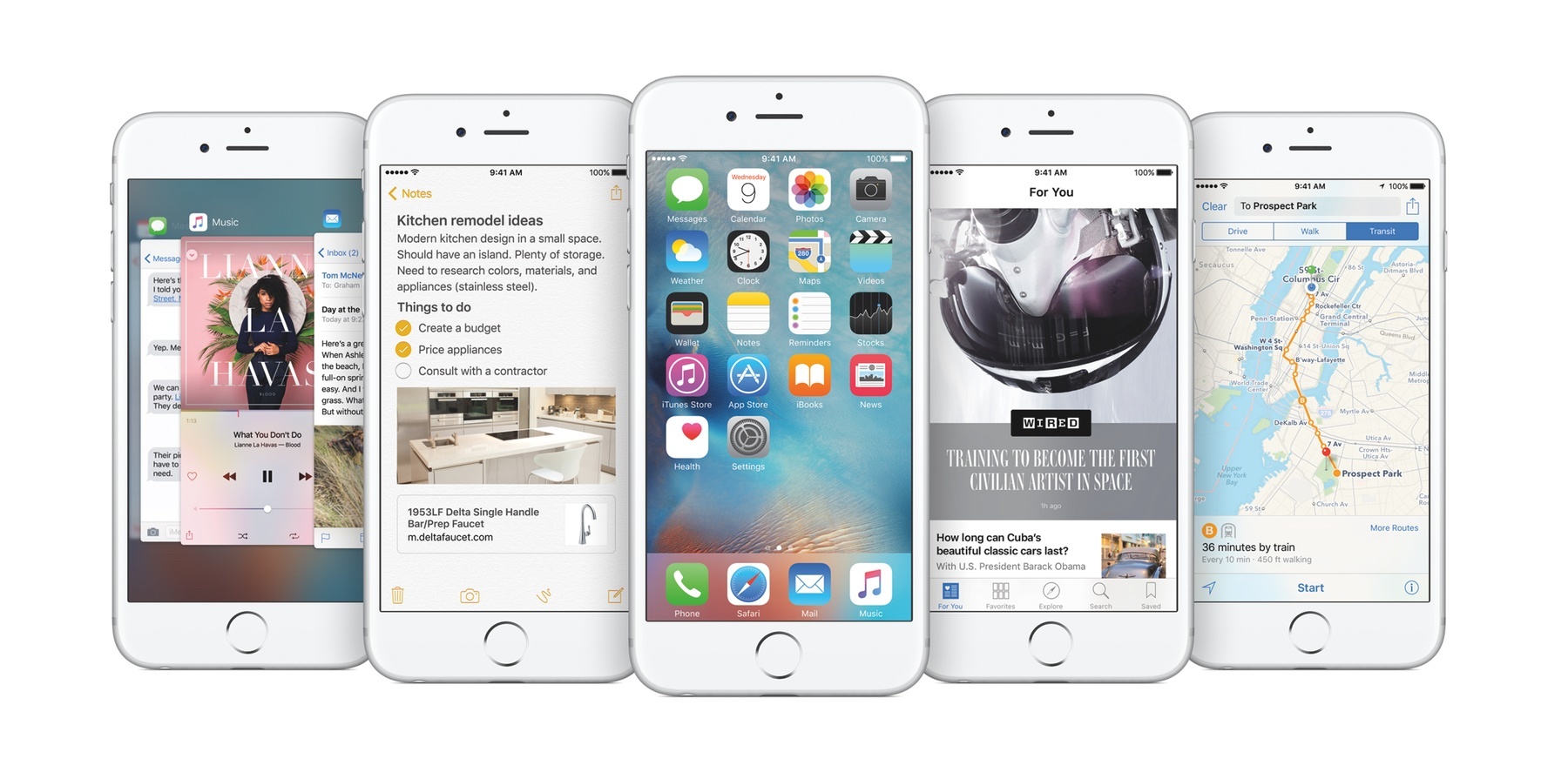
With that in mind, here are five “little things” in iOS 9 that stand out the most.
Read more