Posts tagged with "design"

Creative Selection Delves into Apple Software Design with Stories about Safari, the iPhone, and the iPad

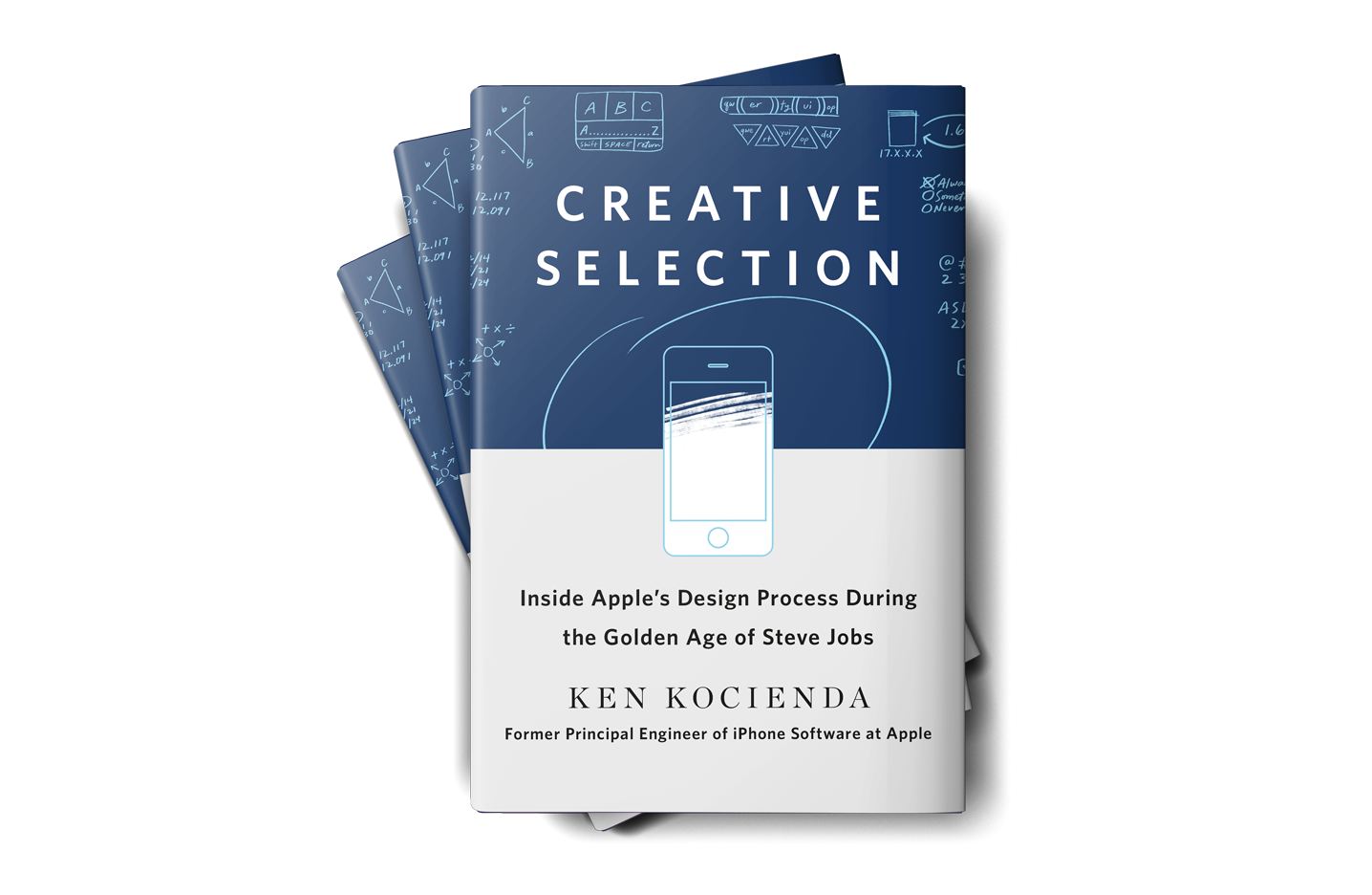
Today, former Apple engineer Ken Kocienda’s book Creative Selection, which covers his career at Apple and insights about the company’s software design process, was released. As an engineer at Apple, Kocienda worked on several high-profile projects including Safari on the Mac and the touch keyboards on the iPhone and iPad. Much of the publicity surrounding the book focuses on Kocienda’s work on the iPhone. However, there is a treasure trove of interesting anecdotes about other products and people that make Creative Selection an absorbing read for anyone interested in the creative process and Apple.

Read more


Affinity Publisher Beta for Mac Available

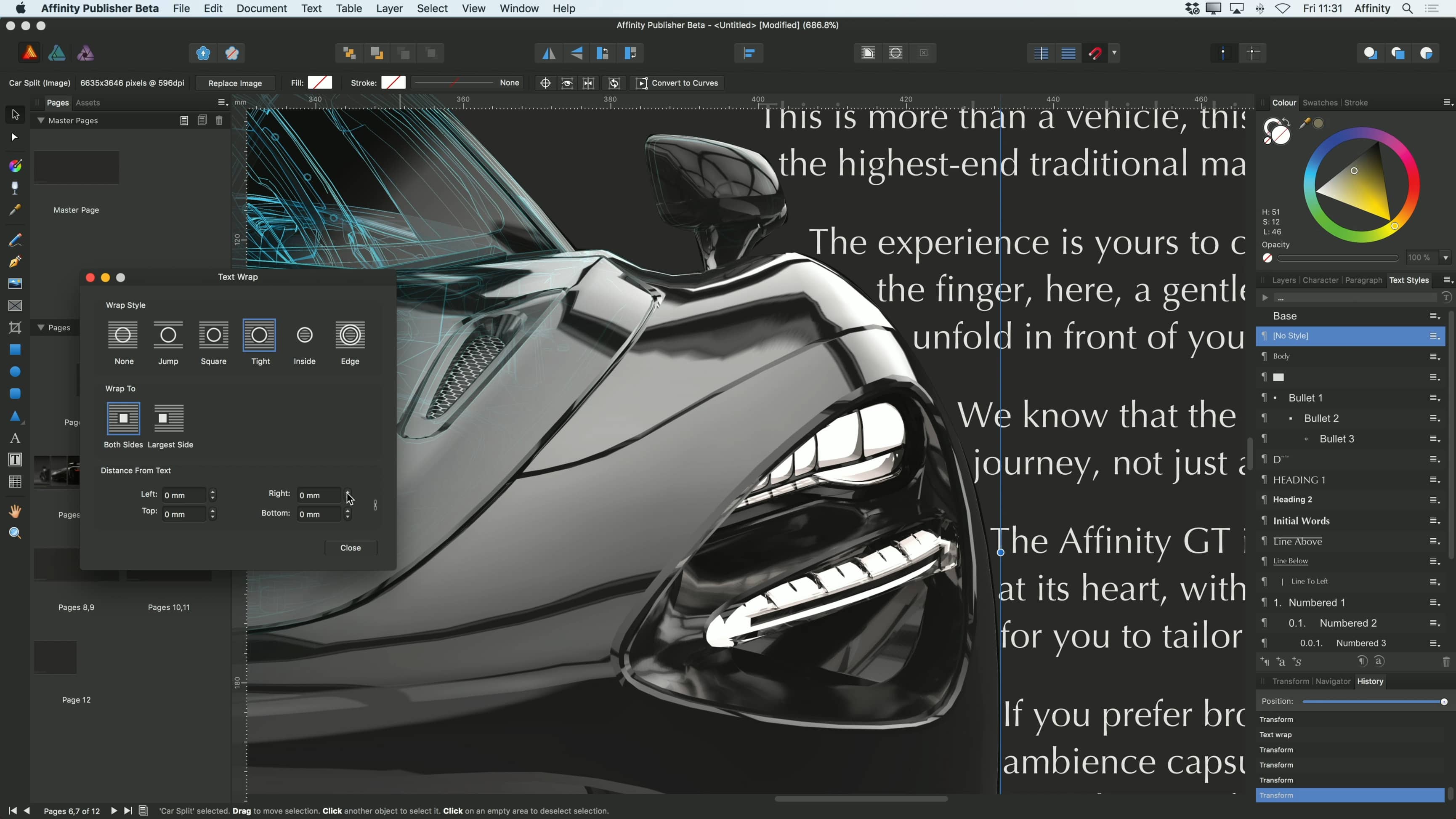
Serif, the maker of Affinity Photo and Designer, announced the launch of a public beta for Affinity Publisher, a desktop publishing app that it is developing for the Mac and Windows. In a press release today, Serif says that the feature set will include:

  • Advanced typography
  • Linked text frames
  • Master pages
  • Facing page spreads
  • Dynamic photo frames
  • Tables
  • Baseline grids
  • Linked resources
  • End-to-end CMYK

Of course, Serif cautions that it is not ready to use in production work, but you can download the app from Affinity’s website and take it for a spin to get a sense for what is coming and provide input to Serif. The final product is expected to ship in ‘a few months’ according to the Publisher preview webpage.

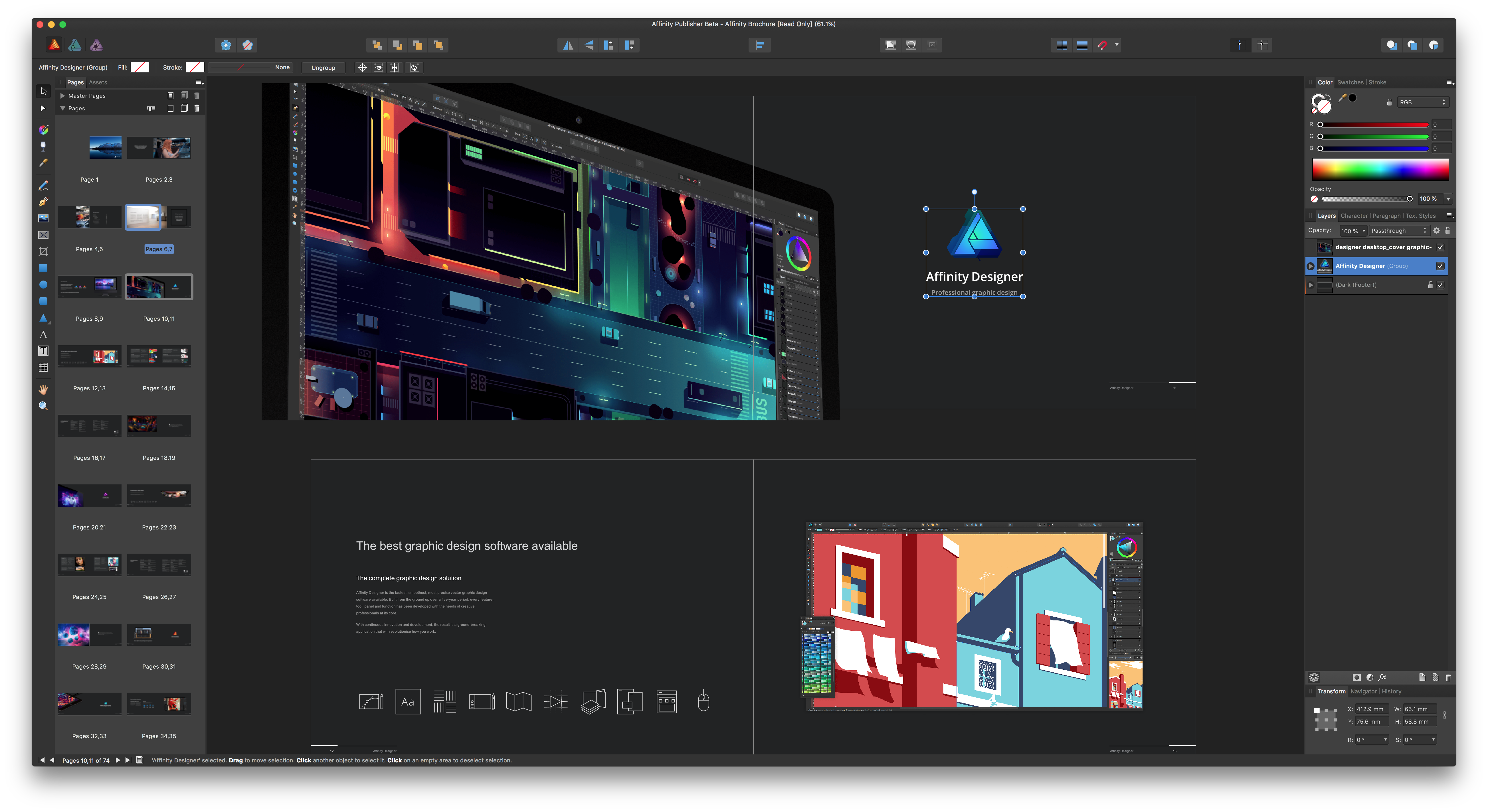
In addition to the signup page, Serif has published a series of 16 short video tutorials explaining the basic functionality of the app. There is also a sample brochure you can download to use as a playground for experimenting with the app’s features.

From my initial look at the beta and tutorials, Publisher is an ambitious effort to build an integrated suite of creative apps by leveraging Affinity Photo and Designer, which will be accessible directly from within Publisher. Those integrations are not yet available in the beta but will be activated in a later build.

It’s been interesting to watch Serif invade an app category, in which Adobe has been the dominant player for so long, with sophisticated but cost-effective alternatives that suit the needs of many users. Publisher looks like an app that could round out the Affinity suite of apps nicely, making the trio of apps appealing to an even greater audience.


Apple Releases New App Design Resources for the Mac and Apple Watch

As tweeted by Mike Stern, Apple’s Platform Experience and Design Evangelism Manager, Apple has updated its AppKit design resources with a comprehensive set of UI elements for making Mac apps. The UI elements come in both Aqua and the Dark Aqua variants for designing Dark Mode Mac apps.

The update, also announced on Apple’s developer news website, includes new watchOS UI elements too, including ‘dozens of new UI elements for watchOS apps, watch face templates for designing complications, a color guide, and new text styles.’

The design assets are available to download in both Photoshop and Sketch formats from the Resources section of Apple’s Human Interface Guidelines website. A full list of all the changes is available here.


The Fragmentation of iOS’s UI Design

Benjamin Mayo on the state of iconography in Apple’s built-in iOS apps:

My gripe is there is no consistency, no structure or logic to this. Apps introduced later sometimes use rounded icons, sometimes not, sometimes create all-new custom glyphs of their own. Incredulously, you could open flagship apps like Messages, Mail and Safari and have no idea Apple was even playing with bold icons as a conceptual change. These apps adopted the iOS 11 large bold navigation bar title formats, but their icons and glyphs have stagnated for more than four years at this point.

Mayo uses eight examples of Apple’s action icon to emphasize the design inconsistencies.

Since iOS 7, each revision of iOS has felt like a tentative design experiment, with icons in a handful of apps moving in different directions. The trouble is, Apple doesn’t seem to have settled on a clear winner among the several options tested, which has begun to make the UI feel directionless. Although rumors seem to indicate that a design refresh of iOS is at least another year off, I hope we’ll start to see indications of where iOS design is going this year at WWDC.

Permalink

Sketch Adds Shared Libraries, Including the Official Apple iOS 11 Design Template, and Prototyping

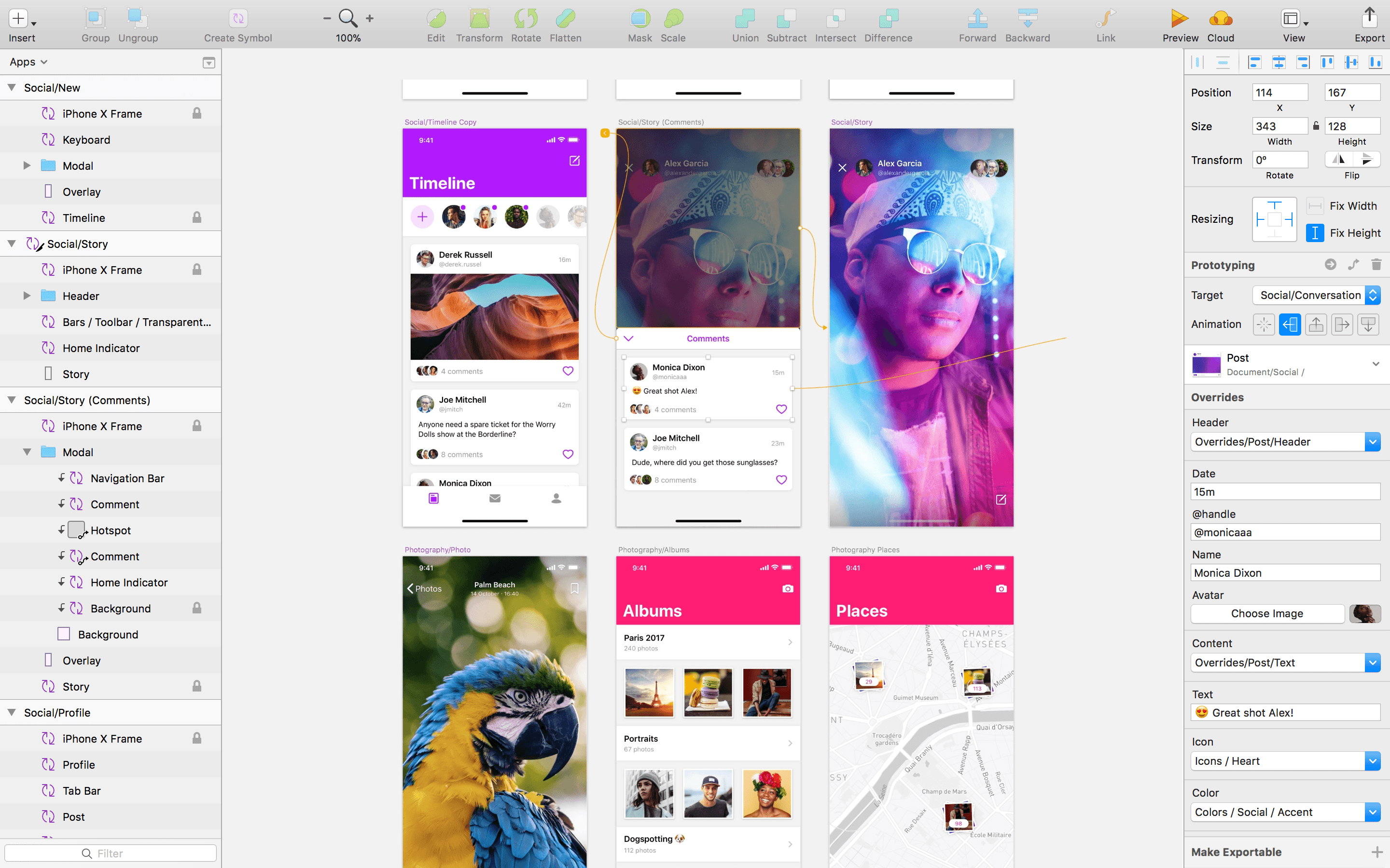
Sketch, the popular design app from Bohemian Coding, received a big update today, but perhaps the most interesting aspect of the update is the incorporation of Apple’s official iOS 11 design template. An earlier update of Sketch added Libraries, sets of design assets that can be saved, reused, and shared. With the new version of Sketch released today, those Libraries can be stored in Sketch Cloud and shared with other Sketch users who can download and subscribe to them.

The utility of the new feature is highlighted by the inclusion of Apple’s official iOS 11 UI Assets as a Shared Library.

According to Bohemian Coding:

We’re really excited to say that we’ve integrated Apple’s iOS 11 design template into Sketch, and can now offer this invaluable resource as a built-in Library.

The Apple iOS UI library has all of the components you’ll need to start working on your next project, carefully crafted for Sketch. This expansive Library includes everything, from tab bars and status bars to buttons and switches, ready to be inserted into your latest designs.

Users can download the iOS 11 design template from the Libraries tab of Sketch’s Preferences. Once downloaded, users will receive notifications of updates to the templates.

Sketch’s latest release also adds prototyping. The feature allows users to link artboards and add animated transitions. Prototypes can be previewed in Sketch, using Bohemian Coding’s Mirror iOS app, or using Sketch Cloud.

To get a sense of what can be done with Sketch’s new prototyping feature, check out the video below by Sam Beckett, who has worked with MacStories in the past on Federico’s iOS concept videos.


Aquarelo: A Beautifully-Designed Mac Color Utility

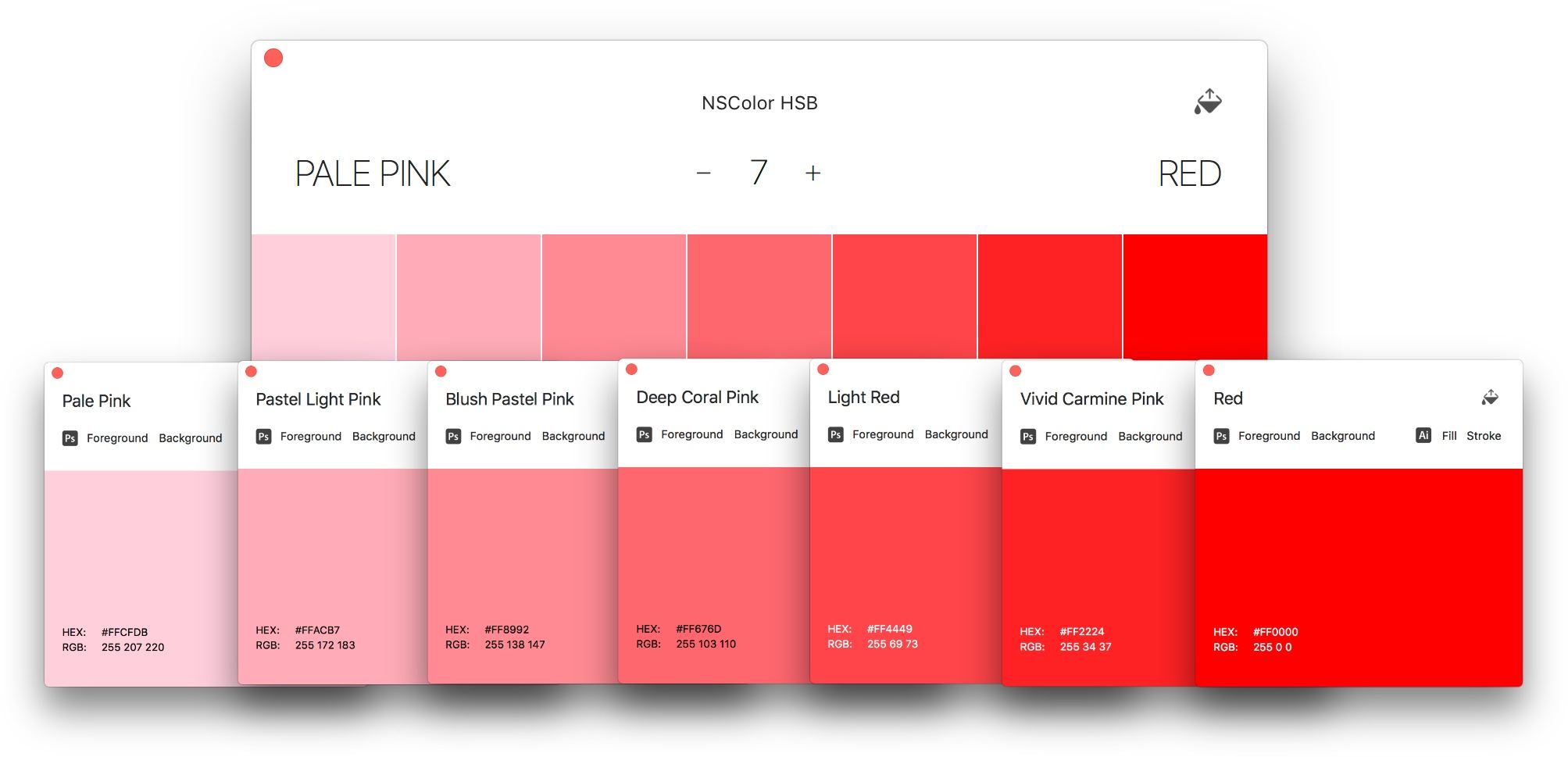
There are a seemingly endless number of ways to represent colors. Whether you’re a professional designer or developer, or someone who just wants to update a website template, you’ve undoubtedly come across several. The trouble with so many different formats is that it guarantees that at some point, the color value you have won’t be the one you require. Aquarelo is a beautifully-designed new Mac app that cuts through the thicket of formats to help you find the colors you want and convert them to the format you need.

Read more


On Ive’s Return to Design Team Management

Bloomberg’s Mark Gurman and Alex Webb reported yesterday on a change in Apple’s design team, confirmed by Apple PR with a statement:

Apple Inc.’s Jony Ive, a key executive credited with the look of many of the company’s most popular products, has re-taken direct management of product design teams.

Ive, 50, was named Apple’s chief design officer in 2015 and subsequently handed off some day-to-day management responsibility while the iPhone maker was building its new Apple Park headquarters in Cupertino, California. “With the completion of Apple Park, Apple’s design leaders and teams are again reporting directly to Jony Ive, who remains focused purely on design,” Amy Bessette, a company spokeswoman, said Friday in a statement.

I don’t know what to think about this. I never assumed Ive would leave Apple after Apple Park was completed. From the outside, we can only infer that his return to managing the design team is important enough for Apple to issue an official statement and remove Design VPs Dye and Howarth from the Leadership page.

Benjamin Mayo also raises a good point:

It’s hard to parse what this means because nobody on the outside really has a good idea of what the title change two years ago meant. Jony Ive’s elevation to Chief Design Officer felt like the first steps to his retirement with Howarth and Dye taking up the posts of lead hardware and software design.

Yet, Apple never tipped its hand that Ive was on the way out. I expected Howarth and Dye to slowly start appearing in keynote presentation videos, in interviews, and new product marketing. Ive would slowly fade from relevance in Apple’s public relations before he left for real. That simply didn’t happen. If anything, Ive became even more intertwined into Apple’s public image. He has done countless interviews and photo shoots in the intervening years.

Permalink

Jony Ive and an Apple Park Architectural Lead on Apple’s New Headquarters and Design

Wallpaper Magazine’s Nick Compton has an extensive interview with Foster + Partners’ Stefan Behling, one of the lead architects of Apple Park, and Apple’s Chief Design Officer, Jony Ive. There are a lot of great details about Apple Park and the Steve Jobs Theater in the article, including this from Behling on constructing a roof on the theater that appears to hover in space:

A network of 44 conduits, carrying electricity, data and sprinkler systems, is housed in three-quarter-inch strips of aluminium in-between the theatre’s glass surrounds. The carbon-fibre roof, tested, built and unbuilt in Dubai, was made the same way you make the hulls of racing yachts and weighs just 80 tons. ‘This is the first time in the history of mankind that this has been done,’ says Behling. ‘It’s the biggest carbon-fibre roof of its kind in the world. If you are serious about achieving something like this, and making it look effortless, you have to go all out. And that does mean doing something that has never been done before.’

Jony Ive has a lot to say about Apple Park too. In response to criticism that the building isn’t sufficiently configurable he says:

Our building is very configurable and you can very quickly create large open spaces or you can configure lots of smaller private offices. The building will change and it will evolve. And I’m sure in 20 years’ time we will be designing and developing very different products, and just that alone will drive the campus to evolve and change. And actually, I’m much more interested in being able to see the landscape, that is a much more important capability.’

Ive also talks about Apple’s design philosophy in general noting that his team’s goal is to ‘get design out of the way.’ However, my favorite part of the interview is Ive’s insight that with every new product, two are actually created:

‘When I look back over the last 25 years, in some ways what seems most precious is not what we have made but how we have made it and what we have learned as a consequence of that,’ he says. ‘I always think that there are two products at the end of a programme; there is the physical product or the service, the thing that you have managed to make, and then there is all that you have learned. The power of what you have learned enables you to do the next thing and it enables you to do the next thing better.

Wallpaper’s interview is a must-read for anyone intrigued by Apple Park and Apple’s approach to design.

Permalink

Pixelmator Pro Announced

Just before WWDC, the Pixelmator team teased a Mac app they’ve been working on for five years. The big reveal came today with an announcement that Pixelmator Pro will be joining the Pixelmator family of image editing apps this fall. Reimagined and rebuilt from the ground up, Pixelmator Pro promises a whole new level of power and ease-of-use.

According to the announcement:

“Pixelmator Pro provides every tool you could ever need to create, edit, and enhance your images on a Mac in an incredibly intuitive and accessible interface”, said Saulius Dailide, one of the founders of the Pixelmator Team. “And with its GPU-powered, machine learning-enhanced tools, it’s truly one of the most advanced and innovative image editing apps on the planet.”

I haven’t tried Pixelmator Pro yet, but judging from the announcement, I expect we’re in for a treat. The most noticeable thing about the new app is its striking UI. Gone are the floating toolbars, replaced by left and right-hand side panels that fade into the background, so the image you’re working on dominates your workspace. I like the one window approach a lot, if for no other reason than I know exactly where my tools are at all times. The combination of a minimalistic toolbar, sparse chrome around the panels, use of transparency, dark interface, and ability to hide UI elements give Pixelmator Pro an expansive feel that emphasizes the image in your workspace instead of the tools.

The changes announced go much deeper than just a redesign, though. The Pixelmator team has taken the opportunity to incorporate the latest Apple technologies and harness Machine Learning. Pixelmator Pro’s editor takes advantage of a Mac’s GPU using Metal 2, the graphics framework announced at WWDC that will debut with macOS X High Sierra. CoreML, also announced at WWDC, will drive much of Pixelmator Pro’s editing engine according to the announcement. There’s also support for the new HEIF image file format.

Also, editing in Pixelmator Pro will be non-destructive:

Pixelmator Pro’s color adjustments, effects, styles, and layouting tools are completely nondestructive, giving users the freedom and flexibility to go back and modify or delete individual changes at any point in the editing workflow. Thanks to the new presets feature, you can create endless combinations of multiple adjustments, effects, or styles, save them to your favorites and reuse them in any of your images. Drag-and-drop sharing also makes it a breeze to share presets with others.

I expect the ability to share combinations of effects, styles, and adjustments will be especially popular.

Pixelmator Pro will be available exclusively from the Mac App Store this fall alongside the current Pixelmator app.