This Week's Sponsor:

PowerPhotos

The Ultimate Toolbox for Photos on the Mac


Posts tagged with "developers"

Apple Tweaks Design Of App Store Category Pages

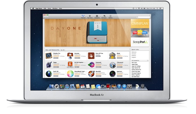
In its weekly App Store refresh, it appears Apple has today tweaked the design of App Store categories to include the same design of the App Store’s home page. By heading to a category like Productivity or Utilities, both from an iOS device or Mac, you can see how Apple is featuring more apps with large banners across the top of a category page, smaller banners in the middle, and the usual “New and Noteworthy” and “Essential” collections that are updated on a weekly basis. Read more


Apple Confirms iTunes Connect Holiday Shutdown December 21-28

In an email sent to developers earlier today, Apple has confirmed that iTunes Connect — the developer portal to manage applications to sell in the App Store — will be closed from December 21 to December 28. During the shutdown, access to iTunes Connect and delivery of any apps or updates will not be available.

iTunes Connect will be temporarily shut down from Friday, December 21, 2012 to Friday, December 28, 2012, for the winter holidays.

[…]

Additionally, the following will be delayed:

Releases scheduled to appear on the App Store for the first time

Pricing changes scheduled through the interval pricing system in iTunes Connect

For the shutdown period, Apple suggest developers to not schedule price changes that would take effect between Friday, December 21 and Friday, December 28. According to Apple, price changes scheduled for the shutdown week will not take effect, and “In-App Purchase will become unavailable for purchase until after the shutdown”.

Last year, Apple shut down iTunes Connect for developer from December 22 to December 29.


The Value Of In-App Purchases

punch quest

punch quest

The Verge writes about to commercial failure of the first version of Punch Quest, a new game by Rocketcat Games:

But the reality was much different. Despite surpassing 600,000 downloads, Punch Quest only just crossed into the five figure range in terms of revenue. “The really scary thing is that profits tend to drop off sharply a week after an app’s out,” Auwae says. “I hear it’s a bit better for free apps, but a paid app often makes most of its money in the first week of being out.”

Figuring out where the problem lies is a difficult task. Punch Quest seems to have done many things right, with a game that has proved popular with a wide audience and was designed from the beginning with the concept of IAP in mind, but obviously something is missing. “There’s a lot of stuff that could be wrong,” says Auwae, “but we’re just not sure.

Earlier this year, our Graham Spencer wrote an extensive feature story on the state of game In-App Purchases, the best practices for developers, and reactions from users to various kinds of IAPs. He concluded:

On the other hand, people are much more appreciative of paying for something that is more tangible — like more levels or new game modes. They are more substantial than a new gun, or some in-game coins that can buy you a power-up. I think this feeling is amplified when a user moves on from a game and looks back at what they payed for. If they were just buying currency for power-ups, there really isn’t anything to show for that money that they once spent. On the other hand if they bought a new game mode, they can see that additional mode and if they decide to come back to the game at a later date, they’ll still have that and be able to take advantage of it.

As Andrew Webster wrote at The Verge, I think Punch Quest’s case is primarily an issue of perceived value. I don’t think Punch Quest’s virtual currency-like model for IAP is a sustainable model.

On the other hand, I don’t think it’s a problem of “small Buy button” (as suggested by The Verge): Loren Brichter’s Letterpress is a different genre, but some mechanics of revenue generation with IAP are comparable with Punch Quest. Loren said he didn’t make any “IAP optimization” to guide users towards spending money, yet Letterpress is a success. I believe it ultimately goes down to the fact that Letterpress’ IAP feels like a must-have, as I wrote in my review.

I think it’s a smart move, because Letterpress’ in-app purchase is a must-have so, essentially, you’ll be purchasing a $0.99 paid app. In this case, the “free” price tag is an illusion to draw more customers to download the app right away: think of it as a “trial” version of the real Letterpress. This is what the App Store dynamics have become, and Brichter is simply experimenting with something completely new for him while playing by the market’s rules. Because while I could go by without themes – I just use the default one – more simultaneous games and played words is what you’re really looking after.

Punch Quest doesn’t make me feel like I’m missing out. It doesn’t leverage the addictive nature of the game to draw me to the IAP options; at the contrary, the fact that it’s easy to collect currency in the game makes me feel like the IAP is unnecessary: I can play this because I like it and I’ll collect coins anyway.

Letterpress, on the flip side, doesn’t trade your time for options. You’re always going to miss themes and simultaneous games if you don’t pay. The IAP of Letterpress is an exclusive option that is based on the game’s essence: playing games against friends. You like this game so much you want to play more games? Then pay. Otherwise, you won’t have the feature. Simple and effective.

With In-App Purchases, I want to feel like I’m paying for something that I need. Even better, I want that to be more than a feeling: it’s got to be a fact.

Personally, I believe developers shouldn’t settle on “established” ways to implement IAPs. For instance, despite the completely different category, I like what iThoughts HD is doing with IAP: the regular app is $9.99 and already a sustainable business model, but if you want, you can pay more. Paying $3.99 for the IAP will unlock “Early Access” features, which include things like Search and Doodling on mind maps. These are features that will come to the main app eventually, but you can pay to get them now.

iThoughts’ IAP works from both technical and conceptual perspectives. By paying, you know you’re supporting the ongoing development of an app you like, and that is a powerful concept by itself. But, at the same time, you’re also getting new features before other people – you’re unlocking new exclusive stuff. Features that make the app better and that are cleverly targeted at people who use iThoughts on a regular basis. It feels like a must-have.

It’s marketed differently, but iThoughts’ IAP is actually very similar to Letterpress: it understands the app’s user base and allows customers to get more functionality by paying.

In-App Purchases are tricky. To get a complete overview of this phenomenon in games, I still recommend reading Graham’s story from June, which includes various surveys with developers and users. Overall, I believe IAPs can be a stable (and possibly more intelligent) business model, but developers should consider the value perceived by their customers before and after the purchase.


Automatically Convert .iconset to .icns with Drag & Drop

Automatically Convert .iconset to .icns with Drag & Drop

Earlier today I indirectly asked on App.net and Twitter if there was a way to automate the process of converting sets of icons for non-Retina and Retina devices. On its developer documentation, Apple recommends using iconutil and tiffutil to convert application icons and graphic resources, respectively. Once you’ve packaged, for instance, .png files inside an .iconset folder, you should fire up the Terminal, and run the command for the .iconset folder you want to convert. How about automating the process for batch conversion of multiple files?

As it often turns out, if you can think about it, then someone likely already blogged about it. Jono Hunt wrote a drag & drop utility earlier this year to do just that: select multiple .iconset folders, drop them onto the app, receive converted .icns files.

Apple have changed the way you should compile .icns files used for Mac application icons. Instead of using Icon Composer you should now use the “iconutil” Terminal command with .png images contained in folders with the .iconset extension. I created an AppleScript droplet to simplify the process. Just drag the .iconset folder containing your .png files on to the app to easily create a retina ready .icns icon.

Jono has also released versions of the script that work with Alfred and Automator. He also build a counterpart for tiffutil, available for download here.

Permalink

Apple Changing App Store Prices for Several Countries

Section on VAT clarified, more updates at the bottom of the article.

As pointed out by several readers on Twitter, Apple appears to be changing pricing tiers of App Store applications in several European countries. Specifically, the lowest price used to be €0.79, which has today been bumped to €0.89. We’ve been able to confirm this is indeed the case, as shown in the screenshot above, taken from the Italian App Store.

So far, we’ve received notices of App Store pricing changes in:

  • Italy
  • Spain
  • Netherlands
  • Portugal
  • Greece
  • Poland
  • Germany
  • France
  • Belgium
  • Austria
  • Czech Republic
  • Denmark
  • Luxembourg
  • Hungary
  • Russia
  • Ireland
  • Finland

Read more


“App Collections” Promoted To App Store Categories Menu

Since the launch of iOS 6 on September 19th, we’ve been tracking Apple’s efforts to promote a new section of the App Store called “App Collections”. In late June 2012, Apple launched  “Game Collections”, which highlighted all the previous game “bundles” Apple had featured on the App Store. For the past couple of years, in fact, Apple has been handpicking apps and games and featuring them in standalone sections often promoted on the front page or elsewhere throughout the Store. For games, such sections included “Big Name Games” and “Benchmark Games”.

However, Apple often launched new sections while forgetting to add new content to existing ones; furthermore, there wasn’t a unified place to browse all the sections launched by Apple through the years. But we’ve noticed a change in the past months: with a revamp of the Editor’s Choice and App of the Week initiatives, Apple also started paying more attention to the curation and discovery aspects of sections. They started by adding new content and launching Game Collections in June; with iOS 6, they created App Collections and featured it in the App Store’s rotating banners; and now, they’re featuring App Collections directly in the Categories menu.

Both on the iPhone and Mac, App Collections are available from the Categories menu of the App Store. On iTunes, they are listed as “iPhone App Collections” and “iPad App Collections”. Interestingly, the iPad’s Categories still hasn’t been updated with the new option.

Apple’s description of App Collections makes it clear they are featuring apps that have been “personally tested”:

With hundreds of thousands of apps on the App Store, how do you find the apps you’ll love using? You’re in the right place – we’ve gathered our favorites here. Every app in these collections is personally tested and recommended by our editors. Whatever you do with your iPhone, iPad, or iPod touch – shopping, watching movies, editing photos, and beyond – you’ll find apps that work smartly and beautifully.

Right now, there are 20 sections inside App Collections:

This may appear like a minor change, but it is, in fact, a signal of a major shift that could soon happen to the App Store’s discovery dynamics. As the App Store grows bigger in terms of available content, it’ll become harder for users to find the app they’re looking for, just like Apple says. Search doesn’t help when you don’t know what you need yet, and there’s only so much space Apple can give to weekly “New and Noteworthy” apps on the Store’s front page.

An up-to-date, lovingly curated collection of app bundles may become the best way for users to discover new apps. More importantly, app collections will put the focus on what an app does, rather than how it performs in the charts. It is a profound change for developers and users.

In my iOS 6 review, I noted how categories had been given a more prominent spot in the App Store’s top toolbar. As I wrote:

The good news for developers is that, with iOS 6, browsing single categories (not their top charts) may now be more accessible and visible to the end user: whereas in iOS 5 some always ignored the Categories tab in the bottom bar, a button to access every category is now available directly from the front page

Essentially, Apple is now treating App Collections as a category that deserves a user’s attention just like “Games” or “Productivity”. It wouldn’t be a surprise, at this point, to see more options like filters coming soon to App Collections as Apple invests more in it.

Last, App Collections highlights the human aspect of apps that are tested and recommended by Apple editors. We’ve long debated the importance of human curation in the App Store, but I think The Iconfactory’s Craig Hockenberry summed it up best in our App Store overview from May: “A movie recommendation from Roger Ebert means a lot more to me than a computer generated ranking based on reviewer scores. Automated systems can help, but I think it’s the personal touch that’s missing”.


Average App Size Increased By 16% Since March

Average App Size Increased By 16% Since March

MacRumors points to new data by ABI Research, showing that, since March 2012, the average app size has increased by 16%:

The iPad 3’s Retina display and Apple’s more liberal submission policy have caused the file sizes of leading iOS apps to grow substantially, especially in games. The latest data from ABI Research shows that the global average app size across all categories was 23 megabytes in September, 16% more than in March.

On March 1, I wrote:

I see two solutions. Either Apple gets the carriers to agree to larger download sizes, establishing a new “average” that should work for most apps (let’s say 60 MB as Panzarino suggests), or they rebuild the download mechanism completely by allowing devices to “ignore” resources they don’t need. The second solution would be a “cleaner” approach, in that it would address the root of this likely scenario — that is, devices downloading apps containing all kinds of images and resources for Retina and non-Retina displays.

As we know, Apple decided to increase the maximum download size over cellular to 50 MB. This, combined with LTE networking, has allowed developers to be more relaxed in regards to their app sizes, and users to have reasonable download times on 4G (or DC-HSDPA). The solution I proposed earlier this year – a way to identify which assets to download for an app on a specific device – would still require a major rework of iOS.

Due to international pricing, this year I had to get a 16 GB iPhone 5. But I regret my decision. Something we’ve learned in the past two years (since the Retina display was introduced in 2010) is that that app sizes are only going up, and you’re never going to wish you got a device with less capacity. You’ll either be fine, or want more. With the iPhone 5 and Retina + Universal games, I find myself having to keep an eye on my available space, which is something I despise doing.

For the future, I hope 32 GB will become the new 16 GB, and I’m looking forward to 128 GB iPhones and iPads.

Permalink

Good App Store Screenshots

Good App Store Screenshots

Speaking of good App Store practices for developers, Jen Gordon published (via Jeremy Olson) a nice overview detailing how users browse the App Store looking for screenshots and icons.

An app with a fantastic interface design will definitely increase sales. However, if all you publish are plain screenshots sans description of features and benefits – you’re missing a HUGE selling opportunity.

In the new iOS 6 App Store, icons and screenshots are more relevant than ever. Particularly with the new “cards” interface for search and genius, the application icon and first screenshot are what users immediately tend to look at, as titles get cut off after 12-15 characters and ratings have a smaller font than iOS 5.

On the other hand, because (on the iPhone) cards are displayed one after the other, developers have more chances to catch a user’s attention with good icons and screenshots. While swiping through search results, beautiful icons get immediately noticed, but the first screenshot has to instantly communicate the main purpose of the app, while showing some elements of its interface. It’s undoubtedly hard to find the right balance between communication and appearances (the coolest part of the UI might not be the most informative), but developers need to keep in mind that just like cards can get an app more visibility, it’s easy to swipe away to the next result.

Permalink

Dissecting The iOS 6 App Store

Dissecting The iOS 6 App Store

Justine Pratt has published (via TUAW) a very thorough overview of the new App Store in iOS 6.

The new AppStore, especially the cards, was really designed for the iPad and the faster processor of the iPhone5. Finally the stores on both devices are common, which should help increase the familiarity when browsing both stores. On older devices, the icons and graphics are slow to load and the cards are slow to scroll on the iPhone. This situation is only temporary, as new devices are released and adopted.

In my iOS 6 review, I took an extensive look at the App Store, its new features, and its most apparent shortcomings; Justine does a much better job at carefully analyzing every single section and change in App Store layout and category organization. I also learned a few tidbits from her overview, such as the new positioning of the “App Support” button next to reviews.

Interestingly, we both came to the conclusion that the new App Store seems to really be optimized for the iPad in terms of layout. In the past few weeks, following the release of iOS 6, I’ve heard quite a few people saying that the opposite was true – that the cards layout was meant for the iPhone first, and eventually brought to the iPad with a larger UI design.

Overall, the App Store still has several visible and deeply annoying bugs that hinder the performance of search, Genius, and Purchased History. Apple still hasn’t fixed many of these, and the improved speed of the iPhone 5 only partially contributes to making the browsing experience slightly better.

As I wrote in my review, there are still some noteworthy additions and changes for developers in the new App Store, so make sure to check out Justine’s article for a detailed analysis.

Permalink