Posts tagged with "developers"

Apple Changing App Store Prices for Several Countries

Section on VAT clarified, more updates at the bottom of the article.

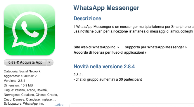
As pointed out by several readers on Twitter, Apple appears to be changing pricing tiers of App Store applications in several European countries. Specifically, the lowest price used to be €0.79, which has today been bumped to €0.89. We’ve been able to confirm this is indeed the case, as shown in the screenshot above, taken from the Italian App Store.

So far, we’ve received notices of App Store pricing changes in:

  • Italy
  • Spain
  • Netherlands
  • Portugal
  • Greece
  • Poland
  • Germany
  • France
  • Belgium
  • Austria
  • Czech Republic
  • Denmark
  • Luxembourg
  • Hungary
  • Russia
  • Ireland
  • Finland

Read more


“App Collections” Promoted To App Store Categories Menu

Since the launch of iOS 6 on September 19th, we’ve been tracking Apple’s efforts to promote a new section of the App Store called “App Collections”. In late June 2012, Apple launched  “Game Collections”, which highlighted all the previous game “bundles” Apple had featured on the App Store. For the past couple of years, in fact, Apple has been handpicking apps and games and featuring them in standalone sections often promoted on the front page or elsewhere throughout the Store. For games, such sections included “Big Name Games” and “Benchmark Games”.

However, Apple often launched new sections while forgetting to add new content to existing ones; furthermore, there wasn’t a unified place to browse all the sections launched by Apple through the years. But we’ve noticed a change in the past months: with a revamp of the Editor’s Choice and App of the Week initiatives, Apple also started paying more attention to the curation and discovery aspects of sections. They started by adding new content and launching Game Collections in June; with iOS 6, they created App Collections and featured it in the App Store’s rotating banners; and now, they’re featuring App Collections directly in the Categories menu.

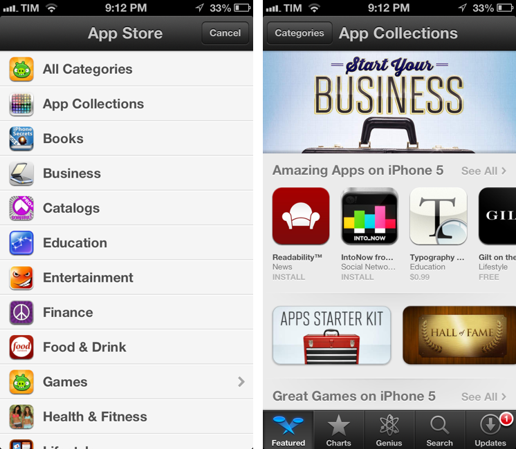
Both on the iPhone and Mac, App Collections are available from the Categories menu of the App Store. On iTunes, they are listed as “iPhone App Collections” and “iPad App Collections”. Interestingly, the iPad’s Categories still hasn’t been updated with the new option.

Apple’s description of App Collections makes it clear they are featuring apps that have been “personally tested”:

With hundreds of thousands of apps on the App Store, how do you find the apps you’ll love using? You’re in the right place – we’ve gathered our favorites here. Every app in these collections is personally tested and recommended by our editors. Whatever you do with your iPhone, iPad, or iPod touch – shopping, watching movies, editing photos, and beyond – you’ll find apps that work smartly and beautifully.

Right now, there are 20 sections inside App Collections:

This may appear like a minor change, but it is, in fact, a signal of a major shift that could soon happen to the App Store’s discovery dynamics. As the App Store grows bigger in terms of available content, it’ll become harder for users to find the app they’re looking for, just like Apple says. Search doesn’t help when you don’t know what you need yet, and there’s only so much space Apple can give to weekly “New and Noteworthy” apps on the Store’s front page.

An up-to-date, lovingly curated collection of app bundles may become the best way for users to discover new apps. More importantly, app collections will put the focus on what an app does, rather than how it performs in the charts. It is a profound change for developers and users.

In my iOS 6 review, I noted how categories had been given a more prominent spot in the App Store’s top toolbar. As I wrote:

The good news for developers is that, with iOS 6, browsing single categories (not their top charts) may now be more accessible and visible to the end user: whereas in iOS 5 some always ignored the Categories tab in the bottom bar, a button to access every category is now available directly from the front page

Essentially, Apple is now treating App Collections as a category that deserves a user’s attention just like “Games” or “Productivity”. It wouldn’t be a surprise, at this point, to see more options like filters coming soon to App Collections as Apple invests more in it.

Last, App Collections highlights the human aspect of apps that are tested and recommended by Apple editors. We’ve long debated the importance of human curation in the App Store, but I think The Iconfactory’s Craig Hockenberry summed it up best in our App Store overview from May: “A movie recommendation from Roger Ebert means a lot more to me than a computer generated ranking based on reviewer scores. Automated systems can help, but I think it’s the personal touch that’s missing”.


Average App Size Increased By 16% Since March

Average App Size Increased By 16% Since March

MacRumors points to new data by ABI Research, showing that, since March 2012, the average app size has increased by 16%:

The iPad 3’s Retina display and Apple’s more liberal submission policy have caused the file sizes of leading iOS apps to grow substantially, especially in games. The latest data from ABI Research shows that the global average app size across all categories was 23 megabytes in September, 16% more than in March.

On March 1, I wrote:

I see two solutions. Either Apple gets the carriers to agree to larger download sizes, establishing a new “average” that should work for most apps (let’s say 60 MB as Panzarino suggests), or they rebuild the download mechanism completely by allowing devices to “ignore” resources they don’t need. The second solution would be a “cleaner” approach, in that it would address the root of this likely scenario — that is, devices downloading apps containing all kinds of images and resources for Retina and non-Retina displays.

As we know, Apple decided to increase the maximum download size over cellular to 50 MB. This, combined with LTE networking, has allowed developers to be more relaxed in regards to their app sizes, and users to have reasonable download times on 4G (or DC-HSDPA). The solution I proposed earlier this year – a way to identify which assets to download for an app on a specific device – would still require a major rework of iOS.

Due to international pricing, this year I had to get a 16 GB iPhone 5. But I regret my decision. Something we’ve learned in the past two years (since the Retina display was introduced in 2010) is that that app sizes are only going up, and you’re never going to wish you got a device with less capacity. You’ll either be fine, or want more. With the iPhone 5 and Retina + Universal games, I find myself having to keep an eye on my available space, which is something I despise doing.

For the future, I hope 32 GB will become the new 16 GB, and I’m looking forward to 128 GB iPhones and iPads.

Permalink

Good App Store Screenshots

Good App Store Screenshots

Speaking of good App Store practices for developers, Jen Gordon published (via Jeremy Olson) a nice overview detailing how users browse the App Store looking for screenshots and icons.

An app with a fantastic interface design will definitely increase sales. However, if all you publish are plain screenshots sans description of features and benefits – you’re missing a HUGE selling opportunity.

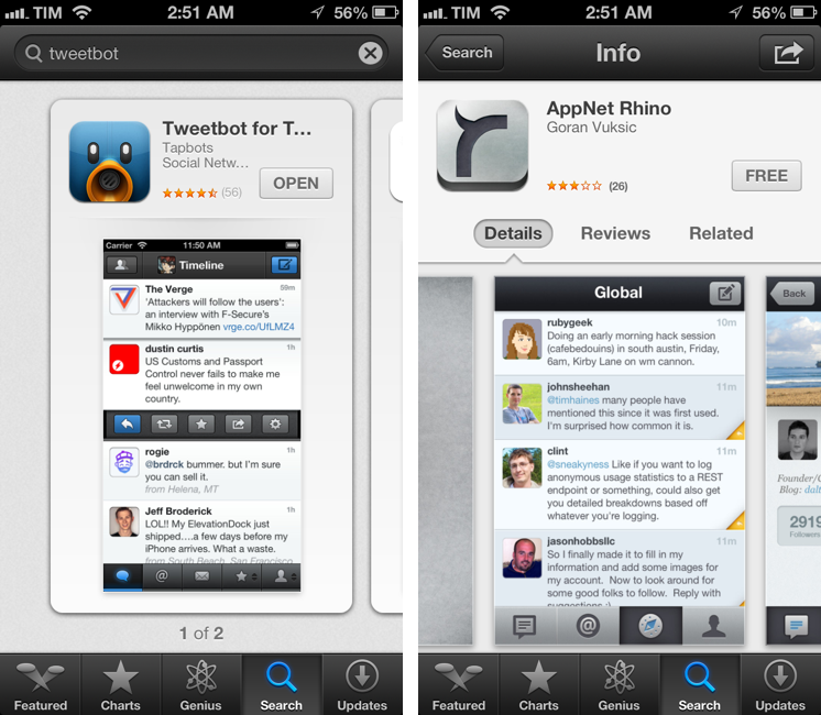
In the new iOS 6 App Store, icons and screenshots are more relevant than ever. Particularly with the new “cards” interface for search and genius, the application icon and first screenshot are what users immediately tend to look at, as titles get cut off after 12-15 characters and ratings have a smaller font than iOS 5.

On the other hand, because (on the iPhone) cards are displayed one after the other, developers have more chances to catch a user’s attention with good icons and screenshots. While swiping through search results, beautiful icons get immediately noticed, but the first screenshot has to instantly communicate the main purpose of the app, while showing some elements of its interface. It’s undoubtedly hard to find the right balance between communication and appearances (the coolest part of the UI might not be the most informative), but developers need to keep in mind that just like cards can get an app more visibility, it’s easy to swipe away to the next result.

Permalink

Dissecting The iOS 6 App Store

Dissecting The iOS 6 App Store

Justine Pratt has published (via TUAW) a very thorough overview of the new App Store in iOS 6.

The new AppStore, especially the cards, was really designed for the iPad and the faster processor of the iPhone5. Finally the stores on both devices are common, which should help increase the familiarity when browsing both stores. On older devices, the icons and graphics are slow to load and the cards are slow to scroll on the iPhone. This situation is only temporary, as new devices are released and adopted.

In my iOS 6 review, I took an extensive look at the App Store, its new features, and its most apparent shortcomings; Justine does a much better job at carefully analyzing every single section and change in App Store layout and category organization. I also learned a few tidbits from her overview, such as the new positioning of the “App Support” button next to reviews.

Interestingly, we both came to the conclusion that the new App Store seems to really be optimized for the iPad in terms of layout. In the past few weeks, following the release of iOS 6, I’ve heard quite a few people saying that the opposite was true – that the cards layout was meant for the iPhone first, and eventually brought to the iPad with a larger UI design.

Overall, the App Store still has several visible and deeply annoying bugs that hinder the performance of search, Genius, and Purchased History. Apple still hasn’t fixed many of these, and the improved speed of the iPhone 5 only partially contributes to making the browsing experience slightly better.

As I wrote in my review, there are still some noteworthy additions and changes for developers in the new App Store, so make sure to check out Justine’s article for a detailed analysis.

Permalink

iOS 6 and Developers

iOS 6 and Developers

Over at TidBITS, Matt Neuburg has posted a clear and concise overview of what iOS 6 means for third-party developers. Among the mentioned technical changes, he talks about UICollectionView:

The major new widget that will have the biggest impact on app interfaces is the collection view. A collection view is like a table view on steroids. A table view is the scrolling column of cells commonly seen in any master–detail app where a list must be displayed; Settings, Mail, and Music are familiar examples. A collection view breaks the bonds of the single vertically scrolling column, so you can expect, in short order, to see horizontally scrollable rows of data, multicolumn tables, and grids of information.

While web-based, some of the conventions of the new App Store in iOS 6 (horizontal-scrolling lists, grids) could be replicated with UICollectionView. I’d argue that many of the changes brought to the App Store are actually making some parts of search and discovery worse, but that’s not the point.

What matters is that, with each new version of iOS, developers are given more powerful tools to build new apps and refine existing ones. As I wrote in my piece about iOS 6, Apple understands “the importance of a healthy developer ecosystem that sets iOS apart from the competition”.

To get a good overview of the changes for developers in iOS 6, I recommend reading Matt’s article.

Permalink

Droplr, Mac App Store, and Sandboxing

Droplr, Mac App Store, and Sandboxing

The developers of Droplr, a sharing utility for OS X, have announced that in order to release version 3.0 of their app on the Mac App Store, they will have to tweak the app’s “upload from Finder” functionality to comply with Apple’s rules.

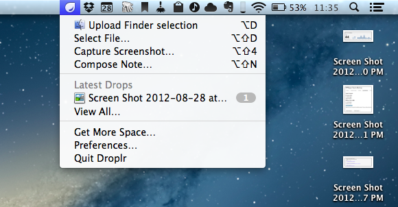
The primary difference will be in the use of the global hotkey (opt+d by default) to share the currently selected item(s) in the Finder. The standalone version will continue to work as it always has, simply select something in the Finder, use the key combination, and that item will be uploaded to Droplr. For the Mac App Store version, when the key combination is triggered with the Finder active, instead of uploading the currently selected items, it will present you with an “open file” dialog where you’ll need to navigate to the item(s) you’d like to share and select them. We don’t believe this provides the best experience, but we do believe it’s an acceptable tradeoff to be able to remain in the Mac App Store, especially given many of our users don’t use the key combination as a primary method of sharing with Droplr.

This update from the Droplr team is particularly interesting as, back in May, speculation arose as to whether Apple would start rejecting any app with “global hotkey functionality” on June 1, when the company began enforcing its new Sandboxing policies for Mac App Store apps. As it turned out, the rumor didn’t specify which kind of apps would fall under Apple’s ban, but several third-party developers confirmed their applications carrying similar functionality went through Apple’s approval process.

However, it appears the “issue” with Droplr 3.0 and the Mac App Store is simply related to standard Sandboxing practices, not strictly hotkeys. It is safe to assume that, per Apple’s Sandboxing implementation, an app like Droplr can’t benefit from unrestricted access to the Finder to automatically upload a file in the background. Several developers I have contacted about this issue confirmed that it’s not a surprise Apple is requiring an Open dialog to access a file outside of the Sandbox, and that this would have been true even if Droplr wasn’t combining the feature with a global hotkey. So while a calendar app can show itself with a hotkey, or a todo app can display a systemwide quick-entry panel, Sandboxing requires an app that accesses files directly (like Droplr does) to go through an Open dialog.

Read Droplr’s blog post here, and our report from May on Mac App Store apps and global hotkey functionality here.

Permalink

Mac App Store: “Not Too Soon To Be Concerned”

Mac App Store: “Not Too Soon To Be Concerned”

Following Marco Arment’s recent thoughts on the Mac App Store and the consequent debates on the future of Apple’s storefront, Macworld’s Lex Friedman talked to some third-party developers to have a better understanding of the issue.

On one hand, Arment says:

The iOS App Store’s restrictions work (“for the most part”), Arment says, “because the platform has grown around them. They mostly don’t get in the way. But on the Mac, the App Store policies are being retrofitted into a well-established environment that they’re fairly incompatible with.

I agree. As I’ve written before, the problem is that Apple let certain apps into the Mac App Store, and is now forcing developers to rethink their strategies. This has effects on those developers’ business, and the customers.

On the other hand, though, it’s important to keep in mind the advantages of the Mac App Store. James Thomson from TLA Systems says:

We’ve had PCalc in the Mac App Store since it opened, and we’ve seen noticeably higher sales from the App Store than through other channels. So, from a visibility and ease of purchase point of view, it would seem that [the Mac App Store is] a success.

Visibility and higher sales are often mentioned by developers as the reasons behind the need to stay on the App Store. But customers, too, like some aspects of the Mac App Store and, it turns out, Sandboxing. As written by Joe Macirowski:

When you think about it, the apps that don’t get along with sandboxing are doing things I now realize I don’t want my apps doing.

Ultimately, it comes down to trusting the developers you install apps from. Maybe Joe doesn’t like the fact that, theoretically, TextExpander could log every keystroke; personally, I trust the guys at Smile to be providers of a great tool for productivity, and not criminals.

As Neven Mrgan wrote, “it’s good for us Mac users that we don’t have to limit ourselves to apps from the Mac App Store”. However, it’s not good for developers that the Mac App Store can’t be trusted for the long term, and that’s not good for Apple either.

Clark is proposing an interesting solution for the future: subscriptions.

It’s becoming clear that the Mac App Store (MAS) is targeting casual software the way the iOS store (IAS) does. This means that, much like traditional pop music through the end of the 20th century, you’ll have a few hits that make most of the money. The problem is how to make money outside of that pop software market.

For my thoughts on Apple, the Mac App Store, and third-party software, read the “Mountain Lion and the Power User” section in my Mountain Lion Review.

It’s too early to tell how the issues mentioned above (sandboxing restrictions, Gatekeeper’s existence, Mac App Store vs. third-party sources) will play out in the long term. We shouldn’t ignore them either: some developers are currently struggling to keep their apps on the Mac App Store, and others are figuring out their own solutions to implement features that Apple demands remain exclusive to it. While the power user will always know how to work around Apple’s default settings, ignoring the complaints and doubts from the developer community would still be shortsighted. Instead, we should consider these issues, reflect on the questions developers pose, and hope that Apple is listening.

As usual, I prefer to wait and see what happens.

Permalink

AppBot Sends Developers A Daily Digest Containing New Reviews Of Their Apps

The Filter Squad development team (creators of Discovryesterday launched AppBot, a neat little service that’ll keep track of App Store reviews and email you a daily digest containing the latest reviews of your apps. AppBot was initially an internal tool for the two development teams but is now a free service in beta that’s bound to be helpful to some other developers who are keen to read new feedback from users but don’t want to have to take the effort of finding all the new reviews (in all the various countries).

In a blog post, Discovr’s Stuart Hall writes that despite some “not so amazing” reviews, they are a “good indication of the average user’s feeling towards your app”. By keeping a track of reviews, you can get a “good sentiment of how you are app is being perceived” - a key factor when word of mouth is such a driving factor of success on the App Store.

So the discovr team made AppBot to solve the problem of easily keeping track of new reviews of their apps from multiple countries. It neatly integrates a link to translate reviews from countries that don’t speak English and allows you to Google search the reviewer names. The app will also send you a list of Apple front page features (Editor’s Choice, New & Noteworthy etc.) to you weekly. You can sign up here and it doesn’t require access to your iTunes Connect account, so anyone can technically use AppBot to keep tabs on any new app.