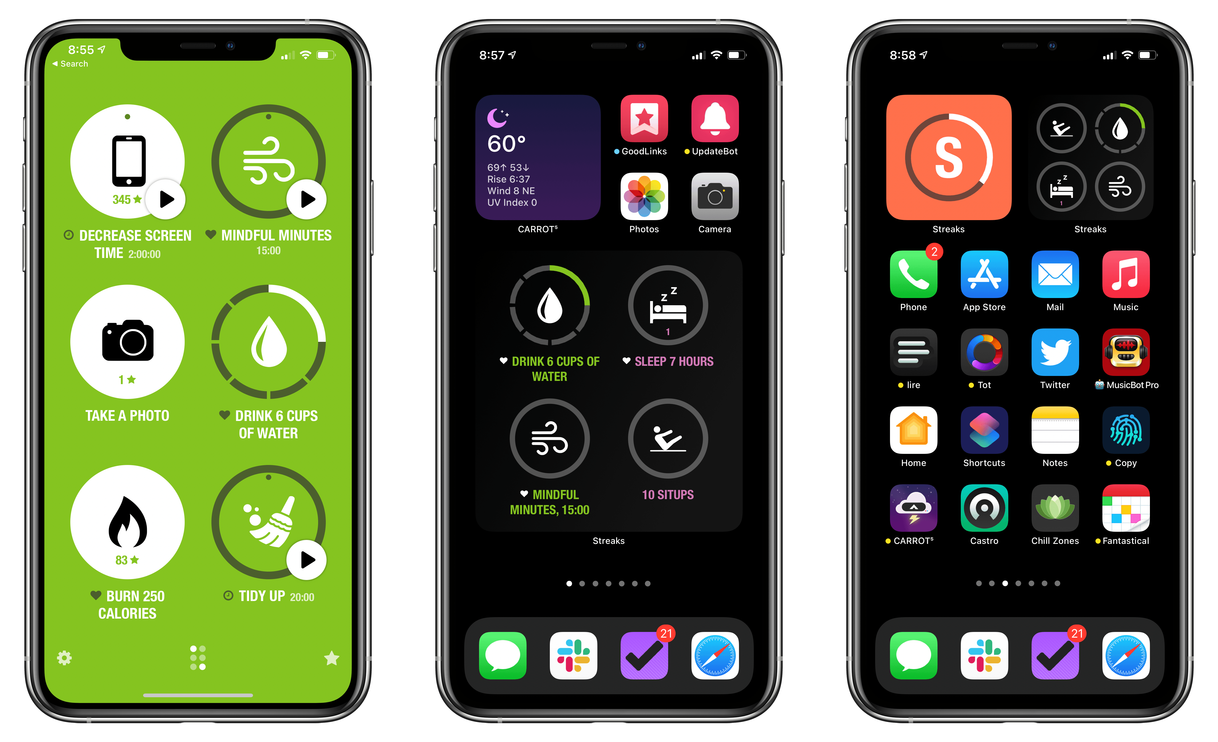
Habit tracking apps have proliferated across the App Store in recent years, but Streaks by Crunchy Bagel, which is the first one I ever tried and reviewed, is still one of my favorites. This week it’s been updated with a trio of highly-customizable widgets, a library of watch faces, plus some design changes, new iPad features, and other updates.
Posts tagged with "health"
Streaks 6 Brings Habit Tracking to Your Home Screen With Extensively Customizable Widgets
Apple Fitness+, the Newest Apple Service, Will Arrive in Late 2020 Exclusively for Apple Watch Users
Today alongside the introduction of the Apple One services bundle and new Apple Watch models, Apple also debuted a brand new paid service coming in late 2020: Apple Fitness+.
Fitness+ is designed to work exclusively with the Apple Watch, requiring an Apple Watch Series 3 or later. When it launches, it will cost $9.99/month or $79.99/year, or it’s included as part of an Apple One Premier plan – and no matter how you get it, Fitness+ will offer Family Sharing support. There will also be a 1-month free trial for all users, or three months free for anyone purchasing an Apple Watch from September 15 on.
Apple Fitness+ brings studio-style workout experiences to your Apple devices in a way that uniquely integrates with the Apple Watch. As a workout video plays, live metrics from your Watch will display in the corner of the screen so you can easily keep track of things like the duration of your workout, heart rate, and calories burned. You’ll also see your Activity rings on-screen, providing convenient updates on your progress as you exercise.
Apple One: The Long-Awaited Services Bundle Is Coming Soon in Three Tiers
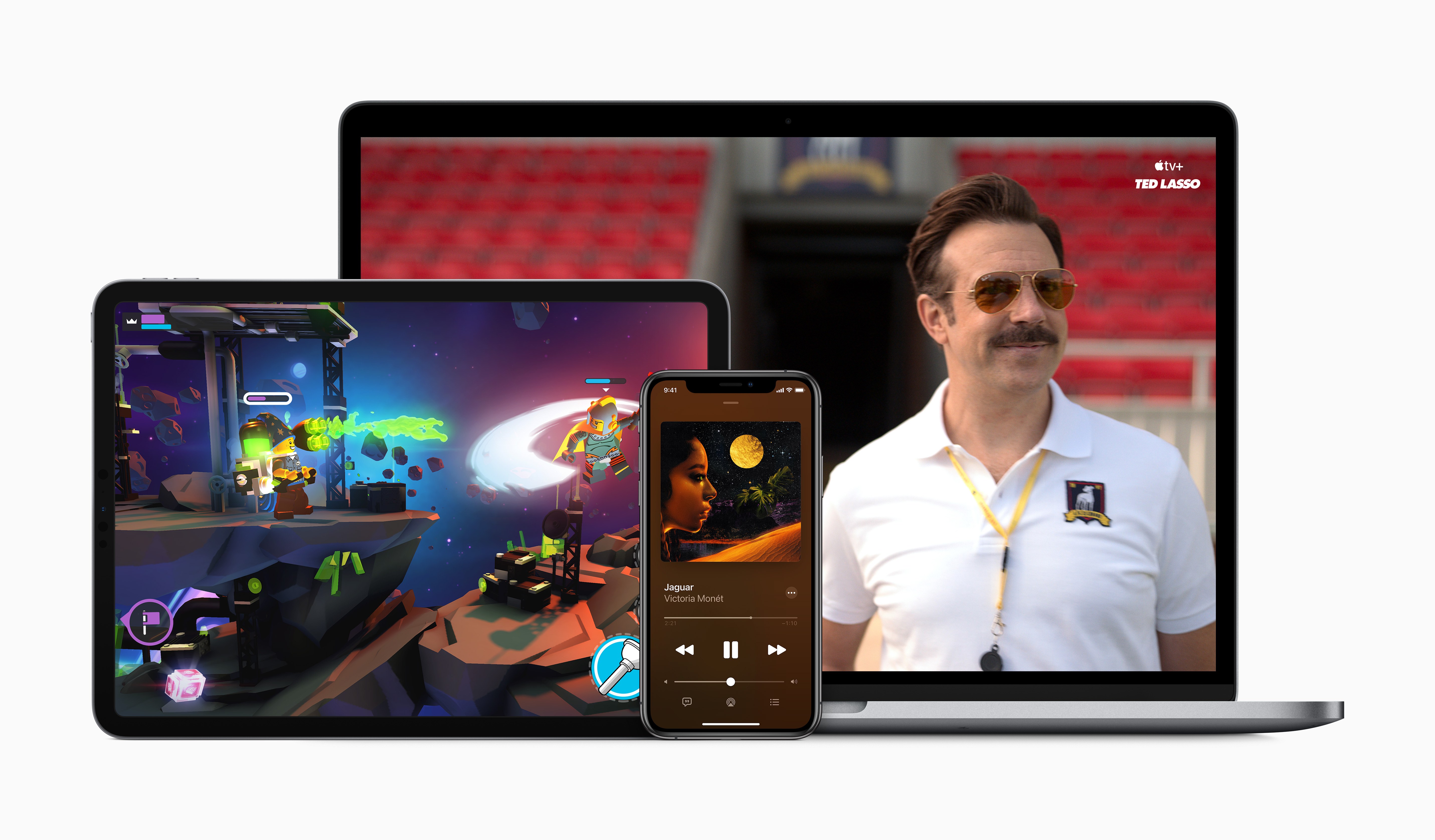
Today during an event in which Apple revealed new Apple Watch and iPad models, the company also had some big services news to share: to increase adoption of the company’s growing slate of services, a new Apple One bundle will be launching soon to bring together multiple paid services at a discounted price.
Although Apple One doesn’t carry an official release date yet besides simply ‘fall,’ Apple did detail the breakdown of pricing and included services across three different Apple One tiers:
- Individual: Includes Apple Music, TV+, Arcade, and 50 GB of iCloud storage for an individual at $14.95/month, a savings of $6/month.
- Family: Also includes Apple Music, TV+, and Arcade, but with 200 GB of iCloud storage and Family Sharing for all services, at $19.95/month for savings of $8/month.
- Premier: This is the big bundle, including Apple Music, TV+, Arcade, News+, the newly announced Fitness+, as well as 2 TB of iCloud storage for $29.95/month, a savings of $25/month.
The Individual and Family tiers of Apple One will be launching in over 100 countries to reach the widest number of users possible. Premier, however, since it includes services like News+ which are only available in limited territories, will only be available in the US, UK, Canada, and Australia at launch.
When Apple One launches, users will be able to try any of the three tiers with a 30-day free trial for services that they aren’t already paying for. It’s also worth noting that according to Apple’s website, Fitness+ likely won’t be available until after Apple One debuts, since it carries a launch window of ‘Late 2020’ while Apple One is ‘Coming this fall.’
Apple One’s tiered structure makes a lot of sense, and the savings seem pretty enticing, especially for the Premier plan. As someone who already subscribes to every Apple service, Premier will be a no-brainer to me as I’ll gain Fitness+ and a higher iCloud storage plan for less than the $38/month I’m paying right now.
You can follow all of our September event coverage through our September 2020 event hub, or subscribe to the dedicated RSS feed.
Apple Watch Series 6 and Apple Watch SE: The MacStories Overview
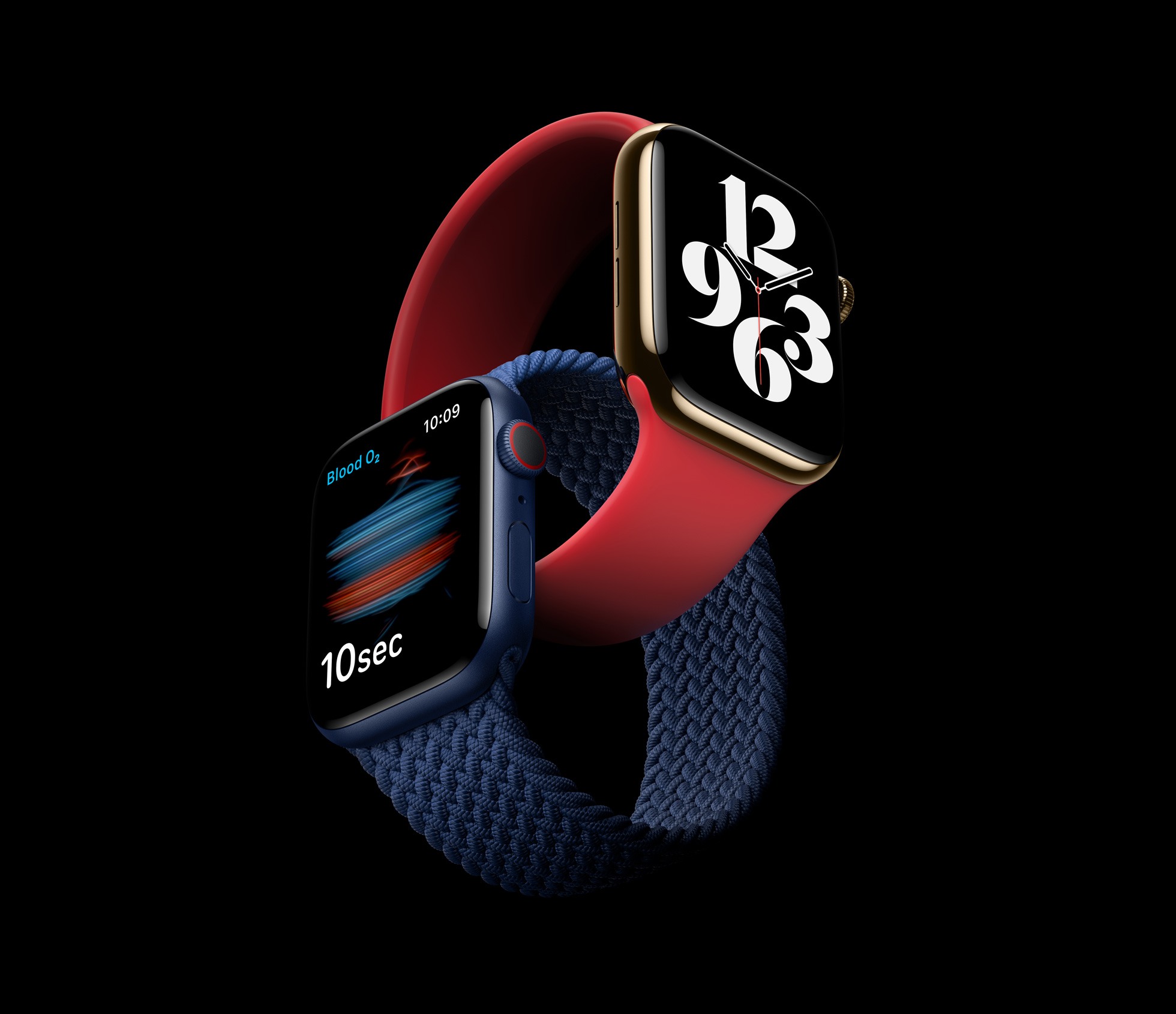
Today in what would normally be an iPhone-led September event, the Apple Watch was able to serve as headliner since new iPhones won’t be coming until October. It was a fitting change because Apple had news to share about not one, but two new Apple Watch models: the Apple Watch Series 6 and Apple Watch SE.
These two devices follow Apple’s strategy with the iPhone, where there’s a flagship line plus a more affordable option that uses a mix of old and new parts. The Apple Watch Series 6 includes a new blood oxygen sensor, improved always-on display, S6 processor, an always-on altimeter, and new finishes. The Apple Watch SE also features the always-on altimeter and a similar design, but without the new color finishes, it includes the S5 processor from last year, but it doesn’t get the blood oxygen sensor nor does it include an always-on display. A new software addition is another key incentive for both the Series 6 and SE: Family Setup, which enables children to be Apple Watch users without having their own iPhones.
Both new Apple Watches are available to order now, and will ship this Friday, September 18. Here’s the full run-down on each new device.
The New Fitness App in iOS 14
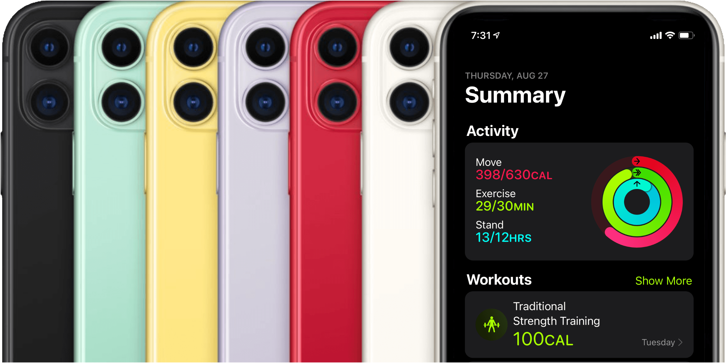
Last year Apple introduced Activity Trends, a new feature for tracking your fitness over time. Trends complemented the Apple Watch’s classic Activity rings feature, and found its home alongside the rings in the iOS Activity app.
Activity rings are binary metrics: did you or did you not meet your goal for moving, exercising, or standing today? Trends, on the other hand, track your past year of activity through rolling 90-day windows, and inform you as to whether you’re improving or declining. If necessary, Trends then suggest improvements such as walking a little more than usual each day or standing for a bit longer each hour. Together, Activity Trends and the classic Activity rings seek to help you develop and maintain an overall healthy lifestyle across a handful of monitored metrics.
Last year, Trends got their own tab in the Activity app alongside the four tabs that had existed previously: History, Workouts, Awards, and Sharing. These tabs always felt a bit sparsely populated for my tastes, and it seems that Apple agreed. In iOS 14, Apple has redesigned the Activity app, consolidating its tab structure, and renamed the app ‘Fitness.’
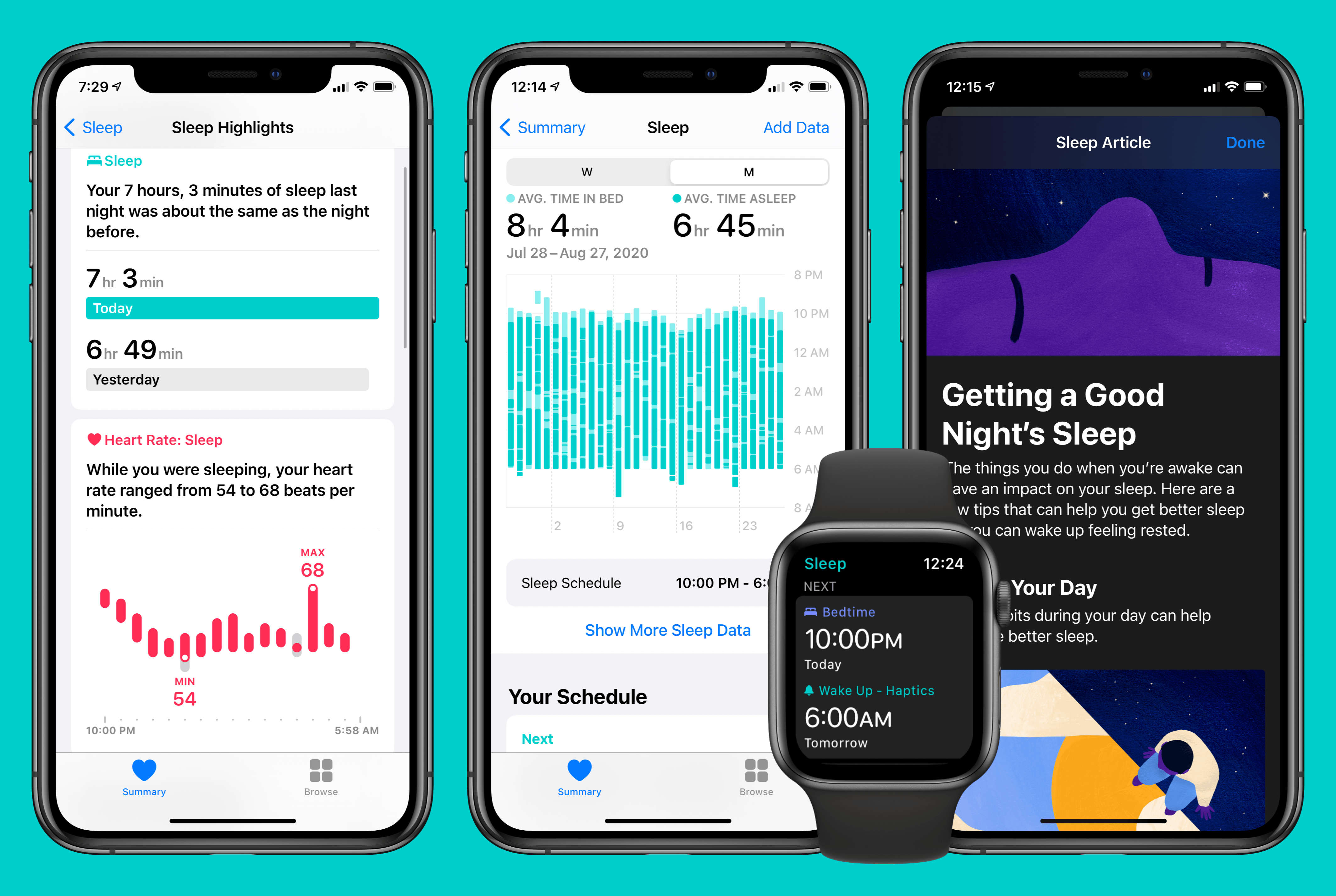
Sleep Tracking in watchOS 7 and iOS 14: Elevated by a User Experience-Driven Design
Sleep tracking has always seemed like a natural addition to the Apple Watch, and for years all signs have indicated Apple had it in its plans. In 2017 the company acquired Beddit, which specialized in sleep-tracking hardware and software. Perhaps one motivation for that move was the fact that paid sleep-tracking apps regularly occupied the App Store’s top charts. Apple has also progressively exhibited strong interest in areas of health, making sleep a no-brainer. So the technology for sleep tracking had been acquired, customer demand was clearly there, and it fit within the broader health ambitions of the company.
Yet until this year, Apple’s sleep-related software enhancements have been limited to…improved alarm options on iPhone. This fall that’s changing, as watchOS 7 and iOS 14 will together introduce a true sleep tracking system.
I’ve been using the new sleep-related features of Apple’s forthcoming OS versions for two full months now, and in true Apple fashion, they’re in some ways more comprehensive and elegant than third-party solutions, and in other ways they’re underpowered compared to what third parties provide, ensuring that they won’t be the best fit for all users, but their simplicity will make them a solid solution for most people.
Apple’s Kevin Lynch on watchOS 7’s Sleep Tracking→
Scott Stein of CNET interviewed Apple’s Kevin Lynch about watchOS 7’s upcoming sleep tracking feature. Unlike third-party sleep tracking wearables and apps, Apple’s approach is simpler. As Stein explains:
Unlike other wearables such as the Fitbit or Oura, which measure how much time you spend in the various sleep phases and even give calculated sleep quality scores, Apple’s sleep tech is more simplified. It just tracks duration of sleep, movement disturbances and heart rate. The content of your sleep isn’t analyzed much at all. Instead, Apple’s placed a big focus on the time you go to bed and what you do while you wind down.
Instead of tracking time spent in different sleep phases, Apple’s focus is on winding down before bed and sleep duration, using positive reinforcement to encourage better habits. As Lynch says:
“You can’t really coach yourself to have more or less REM stages,” he says. “We felt like that wasn’t the best way Apple could add value here on sleep. We focused on the transition to the bed, which we think is way more actionable, and will result in people getting a better night’s sleep, which then has secondary effects of perhaps your REM stages sorting themselves.”
I haven’t had a chance to install the watchOS 7 beta yet, but sleep tracking is right at the top of my list of features I want to try this summer. I’ve used third-party apps that made me feel anxious about my lack of sleep, so I’m keen to see how Apple’s approach stacks up.
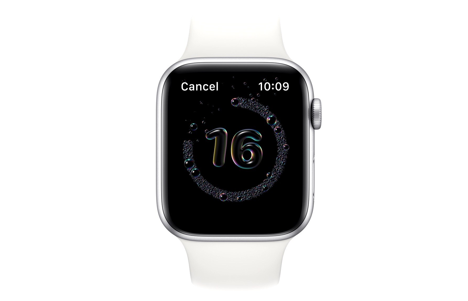
How the watchOS 7 Handwashing Feature Works→
Brian Heater at TechCrunch has published a detailed explanation of how the upcoming handwashing feature for Apple Watch works:
The feature, which is built directly into the forthcoming version of watchOS, is designed to work like fitness tracking in a number of ways. For starters, if the user opts into it, it’s designed to automatically trigger when handwashing is detected, starting a countdown timer of 20 seconds. The accelerometer is the key piece of hardware here, waiting for the specific handwashing pattern — which apparently adopts a number of different methods, depending on who’s actually doing the scrubbing.
The system uses machine learning models to tackle different methods, but the system gets an additional nudge from the Watch’s microphone. Along with motion, the app listens for the sound of running water. Even that’s not enough, though — after all, eco sinks have become increasingly popular, meaning that there’s often less water sound to be listening for. The sound of squishing soap takes care of that last bit. It’s got a unique enough audio signature so as to confirm that handwashing is taking place.
Interestingly, the piece notes that this feature has been in the works for years, it isn’t simply a reaction to the current pandemic. I haven’t tried the feature yet, but I’m anxious to see if it works as advertised. If it’s unreliable, I’ll surely leave it turned off, but if it works well it could be a valuable aid to preventing the contraction of COVID-19. At the very least, I’m always happy to see Apple explore new areas of health.
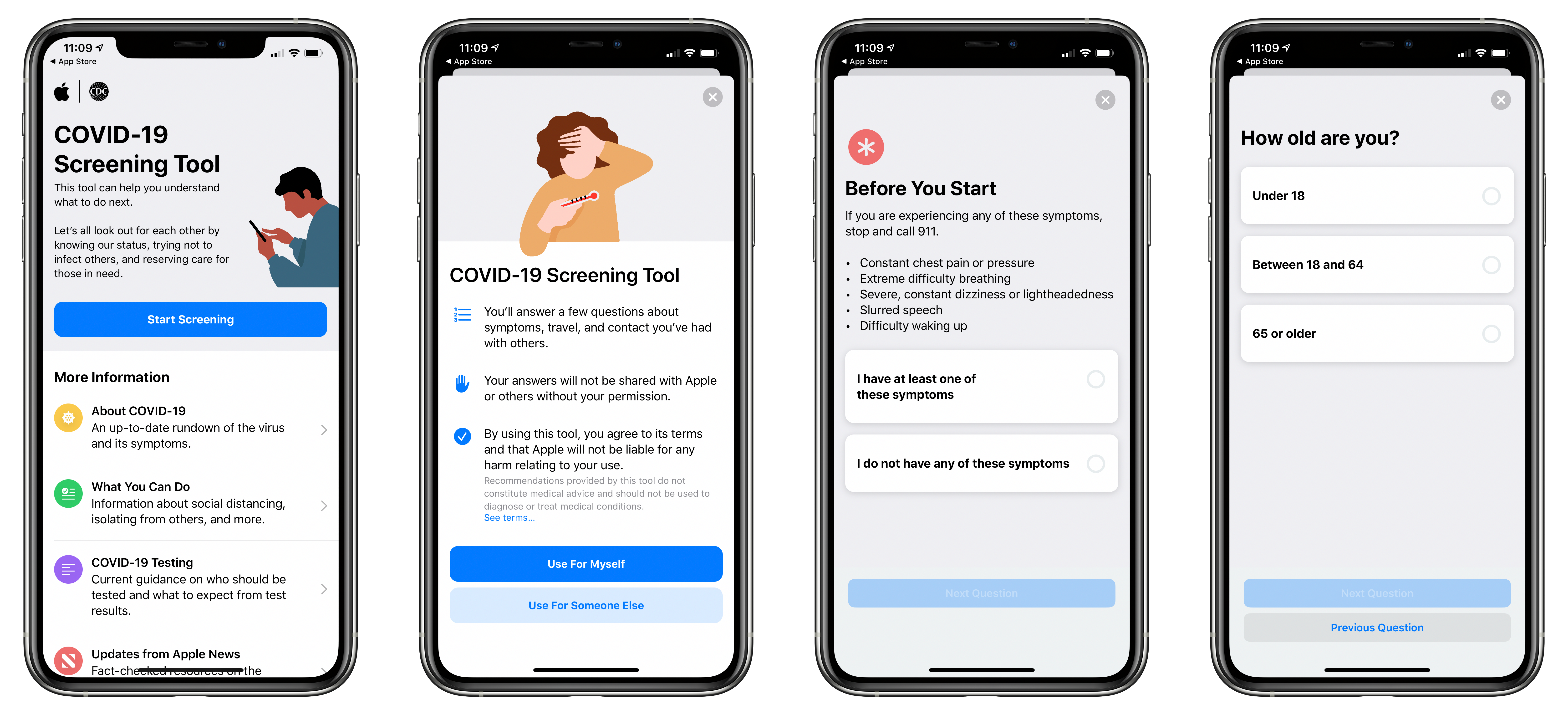
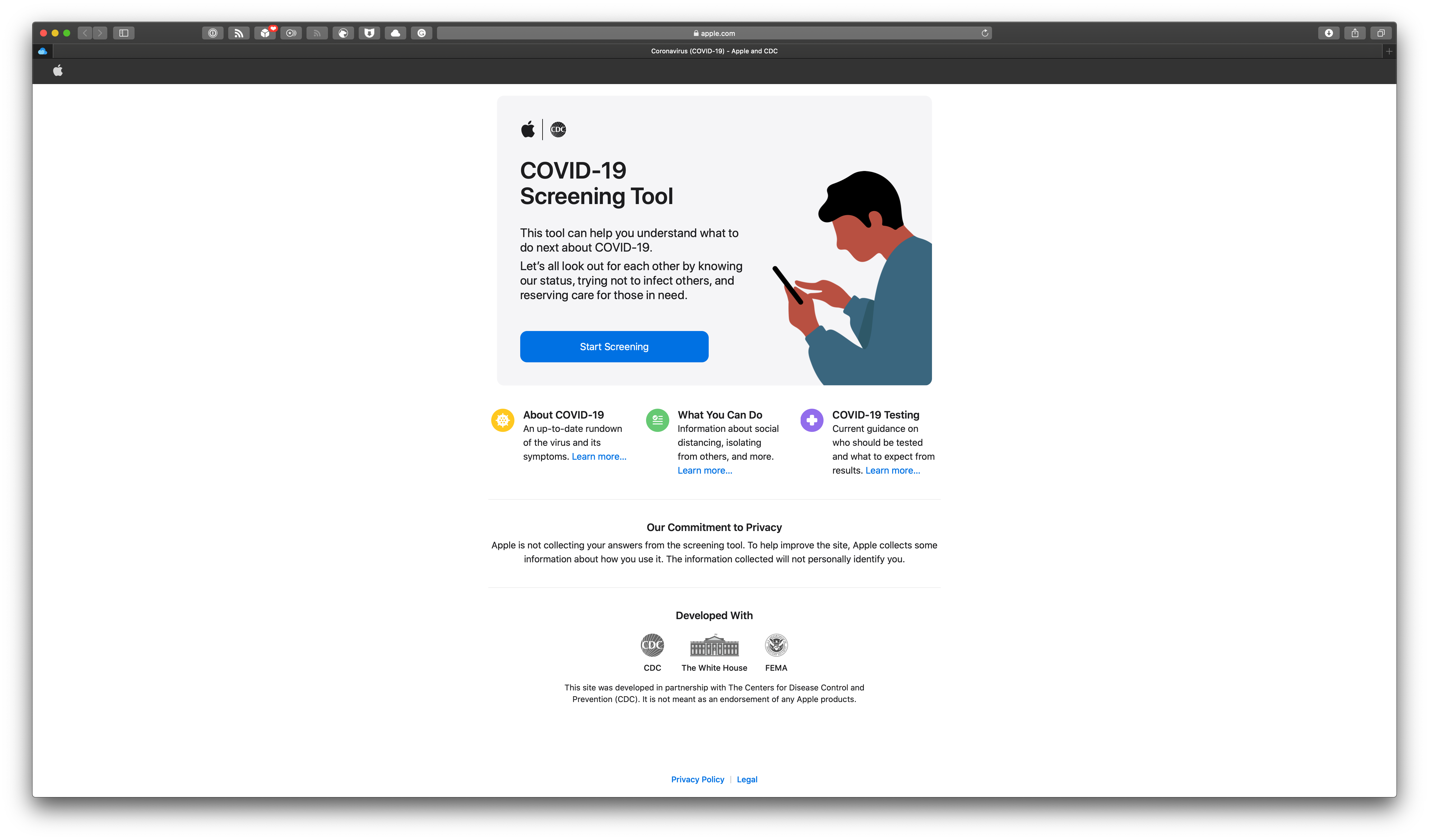
Apple Releases Free COVID-19 App and Website
Apple has launched a new app developed in partnership with the Centers for Disease Control and Prevention, the White House’s Coronavirus Task Force, and the Federal Emergency Management Agency called Apple COVID-19. The company released the app with a press release:
Apple today released a new screening tool and set of resources to help people stay informed and take the proper steps to protect their health during the spread of COVID-19, based on the latest CDC guidance. The new COVID-19 website, and COVID-19 app available on the App Store, were created in partnership with the CDC,1the Coronavirus Task Force and FEMA to make it easy for people across the country to get trusted information and guidance at a time when the US is feeling the heavy burden of COVID-19.
In addition to a coronavirus screening questionnaire, the app and website include other resources from trusted information sources:
The app and website also offer access to resources to help people stay informed and get the support they need. Users will receive answers to frequently asked questions about COVID-19, including who is most at risk and how to recognize symptoms. In addition, they will learn the most up-to-date information from the CDC like best practices for washing hands, disinfecting surfaces and monitoring symptoms.
Users can also ask Siri “How do I know if I have coronavirus?” to access further resources and a collection of telehealth apps on the App Store.
The Apple COVID-19 app is available as a free download on the App Store, and the website is located at apple.com/covid19.


