This Week's Sponsor:

PowerPhotos

The Ultimate Toolbox for Photos on the Mac


Posts tagged with "iOS 7"

“Why You Got a New Phone?”

A great piece by Matt Drance.

This is a thought I wish I had in my article on iOS 7:

The emphasis on text is also striking. More than just content, text has replaced iconography in many cases. Look at Camera: the modes — VIDEO, PHOTO, SQUARE, PANO — are represented by text for the first time ever on iOS. This to me is proof that “clarity” has taken top priority. iOS is available in a number of countries and languages, which means every piece of text has to be localized (translated) many times over. This isn’t only time consuming, it’s disruptive to UI design: a short word in English is not necessarily short in German, and suddenly things don’t fit on screen anymore. I attended many meetings at Apple where people cringed at changing a word shortly before release, because it meant a whole new round of localize-then-build-then-test.

Apple still hasn’t seeded a developer beta of iOS 7 for iPad. Looking at one of the official screenshots posted online (the Music app, mirrored here), I wonder if more Apple apps for iPad will also prefer text over icons in tab bars.

Permalink

Flatness and the Dimensionality of iOS 7

David Cole, product designer at Quora, writes:

The big, obvious change to the look in iOS 7 is the flatness. This change is being characterized as a stripping away of dimensionality. I’ll propose something else is going on here: the move to flat screens actually affords a ramp up in dimensionality. When an individual screen gets flattened together, you can treat it as a single object that you can then manipulate and relate to other screens. This concept is at the heart of the biggest changes to the iOS 7 interaction paradigms.

Permalink

Matt Gemmell Compares iOS 7 To iOS 6

The smear of murky tones across the lower-right half of the iOS 6 grid is replaced with whites and a few light blues on iOS 7. Similarly, iOS 6’s handful of different visual styles (and several eccentric outliers) have become essentially two main themes on iOS 7: the paper-like, bright style in about 75% of apps, and the dark utility style for the remainder.

A great piece by Matt, especially in his thoughts on “flatness” and “brightening”. The pixelated screenshot comparison shows just how striking the difference between iOS 6 and iOS 7 is.

Permalink

Game Controller Support In iOS 7 and 10.9

As first noted by TouchArcade (via Macgasm), the iOS 7 and OS X 10.9 beta seeds released to developers on Monday include support for a new Game Controller framework that will allow games to connect to controllers plugged into iOS devices or communicating wirelessly with them. TouchArcade writes:

So here we have what appears to be a style of game controller that allows you to see the screen of your phone, as well as an entirely standalone controller with what seems to be dual analog sticks. Also, we’ve heard that Apple has reinforced that if your game is going to support a game controller it needs to be totally playable without.

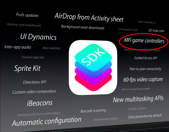
There are a couple of interesting tidbits worth noting with Apple’s strategy on game controllers. As shown in a slide at the end of the keynote, game controllers will be built by hardware partners through the MFi program, which Apple has typically used for electronic accessories and AirPlay audio devices. This means that, rather than announcing its own dedicated game controller, Apple has chosen (for now) to provide a technical specification that other companies will have to follow if they want to get approval and sell controllers carrying the “Made for iPhone” badge.

Interestingly, the SDK addition follows a rumor from March 2013, when PocketGamer claimed that Apple had booked a room at the Game Developers Conference under a pseudonym to talk to developers about an upcoming physical “joypad”. For now, Apple has opted for consistency across different controller models to ensure game developers will only have to learn a single framework that lets the OS automatically take care of capturing profiles from game controllers. In addition, Apple is making the controllers optional: if a game will add support for MFi controllers, it’ll also have to provide standard multi-touch controls that don’t require a hardware controller.

iOS gaming has long been criticized for lacking the precise input of PCs, consoles, and dedicated portable gaming machines. Over the years, a number of third-party solutions aimed at enhancing iOS’ game control mechanics surfaced, but each one of them came with its proprietary SDK that required developers to manually add support for new controllers in their games. A few notable names include iCade Mobile, a hardware controller, and Joypad, an app to turn iPhones into game controllers for other devices. On the accessory side, external attachments like Ten One Design’s Fling tried to turn on-screen controls often used by developers into more tactile experiences.

It’ll be interesting to see how Apple’s officially-sanctioned solution for iOS 7 and 10.9 will be met by hardware companies. Apple’s requirement to make game controller optionals won’t allow game developers to build games exclusively targeting the hardware control system, which could pose a new challenge for game makers already considering truly separate touch and controller mechanics.


The iOS 7 App Store Opportunity

Marco Arment has a good take on what iOS 7 represents for developers: a huge opportunity to differentiate apps that will inevitably remain stuck on iOS 6 from those that will embrace iOS 7’s new modern approach later this year.

As I wrote today, it’ll be interesting to see how developers of existing apps will adapt to iOS 7’s dramatic reimagination of the OS. I do believe that many will try an in-between approach to a) keep their identity in the jump to iOS 7 or b) target both iOS 6 and iOS 7 with separate interfaces. I either case, I don’t think that’s a great solution. And, I am curious to see how long it’ll take designers and developers to exclusively target iOS 7 with different, custom interfaces – as many have done in the past five years.

I’m also thinking about how the App Store team will handle the transition from iOS 6 to iOS 7, which should coincide with Apple reaching the 1 million apps milestone (I was off by < 100,000 apps). Aside from App Store improvements that I mentioned in the past, I believe Apple should find a way to clearly promote and organize apps that have been built exclusively for iOS 7. The new OS isn’t just tweaking functionalities or refining some UI elements; I find it hard to envision an App Store that doesn’t make any distinction between “classic” and “modern” apps.

In the past, Apple launched App Store sections for apps taking advantage of new OSes or hardware features, and I’m wondering if, with 1 million iOS apps, differentiation between iOS 6 and iOS 7 should deserve another simple section or something more advanced like search filters, “made for iOS 7” badges, or new editorial efforts from the App Store team.

Properly promoting and organizing iOS 7 apps on the Store can benefit Apple, its users, and third-party developers. The App Store’s back catalog isn’t a new topic of discussion, but with iOS 7 and six zeros getting closer, it’s worth reconsidering it.

Permalink

iOS 7 and Aqua

The Iconfactory’s Craig Hockenberry was around when Aqua was first introduced:

Like with Aqua, these fundamental changes in how things work will stick around for a long time. We may complain about how things look in the short term, but improvements in usability will be something that we value much more in the long term.

But more importantly, and more subtly, is the change of focus within the apps themselves. In the design of Twitterrific 5, we went through the process of figuring out what content was most important and then designing controls around that information. Previous designs focused on the control structure first and then filled it with content.

The more I keep using iOS 7, the more I think apps like Twitterrific 5 and Vesper already are great fits for its new interface principles. They are actual, commercial proof that focusing on content first doesn’t imply ending up with boring, overly simplistic apps.

Permalink

Frank Chimero On iOS 7

Luckily, things like icons, colors, and typography are easier to iterate than userflows, information architecture, and features. They’re also the elements that take more time than expected to craft, so I can see all of these refinements being the most likely to be cut from a tight deadline, and the first up to be revisited by the design team before the official release, or quickly thereafter. If that awful Safari icon bugs you, imagine how the designers at Apple must feel.

I do think that some aspects of iOS 7 beta 1 interface are, indeed, poorly put together. Others simply look odd right now. And I agree with Frank: when you have to introduce a working demo on stage (multiple ones, in fact) and release a developer beta on the same day, refinements are likely cut. The problem is that the Internet will notice inconsistencies; the upside is that Apple designers use the Internet, too.

Permalink

iOS 7: Thoughts and Questions

iOS 7

iOS 7

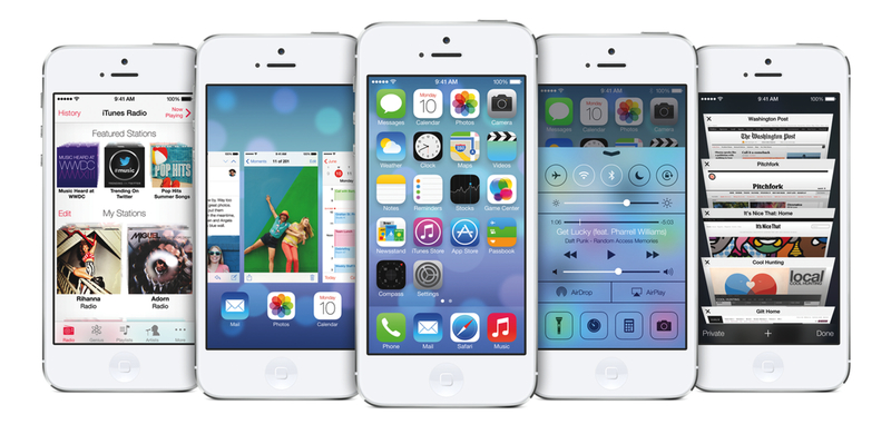
Announced yesterday at Apple’s WWDC 2013 keynote, iOS 7 is a dramatic reimagination of Apple’s mobile operating system.

iOS 7 introduces new user features and brings over 1500 new developer APIs. For users looking for a quick overview of what’s changed and improved in iOS 7, the OS’ user interface will immediately appear as the most visible change. Tim Cook referred to it as a “stunning new UI”, noting how iOS 7 is the biggest change to iOS since the introduction of the original iPhone, which ran iPhone OS 1.0. iOS 7 is unmistakably different, but how the interface looks is simply the first aspect that jumps out. Read more


iOS 7 Confirmed: New Banners Up at Moscone West [Update: OS X Too]

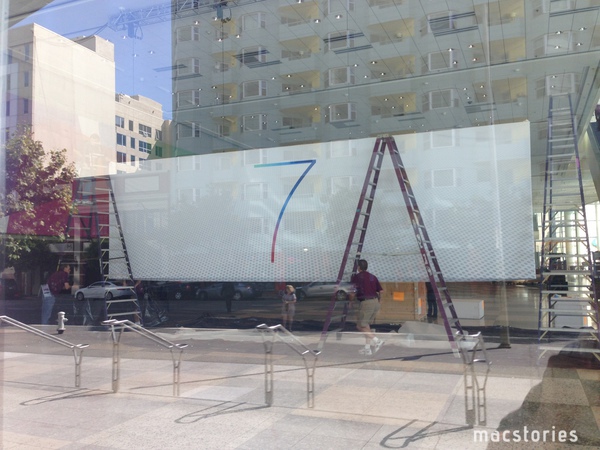
It’s been three days since Apple started decorating Moscone West with WWDC 2013 banners, and today the company has started publicly showing off new signage hinting at the next iteration of iOS, iOS 7. In a press release published in April, Apple said developers attending WWDC would learn about the future of iOS and OS X.

Using a very simple layout compared to last year, Apple is simply saying “7” on the banner that’s being put up at Moscone West right now. According to speculation from the past few months, iOS 7 will be a departure from previous versions of the operating system in terms of user interface design. After last year’s reorganization of the executive team, Tim Cook himself confirmed at D11 that Jony Ive, now head of the Human Interface Group at Apple, has been working on a new “look and feel” for iOS.

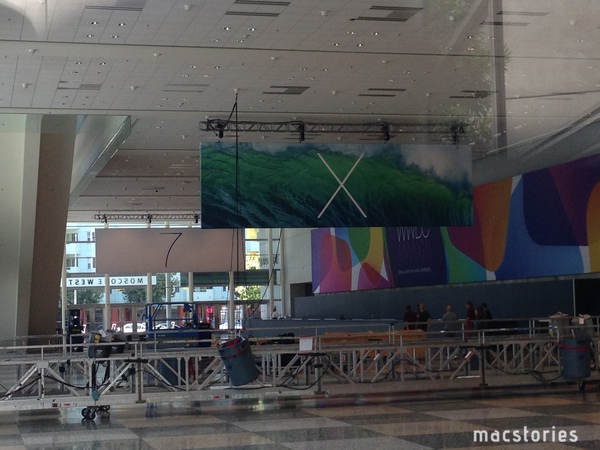
Update: Apple has also just started assembling banners hinting at OS X, which, similarly to the “7” banner, simply say “X”. The background of the banner seems to depict an ocean wave.

Read more