Over the holidays, the iA Writer team released version 5.4 of its iOS, iPadOS, and Mac apps, which added improved export options. The iOS and iPadOS apps also gained local backups and hashtag suggestions.
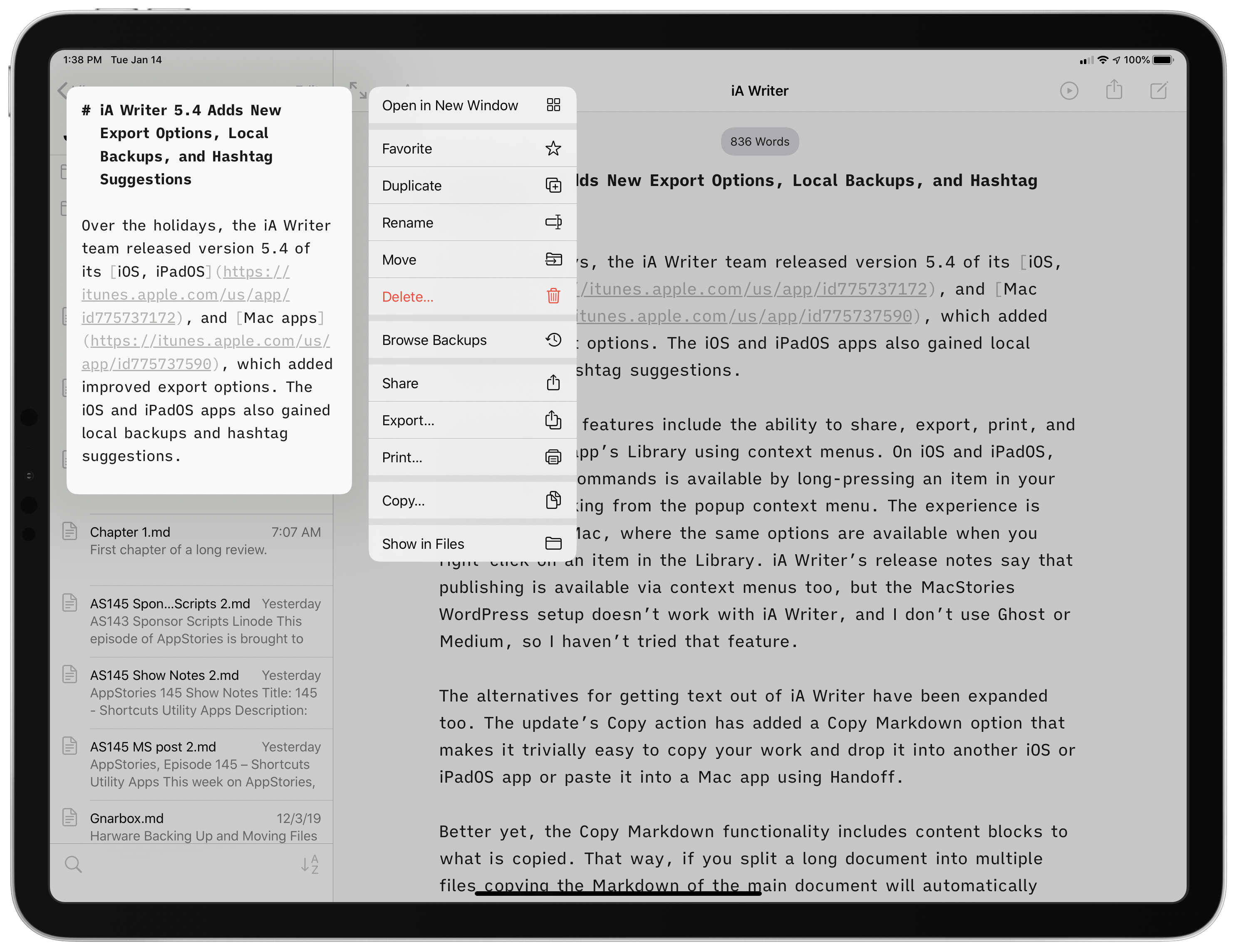
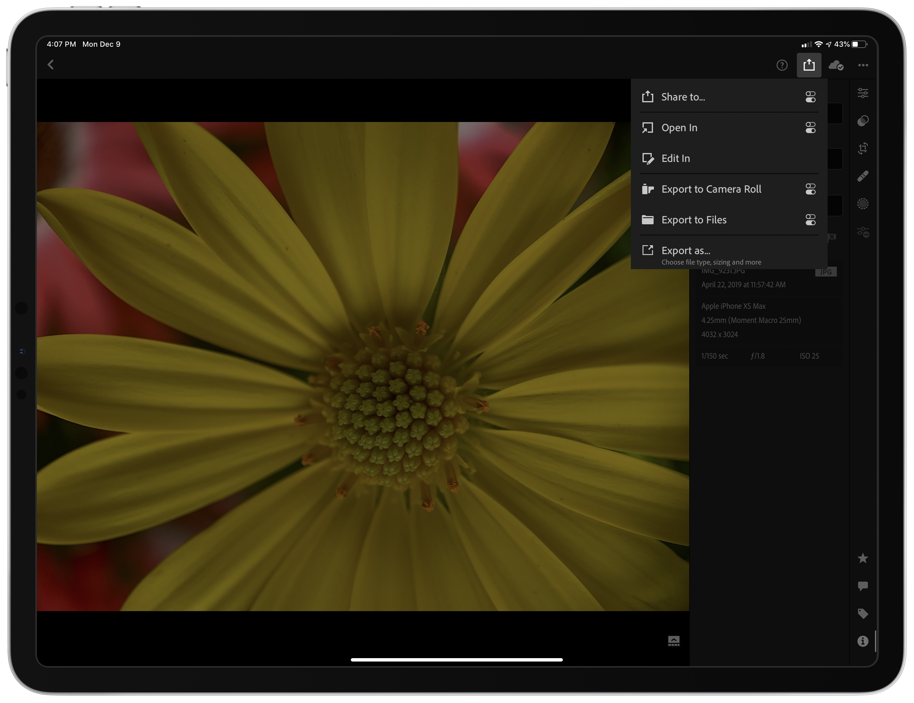
The new export feature adds the ability to share, export, print, and copy from the app’s Library using context menus. On iOS and iPadOS, each of those commands is available by long-pressing an item in your Library and picking from the popup context menu. The experience is similar on the Mac, where the same options are available when you right-click on an item in the Library. iA Writer’s release notes say that publishing is available via context menus too, but the MacStories WordPress setup doesn’t work with iA Writer, and I don’t use Ghost or Medium, so I haven’t tried that feature.
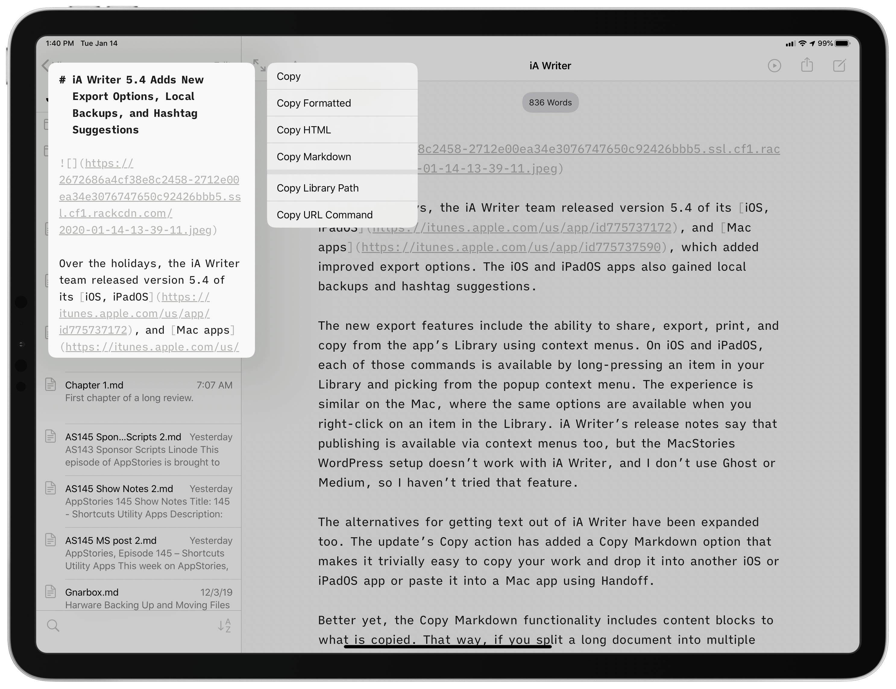
The alternatives for getting text out of iA Writer have been expanded too. The update’s Copy action has added a Copy Markdown option that makes it trivially easy to copy your work and drop it into another iOS or iPadOS app or paste it into a Mac app using Handoff.
Better yet, the Copy Markdown functionality includes content blocks to the copied text. That way, if you split a long document into multiple files, copying the Markdown of the main document will automatically incorporate the externally referenced files as content blocks. It’s an excellent way to assemble a long-form story and paste it into a content management system or another app with just a couple of taps. Together with the app’s existing copy, share, and export options, iA Writer has become one of the most versatile text editors when it comes to delivering your final text in the format you want and where you need it.
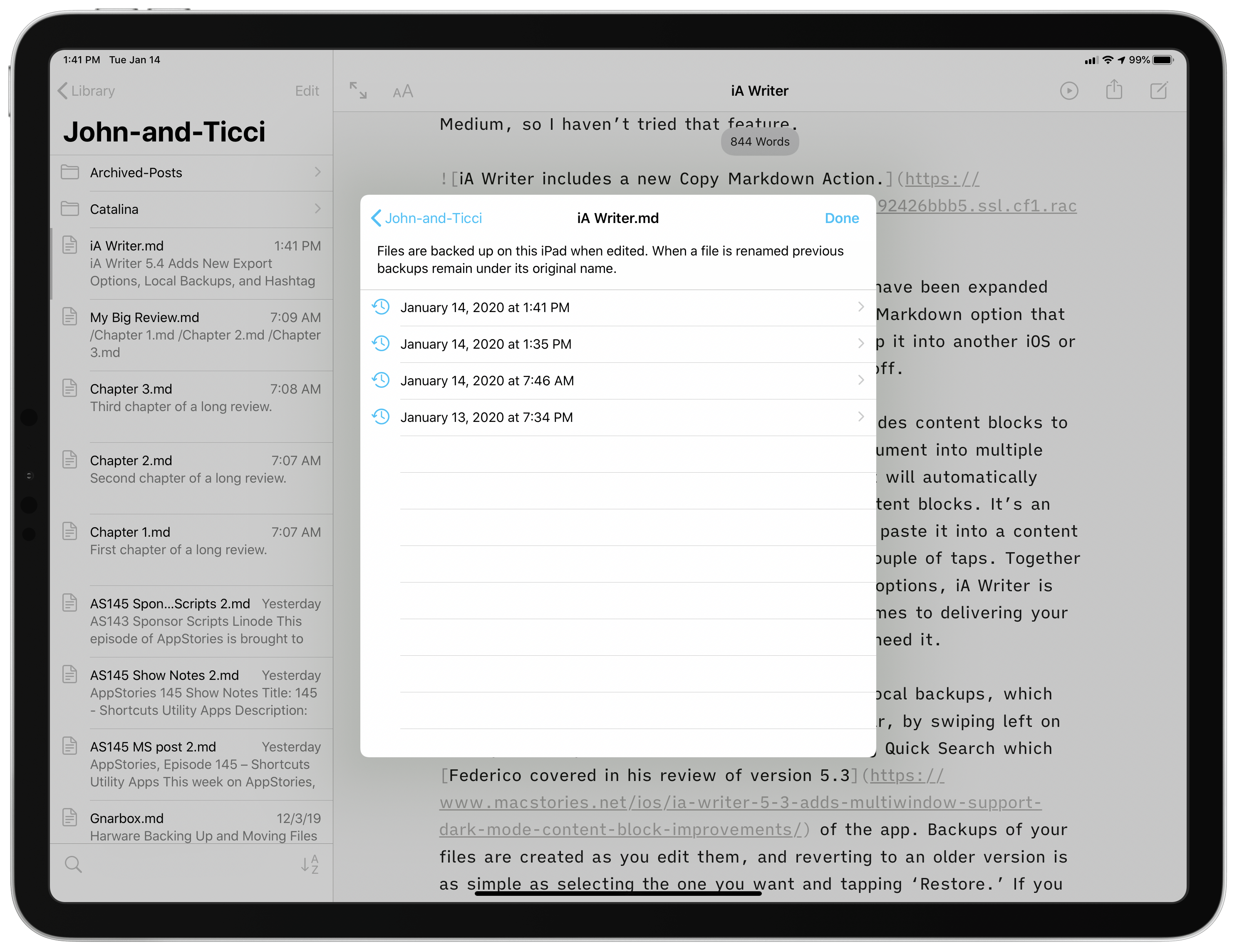
On iOS and iPadOS, iA Writer 5.4 has also added local backups, which are accessed from the action button in the toolbar, by swiping left on or long-pressing an item in your Library, or using Quick Search, which Federico covered in his review of version 5.3 of the app. Backups of your files are created as you edit them, and reverting to an older version is as simple as selecting the one you want and tapping ‘Restore.’ If you change the name of a document, the app keeps the older backups under the file’s original name. You can also navigate to the root level of your Library folder structure from the backups of the document you are currently viewing, allowing you to browse every local backup created by iA Writer on your device.
The strength of iA Writer’s backup feature is that the backups are local. iOS 13 has been a buggy release, and iCloud Drive continues to cause trouble for some users. By creating a local backup, iA Writer provides its users with a copy of their work on whichever device they’re using that isn’t affected by sync or other cloud-based issues.
In my testing, the new backup feature worked well and provided additional peace of mind that my work is safe, which I love. I did run into a bug when navigating back to the editor from the backup view when I entered it via the Library’s context menu. The editor lost the focus, so I had no cursor or keyboard, though it’s an issue that can be fixed by tapping into another document and then back to the one you’re editing. Hopefully, that will be fixed soon, but for now, the workaround is simple, and the issue is easily avoidable by not using the context menu to access backups for the time being.
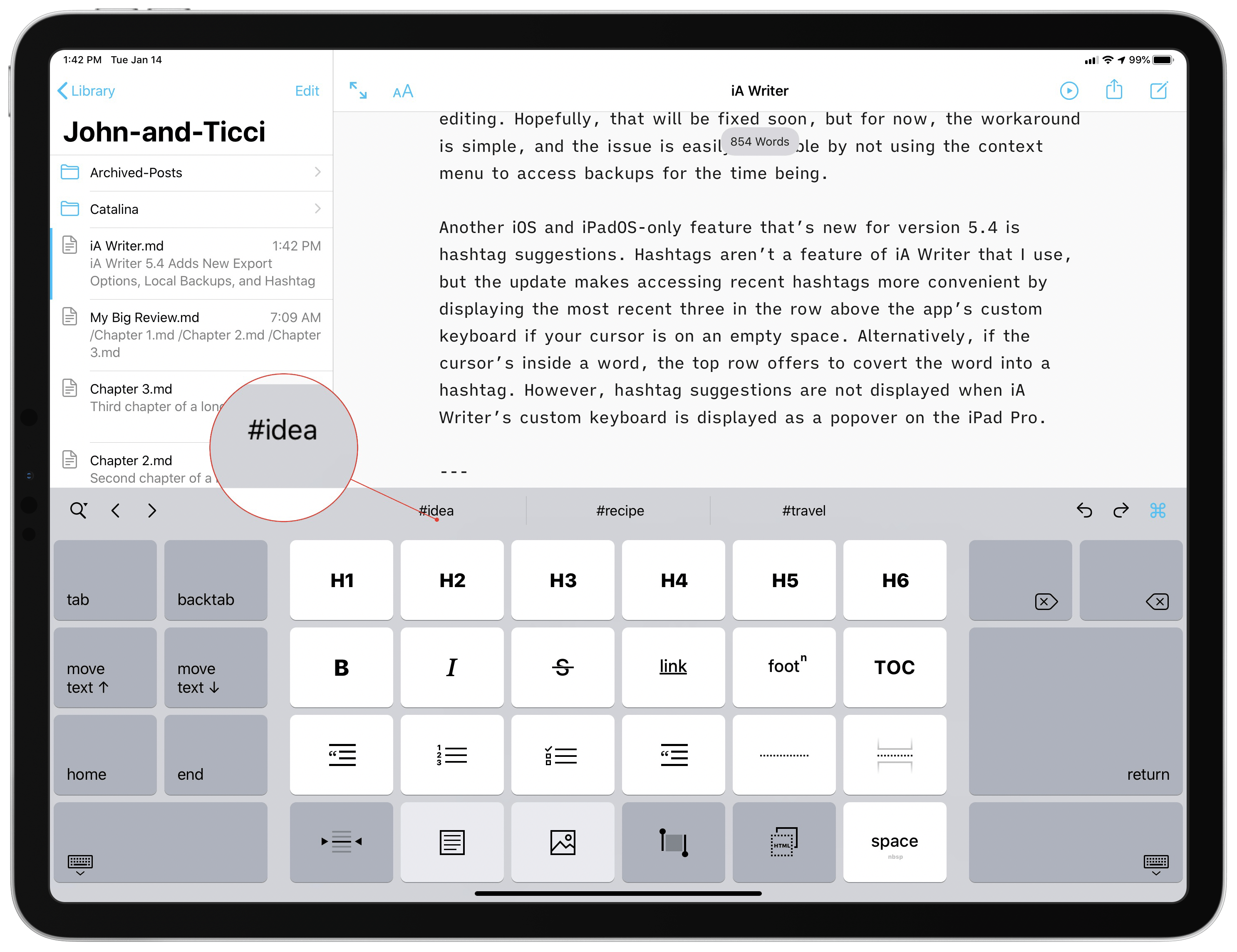
Another iOS and iPadOS-only feature that’s new for version 5.4 is hashtag suggestions. Hashtags aren’t a feature of iA Writer that I use, but the update makes accessing hashtags more convenient by displaying the most recent three in the row above the app’s custom keyboard if your cursor is on an empty space. Alternatively, if the cursor’s inside a word, the top row offers to convert the word into a hashtag. It’s worth noting, however, that hashtag suggestions are not displayed when iA Writer’s custom keyboard is displayed as a popover on the iPad Pro.
In the broader scheme of iA Writer’s development, version 5.4 is a relatively minor update, though it does reinforce why the app was chosen as the MacStories Selects App of the Year. iA Writer has been a category-leading text editor for years, but it continues to receive regular updates that incorporate the latest technologies on every platform in ways that refine the experience for users and expand the app’s capabilities.
There’s an incredible amount of power tucked away behind iA Writer’s simple UI. That power is always just a tap or two away, but stays hidden until you need it, which is my favorite sort of pro app UI.
iA Writer 5.4 for iOS and iPadOS and for the Mac is available as a free update for existing users.


