Today, Apple announced three new security features.
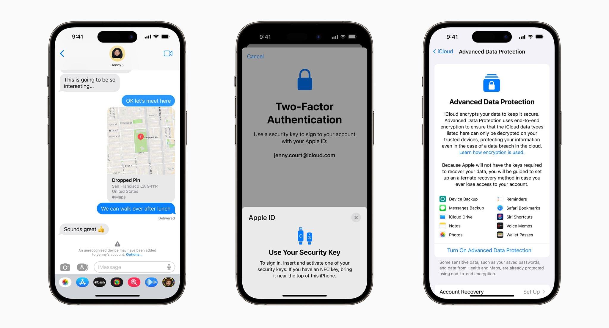
First, iMessage Contact Key Verification allows users to verify that they are communicating with the person with whom they think they’re communicating. The feature will alert users who use it if someone has infiltrated cloud services to gain access to the user’s iMessage conversations. For even greater security, users can compare a Contact Verification Code in person, on FaceTime, or through another secure channel.
Second, Security Keys lets users adopt hardware security keys when logging into their iCloud accounts. The new system is an enhancement over two-factor authentication because it prevents someone from obtaining a your second factor through a phishing scam.
Third, Advanced Data Protection for iCloud adds encryption on the iPhone, iPad, and Mac for a long list of data categories. According to Apple’s press release:
iCloud already protects 14 sensitive data categories using end-to-end encryption by default, including passwords in iCloud Keychain and Health data. For users who enable Advanced Data Protection, the total number of data categories protected using end-to-end encryption rises to 23, including iCloud Backup, Notes, and Photos. The only major iCloud data categories that are not covered are iCloud Mail, Contacts, and Calendar because of the need to interoperate with the global email, contacts, and calendar systems.
Apple says that iMessage Contact Key Verification will be available globally in 2023, and Security Keys is coming early 2023. Advanced Data Protection for iCloud is available in the US today for participants in Apple’s beta OS program, and will presumably roll out with the next point release to Apple’s OSes.