Posts tagged with "macOS Reviews"

macOS Sequoia: The MacStories Review

Sequoia is unlike any major macOS update in recent memory. Annual OS releases usually tell two stories. The first is the tale of that release, which consists of a combination of design, system, and built-in app changes that add to the existing Mac experience. The second story plays out over time, taking multiple years to unfold and reveal itself. The best macOS releases are those that strike a balance between the two.

Often, a macOS update’s multi-year story revolves around new developer technologies that signal a change in direction for the entire platform. Swift and Catalyst were like that. Neither had an immediate impact on the day-to-day experience of using a Mac. However, even though the final destination wasn’t entirely clear at first, the corresponding macOS releases included concrete first steps that provided a sense of where the Mac was heading.

It’s possible to look at macOS Sequoia and see something similar, but the resemblance is only skin deep. This year’s release includes meaningful updates to system apps and even a brand new one, Passwords. Plus, Apple Intelligence promises long-term, fundamental changes to how people use their Macs and will likely take years to fully realize.

But Sequoia feels fundamentally different from Swift, Catalyst, and other past releases. It’s light on new features, the design changes are few and far between, and Apple Intelligence isn’t part of macOS 15.0 at all – although more features are on the way and are currently part of the macOS 15.1 developer beta. So what sets Sequoia apart isn’t so much what you can do with it out of the box; what’s unique about this release is that you could install it and not even notice the changes.

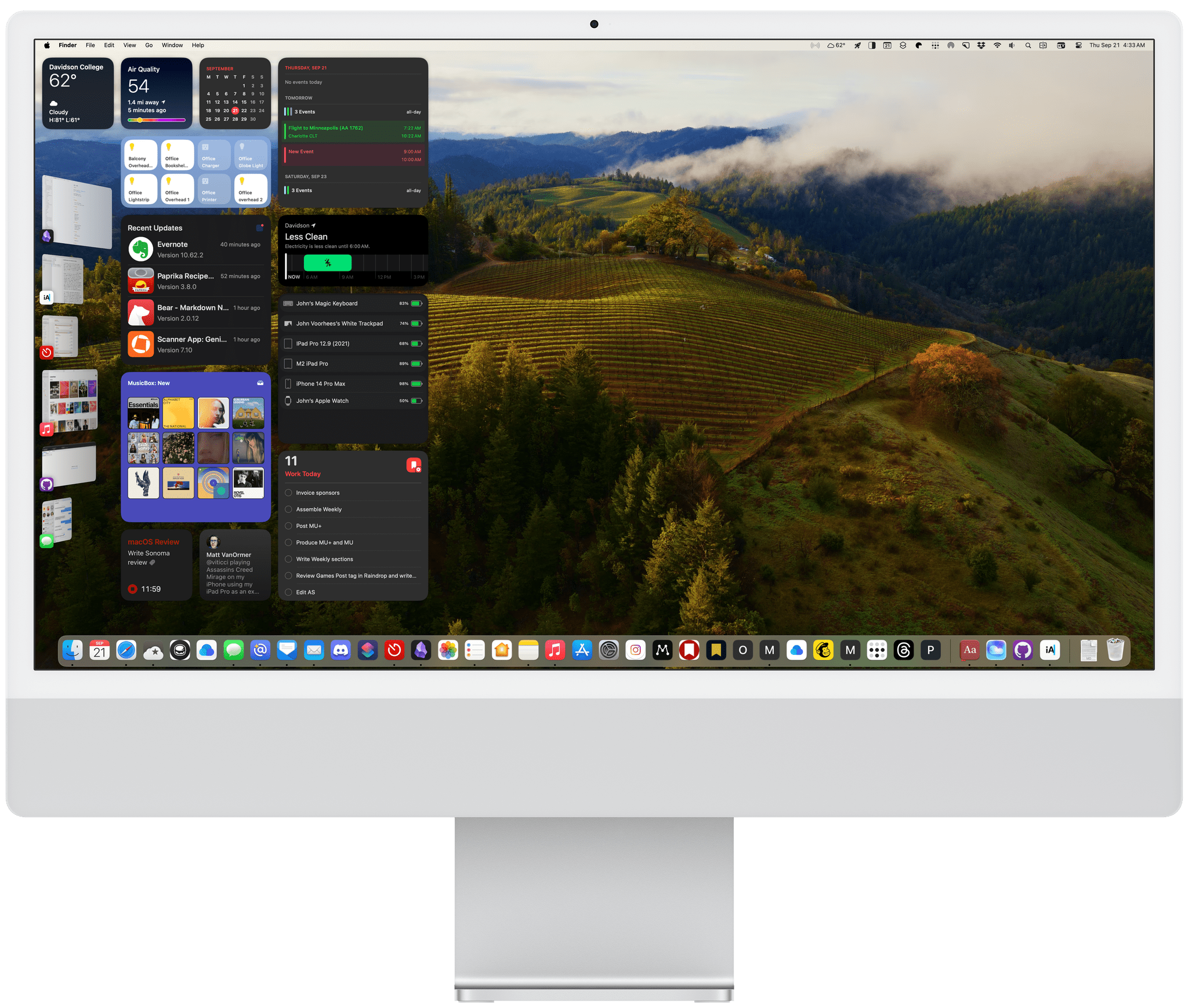
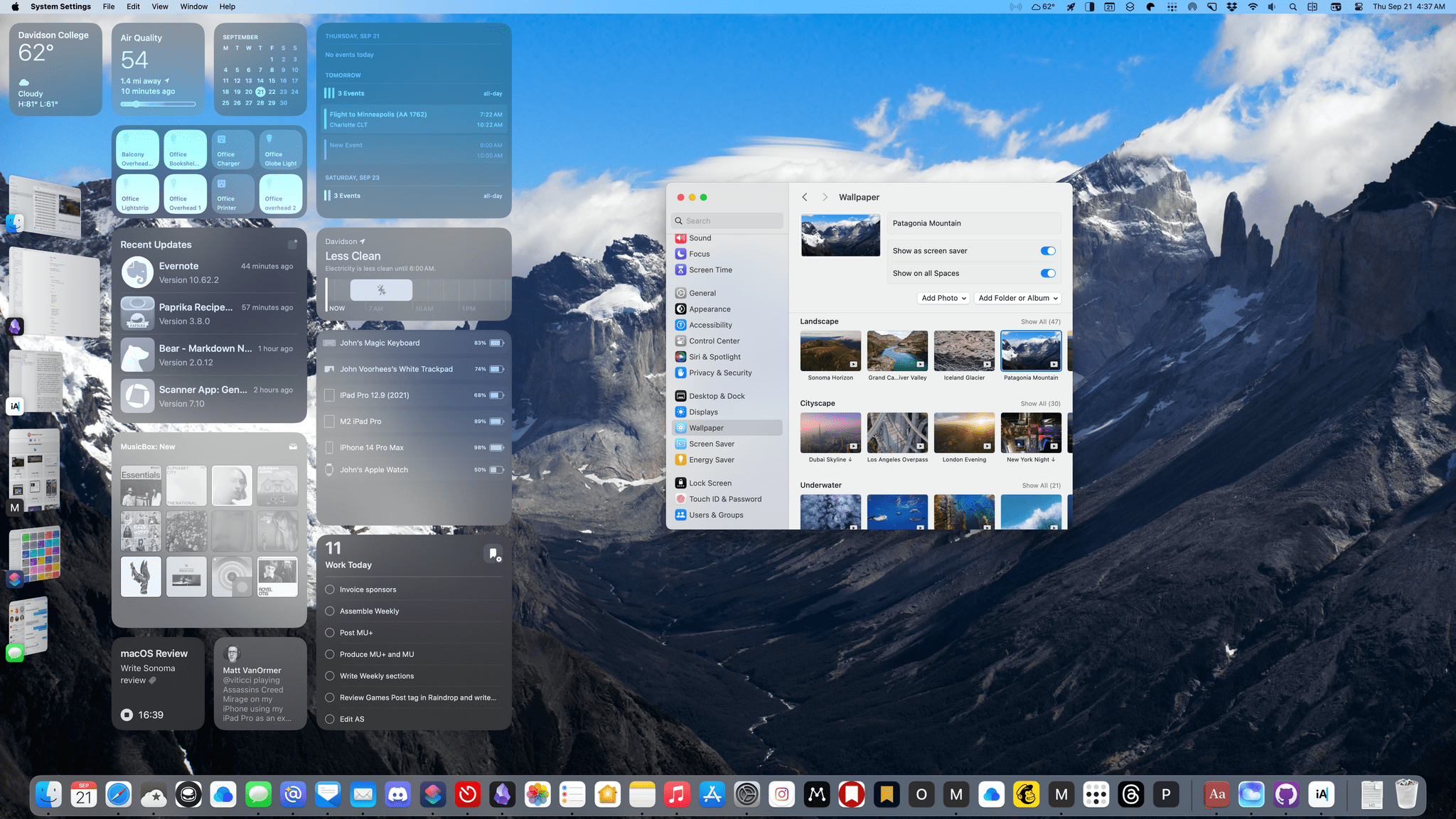
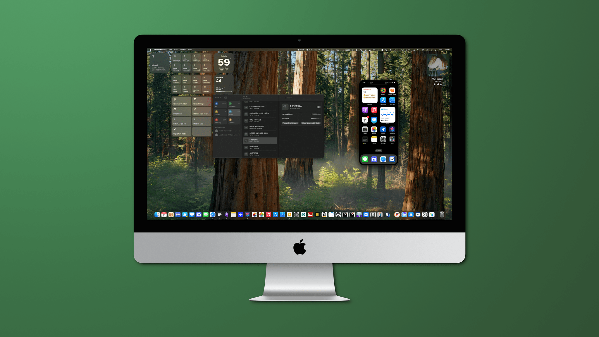
That’s not to say that Sequoia is a bad update. There’s more to like than not, with excellent additions like iPhone Mirroring, window tiling, the new Passwords app, and Safari’s video viewer. The trouble is that the list of changes, good or bad, falls off steeply after that. A half loaf may be better than none, but Apple has taught us to expect more, which makes Sequoia vaguely unsatisfying and out of balance compared to other releases.

It’s clear is that Apple is placing a big bet that artificial intelligence will pay off for macOS the same way magic beans did for Jack and his mother. The question heading into macOS 15.1 and beyond is whether Apple’s beans are magical too. Perhaps they are, but based on what I’ve seen of macOS 15.1, I’m not feeling the magic yet. I’ll reserve judgement and revisit Apple Intelligence as it’s incrementally rolled out in the coming months. For now, though, let’s consider macOS Sequoia 15.0’s morsels that readers can actually dig into today.

Read more


    macOS Sonoma: The MacStories Review

    In one sense, the story of this year’s macOS update is that there is no story, but that’s not exactly right. Instead, it’s a bunch of stories. It’s the tail end of the realignment of macOS with Apple’s other OSes that began with macOS Catalina in 2019. However, Sonoma is also part of a work-at-home story accelerated by COVID-19. The OS is also linked to the story of visionOS, only part of which has been revealed. Sonoma is a bundle of narrative threads built on the foundation of past releases, adding up to a collection of updates that will be less disruptive for most Mac users than recent macOS updates. Instead, Sonoma is packed with a variety of useful new features that help draw it closer to iPadOS and iOS than ever before, design enhancements, and a few disappointing omissions.

    The timing for a more modest macOS update is right. In recent years, Mac users have had to adjust to substantial redesigns of everything from their favorite system apps to the Finder’s windows and toolbars. The changes were inescapable and necessary to harmonize the Mac with Apple’s other products, but also disruptive for some long-time users.

    Sonoma adds a vast collection of new wallpaper and screensaver options.

    Sonoma adds a vast collection of new wallpaper and screensaver options.

    With macOS Sonoma, the biggest design shifts seem to be behind us – at least for the time being. Interactive widgets on the desktop are a big change this year, but it’s not like macOS dumps a bunch of them on your desktop by default. If you never want to see a widget anywhere near your desktop, you don’t have to. Other than the subtle way the login screen has changed and the new screensavers and wallpapers that are available, the core macOS experience has barely changed.

    Instead, this year’s update is primarily about refining and building upon the foundation of the past few years, coupled with a handful of more significant updates to system apps. So, while the marquee features and design changes may be less notable than in recent years, there is still a long list of new and refreshed items that touch nearly every aspect of the OS, so let’s dive in.

    Read more


    macOS Ventura: The MacStories Review

    macOS Ventura is a hard release to pin down. I’ve been running it for months, and it’s been running well for all my everyday work and personal tasks. Features like Continuity Camera, iCloud Shared Photo Library, and the many system app updates have, on the whole, been stable, worked as advertised, and helped me do more with my Mac. So, from an everyday workflow standpoint, Ventura is an excellent release that delivers on the promise of an OS that moves in step with Apple’s other OSes and erases artificial barriers to users coming from iOS and iPadOS. And yet, I worry about the clouds on the horizon.

    The release of Ventura is just one moment in time along macOS’s evolutionary path, but it’s an important one. Each fall release is a marker laid down by Apple that says something about where the Mac has been and where it’s going.

    The story of macOS Ventura didn’t begin at WWDC in June. As I wrote in last year’s macOS Monterey review, it started five years ago:

    For the past few years, no narrative thread has been more important to the Mac and its operating system than their realignment within Apple’s product lineup. It’s a fundamental transformation of both hardware and software that has taken shape over years, beginning publicly with Craig Federighi’s WWDC Sneak Peek in 2018.

    Before Mac Catalyst, there was Craig Federighi's 2018 Sneak Peek.

    Before Mac Catalyst, there was Craig Federighi’s 2018 Sneak Peek.

    Last year’s release of Monterey went a long way toward validating what came before with Catalina and Big Sur:

    Monterey is one of the most tangible, user-facing payoffs of the past three years of transition. More than ever before, Apple is advancing system apps across all of its platforms at the same time. Finally, everything is everywhere.

    Ventura is, in many ways, a continuation of Monterey’s storyline. Apple has delivered a second year of parallel development across its system apps, with the notable exception of Shortcuts, which I’ll cover later. That’s a big win for Mac users who, in previous years, waited multiple releases for apps like Maps and Books to catch up with their iOS and iPadOS counterparts.

    The familiar interface and feature set across multiple platforms are one of the biggest and most tangible achievements of the past few years.

    The familiar interface and feature set across multiple platforms are one of the biggest and most tangible achievements of the past few years.

    So, with Monterey’s success of moving system apps forward in unison across all OSes looking more like a trend than a one-off novelty, what are the clouds I’m seeing on the horizon? There are three:

    • Stage Manager: Stage Manager is in far better technical shape on the Mac than on the iPad. In fact, I’ve been using it every day since WWDC and will continue to do so. There’s lots of room for improvement, which I’ll cover below, but my concern extends beyond the Mac-specific issues to what the feature’s problems on the iPad mean for Mac users long-term, which is something I covered last month for Club MacStories members and will expand on below.
    • Shortcuts: Shortcuts was in rough shape when it launched on the Mac last year. The app is in a much better place today, although bugs continue to be a problem. More concerning to me, though, is the lack of new system-level actions on the Mac. A lot of resources undoubtedly went into stabilizing Shortcuts on the Mac over the past year, which is understandable, but unfortunately, those efforts seem to have been at the expense of introducing new system-level actions or maintaining parity with new actions on iOS and iPadOS.
    • System Settings: So much of the design work we saw introduced with Big Sur was so carefully considered to harmonize macOS with iPadOS while retaining its Mac nature that System Settings is a shock to, well, the system. System Preferences was long overdue for a refresh, but System Settings isn’t the redesign we needed. Instead, it’s a clear example of why you can’t just graft iOS or iPadOS design onto macOS and call it quits.

    Although each of the items above concerns me, it’s equally important to put them in context. For most users, macOS is in a very good place. My day-to-day work on the Mac isn’t affected by whether the iPadOS version of Stage Manager is buggy. I may feel constrained by the lack of some actions in Shortcuts on my Mac, but at the same time, I’ve got Shortcuts on the Mac, something I’d hoped for for years. And Systems Settings are, after all, just settings that may not be great to look at, but they still work.

    However, while the issues with Ventura may not be immediate, they’re still important because they threaten the viability of the Mac in the midst of its hardware renaissance. I want to see the Mac continue to grow and flourish, and I’m convinced more than ever that aligning it and the iPad is one of the ways to accomplish that. Unfortunately, Ventura doesn’t move that ball forward in a meaningful way.

    With Apple firing on all cylinders when it comes to hardware, now is no time to let macOS stall. Source: Apple.

    With Apple firing on all cylinders when it comes to hardware, now is no time to let macOS stall. Source: Apple.

    By tying the two together, Apple has set the stage for a healthier third-party app ecosystem that benefits both platforms by making it more economical for developers to create apps for both. I’m sent a lot of apps to try, and I can tell you that this is absolutely happening already. The vast majority of the apps I’m sent today aren’t Mac-only or iPad-only – they’re universal apps that work on both and usually the iPhone and Apple Watch too.

    However, the work and the story that started with Federighi’s Sneak Peek aren’t finished. For the Mac and iPad to thrive, now is not the time for Apple to take its foot off the gas. Yet, that’s what Ventura feels like after several years of foundational changes to macOS. It’s not a bad update. There’s a lot to like among the system apps and other changes, but I can’t shake the nagging sense that Apple has taken its eye off the long-term vision for macOS with Ventura. That won’t affect your day-to-day use of the OS, but it’s certainly something worth keeping a close eye on as Ventura is updated and WWDC rolls around again next summer.

    Read more


    macOS Monterey: The MacStories Review

    OSes are never truly finished. macOS has been continuously evolving for decades, and it would be foolhardy to declare it ‘finished’ in any sense of the word. It’s not.

    However, when you step back and look at macOS over time, trends and storylines emerge from the feature list minutiae of each release. For the past few years, no narrative thread has been more important to the Mac and its operating system than their realignment within Apple’s product lineup. It’s a fundamental transformation of both hardware and software that has taken shape over years, beginning publicly with Craig Federighi’s WWDC Sneak Peek in 2018.

    The story begins with a Sneak Peek at the end of a WWDC keynote in 2018.

    The story begins with a Sneak Peek at the end of a WWDC keynote in 2018.

    A parallel story has been playing out with the iPad’s hardware and OS. The iPad’s trajectory has been different than the Mac’s, but today, we find ourselves with two distinct but more closely aligned platforms than ever before. To get there, the iPad has grown into a powerful, modular computer, while the latest Macs now run on the same processor architecture as the iPad Pro and no longer work differently in places just because that’s the way it’s always been.

    The journey hasn’t always been easy, especially in the wake of questions about Apple’s commitment to the Mac. The company took those concerns head-on in an unusual meeting with a handful of tech writers in 2017. Still, it was only natural for users to question whether the direction macOS was heading was the correct one.

    It didn’t help that those first Catalyst apps that were part of the 2018 Sneak Peek – Home, News, Stocks, and Voice Memos – were rough around the edges and a departure from long-held beliefs about what constitutes a great Mac app. The Mac’s apps had historically been held out as a shining example of the kind of user experiences and designs to which developers who cared about their apps could aspire. Unfortunately, many early Mac Catalyst apps weren’t very inspiring.

    The realignment has been rocky for iPad users, too, especially for iPad Pro uses. The Pro’s hardware has been infrequently updated, and the performance of the Apple silicon processors they’ve run on has outpaced what the apps on the platform can do.

    Users’ fears have also been fueled by Apple’s institutional secrecy and the multi-year scope of the company’s undertaking. Early communications about Mac Catalyst and SwiftUI left developers and observers confused about the role of each. The situation is more clear today, but at the same time, the question of how to approach building a Mac app is best answered with ‘it depends.’ That isn’t a very satisfying answer. Nor does it help that despite the added clarity, technologies like SwiftUI still have a long way to go to reach their full potential.

    Catalina was full of promise, but the road ahead was unclear.

    Catalina was full of promise, but the road ahead was unclear.

    Yet despite the bumps along the road, macOS has made great strides since that 2018 Sneak Peek. With Catalina, we saw the first steps down a path that pointed the Mac in a new direction. Although sometimes messy, the promise of Catalina was exciting because, as I concluded in that review:

    There’s no greater threat to the Mac than resistance to change that exists not because the change is worse, but because it’s different.

    Catalina was a counter-strike against the sort of inertia that would have doomed macOS eventually, even though at the time, it was more a promise than a destination.

    Big Sur's design changes brought the direction of macOS into sharper focus.

    Big Sur’s design changes brought the direction of macOS into sharper focus.

    Big Sur picked up where Catalina left off, adjusting course and clarifying where macOS was heading. The update continued the harmonization of user experiences across Apple’s entire lineup, creating a more natural continuum among the company’s products through new design language and updated system apps without abandoning what makes the Mac unique. I don’t mean to suggest that Catalina or Big Sur were unmitigated successes. They weren’t, and some of the missteps of those releases have yet to be addressed, but there was no mistaking where macOS was headed after the release of Big Sur.

    Monterey harmonizes system app updates across all of Apple's platforms.

    Monterey harmonizes system app updates across all of Apple’s platforms.

    Monterey’s focus is all about system apps, a topic near and dear to me. With the technical building blocks in place and a refined design out of the way, Monterey is one of the most tangible, user-facing payoffs of the past three years of transition. More than ever before, Apple is advancing system apps across all of its platforms at the same time. Finally, everything is everywhere.

    However, as much as it pleases me to see the groundwork laid in years past pay dividends in the form of new features being rolled out simultaneously on all platforms, Monterey’s payoff isn’t an unqualified success. Every OS release has its rough spots, but this year, Shortcuts is especially rough. As optimistic and excited as I remain for Shortcuts to be the future of automation on the Mac, it’s too frustrating to use at launch. That’s not to say I haven’t enjoyed any upside using Shortcuts on my Mac, and it has improved over the course of the beta period, but it still gets in my way more often than it should.

    Alright, that’s enough looking back. Let’s dig in and see where things work, where they don’t, and what lies ahead when you install macOS Monterey.

    Read more


    macOS Big Sur: The MacStories Review

    Big Sur is a big deal. The OS picks up where Catalina left off, further rationalizing Apple’s product lineup through design, new ways to bring apps to the Mac, and updates to existing system apps. The approach realigns functionality across Apple’s platforms after years of divergence from their common foundation: Mac OS X. The result is an OS that walks a perilous line between breaking with the past and honoring it, acknowledging the ways computing has changed while aiming for a bold future.

    macOS, which OS X has been called since 2016, is a mature operating system, so more often than not its annual updates are incremental affairs that don’t turn many heads. Big Sur is different. It’s an update that promises a future that’s connected to its past yet acknowledges today’s mobile-first computing landscape and harmonizing user experiences across devices.

    Big Sur also clarifies Apple’s Mac strategy, the contours of which began to emerge with Catalina. It’s a vision of a continuum of computing devices that offer a consistent, familiar environment no matter which you choose while remaining true to what makes them unique. In practical terms, that means a carefully coordinated design language and a greater emphasis on feature parity across OSes. Conceptually, it’s also an opportunity for macOS to shed the perception that it’s a legacy OS overshadowed by iOS and reclaim a meaningful place in Apple’s lineup for years to come.

    Together, the changes to macOS set the table for Apple’s M1 Macs, the next big step in the Mac’s modernization, and easily earn Big Sur its designation of version 11.0.

    Read more


    macOS Catalina: The MacStories Review

    Ironically, Apple chose to name this year’s update to macOS after an island. Since the iPhone and iOS took off, macOS has sometimes felt like an island isolated from the rest of the company’s OSes, but the goal articulated by the company at WWDC this year was quite the opposite. Apple clearly telegraphed that change is coming to the Mac and it’s designed to bridge the user experiences between each of its platforms.

    To developers, that message came in the form of Catalyst and SwiftUI. Catalyst, which was previewed as an unnamed ‘Sneak Peek’ in 2018, is meant to make it easier for iPadOS developers to bring their apps to the Mac. SwiftUI has a similar longer-term goal of unifying and streamlining how developers build the interfaces for their apps across a range of devices, for everything from the Apple Watch to the Mac.

    The efforts to draw macOS in closer with Apple’s other operating systems run deeper than just developer tools though. macOS may have been the foundation on which iOS was built, but in the years that followed iOS’s introduction, the two OSes grew apart. Identically-named apps were developed on different schedules, which meant they rarely included the same features. Also, system-level functionality like System Preferences, which serves the same purpose as iOS’s Settings app, was unfamiliar, making Mac adoption unnecessarily hard for newcomers. Catalina is an attempt to address those kinds of inconsistent user experiences.

    With Catalina, Apple has taken clear, though not always successful, steps to bridge the divide between the Mac and iOS. App functionality has been realigned, System Preferences has been rearranged, and new features have been added to make it easier to move from one platform to the other.

    As with other transitional periods in the Mac’s history, this one isn’t going to be easy. However, because the change is driven by a fundamental change in computing, it’s also necessary. We live in a new climate where computing is now dominated by mobile devices. For many people, a smartphone is all the computing power they need day-to-day. That doesn’t mean there’s no longer a place for the Mac, but it’s clearly what’s driving the changes in Catalina.

    Apple could have chosen to ignore the shift of the ground beneath its feet and merely maintained macOS, making the kind of small incremental changes we’ve become accustomed to in recent years. However, not adapting is as deliberate a choice as change is, and it carries just as much or more uncertainty for the Mac as a platform because it risks irrelevance.

    The Mac isn’t in crisis, but it isn’t healthy either. Waiting until the Mac is on life support isn’t viable. Instead, Apple has opted to reimagine the Mac in the context of today’s computing landscape before its survival is threatened. The solution is to tie macOS more closely to iOS and iPadOS, making it an integrated point on the continuum of Apple’s devices that respects the hardware differences of the platform but isn’t different simply for the sake of difference.

    Transitions are inherently messy, and so is Catalina in places. It’s a work in process that represents the first steps down a new path, not the destination itself. The destination isn’t clear yet, but Catalina’s purpose is: it’s a bridge, not an island.

    Read more


    macOS Mojave: The MacStories Review

    I went to San Jose this June not expecting much from macOS. After all, it’s a mature OS that already did what I need. My expectations were reinforced by rumors and leaks that Apple would introduce a Dark Mode and the fact that High Sierra introduced several significant foundational changes to macOS. I concluded that Mojave would focus primarily on a design refresh.

    I was wrong. Dark Mode is the most visible and one of the most significant changes to macOS, but Mojave is much more than a UI refresh. Dark Mode and Mojave’s other system updates include productivity enhancements that have made meaningful improvements to the way I work on my Mac.

    It took some time to acclimate to Dark Mode, but now I prefer it. As much as I like Dark Mode though, the most important changes to macOS have been those that surface existing functionality in new places making them more useful than in the past.

    Mojave adds a collection of Desktop, Finder, and screenshot tools that are notable for the way they meet users where and how they work. It’s a functional approach to computing that has had a bigger impact on my day-to-day workflow than other recent updates to macOS, even where the Mojave updates provide new ways to do things I could already do before.

    There’s a lot to cover in Mojave, so I’m going to dive right in and dispense with explaining how to set it up. Apple has a whole page devoted to the topic that you can explore if you’d like. Instead, let’s start by considering how Mojave’s Dark Mode.

    Read more


    macOS High Sierra: The MacStories Review

    Since Mac OS X 10.5 Leopard was released in 2007, Apple has periodically paused to release updates to what is now known as macOS that are more a refinement of their predecessors than major upgrades. Apple signals each refinement release by picking a name that relates to the one immediately before it. In 2009, that meant Leopard was followed by Snow Leopard; in 2012, Mountain Lion followed Lion. It’s been a while, and Apple has moved from big cats to California landmarks and adopted the macOS moniker, but the company is back with another operating system update that predominantly focuses on under-the-hood features by following last year’s macOS 10.12 Sierra with macOS 10.13 High Sierra.

    For a foundational release, High Sierra goes about as low as you can go by introducing an entirely new filesystem for the first time in almost twenty years. Apple File System, also known as APFS, is a modern filesystem developed by Apple to accommodate the needs of each of its platforms in ways that HFS+ couldn’t manage. If there’s a theme to each of the core technologies introduced with High Sierra, it’s laying the groundwork for the future across Apple’s product line. New video compression technology, Metal 2, and VR are all part of a new bedrock being laid to prepare for the future.

    That’s not to say that there are no goodies in High Sierra though. Photos has received several new features, and although not individually as significant, changes to Mail, Notes, Safari, Siri, Spotlight, and other apps all add up to a solid collection of refinements that make the Mac more efficient than before. Even so, High Sierra won’t be remembered for revolutionary user-facing features. Instead, along with new iMac Pros and Mac Pros on the horizon, it shows that Apple still cares about the Mac, but is also taking a broader view, building the infrastructure for the next chapter in computing across all of its present and future products.

    Read more