Email isn’t going anywhere anytime soon despite its flaws. Tools like Slack have replaced the lion’s share of internal communications at many companies, and a long list of messaging apps have chipped away at conversations among individuals. Still, email has proven resilient.
One of email’s many problems is how hard it can be to manage the volume of messages so many of us receive. Over the years, developers have come up with innovative tools layered on top of the core email protocols to improve the experience. However, few of them are with us anymore. Remember Sparrow? How about Mailbox or Acompli? Notice a trend? There are still some bright spots, like Mimestream on the Mac and Spark, but with so few survivors, having a strong choice from Apple has never been more important.
That’s why the situation with Apple’s Mail app has been so distressing in recent years. Mail sat, barely touched on any platform for what seemed like forever. However, this fall, across iOS, iPadOS, and macOS, Apple is finally bringing many of the features pioneered by others to its own Mail app. You won’t find every cutting-edge modern email feature in Mail. Message collaboration and back channel chat about email messages among team members, which Spark and other apps offer, is a good example of a feature Apple has left to others. However, I expect most individuals and teams that aren’t looking to use email as though it were Slack will like what they see in Mail, so let’s dig into the details.
Existing Pixelmator Photo users won’t have to subscribe to continue using the app and should be able to add the Mac version at a discount when it’s released. New customers can subscribe for $4.99 per month or $23.99 per year after a 7-day free trial. There’s also a lifetime purchase option that costs $54.99. Pixelmator says that the subscription pricing will increase for new subscribers when the Mac app is released, so now is a good time to subscribe if you were hoping that the team would add a Mac version.
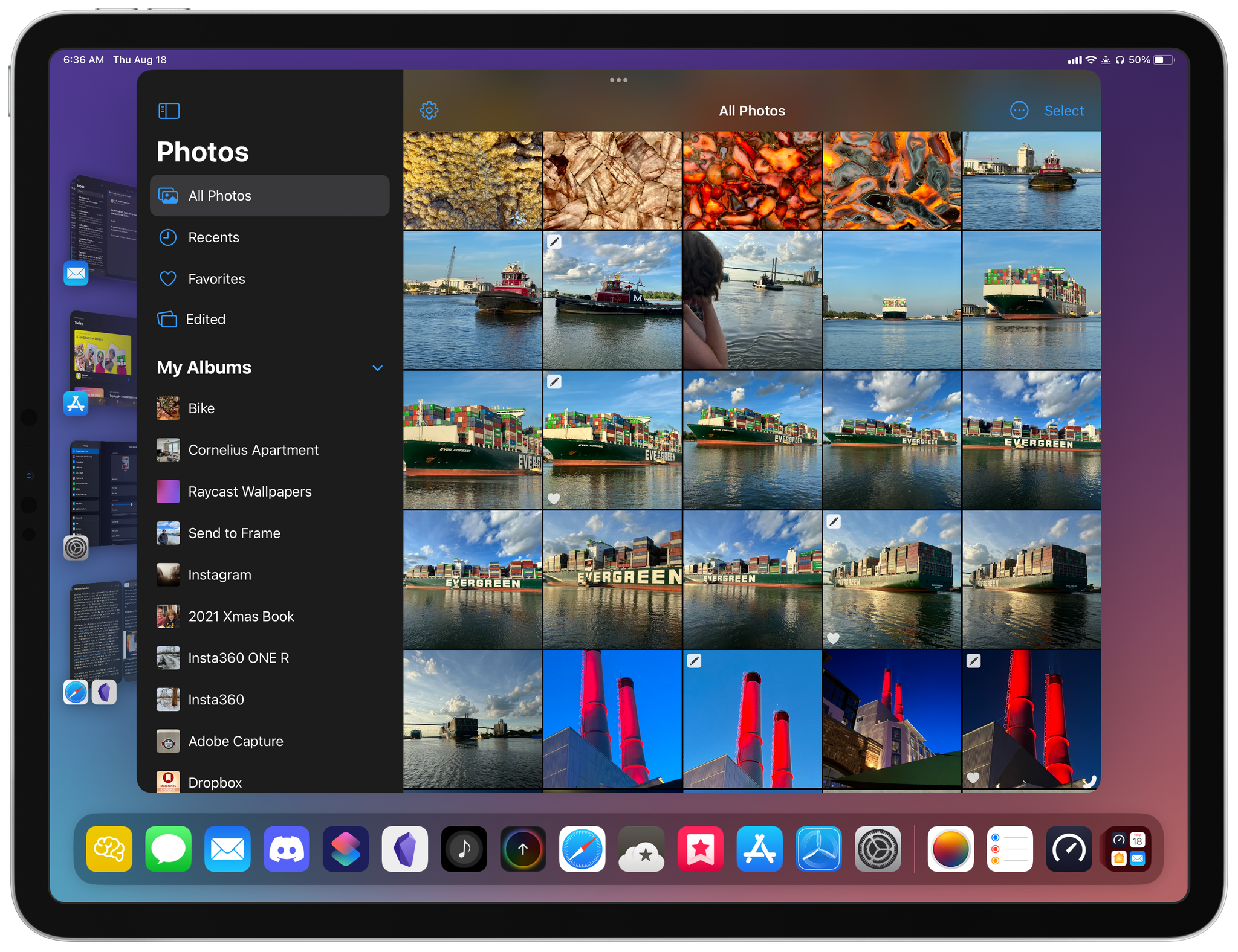
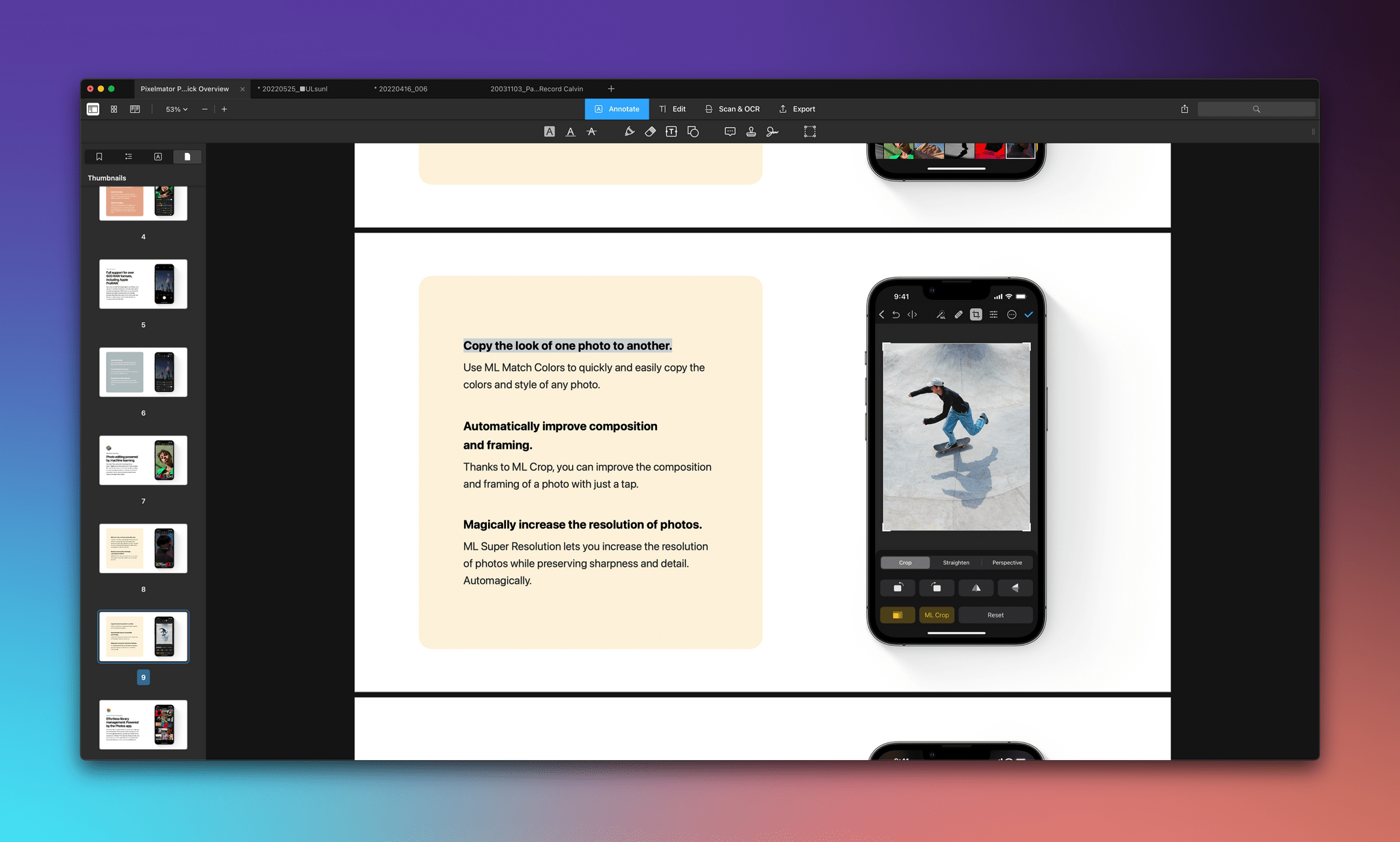
Pixelmator Photo for iPad.
There are a lot of reasons for Pixelmator Photo’s move to a subscription model, which are explained in detail in the team’s blog post. As with any move from paid-up-front to a subscription, some users will be left behind, which is a shame, but I’m not surprised by Pixelmator’s move. I’m more surprised that the switch didn’t occur earlier. Pixelmator Photo is a top-notch, high-quality app that is continuously developed to keep up with advances in Apple’s photo editing frameworks and hardware updates. That’s not the sort of app that can be offered for a set price indefinitely, as demonstrated by the manyothersophisticatedapps, including other photo editing apps, that have made the leap to a subscription model. Hopefully, the switch to subscriptions will allow the Pixelmator team to continue to develop Photo for a long time to come.
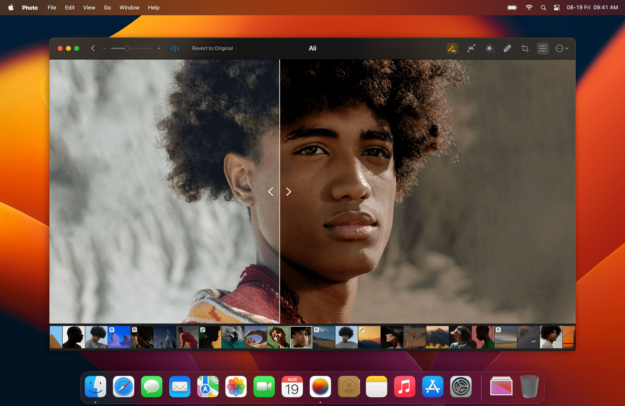
There aren’t many details about the Mac version of Pixelmator Photo to share except for the image at the top of this story, but I like what I see. If you’ve used the iPad version of Pixelmator Photo, the Mac app will be immediately familiar with its spare UI and focus on the image being edited. There’s no word yet on when the Mac version might be released, but when it is, we’ll have a complete review.
Last year, we awarded NoirBest New App of 2021 as part of the MacStories Selects Awards. Jeffrey Kuiken’s Safari extension for the iPhone, iPad, and Mac, which can apply a custom dark mode to websites that don’t offer their own, is a fantastic example of an app that implements a new technology – the native Safari extensions introduced with iOS and iPadOS 15 and earlier on the Mac – in a way that is simple to use but also provides advanced customization for users who want that. Noir immediately became a MacStories favorite on launch, and it remains an app that I rely on every day.
The latest update to Noir takes the app’s original concept a step further with new theming options, theme sharing, and extensive keyboard shortcut support. It’s an excellent update that anyone who likes to tweak the colors used in their apps will appreciate. Let’s take a closer look.
PDF Expert by Readdle has been a leading PDF utility since the early days of the App Store, offering the kind of pro-level features that are critical to users whose work depends on managing and editing PDFs. With today’s update to version 3, PDF Expert for Mac debuts a new look, optical character recognition support, new export formats, and changes to its business model across all platforms. We’ve covered the core features of PDF Expert many times in the past, so let’s focus on the changes you can expect from today’s update.
One of the cornerstone features coming to macOS Ventura this fall is Stage Manager, which lets you create sets of multiple apps, decluttering your desktop without a lot of fiddling. In my limited use so far, I’m optimistic about Stage Manager’s future as a way to manage apps, but it’s not for everyone, which is fine because there are so many other ways to manage windows on a Mac.
There are other utilities available for arranging windows on your desktop and saving those configurations. For window placement, I use Magnet. I love that the app can be driven entirely by keyboard shortcuts but is also always available in my Mac’s menu bar.
However, for some reason, utilities for saving the window configurations I create with Magnet have never stuck as part of my workflow. With Stage Manager on my mind recently, though, I thought I’d give a new app called Warp a try.
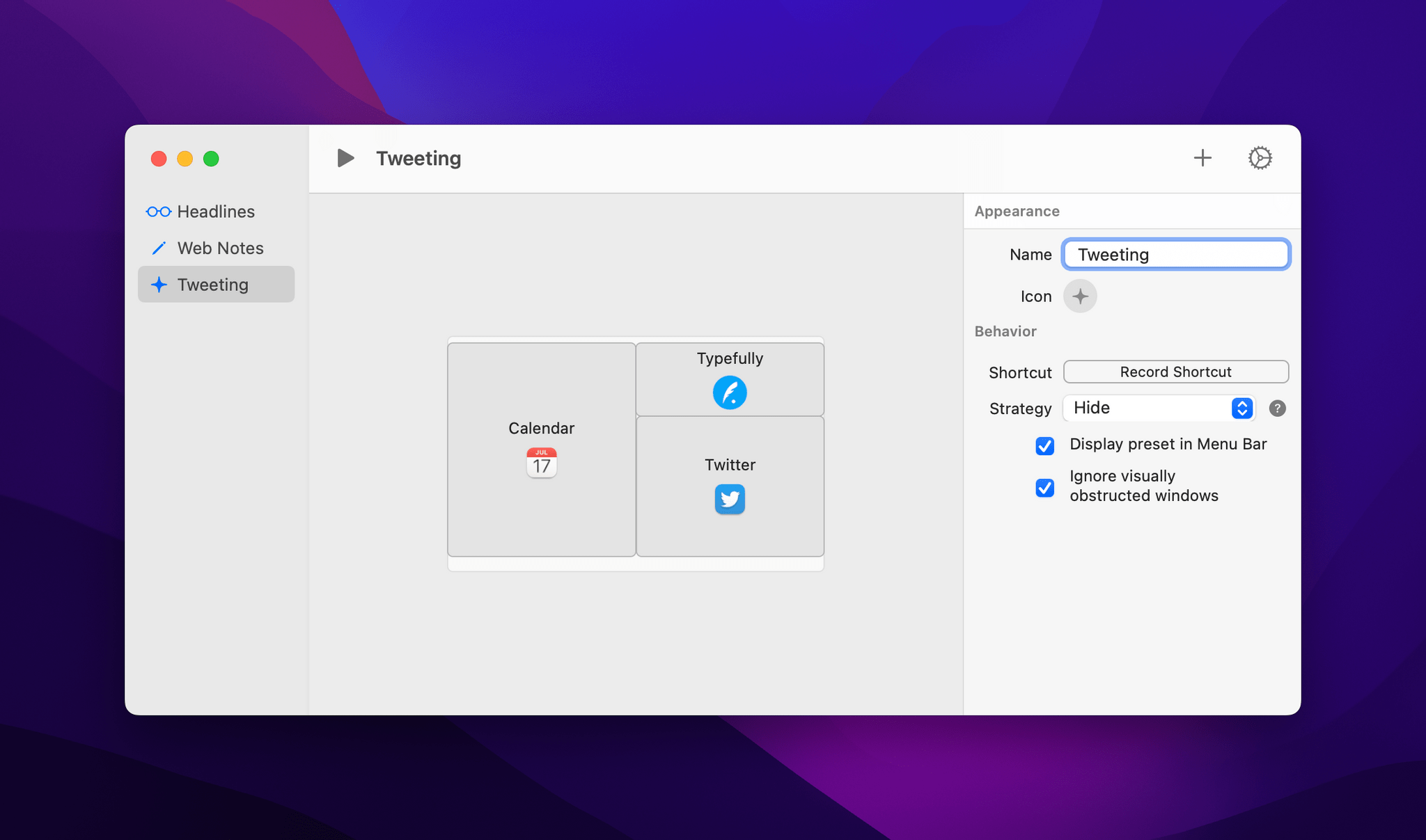
I like the way Warp previews layouts in its preferences.
Warp is the creation of Mike Choi, who released Juice, a macOS Bluetooth device manager that I covered in 2019. I’ve only been using Warp for a few days, but it has already fit neatly into my Mac workflow because it’s a simple, keyboard-driven utility that scratches the same sort of itch as Magnet.
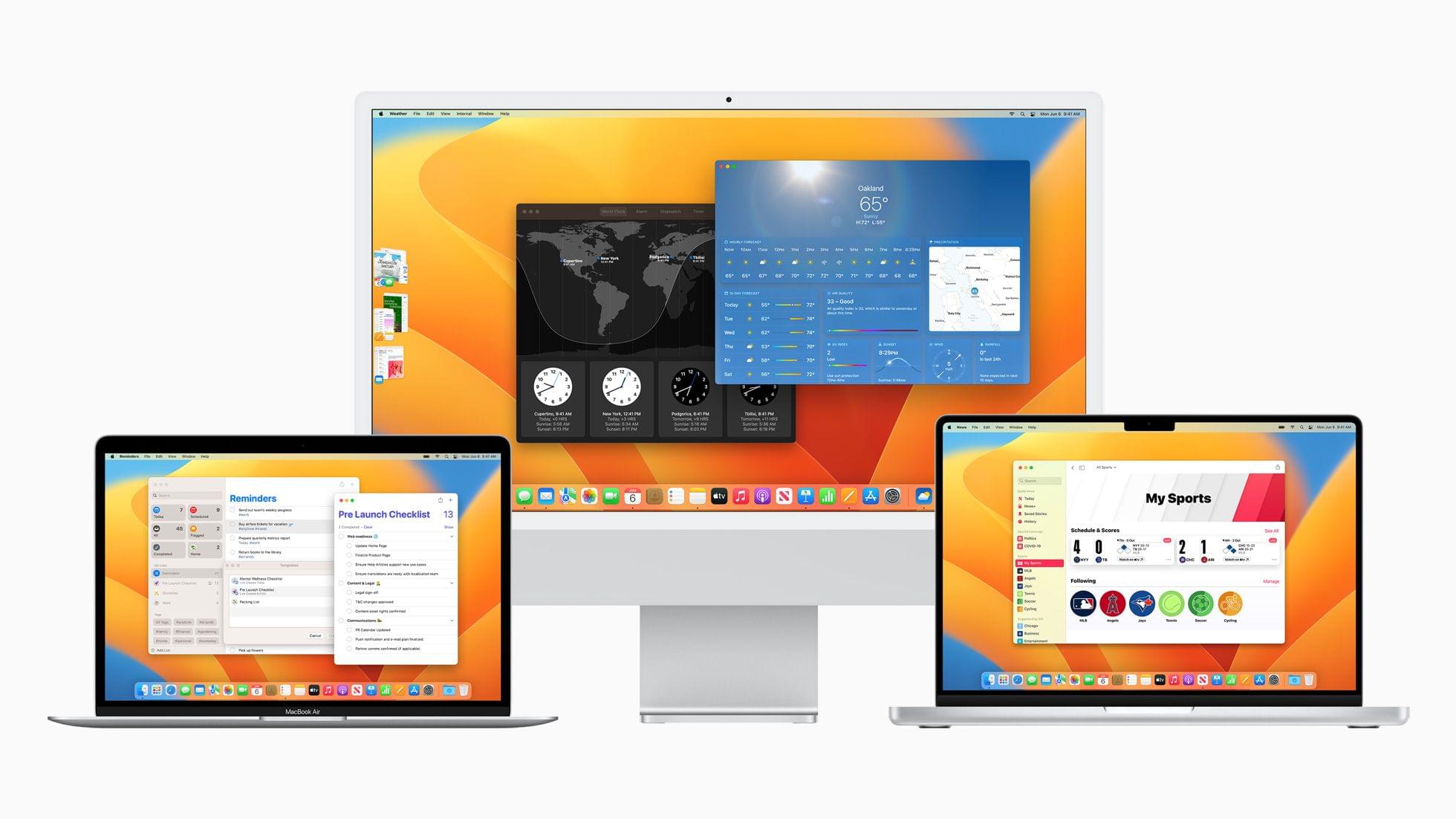
At this morning’s WWDC keynote presentation, SVP of Software Engineering Craig Federighi took the stage to announce the latest update to Apple’s desktop operating system: macOS Ventura. Ventura introduces a host of improvements, with many going hand-in-hand with their iOS and iPadOS 16 counterparts. A new windowing mode is perhaps the most intriguing addition, but the clearest wins come in the form of smaller app-specific features such as scheduling outgoing emails in Mail or marking conversations as unread in Messages. Altogether, Ventura looks like a very solid year-over-year upgrade for macOS.
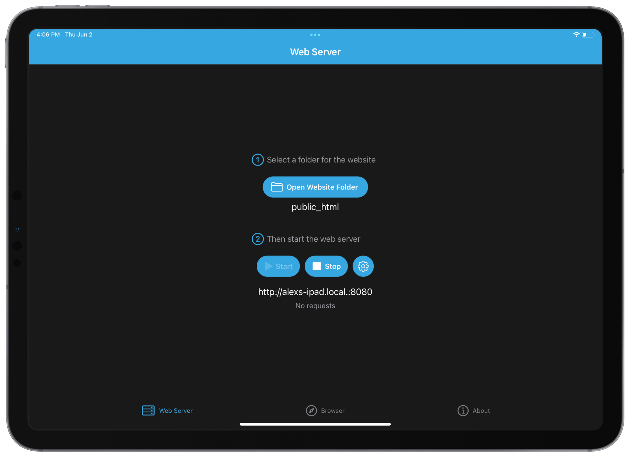
Early today The Iconfactoryreleased their latest app, a simple web server utility called WorldWideWeb. Solidly developer-focused in scope, the app serves files from a local directory to an automatically generated URL, making these files available to any device on your local network. While there are sure to be more inventive use cases for such a utility, its general purpose is for testing simple websites built on the Web’s greatest primitive: HTML.
WorldWideWeb’s killer feature is simplicity. The app’s entire main interface consists of two tiny sections: in the first you select a folder, and in the second you start or stop the web server. When the server is activated, a URL is generated. The app uses Bonjour to make the address available to any device on the same Wi-Fi network as the host. Just copy and paste the URL or press the ‘Open in Browser’ button to view the website natively in a web browser.
For the past few months, I’ve been living a double life.
Most of you probably know me as “the iPad guy”. And rightfully so: the iPad – more specifically, the iPad Pro – is my favorite computer Apple’s ever made; my coverage of iPad, iPad apps, and, later, iPadOS has far exceeded everything else on MacStories for the last 10 years. I’ve long considered myself primarily an iPad user and someone who strongly believes in the platform because there’s nothing else like it. I don’t think I need to tell that story again.
For these reasons, as you can imagine, when Apple got in touch with me last November asking if I wanted to try out one of the new MacBook Pros with the M1 Max chip, I welcomed their suggestion with a mix of surprise, trepidation, and, frankly, genuine curiosity. What could I, a longtime iPad user, even contribute to the discourse surrounding the comeback of the Mac lineup, the performance of Apple silicon, and the reality of modern Mac apps?
But I was intrigued by the proposal regardless, and I said yes. I was very skeptical of this experiment – and I told Apple as much – but there were a few factors that influenced my decision.
First and foremost, as many of you have probably noticed, I’ve grown increasingly concerned with the lack of pro software (both apps and OS features) in the iPad Pro lineup. As I wrote in my review last year, iPadOS 15 was, by and large, a quality-of-life update that made iPadOS more approchable without breaking any new ground for existing pro users of the platform. As much as I love the iPad, at some point I have to face its current reality: if Apple thinks iPadOS isn’t a good fit for the kind of functionalities people like me need, that’s fine, but perhaps it’s time to try something else. If my requirements are no longer aligned with Apple’s priorities for iPadOS, I can switch to a different computer. That’s why I believe 2022 – and the upcoming WWDC – will be a make-or-break year for iPad software. And I don’t think I’m the only iPad user who has felt this way.
Second, the arrival of Shortcuts on macOS Monterey gave me an opportunity to expand and rethink another major area of coverage for MacStories, which is automation. Along with iPad and iOS, I consider Shortcuts the third “pillar” of what I do at MacStories: with the Shortcuts Archive, Shortcuts Corner and Automation Academy on Club MacStories, and Automation April, I’m invested in the Shortcuts ecosystem and I know that our readers depend on us to push the boundaries of what’s possible with it. With Shortcuts on macOS, I felt a responsibility to start optimizing my shortcuts for Mac users. That meant learning the details of the Shortcuts app for Mac and, as a result, use macOS more. From that perspective, Apple’s review unit couldn’t have come at a better time.
Third, and perhaps most important to me and least helpful for you all, is one of my greatest fears: becoming irrelevant in what I do. As a writer, I guess I shouldn’t say this; I should say that I write for me, and that I would write regardless, even if nobody read my stuff. But as a business owner and someone who’s gotten used to having a medium-sized audience, that would be a lie. I love the fact that I can write for my readers and get feedback in return. I love that I can write something that is wrong and be corrected by someone. I don’t want to lose that. Do you know what’s a really easy way to make it happen? Grow into someone who’s stuck in their ways, only writes about a certain topic, and doesn’t think anything else is worth trying or even remotely considering. In my case, I don’t want to look back at MacStories in 10 years and regret I didn’t at least try macOS again because I was “the iPad guy” and I was “supposed to” only write about a specific topic. I make the rules. And the rule is that curiosity is my fuel and I was curious to use macOS again.
So that’s my context. For the past six months, I’ve been using my MacBook Pro instead of the iPad Pro to get my work done on a daily basis. I’ve kept using the iPad Pro to test my shortcuts, read articles, and write in places where I didn’t have enough room for a MacBook, but, by and large, I’ve lived the macOS lifestyle for half a year by now.
As we head into WWDC, here’s my story on how this experiment went.
It’s been fun to watch Grocery by Conrad Stoll evolve over the years. The app started as a relatively simple shopping list app on the iPhone but has transformed into something much deeper. Today, Grocery is available on the iPhone, iPad, Mac, and Apple Watch and offers a comprehensive feature set that also covers meal planning, recipes, and inventory tracking. This week’s release of version 3.0 of Grocery takes the app’s formula further with a fresh, modern design, tighter integration between inventory management and shopping lists, and other new inventory features for better tracking of what you have on hand. It’s an excellent update that takes advantage of the latest features of Apple’s OSes to offer a broad-based approach to grocery shopping.
I’m going to focus this review on what’s new in Grocery 3.0, but you can read more about the app’s core features in my pastreviews.