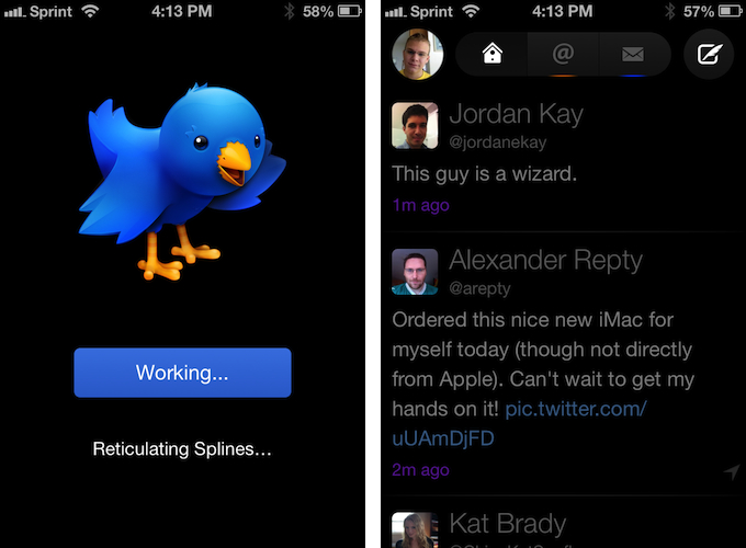
Twitterrific 5. It’s been fun to watch Twitter’s reaction to an app that I, and other writers, wanted to surprise the world with. Alas, it was bound to leak, unsurprisingly by Apple’s Japanese App Store. The Iconfactory’s latest iteration of their famed Twitter client is shockingly different isn’t it? The same gut reactions I watched unfold on Twitter could not better describe the same gut reactions I had when I first saw just how striking the new interface is.
Sharing the first pic of Twitterrific 5 with my coworkers resulted in an immediate, “Wow.” After a few more screenshots, “That looks like a Windows 8 app. Like Track 8.” It’s an absolutely fair assessment. And it’s one I’ve seen echoed on Twitter as I watched the tweets scroll by. Thankfully, Twitterrific 5 is as much of an iOS app as it ever was. No text hangs off the screen — no “CTURES” as Federico and I will joke.
Twitterrific 5 presents itself dressed in black with Helvetica accents and familiar shades of orange and blue for mentions and messages. It’s both instantly recognizable and obviously different. In contrast to colored entries and standard rectangular iOS elements, it is typography, floating buttons, and rounded corners that are pervasive in the new Twitterrific.


