Posts tagged with "UI"

Screens 1.5 Now Available: Still The Best VNC Client for iOS

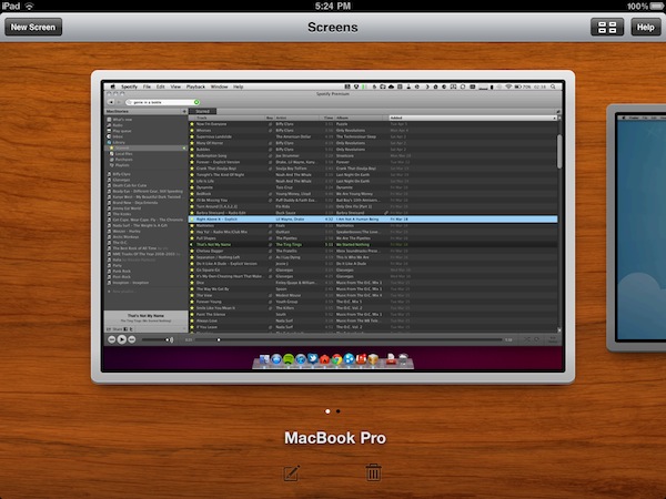
When I first reviewed Screens, a universal VNC client for iOS by Edovia, I was impressed by the speed and elegance of the app, which made it super-simple to connect to Windows PCs or Macs on a local network, as well as remote computers powered by a global dynamic hostname. Together with that, Edovia’s Screens proved that a VNC client for iPhone or iPad didn’t need to completely mimic the functionality of a desktop computer: rather than putting a mouse cursor on screen, the app allowed you to turn a computer’s screen into a multi-touch based experience as if it was built for iOS in the first place. With Screens, you don’t move a cursor like in most VNC clients: you touch the computer’s windows and apps. With gorgeous animations, responsive loading times and a free service called Screens Connect to automatically and easily log into a remote machine without having to fiddle with IP addresses and router ports, Screens managed to become the most popular VNC app for iOS, and one of my favorites overall.

Months after the original release, Screens receives today a major update to version 1.5, which I had the pleasure to beta test and play with for the last couple of weeks. Screens 1.5 introduces a lot of optimizations to the underlying VNC engine to make connections faster, more stable and, based on my tests, more responsive with both PCs and Macs. Minor bug fixes and improvements aside, Screens 1.5 fixes an issue that caused a crash when disconnecting from a computer, and enhances responsiveness with several Windows VNC servers. As far as connecting to a remote computer goes, Screens now displays the Screens Connect status in the Settings, so you can instantly know whether your computer is remotely accessible or not. However, connecting to a machine on your local network is as easy as before – Screens automatically recognizes computers with screen sharing enabled, and all you’ll have to do is enter a password and choose a nickname.

Screens 1.5 also brings a new icon, a revamped UI and a new Grid View on the iPad that will come in handy for those who manage a lot of different computers; if you’re concerned about privacy, Screens now enables you to choose whether or not you want the app to grab a screenshot of your desktop upon disconnecting. If you don’t want to have “real” previews in Screens’ dashboard, a default image will be used. In the Settings, you can also set a computer to open in fullscreen mode, and you can toggle modes (full, partial, off) with a three-finger tap. It works really well.

Screens 1.5 is an important update to a great VNC client for iOS that keeps getting better with lots of options, and a fast engine. The developers didn’t sacrifice usability for options, though, as the app is still very easy to use and provides a simple way to add, modify and delete computers. The update is propagating now in iTunes, and you get the app here at $19.99. Highly recommended. Read more


The Problems with a Retina Display on the Mac

The Problems with a Retina Display on the Mac

If Apple were to do something like the above, the biggest question I would have is whether or not they’d put something into place for users who genuinely do want much smaller UI elements and much more screen real estate. That is, if Apple were to double their UI, and then use the 2×1080p resolution for the 27-inch iMac, there’s a sense in which current 27-inch iMac users would feel like they were actually losing screen real estate from their current 2560 × 1440 displays. But that’s why Apple’s Apple and I’m a guy writing about them: if and when Retina Displays do come to the Mac, they will have thought that issue through and either solved it, or decided that the set of users who would be upset by it isn’t a large enough group to hold other users back.

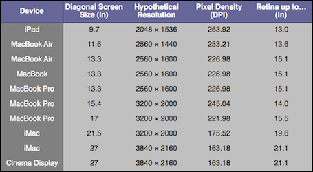
Tim Ricchuiti at The Elaborated makes a great case for the issues Apple would have to overcome in implementing higher resolution displays (let’s just call them Retina Displays for the sake of the argument) on Macs: at 3200 x 2000 pixels (that’s the resolution of the default wallpaper image found in the Lion betas, and no Mac or Apple-branded screen currently ships with such pixel density), UI elements on a MacBook Pro 15” would look small, unless Apple comes out with a solution to offer same-size graphics, on a higher-res screen. On the iPhone 4, for example, they allowed developers to create “2x” graphics that, with double the pixels on the iPhone 4, look the same size of iPhone 3GS graphics. But how would you do that on a Mac, where users can decide to install apps both from the web and the Mac App Store, thus preventing Apple from enforcing a 2x standard? Plus, how could Apple offer a way to switch between bigger and smaller UI elements? A desktop ecosystem like OS X with computers featuring much bigger displays than iOS devices raises more questions over the implementation and usage of Retina Display.

Make sure to check out Tim’s full article here. Whilst “HiDPI display modes” were previously rumored to be finding their way to new Mac screens relatively soon, we think Apple will have to find a solution to the problems with a Retina Display on the iPad first. [via Daring Fireball]

Permalink

This Front Row Mockup Is Totally Gorgeous

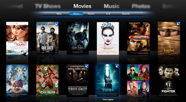
Designer Zach Forrester tried to imagine what would Front Row look like if Apple updated its interface with new shiny pixels, animations and a visualizer. The result, a series of mockups available here, is impressive: Zach took the basic concept underlying Front Row’s UI and the Apple TV’s browsing experience and re-imagined them with a bit of artistic sense and pixel perfection in mind.

I’m not sure about the keyboard as-you-type he designed, but everything else looks great: from the Movies view with larger poster art and slide-in animation for a single item, to the music player that includes a subtle visualizer on top of the Cover Flow navigation and next to the Now Playing album art.

More screenshots are available here, and there’s a limited web demo for you to play around as well. [via Beautiful Pixels] Read more


iPhone Apps and Custom Tab Bars

iPhone Apps and Custom Tab Bars

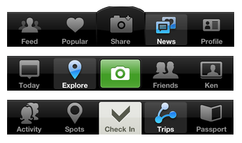
There’s been a new trend with iPhone apps to use more sophisticated custom tab bars. In case you don’t know what a “tab bar” is, it’s historically been the black bar at the bottom of the screen, which provides the main navigation for the iPhone app.

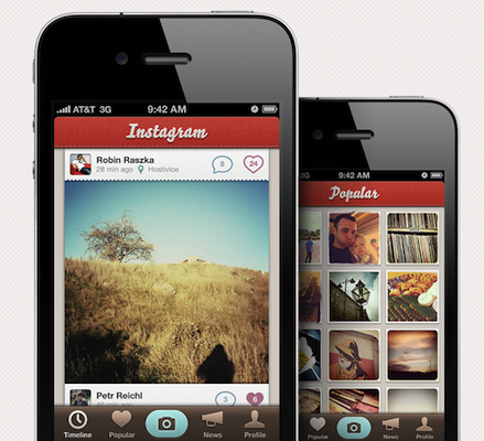
A trend started by Instagram (the first popular app to place an action button in the tab bar, not a view selector) is quickly expanding to other apps like Gowalla and Path. While I recognize this isn’t exactly ideal from a UI ecosystem standpoint (it break several of Apple’s interface guidelines), I do think that sometimes disruption is necessary as it leads to innovation. The problem is, many developers just wait for Apple to innovate.

Permalink


A Beautiful Instagram Facelift

A Beautiful Instagram Facelift

Instagram is one of the hottest photo sharing apps on the App Store right now but there’s one problem: it doesn’t look that great. At Tapmates, we take pride in our icons and user interfaces, so we decided to mock-up what it would look like if we made it.

The mockup surely sports some pretty pixels. Still, it breaks many of Apple’s interface guidelines, such as the camera button in the tab bar. Looks great nonetheless.

What do you think?

Permalink

Free iPad GUI PSD For iOS Designers

Free iPad GUI PSD For iOS Designers

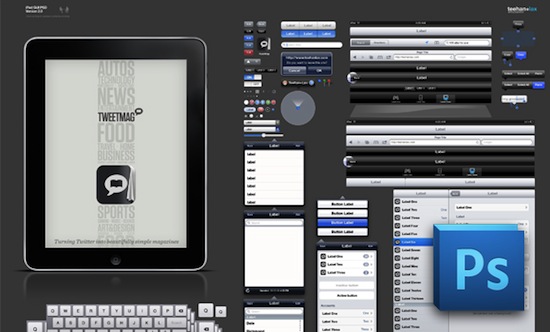
We’ve always just created this file for ourselves and shared it freely. It takes a good deal of time to create and maintain but it saves us a lot of effort on projects and pitches – we hope it does the same for you. So, this time around we’re asking anyone who actually gets some use out of it to pay whatcha’ like. Hate it? Don’t pay anything.

Free to download, pay if you like. Go get it here.

By the way, it’s from the creators of TweetMag.

Permalink

djay: Full-Featured DJ System For iPad With A Gorgeous UI

When the iPad was announced back in January, many of us realized that the device would be perfect for professional DJ software. A large multi-touch surface, a brand new device developed by Apple backed up by the App Store – obviously the iPad was meant for DJ and music applications. Even more than the iPhone (which saw the rise of music making software anyway, in spite of the 3.5-inch screen) the iPad was too perfect for turntable interfaces to not take the risk and start developing one soon after the announcement.

What happened is history: just take a look at DJ Rana June’s Youtube channel and open the Music category in the App Store to get the idea of the success of professional music making / mixing software on the iPad. There are hundreds of apps out there that allow you to record and mix music, and there are dozens of quality DJ apps in the App Store.

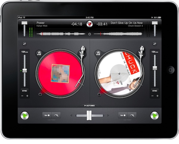
The just-released djay by Algoriddim, however, takes the game a step further. It comes with an impressive feature set and underlying technology, it takes advantage of iOS 4.2 audio and streaming functionalities, it’s got stunning user interface and animations. Here’s why you should check it out no matter if you’re into DJ software for iOS devices (and Mac) or not. Read more


Is Realistic UI Design Realistic?

Is Realistic UI Design Realistic?

When Apple introduced the iPad, along with it came a set of Human Interface Guidelines.

This idea is essentially doubling down on skeuomorphic realism — a derivative device containing features from an analog ancestor for purely aesthetic or emotional reasons.

But how good is that advice, generally? This is clearly a call for more than just the polished aesthetic details and refinements a designer takes pride in. This is about advancing literalist design styles and skeuomorphics on the grounds that it improves usability through a natural understanding of how an app works. Apple rightly resisted this temptation in many cases, but the Notes and Calendar apps are a different story. Apple combined analog design with modern UI patterns at the expense of affordance. My real life, analog paper doesn’t scroll. Are we now to expect its digital replication should?

A very few developers seem to understand that you don’t have to necessarily imitate real life objects to create a successful and enjoyable application. [via Beautiful Pixels]

Permalink