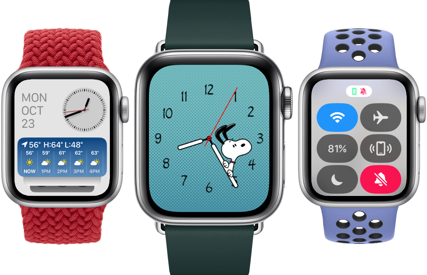
In my watchOS 9 Review last year, I spent the introduction reminiscing on the more exciting days of watchOS yore. Those early years were full of whimsy and foolishness, with many wild and ambitious new features that failed far more often than they succeeded. By my count, it took until watchOS 4 for Apple to find its footing, and by watchOS 6 the predictable pattern of iteration that I laid out last year had begun.
As I said last time, it’s hard to argue against the slow and steady march of watchOS. This software joined with the Apple Watch hardware has resulted in a years-long market domination that shows no sign of stopping. Yet, market be damned, I couldn’t help but feel disappointed. Health and fitness features were flourishing, but the rest of watchOS never quite felt fully baked.
As it turns out, Apple seems to have agreed.
In watchOS 10, for the first time in years, the iterative update pattern is broken. Rather than the usual handful of minor app updates, new watch faces, and health and fitness features, Apple has instead dropped another major rethink of Apple Watch interaction methods. The side button has been reassigned, the Dock has been demoted, apps have a new design language throughout the system, and widgets have made their Watch debut.
This is the largest year-over-year change to watchOS since version 4, and I am here for it. Let’s jump in and see if Apple has hit the mark this time, or if they’ll be back to the UI drawing board again in the years to come.


