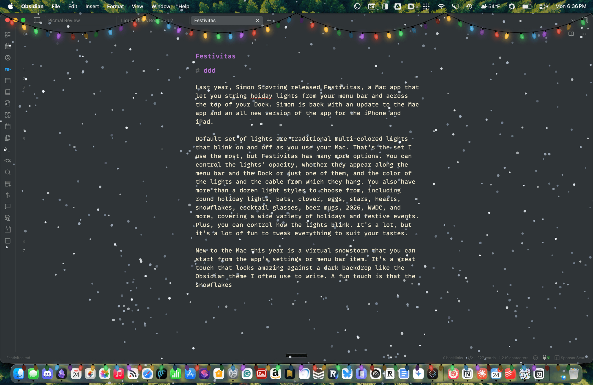
Last year, Simon Støvring released Festivitas, a Mac app that lets you string holiday lights from your menu bar and across the top of your Dock. This year, Simon is back with an update to the Mac app and a new version for the iPhone and iPad.
The default set of lights consists of traditional multi-colored bulbs that blink on and off as you use your Mac. That’s the set I use the most, but Festivitas offers many more options. You can control the lights’ opacity, whether they appear along both the menu bar and the Dock or just one of them, and the colors of the lights and the cable from which they hang. You also have more than a dozen light styles to choose from, including round holiday lights, bats, clovers, eggs, stars, hearts, snowflakes, cocktail glasses, beer mugs, “2026,” “WWDC,” and more, covering a wide variety of holidays and festive events. Plus, you can control how the lights blink. It’s a lot, but it’s also just plain fun to tweak everything to suit your tastes.
This year, the Mac app adds a virtual snowstorm that you can start from the app’s settings or menu bar item. It’s a great addition that looks amazing against a dark backdrop like the Obsidian theme I often use to write. A fun touch is that the snowflakes avoid your pointer, and you can adjust the sensitivity of this feature in settings. You can also use your pointer to push around the lights hanging from the menu bar, which is handy for those times when they obscure Safari’s menu bar or other content.
The snow is lovely. I highly recommend pairing it with the Animal Crossing Snowy Day soundtrack on Nintendo Music. It’s an incredibly peaceful and relaxing combination.
Festivitas supports Shortcuts, too. Simon has created some fun example automations that you’ll find in the app’s settings to do things like turning on the snowstorm when snow is forecast and activating your lights when you play music.

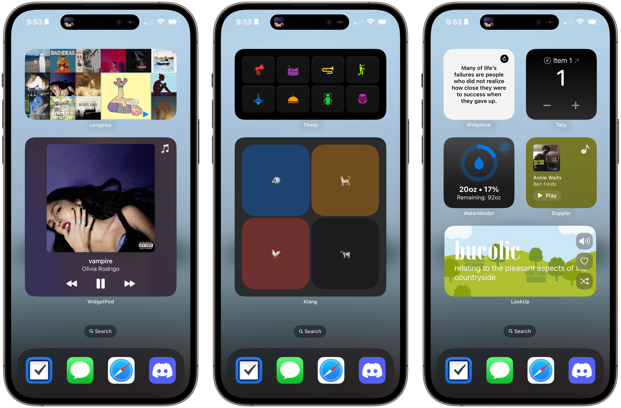
New this year is a Festivitas app for the iPhone and iPad. The app lets you build small, medium, and large widgets to place on your Home Screen. You can either frame a photo with twinkling lights or create a transparent-style widget so the lights frame an element of your Home Screen. I love that the lights framing the photos are animated, an effect I know isn’t easy to do with a widget. You can also add text and make other adjustments to each widget.
Festivitas isn’t going to help you get more done. In fact, it might even slow you down a little bit, and maybe that’s the point. Taking a moment to enjoy the app’s lights and be mesmerized by the falling snow is a good reminder to slow down a little and have some fun.
Festivitas for the Mac is available directly from the app’s website for any price you want to name between $3.99 and $9.99. The iPhone and iPad version is a free download on the App Store with a range of in-app purchases from $3.99 to $9.99 to create a similar name-your-price system.
.](https://cdn.macstories.net/wednesday-27-sep-2023-11-00-17-1695827189031.png)