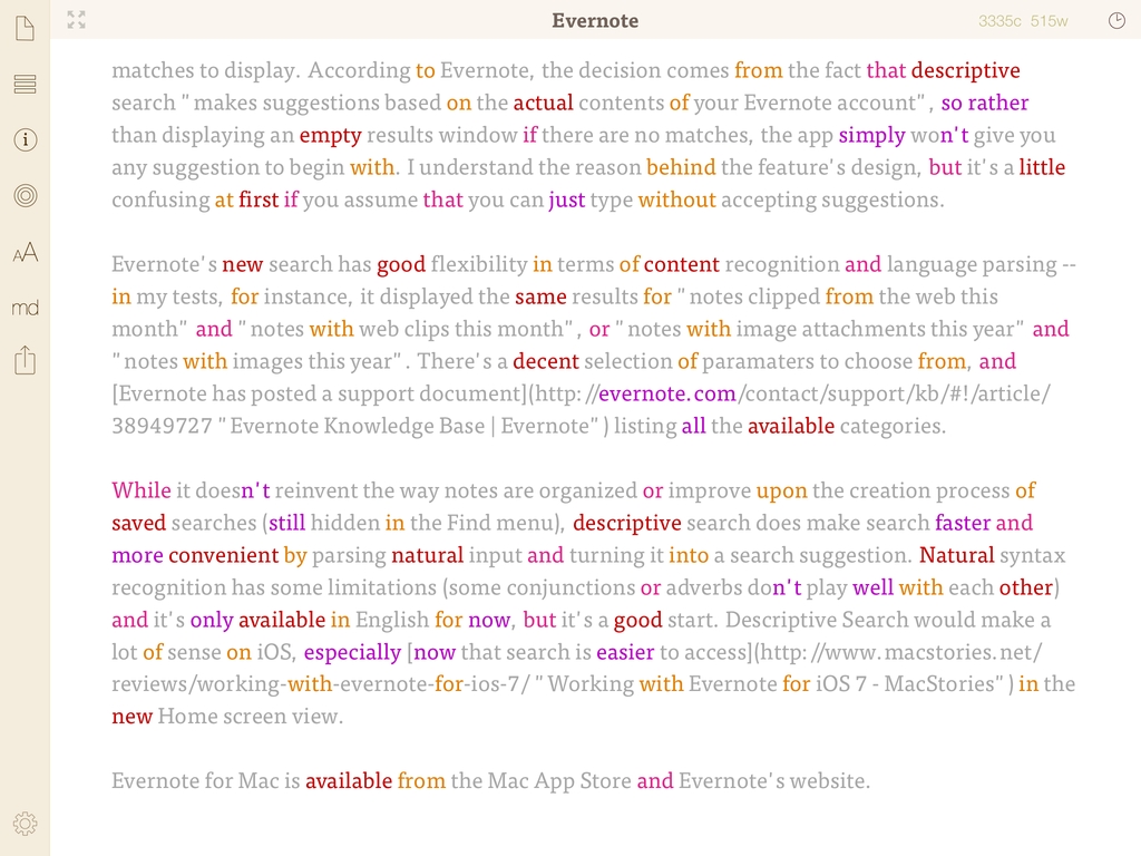
My iPad writing setup primarily consists of Evernote, Editorial, and WriteRight, three apps that I use to research, write & edit, and proofread my articles, respectively. For the past few months, I’ve been using Greg Pierce’s Phraseology 2.0 for iPad, which is out today on the App Store and which I consider a must-have companion app for people who write on the iPad and want to craft better text.
Posts tagged with "writing"
Efficient Writing On iOS with Phraseology 2.0
Improving The iOS Keyboard→
Improving The iOS Keyboard
Chris Bowler, writing about possible improvements for the iOS keyboard:
The negative with writing on the iPad is typing. It’s a bit of a mixed bag experience — the iOS autocorrection is (at times) brilliant and I can fly along with confidence, knowing the OS is going to correct my typos. But when mistakes are made and are either not autocorrected, or autocorrected incorrectly, then the iPad becomes a less comfortable environment.
Remember when, ahead of the original iPad’s announcement in January 2010, rumors tended to focus on what the “tablet keyboard” would be like? Here are a few examples. In spite of the iPhone having shown that Apple simply wanted a regular keyboard’s appearance translated to multitouch, several people wondered whether Apple should do something different for the bigger screen. The answer was that they simply designed a “full-screen” keyboard.
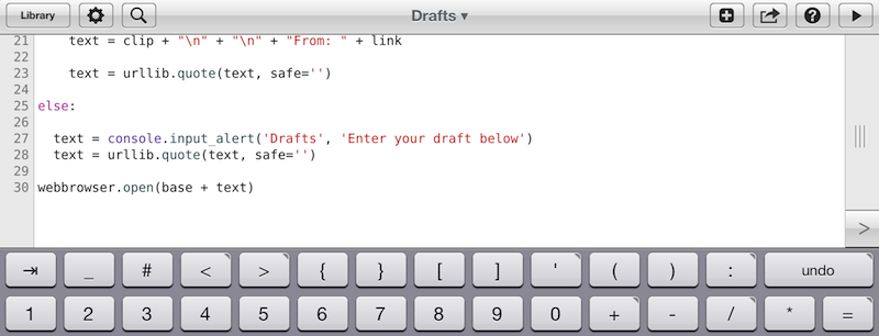
As Chris notes, over the years third-party developers have extended the iOS keyboard with additional bars. Look at Writing Kit, Pythonista, Textastic, and iA Writer for examples of these modifications.
I think the discussion on the iOS keyboard often mixes writing with editing. Personally, I believe the iOS keyboard is great for writing, because it’s just a normal keyboard, but iOS text selection is in serious need of an update, because it feels outdated. I’m not sure the average user cares about better text selection, but for the sake of the argument, I will say that a better solution should be explored.
If you read those old pre-2010 posts on the “iSlate keyboard”, you’ll notice a common thread: that Apple must build something revolutionary for text entry. I recall some people guessed a split keyboard could be a possible implementation, and, in fact, that one came true in 2011. But what about text selection? I don’t think keeping on adding bars above the keyboard is feasible. Especially on the landscape iPad, a single bar alone sensibly diminishes the space available for writing – space being one of the most commonly cited advantages of the iPad against 16:9 and 16:10 tablets. On the iPhone 5, it’s an acceptable solution thanks to the taller screen, but, then again, the bar is too narrow to be a meaningful improvement.
Rather, I would say entirely new ideas for text selection and manipulation are the future. It’s the reason everyone got excited for the Hooper Selection: once you saw it, it just made perfect sense. Too, I wouldn’t completely forget about features that Apple put on the shelf, as they tend to come back.
So here’s my hope for the future of iOS for writing: the same keyboard, but also new, fresh ideas for text selection and editing.
Marco Arment’s The Magazine: At The Intersection of Technology and Writing
When people ask me about my job, I usually reply: “I write about technology”.
Just a little over three years ago, I found myself unemployed, so I started MacStories. It wasn’t easy. Not because of WordPress, FTP, or getting black pixels to appear on a white background. I’ve never had a problem with putting words on a screen.
It wasn’t easy because where I live, a small town in Italy, writing about technology sounds a lot like “I spend my days at home looking at a computer while I drink coffee” . Which, to be fair, is a pretty accurate representation of my daily agenda. But how I do it, and why I do it, and understanding the whole idea of seeing technology as more than a bunch of cables – well, that was the not-so-easy part.
It still is. I know it will be for a long time. And yet I keep typing on this keyboard because I think it’s worth it. I do what I can by writing about my experiences.
Because, hopefully, thanks to technology, our kids will have a better future.
Because twenty years from now, people won’t “find out” they have cancer. They will know in advance, thanks to technology.
That’s quite a goal I, and others like me, are priding ourselves upon, you’d argue, when, effectively, what we do is reviewing apps and reflecting on the latest news. In practical terms, that’s what I do. But I see it as more than that.
Writing is about making connections.
In the past three years, I’ve seen how the great technology writers I look up to are able to make connections between topics and streams of thoughts: they look at the big picture.
On the flip side, technology writing, a scene that’s built on its very distinct and yet cohesive communities, has created connections between people. I wouldn’t have met the MacStories team if it weren’t for writing and following the same writers. I wouldn’t have gotten to know friends like Shawn, Stephen, Gabe, David, Matt, Matthew, Justin, Brett, and many more.
In fact, if it weren’t for this little writing thing of ours, I wouldn’t have met any of you.
Great writing creates connections inside and outside of text.
The Magazine
Marco Arment’s The Magazine falls exactly under this aspect of writing. It’s about people who love technology, delivered as a curated collection of articles from great writers. In a way, it’s the opposite of Instapaper: while Marco’s more popular app is what you make of it, The Magazine is Marco’s own vision. So, yes – you’ll have to trust him on this one.
I’ve never met Marco in real life. We’ve exchanged emails a couple of times and perhaps replied to each other on Twitter. The other day we talked about pears on App.net. But see, the great thing about the Internet is that I genuinely like this guy only because of his work and passion for technology.
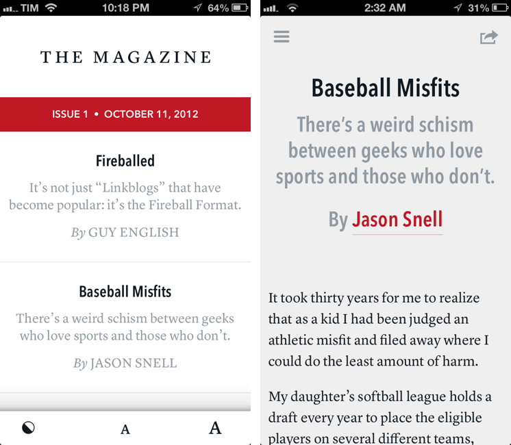
I think The Magazine is a promising and notable initiative for a variety of reasons. Firstly, for as much as I praise the tech community, there are aspects of it that I’m not particularly fond of. I don’t like rumors and linkbaity headlines. Sometimes I think that it’s too much when a site tries to tell me everything about a topic with 20 articles. In the words of Marco, The Magazine will take a “a measured approach to the big picture” with “meaningful editorial and big-picture articles”. Or, as Guy English writes in “Fireballed” for the first issue, The Magazine is both old and new. It’s old in that it won’t share the same publication schedule of most blogs; it’s new, because it should encourage writers to create more, new “timeless pieces” based on a business model that their “Fireball Format” website wouldn’t probably allow. I suggest you read Guy’s article in the first issue (there is a free 7-day trial).
I’ve heard from several people who received copies of The Magazine in advance that, in hindsight, the idea is obvious. Get articles from great writers and make an app out of it with new content available periodically. To me, The Magazine seemed “obvious” more because of the technology it’s built with.
Earlier this week I wrote a post on how to hide Newsstand from iOS 6. The Magazine is entirely based on Newsstand, and, a year after the launch of iOS 5, it’s the first app that gives it a purpose, at least for me. Read more
New Apps & Tools For More Efficient Writing
For the past week, the entire MacStories team and I have been focusing on finalizing our coverage of Mountain Lion, which, according to recent speculation, may be coming out next Wednesday, July 25th. As you may have noticed, we have been posting less frequently on the site, but we wanted to get our coverage just right, and I think we’ve managed to come up with a good plan. More details soon.
In the meantime, I’d like to share some links of apps and tools I have been using to research, write, and edit my review of Mountain Lion. As a general tip, make sure to check out our Reviews section, as several of the apps we have reviewed recently have a spot on my iPhone or iPad Springboard. But I’ve also discovered some new gems that, while working on the review, have helped me organize all my material more efficiently.
Scrivener. Per Dave Caolo’s recommendation, I decided to give Scrivener a try as a desktop app for writing and researching articles, and I’m glad I did. I’m still a novice – Scrivener is very complex and feature-rich – but here’s a few things that immediately enhanced my workflow: possibility to organize ideas and drafts as outlines, text, or visual notes; support for file attachments and OPML; document references for webpages; split-mode for comparing “snapshots” of document copies without creating duplicates of a file. I have been using Scrivener to compare various edits of my review, and I love it. An iPad app is coming, and I also got this book to learn my ropes around the app. Even better: Scrivener can sync to Dropbox, so I can make additions using the app I prefer. For iOS integration, I’ve been testing an app called Index Card, though I’m still not entirely sold on its implementation of the cork board.
Marked. To preview Scrivener’s contents (written in Markdown), I use Marked. Its exporting features are fantastic, and I have been using the outline navigator to get a better sense of my review’s structure. If you write on a Mac, you need Marked.
Keyboard Maestro Markdown Library. I only found out about this collection of macros this week, when I was looking for ways to automate link insertion in my article with Markdown. It turns out, the Keyboard Maestro Markdown Library contains macros for links, formatting, lists, and even images. I have tweaked them to better suit our site’s requirements (for instance, I have added captions to my image macro, and article titles to the link one using this tip), and, in total, I’m pretty sure they have already helped me save minutes I would have spent copying & pasting HTML instead. Amazingly useful. More on why I love Keyboard Maestro here.
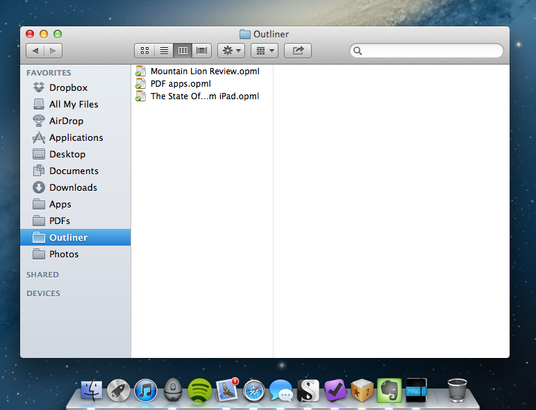
OmniOutliner and CarbonFin Outliner. I have recommended these two apps in the past, but they’re worth a second mention. For my review, I created an outline on my iPhone months ago and started adding new ideas and notes from there. On iOS, I like Outliner because it supports Dropbox and has a simpler interface than OmniOutliner for adding notes and indenting elements. But on the Mac, I rely on The Omni Group’s app because it’s got the best support for keyboard shortcuts and notes – which are both essential to my workflow.
NoMoreiTunes. I had to look up several iTunes applications in the past week, and this Safari extension did the trick (read: it doesn’t launch iTunes when Safari opens an iTunes link).
Markdown Service Tools. Because sometimes I want to use my Mac’s contextual menu to quickly generate HTML off some Markdown.
Macdrifter’s Dictionary Macro. Mountain Lion features a new three-finger single-tap action for Dictionary lookups and file previews, but some apps don’t recognize this gesture. If you use Keyboard Maestro, this is a nice way to forward any selected word to Dictionary.
Evernote. While my writing happened in Scrivener, all other research material that didn’t strictly belong to the article went into Evernote. With it, I use a combination of other apps and hacks that make it easy to save URLs, images, and just about anything. I use EverWebClipper to quickly beam URLs into Evernote from Mobile Safari; lately, I’ve also been playing with EverClip, which doesn’t feature a bookmarklet but can run in the background (“listening” for every new copied file) for 10 minutes. It’s sort of like Pastebot, but for Evernote, which is nice. To automate the process of saving links while on my Mac, I use a couple of AppleScripts put together by our Don Southard, which are obviously configured to work with Keyboard Maestro.
Captio. Indispensable utility to quickly save new tasks into my OmniFocus database.
iFiles. Following GoodReader’s somewhat unexpected removal of its iCloud-based file storage, iFiles came out with a similar functionality, and it works pretty well. iFiles hasn’t received a major update in months – apparently, the developer is working on a 2.0 version – but this iCloud integration is interesting, and works as you’d expect from an iOS file manager.
Last, IFTTT. If I’m not writing, I’m typically distracted by Internet while I browse around looking for interesting stuff. To make sure I can focus on writing without missing out on cool links, I have set up IFTTT to backup favorite tweets and starred Google Reader items to my Evernote and as a text file in my Dropbox. This way, if these services go down or will someday cease to support these functionalities, I’ll still have a complete archive of everything I had saved.
WriteUp 3.0
In my original comparison of iOS text editors, I included WriteUp, a fast and powerful Dropbox-enabled app that stood out thanks to its support for folders and sub-folders, exporting options, and versions. Prior to settling with Writing Kit for my daily iPad writing efforts, in fact, I had been using WriteUp as my go-to text editor – version 2.0 of the app was solid, but in the end not as powerful as Writing Kit.
Version 3.0 of WriteUp, released today, adds new powerful functionalities to speed up the process of working with multiple Dropbox folders and notes, bringing a new built-in web browser to augment the app’s research capabilities with split view. I have been testing WriteUp 3.0 for the past two weeks, and while I won’t completely switch from Writing Kit just yet, this new iteration of the app has stayed on my iPad because of the very specific features it introduces.
Split View
If you write on the web, split view is kind of a big deal. Being able to take notes and write blog posts while referencing a webpage on the other side of the screen is something we do every day on our Macs, yet it has been increasingly difficult to find iOS apps – especially iPad apps – that can get it right. In the past months, I have tried several applications that promised to allow me to “take notes while browsing”, yet most of them either failed at delivering a serious text editing environment to begin with, or simply didn’t function as advertised.
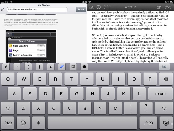
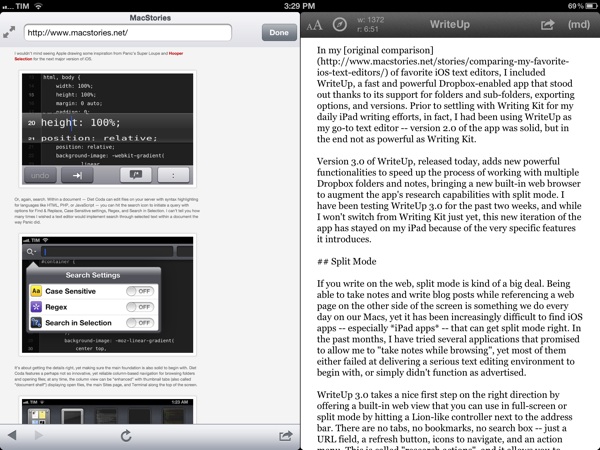
WriteUp 3.0 takes a nice first step on the right direction by offering a built-in web view that you can use in full-screen or split mode by hitting a Lion-like controller next to the address bar. There are no tabs, no bookmarks, no search box – just a URL field, a refresh button, icons to navigate, and an action menu. The latter is called “research actions”, and it allows you to open a link in Safari, copy it, email it, send it to Pocket or Instapaper, or “insert it into the note”. This option will basically copy the link to WriteUp’s clipboard highlighting the dedicated link button in the extra keyboard row, allowing you to open anInsert Link panel with the address already copied. Unfortunately, unlike Writing Kit, WriteUp 3.0 still doesn’t let you select words in text and only wrap those within Markdown links; I hope better Markdown auto-wrapping options will come in a future version of WriteUp. Overall, I also still prefer Writing Kit’s custom keyboard row.
The built-in web browser isn’t perfect: its performances aren’t comparable to Mobile Safari, and because of its size constraints, webpages will often be displayed partially, even when using the iPad in landscape mode. On a couple of times, I also noticed WriteUp would “freeze” a webpage without letting me reload it, and I really think there should be a dedicated Google button to relieve stress from the address bar. In spite of these few bugs and limitations, however, I can’t help but like WriteUp’s split view. It doesn’t let me drag & drop text between panels – I am not even sure that is technically possible – but it works in portrait and landscape mode, it’s dismissible with gestures, and, more importantly, it has already helped me write several news posts for MacStories when I needed to work side by side with webpages to reference quotes and other facts. It can only get better from here (idea: split view for multiple notes).
Pinned Notes, Favorites, and iCloud
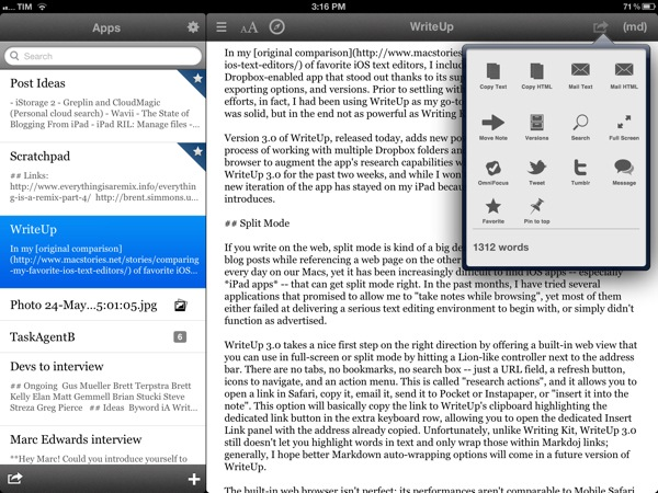
The second major addition to WriteUp 3.0 is something I’ve been wanting from a Dropbox text editor for a long time, and which the app gets precisely right. WriteUp can now mark notes as “favorite” and make them available anywhere no matter the folder they are into. Furthermore, a separate “pin” option lets you pin notes at the top of any folder, and both favorite and pinned items are synced across devices running WriteUp with iCloud.
Here’s how I use this feature. As outlined in my Dropbox writing workflow, I try to keep a consistent environment of text files that are always accessible and up to date independently from the tool or device I decide to use.
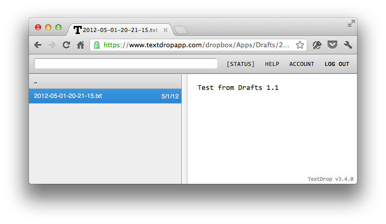
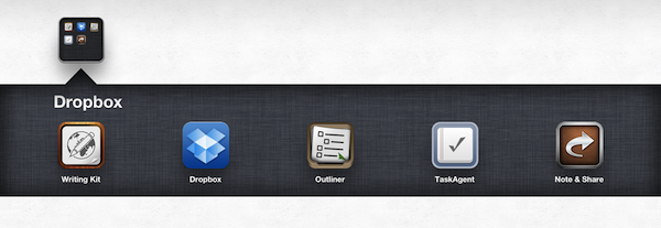
Lately, I have unified all my notes, drafts, and lists inside a single Apps folder that I can access from Writing Kit, TaskAgent, Drafts, TextDrop, and my Mac. My “longer notes” are located in the root of the /Apps folder, with sub-folders for the aforementioned apps inside it. OS X and TextDrop make it easy to navigate through these as they have access to my entire Dropbox filesystem; most iOS text editors, on the other hand, typically force you within a single folder, and won’t let you move between sub-folders. Not only does WriteUp let me navigate notes and folders, it now also a) enables me to mark my most used TaskAgent list as favorite so I can see it in the main Apps folder and b) pin my Scratchpad.txt file to the top of the folder view so I’ll always know where I can quickly jot down notes and links (and if I happen to be cleaning up my Drafts folder, I can easily cut links, and copy them back to Scratchpad.txt without navigating back to /Apps).
Pinned and favorite notes have been a terrific addition to my workflow, and I found both the implementation and iCloud sync solid and reliable. It’s not for everyone – admittedly, several writers I know like to keep their Dropbox notes and folders in separate locations – but if you’ve been looking for a way to unify your text files and folders in a single view, WriteUp 3.0 should have you covered here.
Wrap Up
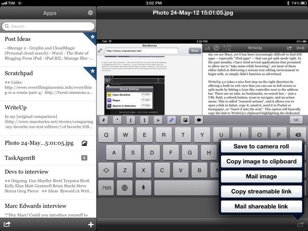
There’s a bunch of other neat additions in WriteUp 3.0. Markdown Extra (tables, footnotes, etc) is now supported, and the app can send notes to OmniFocus, iMessage, and publish to Tumblr. Terminology integration lets you look up or replace words using Agile Tortoise’s fantastic dictionary app; you can move “complete” folders to other locations in your Dropbox; and because Dropbox now lets you share files from any folder, WriteUp 3.0 can upload images, and give you a streamable link you can share or use as source for images in your notes. If you plan on serving images from your Dropbox account, this will come in handy.
In my tests, I experienced a few bugs with WriteUp 3.0. Sometimes, the built-in Markdown preview wouldn’t be displayed, forcing me to tap on another note, then select the previous one again to activate it; the app didn’t crash, but it failed to create a text file with “2.1” in the title (it wrongly recognized .1 as the extension, thus not creating a .txt file), and the bottom navigation bar (where the + button to create new notes is placed) isn’t displayed when using a Bluetooth keyboard. Fortunately, the developer has been extremely responsive, and I was told fixes, stability improvements, and new features are already underway now that 3.0 is available.
WriteUp 3.0 is a great update. In my opinion, Writing Kit still remains the most powerful text editor around, but, as I mentioned above, at the same time I couldn’t get myself to stop using the functionalities introduced in WriteUp 3.0 such as split view and favorite items. For those specific purposes – writing while referencing a webpage and browsing notes across folders – WriteUp 3.0 is superior to Writing Kit.
With strong sharing options, support for Versions (another feature most iOS text editors are lacking), images, custom CSS previews, and all the other features of version 2.0, WriteUp 3.0 has still some rough edges, but shows an incredibly promising, and possibly even more powerful text editing future.
WriteUp 3.0 is $4.99 on the App Store.
My New Dropbox “Quick Note-Taking” App: Drafts 1.1
In my review of Drafts 1.0, I wrote:
Drafts is neither a text editor nor a minimal Twitter client. Drafts is a frictionless way to capture and save ideas that also happens to be integrated with system functions and applications you may be already using to elaborate on those ideas. Drafts can be used as an inspirational notepad to store the genius idea you have while you’re brewing coffee, or when you’re busy writing something else (just fire up Drafts, and quickly dictate your text if you have an iPhone 4S). I would like to see an even faster way to email text (like Captio or Note 2 Self do) as well as support for Evernote and more text-based iOS apps in a future update, so here’s to hoping the feedback on this initial version will be strong enough to encourage Greg Pierce, the developer of Drafts and Terminology (which the app also supports for definitions), to consider more functionalities and an iPad counterpart.
And from my Dropbox Writing Workflow, about the service I use to save “quick snippets of text” into Dropbox:
I am not always writing long form content. In fact, most of the time I am simply saving ideas and short sentences in Dropbox. The web service I use to quickly get bits of text as .txt files into Dropbox is Send To Dropbox. Using my “Attachments” folder, Send To Dropbox connects via OAuth to my Dropbox account and gives me a unique email address I can email stuff to.
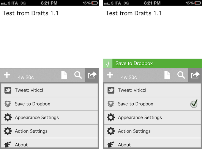
Drafts 1.1, released today, delivers in the two areas I used to find myself dabbling in: quick notes and Dropbox. Aside from a new icon by Wet Frog Studios, some minor UI refinements, and better feedback for executed actions, Drafts 1.1 comes with direct Dropbox integration to let you easily save a draft with one tap into your Dropbox account. Drafts will save notes as timestamped .txt files, meaning that, if you’re clever enough and want to automate your quick note-taking workflow, you could build rules in Hazel to look for specific timestamps and content inside the Apps/Drafts folder in Dropbox.
Personally, Drafts 1.1 fills a particular void in my workflow – a native iPhone app whose sole purpose is to save quick bits of text as single .txt files in Dropbox. With Drafts 1.1 and TextDrop, I can reclaim control of my drafts without being forced to use Send To Dropbox (which still has the obvious advantage of working anywhere). I like how I can type text into Drafts 1.1, hit the Dropbox sharing button, forget about it, and then access my text snippets with TextDrop, iOS file managers like ReaddleDocs and GoodReader (which allow you to directly edit text or “open in” other apps), or my OS X Dropbox folder.
Drafts 1.1, however, doesn’t just bring a few enhancements, bug fixes, and Dropbox support. For instance, third-party app integration has been supercharged with direct support for Sparrow (text will be passed along as email body, and the cursor will be automatically placed in the Subject field), Messages, and Simplenote. Even better, Drafts now lets you configure the apps and actions you want to keep visible in the sharing list with a dedicated menu; installed apps are automatically recognized, whilst supported-but-not-installed ones have a link back to the App Store (the App Store link button could use the same fresh coat of UI paint the icon received). You can enable and disable actions with a double tap.
Typically, 1.1 updates don’t fundamentally change the nature of an app, as they improve on existing features and fix glaring omissions of the first release. For me, Drafts 1.1, with the addition of Dropbox and more stability, feels like an all-new app that now sits in my iPhone dock to quickly save .txt into Dropbox. If you liked the functionalities of Drafts 1.0 and were waiting for more, I highly recommend Drafts 1.1, available on the App Store today at $0.99.
My Dropbox Writing Workflow
Ever since I wrote about my new year’s resolutions to work smarter using better tools, compared my favorite iOS text editors, and shared some of my workflow techniques on Macdrifter, I thought it would be appropriate to share a bit more about the activity that takes up 80% of my work time: writing.
As I wrote in my comparison of iOS text editors:
Two months ago, I noted how there seemed to be a distinction between text editors focused on long-form writing, and the ones stemming from a note-taking approach. I think this difference is blurring with time, but there are still several apps that are clearly focused on distraction-free, long-form writing, like iA Writer and Byword, whereas the ones I tried for this article belong to the note-taking/Markdown/Dropbox generation of text editors. I like iA Writer and Byword, but I’m saving that kind of apps for another article.
In my workflow, there is a distinction between apps “for writing” and tools for quick “note-taking”, but in order to minimize the effort required to keep everything in sync and tied together, I set out to make sure the differences of such tasks could coexist within a single ecosystem.
My writing ecosystem is powered by Dropbox. Read more
WordPress 2.9 for iOS Gets New Text Editor, Fixes
WordPress has released an update to their iOS client earlier today, adding a number of features that have been requested since the original release of the blogging client for iPhone and iPad. I’ve been trying the latest WordPress, and while it’s still far from being the perfect app to write long articles on the go, the new features introduced in the latest update surely contribute to enhancing the overall experience.
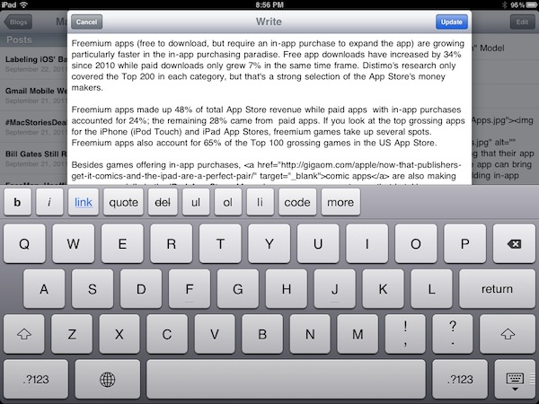
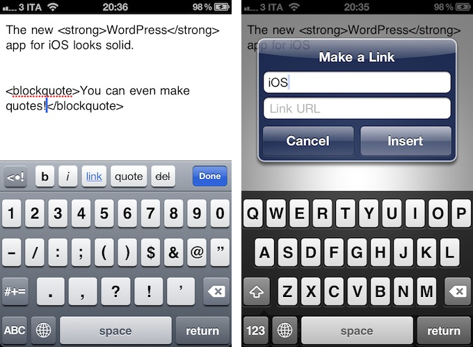
For one, WordPress 2.9 has a refreshed text editor. It’s not the same visual editor you’d get on a self-hosted WordPress blog – it still forces you to write with visible HTML, then hit a button to preview text – but it’s got an additional keyboard row both on the iPhone and iPad with buttons for bold and italic text, adding links, quotes and strikethroughs, bulleted lists, and more. The app is pretty smart in that text will be automatically wrapped between HTML tags both when you hit the buttons as you type, or manually select text afterwards. I’d like to see the possibility of manually arranging and customizing the extra keyboard row in a future update, but there’s no doubt the feature gets the job done for now.
Editing is done in a pop-up window on the iPad (my main writing machine when I’m on the go), with buttons along the bottom to switch between HTML, settings, preview, and attach media. Whereas the iPad app lets you switch between modes with the tap of a button, on the iPhone you’ll have to hit “Done” to go back to the previous view (with settings, title, categories, etc.).
WordPress mentions two more features in the iTunes changelog:
Full Screen Editing. No more teeny-weeny content editor — now you can view more text at a time while you post on the go.
Reading Made Easy. Keeping track of your favorite blogs has never been easier. Browse all the latest posts on blogs you follow in one place, right from your iPhone.
WordPress 2.9 comes with three minor fixes as well, which include posting pictures that you’ve already taken with Quick Photo (introduced in version 2.8), and stats/referrer links that can be opened in-app. In a post on the WordPress for iOS blog, the developers explain the new “Read” feature:
If you have one or more WordPress.com blogs in your WordPress for iOS app you’ll now see a Read button in the blogs list. This is the fastest way to keep up with posts from blogs you’re following on WordPress.com. Here’s how it works: if you go to any WordPress.com blog and click the Follow button, you’ll not only get email notifications about new posts from that blog, they’ll also show up right in the app!
WordPress 2.9 is an interesting update, one that I’m sure will get more writers to consider the iOS app as a feasible alternative when a laptop is not available. I’m definitely looking forward to version 3.0, which is going to be the “biggest update to the WordPress for iOS app since its birth”.
Download WordPress for iOS here.
MarkdownNote Brings Live Markdown Previews to OS X
Folks who enjoy writing in Markdown have already installed Brett Terpstra’s fantastic Marked for Mac, a nifty utility to generate HTML previews from Markdown documents written in any OS X application. You can read our review of version 1.2 here. Those who prefer a more cohesive writing environment with plain text/Markdown and HTML output living in the same application, however, might want to take a look at MarkdownNote, a new entry in the Markdown editing space that’s got some interesting features.
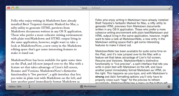
MarkdownNote has been available for quite some time on the iPad, and it’s now jumped over to the Mac with a feature set that takes advantage of Lion’s full-screen, Resume and Versions. MarkdownNote’s distinctive functionality is “live preview”, a split interface that lets you write in plain text with Markdown on the left, and have another panel immediately format Markdown as HTML on the right. This happens as-you-type, and with Markdown’s **strong** and *italic* formatting options you’ll only have to properly close such “tags” for the preview to refresh accordingly. MarkdownNote has a menu on the bottom left to resize the panels for Markdown and Live Preview, with options to set the editor and preview at 50, 70 or 100 percent.
MarkdownNote can save .txt files (everyone loves plain text, right?) , it lets you pick your own font and it’s got some further options to play with in the Preferences. When you’re done writing, you can copy the HTML and paste it somewhere else as usual. I’ve found MarkdownNote to be extremely useful in full-screen mode, as the split interface makes for a great alternative to having large borders around your text – with this app, you don’t waste space and you’ve got a live-updating preview at the same time.
MarkdownNote and Marked
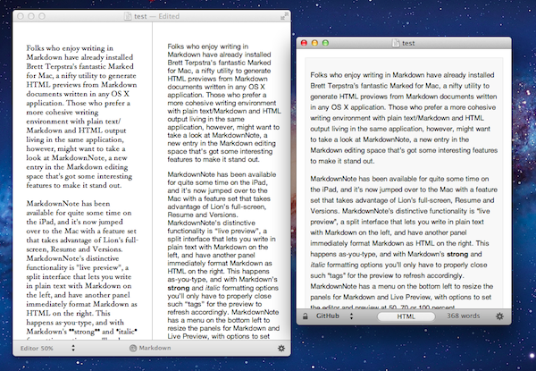
Best of all, MarkdownNote works great with Brett’s Marked, although you may wonder why would anyone use Marked when MarkdownNote has got a live preview. I think MarkdownNote is great at letting you write and quickly keep an eye on the correct visual output, but I still prefer Marked for editing – after I’ve written a long piece, I fire up Marked, choose my favorite style, see how many words I’ve typed, and I go through my Markdown. I love this combination of writing tools.
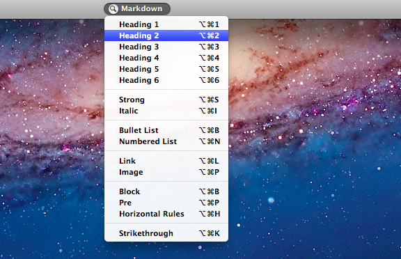
At $3.99 on the Mac App Store, MarkdownNote gives you an easy way to write in Markdown and instantly see how the words you typed will look like, and use keyboard shortcuts to facilitate the process of Markdown writing itself. MarkdownNote works really well in combination with Lion’s full-screen mode and Marked – if you’re a Markdown nerd, you should give this a try.


